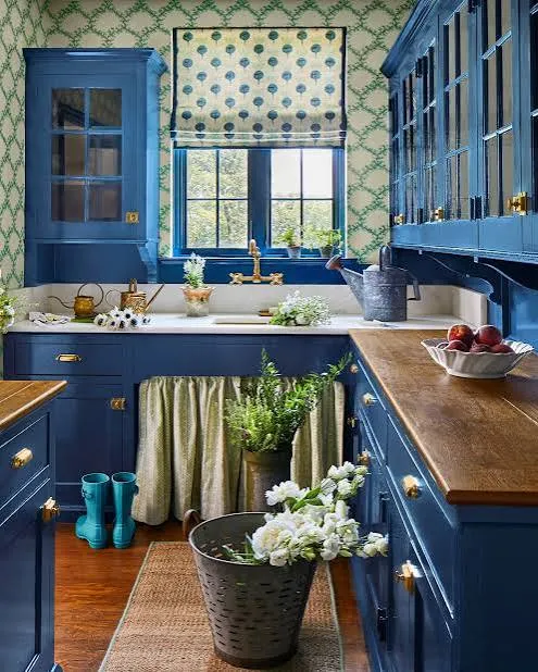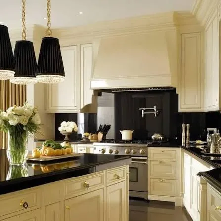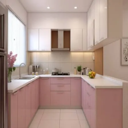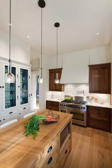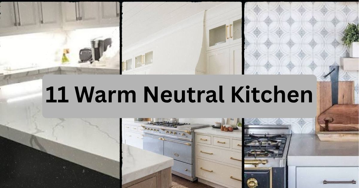
Category: Kitchen

  • 11 Warm Neutral Kitchen Ideas That Feel Like a Hug Every Time You Walk In

    11 Warm Neutral Kitchen Ideas That Feel Like a Hug Every Time You Walk In

    I’ve spent way too many hours scrolling through kitchen photos, and I can tell you this list of 11 warm neutral kitchen ideas is the most useful roundup you’ll find on the topic. I’ve tested what actually works, what looks good in photos but falls flat in real life, and what gives you that cozy, expensive feel without a huge budget.

    A warm neutral kitchen uses colors like cream, tan, soft brown, and warm white instead of stark white or cool gray. This palette makes the space feel inviting and timeless while still looking clean and put together.

    Stick around, because I’m breaking down 11 specific ways to bring this look into your own kitchen, plus a few mistakes that can wreck the vibe if you’re not careful.

    What Makes a Kitchen “Warm Neutral” Anyway

    Okay, so let’s get on the same page first. A warm neutral kitchen isn’t beige for the sake of beige. It’s about picking colors that have a hint of yellow, orange, or red undertone instead of blue or gray. Think oatmeal, caramel, terracotta-adjacent tan, and soft ivory.

    The whole point is that the space feels calm but not cold. It’s the difference between a kitchen that looks like a hospital and one that looks like a place you’d want to drink coffee in on a Sunday morning. I’ve noticed warm neutrals also age better than trendy colors. They don’t scream “2020s kitchen” the way a certain shade of sage green does.

    Now let’s get into the actual ideas.

    1. Start With Creamy White Cabinets Instead of Stark White

    Creamy White Kitchen Cabinet Colors | A Blissful Nest
    Credit: A Blissful Nest

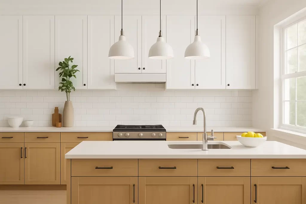
    Stark white cabinets can feel sterile, almost clinical. Swap them for a creamy white or warm off-white instead. Colors like Benjamin Moore’s Swiss Coffee or Sherwin Williams’ Alabaster give you that clean cabinet look without the cold edge.

    The trick is checking the undertone before you buy paint. Hold the swatch next to a pure white sheet of paper. If it looks yellowish or beige-ish next to that white, you’ve got a warm neutral.

    This works in almost any style. Farmhouse kitchens love it. Modern kitchens can use it too, paired with black hardware for contrast. Coastal kitchens might lean slightly cooler, but a warm cream still reads fresh next to natural wood tones.

    Once your cabinets are set, the countertops need to play nice with that warmth too.

    2. Choose Countertops With Warm Veining or Speckling

    Stone Veining - Answers and Examples — Natural Stone City
    Credit: Natural Stone City

    Bright white quartz with gray veins can fight against a warm neutral cabinet color. Instead, look for countertops with warm veining, like soft gold, tan, or brown streaks running through cream or white stone.

    Materials like butcher block, honed limestone, or quartz designed to mimic Calacatta Gold work really well here. These surfaces bring texture and warmth without adding a strong color.

    Practical tip: bring a cabinet paint chip with you to the stone yard. Hold it against slabs in real daylight before deciding. Store lighting can trick you.

    Traditional kitchens often go with marble-look quartz. Modern kitchens might choose a simpler warm quartz with subtle movement. Either way, the goal is countertops that feel like an extension of the walls, not a competing element.

    Next, let’s talk about what goes above those counters.

    3. Add Warm Wood Open Shelving

    Warm wood, open shelves, and a little corners that make daily routines feel special #kitcheninspo #openshelving #warmminimalism #homedetails #cleanaesthetic
    Credit: instagram.com

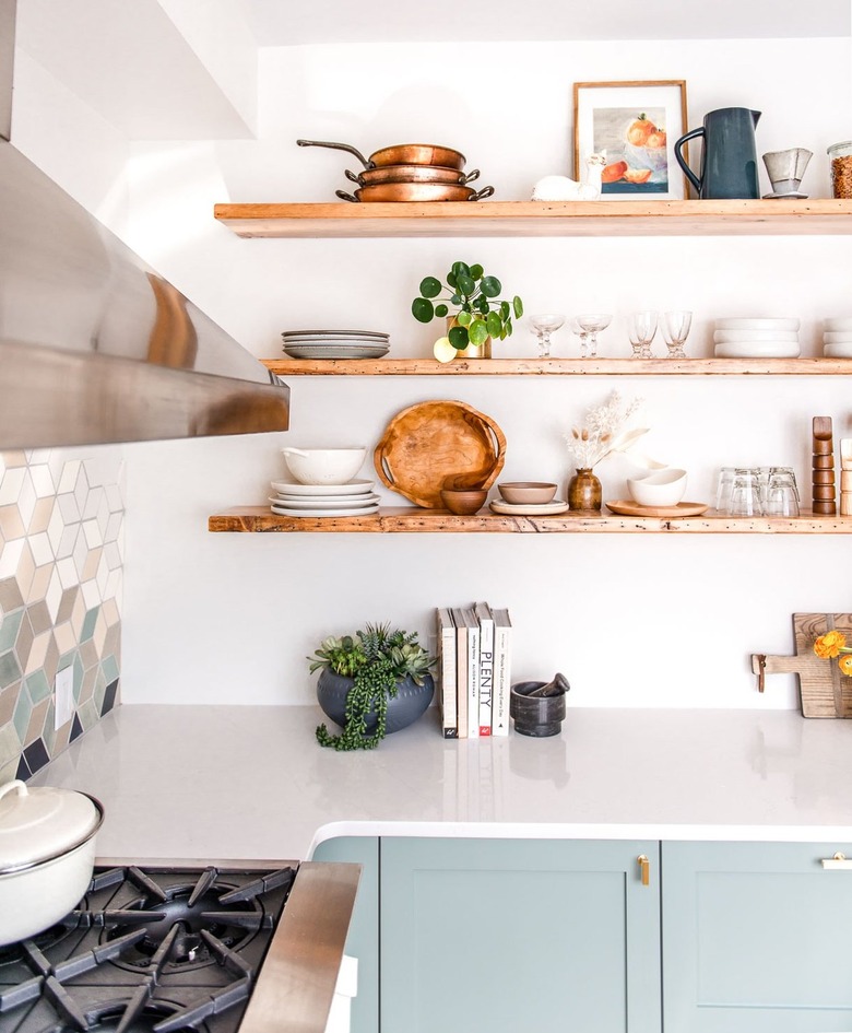
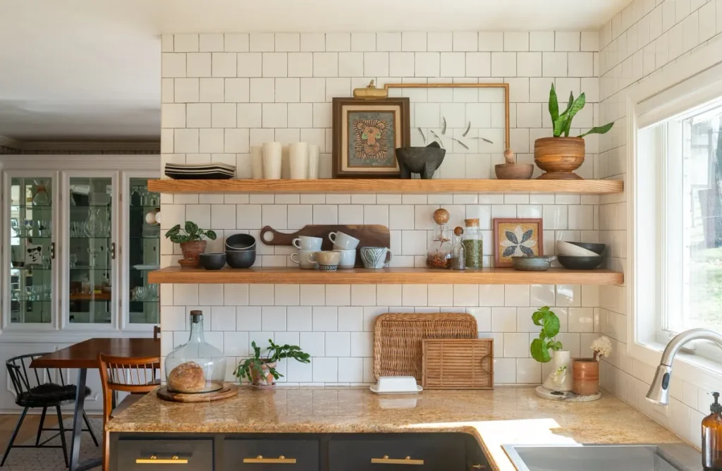
    Open shelving in a natural wood tone instantly adds warmth. Oak, walnut, or even reclaimed barn wood shelves break up a sea of cabinetry and give your eyes something textured to land on.

    I like this idea because it’s cheap to try. You don’t need to rip out cabinets. Just add a shelf or two where you’d normally have upper cabinets, especially near a sink or stove area.

    Style it with a mix of ceramic bowls, a few cookbooks, and one or two plants. Don’t overload it. Three to five items per shelf usually looks best.

    This idea shines in farmhouse and modern rustic kitchens. Coastal kitchens can use whitewashed wood instead of deep walnut for a lighter feel.

    Once your shelves are warm and wood-toned, your lighting needs to match that energy.

    4. Swap Cool LED Bulbs for Warm-Toned Lighting

    Soft White vs. Daylight Bulbs: Where to Use Both in Your Home
    Credit: House Beutiful

    This one’s sneaky important. A lot of kitchens look cold not because of the paint, but because of the light bulbs. Cool white LEDs (anything above 3000K) cast a blue-ish tint that fights against warm neutral colors.

    Switch to bulbs rated around 2700K to 3000K. These give off a soft, golden glow that makes cream cabinets and wood tones look richer.

    Practical tip: check the bulb packaging for the Kelvin number, not just “warm white” or “soft white” labels, since those terms aren’t standardized.

    This matters in every style of kitchen. Even a sleek modern space benefits from warmer bulbs, especially over islands and under cabinets.

    Speaking of islands, let’s talk about making that piece the star of your warm neutral scheme.

    5. Make Your Island a Warm Wood or Tan Statement Piece

    30 Kitchen Island Ideas No One Shares Because Most Homes Stop at Basic Function
    Credit: Homeedit

    If your cabinets are painted cream or white, your island can be the one spot where you introduce a deeper warm tone. Think honey oak, walnut, or a tan-painted finish.

    This creates contrast without breaking the neutral palette. It also makes the island feel like furniture instead of just more cabinetry.

    I’d suggest pairing it with woven or leather counter stools. That combo of wood, leather, and cream cabinetry is basically the poster child for warm neutral kitchens.

    Modern farmhouse kitchens do this constantly. Transitional and traditional kitchens can use a slightly more refined wood tone, like cherry or mahogany-stained oak.

    Now let’s bring in some color palette specifics, because picking the right combo matters a lot here.

    Warm Neutral Color Palette Combinations

    Palette NameCabinet ColorWall ColorAccent ColorBest For
    Cream & CaramelWarm whiteSoft beigeCaramel wood tonesFarmhouse, cottage
    Sand & StoneGreige (gray-beige)Warm taupeCharcoal hardwareModern, transitional
    Terracotta TouchIvoryCreamMuted terracotta accentsMediterranean, boho
    Golden OakAlmond whiteLight tanGolden oak woodTraditional, rustic
    Soft LatteMushroom beigePale mochaBronze fixturesContemporary, minimal

    Now that you’ve got a palette picked, let’s look at how backsplash choices can either support or clash with it.

    6. Pick a Backsplash That Echoes Your Countertop, Not Fights It

    The Perfect Pair: How to Pick Backsplash to Match Countertop - The JC Huffman Cabinetry Company
    Credit: jchuffman

    A busy, patterned backsplash can throw off an otherwise calm warm neutral kitchen. Instead, go with a simple subway tile in cream or warm white, or a natural stone mosaic with tan and brown flecks.

    Zellige tile is a great option too. Its handmade look adds texture and slight color variation, which keeps things interesting without adding visual noise.

    Practical tip: match your grout color close to the tile color instead of using stark white grout. This keeps the backsplash looking soft and cohesive rather than gridded and busy.

    Coastal kitchens might use a warm white subway tile with a slight sheen. Modern kitchens often go for large-format tile in the same warm neutral tone as the walls.

    Once your backsplash is settled, it’s time to think about the floor beneath your feet.

    7. Ground the Room With Warm-Toned Wood or Tile Flooring

    Warm Toned Wood Floors for 2025 | Flooring America
    Credit: Flooring America

    Cool gray flooring is everywhere right now, but it can undercut a warm neutral kitchen fast. Swap it for warm oak, hickory, or terracotta-look tile instead.

    Wood flooring in a honey or medium brown tone adds instant coziness. If you need something more durable for a busy kitchen, look for porcelain tile that mimics warm wood grain or has a soft, sandy tone.

    Practical tip: if you’re not ready to redo your floors, a jute or wool area rug in a warm tan can fake the effect for way less money.

    Traditional and farmhouse kitchens lean into deeper wood tones. Modern kitchens often choose a lighter, more matte wood look to keep things feeling airy.

    With the floor handled, let’s talk about a detail people skip: hardware.

    8. Use Warm Metal Hardware Like Brass or Bronze

    Mixed Metals Done Right: Brass, Chrome & Matte Black + Frame Matching
    Credit: rossettiart

    Chrome and stainless steel hardware can feel a little cold and clinical against warm neutral cabinetry. Swapping to brushed brass, warm bronze, or matte gold hardware ties everything together.

    This is one of the cheapest updates you can make. A set of new cabinet pulls can transform a kitchen for under a couple hundred dollars in most cases.

    Practical tip: stick to one metal finish throughout the kitchen, including faucet, cabinet pulls, and light fixtures. Mixing too many metals can make the space feel unplanned.

    Traditional kitchens often go with warm brass. Modern kitchens might choose a matte black instead, which still works with warm neutrals since black reads as a neutral too.

    Now let’s move to something people forget entirely: the ceiling.

    9. Don’t Ignore the Ceiling, Warm It Up Too

    Your ceiling is the most underrated surface in your home. I am officially begging you to stop leaving it plain white and start treating it like the design opportunity it is! ✨, Painting your ceiling ...
    Credit: instagram

    Most people paint their ceiling stark white and call it done. But a bright white ceiling next to warm neutral walls and cabinets can look mismatched, almost like an afterthought.

    Try painting the ceiling the same warm white as your trim, or go a shade lighter than your wall color. This creates a soft, enveloping feel instead of a jarring line where the wall meets the ceiling.

    Practical tip: if you have exposed wood beams, leave them natural or whitewash them lightly instead of painting them white. They add texture that pure white paint erases.

    This idea works especially well in farmhouse and coastal kitchens with vaulted or beamed ceilings. Modern kitchens can use a warm white flat ceiling for a subtle, cohesive look.

    Let’s talk textiles next, because fabric choices matter more than people think.

    10. Layer in Warm Textiles Like Linen Curtains and Woven Runners

    How to Style Natural Linen Curtains for a Cozy and Elegant Living Room – ForestlandLinen
    Credit: ForestlandLinen

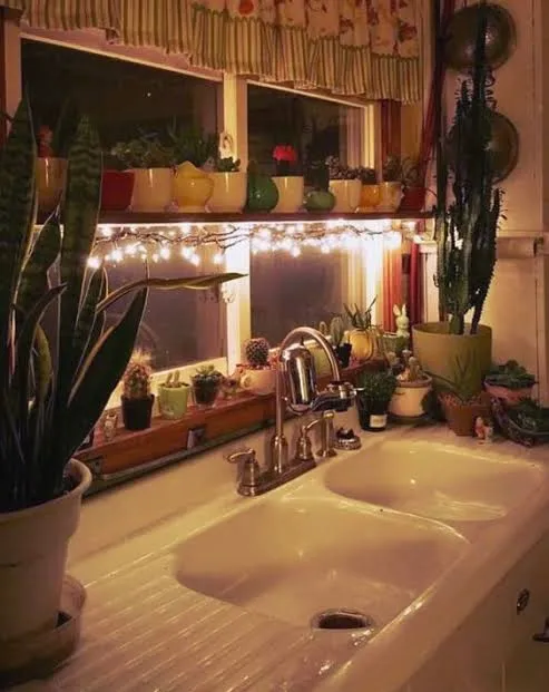
    Hard surfaces dominate kitchens, so soft textiles make a big difference in warmth. Linen café curtains in oatmeal or tan, a woven table runner, or cushioned seat pads on stools all add texture and coziness.

    I like linen because it has a slightly imperfect, relaxed look that fits the warm neutral vibe perfectly. Avoid anything too crisp or shiny, since that can feel more formal and cold.

    Practical tip: layer at least two textures, like a woven runner plus a linen curtain, rather than just one fabric element. This keeps the kitchen from feeling flat.

    Boho and coastal kitchens go heavy on texture here. Modern kitchens might use just one simple linen element to keep things minimal but still warm.

    Budget Tiers for a Warm Neutral Kitchen Refresh

    Budget TierWhat You Can DoEstimated Cost Range
    Small ($50-$300)New hardware, warm bulbs, textiles, rug$50-$300
    Medium ($500-$3,000)Paint cabinets, new backsplash, open shelving$500-$3,000
    Large ($5,000-$15,000)New countertops, flooring, island rebuild$5,000-$15,000
    Full Remodel ($20,000+)Cabinets, layout change, all finishes replaced$20,000-$60,000+

    Once your textiles and budget plan are sorted, let’s talk about a detail that pulls the whole room together: your wall color choice near the windows.

    11. Use Warm White Trim and Window Frames

    Should your Trim Colour match your White Vinyl Windows? -
    Credit: Maria Kilam

    Bright white trim can create a stark contrast against warm walls and cabinets. Swap it for a warm white trim color instead, something with a slight cream or ivory tint.

    This small shift keeps your eye moving smoothly through the room instead of catching on jarring white lines. It’s a subtle change, but it makes a real difference in photos and in person.

    Practical tip: use the same warm white for trim, window frames, and ceiling to create one cohesive envelope of color around your warm neutral cabinets and walls.

    Traditional and cottage kitchens benefit most from this softer trim approach. Modern kitchens can keep a slightly cooler white trim if they want just a touch of contrast, but keeping everything warm usually reads more intentional.

    With all eleven ideas in place, your kitchen should already feel warmer, cozier, and more put together. But a few quick tips can help you avoid common slip-ups.

    Tips for Success

    • Test paint colors on your actual wall, not just a swatch card, since lighting changes everything.
    • Buy one extra tile or paint sample and live with it for a week before committing.
    • Keep at least 60% of your surfaces in the lightest neutral tone to avoid a cave-like feel.
    • Add one plant or greenery element, since warm neutrals can look flat without some living color.
    • Photograph your kitchen in daylight and evening light before finalizing choices, since warm tones shift a lot under artificial light.
    • Don’t rush the hardware and lighting choices. These small details make or break the whole warm neutral look.

    Common Mistakes and How to Avoid Them

    Choosing a “greige” that’s actually cool-toned
    : Check the paint undertone in natural daylight before buying. If it looks purple or blue-ish in shade, skip it.

    Mixing too many wood tones
    : Stick to two wood tones max in one kitchen, like a lighter floor and a darker island.

    Using stark white grout with warm tile
    : Match grout closer to the tile’s base color to avoid a gridded, cold look.

    Forgetting the ceiling and trim
    : Treat these as part of your color plan, not an afterthought painted a different white by default.

    Overloading open shelves
    : Keep shelves at 60% full max so the warmth doesn’t turn into visual clutter.

    Ignoring lighting temperature
    : Always check the Kelvin rating on bulbs, since the wrong temperature can undo all your color work.

    Similar Variations

    • Japandi Kitchen – Blends warm neutral tones with minimalist Japanese and Scandinavian design lines.
    • Mediterranean Warm Kitchen – Adds terracotta, warm blues, and wrought iron to the warm neutral base.
    • Modern Farmhouse Neutral – Combines warm whites with black accents and shiplap detailing.
    • Coastal Warm Neutral – Lightens the palette with sandy tones and whitewashed wood for a beachy feel.
    • Desert Warm Kitchen – Uses clay, rust, and warm tan tones inspired by desert landscapes.
    • Rustic Warm Neutral – Leans into reclaimed wood, stone, and deeper caramel tones for a cabin-like feel.

    Getting a warm neutral kitchen right isn’t about picking one perfect paint color and calling it done. It’s about layering warm tones across your cabinets, counters, floors, lighting, and textiles so everything works together instead of fighting for attention.

    I hope these ideas give you a clear starting point, whether you’re doing a full remodel or just swapping out hardware this weekend. Any one of these changes on its own helps, but combining a few is really what makes an 11 Warm Neutral Kitchen feel finished, cozy, and like a space you actually want to spend time in.
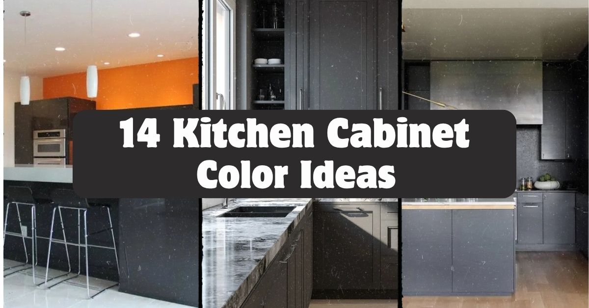
  • 14 Kitchen Cabinet Color Ideas That’ll Change How You See Your Kitchen

    14 Kitchen Cabinet Color Ideas That’ll Change How You See Your Kitchen

    I’ve spent way too many hours staring at paint swatches, so let me save you the trouble with these 14 kitchen cabinet color ideas that actually work in real homes, not just magazine spreads.

    What are the best kitchen cabinet colors? The best kitchen cabinet colors depend on your kitchen’s light, size, and style. Popular choices include navy blue, sage green, warm white, charcoal gray, and two-tone combos. Darker colors add drama in larger spaces, while lighter shades open up small kitchens.

    Stick around, because I’m about to walk you through ideas you probably haven’t thought of, plus a few mistakes that could cost you a repaint.

    Why Cabinet Color Matters So Much

    Here’s the thing. Your cabinets take up more visual space than almost anything else in your kitchen. Counters get covered in stuff. Walls get hidden behind cabinets. But cabinet doors? They’re always on display.

    I learned this the hard way when I painted my first kitchen a trendy gray that looked amazing online and depressing in my actual house. Lighting changes everything. So does the size of your room and even the direction your windows face.

    Cabinet color sets the whole mood. It can make a kitchen feel like a cozy cabin or a bright, airy escape. Let’s get into the ideas.

    1. Go Bold With Navy Blue Lower Cabinets

    Credit: Countryliving

    Navy blue is having a real moment, and I get why. It’s dramatic without being scary. Pair navy lower cabinets with white or cream uppers, and you get contrast that feels intentional, not accidental.

    I’d recommend brass or gold hardware here. It warms up the blue and keeps things from feeling too cold or corporate.

    Practical tip: Test navy on the side of your island first. Islands get less direct light than wall cabinets, so you’ll see the true depth of the color before committing to the whole kitchen.

    This look works beautifully in traditional kitchens, but it also slides right into modern farmhouse style if you swap the hardware for matte black.

    Speaking of contrast, let’s talk about a color combo that never seems to go out of style.

    2. Try Classic White Uppers With Wood Lower Cabinets

    Credit: Rollcallpainting

    This combo has stuck around for a reason. White cabinets up top keep things bright. Natural wood on the bottom adds warmth and texture. It’s the best of both worlds.

    Choose a wood tone that matches your flooring, or at least doesn’t clash with it. Oak, walnut, and maple all work depending on how warm or cool you want the space to feel.

    Practical tip: If your kitchen doesn’t get much natural light, lean toward lighter wood tones like white oak instead of dark walnut. Dark wood can eat up light fast.

    Coastal kitchens love this look, and so do modern farmhouse and Scandinavian-style spaces. It’s flexible enough to fit almost anywhere.

    Now let’s move to a color that’s basically the new neutral.

    3. Warm Up Your Space With Sage Green

    Credit: countryliving

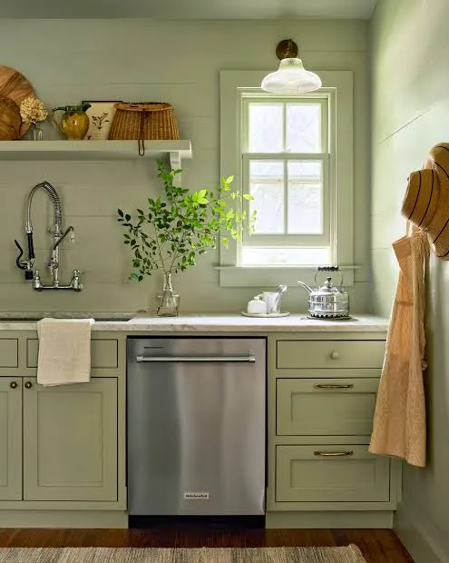
    Sage green is soft, earthy, and way more forgiving than people expect. It’s not as loud as emerald or forest green, but it still adds personality.

    This color pairs really well with brushed nickel or unlacquered brass hardware. Butcher block counters and open wooden shelving also look amazing next to sage.

    Practical tip: Sage green can look muddy under yellow-toned lighting. Test your paint swatch under your actual kitchen bulbs before buying gallons.

    In cottage-style kitchens, sage feels right at home. It also works surprisingly well in mid-century modern spaces when paired with clean lines and simple hardware.

    If green feels like too big a leap, there’s a safer cousin waiting in idea number four.

    4. Keep It Timeless With Warm White or Cream

    Credit: Oppeinhome

    Warm white is not the same as stark white. Warm white has a hint of yellow or beige mixed in, which keeps things from feeling clinical or cold.

    This shade works with literally every countertop material and backsplash color. That’s part of why it’s so popular.

    Practical tip: Ask for a sample pot before committing. Warm whites can shift dramatically depending on your wall color and lighting, so don’t trust the paint chip alone.

    Traditional kitchens practically live on warm white. Modern farmhouse kitchens use it constantly too, especially paired with black hardware and open shelving.

    Let’s compare a few popular cabinet color families so you can see how they stack up.

    Kitchen Cabinet Color Comparison Table

    ColorBest ForLight RequirementMaintenance Level
    Navy BlueBold statement kitchensBright natural light preferredMedium (shows dust)
    Warm WhiteAny kitchen sizeWorks in low or bright lightHigh (shows smudges)
    Sage GreenCottage, farmhouse stylesModerate to bright lightLow to medium
    Charcoal GrayModern, industrial kitchensBright light recommendedMedium
    Natural WoodCoastal, Scandinavian stylesAny lightingLow

    5. Add Drama With Charcoal Gray Cabinets

    Credit: Pahome

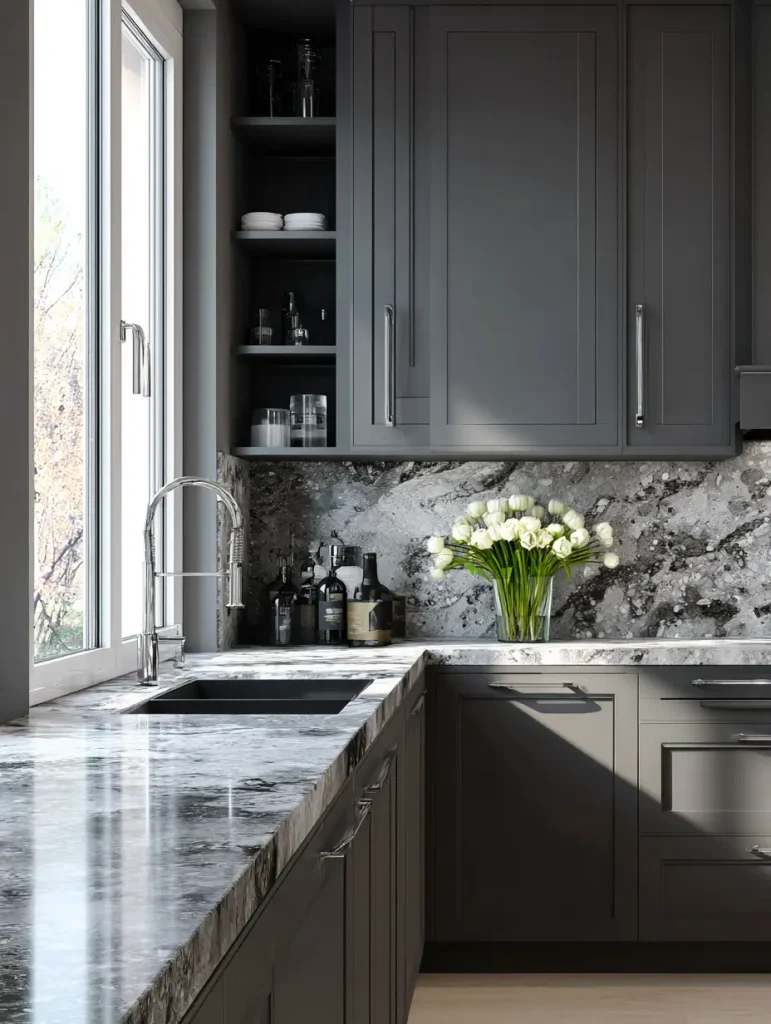
    Charcoal gray sits right between black and gray, giving you drama without the commitment of full black. It’s moody but still livable.

    I like pairing charcoal with white countertops to keep the whole kitchen from feeling like a cave. Gold or brushed brass hardware adds a nice pop against the dark background.

    Practical tip: Add under-cabinet lighting if you go charcoal. Dark cabinets can make small kitchens feel closed in without extra light sources.

    This color shines in modern and industrial kitchens, but a softer charcoal with brass accents can also work in transitional spaces.

    Now, if you want two colors working together instead of one, keep reading.

    6. Mix Two Tones for a Custom Look

    Credit: hgtv

    Two-tone kitchens are everywhere right now, and it’s not just a trend. Splitting your colors, usually a darker shade on the island or lower cabinets and a lighter shade up top, adds depth without overwhelming the room.

    Popular combos include navy and white, black and wood, or sage and cream. The key is picking colors that don’t fight each other in tone or saturation.

    Practical tip: Keep your darker color on the lower half of the kitchen. This grounds the room and feels more balanced than a top-heavy dark color scheme.

    Two-tone works in almost any style, from farmhouse to contemporary, because you control the exact color pairing to match your vibe.

    Let’s talk about a color that feels fresh precisely because it’s a little unexpected.

    7. Go Unexpected With Terracotta or Burnt Orange

    Credit: Hgtv

    I know this sounds bold, but terracotta cabinets are showing up in more kitchens, and they bring instant warmth. Think sun-baked clay, not neon orange.

    This works best as an accent, maybe on an island, rather than covering every cabinet in the kitchen. Pair it with cream walls and brass or black hardware.

    Practical tip: Balance terracotta with plenty of neutral counter and floor space. This color needs breathing room to look intentional instead of overwhelming.

    Mediterranean and boho kitchens practically beg for this shade. It also works surprisingly well in modern kitchens that want a warm, earthy contrast.

    If earthy tones speak to you, there’s a deeper, richer option coming up next.

    8. Deepen the Mood With Forest Green

    Credit: elledecor

    Forest green is sage green’s bolder sibling. It’s rich, a little formal, and instantly makes a kitchen feel more finished and intentional.

    Pair forest green with brass hardware and marble or quartz counters for a look that feels expensive without the expensive price tag.

    Practical tip: Use forest green only on lower cabinets if your kitchen is small. Full forest green walls of cabinets can shrink a room visually.

    Traditional and transitional kitchens love this shade. It also fits nicely into moody, English-cottage-inspired spaces.

    Let’s lighten things up again with a color that’s basically a kitchen chameleon.

    9. Stay Flexible With Soft Gray-Greige

    Credit: jk-cabinetry

    Greige, that in-between shade of gray and beige, is the ultimate compromise color. It’s warmer than gray but more grounded than beige.

    This color plays nice with almost any countertop, from white quartz to darker granite. It’s a safe bet if you’re worried about resale value or just can’t commit to something bolder.

    Practical tip: Look for greige with warm undertones if your kitchen faces north, since north-facing rooms tend to get cooler light.

    Greige works in transitional, modern, and even traditional kitchens. It’s basically the little black dress of cabinet colors.

    Now let’s talk about going all in on black.

    10. Make a Statement With Matte Black Cabinets

    Credit: architecturaldigest

    Matte black isn’t for everyone, but when it works, it really works. It photographs beautifully and gives kitchens a sleek, high-end feel.

    I always recommend matte over glossy black. Glossy shows every fingerprint and smudge, while matte hides small imperfections much better.

    Practical tip: Balance black cabinets with a light-colored backsplash and countertop. Otherwise, the kitchen can feel dark and heavy.

    Modern and industrial kitchens are the natural home for black cabinets, though a softer black with wood accents can work in transitional spaces too.

    Let’s shift toward something a little more playful.

    11. Add Personality With Dusty Blue

    credit: countryliving

    Dusty blue sits between navy and powder blue, giving you color without the intensity of a true navy. It’s calm, a little vintage-feeling, and works in kitchens big and small.

    This shade pairs really well with white subway tile and natural wood floors. It doesn’t compete with other elements in the room.

    Practical tip: Test dusty blue next to your existing floor and counter samples. This color can lean either gray or purple depending on the light, so double-check before painting.

    Cottage kitchens and coastal kitchens both love dusty blue. It even fits into vintage-inspired retro kitchens with the right hardware.

    Speaking of vintage vibes, let’s talk about a color combo that feels like it walked out of an old farmhouse.

    12. Bring Character With Cream and Black Combos

    Credit: interiorcompany

    Cream cabinets paired with black accents, whether that’s a black island, black hardware, or a black range hood, create instant character. It’s a classic combo that never really goes out of style.

    The cream keeps things soft and warm, while the black adds sharp definition and a little edge.

    Practical tip: Use black sparingly at first, maybe just hardware and light fixtures, then add more black elements if you want a bolder look later.

    Farmhouse kitchens are basically built around this combo. Traditional and transitional kitchens use it constantly too.

    Let’s check out a quick budget breakdown before moving to the last two ideas.

    Cabinet Painting Budget Guide

    Project ScopeDIY Cost RangeProfessional Cost RangeTime Estimate
    Small kitchen (10-15 cabinets)$200-$400$1,500-$3,0002-4 days
    Medium kitchen (16-25 cabinets)$400-$700$3,000-$5,5004-6 days
    Large kitchen (26+ cabinets)$700-$1,200$5,500-$9,0006-10 days
    Two-tone custom job$500-$900$4,000-$7,0005-8 days

    13. Try a Muted Blush or Dusty Rose

    Credit: interiorcompany

    This one surprises people, but muted blush cabinets can look sophisticated instead of childish when done right. The key word is muted. Skip anything bright or cotton-candy toned.

    Pair blush with warm wood floors and brass hardware for a look that feels soft but grown-up.

    Practical tip: Use blush on an island or a small bank of cabinets rather than the whole kitchen. It’s a strong color that works best in smaller doses.

    This idea fits beautifully in modern glam kitchens and soft, feminine cottage-style spaces.

    Last but not least, let’s talk about a trend that’s all about texture over color.

    14. Layer Different Wood Tones Instead of Paint

    Credit: houzz

    Sometimes the best cabinet color idea isn’t a paint color at all. Mixing two different wood tones, like a walnut island with white oak upper cabinets, gives you warmth and contrast without touching a paint can.

    This works especially well if you love the look of natural materials and want your kitchen to feel grounded and organic.

    Practical tip: Stick to two wood tones max. Three or more starts to look busy and unplanned.

    Scandinavian, coastal, and modern organic kitchens all lean heavily on this approach.

    Tips for Success

    • Always test paint samples on your actual cabinets, not just a wall, since cabinet material affects how color reads
    • Consider your countertop and backsplash before locking in a cabinet color
    • Choose semi-gloss or satin finishes for easier cleaning, especially with darker colors
    • Don’t skip primer if you’re switching from a dark color to a light one
    • Live with a sample for at least three days to see it in morning, afternoon, and evening light
    • Factor in hardware finish early since it changes how a color feels
    • Ask your painter about durability ratings if you have kids or pets in the house

    Common Mistakes and How to Avoid Them

    Choosing a color based only on online photos
    Lighting and screens distort color constantly. Always get a physical sample before committing.

    Ignoring your kitchen’s natural light direction
    North-facing kitchens need warmer tones. South-facing kitchens can handle cooler shades without looking cold.

    Going too dark in a small, low-light kitchen
    Dark colors can work anywhere, but small dark kitchens need extra lighting to avoid feeling cramped.

    Skipping proper prep work
    Cabinets need cleaning, sanding, and priming. Skipping steps leads to peeling and chipping within months.

    Matching cabinet color to current trends instead of your style
    Trends fade fast. Pick a color you’ll still like in five years, not just this season.

    Forgetting about hardware and lighting
    The wrong hardware finish can make an otherwise great color choice feel off balance.

    Similar Variations

    • Coastal Blue Kitchens – Lighter, breezier blues paired with white and natural rope or wood accents
    • Modern Farmhouse Neutrals – Warm whites and soft grays paired with black hardware and shiplap
    • Moody Traditional Kitchens – Deep greens or navy paired with brass and marble for a formal feel
    • Scandinavian Minimalist Kitchens – Light wood tones and white cabinets with almost no ornamentation
    • Industrial Loft Kitchens – Matte black or charcoal cabinets paired with exposed brick and metal accents
    • Vintage Cottage Kitchens – Soft pastels like dusty rose or sage paired with brass and glass-front cabinets

    Picking a cabinet color doesn’t have to feel overwhelming once you break it down into real options instead of vague trends. Whether you go bold with navy, safe with warm white, or something totally unexpected like terracotta, the right choice comes down to your light, your style, and honestly, what makes you happy every time you walk into your kitchen. I hope these 14 Kitchen Cabinet Color Ideas gave you a clearer picture of what will actually work in your own home.

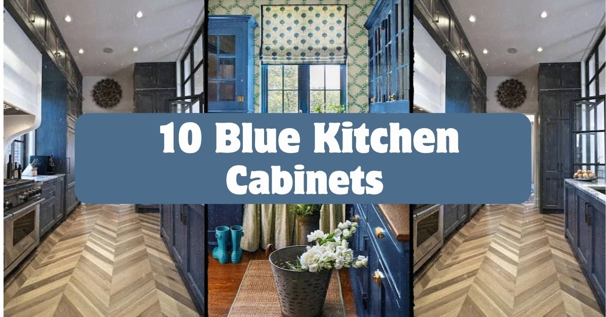
  • 10 Blue Kitchen Cabinets That Will Change How You See Your Kitchen

    10 Blue Kitchen Cabinets That Will Change How You See Your Kitchen

    I’ve spent way too many hours scrolling through kitchen photos, and I can honestly say these 10 blue kitchen cabinets ideas are some of the smartest, most livable looks I’ve found. If you’re on the fence about going blue, stick with me. I’m going to break down exactly what works and why.

    Blue kitchen cabinets are cabinetry painted or stained in shades ranging from soft powder blue to deep navy, used as the main color for lower cabinets, upper cabinets, or both. They pair well with white, wood, brass, and black accents, and they work in kitchens of almost any size or style.

    Ready to see how blue can totally transform your kitchen without making it feel cold or trendy in a bad way? Let’s get into it.

    Why Blue Kitchen Cabinets Just Work

    Here’s the thing about blue. It’s not white, but it’s not scary either. That’s why it’s become such a go-to color for kitchens. It feels fresh, it hides fingerprints better than white, and it plays nice with almost any metal finish you throw at it.

    I think people love blue because it feels calm but still has personality. You’re not stuck with boring beige, but you’re also not committing to something wild like hot pink. Blue sits in this sweet spot. It works in old farmhouses, sleek modern builds, and cozy cottage kitchens alike. That flexibility is honestly the whole reason this color trend has stuck around instead of fading out like some others.

    1. Navy Lower Cabinets With White Uppers

    20 Blue Kitchen Cabinet Ideas to Inspire Your Remodel
    Credit: Mydomaine

    This combo is a classic for a reason. You get the drama of navy blue down low, grounding the whole room, while white upper cabinets keep things feeling light and open. It’s a great trick if your kitchen doesn’t get tons of natural light, because the white up top bounces brightness around.

    Pair this with brass or gold hardware for a warm contrast, or go with matte black if you want something more modern and moody. A practical tip: keep your countertops light (think white quartz or marble-look) so the navy doesn’t swallow the room.

    This look adapts beautifully to traditional kitchens with shaker-style doors, but it also works in modern spaces with flat-panel cabinets. Once you’ve nailed the two-tone base, you might want to think about how the walls play into the mix, which brings us to the next idea.

    2. Soft Sky Blue Walls With Deeper Blue Cabinets

    31 Best Blue Kitchen Cabinet Ideas for a Classic Look
    Credit: Countryliving

    Going monochromatic with blue sounds risky, but it actually creates this really soothing, cohesive look. Use a lighter blue on the walls and a richer, deeper blue on the cabinets so there’s still contrast and depth. It keeps the kitchen from feeling flat or one-note.

    The tip here is to use the 60-30-10 rule: 60% lighter blue, 30% darker cabinet blue, and 10% accent color like white trim or wood shelving. This keeps the balance right so it doesn’t feel like you’re standing inside a paint swatch.

    Coastal and cottage-style kitchens love this look, but you can make it feel more modern by keeping the hardware simple and skipping ornate trim. Once the walls and cabinets are settled, the countertop choice becomes the next big decision.

    3. Butcher Block Countertops Over Blue Cabinets

    20 Wood and Butcher Block Kitchen Countertop Ideas | HGTV
    Credit: Hgtv

    Wood and blue are basically best friends. Butcher block countertops add warmth and texture that stone counters just can’t match. The wood grain softens the boldness of the blue, making the whole kitchen feel more relaxed and lived-in.

    If you go this route, seal the butcher block well and reseal it every six months to a year, especially near the sink. That’s the practical part people skip and regret later.

    This pairing is perfect for farmhouse and rustic kitchens, but it also shows up in Scandinavian-style spaces where wood and clean lines rule. Speaking of texture, let’s talk about what happens when you bring metal into the mix.

    Blue Cabinet Color and Hardware Pairing Guide

    Blue ShadeBest Hardware FinishStyle Vibe
    NavyBrass or GoldTraditional, Moody
    Powder BlueBrushed NickelCoastal, Soft Modern
    Slate BlueMatte BlackModern, Industrial
    Teal-BlueCopperEclectic, Bohemian
    Denim BlueChromeTransitional, Clean

    4. Brass Hardware for a Warm Contrast

    Designers' Favorite Ways to Use Brass in a Kitchen
    Credit: Houzz

    Brass hardware against blue cabinets is one of those combos that just glows. It adds a little shine and warmth that keeps the blue from feeling too cool or sterile. Even a small detail like cabinet knobs can change the whole personality of a kitchen.

    My tip: mix your brass hardware with a brass or gold faucet too, so the metals feel intentional instead of random. Nothing looks more off than mismatched metal finishes scattered around a kitchen.

    This works great in traditional and transitional kitchens, but a slightly aged or unlacquered brass finish can push the look into more of a vintage or eclectic direction. Once your hardware is locked in, backsplash tile is the next spot to think about.

    5. Classic Subway Tile Backsplash

    33 Subway Tile Backsplashes - Stylish Subway-Tile Ideas for Kitchens
    Credit: Elle Decor

    Subway tile is the reliable friend of kitchen design. It never overwhelms the blue cabinets, and it gives your eyes a little visual break between the counter and upper cabinets. White subway tile is the safest choice, but a pale blue-gray tile can tie things together even more.

    A quick tip: lay your subway tile in a herringbone pattern instead of the standard brick pattern if you want a little extra interest without adding more color.

    This backsplash style is basically universal. It fits farmhouse, modern, coastal, and transitional kitchens without missing a beat. Now that the walls are covered, let’s talk about what sits on top of your counters.

    6. Open Shelving to Break Up Cabinet Boxes

    35 Open Storage Ideas for Every Room of Your Home
    Credit: Bhg

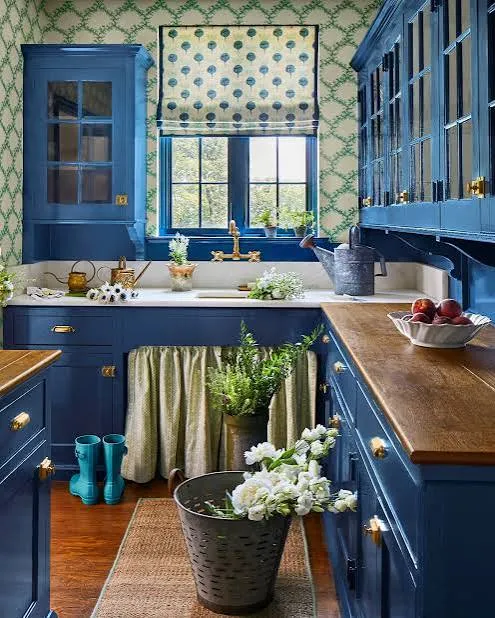
    Full walls of blue cabinets can feel heavy if you’re not careful. Swapping in a section of open shelving lightens things up visually and gives you a spot to show off dishes, glassware, or a few plants. It also makes a small kitchen feel less boxed in.
    Practical tip: paint the inside back panel of your open shelving a slightly different shade, like white or a warm cream, so your dishes pop against it instead of blending into the blue.

    Open shelving fits cottage and farmhouse kitchens especially well, but floating shelves in a darker wood tone can make it feel modern too. Speaking of lightening things up, let’s talk about how a kitchen island can carry a totally different color.

    7. A Contrasting Island Color

    23 Contrasting Kitchen Island Ideas
    Credit: Bhg

    If your perimeter cabinets are blue, try making your island a different color entirely, like white, black, or even a warm wood tone. This creates a natural focal point in the kitchen and keeps the whole room from feeling too matchy.

    A helpful tip here is to use the island color as your “third color” in the kitchen, tying it back to something small elsewhere, like a rug or a few bar stools.

    This idea works in almost every style. Modern kitchens might use black islands, farmhouse kitchens lean toward wood, and coastal kitchens often go with crisp white. Once your island stands out, your lighting fixtures need to keep up.

    8. Statement Pendant Lights Above the Island

    26 Kitchen Lighting Ideas That Make a Statement
    Credit: Bhg

    Blue cabinets set a calm tone, so this is your chance to have a little fun with lighting. Bold pendant lights in brass, black, or even glass with colored accents can add personality without messing with your color scheme.

    Tip: hang pendants 30 to 36 inches above the island countertop for the best mix of function and style. Too high and they lose impact, too low and they block your view across the kitchen.

    Modern kitchens can go sleek and geometric with their pendant choice, while traditional kitchens might lean toward lantern-style fixtures. Lighting sets the mood, but flooring grounds the whole room, so let’s go there next.

    Budget Tiers for Painting Kitchen Cabinets Blue

    Budget TierApprox. Cost RangeWhat’s Included
    DIY Basic$200 to $400Paint, primer, brushes, basic hardware swap
    DIY Pro$500 to $900Higher-quality paint, sprayer rental, new hardware
    Professional Paint Job$1,500 to $3,500Labor, premium paint, prep work, minor repairs
    Full Cabinet Replacement$8,000 to $20,000+New blue cabinet boxes, doors, installation

    9. Warm Wood Flooring Underfoot

    30 Kitchen Flooring Options and Design Ideas | HGTV
    Credit: Hgtv

    Blue cabinets can feel a little cool on their own, so warm wood flooring balances things out nicely. Medium or honey-toned wood works especially well because it doesn’t compete with the blue, it just supports it.

    Tip: if you’re not ready to commit to real hardwood, luxury vinyl plank in a warm wood tone gives you the same effect for a lot less money and much easier upkeep.

    This pairing shows up in farmhouse, traditional, and transitional kitchens most often, though a darker wood floor can push things toward a more modern, moody feel. With the floor sorted, let’s talk about how green touches can round things out.

    10. Greenery and Plants for Natural Contrast

    Green Kitchens - 33 Inspiring Green Kitchen Ideas
    Credit: House Beautiful

    Blue and green are neighbors on the color wheel, which is exactly why plants look so good against blue cabinets. A few potted herbs on the counter or a hanging plant near the window adds life and softens all those hard surfaces.

    Practical tip: stick with low-maintenance plants like pothos, snake plants, or fresh herbs if you don’t have a great track record keeping plants alive. Kitchens can be tricky with temperature swings.

    This works in every kitchen style honestly. Coastal kitchens might use dried greenery, while modern kitchens often prefer a single sculptural plant. Let’s round things out with two more ideas that tie the whole look together.

    Tips for Success

    • Test paint samples on your actual cabinets, not just a wall, since lighting changes how the color looks
    • Stick to one dominant blue shade throughout the kitchen to avoid a mismatched look
    • Use satin or semi-gloss finish on cabinets since they’re easier to wipe down than matte
    • Balance bold blue with at least one neutral surface, like counters or floors
    • Don’t skip the primer step if you’re painting existing cabinets, or the color won’t hold up
    • Bring home hardware samples before buying in bulk, since finishes look different under kitchen lighting
    • Keep your blue consistent with your home’s overall color palette so the kitchen doesn’t feel disconnected from other rooms

    Common Mistakes and How to Avoid Them

    Choosing too dark a blue in a small, low-light kitchen
    : Stick with lighter or mid-tone blues if your kitchen doesn’t get much natural light, so it doesn’t feel like a cave.

    Mixing too many metal finishes
    : Pick one or two metal tones max for hardware, faucets, and lighting so things feel intentional.

    Skipping the primer before painting
    : Always prime cabinets first, especially if they’re laminate or previously glossy, so the paint actually sticks.

    Ignoring the finish sheen
    : Flat paint scratches and stains easily in kitchens, so go with satin or semi-gloss instead.

    Forgetting to sample the color in your actual kitchen lighting
    : Paint colors shift dramatically between natural light and warm bulbs, so always test in your space first.

    Overdoing matching decor
    : Not every towel, rug, and accessory needs to match the cabinets exactly, or the kitchen starts feeling like a themed room instead of a real home.

    Similar Variations

    • Coastal Blue Kitchen: Lighter, breezier blues paired with white and natural textures like rope or rattan
    • Navy Farmhouse Kitchen: Deep navy cabinets mixed with wood beams and vintage-style hardware
    • Modern Slate Blue Kitchen: Cool-toned blues paired with matte black fixtures and minimal decor
    • Two-Tone Blue and White Kitchen: Blue on lower cabinets only, kept crisp and classic with white uppers
    • Bohemian Teal Kitchen: Teal-blue cabinets mixed with warm metals, patterned tile, and lots of plants
    • Vintage Powder Blue Kitchen: Soft, muted blue cabinets paired with retro appliances and simple hardware

    At the end of the day, blue cabinets give you way more flexibility than people expect. You can go moody and dramatic, soft and coastal, or clean and modern, all using the same base color. The trick is picking the right shade for your light, balancing it with the right materials, and not overthinking the small details. Whether you’re repainting an old kitchen or planning a full renovation, these 10 blue kitchen cabinets ideas give you a solid, practical starting point that actually works in real homes.

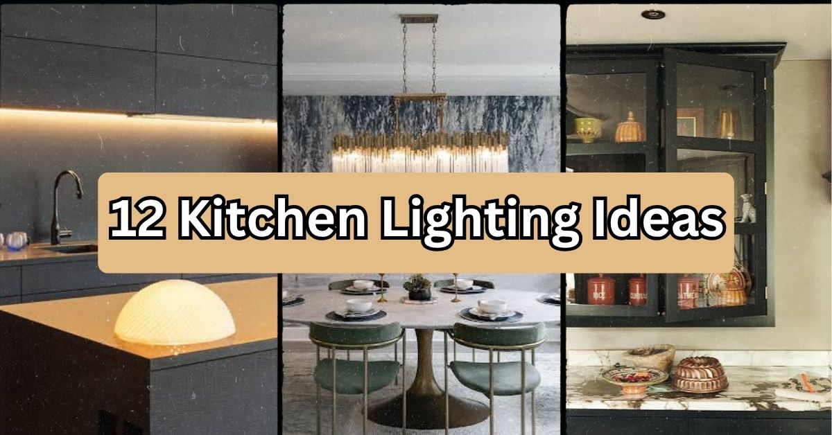
  • 12 Kitchen Lighting Ideas That’ll Make Your Cooking Space Actually Shine

    12 Kitchen Lighting Ideas That’ll Make Your Cooking Space Actually Shine

    If you’ve been searching for 12 kitchen lighting ideas that actually work in real homes (not just fancy magazine shoots), you’re in the right spot. I’ve spent way too many hours staring at kitchen ceilings, comparing fixtures, and asking myself “will this look good in five years?” So let me save you the trouble.

    Kitchen lighting design refers to the layered use of ambient, task, and accent light sources to make a kitchen both functional and visually appealing. A well-lit kitchen typically combines overhead fixtures, under-cabinet strips, and pendant lights to cover cooking, prepping, and gathering needs.

    Stick around, because I’m about to walk you through everything from budget-friendly fixes to statement pieces that’ll make guests ask where you got them.

    Why Kitchen Lighting Matters More Than You Think

    Here’s the thing nobody tells you: your kitchen probably has the worst lighting setup in your whole house. One overhead light. Maybe two. That’s it.

    But kitchens do a lot of jobs. You chop vegetables. You read recipes. You host people for wine and snacks. Each of those needs different light. That’s why designers talk about “layering” light instead of just slapping one fixture in the middle of the ceiling and calling it done.

    Once you start thinking in layers, everything gets easier. You stop asking “what light should I buy” and start asking “what job does this corner of my kitchen need light for.” That mindset shift changes everything.

    1. Install Under-Cabinet Lighting for Real Task Lighting

    How To Install Under-Cabinet Lighting: Steps, Tips & Costs - Taskrabbit Blog
    Credit: Taskrabbit

    This one’s non-negotiable in my book. Under-cabinet lights sit right above your countertop, shining down exactly where you chop, mix, and prep. No more shadows from your own head blocking the cutting board.

    LED strip lights work great here. They’re thin, they run cool, and they last forever. Go with a warm white (around 2700K to 3000K) if your kitchen has wood tones, or a cooler white (3500K to 4000K) for stainless steel and white cabinets.

    Practical tip: Buy dimmable strips. You’ll want full brightness while cooking and a softer glow for late-night snack runs.

    This idea works in literally every kitchen style, from farmhouse to ultra-modern, because it’s hidden until it’s turned on. Once your counters are covered, let’s talk about what’s happening above your island.

    2. Hang Pendant Lights Over Your Kitchen Island

    20 Dining Rooms With Chic Chandeliers and Pendant Lights
    Credit: Houzz

    Pendants are the statement earrings of kitchen lighting. They hang low, they draw the eye, and they instantly make a kitchen feel finished. The trick is getting the size and spacing right.

    For a standard island, hang two or three pendants spaced about 24 to 30 inches apart. Keep the bottom of the fixture 30 to 36 inches above the counter surface. Too high and they look lost. Too low and you’ll bonk your head reaching for the salt.

    Practical tip: Measure your island length, divide by three, and space your pendants at those points for even coverage.

    Coastal kitchens love glass or rattan pendants. Modern kitchens go for matte black or brass geometric shapes. Traditional spaces often choose bell-shaped glass with bronze finishes. Once your island is glowing, it’s time to think bigger picture with the ceiling.

    3. Add a Statement Chandelier for Dining Areas

    26 Kitchen Lighting Ideas That Make a Statement
    Credit: Better Homes & Gardens

    If your kitchen has a breakfast nook or an eat-in table, a small chandelier changes the whole vibe. It’s not just light, it’s decor. It says “this spot matters.”

    You don’t need anything huge. A mini chandelier, maybe 18 to 24 inches wide, works perfectly over a table for four. Go bigger only if your table seats six or more.

    Practical tip: Hang the chandelier so the bottom sits about 30 inches above the tabletop, giving clear sightlines across the table.

    Farmhouse kitchens tend to like wood and iron mixes. Glam kitchens go for crystal or beaded styles. Minimalist spaces choose simple linear fixtures with exposed bulbs. Speaking of exposed bulbs, let’s talk about a trend that’s stuck around for a reason.

    Fixture Type Comparison Table

    Fixture TypeBest ForAverage Cost RangeLight Output
    Pendant LightsIslands, peninsulas$50 to $300 eachMedium, focused
    ChandeliersDining nooks, breakfast tables$150 to $600Medium, ambient
    Under-Cabinet LEDsCountertops, task areas$30 to $150 per runHigh, directional
    Recessed CansGeneral ambient light$20 to $80 per fixtureHigh, spread out
    Track LightingAccent walls, open shelving$40 to $200Adjustable, focused

    4. Use Recessed Lighting for Even, Ambient Coverage

    Top Recessed Lighting Ideas to Transform Your Home
    Credit: Visual Comfort

    Recessed lights, also called can lights, sit flush in the ceiling and spread light evenly across the whole room. They’re the quiet workhorses of kitchen lighting. Nobody notices them, but everybody notices when a kitchen is missing them.

    The general rule is one recessed light for every 4 to 6 square feet of ceiling space, though this shifts based on ceiling height and bulb wattage. Space them evenly in a grid pattern for the most consistent light.

    Practical tip: Use warm LED bulbs (around 2700K) in recessed cans so your kitchen doesn’t feel like a hospital hallway.

    This works in almost any style since the fixtures themselves disappear into the ceiling. Modern farmhouse, transitional, contemporary, it all works. Now let’s brighten up a spot people often forget.

    5. Light Up Open Shelving With Small Puck Lights

    Shelf lighting ideas: how to light up shelves for a chic look | Dako Furniture
    Credit: Dako Furniture

    Open shelves look great until they’re sitting in shadow. Small puck lights, either battery-powered or wired, tucked under each shelf, make your dishes and glassware glow like a little display case.

    These lights are cheap and easy to install yourself. Stick-on LED pucks cost as little as $15 for a pack of six. No electrician needed.

    Practical tip: Angle the pucks slightly forward so light hits the items on the shelf below instead of just the shelf surface itself.

    Coastal and bohemian kitchens with open shelving benefit the most here, since they usually display baskets, plants, or ceramics that deserve to be seen. Speaking of showing things off, let’s talk about glass-front cabinets.

    6. Add Interior Cabinet Lighting to Glass-Front Cabinets

    8 ways to style glass fronted kitchen cabinets | Homes and Gardens
    Credit: Homes and gardens

    If you’ve got glass-front cabinets showing off your good dishes or glassware, adding a small light inside changes everything. It turns a simple cabinet into a lit display case, almost like a museum exhibit for your kitchenware.

    Small LED strip lights or battery-operated tap lights fit easily inside cabinet interiors. Many run on batteries so you skip the wiring hassle completely.

    Practical tip: Choose lights with a warm tone to make white dishware and glass pieces look inviting rather than clinical.

    Traditional and transitional kitchens use this trick most often, especially with glass-front upper cabinets near a dining space. Now let’s move to something that solves a problem almost every kitchen has.

    7. Fix Dark Corners With Toe-Kick Lighting

    Quick Fix: Easy Toe-Kick Lighting
    Credit: Houzz

    Toe-kick lighting sits at the base of your cabinets, right near the floor. It’s subtle, but it does two things really well: it adds a soft nightlight glow, and it makes your kitchen feel bigger by lighting up the floor level.

    This is especially handy in kitchens with dark flooring or lower light at night. It also helps you avoid stubbing your toe during a midnight fridge raid.

    Practical tip: Use a motion sensor so the toe-kick lights turn on automatically when you walk into the kitchen at night.

    Modern and minimalist kitchens use this a lot since it keeps the look clean while still being functional. Now, let’s talk about a lighting trick that adds drama without adding clutter.

    8. Install a Skylight or Solar Tube for Natural Light

    Sun Tunnels: Find Some Light In Every Room - This Old House
    Credit: This Old House

    Nothing beats real daylight. If your kitchen has roof access, a skylight or solar tube can flood the space with natural light during the day, cutting down on your electric bill and making the whole room feel brighter and happier.

    Solar tubes are smaller and cheaper than full skylights, often costing $500 to $900 installed, compared to $1,500 to $3,000 for a full skylight.

    Practical tip: Place skylights over the sink or prep area, since that’s usually where you need the most visual clarity during the day.

    This works especially well in Mediterranean, farmhouse, and coastal kitchens, where natural light is part of the whole design philosophy. Now let’s cover something a lot of people skip: dimmer switches.

    9. Put Everything on Dimmer Switches

    Customizing the Home with Designer Light Switches and Wall Plates - Cozy Stylish Chic
    Credit: Cozy Stylish Chic

    This might be the cheapest, easiest upgrade on this whole list. Dimmer switches let you control the mood instantly. Bright for cooking, soft for dinner parties, dim for a midnight snack.

    Most dimmer switches cost between $15 and $40 and take less than an hour to install if you’re comfortable with basic electrical work. If not, an electrician can usually knock it out in one visit for a small fee.

    Practical tip: Install separate dimmers for your overhead lights and your under-cabinet lights so you can control each layer independently.

    Every kitchen style benefits from this one. There’s no downside. Now let’s talk about a design trend that adds warmth in an unexpected way.

    10. Use Warm-Toned Bulbs to Create a Cozy Glow

    What is a Warm Light? And How it Can Make Your Home Cozier – Cozy Cottage
    Credit: Cozy Cottage

    The color temperature of your bulbs changes the entire feeling of your kitchen. Cool white bulbs (4000K and up) feel clinical and bright, great for task areas. Warm white bulbs (2700K to 3000K) feel cozy and inviting, perfect for evening gatherings.

    Mixing both is smart. Use cooler tones under cabinets for task work, and warmer tones in pendants and chandeliers for ambiance.

    Practical tip: Buy one bulb of each temperature before committing to a whole set, and test them in your kitchen at night to see which feels right.

    Color Temperature Guide

    Kelvin RangeFeelBest Used For
    2200K to 2700KVery warm, cozyDining nooks, ambiance
    2700K to 3000KWarm whiteGeneral kitchen lighting
    3500K to 4100KNeutral whiteTask areas, prep zones
    5000K and upCool, brightRarely recommended for kitchens

    Farmhouse and traditional kitchens usually lean warm across the board. Modern and industrial kitchens sometimes mix warm and cool for contrast. Let’s move on to a lighting idea that’s often overlooked entirely: the window itself.

    11. Maximize Natural Light With Sheer or No Window Coverings

    Maximize Natural Light: 10 Easy Ways to Brighten Your Home
    Credit: DecorMatters

    Sometimes the best lighting idea costs nothing. If your kitchen window gets good sun, skip heavy curtains. Use sheer panels or leave the window bare to let natural light pour in during the day.

    This pairs well with light-colored countertops and walls, which bounce daylight around the room instead of absorbing it.

    Practical tip: If privacy’s a concern, try frosted window film instead of curtains. It still lets light through while blocking the view inside.

    Coastal, Scandinavian, and modern farmhouse kitchens all lean into this idea heavily, since natural light is a core part of those styles. Last but not least, let’s talk about a fixture type that’s making a serious comeback.

    12. Bring Back Track Lighting for Flexible Accent Light

    What is Track Lighting? Types, Costs, Ideas and More - LEDYi Lighting
    Credit: LEDYi Lighting

    Track lighting got a bad reputation in the 90s, but the newer versions look nothing like those old brass fixtures. Today’s track lighting comes in sleek black or white finishes with adjustable heads you can point exactly where you need light.

    It’s great for kitchens with open shelving, art on the walls, or awkward layouts where recessed lighting just won’t reach every corner.

    Practical tip: Point one or two heads toward your backsplash or a piece of wall art to add a focal point without extra fixtures.

    Industrial and modern kitchens use this style most successfully, especially in open-concept layouts with exposed ceilings or ductwork. Now that you’ve got all twelve ideas, let’s talk about how to actually pull this off without making costly mistakes.

    Tips for Success

    • Layer at least three light sources (ambient, task, and accent) in every kitchen, no matter the size.
    • Test bulb color temperatures in your actual kitchen before buying a whole case of them.
    • Keep pendant lights centered over the island, not centered on the room, since these are rarely the same spot.
    • Budget 10 to 15 percent extra for electrical work if you’re adding new wiring instead of using existing fixtures.
    • Choose dimmable fixtures whenever possible, even if you don’t install the dimmer switch right away.
    • Match metal finishes across your fixtures (all matte black, or all brass) to keep the kitchen feeling pulled together.

    Common Mistakes and How to Avoid Them

    Relying on one overhead light for the whole kitchen
    : Add at least two more layers, like under-cabinet task lighting and a pendant or accent fixture, to cover different needs.

    Hanging pendants too high or too low
    : Keep pendant bottoms 30 to 36 inches above the counter or island surface for the right balance.

    Mixing too many metal finishes
    : Stick to one or two finishes across all fixtures, like matte black paired with brushed brass, to avoid a cluttered look.

    Skipping dimmers entirely
    : Install dimmer switches on at least your main overhead and island lights so you can adjust brightness for different activities.

    Using the wrong bulb temperature everywhere
    : Use warmer bulbs for ambiance areas and cooler or neutral bulbs for task zones like counters and stovetops.

    Forgetting to light dark corners and cabinet interiors
    : Add small puck lights or LED strips inside cabinets and under shelving to eliminate shadows in overlooked spots.

    Similar Variations

    • Farmhouse Kitchen Lighting: Wood and iron fixtures paired with warm bulbs and exposed filament styles.
    • Industrial Kitchen Lighting: Black metal track lighting, exposed bulbs, and factory-style pendants.
    • Coastal Kitchen Lighting: Rattan or glass pendants, lots of natural light, and light, airy finishes.
    • Modern Minimalist Kitchen Lighting: Recessed cans, hidden LED strips, and simple geometric pendants.
    • Traditional Kitchen Lighting: Bronze or brass chandeliers, glass-front cabinet lighting, and warm ambient tones.
    • Scandinavian Kitchen Lighting: Simple pendant shapes, lots of natural window light, and soft warm bulbs throughout.

    At the end of the day, good kitchen lighting isn’t about buying the fanciest fixture in the store. It’s about layering light so every corner of your kitchen actually works for you, whether you’re chopping onions or hosting friends for wine. Small changes, like adding a dimmer switch or under-cabinet strip, can make a bigger difference than you’d expect.

    I hope this walkthrough gave you a clearer picture of what your kitchen actually needs. Pick two or three ideas from this list to start, see how they feel, and build from there. That’s really all these 12 Kitchen Lighting Ideas are meant to do: help you find the right glow for the way you actually live in your kitchen.

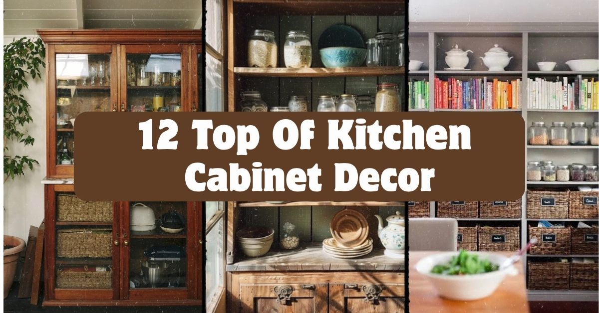
  • 12 Top Of Kitchen Cabinet Decor

    12 Top Of Kitchen Cabinet Decor

    If you’ve ever stared at that awkward empty space above your kitchen cabinets and wondered what to do with it, I’ve got you covered. This guide walks through 12 top of kitchen cabinet decor ideas that actually work in real homes, not just magazine spreads. I’ve tested a bunch of these myself, and I’m sharing what actually holds up over time.

    Top of kitchen cabinet decor refers to styling the gap between your upper cabinets and the ceiling using items like baskets, plants, jars, or artwork. The goal is to fill dead space with pieces that add color, texture, or personality without looking cluttered or collecting dust unnecessarily.

    Stick around, because I’m also going to show you the mistakes people make with this space, plus some style variations you probably haven’t thought of yet.

    What Is Top-of-Cabinet Decor, Really?

    Okay so here’s the deal. Most kitchens have this weird gap above the cabinets. Builders leave it there because running cabinets to the ceiling costs more. That gap can look sad and empty, or it can become one of the coolest parts of your kitchen. I think of it like the top shelf of a bookcase. You wouldn’t leave it bare, right? Same idea here. The trick is picking things that fit your kitchen’s personality without turning into a dust trap you dread cleaning every few months. Let’s get into the good stuff.

    1. Group Vintage Pottery in Odd Numbers

    Credit: Stockcake

    Vintage pottery instantly makes cabinet tops feel curated instead of random. I like grouping pieces in threes or fives because odd numbers just look more natural to the eye than even ones. Mix heights and shapes but keep the color family similar, like earthy browns, creams, or muted blues.

    Actionable tip: place your tallest piece slightly off-center, not dead in the middle, to avoid a stiff, symmetrical look.

    This works great in farmhouse or traditional kitchens. For modern spaces, swap pottery for sleek ceramic vessels in matte black or white instead.

    Once you’ve got your pottery grouped up, you might want something that adds a bit of natural texture nearby, which brings me to baskets.

    2. Add a Row of Woven Baskets

    Credit: Thebasketcompany

    Woven baskets are a classic for a reason. They add warmth and texture without screaming for attention. I love lining up two or three baskets of slightly different sizes across the cabinet top. They also double as sneaky storage if you flip them upside down or tuck small items inside.

    Actionable tip: choose baskets with flat bottoms so they sit stable and don’t wobble every time you open a cabinet door underneath.

    Coastal and boho kitchens practically demand this look, but even a modern farmhouse kitchen can pull it off with lighter-toned rattan.

    Baskets bring texture, but if you want something with a little more visual weight, large jars or jugs are your next move.

    3. Display Large Decorative Jugs or Jars

    Credit: Homesandgardens

    Big glass or ceramic jugs fill vertical space fast, which is great if your cabinet gap is on the taller side. I’ve seen these look amazing in amber glass, matte stoneware, or even old milk jug styles picked up from flea markets.

    Actionable tip: stick to one or two large jugs rather than five small ones. Fewer, bigger pieces read as intentional instead of cluttered.

    Traditional and farmhouse kitchens love this look. In a modern kitchen, try a single oversized glass vessel with clean lines instead of anything rustic.

    Now that we’ve covered a few decor styles, let’s compare materials so you can pick what actually fits your space and budget.

    Material Comparison for Cabinet-Top Decor

    MaterialAverage CostDurabilityBest Style Match
    Ceramic pottery$15-$60 per pieceHigh, but chips if droppedFarmhouse, traditional
    Woven rattan/seagrass$10-$40 per basketModerate, fades in direct sunCoastal, boho
    Glass jars/jugs$8-$50 per pieceHigh, but breakableModern, farmhouse
    Metal/copper$20-$80 per pieceVery high, tarnishes over timeIndustrial, traditional
    Wood crates$10-$35 per pieceHigh, may warp with humidityRustic, farmhouse

    4. Bring in Greenery with Trailing Vines

    Credit: Elledecor

    Plants make everything feel alive, and cabinet tops are perfect for trailing varieties like pothos or ivy. The vines cascade down naturally and soften all those hard lines from your cabinets. Fake plants work fine here too if you don’t want to deal with watering something you can barely reach.

    Actionable tip: use a small stool or step ladder monthly to dust and check real plants for pests, since this spot gets forgotten easily.

    This idea flexes across almost every style. Boho kitchens love lush greenery, while modern kitchens might prefer one simple trailing plant in a minimalist pot.

    Greenery softens a space, but if you want more personality on display, your book collection might be the answer.

    5. Line Up Vintage Cookbooks

    Credit: Thecottagemarket

    Old cookbooks add color, texture, and a little storytelling to your kitchen. I like stacking some flat and standing others upright with a small bookend or decorative object leaning against them. It feels lived-in without looking messy.

    Actionable tip: choose books with spines in colors that complement your kitchen palette, not just random ones from a thrift store bin.
    This works beautifully in traditional and cottage-style kitchens. Modern kitchens can still pull it off with a few carefully chosen design books instead of grandma’s recipe collection.
    Speaking of collections, few things say “kitchen charm” quite like a display of copper cookware.
    6. Showcase a Collection of Copper Pots

    Credit: Hunker

    Copper pots and pans have that warm, glowing look that instantly makes a kitchen feel cozy. Even if you never cook with them, hanging or displaying a few on top of your cabinets adds shine and warmth to an otherwise flat space.

    Actionable tip: use a light polish every few months to keep that copper glow from turning dull and greenish.

    This is a natural fit for traditional and French country kitchens. In modern spaces, stick to one or two pieces for contrast rather than a full collection.

    If your cabinets don’t reach that high or you want more flexibility, floating shelves might solve your whole layout problem.

    7. Install Floating Shelves Instead of Blank Space

    Credit: Biggerthanthethreeofus

    Sometimes the smartest move isn’t decorating the gap, it’s changing it. Adding a thin floating shelf just below the ceiling gives you a real surface to work with instead of balancing everything on cabinet edges. This also makes cleaning way easier.

    Actionable tip: keep the shelf depth under 10 inches so it doesn’t compete visually with your cabinets below.

    Floating shelves fit almost any style since you control the finish, from raw wood for rustic kitchens to painted white for modern ones.

    Once you’ve got a shelf or flat surface, lighting can take the whole display to another level.

    8. Add String Lights or Warm Lighting

    Credit: Digsdigs

    A little hidden lighting above your cabinets creates a soft glow that makes your whole kitchen feel warmer at night. I’ve used simple LED strip lights tucked behind decor items, and it completely changes the mood without any major renovation.

    Actionable tip: choose warm white bulbs, around 2700K to 3000K, instead of bright white, so the light feels cozy instead of clinical.

    Modern kitchens look great with clean LED strips, while farmhouse and traditional spaces can use small string lights with exposed bulbs for extra charm.

    Lighting sets the mood, but nothing personalizes a space faster than art or signage.

    9. Mix in Framed Art or Wooden Signs

    Credit: bhg

    Small framed prints or wooden signs leaned against the wall above cabinets add personality fast. I like mixing a piece of art with a small plant or jar so it doesn’t look like a random picture frame just sitting there awkwardly.

    Actionable tip: lean pieces at a slight angle using a small stand or easel instead of laying them completely flat, so they catch the eye.

    Coastal kitchens love beachy signs, farmhouse kitchens go for “gather” or “eat” style wood signs, and modern kitchens do best with abstract art in simple frames.

    Now let’s talk budget, because not every idea here costs the same amount to pull off.

    Budget Tiers for Cabinet-Top Decor

    Budget TierPrice RangeWhat You Get
    LowUnder $50Thrifted jars, a few plants, basic baskets
    Mid$50-$150New pottery, quality baskets, small art prints
    High$150-$400Floating shelves, copper collection, curated vintage pieces
    Splurge$400+Custom shelving, professional lighting, designer decor pieces

    10. Use Matching Glass Jars for a Uniform Look

    Credit: Nakpunar

    If you want a cleaner, more organized look, matching glass jars are the way to go. I fill mine with pasta, dried flowers, or even just leave a few empty for visual variety. The uniformity makes the whole cabinet top feel put together instead of thrown up there.

    Actionable tip: buy jars from the same set or brand so lids and shapes actually match, since mismatched jars ruin the clean effect.

    This idea is perfect for modern and minimalist kitchens. Farmhouse kitchens can still use it by choosing jars with a slightly frosted or vintage glass finish.

    If you’re someone who loves to entertain, a small bar display might be more your style than jars.

    11. Add a Wine or Bar Display

    Credit: Soinspalliatifspaca

    Turning your cabinet top into a mini bar area is a fun twist most people don’t think about. A few wine bottles, some stemware, or a small decorative tray with bar tools can make that space feel intentional and useful, not just decorative.

    Actionable tip: use a small tray underneath bottles and glasses so everything looks grouped instead of scattered across the surface.

    This works especially well in modern and industrial kitchens. Traditional kitchens can soften it with a wooden tray and warmer glass tones.

    Whatever style you choose, remember that decor doesn’t have to stay the same all year, which brings me to my last big idea.

    12. Layer with Seasonal Decor Rotations

    Credit: bhg

    Swapping a few pieces every season keeps your kitchen feeling fresh without a full redo. I keep a small bin of seasonal items, pumpkins in fall, greenery in winter, light florals in spring, and rotate them in with my permanent pieces like baskets or pottery.

    Actionable tip: keep your “base” decor neutral year-round and only rotate two or three small accent pieces, so the swap takes five minutes, not an hour.

    This flexes beautifully across every style since you’re just changing accents, not the whole setup. Coastal kitchens might rotate shells and driftwood, while traditional kitchens rotate seasonal florals or wreaths.

    13. Use Decorative Trays to Anchor Groupings

    Credit: letsfoodie

    A decorative tray placed under a cluster of jars, plants, or pottery instantly makes the whole display look organized. Without a tray, items can look like they’re just randomly sitting up there. With one, it looks styled on purpose, even if you didn’t spend much time on it.

    Actionable tip: choose a tray slightly wider than your grouping so there’s a small visible border around the items, not edges hanging off.

    Modern kitchens do well with metal or lacquered trays, while farmhouse and cottage kitchens look great with a distressed wood tray instead.

    Tips for Success

    • Measure your cabinet gap before buying anything, since even two inches of extra clearance changes what fits.
    • Keep a step stool nearby so dusting actually happens instead of getting ignored for months.
    • Stick to a consistent color palette across all your pieces so the display feels planned, not random.
    • Leave some negative space between groupings instead of filling every inch of the surface.
    • Choose lightweight items if your cabinets are older or not built for heavy weight up top.
    • Repaint or refinish thrifted pieces to match your kitchen instead of leaving them mismatched.
    • Take a photo of your finished display and live with it for a week before making final tweaks.

    Common Mistakes and How to Avoid Them

    Overcrowding the space
    : Fewer, larger items look more intentional than a dozen small trinkets crammed together.

    Ignoring scale
    : Tiny decor items get lost above tall cabinets. Choose pieces sized to match the height of the gap.

    Skipping dust maintenance
    : This spot collects grease and dust fast in kitchens. Clean it monthly, not yearly.

    Mismatched color palettes
    : Random colors make the space look chaotic. Stick to two or three complementary tones.

    Using heavy, unstable items
    : Top-heavy decor near the ceiling is a safety risk, especially in homes with kids. Choose stable, lightweight pieces.

    Forgetting your kitchen’s style
    : Rustic crates in a sleek modern kitchen look out of place. Match decor to your existing design language.

    Similar Variations

    • Farmhouse Cabinet Topper: Wood crates, cookbooks, and warm pottery for a cozy, lived-in feel.
    • Coastal Cabinet Display: Woven baskets, driftwood, and glass jars in soft blues and sandy neutrals.
    • Modern Minimalist Topper: A few sleek vessels and one plant, nothing more, in a tight neutral palette.
    • Industrial Loft Style: Metal containers, copper accents, and exposed bulb lighting for an urban edge.
    • Traditional French Country: Copper pots, vintage jugs, and framed botanical prints for old-world charm.
    • Boho Eclectic Mix: Layered plants, textured baskets, and mismatched pottery in warm earthy tones.

    Filling that empty space above your cabinets doesn’t need to be complicated or expensive. A few well-chosen pieces, some greenery, or a simple floating shelf can completely change how your kitchen feels. Whether you go rustic, modern, or somewhere in between, these 12 top of kitchen cabinet decor ideas give you a real starting point to make that awkward gap actually work for you.

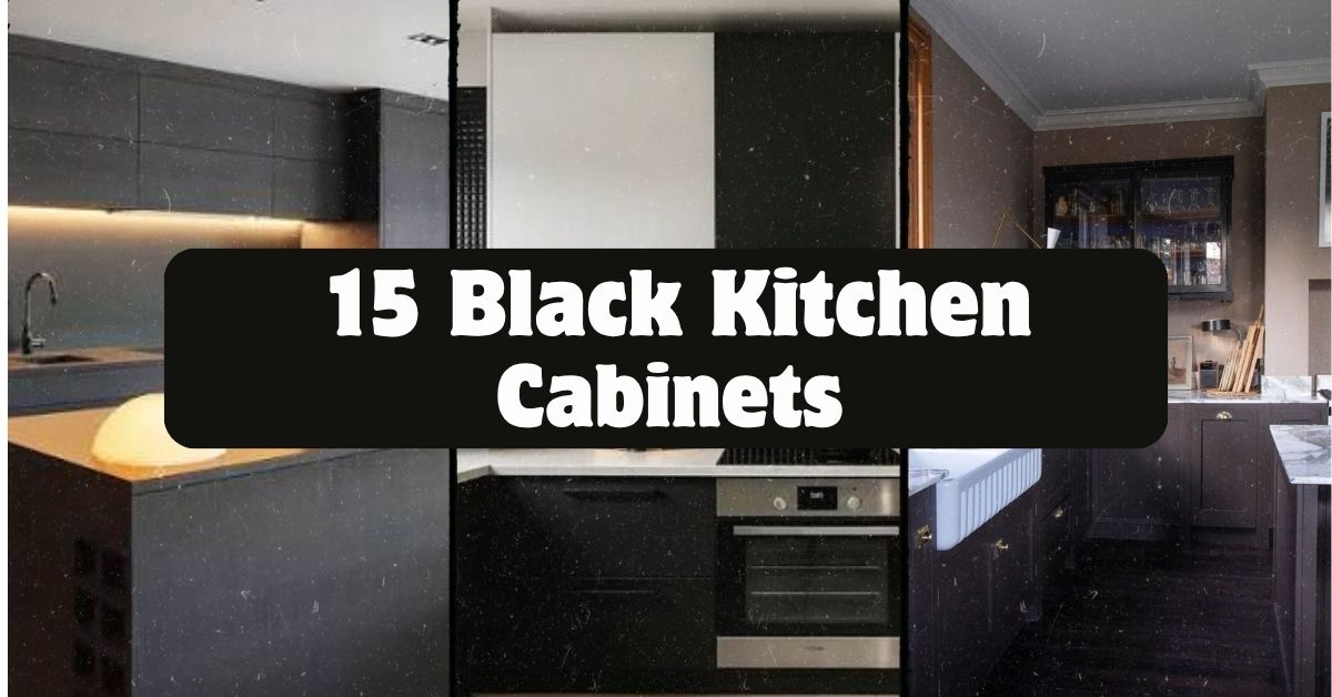
  • 15 Black Kitchen Cabinets That Will Change How You See Your Kitchen

    15 Black Kitchen Cabinets That Will Change How You See Your Kitchen

    I’ve spent hours digging through kitchen design trends, and I can tell you 15 black kitchen cabinets ideas are having a real moment right now. If you’ve ever wondered whether dark cabinets could work in your own home, you’re in the right spot. This article breaks down exactly what makes black cabinetry work, why it’s not just a fad, and how to pull it off without making your kitchen feel like a cave.

    Black kitchen cabinets are cabinet designs finished in matte, satin, or glossy black paint or stain, used as the main storage and visual anchor of a kitchen. They pair with light countertops, brass or gold hardware, and natural wood accents to balance the darker tone and prevent the space from feeling too heavy.

    Stick around, because I’m about to walk you through 15 specific ways to use black cabinets, plus a few mistakes that trip people up every single time.

    Why Black Cabinets Are Taking Over Kitchens

    I remember when white kitchens were the only “safe” choice. Everyone wanted bright, clean, and airy. Then black cabinets started showing up in magazines and Pinterest boards, and honestly, they changed the game.

    Black cabinets give a kitchen instant personality. They look sleek in a modern home and surprisingly cozy in a farmhouse-style one. The trick is balance. Black soaks up light, so you need to pair it with the right countertops, backsplash, and lighting to keep things from feeling dark or small. Once you nail that balance, black cabinets look expensive, timeless, and way more interesting than another white kitchen.

    1. Pair Black Lower Cabinets With White Uppers

    25 Stunning Two Tone Painted Kitchen Cabinet Ideas for 2025
    Credit: Rollcallpainting

    This is the easiest way to dip your toes into black cabinetry without going all in. Keep your upper cabinets white or cream, and let the black lowers ground the room. This two-tone look feels balanced because the eye travels naturally from light to dark.

    Choose a warm white for the uppers, not stark white, so the contrast doesn’t feel too harsh. Add brushed nickel or matte black pulls to tie both tones together.

    Practical tip: Test paint samples on your actual cabinet doors before committing, since lighting changes how black reads throughout the day.

    This works beautifully in transitional and farmhouse kitchens especially. Once you’ve got the two-tone base down, you can start layering in texture, which brings us to the next idea.

    2. Add a Textured Wood Island for Contrast

    80 Modern Kitchen Island Ideas to Transform Your Home in 2026
    Credit: Elle Decor

    A black kitchen needs warmth somewhere, and a wood island does that job perfectly. Think butcher block, reclaimed oak, or a walnut stain. The wood breaks up all that black and adds a natural, lived-in feel.

    Keep the island a slightly different wood tone than your flooring so it stands out as a feature, not just a match. A waterfall edge countertop on the island can also add a modern touch if that’s your style.

    Quick tip: Stick with a matte or satin finish on the wood so it doesn’t compete with glossy black cabinets nearby.

    Coastal kitchens love this combo with lighter driftwood tones, while industrial kitchens lean toward darker, distressed wood. Next, let’s talk about what goes above those black cabinets.

    3. Use a Marble or Quartz Backsplash for Brightness

    41+ Backsplash for White Quartz Countertops ( TRENDIEST ) - Tile Ideas
    Credit: Backsplash

    Black cabinets can feel heavy without something reflective nearby. A marble or quartz backsplash with light veining bounces light back into the room and keeps things from feeling closed in.

    Go floor-to-ceiling if your budget allows, especially behind the stove. It creates a dramatic focal point that photographs beautifully and never goes out of style.

    Actionable tip: Choose a backsplash with subtle gray or gold veining to complement both black cabinets and metal hardware.

    Modern farmhouse kitchens do well with softer marble patterns, while contemporary kitchens can handle bolder, more dramatic veining.

    Countertop and Backsplash Pairings for Black Cabinets

    Countertop/Backsplash MaterialBest Paired WithApproximate Cost per Sq. Ft.Style Fit
    Carrara MarbleBrass hardware, white oak floors$75–$150Traditional, French Country
    White QuartzMatte black fixtures, gray grout$50–$100Modern, Transitional
    Butcher Block WoodCopper accents, exposed brick$35–$70Farmhouse, Industrial
    TerrazzoColorful glass tile, brass pulls$60–$120Eclectic, Retro
    ConcreteSteel appliances, minimal decor$65–$135Industrial, Modern

    Now that your surfaces are sorted, let’s look at how lighting changes everything.

    4. Install Warm Under-Cabinet Lighting

    How to Choose and Install the Best Under Cabinet Lighting for your Kitchen - The Palette Muse
    Credit: Thepalettemuse

    Black cabinets absorb light instead of reflecting it, so under-cabinet lighting isn’t optional here, it’s essential. Warm LED strips tucked under the upper cabinets light up your countertop workspace and add a soft glow that makes black cabinetry look intentional rather than dim.

    Choose LED strips with a warm white temperature, around 2700K to 3000K, to avoid a cold, clinical feel.

    Practical tip: Install lighting on a separate switch so you can control ambiance during evening meals versus daytime cooking.

    This idea works in every kitchen style because good lighting is universal. Once your cabinets are lit properly, it’s time to think about what’s holding them together, literally.

    5. Choose Brass or Gold Hardware for Warmth

    brass-cabinet-hardware
    Credit: Modern-matter

    Black cabinets paired with cool silver hardware can feel a little sterile. Switch to brass, gold, or even aged bronze pulls and knobs, and suddenly the whole kitchen feels warmer and richer.

    I always tell people this is the cheapest, fastest upgrade you can make. Swapping hardware costs way less than repainting cabinets but changes the entire mood of the room.

    Actionable tip: Mix hardware finishes sparingly, like brass pulls with matte black faucets, for a curated, collected look rather than matchy-matchy.

    Traditional kitchens shine with ornate brass details, while modern spaces prefer sleek, unlacquered brass with simple lines. Speaking of faucets, let’s talk fixtures next.

    6. Go Bold With a Black Faucet and Sink Combo

    A brown kitchen with cabinets and a sink.
    Credit: lovechicliving

    If you’re already committing to black cabinets, why not extend that into your fixtures? A matte black faucet paired with a black or dark granite composite sink creates a cohesive, moody look that feels custom-designed.

    This works especially well in kitchens with white or light stone countertops, since the contrast makes the black pop even more.

    Quick tip: Look for faucets with a matte, not glossy, finish so it doesn’t clash with cabinet sheen.

    Industrial and modern farmhouse kitchens both love this look. Coastal kitchens can pull it off too, as long as the rest of the palette stays light and airy. Next, let’s talk wall color, because it matters more than people think.

    7. Paint Walls a Soft, Warm Neutral

    Credit: Hgtv

    Black cabinets need a wall color that supports them without fighting for attention. Soft neutrals like warm white, greige, or pale sage work wonders here. Avoid stark white walls, since the contrast can feel too stark and clinical against black cabinetry.

    I like recommending a warm off-white with a hint of yellow or beige undertone. It softens the whole room instantly.

    Practical tip: Test your wall color next to your cabinet sample in both natural and artificial light before painting the whole room.

    Traditional kitchens do well with warm cream tones, while modern kitchens can handle cooler grays. Once your walls are sorted, open shelving is worth considering too.

    8. Add Open Wood Shelving for Balance

    24 Ideas for Kitchens With Open Shelving
    Credit: Thespruce

    Full black cabinetry can feel like a lot if every wall is covered. Swap one section for open wood shelves instead. This breaks up the visual weight and gives you a spot to display dishes, plants, or cookbooks.

    Choose a wood tone that matches or complements your island or flooring for a cohesive look.

    Actionable tip: Style shelves in odd numbers, like groups of three items, for a more natural, less staged appearance.

    Farmhouse and coastal kitchens especially benefit from this softer, more relaxed touch. Now let’s zoom into cabinet finish itself, because matte versus glossy makes a real difference.

    Black Cabinet Finish Comparison

    Finish TypeLook and FeelMaintenance LevelBest For
    Matte BlackSoft, modern, hides smudges wellLowContemporary, Scandinavian
    Satin BlackSlight sheen, versatileMediumTransitional, Farmhouse
    High-Gloss BlackReflective, dramatic, shows fingerprintsHighModern, Glam
    Black Stain (Wood Grain Visible)Natural texture, rustic warmthMediumTraditional, Rustic

    9. Use Black Cabinets Only on One Wall

    One-Wall Kitchen Layouts: 17+ Design Ideas and Tips
    Credit: Kitchencabinetkings

    Not ready to commit your whole kitchen to black? Try it on one wall only, like a pantry wall or the wall housing your range. This lets you experiment with the trend without a full renovation commitment.

    Keep the rest of your cabinetry in a lighter wood tone or white to create intentional contrast rather than a mismatched look.

    Practical tip: Use the black wall as your kitchen’s focal point by adding statement lighting or open shelving right above it.

    This approach fits small kitchens especially well, since it adds drama without shrinking the space visually. Next, let’s talk about floors, because they need to hold their own against black cabinets.

    10. Choose Wide-Plank Wood Flooring

    Wide Plank Wood Flooring In The Kitchen | Hull Blog
    Credit: Hullforest

    Black cabinets look incredible against warm, wide-plank wood floors. The wood grain adds texture and warmth that balances out all that dark cabinetry above.

    Go for a medium to light wood tone rather than dark flooring, since dark floors paired with dark cabinets can make a kitchen feel like a shadow box.

    Actionable tip: Choose flooring with some texture or graining, not a perfectly smooth finish, to add visual interest underfoot.

    Modern farmhouse and traditional kitchens both lean heavily on this combo. Coastal kitchens do a lighter, whitewashed version of the same idea. Now, let’s talk about a design choice that’s a bit bolder: black cabinets with black walls.

    11. Try a Moody All-Black Kitchen

    45 Black Kitchens That Are Both Timeless and Bold
    Credit: bhg

    If you’re feeling brave, go full moody and pair black cabinets with black or deep charcoal walls. This creates a dramatic, restaurant-like feel that’s become popular in loft-style homes and city apartments.

    The key here is lighting. You need multiple light sources, pendant lights, under-cabinet lighting, and recessed ceiling lights, to keep the space from feeling like a cave.

    Practical tip: Add a few metallic or glass accents to bounce light around the room and prevent visual flatness.

    This look is best suited for modern, industrial, or glam kitchens with high ceilings and big windows. Smaller kitchens should approach this idea carefully. Speaking of smaller spaces, let’s cover how to make black cabinets work in a compact kitchen.

    12. Use Glass-Front Cabinets to Add Depth

    8 ways to style glass fronted kitchen cabinets | Homes and Gardens
    Credit: Homesandgardens

    Solid black cabinets everywhere can feel visually heavy in a smaller kitchen. Swap a few upper cabinet doors for glass fronts instead. This adds depth, breaks up the solid black, and gives you a spot to show off pretty dishware.

    Choose frosted or seeded glass if you want a softer, more diffused look rather than a fully see-through display.

    Actionable tip: Keep the inside of glass-front cabinets tidy and color-coordinated, since everything inside becomes part of your decor.

    Traditional and coastal kitchens both use this trick often. Modern kitchens tend to skip the frosted glass in favor of clear, minimalist panels. Next, let’s talk about how greenery changes a black kitchen completely.

    13. Bring in Greenery to Soften the Look

    Before & After an Eat-In Kitchen Makeover in Green | Houzz AU
    Credit: Houzz

    Black cabinets can feel cold without something living in the room. Adding potted herbs, a small tree, or hanging plants softens the whole space instantly and adds a pop of natural color.

    I always suggest low-maintenance plants like pothos, snake plants, or fresh herbs on a windowsill, since kitchens can be tricky environments for finicky plants.

    Practical tip: Group plants in varying heights on open shelves or windowsills for a more layered, natural look.

    This works in literally every kitchen style, from modern to farmhouse to coastal. Now let’s talk about a finishing touch that ties everything together: your ceiling.

    14. Add a Statement Ceiling or Beams

    25 Best Coffered Ceiling Ideas
    Credit: bhg

    Don’t forget to look up. Black cabinets pair beautifully with exposed wood beams, shiplap ceilings, or even a painted ceiling in a complementary tone. This draws the eye upward and keeps the black cabinetry from being the only interesting feature in the room.

    Choose a natural wood beam finish if your island or flooring already has warm wood tones, for a cohesive design story.

    Actionable tip: If a full ceiling redo isn’t in the budget, even a simple crown molding painted a contrasting color can add architectural interest.

    Farmhouse and traditional kitchens use exposed beams often, while modern kitchens might opt for a sleek painted ceiling instead. Finally, let’s talk about the small details that pull the whole look together.

    15. Layer in Black and Gold Accessories

    25 Black and Gold Kitchen Ideas: 2026 Modern & Moody Trends - Hackrea
    Credit: Hackrea

    Once your cabinets, counters, and floors are set, it’s the little details that finish the look. Black and gold accessories, think cabinet knobs, light fixtures, bar stools, or even a black-framed mirror, tie the whole kitchen together without requiring another big renovation step.

    Choose one or two accent colors, like gold and a soft sage green, to avoid a cluttered or mismatched feel.

    Practical tip: Rotate smaller decor items seasonally, like swapping out a fruit bowl or dish towels, to keep the space feeling fresh without spending much money.

    This layering trick works across every style I’ve mentioned so far. It’s the easiest, cheapest way to make a black kitchen feel finished and personal.

    Tips for Success

    • Always test paint or stain samples on actual cabinet doors, not just paper swatches, before committing to a full kitchen repaint.
    • Balance black cabinets with at least one light element, whether that’s countertops, walls, or flooring, so the room doesn’t feel too dark.
    • Invest in good lighting first. Black cabinets show poor lighting more than any other color choice.
    • Choose a mix of textures, like matte cabinets with glossy countertops, to keep the kitchen visually interesting.
    • Don’t skip hardware. Cheap or mismatched hardware can make even expensive cabinets look unfinished.
    • Keep countertop clutter minimal since black cabinets already draw a lot of visual attention.
    • Consider your home’s natural light before committing to black, since north-facing kitchens may need extra light sources to balance the darker tone.

    Common Mistakes and How to Avoid Them

    Going too dark everywhere
    : Pair black cabinets with light countertops, walls, or flooring so the kitchen doesn’t feel cramped or cave-like.

    Skipping proper lighting
    : Install a mix of under-cabinet, recessed, and pendant lighting since black absorbs light instead of reflecting it.

    Choosing the wrong hardware finish
    : Warm metals like brass or gold soften black cabinets, while cool chrome can feel harsh and sterile.

    Ignoring maintenance needs
    : Glossy black shows fingerprints and smudges quickly, so choose matte or satin finishes for high-traffic kitchens.

    Forgetting about ventilation and airflow
    : Dark, enclosed kitchens need good ventilation to avoid feeling stuffy, especially in smaller spaces without much natural light.

    Overdoing matching accessories
    : Too much matchy black and gold everywhere can feel staged rather than lived-in, so mix in some texture and variety.

    Similar Variations

    • Navy Blue Cabinets: A softer alternative to black that still feels dramatic but slightly warmer and less stark.
    • Charcoal Gray Cabinets: Offers a similar moody effect with a bit more flexibility for lighter, airier spaces.
    • Two-Tone Black and Wood Cabinets: Combines black lowers or uppers with natural wood tones for a balanced, textured look.
    • Matte Black Industrial Kitchens: Leans into raw materials like steel, concrete, and black cabinetry for a loft-inspired feel.
    • Black and White Checkerboard Kitchens: Pairs black cabinets with bold black-and-white flooring for a retro, high-contrast statement.
    • Black Shaker Farmhouse Kitchens: Uses traditional shaker-style black cabinets with rustic wood accents for a cozy, country feel.

    Black cabinets aren’t just a trend that’s going to disappear next year. They’re a smart, flexible design choice that works in almost any home style, as long as you balance the darkness with the right light, texture, and warmth. Whether you go bold with an all-black kitchen or just dip your toes in with a black island, there’s a version of this look that fits your space and your budget. I hope these 15 black kitchen cabinets ideas gave you enough inspiration to start planning your own kitchen refresh with confidence.

  • 11 Kitchen Accent Wall Ideas That’ll Make Your Space Pop

    11 Kitchen Accent Wall Ideas That’ll Make Your Space Pop

    I’ve spent way too many hours scrolling through kitchen renovation photos, and I can tell you this: an 11 kitchen accent wall approach isn’t just a trend, it’s one of the easiest ways to transform a boring kitchen without breaking your budget. If you’ve been staring at your plain kitchen walls wondering what’s missing, I get it. That “something’s off but I can’t name it” feeling is real.

    A kitchen accent wall is one wall in your kitchen painted, tiled, or textured differently than the rest to create a focal point. It draws the eye, adds contrast, and gives an otherwise flat room some personality without a full remodel.

    Stick around, because I’m about to walk you through 11 solid ideas, plus some real tips on colors, materials, and mistakes to dodge.

    What Exactly Is a Kitchen Accent Wall?

    Okay so let’s back up for a second. A kitchen accent wall is basically one standout wall that looks different from the other three. Maybe it’s bold paint. Maybe it’s textured tile. Maybe it’s reclaimed wood. The point is contrast.

    Think of it like the one friend at a party wearing a bright jacket while everyone else is in neutrals. That wall grabs attention first. It gives your eyes somewhere to land. And honestly, it’s one of the cheapest design tricks that makes a huge visual difference. You don’t need to touch your cabinets or floors. Just pick a wall and make it work harder than the others.

    1. Go Bold With a Deep Emerald Green Wall

    Deep Emerald Green Wall Paint Design for Eclectic Living and Dining Rooms
    Credit: Interior Company

    Deep green walls make white cabinets pop like nothing else. This color feels rich without being loud, and it pairs beautifully with brass or gold hardware.

    Paint the wall behind your stove or sink for max impact since that’s usually where people’s eyes go first anyway. Keep your countertops light, like white quartz or marble, so the green doesn’t overwhelm the room.

    Practical tip: test the paint color at different times of day before committing. Green can look totally different under morning light versus evening lamps.

    This works great in traditional kitchens but also fits modern farmhouse spaces if you pair it with black fixtures.

    Once you’ve nailed the color, you’ll want to think about texture next, because paint alone can only do so much.

    2. Add Texture With Exposed Brick

    Get Brick Wall Texture with These Exposed Brick Wall Designs
    Credit: Livespace

    Exposed brick brings warmth and an industrial edge that painted walls just can’t match. It’s rugged, it’s got history, and it instantly makes a kitchen feel lived-in and cozy instead of sterile.

    If you don’t have real brick, thin brick veneer panels give you the same look without demolition. Stick to warm red or terracotta tones if your kitchen has wood cabinets, or go whitewashed brick for a softer, farmhouse feel.

    Quick tip: seal the brick with a matte sealant so it doesn’t crumble or shed dust near your food prep areas.

    Brick fits industrial lofts perfectly, but whitewashed versions slide right into coastal or Scandinavian kitchens too.

    Speaking of texture, let’s talk about something even bolder: patterned tile.

    3. Install a Statement Tile Backsplash Wall

    How to Create a Beautiful Statement Wall with Back Splash Tile - KTJ Design Co.
    Credit: ktjdesignco

    Tile isn’t just for backsplashes anymore. Turning an entire wall into a tiled feature, especially behind open shelving or a range, creates serious visual drama.

    Moroccan-style tiles, hexagon patterns, or even subway tile laid in a herringbone pattern all work here. Choose a tile color that contrasts with your cabinet color for the best effect.

    Practical tip: order 10% extra tile for cuts and future repairs. Trust me, you don’t want to hunt for a matching batch two years later.

    This idea shines in Mediterranean, eclectic, and bohemian kitchens especially well.

    Now, if tile feels too permanent for you, wallpaper might be your answer.

    4. Use Wallpaper for an Instant Personality Boost

    Wallpaper in the powder room creates an instant personality boost! @khminteriors used our “Leaf Column” to create this stunning space
    Credit: Instagram

    Wallpaper has made a huge comeback, and kitchens are no exception. It’s faster than tiling and way easier to change later if you get tired of it.

    Botanical prints, geometric patterns, and even vintage-inspired designs all work great on a single kitchen wall. Just make sure you pick a wipeable or vinyl-coated wallpaper since kitchens deal with grease and steam.

    Practical tip: apply wallpaper on the wall farthest from your stove to avoid grease buildup ruining the pattern faster than expected.

    Wallpaper adapts to almost any style, from grandmillennial florals to sleek modern geometrics.

    Next up, let’s go even simpler with something you probably already have lying around: wood.

    Material Comparison for Kitchen Accent Walls

    MaterialAverage Cost (per sq ft)DurabilityBest For
    Paint$0.50–$1.50Moderate, needs repainting every 3-5 yrsRenters, budget projects
    Wallpaper$3–$12Moderate, sensitive to moistureDry walls, low-splash zones
    Tile$5–$20High, water and heat resistantBehind stoves, high-traffic areas
    Reclaimed Wood$8–$25High if sealed properlyFarmhouse, rustic kitchens
    Brick Veneer$10–$30Very highIndustrial, loft-style kitchens

    5. Bring in Reclaimed Wood Paneling

    Reclaimed wood paneling – Salvaged wood & Barnwood!
    Credit: historischhout

    Reclaimed wood adds instant warmth and character that new materials just can’t fake. Every plank has its own story, dents, knots, and color variation included.

    Use it on the wall opposite your main cooking area so it doesn’t interfere with heat or grease exposure. Stick to natural stains rather than heavy paint to let the wood grain show through.

    Practical tip: mix plank widths for a more organic, less “kit assembled” look.

    This idea is a natural fit for farmhouse and rustic kitchens, but it also softens up minimalist spaces surprisingly well.

    If wood feels too rustic for your taste, maybe it’s time to consider something sleeker like matte black.

    6. Try a Moody Matte Black Wall

    Black Wall Paint Living Room Inspiration | Apartment Therapy
    Credit: Apartment Therapy

    Matte black sounds intimidating, but it’s actually one of the most versatile accent choices out there. It makes everything else in the room, especially wood tones and metallics, look intentional and expensive.

    Pair it with brass, gold, or copper hardware for warmth, or stick with chrome for a colder, more modern vibe. Keep your lighting bright though, since black absorbs a lot of light naturally.

    Practical tip: use a matte finish, not gloss, because glossy black shows every fingerprint and smudge.

    This works incredibly well in modern and industrial kitchens, though it can also anchor a moody, dramatic traditional space.

    Now let’s lighten things up a bit with a color that’s having a major moment right now.

    7. Paint It Terracotta for Earthy Warmth

    How to use earthy terracotta paint colours for warm, timeless interiors - Edward Bulmer Natural Paint
    Credit: Edward Bulmer

    Terracotta walls bring a sun-baked, Mediterranean warmth that feels both trendy and timeless at the same time. It’s earthy without being boring, and it pairs beautifully with cream, sage green, and warm wood tones.

    This color works especially well if your kitchen gets a lot of natural light since it can look slightly muddy in dim spaces. Balance it out with white or cream countertops to keep things from feeling too heavy.

    Practical tip: use a limewash paint technique for added texture and an authentic, aged look.

    Terracotta fits Mediterranean, boho, and Spanish-style kitchens like it was made for them.

    Let’s switch gears now and talk about something a little more unexpected: chalkboard walls.

    8. Create a Functional Chalkboard Wall

    What's the Best Way to Create a Chalkboard Wall? - Paint EZ
    Credit: Paint EZ

    This one’s fun because it’s not just decorative, it’s actually useful. A chalkboard accent wall gives you space to jot down grocery lists, meal plans, or doodle with the kids.

    Paint just one wall section with chalkboard paint, maybe behind a pantry door or near your fridge. Keep the rest of the kitchen simple so this wall doesn’t feel cluttered or chaotic.

    Practical tip: prime the wall properly before applying chalkboard paint, or it’ll wear unevenly within a few months.

    This idea works surprisingly well in modern farmhouse and eclectic kitchens where function meets personality.

    Speaking of function, let’s talk about a material that’s practical and gorgeous: natural stone.

    9. Feature a Natural Stone Slab Wall

    Slab Wall: Ideas For A Striking Effect | Marble Systems
    Credit: Marble Systems

    Stone slab walls, like the kind you’d see behind a stove in a high-end kitchen, add serious luxury without needing much else in the room. Marble, quartzite, and travertine all bring unique veining that acts like natural art.

    Use this on the wall behind your cooktop for both beauty and heat resistance. Keep your cabinetry simple and streamlined so the stone gets to be the star.

    Practical tip: request a slab with continuous veining so the pattern flows naturally across seams.

    This idea fits high-end modern and transitional kitchens especially well, though it can work in traditional spaces too if you choose a warmer stone tone.

    Now, if stone feels out of budget, here’s a cheaper way to get texture: shiplap.

    10. Install Classic Shiplap for Cozy Charm

    Amazing Shiplap Wall Ideas to Add a Rustic Charm to Your Home - This Old House
    Credit: This Old House

    Shiplap gives you that cozy, cottage-core feeling without costing a fortune. The horizontal lines add subtle texture and make ceilings feel taller by drawing the eye across the wall.

    Paint it white for a classic farmhouse look, or go with a soft blue or sage for something a bit more unique. Keep the boards evenly spaced for a clean, intentional look rather than a rushed DIY vibe.

    Practical tip: use pre-primed shiplap boards to save yourself painting time and get more even coverage.

    This idea is basically a farmhouse and coastal kitchen staple, though it also softens modern spaces nicely.

    Let’s wrap up the numbered ideas with something bold and a little unexpected: mixed metal panels.

    11. Mix Metal Panels for an Edgy Modern Look

    Mixed Metal Kitchens Are the Next Big Thing in Design | Livingetc
    Credit: Livingetc

    Metal accent walls, think copper, brushed steel, or even corrugated tin, bring an unexpected industrial edge that feels fresh and current. It’s not something you see in every kitchen, which makes it stand out even more.

    Use metal panels on a wall away from direct food prep to avoid scratches and dents over time. Pair with warm wood tones or leather bar stools to soften the harder metal texture.

    Practical tip: choose brushed or matte metal finishes over polished ones since they hide fingerprints and scratches much better.

    This idea fits modern industrial kitchens perfectly, but a warm copper tone can even work in eclectic or boho spaces.

    Budget Tiers for Accent Wall Projects

    Budget TierPrice RangeBest Options
    Low ($50–$200)DIY paint or wallpaperBold paint color, peel-and-stick wallpaper
    Mid ($200–$800)Semi-DIY materialsShiplap, brick veneer, tile backsplash
    High ($800–$3000+)Professional installStone slab, custom tile, metal panels

    Tips for Success

    Here’s what I’ve learned from watching (and making) my own kitchen mistakes over the years.

    • Pick your accent wall based on where people naturally look first, usually behind the stove or sink.
    • Test paint and tile samples under your actual kitchen lighting, not just in the store.
    • Balance bold walls with neutral countertops and cabinets so the room doesn’t feel too busy.
    • Don’t rush the prep work. A poorly primed wall ruins even the best paint color.
    • Add a light fixture near the accent wall to highlight the texture or color at night.
    • Keep hardware finishes consistent across the kitchen so the accent wall feels intentional, not random.
    • Live with paint swatches for at least three days before committing to a full wall.

    Common Mistakes and How to Avoid Them

    Choosing a color that clashes with cabinets
    : Pull colors from your existing cabinet undertones, warm or cool, before picking your accent shade.

    Picking a wall with no natural focal point
    : Choose a wall that already draws the eye, like behind the range or a large window.

    Using glossy paint in a high-traffic kitchen
    : Stick to matte or eggshell finishes since they hide imperfections and reduce glare from overhead lighting.

    Ignoring moisture and grease exposure
    : Avoid delicate materials like paper-based wallpaper near stoves or sinks where steam and splatter happen often.

    Overdoing multiple bold elements at once
    : Let the accent wall be the star and keep everything else, like backsplash or flooring, more neutral.

    Skipping a sample test before full installation
    : Always test a small section of paint, tile, or wallpaper first to see how it reacts to your kitchen’s lighting.

    Similar Variations

    • Coastal Blue Accent Wall – Soft blues and whites that mimic ocean tones for a beachy, breezy kitchen feel.
    • Industrial Concrete Wall – Raw concrete or concrete-look panels for an edgy, urban loft vibe.
    • Botanical Wallpaper Wall – Leafy, plant-based patterns that bring nature indoors without needing actual plants.
    • Two-Tone Cabinet and Wall Combo – Matching your accent wall color to just your lower or upper cabinets for a cohesive look.
    • Geometric Tile Feature Wall – Bold patterned tile in one section for a punchy, modern statement.
    • Vintage Mirror Wall – Antique mirrors arranged on one wall to bounce light and add old-world charm.

    At the end of the day, picking the right accent wall really comes down to your kitchen’s natural light, your existing cabinet colors, and how bold you’re willing to go. Whether you choose bold paint, natural stone, or something as simple as shiplap, the goal stays the same: create one wall that makes the whole room feel more finished. That’s really the heart of any good 11 kitchen accent wall idea, giving your space personality without needing a full renovation budget.

  • 10 Two Tone Kitchen Cabinets Ideas That’ll Change How You See Your Kitchen

    10 Two Tone Kitchen Cabinets Ideas That’ll Change How You See Your Kitchen

    I’ve spent way too many hours scrolling through kitchen photos, and I can tell you that 10 two tone kitchen cabinets ideas are exactly what you need if you’re stuck picking just one color. I’m going to walk you through real combos that work, why they work, and how to pull them off without hiring a design team.

    Two tone kitchen cabinets means using two different colors or finishes on your upper and lower cabinets, or on your island versus the rest of your cabinetry, to create visual contrast and depth in a kitchen. This approach adds dimension without requiring a full color overhaul.

    Stick around, because I’m about to show you combos you probably haven’t thought of, plus a few mistakes that’ll save you money if you avoid them.

    What Even Is a Two Tone Kitchen, Anyway?

    So here’s the deal. A two tone kitchen just means you’re not painting every single cabinet the same shade. Maybe your bottom cabinets are navy and your top ones are white. Maybe your island stands out in a totally different color from everything else. That’s it. That’s the whole concept.

    I love this style because it feels custom without costing custom prices. You get the drama of bold color, but you’re not trapped in a dark cave of a kitchen either. It’s like getting the best of both worlds. Light stays light, dark stays interesting, and your eyes actually have something fun to look at instead of one flat wall of cabinets.

    1. Navy Blue Lowers with Crisp White Uppers

    Modern Navy Blue Kitchen Cabinets: 35+ Chic and Trendy Design Ideas
    Credit: Nelsonkb

    This combo never gets old, and I mean that. Navy blue on the bottom cabinets grounds the room, while white uppers keep everything feeling airy and open. It’s the classic starting point for anyone nervous about going bold.

    Pair it with brass or gold hardware to warm things up. A practical tip: use navy on cabinets that see less light, since dark colors can make shadowy corners feel heavier.

    This look works beautifully in traditional kitchens, but it also slides right into modern farmhouse spaces if you add shaker-style doors. Once you nail this base pairing, you can start playing with a bolder island color, which brings me to the next idea.

    2. A Contrasting Island That Steals the Show

    80 Modern Kitchen Island Ideas to Transform Your Home in 2026
    Credit: elledecor

    Your island doesn’t have to match anything. Seriously. Paint it forest green, black, or even a deep burgundy while the rest of your cabinets stay a soft white or cream. This creates a natural focal point the second someone walks in.

    I’d suggest picking a color that shows up somewhere else in the room, like a light fixture or a rug, so it feels intentional and not random.

    This trick works in almost every style, from coastal to industrial, because islands are meant to stand apart anyway. Now let’s talk about a softer version of this same idea using wood tones instead of paint.

    3. Natural Wood Island Against Painted Perimeter Cabinets

    19 Kitchen Island Color Ideas for a Striking Accent
    Credit:bhg

    If full color commitment scares you, wood is your friend. Keep your perimeter cabinets painted white or light gray, then let your island cabinets show off raw or stained wood grain. This brings warmth into a kitchen that might otherwise feel too clinical.

    Practical tip: choose a wood tone that matches your flooring so the room doesn’t feel disconnected.

    This pairing is basically made for modern farmhouse and Scandinavian style kitchens, though it works in traditional spaces too if you pick a richer wood stain. Next up, let’s flip the whole script and go dark on top instead of bottom.

    4. Dark Upper Cabinets with Light Lower Cabinets

    Trending - Dark Lower Kitchen Cabinets - The Decorologist
    Credit: Thedecorologist

    Most people go light on top and dark on bottom, but flipping it creates a totally different mood. Dark uppers, like charcoal or black, feel bold and dramatic, especially with open shelving mixed in. Light lower cabinets keep the room from feeling too heavy.

    This works best in kitchens with high ceilings and good lighting, since dark upper cabinets can shrink a small, dim space fast.

    It’s a great match for modern and industrial kitchens, especially with matte black fixtures. Speaking of fixtures, let’s talk about how hardware choices change everything in a two tone kitchen.

    Two Tone Cabinet Color Pairings and Best Home Styles

    Color PairingUpper CabinetsLower CabinetsBest Suited Style
    Classic NavyWhiteNavy BlueTraditional, Coastal
    Warm WoodWhiteNatural WoodFarmhouse, Scandinavian
    Bold ContrastBlackWhiteModern, Industrial
    Soft SageCreamSage GreenCottage, Traditional
    Moody CharcoalCharcoalLight GrayModern, Transitional
    Terracotta WarmthWhiteTerracottaBoho, Mediterranean

    5. Sage Green Base with Warm White Uppers

    Sage Green Kitchen Cabinets: 10 Stunning Designs | OPPEIN
    Credit: Oppeinhome

    Sage green has become one of my favorite colors for kitchens because it’s calming but not boring. Use it on your lower cabinets and keep the uppers a warm white, not stark white, so the whole thing feels cozy instead of cold.

    Add wooden cutting boards, woven baskets, or brass hardware to tie the natural feel together. A quick tip: test the sage color in your actual kitchen lighting before committing, since green shifts dramatically between natural and artificial light.

    This combo fits cottage kitchens perfectly, but it also works in modern spaces if you keep the rest of the room simple and uncluttered. Now let’s look at a pairing that leans into texture instead of just color.

    6. Matte Black Lowers with Textured White Uppers

    Credit: Backsplash

    Matte black cabinets on the bottom give a kitchen serious depth. Pair them with white uppers that have some texture, like beadboard or fluted panel doors, so the top half doesn’t feel flat compared to the bold black base.

    Practical tip: stick with matte finishes instead of glossy black, since matte hides fingerprints and smudges way better in a kitchen.

    This look is a favorite in modern and transitional kitchens, but it can work in traditional homes too if the white uppers have classic raised-panel details. From here, let’s soften things up with a pastel option.

    7. Blush Pink Island with Neutral Perimeter Cabinets

    Credit: Homesandgardens

    I know pink sounds risky, but a dusty blush pink island can be surprisingly sophisticated. Keep the surrounding cabinets in a neutral tone like greige or soft white so the pink doesn’t overwhelm the space.

    Pair it with brushed nickel or matte gold hardware for a polished finish. Tip: use pink sparingly, just on the island, so it reads as a design choice rather than a theme.

    This pairing shines in transitional and modern kitchens, especially ones with lots of natural light. Next, let’s talk about a two tone approach that uses different materials, not just colors.

    8. Mixed Material Cabinets Using Wood and Painted Panels

    Credit: Blockrenovation

    Instead of two paint colors, try mixing painted cabinet doors with natural wood ones on the same wall. Maybe your drawers are painted white while your upper cabinet doors are wood. This creates contrast through texture and material, not just color.

    Practical tip: keep the wood tone and paint color in the same temperature family, either both warm or both cool, so they don’t clash.

    This idea is perfect for Scandinavian and Japandi style kitchens, but it also works beautifully in farmhouse spaces. Let’s move on to a bolder, moodier combination next.

    9. Deep Green Lowers with Black Uppers

    Credit: Jenniferrizzo

    This one’s for people who want serious drama. Deep forest green on the bottom paired with black upper cabinets creates a rich, almost jewel-toned kitchen. It’s not for everyone, but it’s stunning when done right.

    Balance the darkness with a light-colored countertop, like white marble or a pale quartz, so the room doesn’t feel like a cave. Practical tip: add under-cabinet lighting since dark cabinets absorb light instead of reflecting it.

    This combo works incredibly well in modern and industrial kitchens with plenty of windows. Now let’s cover a two tone idea that’s all about the backsplash tying everything together.

    10. Two Tone Cabinets Unified by a Bold Backsplash

    Credit: Hgtv

    Sometimes the two tone effect isn’t about the cabinets fighting each other, it’s about a backsplash bridging them. Pick a backsplash with colors that pull from both your upper and lower cabinet tones so everything feels connected.

    For example, if you’ve got white uppers and navy lowers, a backsplash with navy and white patterned tile ties the whole look together instantly.

    Practical tip: choose the backsplash before finalizing paint colors if you’re doing a full renovation, since tile options are often more limited than paint options.

    This trick works across every style because a good backsplash acts like a translator between two different colors. Let’s check out one more budget-friendly approach before wrapping up the color ideas.

    Two Tone Kitchen Cabinet Budget Breakdown

    Budget TierApproachEstimated Cost RangeBest For
    Low BudgetPaint existing cabinets, keep one section natural wood$200–$600DIY renovators
    Mid BudgetPaint cabinets professionally, new hardware$1,500–$4,000Homeowners updating a kitchen
    High BudgetNew custom cabinets in two finishes$8,000–$20,000+Full kitchen remodels

    Tips for Success

    • Test paint samples on your actual cabinets, not just a wall, since cabinet material changes how color looks.
    • Keep your hardware finish consistent across both colors so the kitchen still feels unified.
    • Choose your darker color for the lower cabinets in most cases, since it grounds the room and hides scuffs better.
    • Don’t skip the primer step, especially when painting over stained or glossy cabinets.
    • Bring home a countertop or backsplash sample before finalizing cabinet colors so everything works together.
    • Live with paint swatches for at least a few days to see how they look in morning and evening light.
    • If you’re unsure, start with your island as the “test” color since it’s a smaller, lower-commitment space.

    Common Mistakes and How to Avoid Them

    Choosing colors with the wrong undertones
    : Fix this by checking if your two colors are both warm or both cool. Mixing warm white with cool gray, for example, can look muddy and unintentional.

    Going too dark in a small, low-light kitchen
    : Fix this by limiting dark tones to lower cabinets or just the island, and keeping walls and ceilings light to balance things out.

    Forgetting about hardware consistency
    : Fix this by picking one metal finish, like brushed brass or matte black, and using it throughout the whole kitchen.

    Skipping a cohesive element between the two colors
    : Fix this by adding a shared accent, like a backsplash, countertop, or light fixture, that pulls both colors together.

    Painting without proper prep work
    : Fix this by cleaning, sanding, and priming cabinets before painting, since skipping steps leads to peeling and chipping fast.

    Picking trendy colors without long-term appeal
    : Fix this by choosing one neutral tone and one accent color, so the kitchen doesn’t feel outdated in a few years.

    Similar Variations

    • Tri-Tone Kitchens – Using three different cabinet colors or finishes for even more visual layering.
    • Ombre Cabinet Kitchens – Gradually shifting from a dark shade to a lighter one across a wall of cabinets.
    • Two Tone with Open Shelving – Combining painted cabinets with open wood shelves for a mixed, airy look.
    • Contrast Trim Kitchens – Keeping cabinet doors one color while painting the trim or molding a different shade.
    • Mixed Metal Two Tone Kitchens – Pairing two cabinet colors with two different hardware metals for extra contrast.

    I’ve walked you through a ton of combos here, and honestly, the best one is whichever makes you excited to walk into your kitchen every morning. Whether you go bold with navy and white or keep it subtle with two shades of gray, the goal is the same: create a kitchen that feels layered, personal, and a little more interesting than a single flat color ever could. If you take away one thing from all these 10 two tone kitchen cabinets ideas, let it be this: contrast doesn’t have to be scary, it just has to be intentional.

  • 13 Under Kitchen Sink Organization Ideas That Actually Work

    13 Under Kitchen Sink Organization Ideas That Actually Work

    If you’ve ever yanked open your cabinet doors looking for dish soap and nearly gotten hit in the face with a tumbling bottle of drain cleaner, you need these 13 under kitchen sink organization ideas. I’ve tested a bunch of these myself, and I’m sharing the ones that actually hold up over time, not just the pretty ones that fall apart after a week.

    Under kitchen sink organization refers to the methods and products used to store cleaning supplies, trash bags, and tools in the cabinet beneath a kitchen sink. Common solutions include tiered shelves, pull-out drawers, tension rods, and labeled bins that work around plumbing pipes.

    Stick around, because I’m going to walk you through every trick I know, plus a few mistakes that cost me time and money so you don’t have to repeat them.

    What Makes Under Sink Storage So Tricky

    Here’s the thing nobody tells you: the space under your sink is basically a weird obstacle course. You’ve got pipes running through the middle, a garbage disposal hogging one side, and sometimes a water filter system taking up the other corner. It’s not a clean rectangle like your other cabinets.

    That’s why regular shelves or bins usually don’t cut it. You need stuff made to work around plumbing, not against it. Once I understood that, everything clicked. I stopped trying to force big storage bins in there and started thinking in layers, zones, and flexible pieces instead. That mindset shift is really the whole secret.

    1. Install a Two-Tier Sliding Shelf

    BENTISM 2 Tier Wire Pull Out Cabinet Under Sink New Zealand | Ubuy
    Credit: Buy

    A two-tier sliding shelf is probably the single best upgrade you can make under your sink. These shelves pull out like a drawer, so you’re not on your knees digging through the back row anymore. Most versions adjust in width, which helps them fit around pipes without a fight.

    Pick a shelf with a rust-resistant coating since moisture down there is common. A tip that saved me: measure the width at the narrowest point of your cabinet, not the widest, before you buy anything.

    This idea works in almost any kitchen style. Farmhouse kitchens can go with a raw metal finish, while modern kitchens might prefer a sleek matte black version.

    Once your shelf is in, you’ll want something to keep loose items from tipping over on it, which brings us to bins.

    2. Use Clear Bins to Group Cleaning Supplies

    22 Under-Sink Storage Ideas to Bring Order to Your Cabinets
    Credit: Bhg

    Clear bins are a game changer because you can see what’s inside without opening every single one. Group items by task like “dish stuff,” “surface cleaners,” and “trash supplies.” This keeps you from buying triple the sponges because you forgot you already had some.

    Actionable tip: use bins with handles so you can lift the whole group out at once instead of digging around.

    Color-wise, clear plastic works with literally every kitchen style since it’s basically invisible. If you want more personality, swatch in some woven baskets instead for a coastal or farmhouse look.

    Now that your supplies are grouped, let’s talk about keeping your trash bags from becoming a tangled mess.

    3. Mount a Trash Bag Dispenser Inside the Door

    Trash Bag Dispenser Roll Holder - Bed Bath & Beyond - 39049451
    Credit: Bedbathandbey

    Nothing is more annoying than digging through a drawer for a trash bag that’s stuck to twenty other bags. A simple dispenser mounted on the inside of your cabinet door solves this instantly. Just tuck a roll of bags in, thread one end through the opening, and pull as needed.

    I like adhesive-mounted dispensers because they don’t require drilling. If you rent your place, this is a big deal.

    This trick fits any style since it’s hidden behind a closed door. Nobody sees it but you, so function wins over form here every time.

    Speaking of doors, let’s put that empty space to even better use.

    4. Add a Door-Mounted Rack for Sprays and Gloves

    Over Door Storage Rack with 8 Basket, Shower Shelf for Hanging, Adjustable Height Hanging Shelf, Living
    Credit: Diy

    The back of your cabinet door is wasted space if you’re not using it. A wire or fabric rack mounted there can hold spray bottles, rubber gloves, and scrub brushes upright and out of the way.

    Actionable tip: measure your door’s depth before buying a rack, since a rack that’s too deep will hit your pipes or bins when you close the door.

    Traditional kitchens tend to like wire racks with a slight vintage look, while modern kitchens often go for smooth white or black plastic versions. Either way, this move frees up a surprising amount of floor space below.

    Once the door space is handled, it’s time to tackle the pipes themselves.

    5. Use a Pipe-Friendly Caddy System

    Black Kitchen Sink Caddy Organiser with Drip Tray, Rotating Drainage Tube and Brush Holder
    Credit: Diy

    Regular bins often don’t fit around plumbing, but pipe-friendly caddies are built with cutouts or adjustable panels specifically for this problem. They basically wrap around the pipe instead of forcing you to work around it.

    This is one of those under kitchen sink organization ideas that feels like a small thing but honestly changes everything. You get back nearly all the space that pipes used to eat up.

    Modern farmhouse kitchens tend to like these in a warm wood-tone finish, while industrial kitchens do well with raw steel versions.

    Now let’s compare a few storage options so you can see what fits your setup and budget.

    Under Sink Storage Options Compared

    Storage TypeBest ForAverage PriceFits Around Pipes?
    Two-Tier Sliding ShelfDeep cabinets$25–$45Yes, adjustable width
    Clear Stackable BinsGrouping supplies$10–$20 eachSometimes, depends on size
    Pipe-Friendly CaddyCabinets with center pipes$20–$35Yes, built for it
    Door-Mounted RackExtra vertical space$12–$25N/A (mounts on door)
    Tension Rod DividerFlat items like trays$8–$15Yes, mounts above pipes

    6. Add a Tension Rod for Flat Item Storage

    7 Genius Tension Rod Ideas — Clever Tension Rod Uses | Apartment Therapy
    Credit: Apartmenttherapy

    A tension rod is a cheap little trick that a lot of people overlook. Install one horizontally a few inches above your cabinet floor, and you’ve got a spot to slide in cutting boards, baking sheets, or spray bottles standing upright.

    This works especially well in narrow cabinets where bins don’t fit well. Actionable tip: use rubber-gripped tension rods so they don’t slip when you’re sliding items in and out.

    This idea is basically invisible once installed, so it works with any kitchen style, from coastal blue cabinets to sleek matte gray ones.

    Next, let’s talk about a common problem: forgetting what you already own.

    7. Label Everything with Waterproof Tags

    Waterproof Labels & Tags | Heavy-Duty & Custom Made
    Credit: Certags

    Labels sound basic, but they make a real difference. Waterproof tags on bins and bottles mean you’re not guessing what’s inside, especially with cleaning products that come in similar-looking containers.

    I like using a simple label maker with clear waterproof tape. It holds up fine even with occasional splashes from the sink above.

    Farmhouse kitchens often go with handwritten chalkboard-style labels for a warm, personal touch. Modern kitchens might prefer minimalist printed white labels instead.

    Once everything is labeled, you’ll want a system for the small stuff, which is where turntables come in handy.

    8. Use a Lazy Susan for Bottles and Sprays

    Effortless Storage with Lazy Susan Kitchen Organizers
    Credit: Cliqstudios

    A turntable, also called a lazy susan, works great in the corners of your under-sink cabinet where reaching is hardest. Instead of leaning in and shuffling bottles around, you just spin it to grab what you need.

    Actionable tip: pick a turntable with a raised lip edge so bottles don’t slide off when you spin it too fast.

    This works in basically any kitchen since it’s a functional piece hidden from view. It’s especially helpful in small galley kitchens where cabinet depth is limited.

    Now, let’s think about moisture control, because that’s a problem many people forget about entirely.

    9. Add a Moisture-Absorbing Tray or Liner

    Amazon.com - TigeJoy Under Sink Mats for Kitchen Waterproof 34" x 22", Cabinet Liner | Leak-Proof Silicone Mat Sink Protector, Kitchen Essentials Organizer and Storage,Boot or Shoe Tray, Pet Feeding Mat
    Credit: amazon

    Under sink cabinets deal with humidity, occasional leaks, and condensation. A moisture-absorbing liner or tray at the bottom of the cabinet protects your cabinet floor from water damage and mildew.

    I personally use a rubber tray with raised edges, since it catches small drips before they spread. Actionable tip: check and replace liners every few months, especially in humid climates.

    This isn’t really a style choice so much as a protective layer, but you can find liners in wood-look or patterned designs if you want it to look a little nicer when the cabinet’s open.

    Once your cabinet floor is protected, let’s talk about vertical space again with hooks.

    10. Install Small Hooks for Hanging Tools

    Smart Kitchen Storage Ideas - Hang Hooks | The Kitchn
    Credit: Thekitchn

    Hooks are super underrated. Stick a few adhesive or screw-in hooks on the cabinet walls to hang small scrub brushes, dust pans, or even small spray bottles by their trigger handles.

    Actionable tip: use hooks with a weight limit label so you don’t overload them and have them pop off the wall.

    Coastal and cottage-style kitchens often like woven rope hooks, while modern kitchens tend to go with slim metal ones. Either way, hooks free up shelf and floor space fast.

    Speaking of freeing up space, let’s look at stackable drawer organizers next.

    11. Add Stackable Drawer Organizers for Small Items

    Maximize Your Storage Space: Kitchen Drawer Organizer Ideas That Work! - Driven by Decor
    Credit: Drivenbydecor

    Small items like sponges, extra gloves, and scrub pads tend to get lost in a big empty cabinet. Stackable drawer organizers, even simple plastic ones, create mini sections so everything has its own spot.

    I like organizers with adjustable dividers since they flex as your supplies change over time. Actionable tip: measure twice before buying, since under-sink depth varies a lot between kitchens.

    This idea works in any style since organizers are usually tucked out of sight. It’s especially helpful in small apartment kitchens where every inch counts.

    Now let’s talk about something people rarely think about: expiration dates.

    12. Rotate and Purge Expired Products Regularly

    How to Rotate Food Storage Correctly and Cut Waste
    Credit: Preparednessmama

    This isn’t a product you buy, it’s a habit you build. Cleaning products and even some kitchen tools have shelf lives. Old bleach loses effectiveness. Expired sprays can even smell weird or separate.

    Actionable tip: set a reminder every three months to do a quick sweep and toss anything old or unused.

    This habit fits every kitchen style because it’s about maintenance, not decor. Still, it’s one of the most overlooked under kitchen sink organization ideas out there.

    Last but not least, let’s talk about a solution for renters and small spaces alike.

    13. Use a Portable Caddy for Easy Access Cleaning Supplies

    How a Cleaning Expert Organizes Her Cleaning Supplies | Reviews by Wirecutter
    Credit: Nytimes

    A portable caddy with a handle holds your most-used cleaning items so you can carry them around the house instead of making multiple trips back to the kitchen. Keep it under the sink when not in use, and grab it whenever it’s cleaning day.

    Actionable tip: pick a caddy that’s slightly smaller than your cabinet opening so it slides in and out smoothly.

    This works great in any kitchen style and is especially handy in multi-story homes. It’s a small trick that saves a surprising amount of time each week.

    Tips for Success

    • Measure your cabinet space, including pipe locations, before buying any organizer.
    • Group items by how often you use them, keeping daily items toward the front.
    • Choose water-resistant materials since under-sink cabinets deal with moisture regularly.
    • Do a supply check every few months to toss expired or unused products.
    • Use vertical space with hooks and door racks before adding more floor bins.
    • Keep heavy items on lower shelves and lighter items on adjustable tiers above.
    • Test drawer slides and turntables in the store if possible, since cheap ones can jam quickly.

    Common Mistakes and How to Avoid Them

    Buying bins before measuring the cabinet
    Always measure width, depth, and pipe placement first, then shop for organizers that fit those exact numbers.

    Stacking heavy bottles on flimsy shelves
    Choose shelves rated for the weight of full cleaning bottles, usually at least 15 to 20 pounds per tier.

    Ignoring moisture damage until it’s serious
    Add a rubber or silicone liner early, and check it regularly instead of waiting for a leak to cause damage.

    Storing chemicals next to food storage bags
    Keep cleaning chemicals in a separate zone or bin, away from anything food-related, to avoid cross-contamination.

    Overpacking the cabinet with too many bins
    Stick to a few well-planned zones instead of cramming in every organizer you can find.

    Forgetting to label containers
    Use waterproof labels so you’re not guessing what’s inside similar-looking bottles or bins.

    Similar Variations

    • Under Bathroom Sink Organization – similar tiered shelves and bins, adapted for smaller cabinets and beauty products.
    • Pantry Zone Organization – grouping food items by category using bins and labels, much like under-sink zones.
    • Garage Cleaning Station Setup – portable caddies and hooks used for lawn and car care supplies instead of kitchen items.
    • Laundry Room Cabinet Organization – tiered shelving and moisture liners adapted for detergent and dryer sheets.
    • Small Apartment Kitchen Storage – stackable organizers and door racks scaled down for tighter cabinet spaces.

    Getting your cabinet in order doesn’t take a fancy renovation or a big budget. It just takes a little planning, the right bins, and a habit of checking in every few months. Once you try even a few of these 13 under kitchen sink organization ideas, you’ll wonder why you put up with the mess for so long.

  • 15 Green Kitchen Cabinets That’ll Make You Rethink White Kitchens Forever

    15 Green Kitchen Cabinets That’ll Make You Rethink White Kitchens Forever

    I’ve spent way too many hours scrolling through kitchen photos, and I can tell you this roundup of 15 green kitchen cabinets is the most complete, honest breakdown you’ll find on the topic. I’m not just throwing pretty pictures at you. I’m giving you real reasons why these colors work, what they cost, and how to actually pull them off in your own space.

    Green kitchen cabinets are painted or stained cabinets in shades ranging from soft sage to deep forest, used as the main color for kitchen storage. They work because green is a neutral in nature, pairing easily with wood, stone, brass, and white without clashing.

    Stick around, because I’m about to show you shades of green you probably haven’t even considered yet, plus a few mistakes that could tank your whole kitchen look.

    Why Green Kitchens Are Having a Moment

    Green just feels different than the usual white or gray kitchen. It’s calm, but it’s not boring. I think that’s why so many homeowners are switching over. Green reminds us of plants, of being outside, of things growing. Put that in a kitchen, and suddenly the room feels alive instead of sterile.

    The other reason green works so well? It’s ridiculously flexible. Light sage feels soft and cottage-like. Deep hunter green feels moody and expensive. Olive feels earthy and warm. There’s a green for basically every style of home, which is exactly why I put this list together.

    1. Sage Green Shaker Cabinets

    Sage Green Kitchen Cabinets: 10 Stunning Designs | OPPEIN
    Credit: Openin

    Sage green is the gateway drug of green kitchens. It’s soft, muted, and barely reads as a “color” at all, which makes it perfect if you’re nervous about commitment. Shaker style cabinets, with their simple flat panel and framed edges, let the color do the talking without extra fuss.

    Pair sage with brushed brass hardware and a butcher block counter for a warm, farmhouse feel. If you want something sleeker, swap in matte black pulls and white quartz.

    Practical tip: test the paint on your actual cabinets, not just a wall swatch. Sage shifts a lot depending on lighting.

    This shade works in farmhouse, cottage, and even minimalist modern kitchens.

    Now let’s go a shade darker for something with a bit more attitude.

    2. Hunter Green Cabinets With Brass Accents

    29 Designer-Approved Green Kitchen Cabinet Ideas for 2025
    Credit: Countryliving

    Hunter green is rich, deep, and honestly kind of luxurious looking. It’s the color you pick when you want your kitchen to feel like a cozy library that also happens to make dinner. This shade pairs beautifully with warm brass or gold hardware because the metal picks up the green’s depth instead of getting lost in it.

    I’d recommend keeping your countertops light, think white marble or cream quartz, so the cabinets don’t swallow the whole room. A dark green island surrounded by lighter perimeter cabinets is also a popular combo.

    Adapts well to: traditional homes, English cottage style, and moody modern kitchens.

    Next up is a shade that splits the difference between bold and subtle.

    3. Olive Green Cabinets for an Earthy Feel

    37 Green Kitchen Cabinet Ideas for a Fresh Start in 2025
    Credit: Elle Decor

    Olive green leans warmer and more muted than hunter or sage. It’s got a little brown mixed in, which makes it feel grounded and organic. I love this one in kitchens with lots of natural wood, like oak floors or wood open shelving.

    Pair olive with terracotta tile backsplash or warm cream walls for a Mediterranean vibe. Keep hardware simple, matte black or aged bronze works great here.

    Actionable tip: use olive on lower cabinets only and keep uppers white if you’re worried the whole room might feel too dark.

    This shade fits boho, Mediterranean, and rustic farmhouse styles especially well.

    Let’s move into something a little more playful next.

    4. Mint Green Cabinets for a Retro Vibe

    37 Green Kitchen Cabinet Ideas to Refresh Your Space - Living Chic
    Credit: Livingchichomedecor

    Mint is fun. It’s the color that says “I’m not taking myself too seriously.” This works great in smaller kitchens or breakfast nooks where you want personality without going too dark or heavy.

    Pair mint with white subway tile and chrome hardware for a diner-inspired look straight out of the 1950s. Add a few black and white checkered floor tiles if you really want to commit to the theme.

    Retro and vintage-inspired homes are the obvious fit, but mint also works surprisingly well in coastal kitchens.

    Now, let’s talk budget, because color choice isn’t the only cost factor here.

    Cabinet Paint Cost Comparison by Approach

    ApproachAverage Cost (10×10 kitchen)Time NeededBest For
    DIY paint job$200–$5003–5 daysBudget renovators, sage or mint shades
    Professional paint job$1,500–$4,0003–7 daysDeeper greens like hunter or forest
    Cabinet refacing with green veneer$4,000–$9,0001–2 weeksHomeowners keeping cabinet boxes
    Full cabinet replacement$8,000–$25,0004–8 weeksTotal kitchen remodels

    5. Forest Green Island With White Perimeter Cabinets

    9 Kitchen Islands That Look Gorgeous in Green
    Credit: Houzz

    Sometimes you don’t want an entire green kitchen. That’s where a forest green island comes in. It acts like a bold piece of furniture in the middle of an otherwise light, neutral kitchen. This is a great compromise if one person in the house wants color and the other wants to keep things safe.

    Go with a contrasting countertop, like white or light gray quartz, so the island really pops. Brass or nickel pulls both work depending on your other finishes.

    Tip: paint the island a different sheen than the perimeter cabinets, satin on the island adds a subtle richness.

    This works in modern farmhouse, transitional, and contemporary kitchens alike.

    6. Two-Tone Green and Wood Cabinets

    29 Designer-Approved Green Kitchen Cabinet Ideas for 2025
    Credit: Countryliving

    Mixing green painted uppers with natural wood lowers (or vice versa) gives you texture and warmth without overdoing the color. It’s one of my favorite combos because it feels collected, like the kitchen evolved over time instead of being picked from a catalog.

    Stick to warm-toned wood, like white oak or walnut, so it doesn’t fight with the green. Sage or olive tend to pair best with wood tones.

    Practical tip: keep the same hardware finish throughout so the mixed materials still feel cohesive.

    This look is huge right now in Scandinavian, modern farmhouse, and mid-century inspired kitchens.

    Let’s look at a bolder statement next.

    7. Emerald Green Cabinets With Gold Hardware

    6 Green Kitchen Cabinets Ideas for Modern Color | Sweeten
    Credit: Sweeten

    Emerald is jewel-toned and dramatic. This isn’t a “blend into the background” color, it’s a statement. Pair it with gold hardware and you get a kitchen that feels almost like a piece of jewelry itself.

    Keep your backsplash simple, plain white tile or a subtle marble, so the cabinets stay the star of the show. This color works best in kitchens with good natural light since darker jewel tones can feel heavy in dim rooms.

    Adapts to: glam, art deco, and modern luxury kitchen styles.

    Next, let’s cool things down with a softer, dustier green.

    8. Dusty Sage With Matte Black Hardware

    The Ultimate Guide to Rustic Sage Green Kitchen Cabinets | George Cabinetry
    Credit: Georgecabinetry

    This is sage’s edgier cousin. Adding matte black hardware instead of brass gives the same soft green a completely different personality, more modern, less cottage. It’s proof that hardware choice can change everything about a color.

    Pair with a light stone counter and simple white subway tile if you want balance. Or go moodier with a dark countertop for high contrast.

    Tip: matte black fingerprints show more than you’d think, wipe pulls down weekly to keep them looking sharp.

    Works great in modern, industrial, and minimalist kitchens.

    9. Green Cabinets With Marble Waterfall Island

    10 Spectacular Marble Kitchens That Have the Wow-Factor | Livingetc
    Credit: livingetc

    If you want your green kitchen to feel high-end, a waterfall island (where the marble or quartz wraps down the sides) is the move. The smooth, continuous stone against a rich green cabinet color instantly reads as custom and expensive, even if it isn’t.

    Choose a marble with subtle green veining if you can find it, it ties the whole look together. Otherwise, plain white or cream stone works fine too.

    This works best in contemporary and modern luxury kitchens, though a soft sage version can work in transitional spaces too.

    Now let’s compare a few popular green shades side by side so you can actually picture the differences.

    Popular Green Cabinet Shades Compared

    Shade NameUndertoneBest Room LightingPairs Well With
    Sage GreenGray-greenBright, natural lightBrass, white oak, cream tile
    Hunter GreenBlue-greenModerate to brightGold, marble, black accents
    Olive GreenYellow-greenWarm, natural lightTerracotta, wood, bronze
    Mint GreenCool, lightBright, north-facingChrome, white tile, pastel accents
    Emerald GreenDeep, saturatedBright, south-facingGold, brass, white stone

    10. Green Cabinets With Black Framed Windows

    Green Kitchens Are Having a Major Moment Right Now — but These Designs Have Staying Power | HGTV
    Credit: Hgtv

    If your kitchen has windows near the cabinetry, black frames create a sharp contrast against green that makes both elements look more intentional. It’s a small architectural detail, but it changes the whole feel of the room.

    This works especially well with darker greens like hunter or forest since the black frame echoes the cabinet’s depth. Add black hardware to tie it all together.

    Tip: if you can’t change window frames, black pendant lights over the island give a similar effect for way less money.

    Works in modern farmhouse, industrial, and transitional kitchens.

    11. Pale Green Cabinets in a Small Galley Kitchen

    These galley kitchen ideas will make you rethink your layout - Goodhomes Magazine : Goodhomes Magazine
    Credit: Good Homes

    Small kitchens don’t have to stick with white to feel bigger. A pale, almost celadon green can actually make a tight galley kitchen feel fresh and open, especially when paired with light countertops and a simple tile backsplash.

    Keep upper cabinets open or glass-front to avoid visual heaviness. Light-colored flooring helps bounce light around too.

    This shade suits cottage, coastal, and Scandinavian-style small kitchens especially well.

    12. Green Lower Cabinets With Open Wood Shelving

    29 Designer-Approved Green Kitchen Cabinet Ideas for 2025
    Credit: Countryliving

    Skipping upper cabinets entirely and going with open wood shelves above green lowers gives a kitchen a relaxed, lived-in feel. It’s practical too, you get easy access to dishes and a spot to show off some nice ceramics or plants.

    Stick to a mid-tone green like olive or moss so it doesn’t compete with whatever you display on the shelves. Keep styling simple, three or four items per shelf max.

    Great for boho, farmhouse, and coastal kitchens.

    13. Green Cabinets With Colorful Tile Backsplash

    37 Green Kitchen Cabinet Ideas for a Fresh Start in 2025
    Credit: Elle Decor

    Not every green kitchen needs to stay neutral everywhere else. Adding a patterned or colorful tile backsplash, think Moroccan-inspired tiles or hand-painted ceramic, gives the room energy without needing loud cabinet colors.

    Pick a backsplash with green tones already in it so the whole thing feels connected rather than random. Keep countertops plain to balance out the pattern.

    This combo thrives in Mediterranean, boho, and eclectic kitchens.

    14. Deep Green Cabinets With Brushed Nickel

    How to Design a Kitchen With Green Cabinets
    Credit: Houzz

    Brushed nickel is quieter than brass or gold, which makes it a good pick if you want your deep green cabinets to feel calm instead of dramatic. It’s a more budget-friendly hardware option too, usually cheaper than brass.

    Pair with white or light gray countertops for contrast. This combo tends to feel more transitional than trendy, which is great if you want a kitchen that won’t feel dated in five years.

    Works in transitional, coastal, and classic kitchen styles.

    15. Green Cabinets With Warm Wood Floors

    37 Green Kitchen Cabinet Ideas for a Fresh Start in 2025
    Credit: Elle Decor

    Finally, don’t underestimate what your floor does to your green cabinets. Warm wood floors, especially in medium or honey tones, soften green cabinetry and keep the whole room feeling cohesive instead of choppy.

    Avoid cool gray floors with warmer greens like olive, they tend to clash. Stick to warm-toned wood or wood-look tile instead.

    This pairing works across almost every style, from farmhouse to modern to traditional.

    Tips for Success

    • Test paint samples in your actual kitchen lighting, both day and night, before committing.
    • Start small with an island or lower cabinets if you’re nervous about a full green kitchen.
    • Use warm metals like brass or gold with earthy greens, and cooler metals like nickel or chrome with blue-based greens.
    • Balance dark greens with light countertops so the room doesn’t feel cave-like.
    • Don’t skip the sheen, satin or semi-gloss holds up better to kitchen grease and moisture than matte.
    • Bring in a real paint chip or cabinet sample when picking countertops and backsplash tile.

    Common Mistakes and How to Avoid Them

    Choosing a green with the wrong undertone for your space
    : Cool greens can look sickly in warm, yellow-lit kitchens. Test samples under your actual lights before buying gallons of paint.

    Going too dark in a room with little natural light
    : Stick to sage or mint in north-facing or small kitchens, save hunter and forest green for bright rooms.

    Matching hardware finish to the wrong green
    : Cool greens generally pair better with silver-toned hardware, warm greens lean toward brass or bronze.

    Skipping a primer before painting cabinets
    : Green paint, especially darker shades, can look uneven without a proper primer coat. Always prime first.

    Overdoing green throughout the entire kitchen
    : Too much of one color can feel flat. Mix in wood, white, or stone elements to break it up.

    Ignoring the backsplash and counter relationship
    : A backsplash that clashes with your cabinet green will fight for attention. Choose neutral or complementary tile tones instead.

    Similar Variations

    • Coastal Green Kitchen – Softer seafoam and sage tones paired with white shiplap and natural rope or rattan accents.
    • Dark Academia Kitchen – Deep hunter or forest greens paired with brass, dark wood, and vintage-style hardware.
    • Mediterranean Green Kitchen – Olive and moss greens with terracotta tile, wrought iron accents, and warm wood beams.
    • Modern Farmhouse Green Kitchen – Sage or muted green cabinets paired with shiplap, black hardware, and butcher block counters.
    • Art Deco Green Kitchen – Emerald or jewel-toned green cabinets with gold accents, geometric tile, and glossy finishes.

    Picking the right green for your kitchen really comes down to lighting, style, and how bold you want to feel. Some shades whisper, some shout, but there’s a green out there for basically every kind of kitchen and every kind of homeowner. Whether you go soft sage or deep forest, I hope this list of 15 green kitchen cabinets gave you the confidence and the specific ideas you needed to finally make the change.