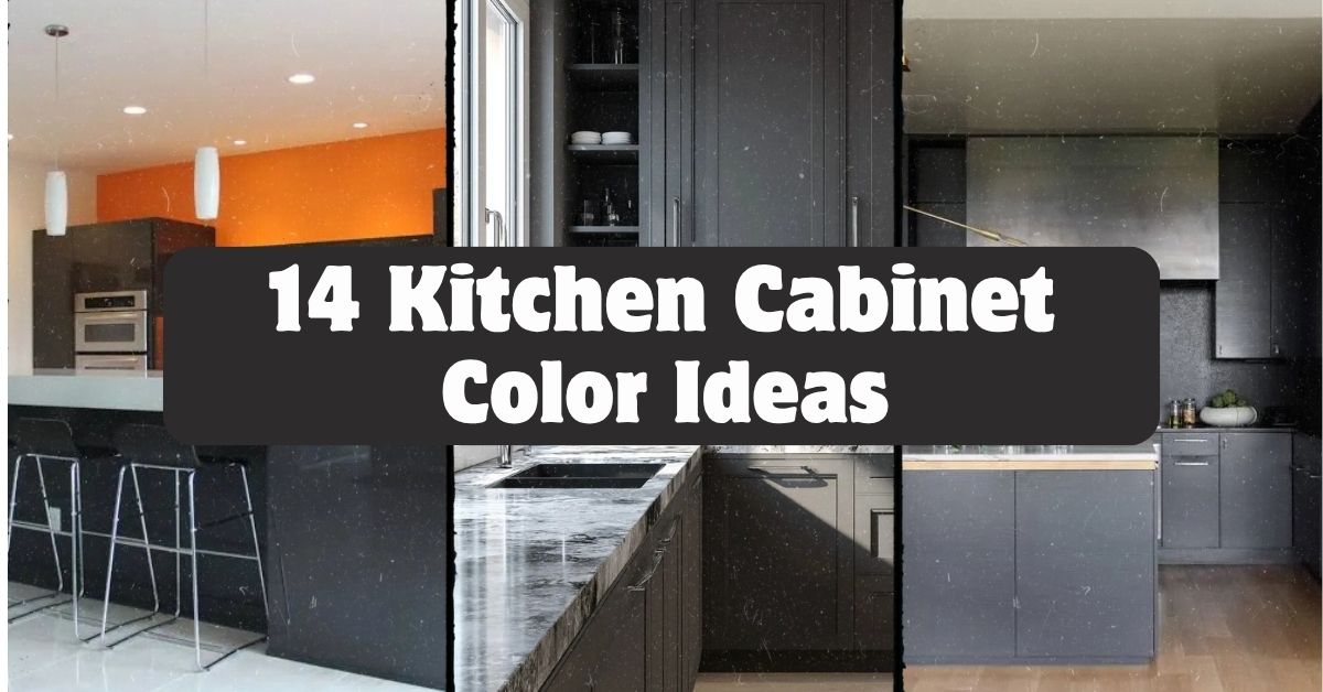
I’ve spent way too many hours staring at paint swatches, so let me save you the trouble with these 14 kitchen cabinet color ideas that actually work in real homes, not just magazine spreads.
What are the best kitchen cabinet colors? The best kitchen cabinet colors depend on your kitchen’s light, size, and style. Popular choices include navy blue, sage green, warm white, charcoal gray, and two-tone combos. Darker colors add drama in larger spaces, while lighter shades open up small kitchens.
Stick around, because I’m about to walk you through ideas you probably haven’t thought of, plus a few mistakes that could cost you a repaint.
Why Cabinet Color Matters So Much
Here’s the thing. Your cabinets take up more visual space than almost anything else in your kitchen. Counters get covered in stuff. Walls get hidden behind cabinets. But cabinet doors? They’re always on display.
I learned this the hard way when I painted my first kitchen a trendy gray that looked amazing online and depressing in my actual house. Lighting changes everything. So does the size of your room and even the direction your windows face.
Cabinet color sets the whole mood. It can make a kitchen feel like a cozy cabin or a bright, airy escape. Let’s get into the ideas.
1. Go Bold With Navy Blue Lower Cabinets
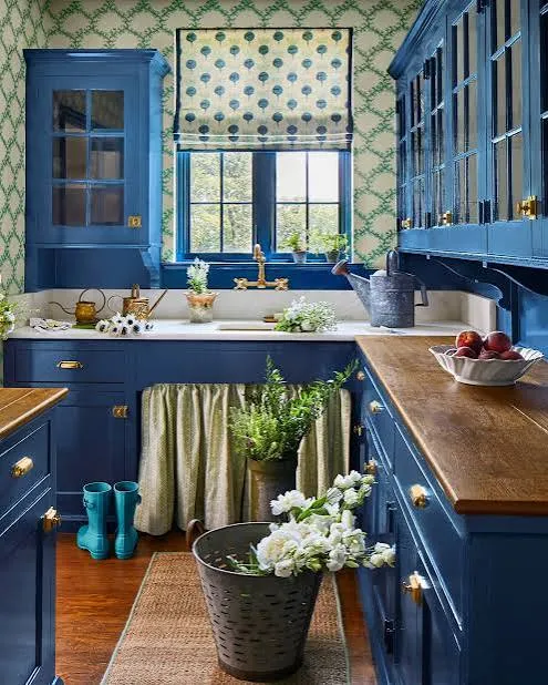
Navy blue is having a real moment, and I get why. It’s dramatic without being scary. Pair navy lower cabinets with white or cream uppers, and you get contrast that feels intentional, not accidental.
I’d recommend brass or gold hardware here. It warms up the blue and keeps things from feeling too cold or corporate.
Practical tip: Test navy on the side of your island first. Islands get less direct light than wall cabinets, so you’ll see the true depth of the color before committing to the whole kitchen.
This look works beautifully in traditional kitchens, but it also slides right into modern farmhouse style if you swap the hardware for matte black.
Speaking of contrast, let’s talk about a color combo that never seems to go out of style.
2. Try Classic White Uppers With Wood Lower Cabinets
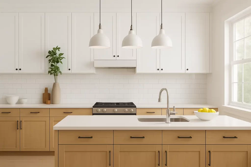
This combo has stuck around for a reason. White cabinets up top keep things bright. Natural wood on the bottom adds warmth and texture. It’s the best of both worlds.
Choose a wood tone that matches your flooring, or at least doesn’t clash with it. Oak, walnut, and maple all work depending on how warm or cool you want the space to feel.
Practical tip: If your kitchen doesn’t get much natural light, lean toward lighter wood tones like white oak instead of dark walnut. Dark wood can eat up light fast.
Coastal kitchens love this look, and so do modern farmhouse and Scandinavian-style spaces. It’s flexible enough to fit almost anywhere.
Now let’s move to a color that’s basically the new neutral.
3. Warm Up Your Space With Sage Green
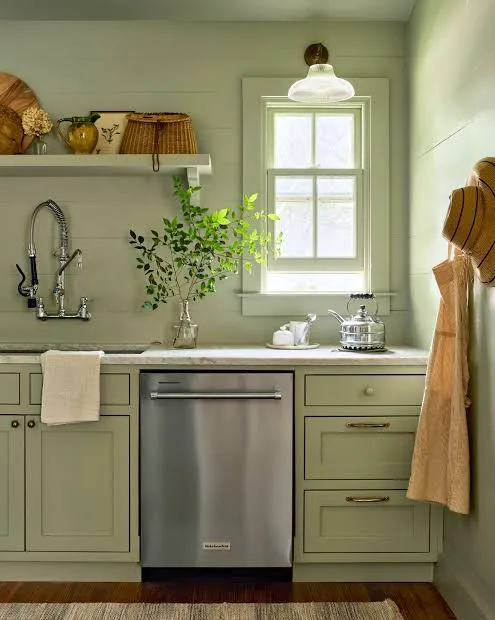
Sage green is soft, earthy, and way more forgiving than people expect. It’s not as loud as emerald or forest green, but it still adds personality.
This color pairs really well with brushed nickel or unlacquered brass hardware. Butcher block counters and open wooden shelving also look amazing next to sage.
Practical tip: Sage green can look muddy under yellow-toned lighting. Test your paint swatch under your actual kitchen bulbs before buying gallons.
In cottage-style kitchens, sage feels right at home. It also works surprisingly well in mid-century modern spaces when paired with clean lines and simple hardware.
If green feels like too big a leap, there’s a safer cousin waiting in idea number four.
4. Keep It Timeless With Warm White or Cream
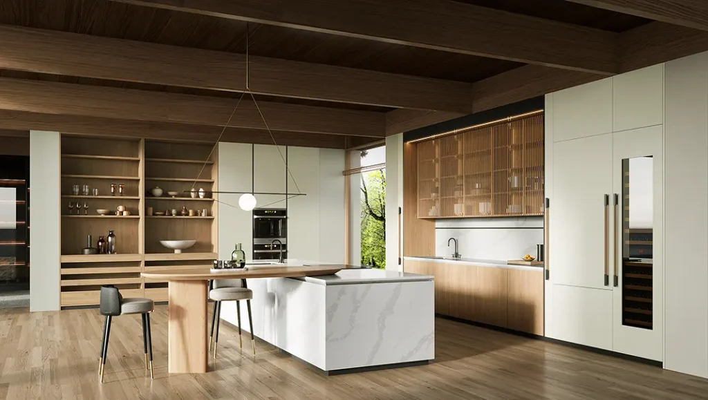
Warm white is not the same as stark white. Warm white has a hint of yellow or beige mixed in, which keeps things from feeling clinical or cold.
This shade works with literally every countertop material and backsplash color. That’s part of why it’s so popular.
Practical tip: Ask for a sample pot before committing. Warm whites can shift dramatically depending on your wall color and lighting, so don’t trust the paint chip alone.
Traditional kitchens practically live on warm white. Modern farmhouse kitchens use it constantly too, especially paired with black hardware and open shelving.
Let’s compare a few popular cabinet color families so you can see how they stack up.
Kitchen Cabinet Color Comparison Table
| Color | Best For | Light Requirement | Maintenance Level |
|---|---|---|---|
| Navy Blue | Bold statement kitchens | Bright natural light preferred | Medium (shows dust) |
| Warm White | Any kitchen size | Works in low or bright light | High (shows smudges) |
| Sage Green | Cottage, farmhouse styles | Moderate to bright light | Low to medium |
| Charcoal Gray | Modern, industrial kitchens | Bright light recommended | Medium |
| Natural Wood | Coastal, Scandinavian styles | Any lighting | Low |
5. Add Drama With Charcoal Gray Cabinets
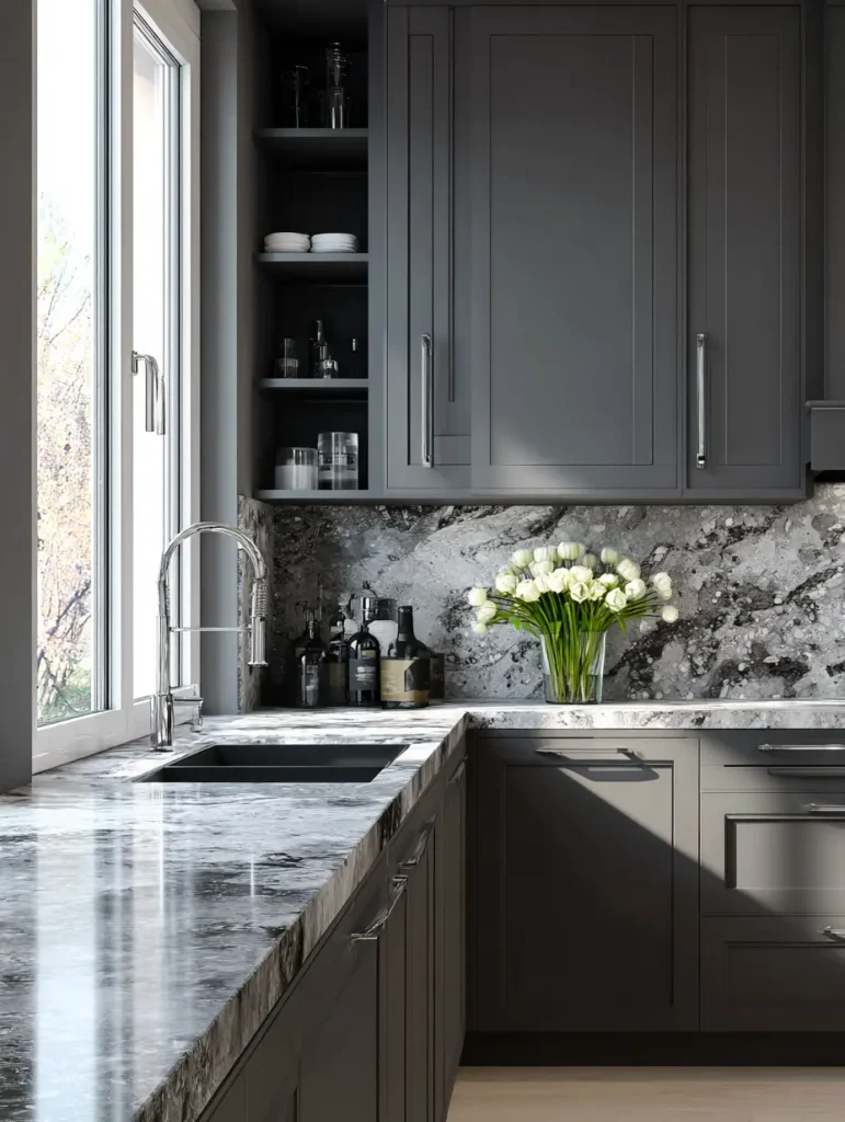
Charcoal gray sits right between black and gray, giving you drama without the commitment of full black. It’s moody but still livable.
I like pairing charcoal with white countertops to keep the whole kitchen from feeling like a cave. Gold or brushed brass hardware adds a nice pop against the dark background.
Practical tip: Add under-cabinet lighting if you go charcoal. Dark cabinets can make small kitchens feel closed in without extra light sources.
This color shines in modern and industrial kitchens, but a softer charcoal with brass accents can also work in transitional spaces.
Now, if you want two colors working together instead of one, keep reading.
6. Mix Two Tones for a Custom Look
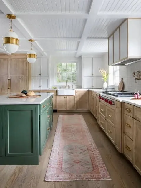
Two-tone kitchens are everywhere right now, and it’s not just a trend. Splitting your colors, usually a darker shade on the island or lower cabinets and a lighter shade up top, adds depth without overwhelming the room.
Popular combos include navy and white, black and wood, or sage and cream. The key is picking colors that don’t fight each other in tone or saturation.
Practical tip: Keep your darker color on the lower half of the kitchen. This grounds the room and feels more balanced than a top-heavy dark color scheme.
Two-tone works in almost any style, from farmhouse to contemporary, because you control the exact color pairing to match your vibe.
Let’s talk about a color that feels fresh precisely because it’s a little unexpected.
7. Go Unexpected With Terracotta or Burnt Orange
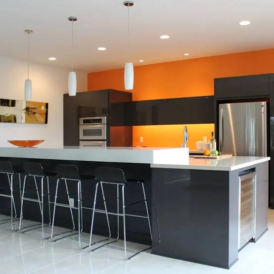
I know this sounds bold, but terracotta cabinets are showing up in more kitchens, and they bring instant warmth. Think sun-baked clay, not neon orange.
This works best as an accent, maybe on an island, rather than covering every cabinet in the kitchen. Pair it with cream walls and brass or black hardware.
Practical tip: Balance terracotta with plenty of neutral counter and floor space. This color needs breathing room to look intentional instead of overwhelming.
Mediterranean and boho kitchens practically beg for this shade. It also works surprisingly well in modern kitchens that want a warm, earthy contrast.
If earthy tones speak to you, there’s a deeper, richer option coming up next.
8. Deepen the Mood With Forest Green
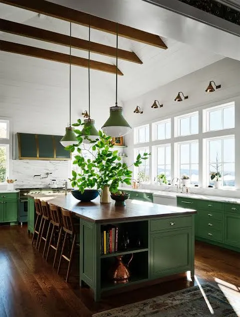
Forest green is sage green’s bolder sibling. It’s rich, a little formal, and instantly makes a kitchen feel more finished and intentional.
Pair forest green with brass hardware and marble or quartz counters for a look that feels expensive without the expensive price tag.
Practical tip: Use forest green only on lower cabinets if your kitchen is small. Full forest green walls of cabinets can shrink a room visually.
Traditional and transitional kitchens love this shade. It also fits nicely into moody, English-cottage-inspired spaces.
Let’s lighten things up again with a color that’s basically a kitchen chameleon.
9. Stay Flexible With Soft Gray-Greige

Greige, that in-between shade of gray and beige, is the ultimate compromise color. It’s warmer than gray but more grounded than beige.
This color plays nice with almost any countertop, from white quartz to darker granite. It’s a safe bet if you’re worried about resale value or just can’t commit to something bolder.
Practical tip: Look for greige with warm undertones if your kitchen faces north, since north-facing rooms tend to get cooler light.
Greige works in transitional, modern, and even traditional kitchens. It’s basically the little black dress of cabinet colors.
Now let’s talk about going all in on black.
10. Make a Statement With Matte Black Cabinets
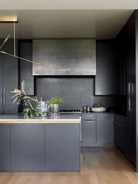
Matte black isn’t for everyone, but when it works, it really works. It photographs beautifully and gives kitchens a sleek, high-end feel.
I always recommend matte over glossy black. Glossy shows every fingerprint and smudge, while matte hides small imperfections much better.
Practical tip: Balance black cabinets with a light-colored backsplash and countertop. Otherwise, the kitchen can feel dark and heavy.
Modern and industrial kitchens are the natural home for black cabinets, though a softer black with wood accents can work in transitional spaces too.
Let’s shift toward something a little more playful.
11. Add Personality With Dusty Blue
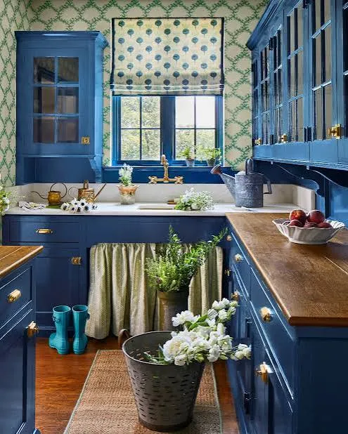
Dusty blue sits between navy and powder blue, giving you color without the intensity of a true navy. It’s calm, a little vintage-feeling, and works in kitchens big and small.
This shade pairs really well with white subway tile and natural wood floors. It doesn’t compete with other elements in the room.
Practical tip: Test dusty blue next to your existing floor and counter samples. This color can lean either gray or purple depending on the light, so double-check before painting.
Cottage kitchens and coastal kitchens both love dusty blue. It even fits into vintage-inspired retro kitchens with the right hardware.
Speaking of vintage vibes, let’s talk about a color combo that feels like it walked out of an old farmhouse.
12. Bring Character With Cream and Black Combos
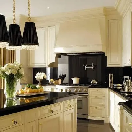
Cream cabinets paired with black accents, whether that’s a black island, black hardware, or a black range hood, create instant character. It’s a classic combo that never really goes out of style.
The cream keeps things soft and warm, while the black adds sharp definition and a little edge.
Practical tip: Use black sparingly at first, maybe just hardware and light fixtures, then add more black elements if you want a bolder look later.
Farmhouse kitchens are basically built around this combo. Traditional and transitional kitchens use it constantly too.
Let’s check out a quick budget breakdown before moving to the last two ideas.
Cabinet Painting Budget Guide
| Project Scope | DIY Cost Range | Professional Cost Range | Time Estimate |
|---|---|---|---|
| Small kitchen (10-15 cabinets) | $200-$400 | $1,500-$3,000 | 2-4 days |
| Medium kitchen (16-25 cabinets) | $400-$700 | $3,000-$5,500 | 4-6 days |
| Large kitchen (26+ cabinets) | $700-$1,200 | $5,500-$9,000 | 6-10 days |
| Two-tone custom job | $500-$900 | $4,000-$7,000 | 5-8 days |
13. Try a Muted Blush or Dusty Rose
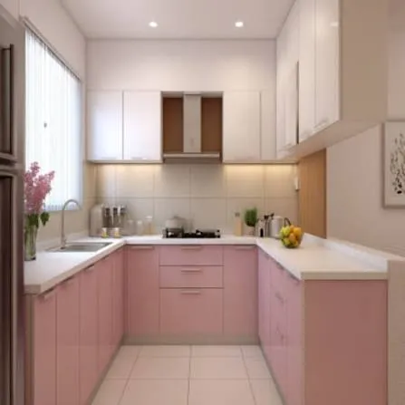
This one surprises people, but muted blush cabinets can look sophisticated instead of childish when done right. The key word is muted. Skip anything bright or cotton-candy toned.
Pair blush with warm wood floors and brass hardware for a look that feels soft but grown-up.
Practical tip: Use blush on an island or a small bank of cabinets rather than the whole kitchen. It’s a strong color that works best in smaller doses.
This idea fits beautifully in modern glam kitchens and soft, feminine cottage-style spaces.
Last but not least, let’s talk about a trend that’s all about texture over color.
14. Layer Different Wood Tones Instead of Paint
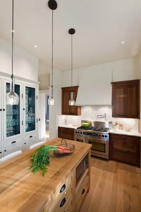
Sometimes the best cabinet color idea isn’t a paint color at all. Mixing two different wood tones, like a walnut island with white oak upper cabinets, gives you warmth and contrast without touching a paint can.
This works especially well if you love the look of natural materials and want your kitchen to feel grounded and organic.
Practical tip: Stick to two wood tones max. Three or more starts to look busy and unplanned.
Scandinavian, coastal, and modern organic kitchens all lean heavily on this approach.
Tips for Success
- Always test paint samples on your actual cabinets, not just a wall, since cabinet material affects how color reads
- Consider your countertop and backsplash before locking in a cabinet color
- Choose semi-gloss or satin finishes for easier cleaning, especially with darker colors
- Don’t skip primer if you’re switching from a dark color to a light one
- Live with a sample for at least three days to see it in morning, afternoon, and evening light
- Factor in hardware finish early since it changes how a color feels
- Ask your painter about durability ratings if you have kids or pets in the house
Common Mistakes and How to Avoid Them
Choosing a color based only on online photos
Lighting and screens distort color constantly. Always get a physical sample before committing.
Ignoring your kitchen’s natural light direction
North-facing kitchens need warmer tones. South-facing kitchens can handle cooler shades without looking cold.
Going too dark in a small, low-light kitchen
Dark colors can work anywhere, but small dark kitchens need extra lighting to avoid feeling cramped.
Skipping proper prep work
Cabinets need cleaning, sanding, and priming. Skipping steps leads to peeling and chipping within months.
Matching cabinet color to current trends instead of your style
Trends fade fast. Pick a color you’ll still like in five years, not just this season.
Forgetting about hardware and lighting
The wrong hardware finish can make an otherwise great color choice feel off balance.
Similar Variations
- Coastal Blue Kitchens – Lighter, breezier blues paired with white and natural rope or wood accents
- Modern Farmhouse Neutrals – Warm whites and soft grays paired with black hardware and shiplap
- Moody Traditional Kitchens – Deep greens or navy paired with brass and marble for a formal feel
- Scandinavian Minimalist Kitchens – Light wood tones and white cabinets with almost no ornamentation
- Industrial Loft Kitchens – Matte black or charcoal cabinets paired with exposed brick and metal accents
- Vintage Cottage Kitchens – Soft pastels like dusty rose or sage paired with brass and glass-front cabinets
Picking a cabinet color doesn’t have to feel overwhelming once you break it down into real options instead of vague trends. Whether you go bold with navy, safe with warm white, or something totally unexpected like terracotta, the right choice comes down to your light, your style, and honestly, what makes you happy every time you walk into your kitchen. I hope these 14 Kitchen Cabinet Color Ideas gave you a clearer picture of what will actually work in your own home.
Leave a Reply