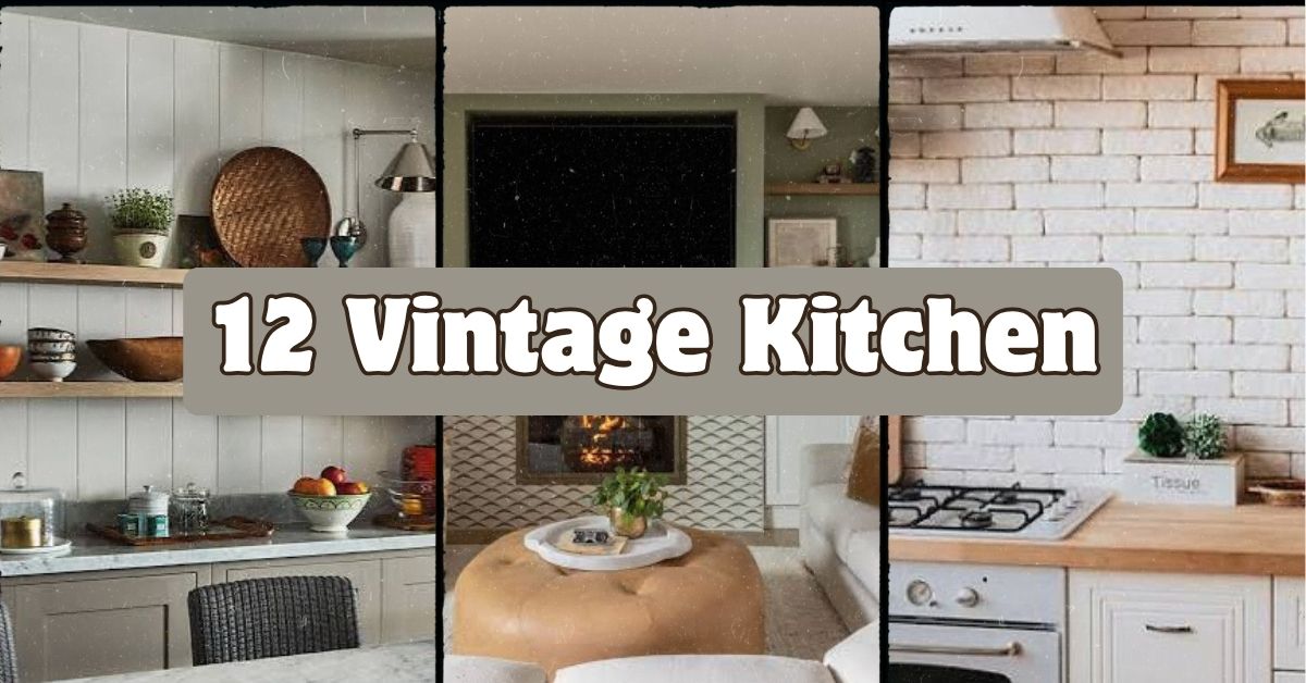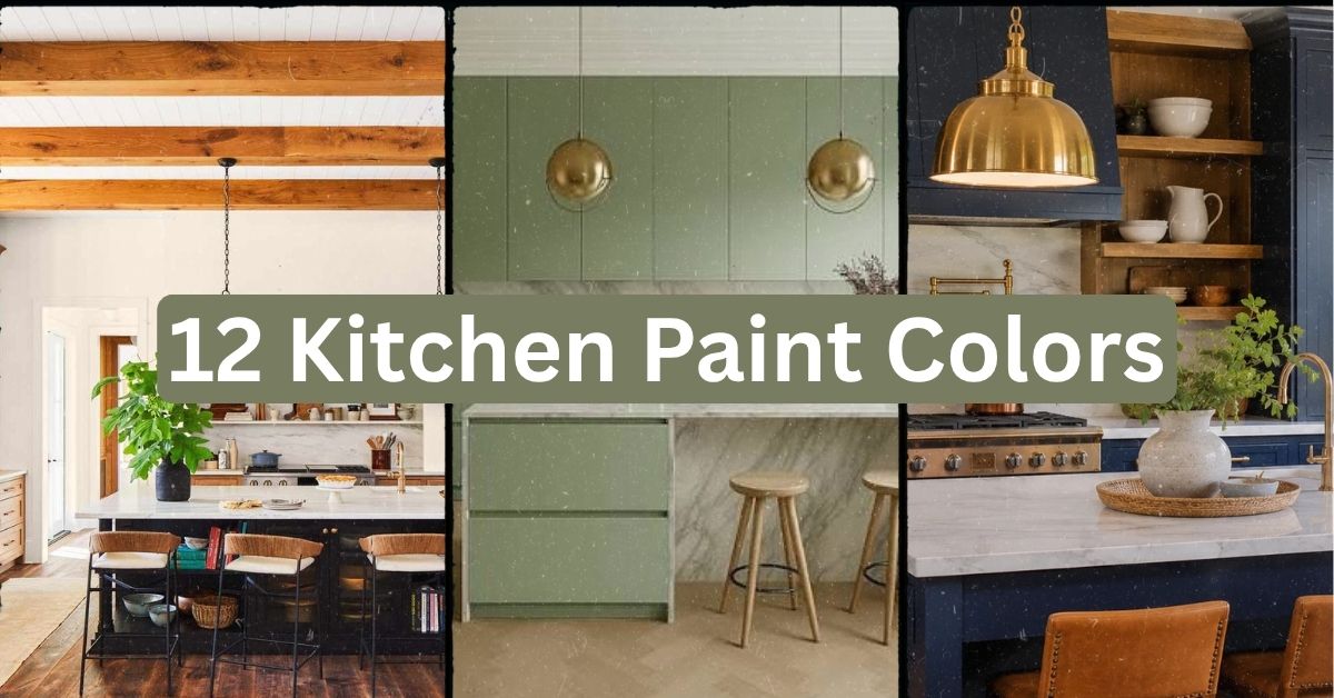
I’ve tested more kitchen paint colors than I can count, and I’m about to hand you the most complete list of 12 kitchen paint colors that actually work in real homes. Ever stood in the paint aisle holding two nearly identical swatches, totally frozen, wondering if you’re about to ruin your whole kitchen? I’ve been there, and that’s exactly why I put this guide together.
Which paint colors work best for kitchens? The best kitchen paint colors include warm whites, soft sage greens, navy blue, greige, buttery yellow, and charcoal gray. These shades balance light, hide daily wear, and pair well with most cabinet and countertop finishes.
Stick around, because I’m walking you through twelve specific colors, how to pair them, and the mistakes that make people repaint within a year.
What Makes a Kitchen Paint Color Actually Work
Picking kitchen paint isn’t like picking a color for your bedroom. Your kitchen deals with grease splatters, steam, sunlight, and constant traffic. So the color needs to do more than look pretty. It needs to hide smudges, play nice with your cabinets, and still feel calm after a long day of cooking.
I always tell people to think about light first. North-facing kitchens need warmer tones. South-facing ones can handle cooler shades without feeling cold. Once you get that part right, the rest is just personal taste. Let’s get into the actual colors.
1. Warm White for a Timeless, Bright Look

Warm white is the color people pick when they want their kitchen to feel clean without feeling sterile. It has a hint of cream or beige mixed in, so it avoids that stark hospital vibe you get from pure white.
This shade works with almost any countertop, from white quartz to butcher block. Pair it with brass or matte black hardware for contrast. A practical tip: test the white on your actual wall at different times of day before committing, since lighting changes it drastically.
Warm white fits modern farmhouse kitchens, coastal kitchens, and even traditional ones. It’s the safest choice on this list, but it never feels boring.
Next up is a color that’s a little bolder but still easy to live with.
2. Sage Green for a Calm, Earthy Feel
Sage green has taken over kitchens the last few years, and honestly, I get why. It feels fresh without screaming for attention. It works because it sits right between green and gray, so it doesn’t compete with wood tones or stainless steel.
Pair sage with natural wood open shelves and woven baskets for texture. A great tip is to use sage only on lower cabinets and keep upper cabinets or walls lighter, so the room doesn’t feel heavy.
This color shines in cottage-style kitchens and modern farmhouse spaces. It also works surprisingly well in mid-century kitchens with walnut cabinetry.
Now let’s talk about a color that adds serious drama without being loud.
3. Navy Blue for Bold Contrast
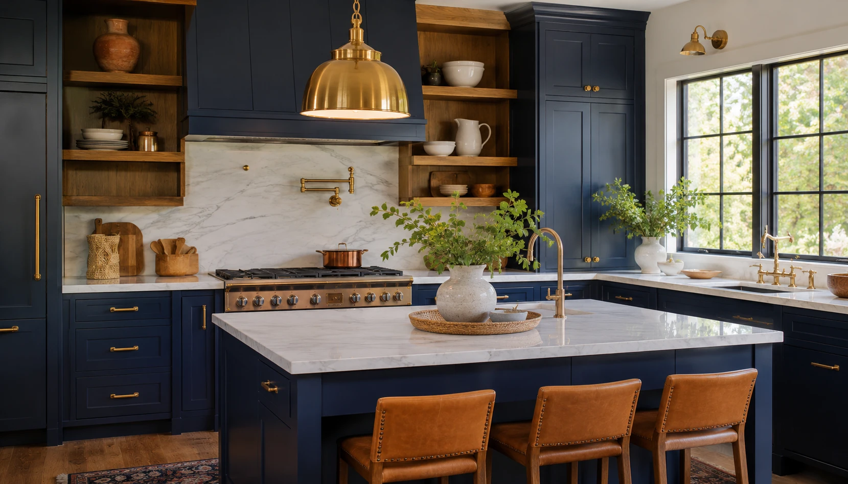
Navy blue on kitchen cabinets or an island creates instant contrast against white countertops. It’s rich, it’s classic, and it photographs beautifully, which is probably why you see it all over design blogs.
Keep your walls lighter if you go navy on cabinets, so the room still feels open. Brass hardware and warm lighting soften the boldness. My tip: test navy on a poster board taped to your cabinet for a full day before painting, since navy can look black in low light.
Navy adapts well to coastal kitchens, traditional kitchens, and transitional designs. It’s less common in strict minimalist spaces, but it can work if you keep everything else simple.
Let’s move to something a bit more neutral and flexible.
4. Greige for the Ultimate Neutral Balance
Greige, that gray-beige hybrid, solves the age-old fight between warm and cool tones. It’s not too gray to feel cold, and not too beige to feel dated.
This color pairs with almost any countertop material, including granite, quartz, and butcher block. A helpful tip: choose a greige with more gray undertone if your kitchen gets lots of natural light, since sunlight can wash out warmer beiges.
Greige fits transitional kitchens best, but it also works in modern spaces when paired with matte black fixtures.
Quick Color Comparison Table
| Color | Best Light Exposure | Pairs Well With | Style Match |
|---|---|---|---|
| Warm White | Any | Brass, black hardware | Farmhouse, Coastal |
| Sage Green | North or East | Natural wood, wicker | Cottage, Mid-Century |
| Navy Blue | South or West | Brass, white countertops | Traditional, Coastal |
| Greige | Any | Quartz, granite | Transitional, Modern |
This table gives you a quick gut check before you commit to a full gallon. Now let’s look at a color that feels sunny without being overwhelming.
5. Buttery Yellow for a Cheerful Kitchen
Buttery yellow brings warmth into a kitchen instantly. It’s softer than a bold sunflower yellow, so it won’t feel like you’re standing in a lemon.
Use it on walls while keeping cabinets white or light wood, so the yellow doesn’t overpower the space. A solid tip: add white trim around windows to keep the yellow from feeling too saturated.
This color fits cottage kitchens and vintage-inspired spaces really well. It also works in small kitchens since it reflects light nicely.
Let’s switch gears to something darker and moodier next.
6. Charcoal Gray for a Moody, Modern Vibe

Charcoal gray on cabinets creates a bold, modern statement. It’s darker than navy but not as harsh as pure black, so it still feels warm in the right lighting.
Pair charcoal with gold or brass hardware to keep the room from feeling too heavy. A practical tip: use charcoal only on lower cabinets or an island, and keep upper cabinets white to balance the weight visually.
Charcoal works beautifully in modern and industrial kitchens. It can also work in traditional kitchens if paired with classic molding and warm wood floors.
Now let’s look at a color that’s having a huge moment in kitchens right now.
7. Terracotta for Earthy Warmth
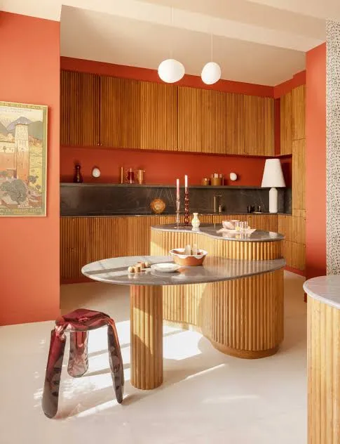
Terracotta brings an old-world, sunbaked feel into a kitchen. It’s warm, a little rustic, and pairs beautifully with natural materials.
Use terracotta on an accent wall or island rather than the whole room, since it’s a strong color. Pair it with cream cabinets and wood accents for balance. My tip: test terracotta next to your existing floor tile first, since some clay-based tiles clash with certain terracotta shades.
This color fits Mediterranean, Spanish-style, and boho kitchens especially well. It can also work in modern farmhouse kitchens if you tone down other bold colors nearby.
Let’s cool things down with a classic blue-gray next.
8. Slate Blue for Subtle Sophistication

Slate blue sits between blue and gray, giving it a quiet, sophisticated feel. It’s calming without being boring, which makes it a favorite for people who want color but not too much color.
Pair slate blue with white marble or quartz countertops for a clean look. A helpful tip: use a satin or eggshell finish on walls, since slate blue can look flat in matte finishes.
This shade works great in coastal kitchens, farmhouse kitchens, and transitional spaces. It also pairs nicely with black steel windows if you’re going for an industrial farmhouse look.
Budget Tier Table for Repainting a Kitchen
| Budget Tier | What’s Included | Estimated Cost Range |
|---|---|---|
| DIY Basic | Paint, brushes, rollers, tape | $150-$300 |
| DIY Premium | High-end paint, primer, hardware swap | $300-$600 |
| Professional Basic | Labor plus standard paint | $800-$1,500 |
| Professional Full Remodel Paint | Cabinets, walls, trim, hardware | $2,000-$4,500 |
Knowing your budget tier ahead of time saves a lot of stress later. Let’s move into a color that feels fresh and clean.
9. Soft Blush for a Gentle, Modern Touch
Soft blush might sound unusual for a kitchen, but a muted, dusty pink can feel surprisingly grown-up. It’s not girly when done right, it’s just warm and soft.
Pair blush walls with black or brass fixtures to keep the room from feeling too sweet. A tip that works well: use blush only on an accent wall behind open shelving, so it doesn’t overwhelm the whole kitchen.
This color fits modern and Scandinavian kitchens especially well. It also works in eclectic kitchens mixed with patterned tile.
Now let’s talk about a deep green that’s a bit different from sage.
10. Hunter Green for Rich, Classic Style
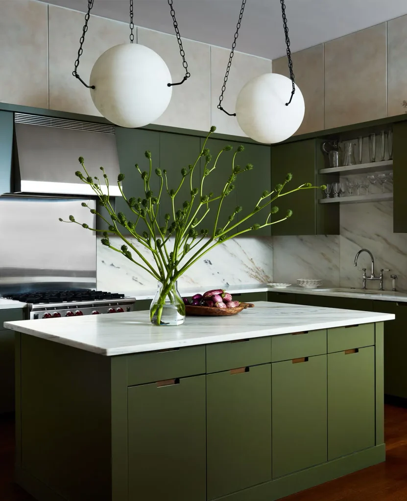
Hunter green feels more traditional and deep compared to sage. It’s the color you pick when you want your kitchen to feel like a cozy library crossed with a chef’s dream space.
Pair hunter green cabinets with brass hardware and white or marble countertops for contrast. A useful tip: keep your ceiling white to prevent the room from feeling like a dark box.
This shade works beautifully in traditional kitchens and English-country style spaces. It also fits modern kitchens if paired with sleek, handle-less cabinet fronts.
Let’s look at a color that feels light, airy, and almost invisible in the best way.
11. Pale Blue for a Fresh, Airy Feel
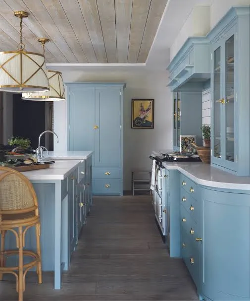
Pale blue is one of those colors that makes a kitchen feel bigger and brighter. It’s calming, easy on the eyes, and works in almost any lighting condition.
Pair pale blue with white subway tile and light wood floors for a clean, coastal feel. A solid tip: choose a blue with slight gray undertones if you want it to feel more sophisticated instead of babyish.
This color shines in coastal kitchens, cottage kitchens, and Scandinavian-style spaces. It also works in small kitchens where you want to avoid a boxed-in feeling.
Last but not least, let’s cover a color that’s bold but still surprisingly livable.
12. Deep Olive for a Grounded, Natural Look

Deep olive brings an earthy, grounded feeling into a kitchen without going full-on dark green. It reads more neutral than hunter green, which makes it easier to pair with a wider range of materials.
Use olive on cabinets while keeping walls a soft cream or white, so the room stays balanced. A great tip: pair olive with unlacquered brass, since it tends to develop a warm patina that matches the earthy tone.
This color works in modern farmhouse kitchens and Mediterranean-inspired spaces. It’s also a great fit for kitchens with lots of natural wood, since it doesn’t compete with warm tones.
Tips for Success
- Always buy a sample pot before committing to a full gallon, even if you’ve used the color before in a different room.
- Paint a swatch on at least two different walls, since morning and evening light change everything.
- Choose a finish based on function. Satin or semi-gloss holds up better than matte in high-traffic kitchens.
- Don’t ignore your countertop and flooring undertones. They can clash with certain wall colors more than you’d expect.
- Live with your sample for at least three days before deciding, since first impressions can be misleading.
- If you’re nervous about commitment, start with an island or accent wall instead of painting the entire kitchen.
- Ask your paint store for a color-matched primer, since it can prevent streaky, uneven coverage on bold colors like navy or charcoal.
Common Mistakes and How to Avoid Them
Skipping the sample stage
: Buy a small tester can and paint a poster board so you can move it around the room and check different lighting angles.
Ignoring the finish type
: Use satin or semi-gloss on kitchen walls and cabinets, since matte finishes stain easily and are harder to clean.
Matching paint to a photo instead of your actual room
: Colors look different depending on your lighting, floor tone, and countertop material, so always test in your own space.
Painting the whole kitchen one bold color
: Balance strong shades like navy or charcoal with lighter walls, ceilings, or countertops so the room doesn’t feel closed in.
Forgetting about undertones
: Hold your paint swatch next to your cabinets and countertop sample before buying, since undertones can clash even if the colors seem to match.
Rushing the prep work
: Clean and lightly sand cabinets or walls before painting, since grease and dust prevent paint from sticking properly.
Similar Variations
- Coastal Kitchen Palette: Soft blues, whites, and sandy neutrals that mimic a beach house feel.
- Modern Farmhouse Palette: Warm whites, sage green, and black accents for a cozy but clean look.
- Mediterranean Kitchen Palette: Terracotta, olive, and deep blue tones inspired by coastal Europe.
- Scandinavian Kitchen Palette: Pale blues, soft grays, and warm whites for a minimal, airy feel.
- Industrial Kitchen Palette: Charcoal, matte black, and deep gray tones paired with metal accents.
- English Cottage Palette: Hunter green, buttery yellow, and warm cream for a classic, storybook feel.
Picking the right shade really comes down to your lighting, your materials, and how bold you want to feel every morning when you walk in for coffee. I’ve shown you real options that work in real homes, not just trendy shades that look good for one photo and fade fast. Whatever direction you choose, these 12 kitchen paint colors give you a solid, tested starting point for a kitchen you’ll actually love living in.