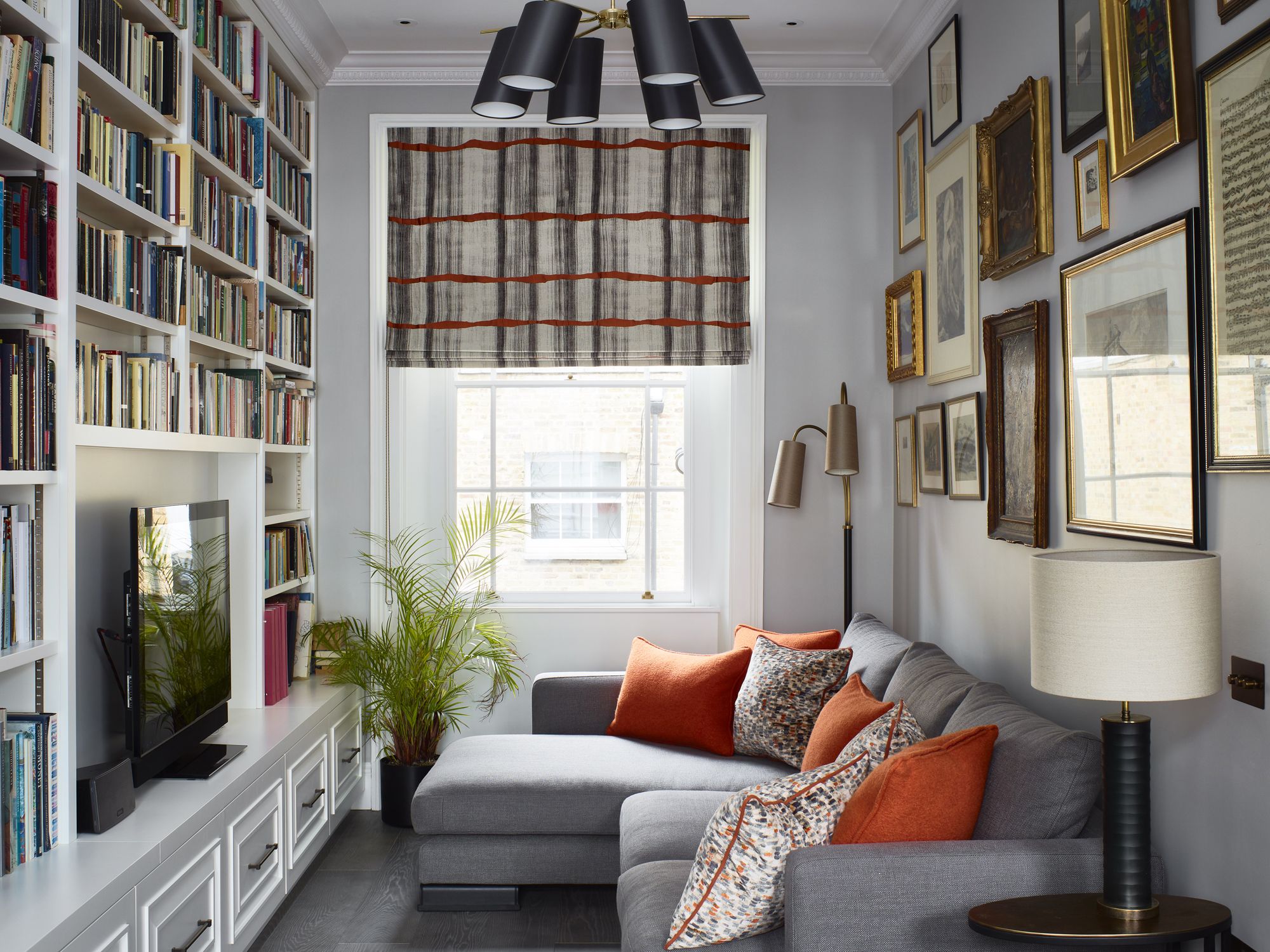
Author: Tayef

  • 11 Basement Kitchenette

    11 Basement Kitchenette

    If you’ve been searching for the best 11 Basement Kitchenette ideas, I’ve got you covered with everything you need to turn that dusty basement corner into a real functioning space. I’ve dug through design trends, talked to folks who’ve done these renovations, and pulled together what actually works versus what just looks good in a magazine. This isn’t a fluffy list. It’s the real deal.

    A basement kitchenette is a small, secondary cooking and food prep area installed in a basement, typically including a mini fridge, sink, microwave, and some counter space. It serves guests, renters, or family members without requiring a trip upstairs to the main kitchen.

    Stick around, because I’m about to walk you through 11 specific layouts and design choices that turn a cold basement into a space people actually want to hang out in.

    What Exactly Is a Basement Kitchenette Anyway?

    Okay, so let’s back up for a second. A kitchenette isn’t a full kitchen. It’s smaller, simpler, and way more forgiving on your budget. Think mini fridge instead of a full-size one. Think two-burner cooktop instead of a six-burner range.

    I love kitchenettes because they solve a real problem. Maybe you’ve got a teenager who wants their own space. Maybe you rent out your basement as an apartment. Maybe you just want somewhere to grab a snack during movie night without climbing two flights of stairs. Whatever your reason, a basement kitchenette gives you flexibility without the cost of a full kitchen remodel.

    Now let’s get into the good stuff.

    1. Go Small with a Galley-Style Layout

    Galley kitchen ideas: 10 designs to elevate your space | Homes and Gardens
    Credit: Home And Gardens

    If your basement is narrow, a galley layout is your best friend. This means putting your counter, sink, and appliances in a straight line along one wall. It’s simple, efficient, and doesn’t eat up floor space.

    I’d suggest sticking with light countertop colors like white quartz or pale gray laminate. Light colors bounce around whatever natural light you have, which basements desperately need. Add open shelving above the counter instead of bulky cabinets to keep things feeling airy.

    Practical tip: measure your walkway space first. You want at least 36 inches of clearance so two people can pass each other comfortably.

    This layout works great in modern farmhouse basements and also fits industrial-style spaces with exposed pipes overhead. Once you’ve nailed the layout, it’s time to think about what goes on top of those counters.

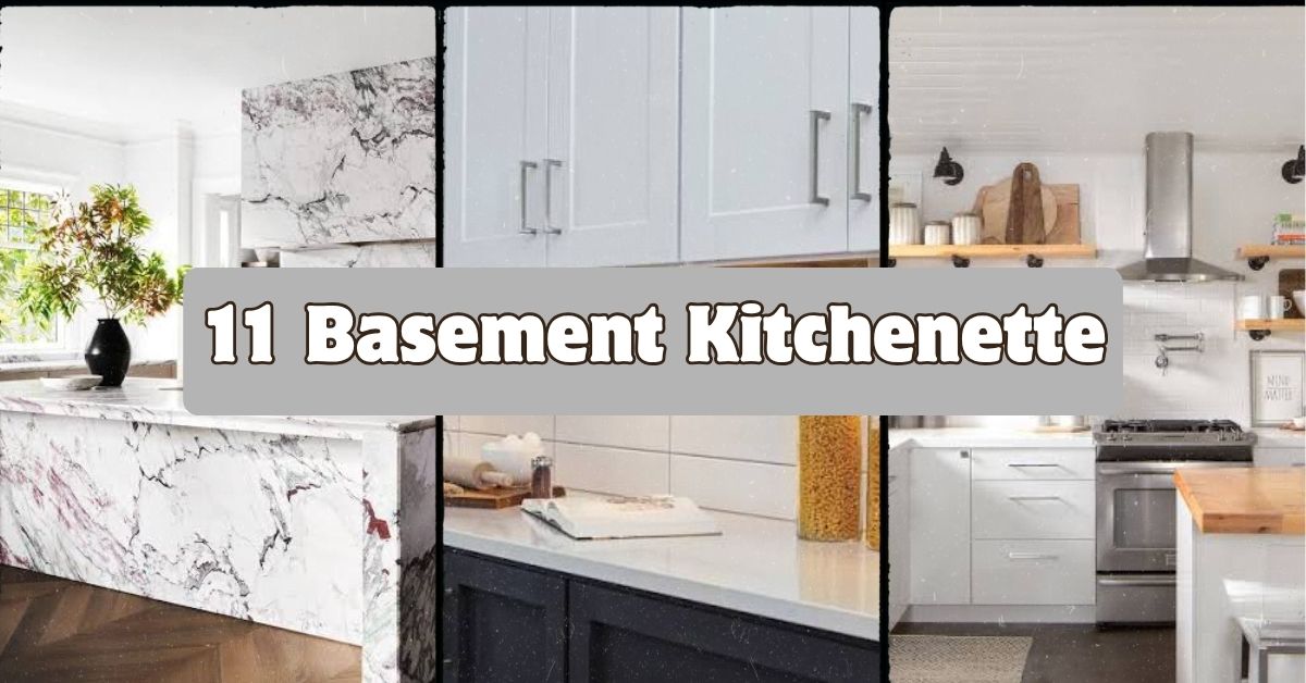
    2. Add a Waterfall Countertop for a High-End Look

    These Gorgeous Waterfall Countertops Redefine Luxury
    Credit; Elle Decor

    A waterfall countertop is when the counter material wraps down the side of the cabinet instead of stopping at the edge. It looks expensive, but you can do it on a budget with laminate that mimics stone.

    This trick works especially well in basement kitchenettes because it draws the eye downward and makes low ceilings feel less oppressive. Pair it with matte black hardware for a modern contrast, or brass pulls if you’re going for something warmer.

    Quick tip: ask your countertop installer about remnant pieces. Waterfall edges use extra material, and remnants can cut your cost by 30 to 40 percent.

    Coastal basements look great with a soft blue-gray waterfall edge, while traditional spaces do well with warm beige tones. Once your counters are sorted, lighting becomes your next big decision.

    3. Install Under-Cabinet LED Lighting

    How to Install Under Cabinet Lighting - The Home Depot
    Credit: The Home Depot

    Basements are naturally dim. No amount of paint color fixes that completely. Under-cabinet LED strips solve the problem by throwing light exactly where you need it, right on your counter and workspace.

    These lights are cheap, easy to install yourself, and use very little electricity. Go with a warm white bulb, around 2700 to 3000 Kelvin, so the space feels cozy instead of clinical.

    Actionable tip: buy strips with a dimmer remote. You’ll want brighter light for cooking and softer light for late-night snacking.

    This idea works in literally every design style because lighting is functional first, decorative second. Now that your kitchenette is lit properly, let’s talk storage.

    Basement Kitchenette Lighting Comparison

    Light TypeAvg CostBrightness (Lumens)Best Use
    LED Strip Lights$15-$40300-600Under cabinets
    Recessed Can Lights$30-$75 per light650-800General ceiling light
    Pendant Lights$40-$150450-800Over counter/bar area
    Puck Lights$10-$25 each200-350Accent/display shelves

    4. Use Open Shelving Instead of Upper Cabinets

    Why I Combined Open Shelves and Cabinets in My Kitchen Remodel
    Credit: Houzz

    I know cabinets feel safer because they hide clutter. But open shelving makes a small basement kitchenette feel bigger and less closed in. It also forces you to keep things tidy, which honestly isn’t a bad thing.

    Go with wood shelves if you want warmth, or floating black metal shelves for something more industrial. Style them with a few plates, some glass jars, and maybe one plant that can survive low light, like a pothos.

    Practical tip: don’t overload the shelves. Three to five items per shelf looks curated. Ten items looks cluttered.

    Modern and Scandinavian basements shine with open shelving, while traditional homes might prefer glass-front cabinets instead. Speaking of cabinets, let’s talk about color choices next.

    5. Paint Cabinets a Bold, Unexpected Color

    The Unexpected Paint Colors Designers Say We'll All Want in Our Homes in 2027
    Credit: Real Simple

    Basements get a bad reputation for being dark and dull. Fight back with a bold cabinet color. Deep green, navy blue, or even a rich terracotta can make your kitchenette the most interesting room in the house.

    Bold colors work especially well in basements because there’s usually less competing color from windows or outdoor views. Balance a dark cabinet with a lighter countertop and lighter walls so the room doesn’t feel like a cave.

    Tip you can use today: test your paint color with a sample swatch under your actual basement lighting, not daylight. Basement bulbs change how colors look more than you’d expect.

    Coastal kitchenettes love soft sage or navy, while modern spaces often go with charcoal or matte black. Once your color scheme is locked in, it’s time to think about the sink setup.

    6. Choose a Compact Farmhouse Sink

    Small Farmhouse Sinks (Under 30") for Compact Kitchens
    Credit: The Sink boutique

    Yes, farmhouse sinks can fit in small spaces. Look for a 24-inch version instead of the standard 30 or 36-inch size. It still gives you that deep basin for washing dishes or rinsing produce, minus the bulk.

    Pair it with a simple gooseneck faucet in a finish that matches your cabinet hardware. This little detail ties the whole kitchenette together visually.

    Actionable tip: install a water filter under the sink if this kitchenette will see regular use. Basement plumbing sometimes sits longer between uses, and filtered water tastes fresher.

    Farmhouse sinks fit naturally into traditional and cottage-style basements, but a stainless apron-front sink gives the same functionality with a more modern look. Now let’s talk about what goes above that sink.

    7. Add a Statement Backsplash

    75 Kitchen Backsplash Ideas That Will Cater to All Aesthetics
    Credit: Elle Decor

    A backsplash is one of the cheapest ways to add major personality to a small space. Because kitchenettes have less counter and cabinet area overall, the backsplash becomes a bigger visual player in the room.

    Try a bold tile pattern like hexagon or herringbone. Subway tile is classic and affordable, but a colorful zellige tile adds texture and depth that photographs beautifully.

    Practical tip: use peel-and-stick tile if you’re renting or want a temporary solution. Good ones look surprisingly real and cost a fraction of ceramic tile.

    Traditional basements do well with classic white subway tile, while eclectic or boho spaces can handle a wild pattern mix. With your backsplash sorted, let’s move on to seating.

    Backsplash Material Comparison

    MaterialCost per Sq FtDurabilityInstall Difficulty
    Ceramic Subway Tile$5-$10HighModerate
    Peel-and-Stick Vinyl$3-$8MediumEasy
    Natural Stone$15-$30HighDifficult (pro recommended)
    Glass Tile$10-$25Medium-HighModerate

    8. Squeeze in a Two-Person Breakfast Bar

    How to Squeeze in a Breakfast Bar Into Your Kitchen
    Credit: Houzz

    If your basement kitchenette has even a small footprint, a breakfast bar gives people somewhere to sit besides the couch upstairs. Two barstools and 18 inches of counter overhang is usually enough.

    Choose stools with backs if you plan on sitting there a while, or backless stools if you want to save space and slide them under the counter completely when not in use.

    Actionable tip: measure 24 to 28 inches between stool centers so people aren’t bumping elbows.

    Industrial basements look sharp with metal stools and a wood-topped bar, while coastal spaces might use woven rattan seats instead. Once seating is handled, storage solutions come next.

    9. Install a Slide-Out Pantry Cabinet

    Slide Out Kitchen Pantry Drawers: Inspiration - The Inspired Room
    Credit: The Inspired room

    Basement kitchenettes rarely have room for a full pantry, but a slim slide-out cabinet, sometimes just 6 to 9 inches wide, tucks into gaps between appliances or cabinets. It holds an impressive amount of canned goods, snacks, and spices.

    These pull-out units keep everything visible and reachable instead of getting lost behind other items. Most home improvement stores sell them as add-on units for existing cabinet boxes.

    Practical tip: measure your gap space before buying. Even a half-inch difference matters with these narrow units.

    This idea works in every design style because it’s purely functional and mostly hidden. Next, let’s talk flooring, since that ties the whole room together.

    10. Choose Water-Resistant Flooring

    Waterproof Flooring Explained | Carpet One Floor & Home
    Credit: Carpet One

    Basements deal with moisture more than any other room in the house. A kitchenette adds even more risk with sink splashes and spills. Skip real hardwood and go with luxury vinyl plank or porcelain tile instead.

    Luxury vinyl plank mimics wood grain almost perfectly now, and it handles water without warping. Porcelain tile works great too, especially with a small area rug layered on top for warmth underfoot.

    Tip you can act on right now: look for flooring rated for “wet areas” or with a slip-resistance rating, especially near the sink zone.

    Modern basements often go with large-format gray tile, while cottage-style spaces might choose a warm wood-look vinyl plank. With floors sorted, let’s talk about making the ceiling feel less low.

    11. Paint the Ceiling to Match the Walls

    Should you paint your ceiling the same color as your walls? | Homes and Gardens
    Credit: Homes And gardens

    Basement ceilings are usually lower than upstairs, and that exposed duct work doesn’t help. One trick designers swear by is painting the ceiling the exact same color as the walls. This removes the visual line where wall meets ceiling, making the whole room feel taller.

    This works especially well with darker, bold colors, since the eye doesn’t naturally look for contrast between wall and ceiling the way it does with white.

    Practical tip: use a paint labeled for ceilings if there’s any exposed duct work, since these formulas usually handle metal and pipe surfaces better.

    This trick works in nearly any design style, from modern minimalist to cozy traditional. Now let’s round things out with one more idea that ties everything together.

    12. Add a Mini Wine Fridge or Beverage Center

    Where To Place a Small Wine Fridge in Your Kitchen
    Credit: Sweeten

    A basement kitchenette is the perfect spot for a mini wine fridge or beverage cooler. It’s a small addition, usually 15 to 24 inches wide, but it adds a ton of function for entertaining without taking up much space.

    Tuck it under the counter next to your mini fridge, or build it into an open shelving unit as a focal point. Glass-front models look sleek and let you show off drink options to guests.

    Actionable tip: leave at least 2 inches of clearance around built-in units for proper ventilation. Overheating shortens their lifespan fast.

    This addition fits modern basements beautifully, but even traditional spaces can pull it off with a wood-paneled cabinet front that hides the appliance look. With all 12 ideas covered, let’s move into some quick success tips.

    Tips for Success

    • Measure everything twice before buying appliances. Basement doorways and stairwells are often narrower than main floor entries, and delivery trucks can’t always get large items down there easily.
    • Check your local building codes before adding a sink or gas line. Some areas require permits for basement plumbing work.
    • Add a dehumidifier nearby if your basement runs damp. Moisture control protects your new cabinets and flooring investment.
    • Plan your electrical outlets before finishing walls. Adding outlets after drywall is up costs way more money and time.
    • Choose appliances with a shorter depth, around 24 inches, to keep walkways clear in tight basement footprints.
    • Test your basement’s ventilation before cooking anything with strong smells down there. A small exhaust fan makes a huge difference.

    Common Mistakes and How to Avoid Them

    Skipping proper ventilation
    : Basements trap smells and moisture easily. Install a small exhaust fan or vent to the outside if you’re doing any real cooking down there.

    Choosing full-size appliances
    : Big appliances eat up space fast in a small kitchenette. Stick with mini or apartment-size versions built for compact spaces.

    Ignoring the ceiling height
    : Low basement ceilings feel worse with bulky upper cabinets. Go with open shelving or shorter cabinet runs instead.

    Forgetting about natural light
    : Basements already lack sunlight. Skip dark, saturated wall colors near windows and use mirrors to bounce around whatever light exists.

    Overlooking waterproofing
    : Basement moisture ruins cabinets and flooring over time. Choose water-resistant materials from the start instead of fixing damage later.

    Placing the kitchenette too far from plumbing lines
    : Extending water lines a long distance adds major cost. Position your sink and appliances near existing plumbing whenever possible.

    Similar Variations

    • Basement Wet Bar: A smaller setup focused on drinks and entertaining, usually skipping the stove or oven entirely.
    • In-Law Suite Kitchenette: A more complete kitchenette designed for a family member living downstairs long-term, often including a full-size fridge.
    • Basement Coffee Bar: A tiny corner dedicated just to coffee and espresso equipment, popular in home offices built into basements.
    • Rental Unit Kitchenette: A basic but code-compliant kitchen setup designed for tenants, focused on function over style.
    • Media Room Snack Station: A stripped-down kitchenette built specifically for movie nights, usually just a mini fridge and microwave near the seating area.
    • Craft Room Utility Kitchenette: A small sink and counter setup added to a basement craft space for easy cleanup, not really meant for cooking meals.

    Building a basement kitchenette doesn’t have to feel overwhelming once you break it into small decisions like layout, lighting, storage, and flooring. Every choice builds on the last one, and before you know it, that unfinished basement corner turns into a space your whole family actually wants to use. Whether you go bold with cabinet color or keep things simple with open shelving, the right combination of these 11 Basement Kitchenette ideas will get you there.
  • 15 Timeless Kitchen Design Ideas That Never Go Out of Style

    15 Timeless Kitchen Design Ideas That Never Go Out of Style

    I’ve spent years studying what makes a kitchen feel right for decades instead of just a few years, and this guide on 15 Timeless Kitchen design ideas is the most complete breakdown you’ll find on the topic. I’ve pulled together real design principles, practical tips, and honest advice so you don’t waste money on trends that’ll look dated by next spring. By the end, you’ll know exactly what makes a kitchen “timeless” and how to bring that into your own home.

    A timeless kitchen is a kitchen design that relies on classic materials, neutral colors, and functional layouts instead of passing trends, so it stays visually appealing and useful for 15+ years without needing a major redo.

    Curious how some kitchens from the 1990s still look fresh today while others feel stuck in the past? Stick around. I’m breaking down 15 specific design choices that make the difference.

    What Makes a Kitchen “Timeless” Anyway?

    Ever walked into a kitchen and thought, “Wow, this could’ve been designed yesterday or twenty years ago”? That’s the timeless look. It’s not about being boring or safe. It’s about picking materials and colors that don’t scream “this was cool in 2016.” Think shaker cabinets, natural stone, warm wood tones, and classic hardware. These choices age like a good pair of jeans, not like last season’s fast fashion. I’ve seen so many homeowners chase trendy tile or bold accent walls, only to regret it a few years later. A timeless kitchen saves you money in the long run because you’re not remodeling every five years just to keep up.

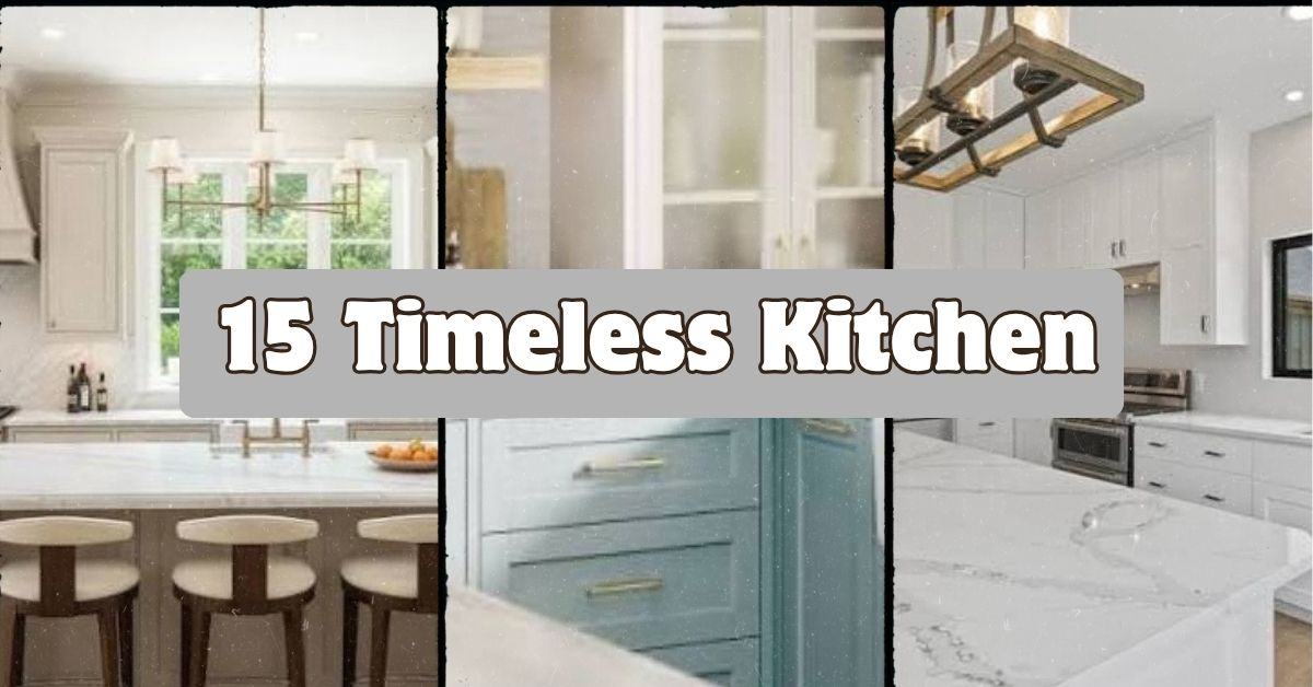
    1. Choose White or Cream Shaker Cabinets

    The Complete Guide to Design Cream Kitchen Cabinets | George Cabinetry
    Credit: Goerge cabinetry

    Shaker cabinets have been around since the 1700s, and they’re still the most requested cabinet style today. That tells you something. The flat panel with a simple raised frame just works with almost any style you throw at it.

    White or cream shaker doors give you a clean base that plays nice with any wall color, countertop, or hardware finish you pick later. My tip: go with a soft cream instead of stark white if you want something a little warmer and less clinical looking.

    This style flexes easily. Add brass hardware for traditional charm, matte black pulls for modern flair, or open shelving nearby for a coastal vibe. Once your cabinets are locked in, the rest of your kitchen decisions get a lot easier.

    2. Install Natural Stone or Quartz Countertops

    Timeless Kitchen Design Using Natural Stone
    Credit: All Amerecin Granite

    Countertops take up a huge amount of visual space, so this decision matters more than people think. Natural stone like marble or granite has been a kitchen staple for over a century. Quartz is newer but mimics that same timeless stone look with less maintenance.

    Stick with neutral veining in white, gray, or beige tones. Avoid heavily colored or patterned stone that ties your kitchen to a specific decade.

    Practical tip: ask for a sample slab and look at it in your actual kitchen lighting before committing. Stone looks different under warm bulbs versus daylight.

    Traditional homes love the movement of real marble. Modern kitchens often lean toward quartz with subtle veining. Either way, neutral wins every time.

    3. Add a Farmhouse or Apron-Front Sink

    Farmhouse Kitchen Sinks – Apron Front Sinks | Kraus USA
    Credit: kraus

    This sink style has stuck around since the 1800s for a reason. It’s deep, practical, and has a certain charm that a standard undermount sink just doesn’t offer.

    Go with white fireclay or a stainless steel apron sink depending on your kitchen’s overall tone. White works beautifully in farmhouse, cottage, and traditional kitchens. Stainless leans more industrial or modern.

    Quick tip: make sure your cabinet base is built specifically for an apron sink. Retrofitting later is a hassle and can get expensive.

    This piece adapts across styles easily. It’s a staple in farmhouse kitchens but also shows up often in modern and coastal designs when paired with clean lines and simple fixtures.

    Countertop Material Comparison

    MaterialAvg. Cost per Sq FtDurabilityMaintenance LevelBest For
    Quartz$50-$100Very HighLowBusy families
    Granite$40-$100HighMediumTraditional homes
    Marble$60-$180MediumHighStatement pieces
    Butcher Block$30-$60MediumMedium-HighFarmhouse style
    Soapstone$70-$120HighLow-MediumRustic, vintage look

    Now that we’ve covered the big-ticket surfaces, let’s talk about how light plays into a timeless kitchen.

    4. Layer Your Lighting with Pendants and Recessed Cans

    Layer Your Lighting Design for Drama and Functionality - The New York Times
    Credit: The New York Times

    A lot of kitchens rely on one overhead light, and that’s a mistake. Timeless kitchens use layers: recessed cans for general light, pendants over the island for task light, and maybe under-cabinet strips for prep areas.

    Pick pendant fixtures in simple shapes like glass globes, linen drum shades, or classic metal cages. Skip anything too trend-specific like neon accents or oddly shaped novelty lights.

    My tip: hang pendants 30 to 36 inches above your counter or island for the right proportion. Too high and they look disconnected. Too low and people bump their heads.

    Traditional kitchens might go with brass lantern-style pendants. Modern kitchens often choose matte black or simple glass globes. Either way, layered lighting always reads as intentional and well-planned.

    5. Pick a Neutral Color Palette with Warm Undertones

    18 Neutral Living Room Ideas with a Touch of Wow
    Credit: Better homes & Gardens

    Color trends come and go fast. Sage green was everywhere a few years back. Before that, gray dominated every kitchen renovation photo. A truly timeless kitchen sticks to whites, creams, warm grays, and soft beiges.

    These colors don’t fight with your cabinets, countertops, or flooring. They also make it way easier to update your look later with small changes like new hardware or a fresh coat of paint on an accent wall.

    Practical tip: test paint samples on your actual kitchen wall for a full week. Lighting changes throughout the day and can make a color look totally different by evening.

    Coastal kitchens lean into soft blues and sandy neutrals. Traditional spaces often prefer warm creams and taupe. Both stay grounded in that same neutral family.

    6. Use Subway Tile for Your Backsplash

    33 Subway Tile Backsplashes - Stylish Subway-Tile Ideas for Kitchens
    Credit: ELLE Decor

    Subway tile has been a kitchen fixture since the early 1900s subway stations gave it the name. It’s simple, clean, and pairs with basically every design style out there.

    Stick with a classic white or off-white tile in a 3×6 inch size laid in a standard offset pattern. Skip the herringbone or chevron layouts if you’re going for true timelessness, since those patterns feel more trend-driven.

    Quick tip: use a light gray grout instead of stark white. It hides dirt better and still looks clean.

    This backsplash works in farmhouse kitchens, modern minimalist spaces, and even more traditional designs when paired with detailed cabinetry. It’s basically the little black dress of kitchen tile.

    7. Choose Hardwood or Wood-Look Flooring

    Wood Flooring Decor Ideas to Make Your Home Look Stunning
    Credit: Nordic Homeworx

    Flooring sets the tone for your whole kitchen, and hardwood has held its value and appeal for well over a century. Even if real hardwood isn’t in your budget, wood-look tile or high-quality luxury vinyl can give you that same warmth.

    Go with medium to warm wood tones. Very dark or very light floors tend to feel more tied to specific design decades, while medium tones stay grounded and flexible.

    My tip: choose a matte or satin finish over high gloss. Matte hides scratches better and looks more natural over time.

    Wood flooring shows up in nearly every kitchen style, from cozy farmhouse to sleek modern spaces with minimal cabinetry. It’s one of the most adaptable choices you can make.

    8. Install Classic Cabinet Hardware in Warm Metals

    13 Kitchen Cabinet Hardware Ideas Designers Want You to Try This Year | Architectural Digest
    Credit: architecturaldigest

    Hardware might seem small, but it makes a real difference in how “current” or “dated” a kitchen feels. Brass, brushed nickel, and matte black have all proven their staying power over the decades.

    Pick simple bar pulls or classic knobs instead of anything overly ornate or oddly shaped. Simple shapes age much better than fussy designs.

    Practical tip: mix metals sparingly if you want that. A little brass with mostly matte black, for example, feels intentional instead of chaotic.

    Brass leans traditional and warm. Matte black feels more modern. Brushed nickel sits comfortably in between, making it a safe pick for transitional spaces.

    Hardware Finish Guide

    FinishStyle FitPrice RangeMaintenance
    BrassTraditional, warm$$Low
    Matte BlackModern, transitional$Low
    Brushed NickelTransitional, versatile$Very Low
    Polished ChromeModern, sleek$Medium
    BronzeFarmhouse, rustic$$Low

    With your hardware picked out, let’s move on to the layout choices that keep a kitchen functional for years to come.

    9. Design an Open, Functional Kitchen Island

    80 Modern Kitchen Island Ideas to Transform Your Home in 2026
    credit: Elle decor

    An island isn’t just a trend. It’s become a functional standard in kitchen design because it genuinely improves workflow. Extra counter space, storage, and often seating all in one piece.

    Stick with a classic rectangular shape and keep the countertop material consistent with (or complementary to) your main counters. Avoid oddly shaped islands or overly bold contrasting colors that might feel dated in a decade.

    My tip: leave at least 36 inches of clearance around your island for comfortable movement, and 42 inches if multiple people cook at once.

    Islands adapt to any style. Farmhouse kitchens often paint them a contrasting color like navy or sage. Modern kitchens usually keep them matching the rest of the cabinetry for a streamlined look.

    10. Add Open Shelving in Moderation

    How to Style Open Shelving in a Modern Living Room
    Credit: Modern Sense Furniture

    Full open shelving throughout a kitchen can feel trendy and impractical for daily life. But a small section of open shelving, maybe near a coffee station or above a prep area, adds charm without going overboard.

    Use wood shelves that match your flooring or cabinetry tone. Style them with a mix of everyday dishware and a few decorative pieces like a plant or ceramic pitcher.

    Practical tip: keep it to items you actually use weekly. Shelves packed with random decor start looking cluttered fast.

    This works beautifully in farmhouse and coastal kitchens especially. Modern kitchens can pull it off too, just with a more curated, minimal display.

    11. Choose a Timeless Range Hood Design

    12 Most Stylish Range Hood Ideas for Your Dream Kitchen
    Credid: Decorilla

    Your range hood is basically a piece of furniture on your wall, so its shape matters. Simple box hoods, curved chimney styles, or hoods hidden behind matching cabinetry all age well.

    Skip anything with heavy ornamentation or an unusual shape that ties too closely to a specific design era. Clean lines win here.

    Quick tip: if you want your hood to be a focal point, choose a material like plaster or wood paneling instead of a busy pattern. It draws the eye without feeling trend-locked.

    Traditional kitchens often go with a curved plaster hood. Modern spaces prefer sleek stainless steel or a hood hidden entirely within cabinetry.

    12. Incorporate a Mix of Textures, Not Just Colors

    Four rooms that demonstrate how important texture is in a scheme | House & Garden
    Credit: House And Gardens

    A kitchen that relies only on color for interest tends to feel flat once that color trend fades. Timeless kitchens lean on texture instead: woven bar stools, textured tile, wood grain, matte versus glossy finishes.

    Combine at least three different textures in your space. Maybe smooth stone counters, textured tile backsplash, and a woven light fixture.

    Practical tip: touch materials in person before buying. Photos don’t capture texture well, and it makes a bigger difference than you’d think.

    Coastal kitchens use natural fiber textures like rattan and jute. Modern kitchens might stick to matte versus glossy contrasts instead of natural fibers.

    13. Keep Window Treatments Simple

    30 beautiful window treatment ideas to elevate any room | Homes and Gardens
    Credit: Homes and Gardens

    Heavy, patterned curtains can date a kitchen fast. Simple roman shades, café curtains, or even bare windows with a classic trim keep things feeling clean and current.

    Choose neutral fabrics like linen or cotton in white, cream, or soft gray. Skip busy florals or bold geometric patterns.

    My tip: if you want pattern, keep it subtle, like a small gingham check or a soft stripe, and only on one window treatment.

    Farmhouse kitchens often use simple café curtains on a rod. Modern kitchens frequently skip window treatments altogether for a clean look.

    14. Use a Timeless Faucet Style

    A French Twist — Our Etoile faucets transform any room with effortless elegance. Inspired by European flair, Etoile brings a timeless chicness that turns everyday moments into something extraordinary. Image 1 |
    Credit: Instagram

    Your faucet gets touched multiple times a day, so it needs to be both durable and good looking for the long haul. Gooseneck faucets and bridge-style faucets have both stayed popular for decades.

    Match your faucet finish to your cabinet hardware for a cohesive look. Brass with brass, black with black, and so on.

    Practical tip: choose a pull-down sprayer over a side sprayer if you want something that feels both classic and functional.

    Bridge faucets lean traditional and vintage. Simple gooseneck faucets in matte black or brushed nickel fit modern and transitional kitchens just as well.

    15. Add Greenery for a Natural, Lived-In Feel

    Benefits Of Indoor Greenery For Your Home
    Credit: Creo

    A kitchen without any plants can feel a little sterile, no matter how nice the design is. A few simple plants add life and warmth that never really goes out of style.

    Stick with low-maintenance options like pothos, herbs in a window box, or a small fiddle leaf fig in the corner. Skip fake-looking artificial plants if you can.

    Quick tip: put a small herb garden on your windowsill. It’s functional for cooking and adds natural color without any extra decorating effort.

    This idea works in literally every kitchen style. Even the most minimal modern kitchen benefits from one simple plant on the counter.

    Tips for Success

    • Start with your cabinets and countertops first. These are the hardest and most expensive to change later.
    • Test paint and material samples in your actual kitchen lighting before buying in bulk.
    • Stick to two or three main colors throughout the space to avoid visual chaos.
    • Invest more money in items you touch daily, like faucets and cabinet hardware.
    • Don’t rush the layout. A poorly planned island or walkway is harder to fix than a wall color you don’t love.
    • Keep at least one or two personal touches, like family photos or handmade pottery, so the space doesn’t feel like a showroom.

    Common Mistakes and How to Avoid Them

    Chasing trendy colors
    : Stick to neutrals for big surfaces like cabinets and counters, then add trendy colors through small, easy-to-change items like towels or a rug.

    Skipping proper lighting layers
    : Add recessed cans, pendants, and under-cabinet lighting instead of relying on one overhead fixture.

    Mismatched metal finishes everywhere
    : Pick one or two metal finishes max and repeat them across hardware, faucets, and light fixtures.

    Overcrowding open shelves
    : Only display items you use weekly, and leave breathing room between objects.

    Ignoring workflow and clearance space
    : Plan at least 36 inches of walking space around islands and major appliances before finalizing your layout.

    Choosing style over function
    : Always ask if a design choice actually works for how you cook and live, not just how it photographs.

    Similar Variations

    • Modern Farmhouse Kitchen – Blends shaker cabinets and shiplap with cleaner, more minimal lines than traditional farmhouse style.
    • Coastal Kitchen – Uses soft blues, natural textures, and lots of white to bring a beachy, relaxed feel.
    • Transitional Kitchen – Sits right between traditional and modern, mixing classic shapes with simpler, cleaner finishes.
    • Scandinavian Kitchen – Focuses on light wood, white walls, and minimal clutter for a bright, airy feel.
    • English Country Kitchen – Leans into richer colors, vintage-inspired hardware, and more ornate cabinetry details.
    • Industrial Kitchen – Combines exposed brick or metal with simple cabinetry for a raw, urban feel.

    At the end of the day, building a kitchen that lasts isn’t about following every trend you see online. It’s about picking solid materials, neutral colors, and functional layouts that make sense for how you actually live. Small choices like hardware finish and lighting layers add up to a space that feels good now and still feels good ten years from now.

    I hope this breakdown gave you a clear starting point for your own project. Whether you’re renovating from scratch or just updating a few key pieces, these 15 Timeless Kitchen ideas should help you build a space you won’t get tired of anytime soon.

  • 11 Rustic Kitchen Ideas That Turn Your Space Into a Cozy Retreat

    11 Rustic Kitchen Ideas That Turn Your Space Into a Cozy Retreat

    I’ve spent way too many hours scrolling through kitchen photos, and I can tell you exactly what makes an 11 rustic kitchen design work versus what just looks like a farmhouse knockoff. This guide breaks down every piece you need, from the big furniture choices down to the tiny details that tie it all together.

    A rustic kitchen is a cooking space that uses natural materials like wood, stone, and metal to create a warm, lived-in feel that mimics old farmhouses or cabins. It typically features exposed beams, distressed finishes, open shelving, and earthy color tones.

    Stick with me and I’ll walk you through 12 specific design ideas, plus a few tables that make picking colors and materials way easier.

    What Makes a Kitchen “Rustic” Anyway?

    Okay so here’s the thing about rustic style. It’s not about buying fake antique junk from a big box store. Real rustic design comes from materials that actually look like they’ve lived a life. Think reclaimed wood, worn stone, hammered metal. It’s the opposite of shiny and perfect.

    I always tell people that rustic kitchens feel like they belong in a mountain lodge or an old farmhouse kitchen your grandma might have had. Nothing matches perfectly. That’s the point. You want warmth, texture, and a little bit of imperfection. It should feel calm, not showroom-fancy.

    Now let’s get into the actual ideas.

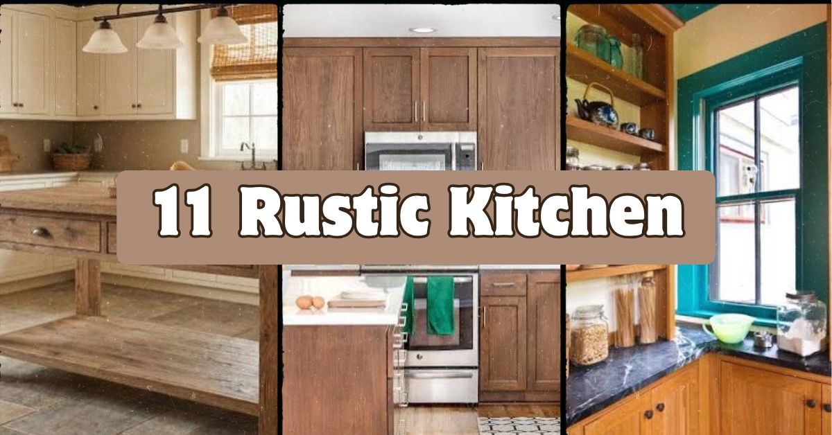
    1. Bring In a Reclaimed Wood Kitchen Island

    Reclaimed Wood Kitchen Island Storage, Rustic Kitchen Island With Drawers / Shelf, Counter Height Dining Table, Butcher Block Island - Etsy
    Credit: Etsy

    A big wood island is basically the heart of a rustic kitchen. I’m talking about a thick, chunky slab of wood, not some thin laminate top. Reclaimed barn wood works great because it already has dents, nail holes, and color variation baked in.

    Pair it with a contrasting base, maybe painted black metal legs or a distressed cabinet body. Keep the countertop simple. A butcher block finish or honed stone both work.

    Quick tip: seal reclaimed wood with a food-safe oil every few months to keep it from drying out and cracking.

    This idea flexes well too. Modern farmhouse kitchens use a cleaner wood slab with simple lines, while cabin-style spaces go for a rougher, thicker cut.

    Next, let’s talk about what goes above that island, because open shelving changes everything.

    2. Swap Upper Cabinets for Open Wood Shelving

    I Swapped My Upper Kitchen Cabinets for Open Shelves - Bob Vila
    Credit: Bob Villa

    Open shelves make a kitchen feel lighter and more personal. Instead of hiding your dishes behind cabinet doors, you show them off. Use raw or lightly stained wood boards mounted on iron brackets for that classic rustic look.

    Style your shelves with mismatched stoneware, wood cutting boards, and a few plants. Don’t overdo it though. Leave some breathing room so it doesn’t look cluttered.

    Practical tip: only put things you actually use often on open shelves. Dust builds up fast on stuff that just sits there for looks.

    In coastal kitchens, people use whitewashed shelves with woven baskets instead of dark wood, which shows how flexible this idea really is.

    Once your shelves are set, your wall color needs to match that same earthy vibe.

    3. Choose Warm, Earthy Wall Colors

    13 Earth-Tone Colors for a Nature-Inspired Home Palette
    Credit: Decorilla

    Color sets the whole mood in a rustic kitchen. You want warm neutrals, not stark white or cold gray. Think terracotta, olive green, warm taupe, and soft browns.

    Rustic Kitchen Color Palette Guide

    Wall ColorBest Paired Cabinet ColorAccent MetalMood Created
    Warm TaupeCream WhiteBlack IronSoft & Cozy
    TerracottaDark WalnutAged BrassBold & Earthy
    Olive GreenWeathered GrayCopperNatural & Calm
    Soft SandCharcoalBronzeAiry & Warm
    Deep BrownOff-WhiteMatte BlackMoody & Rich

    A quick tip here: test paint samples on the wall for a few days before committing. Lighting changes everything, especially in kitchens with lots of windows.

    Traditional homes lean toward deep brown and olive, while modern rustic spaces prefer sand and taupe for a lighter feel.

    With your wall color locked in, it’s time to think about the ceiling, because rustic kitchens often shine brightest up top.

    4. Expose or Add Wood Ceiling Beams

    8 Home Transformations with Stunning Exposed Beams
    Credit: sweeten

    Exposed beams instantly signal “rustic” to anyone who walks in. If your kitchen already has beams hidden behind drywall, sometimes it’s worth exposing them. If not, faux beams made from lightweight wood can fake the look convincingly.

    Stain them a dark walnut or leave them raw and weathered depending on your color scheme. They pull the eye up and make the whole room feel bigger and more architectural.

    Actionable tip: hang simple pendant lights from the beams instead of recessed lighting. It adds warmth and keeps the ceiling from feeling flat.

    Cabin-style kitchens go heavy with thick round beams, while farmhouse kitchens prefer straighter, thinner ones.

    Now that your ceiling has character, let’s ground the room with the right flooring.

    5. Install Wide-Plank Wood Flooring

    6 Interior Design Ideas to Complement Wide Plank Floors
    credit: Hardwood design Company

    Flooring makes a bigger difference than people expect. Wide wood planks, especially in a matte or slightly distressed finish, anchor the whole rustic look. Avoid glossy finishes. They read as modern, not rustic.

    Oak, hickory, and pine are all common choices. Darker stains create a moody feel, while lighter natural tones keep things bright and airy.

    Here’s a tip: if real wood isn’t in your budget, luxury vinyl plank with a wood-grain texture can fool almost anyone from a few feet away.

    Mediterranean rustic kitchens often swap wood for terracotta tile instead, which gives a similar warm, grounded feeling.

    Once your floor is sorted, your cabinets need to match that same natural, worn-in energy.

    6. Pick Cabinets With Visible Wood Grain or Distressed Paint

    12 Kitchens That Wow With Wood Cabinets
    Credit: Houzz

    Cabinets are basically the backbone of your kitchen’s look. For rustic style, skip the flat, painted MDF doors. Go for real wood with visible grain, or a distressed paint finish that shows a little wear on the edges.

    Shaker-style doors work great here because their simple lines let the wood texture do the talking. Add black iron pulls or leather strap handles for extra character.

    Practical tip: if you’re repainting existing cabinets, sand the edges lightly after painting to create that naturally worn look.

    Modern rustic kitchens often mix matte black cabinets with wood accents, blending sleek and cozy in one space.

    Once your cabinets are set, let’s talk about the sink, because rustic kitchens love a statement piece there too.

    7. Add a Farmhouse Apron Sink

    10 Drool-Worthy Farmhouse Sinks for Kitchens
    Credit: The spruce

    A deep, wide farmhouse sink isn’t just practical, it’s a design statement. The exposed front panel (called an apron) gives it that classic rustic charm. Fireclay or cast iron versions hold up well and age nicely over time.

    Pair it with a bridge-style faucet in an aged bronze or black finish. This combo alone can make a kitchen feel instantly more farmhouse.

    Quick tip: go with a sink at least 30 inches wide if you do a lot of cooking. Trust me, the extra space for pots and pans is worth it.

    Coastal kitchens often pair white apron sinks with brass fixtures for a lighter, beachy contrast.

    Speaking of fixtures, lighting is next on our list and it matters more than most people think.

    8. Hang Wrought Iron or Wood-and-Metal Light Fixtures

    Vintage Wrought Iron Hanging Chandelier – Hand-Forged Spanish Colonial & Mediterranean Lighting - Rustica House ®
    Credit: Rustica House

    Lighting fixtures are like jewelry for your kitchen. Wrought iron chandeliers, wood bead pendants, and metal lantern-style fixtures all scream rustic without saying a word.

    Stick to warm-toned bulbs, around 2700K to 3000K, for that golden, cozy glow instead of harsh white light.

    Lighting Style Comparison

    Fixture TypeMaterialBest Kitchen StyleApprox. Price Range
    Lantern PendantBlack Iron & GlassFarmhouse$60-150
    Wood Bead ChandelierNatural WoodBoho Rustic$100-250
    Mason Jar LightGlass & MetalCottage Rustic$40-90
    Antler-Style FixtureResin/MetalCabin Rustic$80-200
    Industrial Cage LightBlack MetalModern Rustic$50-120

    Tip: hang pendants about 30 to 36 inches above your island counter for the right proportion.

    Traditional kitchens favor ornate iron chandeliers, while modern rustic spaces go for simple cage-style fixtures.

    Now let’s bring in some texture through textiles, because a kitchen needs softness too.

    9. Layer in Woven and Natural Fiber Textiles

    The Natural Fiber Rug Your Bohemian Interior Has Been Missing – Natural Rug Co
    Credit: natural rug Co.

    Rustic kitchens need soft touches to balance all that wood and metal. Woven placemats, jute rugs, and linen curtains add texture without looking fussy.

    Stick to natural fibers like cotton, linen, and jute. Skip synthetic fabrics since they tend to look shiny and out of place.

    Tip: layer a jute runner rug in front of your sink. It’s practical for standing comfort and adds instant texture.

    Coastal rustic kitchens use lighter woven textures like seagrass, while cabin styles lean toward wool and flannel patterns.

    Next, let’s talk storage, because rustic kitchens often use it as a design feature, not just a hiding spot.

    10. Use Open Baskets and Crates for Storage

    How to use storage baskets properly: 5 organizing tips | Homes and Gardens
    Credit: Home And gardens

    Instead of stashing everything in cabinets, rustic kitchens often show off storage with woven baskets, wooden crates, or metal bins. Store fruit, bread, or linens in these instead of plastic containers.

    This does double duty. It looks charming and it’s genuinely useful. Stack a few wooden crates for extra pantry storage if you’re short on cabinet space.

    Tip: label baskets with small wood or metal tags so everything stays organized and easy to find.

    Farmhouse kitchens love this idea most, but even modern rustic spaces use sleek metal bins for the same effect.

    Now let’s add some greenery, because plants bring life into an otherwise all-natural-material space.

    11. Add Potted Herbs and Greenery on Open Surfaces

    15 Vertical Wall Herb Arrangements For Small Spaces
    Credit: Mintypan

    Plants soften all the hard textures in a rustic kitchen. Small potted herbs on a windowsill or open shelf add color and a little life to the space. Rosemary, basil, and thyme work great since you can actually use them while cooking.

    Terracotta pots fit the rustic vibe better than plastic or ceramic ones. Group a few different heights together for visual interest.

    Tip: place herb pots near a window that gets at least four hours of sunlight a day so they actually survive past week one.

    Modern rustic kitchens sometimes swap herbs for larger statement plants like fiddle leaf figs for a cleaner, more sculptural look.

    Last but not least, let’s talk about the small details that pull everything together.

    12. Mix Metal Finishes for Depth

    How to Mix Metals in Your Home Decor: 6 Tips to Follow
    Credit: The Spruce

    A lot of people think rustic means everything matches. Actually, the opposite is true. Mixing black iron, aged brass, and copper finishes across your faucet, cabinet hardware, and light fixtures creates depth and keeps the kitchen from feeling flat.

    Pick one dominant metal, then add one or two accent metals in smaller doses like drawer pulls or a single pendant light.

    Tip: keep your faucet and sink hardware in the same finish, but feel free to mix everything else.

    This trick works across every rustic variation, from cabin to coastal, since mixed metals read as collected-over-time rather than matchy-matchy.

    With all twelve ideas in place, your kitchen should already feel warmer and more personal. Let’s wrap up with some quick success tips.

    Tips for Success

    • Start with flooring and wall color first since they’re the hardest to change later.
    • Buy one or two real statement pieces (like a reclaimed wood island) rather than lots of cheap rustic-looking decor.
    • Keep your color palette to three main tones so the space doesn’t feel busy.
    • Add texture through textiles and baskets before buying more furniture.
    • Test paint and stain samples in your actual kitchen lighting, not under store lights.
    • Balance rough textures with at least one smooth surface, like polished stone counters, so it doesn’t feel too heavy.
    • Shop secondhand stores for authentic worn furniture pieces instead of buying new “distressed” items.

    Common Mistakes and How to Avoid Them

    Overdoing dark wood everywhere
    : Balance dark wood with lighter walls or countertops so the room doesn’t feel like a cave.

    Buying fake-looking distressed furniture
    : Look for pieces with real wear patterns, or lightly distress your own furniture with sandpaper for a more authentic look.

    Skipping texture variety
    : Mix wood, metal, stone, and fabric so the kitchen doesn’t feel one-note.

    Using cold white lighting
    : Stick to warm bulbs around 2700K to 3000K for that cozy glow rustic kitchens need.

    Cluttering open shelves
    : Only display items you use weekly and leave open space between groupings.

    Ignoring the ceiling
    : Beams or wood paneling up top make a huge difference, don’t skip this detail just because it’s out of the normal sightline.

    Similar Variations

    • Modern Rustic: Cleaner lines, matte black metal, and simple wood tones for a less cluttered farmhouse feel.
    • Cabin Rustic: Heavier wood beams, stone accents, and darker color palettes inspired by mountain lodges.
    • Coastal Rustic: Lighter wood tones, whitewashed finishes, and woven natural textures for a beachy twist.
    • Industrial Rustic: Combines raw metal, exposed brick, and reclaimed wood for a warehouse-meets-farmhouse vibe.
    • Scandinavian Rustic: Light wood, minimal decor, and soft neutral tones for a cozy yet uncluttered look.
    • Southwestern Rustic: Terracotta tones, wrought iron details, and clay tile floors for a warm desert feel.

    Building a rustic kitchen really comes down to picking natural materials and letting them show their age and texture instead of hiding it. Once you nail the big stuff like flooring, cabinets, and lighting, the smaller details like baskets and greenery practically style themselves. I hope these ideas give you a clear starting point for creating your own 11 Rustic Kitchen that feels warm, welcoming, and totally yours.

  • 14 Fall Living Room Decor Ideas That Actually Feel Cozy (Not Cluttered)

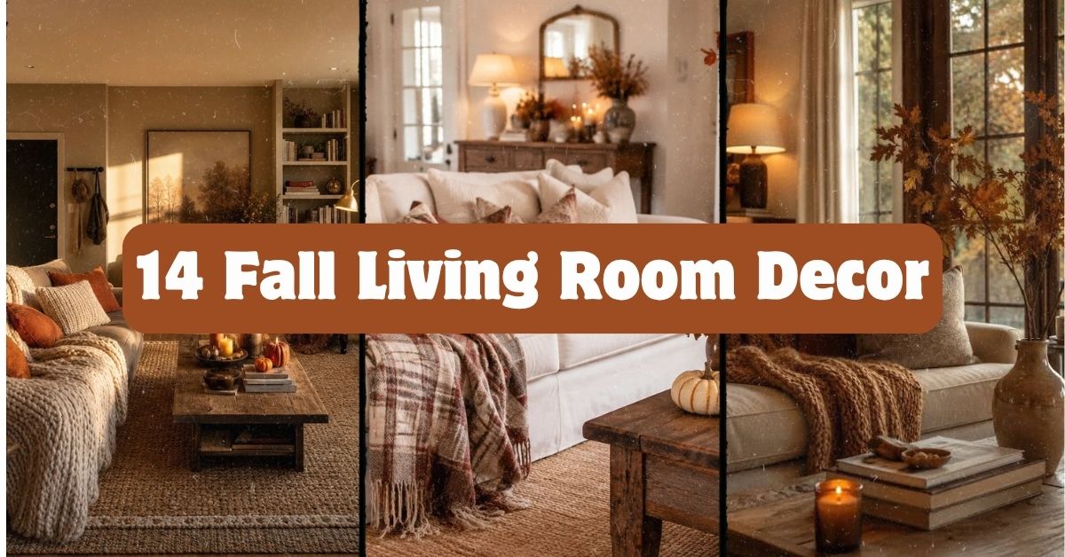
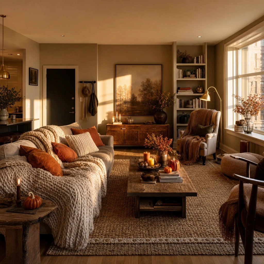
    14 Fall Living Room Decor Ideas That Actually Feel Cozy (Not Cluttered)

    I’ve put together 14 fall living room decor ideas that will make your space feel warm and inviting the second the temperature drops. If you’ve ever stood in your living room wondering why it still feels like summer even though there’s a chill in the air, I get it. That’s exactly the problem this guide is here to fix.

    Fall living room decor refers to seasonal design changes that bring warmth, texture, and autumn color into a space through textiles, lighting, and accessories. It typically includes swapping pillows, adding layered lighting, and using natural materials like wood and wool.

    Stick with me and I’ll walk you through 14 specific ways to pull this off, plus the mistakes that make rooms look messy instead of cozy.

    What Makes Fall Living Room Decor Different

    Fall decor isn’t about pumpkins on every shelf. It’s about mood. Think warm light, soft textures, and colors that remind you of leaves changing outside your window. I always tell people the goal is to make a room feel like a hug. That means layering blankets, swapping out cold metals for warmer tones, and bringing in scents and textures that feel like autumn without turning your living room into a craft store display. The best fall spaces use restraint. A few good pieces beat ten random ones every time. Once you get that mindset down, the rest of this list will make a lot more sense.

    1. Swap Your Throw Pillows for Warm, Textured Fabrics

    35 Living Room Fall Decor Ideas for a Cozy Home
    Credit: Nikki

    This is the easiest change you can make, and it costs the least. Pull out your bright summer pillows and bring in ones with texture, think corduroy, chunky knit, or boucle. Colors like rust, mustard, deep olive, and chocolate brown instantly warm up a couch.

    Pick two or three colors max so it doesn’t look chaotic. Mix textures more than colors for a layered look that still feels calm.

    Actionable tip: Buy pillow covers instead of whole new pillows. You save money and storage space.

    This works in almost any style. Modern homes can stick to solid colors in these tones, while traditional spaces can add small patterns like plaid or houndstooth.

    Once your pillows are sorted, it’s time to think about what’s under your feet.

    2. Layer a Wool or Chunky Knit Rug for Warmth

    15 Fall Living Room Decor Trends for 2026
    Credit: Nikki

    Rugs do more for a room’s temperature feel than people realize. A chunky wool or knit rug adds warmth underfoot and visually softens a room the second you walk in.

    Layer it over a jute or sisal rug if you already have one down. This adds depth without buying two full-price rugs.

    Actionable tip: Choose a rug about 2 to 4 inches smaller than your current one so the layered edges show.

    Coastal homes can use a lighter oatmeal tone. Farmhouse and traditional spaces do well with deeper browns or plaid patterns.

    Now that your floor feels cozier, let’s talk about what’s happening at eye level with your lighting.

    3. Swap Cool White Bulbs for Warm Amber Lighting

    27 Cozy Fall Living Room Ideas That Feel Warm, Not Cluttered - Zalewska Home
    Credit: Zalewska Home

    Lighting changes everything about how a room feels. Cool white bulbs make a space feel clinical. Warm amber bulbs, around 2700K, make everything look softer and more golden, which is exactly the fall mood you want.

    Add a few table lamps if you only have one overhead light. Multiple light sources at different heights make a room feel layered and intentional.

    Actionable tip: Use dimmable bulbs so you can adjust brightness as it gets darker earlier in the evening.

    This trick works in every design style because it’s about temperature, not aesthetic. Even minimalist rooms benefit from warmer light.

    Speaking of warmth, let’s talk about candles and how they add both light and scent to your space.

    4. Bring in Layered Candles for Scent and Ambiance

    Autumn Interior Design: Cozy Fall Decor Tips for Your Home
    Credit: DecorMatters

    Candles do double duty. They add flickering light and a seasonal scent, think cinnamon, cedar, or fig, without overwhelming the room.

    Group candles of different heights on a tray instead of scattering them everywhere. This creates a little vignette instead of clutter.

    Actionable tip: Stick to one scent family per room so smells don’t compete with each other.

    Modern spaces look great with simple glass jar candles. Traditional and farmhouse rooms can use pillar candles in wood or metal holders.

    Once your lighting and scent are dialed in, it’s time to think bigger, literally, with your furniture arrangement.

    Budget Breakdown for Fall Living Room Refresh

    Budget TierWhat You GetEstimated Cost
    Low ($50-100)New pillow covers, 2-3 candles, throw blanket$50-100
    Mid ($150-300)Above plus a layered rug and warm bulbs$150-300
    High ($400+)Above plus new lamp, art print, and wood accents$400-600

    5. Rearrange Furniture to Create a Cozier Conversation Area

    51 Small Living Room Ideas for a Cozy Common Area | Architectural Digest
    Credit: Architecture

    Sometimes the biggest fall decor update isn’t a new item at all. It’s rearranging what you already have. Pull your seating closer together to create a tighter, more intimate conversation area. This naturally feels cozier than furniture spread far apart.

    Angle chairs slightly toward the couch instead of lining everything up straight against walls.

    Actionable tip: Leave about 3 feet between pieces so the space still feels open, not cramped.

    This works no matter your style. Modern rooms can keep clean lines while traditional spaces might add an extra accent chair for a more layered look.

    With your furniture settled, let’s add some greenery that still fits the fall mood.

    6. Add Dried or Faux Fall Foliage in Simple Vases

    Favorite Fall Stems & Foliage - Love Grows Wild
    Credit: Love Grows Wild

    Fresh flowers feel more like spring or summer. For fall, switch to dried branches, faux eucalyptus with warm tones, or wheat stalks in a simple ceramic or glass vase.

    Keep arrangements a little wild and asymmetrical rather than perfectly round. It looks more natural that way.

    Actionable tip: Spray craft paint lightly on faux leaves in rust or gold tones if you want a custom look without buying new stems.

    Coastal homes can use pampas grass in a light vase. Traditional spaces look great with deeper red or orange dried hydrangeas.

    Now let’s move to the walls, because fall decor isn’t just about surfaces you touch.

    7. Layer Wall Art With Warm, Moody Tones

    30 Fall Decorating Ideas for a Cozy Autumn Home
    Credit: DecoMatters

    Swap out any bright, summery art for pieces with deeper, moodier colors. Think landscape prints in amber and brown tones, abstract art with warm gradients, or vintage botanical prints.

    You don’t need to buy all new frames. Just switching the art inside frames you already own makes a big difference.

    Actionable tip: Group three different-sized frames in an asymmetrical cluster instead of one big piece for more visual interest.

    Modern homes can lean into abstract warm-toned art. Traditional rooms do well with classic landscape or still life paintings.

    Once your walls feel seasonal, let’s talk about the couch itself.

    8. Drape a Chunky Knit Throw Blanket Over the Sofa

    Cozy Fall Apartment Decor Ideas That Reveal The One Detail Making Every Room  Feel Like Autumn - Edward George
    Credit: Edwards

    A throw blanket draped just right instantly signals “cozy season” the moment someone walks in. Chunky knit or faux fur textures work best for fall.

    Don’t fold it perfectly. A slightly rumpled, lived-in drape over the arm of the couch looks more inviting than a stiff, folded square.

    Actionable tip: Buy blankets in a color one shade darker than your pillows so they complement without matching exactly.

    This idea works everywhere. Coastal rooms can use a cream cable knit, while farmhouse spaces might go with a plaid design.

    Blankets bring in texture, but let’s talk about another material that instantly says fall: wood.

    9. Bring in Natural Wood Accents Through Trays and Bowls

    55 Designer-Approved Ways to Decorate Your Home for Fall
    Credit: House Beautiful

    Wood adds warmth without adding color, which makes it a safe choice if you’re worried about going overboard with orange and brown everywhere. A simple wood tray on your coffee table or a wood bowl filled with pinecones does the trick.

    Mix wood tones instead of matching them exactly. A slightly different shade of wood feels collected, not mass-produced.

    Actionable tip: Use a wood tray to corral remote controls and coasters so it’s functional, not just decorative.

    Modern homes can use lighter woods like ash or white oak. Traditional or rustic spaces look great with darker walnut tones.

    Speaking of the coffee table, let’s talk about how to style it as a whole.

    10. Style Your Coffee Table With a Layered Centerpiece

    5 Minute Fall Vignettes - Easy Decorating - Cali Girl In A Southern World
    Credit: Call Girl

    A coffee table with one lonely candle looks unfinished. Instead, layer a stack of books, a small vase, and a tray together for a styled but lived-in look.

    Vary the heights. Tall vase, medium stack of books, low dish. This creates visual interest without looking cluttered.

    Actionable tip: Keep the color palette of your coffee table items within two or three tones so it feels curated.

    This idea flexes easily. Minimalist homes can use just two items, while eclectic spaces can layer four or five.

    Now that your table is styled, let’s look up at your mantle or shelving if you have one.

    Fall Color Palette Combinations by Style

    Home StylePrimary ColorsAccent Colors
    ModernCharcoal, creamRust, burnt orange
    FarmhouseWarm white, tanDeep red, olive green
    CoastalSand, oatmealSoft amber, sage
    TraditionalChocolate brown, goldCranberry, mustard

    11. Style Your Mantle or Shelves With Seasonal Layers

    20+ Best Fall Mantel Decor Ideas You'll Love This Season
    Credit: one kindesign

    If you have a mantle or open shelving, this is prime real estate for fall styling. Layer a mirror or art piece in the back, then add candles, small vases, and a stack of books in front.

    Odd numbers of items, three or five, tend to look more balanced than even numbers.

    Actionable tip: Leave some negative space. Not every inch needs to be filled to feel styled.

    Traditional homes can add garland along the mantle edge. Modern spaces should keep it sparse with just two or three sculptural pieces.

    Once your shelves are done, let’s think about scent beyond candles.

    12. Add a Simmer Pot or Diffuser for Background Scent

    How to make a home smell nice for fall | Homes and Gardens
    Credit: Home and Garden

    Beyond candles, a simmer pot on the stove with cinnamon sticks, orange peel, and cloves fills your whole living room with fall scent without any fire risk. If you don’t want to deal with the stove, a reed diffuser in a similar scent works too.

    This is a subtle touch, but it changes how a room feels the second you walk in.

    Actionable tip: Refresh diffuser oils every 4-6 weeks since scent fades faster than you’d think.

    This idea works in every home style since it’s invisible. Nobody sees a scent, they just feel the mood it creates.

    Now let’s talk about something people forget: window treatments.

    13. Swap Light Curtains for Heavier, Warmer Fabric Panels

    Summer Curtain Swap Guide: Keep Your Home Cool Room by Room – Joydeco
    Credit: JoyDeco

    Thin linen curtains that feel great in summer can feel a little bare once fall hits. Swapping to a heavier fabric, like velvet or a thicker cotton blend, adds warmth and blocks out the earlier evening darkness.

    Choose a color that’s a shade or two darker than your walls so the curtains frame the window without overwhelming it.

    Actionable tip: Hang curtains a few inches above the window frame to make ceilings look taller while you’re at it.

    Modern homes can stick to solid deep colors. Traditional spaces might add subtle texture like a herringbone weave.

    Last on the list is something small but mighty: your entry table or console, if your living room has one.

    14. Style Your Console Table With a Fall Vignette

    33 Fall Living Room Decor Ideas to Cozy Up Your Space
    Credit: the spruce

    If your living room has a console table or entryway table nearby, use it as a small styling moment. A lamp, a small stack of books, and a seasonal object like a ceramic pumpkin or dried floral stem work well together.

    Keep the vignette to three or four items so it doesn’t compete visually with the rest of the room.

    Actionable tip: Rotate one item seasonally instead of redoing the whole table, it saves time and money.

    This works in every style since console tables are pretty universal. Just adjust the objects to match your home’s overall vibe.

    Tips for Success

    • Start with lighting and textiles before buying anything new. Half the fall feeling comes from warm bulbs and texture swaps you might already own.
    • Stick to a three-color palette max across the whole room so it feels cohesive, not chaotic.
    • Shop your own house first. Move items from other rooms before buying new decor.
    • Layer textures more than colors. A room with five different browns in different materials looks richer than five different colors.
    • Don’t decorate every surface. Leaving some empty space makes the styled areas stand out more.
    • Buy a few higher-quality pieces instead of many cheap ones. A good throw blanket will outlast ten dollar-store items.

    Common Mistakes and How to Avoid Them

    Overdoing pumpkin decor
    : Fall decor doesn’t need to be literal. Skip the pumpkin on every surface and focus on color, texture, and lighting instead.

    Using too many bright orange tones
    : Bright orange can feel more Halloween than autumn. Stick to rust, terracotta, and deeper amber tones for a more sophisticated look.

    Forgetting to change lighting
    : New pillows won’t matter much if your lighting is still cold and bright. Warm bulbs make the biggest difference of anything on this list.

    Cluttering every surface
    : More isn’t cozier. Leave breathing room between decor items so the room doesn’t feel busy.

    Ignoring scent
    : A room can look perfect and still feel off if it smells like nothing. A simmer pot or one good candle finishes the look.

    Matching everything exactly
    : Perfectly matched sets look staged. Mix tones and materials slightly for a more natural, collected feel.

    Similar Variations

    • Hygge Living Room Decor: Focuses on Scandinavian-style coziness with neutral tones, soft textiles, and minimal clutter year-round.
    • Rustic Farmhouse Fall Decor: Leans into reclaimed wood, plaid patterns, and vintage-inspired accessories for a more country feel.
    • Modern Autumn Minimalism: Keeps the color palette and item count low while still nodding to the season through one or two bold accent pieces.
    • Coastal Fall Transition Decor: Softens typical fall oranges into sandy, muted tones that still feel beachy even as temperatures drop.
    • Moody Boho Fall Decor: Uses darker jewel tones, layered textiles, and global-inspired patterns for a richer, eclectic autumn look.

    Getting your living room ready for fall doesn’t require a full remodel or a shopping spree. Small swaps, warmer bulbs, a chunky blanket, a new candle scent, add up fast when you layer them thoughtfully. The real trick is restraint. Pick a few ideas that fit your space and your budget, and let them do the work instead of trying to cram in all 14 at once. However you mix and match them, these 14 fall living room decor ideas give you a real starting point for a space that feels warm the second the season changes.

  • 13 Small Living Room Ideas

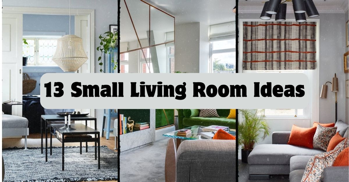
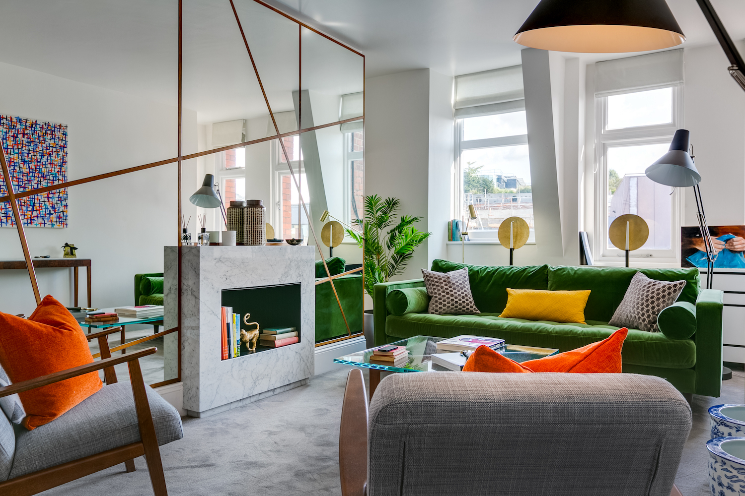
    13 Small Living Room Ideas

    I’ve spent way too many hours scrolling through design blogs looking for 13 small living room ideas that actually work in real homes, not just magazine spreads, and I think I finally cracked the code.

    What are the best small living room ideas? The best small living room ideas focus on multi-functional furniture, light color palettes, smart storage, and vertical space use. These strategies make a compact room feel bigger, brighter, and more livable without a full renovation.

    Stick with me here. I’m about to walk you through everything I’ve learned from redoing my own cramped living room, plus tricks designers use that nobody talks about enough.

    What Makes Small Living Room Design Different

    Small living rooms play by their own rules. You can’t just shrink big-room ideas and expect them to work. Every piece of furniture has to earn its spot. Every color choice matters more because there’s less room for it to breathe. I used to think small spaces meant sacrificing style, but that’s just not true anymore. The trick is thinking in layers: what you need, what you love, and what tricks the eye into seeing more space than there really is. Once you get that mindset, decorating a tight living room actually gets kind of fun. It’s like solving a puzzle where the prize is a room you actually want to hang out in.

    1. Choose a Light, Airy Color Palette

    51 Living Room Color Schemes From Bold to Understated
    Credit: the spruce

    Dark colors can make a small room feel like a cave. Light colors do the opposite. They bounce light around and make walls feel like they’re pushing back a little.

    I’m not saying paint everything stark white. Soft neutrals like warm beige, pale sage, or light gray all work great too. The goal is keeping most surfaces light so the room feels open, then adding personality through smaller accents.

    Actionable tip: Paint your ceiling one shade lighter than your walls. This trick makes ceilings feel higher than they actually are.

    This idea flexes easily. Coastal homes might lean into soft blues and whites. Modern spaces could go monochrome gray. Traditional rooms often stick with creamy neutrals. Once your base color is set, it’s time to think about how furniture fits into that light backdrop.

    2. Pick Furniture That Does Double Duty

    How to Choose Multi-Functional Furniture for Small Spaces | Houzz AU
    Credit: Houzz

    Small rooms don’t have room for pieces that only do one job. A coffee table that opens up for storage. An ottoman that hides blankets. A sofa bed for guests. These pieces save space while still looking good.

    I switched my old coffee table for a storage ottoman last year and it changed everything. Suddenly I had a place for remotes, magazines, and random junk that used to pile up on the floor.

    Actionable tip: Measure your space before shopping. Multi-functional furniture is often bulkier than single-purpose pieces, so know your limits.

    Modern homes might choose sleek lift-top tables. Farmhouse style could use a woven storage trunk instead. Either way, this approach clears clutter fast. Speaking of clutter, let’s talk about where the rest of your stuff should go.

    3. Use Vertical Storage Instead of Floor Space

    Small home storage ideas - My homes Life
    Credit: My Homes Life

    When floor space is tight, look up. Tall bookshelves, wall-mounted cabinets, and floating shelves all store stuff without eating into your walking room.

    I added two floating shelves above my TV console and it freed up so much floor space. Books, plants, and picture frames all moved up and out of the way.

    Actionable tip: Install shelves at varying heights to draw the eye upward, which makes ceilings feel taller.

    This works in almost any style. Industrial rooms might use metal pipe shelving. Traditional spaces could go with built-in white cabinetry. Once your storage is vertical, your next move is making sure your furniture arrangement matches that same space-saving logic.

    Small Living Room Furniture Size Guide

    Furniture PieceSmall Room Size (under 150 sq ft)Medium Room Size (150-250 sq ft)
    SofaLoveseat, 60-65 inchesStandard sofa, 72-78 inches
    Coffee Table24-36 inches wide36-48 inches wide
    TV StandUnder 48 inches wide48-60 inches wide
    Area Rug5×7 feet8×10 feet
    Accent Chair28-30 inches wide30-34 inches wide

    4. Float Furniture Away From the Walls

    This one surprised me. I always thought pushing everything against the walls opened up more space. Turns out, floating furniture slightly away from walls can actually make a room feel more intentional and bigger.

    Try pulling your sofa a few inches off the wall. Add a slim console table behind it if you have the room. This creates a sense of flow instead of a room that feels like it’s hugging its edges out of necessity.

    Actionable tip: Leave at least 30 inches of walking space between furniture pieces so the room doesn’t feel like an obstacle course.

    Mid-century modern rooms love this floating technique. Traditional spaces can do it too, just with slightly more furniture spacing. Once your layout breathes a little, mirrors can push that open feeling even further.

    5. Hang a Large Mirror to Bounce Light Around

    Living room mirror ideas – 10 ways to add light and style | Livingetc
    Credit: livingltc

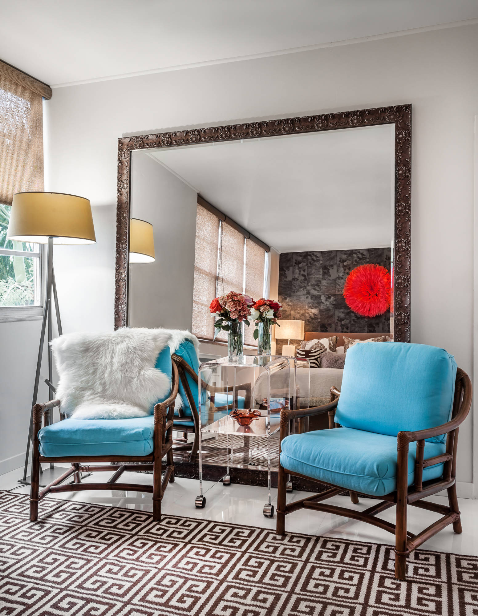
    Mirrors are like cheat codes for small rooms. They reflect light, they reflect the room itself, and they trick your brain into thinking there’s more square footage than there is.

    I hung a large mirror across from my window and the room noticeably brightened up. It also made the space feel twice as big without moving a single piece of furniture.

    Actionable tip: Position mirrors to reflect a window or a piece of art, not a blank wall, for the best effect.

    Coastal and modern homes often use round or arched mirrors. Traditional rooms lean toward ornate framed styles. Once light is bouncing around your room, let’s talk about how to layer in real light sources too.

    6. Layer Multiple Light Sources

    Small living room lighting ideas: 29 designs and expert advice | Homes and  Gardens
    Credit: Homes and garden

    Overhead lighting alone makes small rooms feel flat and kind of harsh. Layering light sources like floor lamps, table lamps, and even string lights creates depth and warmth.

    I added a floor lamp in the corner of my living room and a small table lamp near my reading chair. Suddenly the whole room felt cozier, even at the same brightness level.

    Actionable tip: Use warm-toned bulbs (around 2700K) for a cozy glow instead of harsh white light.

    Farmhouse rooms might use lantern-style lamps. Modern spaces often go for sculptural lighting pieces. With your lighting sorted, it’s time to think about what’s on the floor beneath all that glow.

    7. Layer a Small-Scale Rug for Definition

    5 Creative Ways to Achieve a Perfect Layered Rug Living Room
    Credit: Decorrilla

    Rugs anchor a room, but in small spaces, the wrong size rug can make things feel chaotic. A rug that’s too small floats awkwardly. One that’s too big overwhelms the space.

    I learned this the hard way with a rug that barely fit under my coffee table. Once I upgraded to a size that reached under my sofa’s front legs, the whole layout suddenly made sense.

    Actionable tip: Choose a rug that extends at least a few inches past your coffee table on all sides.

    Bohemian rooms love layered rugs with pattern. Minimalist spaces do better with a single solid tone. Once your rug is set, your wall decor should follow the same balancing act.

    8. Decorate Walls With a Purposeful Gallery Layout

    Living room gallery wall ideas – 10 ways to add design flair | Livingetc
    Credit: Livingtc

    Empty walls feel unfinished, but cluttered walls feel chaotic. In small rooms, a curated gallery wall hits the sweet spot. It draws the eye up, adds personality, and doesn’t take up any floor space at all.

    I arranged a mix of framed photos and small art prints above my sofa and it became the focal point of the whole room.

    Actionable tip: Lay your frames out on the floor first to plan spacing before hammering a single nail.

    Traditional homes might use matching frames for a formal look. Eclectic spaces mix frame styles and sizes freely. Once your walls are working for you, curtains are the next easy win.

    9. Hang Curtains High and Wide

    How high should I hang my curtains? The rules designers follow | Homes and  Gardens
    Credit: Homes and garden

    This trick is simple but so many people skip it. Hanging curtains close to the ceiling, rather than right above the window frame, makes windows (and the whole room) look taller.

    I moved my curtain rod up about eight inches and it made a noticeable difference. The window suddenly looked bigger than it actually is.

    Actionable tip: Hang curtains a few inches wider than the window frame so they don’t block natural light when open.

    Coastal rooms love sheer, breezy curtains. Traditional spaces might choose heavier drapes with more structure. Once your windows are dressed properly, let’s think about furniture shapes that keep pathways clear.

    10. Choose Furniture With Exposed Legs

    How to Make a Small Room Look Bigger Without Knocking Down Walls — JJones  Design Co.
    Credit: JJones

    Furniture that sits flush on the floor, like a sofa with a solid base, blocks sightlines and makes rooms feel heavier. Furniture with exposed legs lets light and floor space peek through underneath.

    I swapped my old boxy armchair for one with slim wooden legs and the whole corner of my room instantly felt lighter.

    Actionable tip: Look for furniture legs at least 4 inches tall to maximize that open, airy feeling underneath.

    Mid-century and Scandinavian styles are built around this idea. Traditional homes can still use it with turned wood legs instead of sleek metal ones. Next, let’s talk about a decor trick that’s often overlooked: scale.

    11. Match Decor Scale to Room Size

    Small Living Room Ideas — Small Living Room Decorating Ideas
    Credit: House Beautiful

    Oversized decor items can swallow a small room whole. A giant vase or a huge piece of art might look great in photos, but in real life, it competes for attention with everything else.

    I made this mistake with a large floor vase that ended up blocking a walking path. Once I swapped it for a smaller tabletop version, the room felt way more balanced.

    Actionable tip: Choose one or two statement pieces max, and keep everything else smaller in scale.

    Minimalist rooms thrive on this restraint. Maximalist spaces can still follow this rule, just with more pattern instead of size. Once your decor scale feels right, built-in seating is worth considering too.

    Budget Tiers for Small Living Room Makeovers

    Budget LevelWhat You Can AffordExample Updates
    Under $200Paint, small decor, curtainsNew throw pillows, wall art, curtain rods
    $200-$800Furniture pieces, rugsAccent chair, area rug, floor lamp
    $800-$2,500Major furniture swapsNew sofa, storage ottoman, gallery wall frames
    $2,500+Full room redesignBuilt-in shelving, custom curtains, new flooring

    12. Add Built-In or Corner Seating

    22 Pretty Ideas for Living Room Corners
    Credit: My Domaine

    Corners often get wasted in small living rooms. Adding a built-in bench or a corner sofa uses that dead space efficiently while still giving you comfortable seating.

    I added a small corner bench with storage underneath and it instantly made my room feel more thought out, not just furnished.

    Actionable tip: Choose a corner unit with a slim profile so it doesn’t visually dominate the room.

    Farmhouse style loves a window seat with cushions. Modern rooms might choose sleek L-shaped sectionals scaled down for smaller footprints. With seating sorted, let’s finish with one more trick that ties the whole room together.

    13. Use a Consistent Color Thread Throughout

    Red thread theory: How can you use it in your home? - Newgate Clocks –  Newgate World
    Credit: New Gate World

    Jumping between too many colors and patterns makes small rooms feel busy and disconnected. Picking one or two accent colors and repeating them through pillows, art, and small decor ties everything together.

    I picked a soft terracotta as my accent color and used it in three spots: pillows, a small vase, and one framed print. That repetition made the whole room feel pulled together instead of random.

    Actionable tip: Pick your accent color from something you already own and love, like a favorite blanket or piece of art.

    Bohemian rooms can use warm, earthy accent threads. Coastal homes might repeat a soft blue instead. This final touch really is what makes all the other ideas click into place.

    Tips for Success

    • Measure twice before buying any furniture, tape measures are cheaper than return shipping
    • Keep a clear pathway of at least 24 inches through the main walking areas
    • Test paint colors on the wall at different times of day before committing
    • Shop secondhand for statement pieces to save money for higher-impact items like rugs or lighting
    • Stick to a repeating color palette of no more than three main colors
    • Prioritize function first, then style, when picking new furniture
    • Declutter before decorating, empty space itself is a design tool

    Common Mistakes and How to Avoid Them

    Buying furniture too big for the room
    : Measure your space and leave walking room before falling in love with an oversized piece.

    Using too many dark colors
    : Stick to a mostly light palette and save dark tones for small accents only.

    Ignoring vertical space
    : Use wall shelves and tall furniture to store items without crowding the floor.

    Skipping a rug or choosing the wrong size
    : Pick a rug that fits under the front legs of your main seating for a grounded look.

    Overcrowding walls with too much decor
    : Plan gallery walls on paper or the floor first, and leave some breathing room between pieces.

    Forgetting about lighting layers
    : Add at least one floor lamp or table lamp beyond your main overhead light.

    Similar Variations

    • Cozy Cottage Living Room: Warm textures, soft florals, and layered throws for a snug feel
    • Scandinavian Minimalist Living Room: Clean lines, light wood, and a mostly white and gray palette
    • Urban Industrial Living Room: Exposed brick, metal accents, and moody neutral tones
    • Coastal Casual Living Room: Light blues, natural fibers, and breezy sheer curtains
    • Eclectic Bohemian Living Room: Mixed patterns, layered rugs, and warm earthy colors
    • Modern Farmhouse Living Room: Shiplap accents, neutral tones, and a mix of rustic and clean furniture

    Small living rooms don’t have to feel cramped or boring. A few smart swaps, some thoughtful color choices, and a little creativity with storage can completely change how a room feels to live in. The best part is you don’t need a huge budget or a full renovation to see real results. Start with one or two ideas from this list, see how they feel, and build from there. That’s really the whole secret behind these 13 Small Living Room Ideas: small changes, done thoughtfully, add up to a room that finally feels like yours.
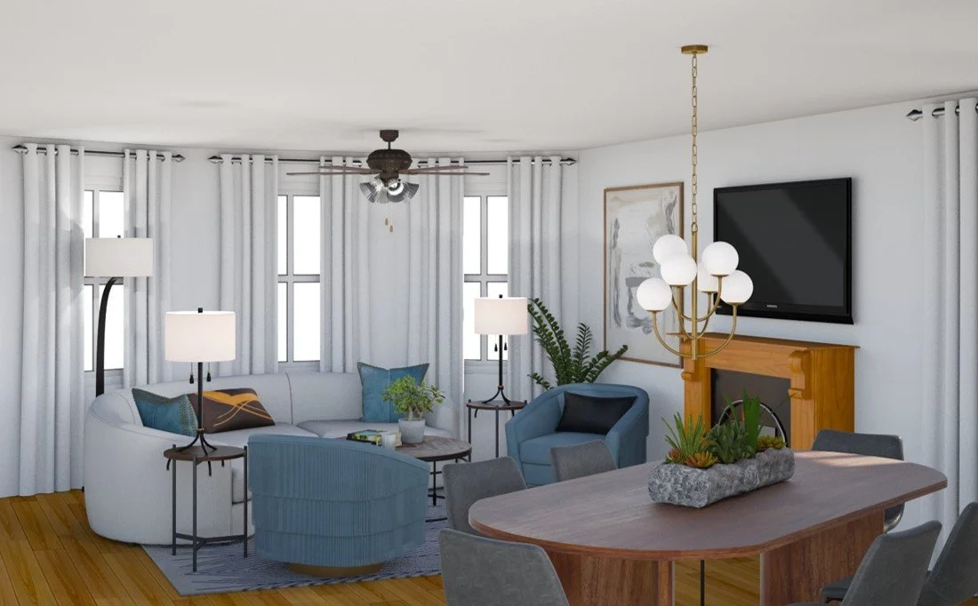
  • 10 Living Room Wall Decor Ideas That Actually Work

    10 Living Room Wall Decor Ideas That Actually Work

    I’ve spent way too many weekends staring at blank walls trying to figure out 10 living room wall decor ideas that don’t look like everyone else’s Pinterest board, and I finally cracked the code. This guide is going to save you the trial and error I went through.

    Living room wall decor refers to the art, mirrors, shelves, and decorative objects placed on walls to add style, personality, and visual balance to a space. The right combination improves flow, hides flaws, and makes a room feel finished.

    Stick around, because I’m about to walk you through more than a dozen ways to dress up your walls, plus a few mistakes that quietly wreck a good design.

    What Makes Wall Decor Actually Work

    Here’s the thing about wall decor. It’s not just about hanging a pretty picture and calling it done. Good wall decor works with your furniture, your lighting, and the size of your room. It pulls your eye around the space instead of letting it get stuck in one boring corner.

    I think of walls as the fourth piece of furniture in any room. They’re not empty space to ignore. They’re a chance to add color, texture, or a little humor if that’s your thing. The trick is balance. Too much on the walls feels cluttered. Too little feels cold and unfinished. Once you find that middle ground, everything else in the room just clicks into place.

    1. Build a Gallery Wall With Mixed Frame Sizes

    How To Make A Gallery Wall (Selecting, Arranging + Layout Ideas!) - Studio  DIY
    Credit: Studio

    A gallery wall is a cluster of framed pieces arranged together on one wall. Mix big frames with small ones so it doesn’t look too matchy. Use a variety of frame colors like black, wood, and gold for depth.

    Start by laying your frames out on the floor first. This saves you from a wall full of extra nail holes. Aim for two to three inches between each frame for a tight, gallery-style look.

    This idea flexes easily. Traditional homes can use ornate gold frames with family portraits. Modern spaces look great with thin black frames and abstract prints. Coastal rooms can swap in beachy prints and driftwood frames.

    Once your gallery wall is up, you might want something bigger to anchor the opposite side of the room, which brings me to oversized art.

    2. Hang One Oversized Statement Piece

    Giant Statement Art | Geometric Wall Hanging | Living Room Decor – We Are  Lunarium
    Credit: We Are Linarium

    Sometimes less really is more. A single large painting, print, or tapestry above your sofa can do more work than ten small pieces combined. Go for something that’s roughly two-thirds the width of your couch for the best proportion.

    Pick a piece with colors that echo something already in the room, like a throw pillow or a rug. That connection makes the whole space feel pulled together instead of random.

    Practical tip: Hang the center of the piece at eye level, about 57 to 60 inches from the floor, regardless of ceiling height.

    This works in almost any style. Modern homes love abstract, bold color-block art. Farmhouse rooms often go for black and white landscape shots blown up big.

    Now that you’ve got a focal point, let’s talk about texture, because flat art isn’t the only option.

    3. Add a Woven Wall Hanging for Texture

    20 Wall hangings that will add texture to your space - Stacy Risenmay
    Credit: Stacy

    Woven wall hangings, like macrame or fiber art, bring warmth and texture that flat art just can’t match. They’re especially good on walls near soft furniture like a linen sofa or a boucle chair.

    These pieces work because they add a tactile, handmade feel to a room that can otherwise feel flat or too polished. Neutral tones like cream, tan, and rust are popular because they blend with almost any color scheme.

    Actionable tip: Hang your woven piece slightly off-center above a reading chair instead of dead center over the sofa. It creates a more relaxed, lived-in vibe.

    Boho and coastal homes practically live for this look. Even modern spaces can pull it off if you keep the piece simple and monochrome.

    Speaking of texture, let’s move to something a little more dimensional: wall shelves.

    4. Style Floating Shelves With Curated Objects

    Living room shelving ideas: 16 beautiful ways to display books and trinkets  | Homes and Gardens
    Credit: Homes And Garden

    Floating shelves give you decor that changes with your mood. Unlike framed art, you can swap out books, small plants, candles, and framed photos whenever you feel like refreshing the space.

    Group items in odd numbers, like three or five, for a more natural, less stiff arrangement. Vary the heights of your objects too. A tall vase next to a short stack of books creates visual rhythm instead of a flat line.

    Tip: Leave some negative space on each shelf. A shelf packed edge to edge looks cluttered, not curated.

    This idea adapts well across styles. Minimalist homes might use just one plant and one book per shelf. Eclectic spaces can pile on more personality with mismatched frames and travel souvenirs.

    Shelves are great, but if you want something with more shine, mirrors are your next move.

    5. Use an Oversized Mirror to Bounce Light

    7 Ways to Make Your Home Look Bigger With Mirrors
    Credit: Houzz

    Mirrors do double duty. They look good and they make a room feel bigger by bouncing natural light around. A large, leaning or wall-mounted mirror across from a window can noticeably brighten a dim living room.

    Round mirrors soften a room full of straight lines and boxy furniture. Rectangular or arched mirrors work well in taller spaces with higher ceilings.

    Practical tip: Place your mirror so it reflects something worth seeing, like a piece of art or a window, not a blank wall or a cluttered corner.

    Traditional homes often go for gold, ornate mirror frames. Modern and minimalist rooms lean toward simple black metal or frameless designs.

    Wall Decor Style Matching Guide

    Home StyleBest Wall Decor ElementsColor PaletteFrame/Material Choice
    ModernAbstract art, geometric shelvesBlack, white, one bold accentThin metal, matte black
    TraditionalOil paintings, ornate mirrorsDeep reds, gold, navyCarved wood, gold leaf
    CoastalWoven hangings, framed printsSandy beige, ocean blue, whiteWhitewashed wood, rattan
    FarmhouseBlack and white photos, signsCream, black, warm wood tonesDistressed wood, black metal
    BohoMacrame, tapestries, plantsTerracotta, mustard, creamNatural fiber, rattan
    MinimalistSingle statement art, clean shelvesMonochrome, one neutral accentThin wood or metal

    Now that you’ve got a feel for how style changes your choices, let’s talk about something a bit more playful: plate walls.

    6. Create a Decorative Plate Wall

    How to Create a Plate Wall, According to a Designer
    Credit: veranda

    This one surprises people. Hanging decorative plates isn’t just a grandma thing anymore. Mixing patterned ceramic or ironstone plates in different sizes on a wall creates a collected-over-time look that feels personal and unique.

    Use plate hangers you can find at most craft stores. They’re inexpensive and don’t damage the plates. Arrange your plates in a loose circle or an organic cluster rather than a strict grid for a more relaxed feel.

    Tip: Thrift stores and flea markets are goldmines for unique plates. You don’t need a matching set. Variety is the whole point.

    This idea leans traditional and farmhouse most naturally, but modern homes can pull it off using solid-color plates in just one or two tones for a cleaner effect.

    If plates feel too fussy for your taste, wall sconces might be more your speed.

    7. Install Wall Sconces for Layered Lighting

    The 25 Best Wall Sconce Decorating Ideas | Lightopia
    Credit: Lightopia

    Wall sconces aren’t just functional. They’re decor and lighting rolled into one. Placing sconces on either side of a large piece of art or a mirror creates instant symmetry and a warm glow in the evening.

    Choose sconces that match your existing metal finishes, like matte black, brass, or brushed nickel, so they feel intentional rather than an afterthought.

    Practical tip: Mount sconces about 60 to 66 inches from the floor for the most flattering light spread across the room.

    Traditional and transitional homes use sconces heavily for that classic, layered lighting look. Modern spaces often choose sleek, minimal sconces with clean lines and no visible hardware.

    Lighting sets a mood, but if you want something with more movement, consider hanging plants next.

    8. Hang Trailing Plants for a Living Wall Effect

    5 clever ways to hang indoor plants - bring your home to life | Livingetc
    Credit: Livingltc

    Live plants on the wall bring color and life that art simply can’t match. Wall-mounted planters or hanging macrame plant holders filled with trailing pothos or string of pearls add a soft, organic touch above a sofa or reading nook.

    Pick low-maintenance plants if you don’t have a green thumb. Pothos, philodendron, and ZZ plants are nearly impossible to kill and grow well even in lower light.

    Tip: Group two or three hanging planters at different heights instead of one alone. It reads more intentional and full.

    Boho and coastal rooms use this constantly, but even a minimalist living room can benefit from one simple trailing plant to soften hard lines.

    Plants bring life, but for pure personality, nothing beats a custom neon or word sign.

    9. Add a Typography or Neon Sign for Personality

    Best Neon Signs For Wall Art and Home Decor: Slogans, Phrases, Shapes
    Credit: Rolling

    A short phrase, quote, or even just your last name in a stylish font can bring instant character to a wall. Neon signs have become especially popular for adding a soft colored glow that doubles as ambient lighting at night.

    Keep the phrase short. Long sentences on a wall sign get hard to read from across the room and start feeling more like a lecture than decor.

    Actionable tip: Choose a sign color that complements, not clashes with, your existing color palette. Soft pink or warm white neon works in almost any room.

    This idea is especially popular in modern and eclectic homes, but a simple wood-burned quote sign can work beautifully in a farmhouse living room too.

    10. Layer Textiles Like Tapestries or Quilts

    Hanging Wall Art Complete Guide - How to Decorate
    Credit: Ballard

    Fabric on the wall isn’t just for dorm rooms anymore. A well-chosen tapestry, vintage quilt, or woven blanket hung on a wall rod adds pattern, softness, and color without needing frames or nails everywhere.
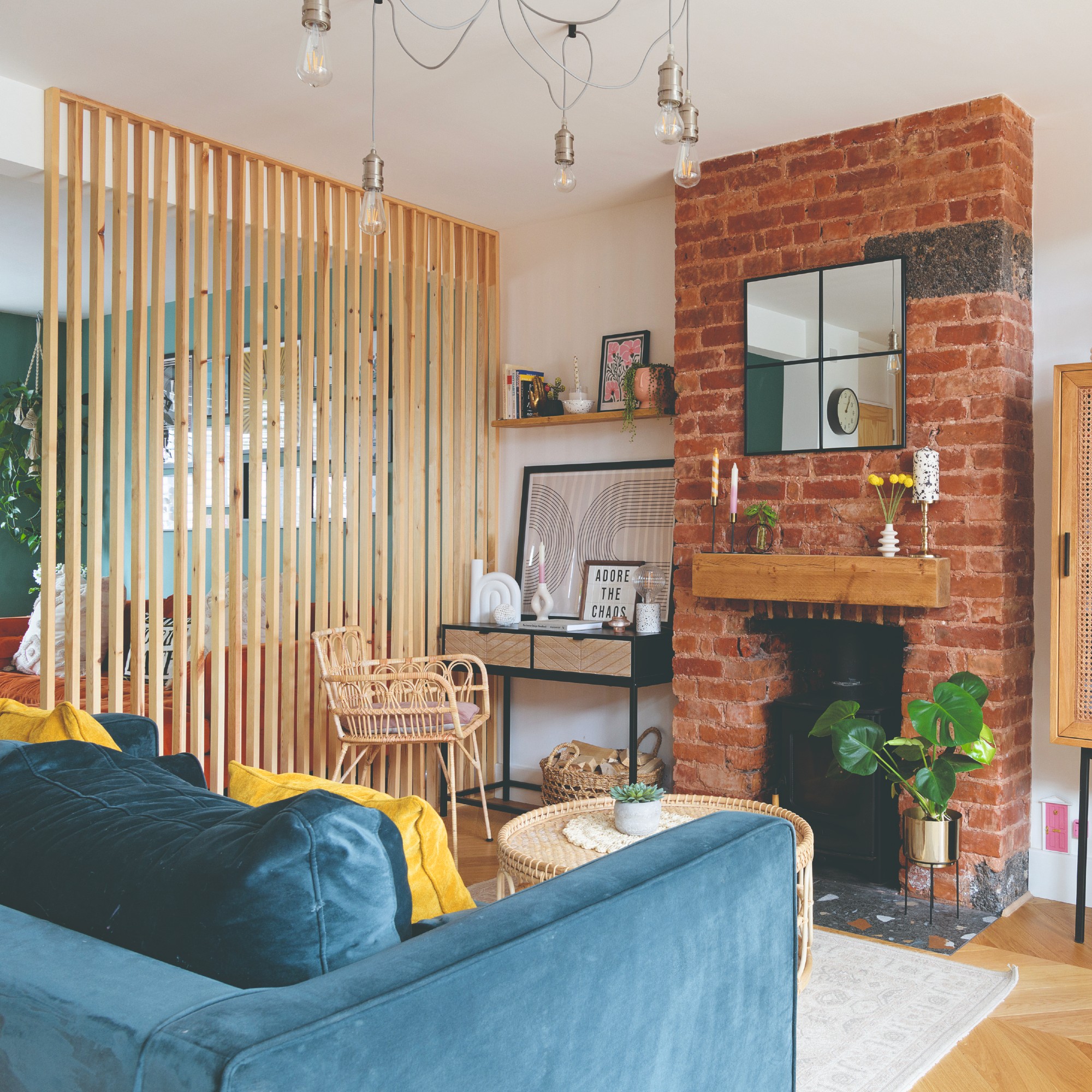
    This works especially well on a large, otherwise empty wall where a single small painting would look lost. Choose a textile with colors that tie back into your rug or throw pillows.

    Tip: Use a simple wood dowel or curtain rod to hang the fabric. It’s an easy, damage-free way to display something with real texture and weight.

    Boho, eclectic, and coastal homes use this idea often, but a simple, muted quilt can work in a farmhouse or traditional space too.

    Wall Decor Budget Breakdown

    Budget TierPrice RangeWhat You GetBest For
    Budget$20-$75Printable art, small mirrors, single plantsRenters, first apartments
    Mid-range$75-$250Framed prints, floating shelves, sconcesMost living rooms
    Investment$250-$800+Original art, large mirrors, custom signageLong-term homeowners

    Tips for Success

    • Measure twice before you drill. A level and a tape measure save you from unnecessary holes.
    • Stick to one dominant color story across your wall decor so pieces feel connected, not random.
    • Use painter’s tape to outline frame placement on the wall before committing to nails.
    • Mix matte and glossy finishes for subtle visual interest.
    • Don’t ignore scale. A tiny picture on a huge wall gets swallowed up.
    • Rotate seasonal decor items, like a wreath or small art swap, to keep the space feeling fresh without a full redo.
    • Step back and view your wall from across the room, not just up close, before finalizing placement.

    Common Mistakes and How to Avoid Them

    Hanging art too high
    : Keep the center of each piece at eye level, around 57 to 60 inches from the floor.

    Ignoring furniture scale
    : Match art width to about two-thirds the width of the furniture below it, like a sofa or console.

    Overcrowding one wall
    : Leave breathing room between pieces. Negative space is part of the design, not wasted space.

    Mismatched frame finishes with no unifying thread
    : Pick one or two metal or wood tones and repeat them throughout the room.

    Choosing decor before choosing a color scheme
    : Settle on your room’s dominant colors first, then shop for wall decor that fits.

    Forgetting about lighting
    : Add a sconce or small picture light if your art sits in a naturally dark corner.

    Similar Variations

    • Coastal Boho: Combines woven textures with beachy, sun-bleached color tones for a relaxed vibe.
    • Modern Farmhouse: Blends black and white photography with distressed wood frames and simple signage.
    • Eclectic Maximalist: Layers gallery walls, plants, and bold color without much restraint or matching.
    • Scandinavian Minimalist: Uses one or two simple art pieces with lots of open wall space and light wood tones.
    • Industrial Loft: Focuses on metal accents, large black and white prints, and exposed materials.
    • Traditional Formal: Leans on gold frames, oil paintings, and symmetrical arrangements for a classic feel.

    At the end of the day, your walls say a lot about how a room feels the moment someone walks in. Small changes, like swapping a mirror or adding one woven hanging, can shift a whole space without a big renovation. I hope this list of 10 Living Room Wall Decor Ideas gave you enough inspiration and practical direction to finally fill those blank walls with confidence.

  • 14 Built In Shelves Living Room Ideas That Will Change How You See Your Walls

    14 Built In Shelves Living Room Ideas That Will Change How You See Your Walls

    I’ve spent way too many hours scrolling through home renovation photos, and I can honestly say these 14 built in shelves living room ideas are some of the smartest storage solutions I’ve come across. If you’re tired of your living room feeling cluttered or boring, you’re in the right place. This guide will walk you through real, doable ideas that work whether you’re renovating or just dreaming.

    Built in shelves are permanent shelving units attached directly to a wall, often flanking a fireplace or filling an alcove. They provide storage and display space without taking up floor room. Unlike freestanding bookcases, they’re custom-built to fit your exact space.

    Stick around, because I’m about to show you 14 different ways to use built in shelves that’ll make your living room feel bigger, smarter, and way more put-together.

    What Makes Built In Shelves So Special

    Here’s the thing about built in shelves. They’re not just storage. They’re basically free architecture. When you build shelves right into your wall, they look like they’ve always been there. That’s the magic. A regular bookcase can feel like an afterthought, something you bought and shoved against a wall. Built ins feel intentional. They hug the room’s shape, work around windows, and make awkward corners actually useful. I think that’s why so many older homes had them. Builders knew empty wall space was wasted space. Once you start noticing built in shelves in other people’s homes, you’ll want them in yours too.
    1. Flank Your Fireplace With Matching Shelf Towers

    12 Gorgeous Ideas For Built-Ins Around a Fireplace - Brick-Anew
    Credit: Brick

    This is the classic move, and there’s a reason everyone does it. Building matching shelf units on both sides of your fireplace creates instant symmetry. Your eye naturally goes to the center, then balances out with the shelves on either side.

    Paint the shelves the same color as your trim for a seamless look, or go bold with a contrasting color like navy or forest green. Fill them with books, framed photos, and a few plants for texture.
    Practical tip: leave the bottom third of each tower as closed cabinets. This hides ugly stuff like remote controls, cables, and board games.

    This works great in traditional homes with a classic mantel, but it also looks sharp in modern spaces with a sleek linear fireplace. Now let’s talk about what happens when you don’t have a fireplace at all.

    2. Build Shelves Into an Awkward Alcove

    Alcove shelving ideas – the most stylish ways to make use of an awkward  space | Livingetc
    Credit: LivingEtc

    Every living room has that one weird nook that doesn’t know what it wants to be. Maybe it’s too narrow for furniture or too shallow for a closet. That’s exactly where built in shelves shine.

    Custom-fit shelving turns dead space into a functional display area. You can go floor to ceiling for maximum storage, or stop at eye level and hang art above.

    Tip: measure the depth of your alcove before planning. Anything under 12 inches deep works best for books and decor rather than bulky items.

    Modern farmhouse homes love this trick with shiplap backing, while coastal homes might add beadboard and light blue paint. Once your alcove is handled, think about extending shelves along a full wall.

    3. Run Floor to Ceiling Shelves Across One Full Wall

    Transform Your Living Room with Custom Built-In Bookshelves
    Credit: sunnyMommy

    If you want serious storage, this is it. A full wall of built in shelves turns your living room into a mini library. It’s dramatic, it’s functional, and honestly, it just looks impressive.

    Break up the shelves with a mix of open sections and closed cabinets. Add a rolling ladder if your ceilings are tall enough. That little detail alone makes the whole wall feel like something out of a design magazine.

    Quick tip: stagger shelf heights instead of making every row identical. It keeps the wall from feeling too rigid.

    This idea fits big, airy modern homes especially well, but a traditional library-style room with crown molding pulls it off beautifully too. Next, let’s shrink things down a bit for smaller spaces.

    4. Add Compact Shelves Around a Window Seat

    Window seats — Urban Homecraft
    Credit: Urban

    Small living rooms need smart solutions, and this one is a favorite of mine. Building shelves on either side of a window seat gives you storage without eating up floor space. The window seat itself becomes a cozy reading nook.

    Keep the shelf depth shallow, around 8 to 10 inches, so it doesn’t compete with the seat cushion. Add a few baskets underneath for blankets or magazines.

    Tip: paint the seat cushion and shelf trim the same color so the whole unit reads as one cohesive piece rather than three separate elements.

    This idea is a natural fit for cottage-style or coastal homes, though a minimalist Scandinavian living room can pull it off too with plain white paint and simple lines. Now let’s look at how open shelving changes the vibe entirely.

    5. Skip the Doors With Open Shelf Displays

    31 Built-In Bookshelf Ideas for Every Room in Your Home
    Credit: Better Homes

    Open shelves without any cabinet doors give your living room a lighter, airier feel. You get to show off your favorite things instead of hiding them away. Books, pottery, framed art, whatever tells your story.

    The key here is not overstuffing every shelf. Leave breathing room. Group items in threes, mix heights, and let some negative space exist.

    Tip: use the rule of odd numbers when styling. Groups of three or five look more natural than even pairs.

    Open shelving works in almost every style, but it especially shines in mid-century modern and boho living rooms where personality and texture matter more than uniformity. Once you’ve got the open shelves figured out, you might want to balance them with some hidden storage.

    Shelf Style Comparison Table

    Shelf TypeBest ForAverage Cost (Per Linear Foot)Maintenance Level
    Open ShelvingDisplaying decor, books$150-$300Medium (dusting)
    Closed CabinetsHiding clutter$250-$450Low
    Mixed Open/ClosedBalance of both$200-$400Medium
    Glass Front CabinetsDisplaying collections$300-$500Medium-High

    6. Mix Open Shelves With Closed Cabinet Storage

    How to Mix Open Shelving and Custom Cabinets for a Balanced Look
    Credit: Imperial

    This is probably the most practical option out there. You get the beauty of open display shelves up top, plus the hidden storage of cabinets down below. Best of both worlds, really.

    Use the top shelves for things you want to show off. Save the bottom cabinets for stuff you don’t want anyone to see, like extra chargers, old files, or your kid’s art supplies.

    Tip: install soft-close hinges on the cabinet doors. It’s a small detail, but it makes the whole unit feel higher quality.

    This combo style works in basically every home style because it’s so flexible. Traditional homes might add raised panel doors, while modern spaces keep the cabinet fronts flat and handle-free. Let’s talk about color next, because paint changes everything.

    7. Paint Your Shelves a Bold Contrast Color

    4 Custom Built-In Painting Ideas for Your Space - Habitar Design
    Credit: Habitar

    White built in shelves are safe, but painting them a bold color turns them into a statement piece. Think deep emerald, moody charcoal, or even a rich terracotta.

    The trick is picking a color that complements your walls without matching them exactly. If your walls are a soft cream, a dark green shelf unit creates contrast that draws the eye without clashing.

    Tip: test your paint color on a small hidden section first. Lighting changes how colors look throughout the day.

    Bold colors fit eclectic and traditional homes especially well, though a modern space can use a single accent color sparingly for a similar effect. Speaking of color, let’s talk about how lighting plays into all of this.

    8. Install Built In Lighting Inside the Shelves

    Built-in Shelf Lighting - Diode LED
    Credit: Diode

    Adding small LED strip lights or puck lights inside your shelves changes the whole mood of your living room at night. Suddenly your bookshelf looks like a gallery display.

    Warm white lighting works best for a cozy feel, while cooler light tones suit more modern, minimalist spaces. Hide the wiring behind the shelf backing so it stays clean and simple.

    Tip: use battery-operated puck lights if running electrical wire feels like too much of a project. They stick on with adhesive and last a long time.

    This idea works beautifully across every style since lighting is universal, but it’s especially striking in dark, moody rooms where shelves need a little glow to stand out. Now, let’s think about scale and how shelf size changes the whole feel of a room.

    9. Go Shallow With Slim Display Shelves

    TIPS FOR CREATING BUILT-IN STORAGE - Paper Room Interiors
    Credit: Paper Room

    Not every shelf needs to hold big, bulky items. Slim, shallow shelves, sometimes just 4 to 6 inches deep, are perfect for displaying small art, framed photos, or collectibles.

    These work great above a sofa or along a hallway leading into your living room. They add visual interest without taking up much space at all.

    Tip: use a small lip or ledge at the bottom of each shelf so framed art doesn’t slide off.

    This idea is a favorite in modern and minimalist homes, but it also works in traditional spaces for displaying family photos in a gallery-style arrangement. Now let’s size up again and talk about corner shelving.

    10. Wrap Shelves Around an Awkward Corner

    10 Rooms with Corner Shelving | Decoist
    Credit: Decoist

    Corners are notoriously hard to use. Furniture doesn’t fit right, and they often become dead zones. Built in corner shelves solve this by wrapping the shelving around the angle, creating a continuous display area.

    This works especially well in living rooms with an L-shaped layout or a corner that’s too small for a chair but too big to ignore.

    Tip: use adjustable shelf brackets so you can change the spacing later if your storage needs change.

    Corner shelving fits nearly any style, though a rustic cabin-style living room can add a rougher wood finish for extra charm. Next, let’s talk about built ins that double as a media center.

    11. Build Shelves Around Your TV for a Media Wall

    How to Build Media Wall Built-ins - Plank and Pillow
    Credit: Plank

    Instead of mounting your TV on a bare wall, build shelves around it. This creates a media wall that looks intentional rather than like an afterthought.

    Add cabinets below for game consoles, cable boxes, and speakers. Use the surrounding shelves for books and decor to soften the look of the screen.

    Tip: hide cords by drilling a small hole through the shelf backing so cables run straight down into the cabinet below instead of hanging loose.

    This is a favorite in modern and contemporary homes since it blends tech into a stylish design. Traditional homes often hide the TV behind cabinet doors that close completely when not in use. Now, let’s talk texture and materials.

    12. Mix Wood and Metal for an Industrial Look

    An industrial edge with metal shelving creates a rugged style. Add an  industrial edge with metal shelving and exposed hardware. This look is  perfect for those who appreciate a more rugged, urban
    Credit: avana_interior

    If your living room leans industrial or modern rustic, try combining wood shelves with black metal brackets or frames. The contrast between warm wood tones and cool metal creates a lot of visual interest.

    Reclaimed wood works especially well here, giving the shelves some age and character. Pair with exposed brick or concrete walls if you have them.

    Tip: seal reclaimed wood with a clear matte finish to prevent splinters and keep the natural texture intact.

    This combo is perfect for industrial and modern farmhouse homes, but a mid-century space can use it too with slimmer metal legs and warmer wood tones. Let’s shift now to a softer, more classic approach.

    13. Add Crown Molding for a Custom, Built-From-Scratch Feel

    How to Add Crown Molding To Built-in Bookshelves - In Honor Of Design
    Credit: In Honor

    Nothing says “this was built for this exact spot” like crown molding along the top of your shelves. It ties the unit into the ceiling and makes it feel permanent, like it was part of the original house.

    Match the molding profile to whatever trim already exists in your living room. If you don’t have existing trim, pick a simple, classic profile that won’t feel too fussy.

    Tip: paint the molding the same color as the shelf unit for a seamless, monochromatic look.

    This detail is essential for traditional and colonial-style homes, though even modern spaces can use a slim, simple molding line for a subtle finish. Finally, let’s talk about the smallest built ins of all.

    14. Use Mini Built In Shelves for Just One Small Wall Section

    20 Beautiful Living Rooms With Built-In Shelving
    Credit: The Spruce

    Not every living room has space for a huge shelf project. Sometimes a small built in, just two or three feet wide, is all you need. Tuck it next to a doorway or in a leftover gap between furniture.

    These mini shelves are great for a few favorite books, a small plant, or a lamp. They add function without overwhelming the room.

    Tip: keep styling minimal here since the space itself is small. Two or three items per shelf is usually plenty.

    This idea works in tiny apartments and small homes of any style, since the scale keeps it flexible everywhere from boho to modern minimalist. With all 14 ideas laid out, let’s talk about how to actually pull this off successfully.

    Tips for Success

    • Measure twice before ordering any custom shelving. Wall irregularities are more common than you’d think.
    • Choose materials based on your climate. Solid wood can warp in humid areas, so consider engineered wood or MDF with a wood veneer.
    • Plan your outlet placement before building shelves around electronics.
    • Don’t fill every single shelf. Empty space helps the eye rest and makes the styled items pop more.
    • Get quotes from at least three contractors if you’re not doing this as a DIY project.
    • Think about weight capacity, especially if you’re planning to store heavy books or decor.
    • Match your shelf finish to your existing trim color unless you’re intentionally going for contrast.

    Common Mistakes and How to Avoid Them

    Overcrowding every shelf
    : Leave some negative space. A shelf packed edge to edge looks cluttered instead of curated.

    Ignoring the depth of the shelf
    : Measure what you plan to store before building. A shelf too shallow for oversized books is a common regret.

    Skipping the electrical planning
    : If you want lighting or a TV built in, plan wiring before construction starts, not after.

    Using the wrong paint finish
    : A high gloss finish shows every fingerprint and dust speck. Matte or eggshell finishes hide wear better.

    Making shelves too uniform
    : Rows of identical, evenly spaced shelves can look sterile. Vary the spacing and mix in a few closed cabinets for balance.

    Forgetting about weight support
    : Thin shelves without proper bracket support can sag over time under heavy books or decor.

    Similar Variations

    • Floating Shelf Walls – No visible brackets, giving a clean, minimalist look that skips the traditional cabinet base entirely.
    • Library Ladder Shelving – Floor to ceiling shelves paired with a rolling ladder for that old-school study feel.
    • Window Seat Bookshelf Combo – Built in seating flanked by shelves, perfect for small reading nooks.
    • Fireplace Flanking Units – Matching shelf towers on either side of a fireplace, the most classic built in style.
    • Corner Wraparound Shelves – Shelving that curves or angles around an awkward room corner to maximize storage.
    • Media Wall Built Ins – Shelves built specifically around a TV, blending entertainment and display space together.

    At the end of the day, built in shelves aren’t just about storage. They’re about making your living room feel finished, personal, and a little more like a home you actually planned instead of one that just happened. Whether you go big with a full wall library or keep it small with a tiny nook shelf, there’s a version of this idea that fits your space and your budget. I hope this list of 14 built in shelves living room ideas gave you enough inspiration to finally tackle that empty wall you’ve been staring at for way too long.

  • 15 Living Room Dining Room Combo Ideas That Actually Work

    15 Living Room Dining Room Combo Ideas That Actually Work

    I’ve helped enough friends figure out their open floor plans to know that a 15 living room dining room combo can feel tricky at first, but I’m about to break down every trick that actually works. Whether you’re dealing with a tiny apartment or a spacious open-concept home, I’ve got you covered with ideas that real people use in real homes.

    A living room dining room combo is a shared open space where seating and dining areas exist together without walls dividing them. The key to success is defining each zone through furniture placement, rugs, lighting, or color while keeping the whole space feeling unified.

    Stick around, because I’m about to show you 15 specific ways to make this layout feel intentional instead of accidental.

    What Makes a Living Room Dining Room Combo Work

    Ever walked into someone’s open floor plan and felt like the furniture was just floating there with no purpose? That’s what happens when a combo space isn’t planned right. I think the secret is treating each area like its own little room, even without walls. You still want a clear “living room zone” and a clear “dining zone.” The magic happens when you connect them with matching colors, similar materials, or a shared theme. Once you get that balance, the whole space feels bigger, not more crowded. That’s really the goal here.

    1. Use an Area Rug to Anchor Each Zone

    Living Room Rug Placement - Do's and Don'ts
    Credit: DressMyCrib

    Rugs are honestly the fastest way to separate a combo space without spending a fortune. I always tell people to grab one rug for the living room seating area and a totally different one for under the dining table. This visual break tells your brain “okay, this is a new zone” even though there’s no wall.

    Pick rugs in a similar color family so they feel connected, not random. A jute rug in the living room and a flatweave in a matching tone under the table works great.

    Try this: measure your dining table and add at least 24 inches on all sides so chairs don’t slide off the rug when pulled out.

    This trick works in coastal homes with natural fiber rugs just as well as it does in modern spaces with geometric patterns. Once your rugs are down, you’ll want furniture that plays nicely with them.

    2. Choose a Sofa That Faces Away From the Table

    What Designers Do With Small, Awkward Gaps Behind the Sofa | Apartment  Therapy
    Credit: Apartment

    Positioning matters more than people think. I like putting the sofa’s back toward the dining area instead of facing it directly. This creates a natural boundary and stops the two spaces from blending into visual chaos.

    A low-profile sofa or one with a solid, simple back works best here since it acts almost like a room divider. Add a console table behind it to hold lamps or decor, and you’ve basically built an invisible wall.

    Quick tip: keep your sofa back under 40 inches tall so it doesn’t block sightlines or make the room feel chopped up.

    Traditional homes might use a tufted sofa here, while modern spaces lean toward clean-lined pieces. Once your seating is anchored, lighting becomes your next best friend for zoning.

    3. Hang Two Distinct Light Fixtures

    How To Mix Multiple Light Fixtures In The Same Space - bandddesign.com
    Credit: Bandd

    Lighting does a lot of heavy lifting in a combo layout. I always recommend one fixture over the dining table, like a pendant or chandelier, and a completely different lighting style in the living room, like floor lamps or a flush mount.

    This contrast signals to anyone walking in that they’ve entered a new “zone,” even in a totally open room. Just make sure the finishes match somewhat, brass with brass, black with black, so it still feels like one cohesive home.

    Practical tip: hang your dining pendant 30 to 36 inches above the table for the right proportion.

    Farmhouse spaces often use a wood beam chandelier over the table paired with simple sconces in the living room. Speaking of contrast, color choices can do similar work.

    Lighting Style Pairings by Home Style

    Home StyleDining Light FixtureLiving Room Light Fixture
    ModernSputnik chandelierArc floor lamp
    FarmhouseWood bead chandelierWall sconces
    CoastalRattan pendantWoven table lamps
    TraditionalCrystal chandelierBrass floor lamp
    IndustrialMetal cage pendantExposed bulb floor lamp

    4. Pick One Color Palette for Both Spaces

    51 Living Room Color Schemes From Bold to Understated
    Credit: The Spruce

    Nothing screams “unplanned” faster than a combo room with clashing colors. I always start with three main colors, one neutral, one accent, and one deeper tone, and use them in both zones.

    Maybe your walls are a warm white, your sofa is sage green, and your dining chairs have sage green cushions too. That repetition ties the whole room together without being matchy-matchy.

    Try this: pick your color palette from one piece you already love, like a rug or artwork, and pull three shades from it.

    Boho spaces might lean into terracotta and cream, while coastal rooms stick to blues and sandy neutrals. Once your colors are locked in, furniture placement gets a whole lot easier.

    5. Create a Furniture “Buffer Zone” With a Console or Bookshelf

    How to Furnish a 2-Bedroom Condo Living Room: A Complete Plan With Siz –  Megafurniture
    Credit: Megafurniture

    If your space feels too open, add a piece of furniture that acts as a soft divider. A console table, low bookshelf, or even a bar cart placed between the two areas gives your eye a place to pause.

    This works especially well in long rectangular rooms where the living room and dining room sit end to end. The furniture piece doesn’t block the flow, it just gently separates it.

    Practical tip: keep buffer furniture under 36 inches tall so it doesn’t disrupt sightlines across the room.

    Mid-century modern homes often use a slim credenza here, while traditional homes might choose a wood console with turned legs. Next, let’s talk about how flooring can help too.

    6. Use Flooring Transitions to Mark Zones

    29 open-plan living room ideas to lay out, zone and decorate | Ideal Home
    Credit: Ideal Home

    Sometimes the room itself gives you clues. If you have hardwood in one area and tile in another, let that natural transition mark where the living room ends and dining room begins. If your floor is all one material, you can fake this with a rug placement or even a subtle floor decal border.

    This is honestly one of the most overlooked tricks. I think people forget the floor is doing just as much work as the furniture.

    Quick tip: if you’re installing new flooring, add a transition strip exactly where you want the “zone” to shift.

    Coastal homes often use light wood throughout with rug zoning, while industrial lofts might use polished concrete with an area rug break. Now let’s move up from the floor to the walls.

    7. Add an Accent Wall Behind the Dining Table

    27 Amazing Dining Room Accent Wall Ideas You'll Love - The Intérieur
    Credit: Interior

    An accent wall is one of my favorite tricks because it gives the dining area its own identity without needing a full wall to separate it. Paint, wallpaper, or even wood paneling behind the table creates a built-in backdrop that says “this is the dining zone.”

    This works especially well when your dining table sits against a wall in an open floor plan combo. It gives the eye something to focus on and makes the table feel intentional, not just plopped in the middle of the room.

    Try this: pick a bold or textured wallpaper for the dining wall since it’s a smaller area and easier to commit to.

    Modern farmhouse spaces love shiplap here, while modern homes might choose a deep navy or charcoal paint. Once the walls are handled, let’s talk furniture scale.

    8. Match Furniture Scale to Room Size

    27 Living Room Dining Room Combos
    Credit: The Spruce

    I’ve seen so many combo rooms fail because the furniture is either too big or too small for the space. A massive sectional paired with a tiny bistro table looks off balance, and so does an oversized dining set squeezed next to a small loveseat.

    Measure your room first, then choose pieces proportional to both the room and each other. A general rule: furniture should fill about two-thirds of the floor space, leaving a third open for walking room.

    Practical tip: leave at least 36 inches of walking space between the dining table and any living room furniture.

    Furniture Size Guide for Combo Rooms

    Room SizeSofa LengthDining Table SizeSeating Count
    Small (under 250 sq ft)60-72 inches36×48 inches4
    Medium (250-400 sq ft)72-84 inches36×60 inches6
    Large (400+ sq ft)84-96 inches40×72 inches8

    Getting the scale right makes everything else on this list work better. Now let’s look at how a shared theme ties it all together.

    9. Repeat a Material Across Both Zones

    How to Split a Living Room & Dining Room? – COZY Living
    Credit: Cozy Living

    Consistency is everything in a combo space. I like picking one material, like wood, rattan, or metal, and using it in both the living room and dining room. Maybe your coffee table has wood legs that match your dining chairs, or your dining table base matches your TV stand.

    This repetition creates a visual rhythm that pulls the whole room together, even if the furniture pieces are totally different shapes.

    Quick tip: repeat at least one material three times across the combo space for it to feel intentional instead of accidental.

    Scandinavian homes love repeating light oak, while industrial spaces repeat blackened metal. Speaking of visual rhythm, let’s talk about sightlines next.

    10. Plan Sightlines From the Main Entry Point

    Clever open plan living room ideas from the House & Garden archive | House &  Garden
    Credit: House

    When you walk into a combo room, what’s the first thing you see? I always suggest arranging furniture so the most attractive piece, like a statement light fixture or a piece of art, is the focal point from the entryway.

    This isn’t just about looks. Good sightlines also help the space feel organized instead of like furniture is randomly scattered. Walk through your front door and notice what your eyes land on first. If it’s a cluttered corner, it’s time to rearrange.

    Practical tip: stand at your main entry point and take a photo. It’s the easiest way to spot furniture placement problems.

    Traditional homes often frame a dining hutch as the focal point, while modern homes might spotlight a sculptural light fixture. Now, let’s talk about curtains and window treatments.

    11. Use Matching Window Treatments Throughout

    Coordinating Window Treatments In An Open Floor Plan Space - Molly in Maine
    Credit: Molly in marine

    If your combo space has windows in both the living room and dining area, keep the curtains or blinds consistent. This might seem small, but mismatched window treatments can make a connected room feel disjointed.

    Stick to one fabric, one color, or at least one style (like all linen curtains or all wood blinds) across every window in the shared space.

    Try this: if budget is tight, buy one curtain style and just adjust the length based on window size rather than switching fabrics.

    Coastal homes often use flowy white linen everywhere, while traditional spaces might choose pinch-pleat drapes in a rich fabric. Next, let’s talk about how to zone with furniture arrangement itself.

    12. Angle Furniture to Create Diagonal Flow

    Curved Furniture and Angled Walls, a Perfect Fit? — Michael Helwig Interiors
    Credit: Micheal

    Instead of lining every piece up against the walls, try angling a chair or the dining table slightly. This breaks up the boxy feeling that a lot of combo rooms get and makes the space feel more dynamic.

    This works especially well in awkward-shaped rooms where a straight layout just doesn’t fit right. An angled table can also open up better walking paths.

    Practical tip: angle furniture at 30 to 45 degrees for the most natural, comfortable flow.

    Eclectic and bohemian spaces embrace angled layouts easily, while formal traditional rooms usually keep things straight and symmetrical. Let’s move on to a trick involving ceiling height.

    13. Use Ceiling Treatments to Define Each Zone

    29 open-plan living room ideas to lay out, zone and decorate | Ideal Home
    Credit: Ideal Home

    If you’ve got the budget, adding a beam, tray ceiling detail, or even a change in paint color on the ceiling can mark where one zone ends and another begins. This works especially well in rooms with higher ceilings where there’s extra visual space to play with.

    It’s a subtle trick, but it makes a real difference once you notice it. Your eyes naturally look up sometimes, and giving them something to see there helps ground each area.

    Quick tip: paint the dining room ceiling a slightly deeper shade than the living room ceiling for an easy, low-cost zone divider.

    Farmhouse homes love exposed wood beams here, while modern homes might use a simple two-tone paint trick. Now let’s talk about function within a small combo space.

    14. Choose Multi-Functional Furniture for Small Spaces

    10 Essential Multi-functional Furniture Pieces for Small Apartments - Urban  Quarter
    Credit: Urban

    If your combo room is on the smaller side, furniture that pulls double duty is a lifesaver. Think a storage ottoman that works as extra dining seating, or a console table that extends into a dining surface when needed.

    This keeps your space from feeling cramped while still giving you everything you need for both living and dining.

    Practical tip: look for extendable dining tables so you get everyday functionality with the option for extra guests.

    Small apartment dwellers in any style, from modern to traditional, benefit from this trick the most. Finally, let’s wrap up with the power of a shared centerpiece.

    15. Add a Statement Piece That Bridges Both Rooms

    45 Dining Room Living Room Combo Ideas -
    Credit: Nestic Homes

    Sometimes the easiest way to unify a combo space is one big, beautiful piece that visually connects to both areas. This could be a large piece of art positioned so it’s visible from both the sofa and the dining table, or an oversized plant placed between the two zones.

    This “bridge” piece acts like a visual handshake between the two rooms, tying them together without extra effort.

    Try this: choose art or a plant tall enough to be seen from a seated position in both areas for real cohesion.

    Every home style can use this trick, from a large fiddle leaf fig in a boho room to a bold abstract painting in a modern space.

    Tips for Success

    • Measure your entire space before buying anything, including walking paths between zones
    • Choose a color palette first, then shop for furniture that fits it
    • Keep a consistent flooring or rug base so the whole area feels grounded
    • Use lighting on dimmers so you can adjust mood for dining versus lounging
    • Don’t be afraid of a rug under the dining table even in a small space
    • Test furniture arrangements with painter’s tape on the floor before committing
    • Add plants or greenery in both zones for a natural connecting element

    Common Mistakes and How to Avoid Them

    Overcrowding the space with too much furniture
    : Stick to the two-thirds rule and leave open walking paths of at least 30 inches.

    Using mismatched color schemes in each zone
    : Pull three colors from one anchor piece and repeat them throughout both areas.

    Skipping rugs because the room feels too small
    : Choose a smaller rug size rather than skipping it entirely, since rugs help define zones even in tight spaces.

    Placing the dining table too close to the sofa
    : Leave at least 36 inches of clearance so both areas function independently.

    Ignoring lighting differences between zones
    : Use distinct fixtures for each area but match metal finishes for cohesion.

    Forgetting a focal point from the entryway
    : Arrange furniture so the first thing guests see is intentional, not a random wall or clutter.

    Similar Variations

    • Kitchen Living Dining Combo: Extends the same zoning tricks into a three-way open floor plan including the kitchen
    • Studio Apartment Combo: A tighter version of this layout that often uses furniture to divide sleeping, dining, and living areas
    • Coastal Open Concept: Leans on light woods, woven textures, and blue tones to unify the combo space
    • Modern Farmhouse Combo: Uses shiplap, wood beams, and neutral palettes to connect living and dining zones
    • Loft-Style Combo: Industrial materials like exposed brick and metal fixtures create cohesion in large open spaces

    I know open floor plans can feel overwhelming at first, but once you break it down zone by zone, it really does get easier. The trick is always the same: give each area its own identity while tying everything together with color, materials, or lighting. That balance is what separates a room that feels planned from one that feels like furniture just got dropped in randomly. If you take just a few of these ideas and apply them to your own space, I promise it’ll make a noticeable difference. That’s really the whole secret behind a great 15 living room dining room combo.

  • 12 Bedroom Inspirations That’ll Make You Want to Redecorate Tonight

    12 Bedroom Inspirations That’ll Make You Want to Redecorate Tonight

    I’ve spent way too many nights scrolling through design boards, and I put together these 12 Bedroom Inspirations so you don’t have to do the same thing. Ever laid in bed staring at your ceiling wondering why your room feels so blah? I’ve been there, and I found the fixes that actually work.

    A bedroom refresh means choosing a color palette, furniture layout, and decor elements that match your personal style and daily needs. The best bedroom designs balance comfort, function, and visual calm, using layered textures, intentional lighting, and a cohesive color story.

    Stick around and I’ll walk you through twelve real, doable bedroom looks. Some are cozy, some are bold, and one might just be exactly what your room’s been missing.

    What Makes a Bedroom Design Actually Work

    Before I jump into the list, let’s talk about what separates a good bedroom from a great one. It’s not about spending a ton of money or buying everything new. Honestly, the best bedrooms I’ve seen mix old and new pieces, lean into one or two colors, and keep clutter off the floor. A great bedroom feels like a hug. It should slow your heart rate down the second you walk in. That’s the vibe we’re chasing with every idea below. Some of these ideas cost nothing but time. Others need a weekend project. Either way, you’ll walk away with real options, not just pretty pictures.

    1. Go All In on a Warm Neutral Palette

    29 Neutral Bedroom Ideas That Aren't Bland or Boring
    Credit: The Spruce

    Warm neutrals never go out of style, and there’s a reason for that. Think creamy whites, soft beige, warm taupe, and a touch of caramel brown. This combo makes a room feel like a cozy hotel suite instead of a sterile box.

    Start with your walls in a warm white or greige, then layer in linen bedding, a wool throw, and wood furniture with visible grain. Add a rattan mirror or wicker basket for texture.

    Practical tip: Test paint samples on your wall at different times of day. Warm neutrals can look yellow under bad lighting.

    This style adapts beautifully to modern farmhouse, traditional, and even minimalist rooms. Next up, let’s talk about a bolder route for those who want more drama.

    2. Add Drama With a Dark Accent Wall

    28 Dark Bedrooms That Add Maximum Drama to Your Home
    Credit: The Spruce

    If beige feels boring to you, try painting one wall in a deep color like charcoal, forest green, or navy. This is called an accent wall, and it instantly gives your room a focal point.

    Place your bed against that wall so it becomes the star of the show. Keep your other walls light so the room doesn’t feel like a cave. Brass or gold hardware on your nightstands pairs really well with dark walls.

    Practical tip: Use a matte or eggshell finish on dark walls to avoid glare from lamps.

    Modern and transitional bedrooms love this look, but even traditional spaces can pull it off with the right trim work. Now let’s soften things up with texture.

    3. Layer Textures for a Cozy, Lived-In Feel

    12 Cozy Bedroom Ideas That Feel Like a Warm Hug | Livingetc
    Credit: LivingEtc

    Texture is the secret ingredient most people skip. A room with one flat color and smooth surfaces feels cold, even if the color is nice. Mixing textures like chunky knit throws, woven baskets, linen curtains, and a jute rug creates warmth without adding more color.

    Grab a faux fur pillow, a wood bench, and a woven wall hanging. Each material talks to the others without competing.

    Practical tip: Aim for at least three different textures in every room, like smooth cotton sheets, a rough wool rug, and a shiny metal lamp.

    This trick works in every design style, from coastal to industrial to farmhouse. Speaking of coastal, let’s dive into that look next.

    4. Bring the Beach Home With Coastal Vibes

    15 Coastal Bedroom Ideas That Are Like Waking Up in a Nancy Meyers Movie
    Credit: ELLE Decor

    Coastal bedrooms use soft blues, sandy neutrals, and white as the main color story. Think of it like your bedroom took a permanent vacation. Furniture tends to be light wood or whitewashed, and decor includes things like woven seagrass baskets, linen curtains, and simple striped textiles.

    Keep your walls white or very light blue, then bring in navy accents through pillows or a throw blanket. A jute rug ties the whole room together.

    Practical tip: Skip anything too literal, like anchor decor or seashell collections. A few subtle nods to the sea go further than a theme park version.

    This style shines in beach towns but honestly works anywhere you want a light, breezy feel.

    Color Palette Comparison Table

    StylePrimary ColorsAccent ColorsBest For
    Warm NeutralBeige, cream, taupeCaramel, brownCozy, traditional rooms
    Dark DramaCharcoal, navy, forest greenBrass, goldModern, bold spaces
    CoastalWhite, sandy tanNavy, soft blueBeach house, breezy rooms
    BohoTerracotta, rustMustard, oliveEclectic, textured rooms

    5. Mix Patterns the Boho Way

    Boho Bedroom Decor - How to Mix Patterns | Architectural Digest
    Credit: architecturaldigest

    Boho bedrooms break the rules on purpose. You’ll see clashing patterns, mixed metals, and plants everywhere. The trick to making it look intentional instead of messy is picking one color family, like warm terracotta and rust, then mixing patterns within that family.

    Layer a patterned rug under a striped throw on a solid comforter. Add macrame wall hangings and a few plants in woven pots.

    Practical tip: Pick fabrics that share at least one common color so the mix feels planned, not random.

    Boho works great in eclectic homes but can also soften a modern space when used sparingly. Let’s shift gears to something more streamlined now.

    6. Strip It Down With Minimalist Design

    Minimalist Bedrooms That Are Gorgeous and Practical - Minimalist Bedroom Ideas
    Credit: ELLE Decor

    Minimalist bedrooms focus on function and calm. You’ll see a platform bed, one nightstand, and almost no decor on the walls. The color palette usually stays within white, black, and one wood tone.

    Choose furniture with clean lines and hidden storage. A floating shelf can hold one plant and one book, nothing more.

    Practical tip: Before buying new furniture, remove everything from your room that you haven’t used in six months. You’ll be shocked how much better it feels.

    Minimalism pairs naturally with modern and Scandinavian styles, though even traditional homes can borrow the “less is more” mindset. Now let’s talk about a look that feels like an old European apartment.

    7. Channel Old World Charm With Traditional Details

    15 Traditional Bedroom Design Ideas with Classic Style
    Credit: Curated Interior

    Traditional bedrooms use classic furniture shapes, like sleigh beds or four-poster frames, paired with rich fabrics such as velvet or damask. Colors tend to be deeper, think burgundy, hunter green, or navy, paired with gold or brass accents.

    Add a tufted headboard, matching nightstands, and a chandelier or statement light fixture. Symmetry matters a lot in this style, so match your lamps and nightstands on each side of the bed.

    Practical tip: Hang curtains higher than your window frame to make the ceiling feel taller and the room feel grander.

    This style feels at home in older houses but can also work in newer builds if you lean into the fabric choices. Next, let’s cool things down with a Scandinavian approach.

    8. Keep It Light and Airy With Scandinavian Style

    Scandinavian Bliss: Transform Your Bedroom with Scandi Style – The Rugs
    Credit: The Rugs

    Scandinavian bedrooms lean heavily on light wood, white walls, and simple furniture shapes. The goal is a room that feels bright even on a cloudy day. Cozy textiles like sheepskin throws and knit blankets keep the room from feeling cold.

    Choose a light oak bed frame, white bedding, and one or two black accents like a lamp or picture frame. Keep decor minimal but warm.

    Practical tip: Use sheer curtains instead of heavy drapes to let in as much natural light as possible.

    This look works beautifully in small bedrooms because the light colors make the space feel bigger. Let’s head into a bolder, more industrial direction next.

    9. Add Edge With Industrial Touches

    Industrial Style Bedroom Design: The Essential Guide
    Credit: Interior design Ideas

    Industrial bedrooms borrow from old factories and warehouses. Think exposed brick, black metal furniture frames, and leather accents. The color palette stays neutral with black, gray, and brown, but the materials do all the talking.

    Add a metal bed frame, a leather accent chair, and an Edison bulb pendant light. Concrete or wood floors complete the look, but even a gray rug can mimic that vibe if you have carpet.

    Practical tip: Balance all the hard materials with one soft element, like a wool throw, so the room doesn’t feel like a garage.

    Industrial style works great in loft apartments but can be dialed back with softer textiles for a more livable bedroom. Now let’s talk about a color-forward option for the bold at heart.

    10. Make a Statement With Jewel Tones

    My moody jewel tone bedroom update - homey homies
    Credit: Homey Homies

    Jewel tone bedrooms use rich, saturated colors like emerald, sapphire, and ruby. This palette feels luxurious without needing a huge budget. The key is picking one dominant jewel tone and using the others sparingly as accents.

    Paint your walls in a deep emerald or use it on your bedding, then add sapphire throw pillows and a small ruby accent, like a lamp shade. Metallic accents in gold or brass make jewel tones pop even more.

    Practical tip: Balance jewel tones with plenty of white or cream so the room doesn’t feel too heavy.

    This style suits eclectic and traditional homes especially well, giving both a touch of glamour. Let’s move to something a bit more grounded and natural next.

    11. Bring the Outdoors In With Organic Modern Design

    Nature Inspired Bedroom Ideas → Our Blog ‣ Enjoy The Wood
    Credit: Enjoy The Wall

    Organic modern bedrooms combine clean lines with natural materials like rattan, linen, and unfinished wood. The color palette stays earthy, with sage green, warm brown, and off-white as the stars.

    Choose a low platform bed, add a woven bench at the foot, and hang a piece of abstract art in earthy tones. Live plants are almost required in this style since they reinforce the natural feel.

    Practical tip: Stick to matte finishes on furniture and decor. Glossy surfaces clash with the earthy, natural vibe.

    Organic modern works in nearly any home because it blends minimalism with warmth. Last but not least, let’s look at a fun, personality-packed option.

    12. Personalize With a Gallery Wall Above the Bed

    18 Best Above-Bed Decor Ideas - How to Decorate Over the Bed
    Credit: ELLE Decor

    Sometimes the best bedroom upgrade isn’t furniture at all, it’s what’s on your walls. A gallery wall above your headboard adds personality fast and costs very little if you use frames you already own or thrift store finds.

    Mix photos, art prints, and small mirrors for variety. Keep a consistent color story in your frames, like all black or all natural wood, so the wall feels cohesive even with mixed content.

    Practical tip: Lay your frames out on the floor first and take a photo before hanging anything. This saves your walls from extra nail holes.

    This idea works in literally every design style because it’s about personal taste, not a specific aesthetic. With all twelve ideas covered, let’s talk about how to actually pull these off without making rookie mistakes.

    Budget Tier Guide for Bedroom Refreshes

    Budget TierPrice RangeWhat You Can Do
    Low$50–$150New bedding, throw pillows, wall art, paint one accent wall
    Mid$150–$500New rug, lamps, curtains, small furniture piece like a bench
    High$500–$1500New bed frame, dresser, statement light fixture
    Splurge$1500+Full furniture set, custom headboard, professional paint job

    Tips for Success

    • Pick your color palette before you buy any furniture or decor. This keeps you from making impulse buys that clash.
    • Measure your room before shopping for a bed frame or dresser. A piece that looks small online can overwhelm a tight space.
    • Layer at least three light sources in your bedroom: overhead, a lamp, and a smaller accent light like a candle or string lights.
    • Buy one statement piece, like a headboard or rug, and build the rest of the room around it.
    • Keep your nightstand surfaces mostly clear. Clutter there affects sleep more than people realize.
    • Wash and rotate your throw pillows and blankets seasonally to keep the room feeling fresh without buying new stuff.
    • Don’t ignore your closet door or the back of your door. Hooks and small mirrors there add function without taking up floor space.

    Common Mistakes and How to Avoid Them

    Buying a bed frame before measuring the room
    : Always measure your space and leave at least two feet of walking room on each side of the bed.

    Choosing all matching furniture from one store set
    : Mix at least one vintage or secondhand piece in to avoid a showroom look.

    Hanging art too high above the bed
    : Keep the bottom of your art frame six to eight inches above the headboard.

    Only using overhead lighting
    : Add a table lamp or floor lamp to create softer, layered light in the evening.

    Overloading the room with too many colors
    : Stick to a main color, a secondary color, and one accent color, nothing more.

    Forgetting about storage
    : Choose a bed frame or nightstand with built-in drawers if your closet space is limited.

    Similar Variations

    • Coastal Grandmother: A softer, more mature take on coastal style with linen fabrics and vintage-inspired furniture.
    • Desert Boho: Boho style with a warmer, sandier palette inspired by desert landscapes.
    • Japandi: A mix of Japanese minimalism and Scandinavian warmth, using natural wood and simple lines.
    • Modern Farmhouse: Combines rustic wood furniture with clean, modern finishes and a neutral palette.
    • Art Deco Revival: Bold geometric patterns, rich colors, and metallic accents inspired by the 1920s.
    • Cottagecore: A romantic, vintage-inspired style with floral patterns and soft, muted colors.

    Redecorating your bedroom doesn’t have to mean starting from scratch or spending your whole paycheck. Pick one or two ideas from this list, start small, and build from there. Your room will thank you, and honestly, so will your sleep schedule once you’ve worked through these 12 Bedroom Inspirations.

  • 15 Bedroom Interior Ideas That Actually Transform Your Space

    15 Bedroom Interior Ideas That Actually Transform Your Space

    If you’ve been searching for 15 bedroom interior ideas that go beyond the same tired Pinterest boards, I’ve got you covered here with the most complete list you’ll find. I’ve spent years digging through design trends, testing layouts in my own space, and talking to people who actually live with their choices. So let’s get into it.

    A bedroom interior refers to the combined design elements, furniture, color scheme, lighting, and decor within a sleeping space that work together to create comfort, function, and personal style. The right interior balances aesthetics with practical needs like storage and rest.

    Stick around, because I’m about to walk you through 15 fresh ideas, plus some mistakes I’ve made myself so you don’t have to repeat them.

    What Makes a Bedroom Interior Actually Work

    Here’s the thing about bedroom design. It’s not just about picking a pretty color or a cute headboard. Your bedroom is the one room where you start and end every single day. That means it needs to do double duty: look good and feel calm.

    I think a lot of people overthink this. They chase trends instead of asking what actually helps them sleep better or feel more relaxed. A good bedroom interior mixes function with personality. It’s got a color palette that soothes you, furniture that fits your space without crowding it, and little touches that make it feel like yours. That’s really all there is to it.

    1. Anchor the Room With a Statement Headboard

    Statement Headboards Are One Of The Biggest Bedroom Trends In 2026 – Here's How To Style Them
    Credit: House Beutiful

    Your bed is the star of the show, so give it a headboard that earns attention. Think upholstered fabric, carved wood, or even a DIY panel covered in textured wallpaper. This one piece can set the tone for everything else in the room.

    Practical tip: Measure your bed frame width first, then choose a headboard that’s at least a few inches wider on each side for visual balance.

    This idea flexes easily. Go tufted velvet for a glam look, rattan for coastal vibes, or reclaimed wood for farmhouse charm. Once your headboard is picked, the rest of your furniture choices get way easier because you’ve already set the style direction.

    Now that your bed is sorted, let’s talk about what goes around it.

    2. Use a Layered Lighting Plan Instead of One Overhead Light

    Home lighting design: A guide to layering light
    Credit: Pooky Lighting

    One ceiling light isn’t going to cut it. I learned this the hard way after years of harsh, flat lighting that made my room feel like a hospital. You need at least three light sources: ambient, task, and accent.

    Add a dimmable overhead fixture, bedside lamps for reading, and maybe a small accent light near a dresser or art piece. This layering gives you control depending on your mood, whether that’s bright morning energy or soft evening wind-down time.

    Practical tip: Install a smart dimmer switch so you can adjust brightness without buying multiple lamps.

    Modern rooms look great with sleek sconces, while traditional spaces love brass table lamps. Once your lighting feels right, your color choices will actually show up the way you intended.

    3. Pick a Calming Color Palette Based on Undertones

    20 Bedroom Color Schemes for a Cozy Sleep Sanctuary, All Designer-Approved
    Credit: Real Simple

    Color affects mood more than people realize. Cool tones like soft blues and sage greens tend to relax the nervous system. Warm tones like terracotta or blush add coziness but can feel stimulating if overdone.

    Color Palette Guide by Mood

    Mood GoalWall ColorAccent ColorBest For
    Calm & RestfulSoft sage greenWarm whiteLight sleepers
    Cozy & WarmTerracottaCreamCold climates
    Airy & FreshPale blueDriftwood brownCoastal homes
    Moody & RichDeep charcoalBrass goldModern lofts
    RomanticBlush pinkDusty roseTraditional decor

    Practical tip: Test paint samples on your wall for at least two days before committing. Light changes color perception a lot.

    Whatever palette you choose, keep it consistent across walls, bedding, and curtains for a cohesive feel. Speaking of bedding, let’s talk textiles next.

    4. Layer Textiles for a Cozy, Hotel-Like Feel

    How to Layer Your Bedding for Luxurious Hotel-Like Experience at Home – DZEE Home
    Credit: DZEE Home

    Nothing makes a bed look flat faster than a single thin comforter. I always tell people to layer: a fitted sheet, a duvet, a folded throw blanket, and a few pillows in varying sizes. This creates depth and texture without much effort.

    Mix materials too. Linen sheets paired with a chunky knit throw feels lived-in and inviting. Silk pillowcases add a touch of luxury and are gentler on hair and skin.

    Practical tip: Stick to three pillow sizes max (standard, euro, and one accent) so it doesn’t look cluttered.

    This works in any style. Boho rooms love mixed patterns, while minimalist spaces stick to solid neutral layers. Once your bed feels inviting, it’s time to think about what surrounds it.

    5. Add a Reading Nook or Cozy Corner

    Reading nook ideas: 10 ways to create a cozy hideaway for relaxing with a book | Homes and Gardens
    Credit: Homes And Gardens

    If you’ve got even a small unused corner, turn it into a reading nook. A comfy chair, a small side table, and a floor lamp are really all you need. This gives your bedroom a second function beyond sleeping.

    I did this in my own room with a secondhand armchair and a $20 lamp. It became my favorite spot in the house almost overnight.

    Practical tip: Position the chair near a window if possible for natural light during the day.

    Coastal bedrooms might use a rattan chair with striped cushions, while traditional rooms could add a wingback chair in leather. Once you’ve claimed that corner, your storage needs come next.

    6. Choose Furniture With Hidden Storage

    35 Hidden Storage Ideas: Ways to Create in Bedroom, Kitchen
    Credit: 99acres.com

    Bedrooms fill up fast with clothes, shoes, and random stuff. Furniture that hides storage keeps things looking clean without sacrificing function. Think storage ottomans, beds with drawers underneath, or nightstands with cabinet doors instead of open shelves.

    Practical tip: Measure under-bed clearance before buying storage bins. Most need at least 7 inches of space.

    Storage Furniture Comparison

    Furniture TypeStorage CapacityBest Room SizePrice Range
    Bed with drawersHighAny$$-$$$
    Storage ottomanMediumSmall-Medium$-$$
    Blanket chestMediumMedium-Large$$
    Nightstand w/ cabinetLowAny$-$$
    Under-bed binsMediumAny$

    This idea works everywhere because clutter-free rooms always feel calmer, no matter your style. With storage handled, let’s talk about walls.

    7. Create a Gallery Wall Above the Bed

    18 Best Above-Bed Decor Ideas - How to Decorate Over the Bed
    Credit: Elle Decor

    Instead of one big art piece, try grouping smaller frames into a gallery wall. Mix photos, prints, and even small mirrors for texture. This adds personality without needing expensive art.

    Practical tip: Lay your frames out on the floor first to plan spacing before hammering anything into the wall.

    Modern rooms look sharp with black frames in a grid pattern. Eclectic or boho rooms can mix frame styles and sizes for a more relaxed vibe. Once your walls have personality, your rug choice should match that energy.

    8. Layer a Textured Rug for Warmth

    How to Layer Rugs: The Trend That Instantly Elevates a Room
    Credit: keva Living

    Hardwood or tile floors can feel cold, literally and visually. A rug adds warmth underfoot and helps define the bed area, especially in open-concept rooms. Go for something plush if you want comfort, or flatweave if you prefer a cleaner look.

    Practical tip: Your rug should extend at least 18 inches beyond each side of the bed for proper scale.

    Jute rugs suit coastal and boho rooms, while a deep pile rug fits modern or glam interiors better. With your floors sorted, let’s think about scent and ambiance.

    9. Add Ambiance With Scent and Sound

    25 Ways to Use Home Fragrance to Add Luxury to Your Day
    credit: designthusiasm

    This one gets skipped a lot, but it matters. A room that smells good and feels quiet is way more relaxing. Try a diffuser with calming scents like lavender or sandalwood, or a small white noise machine if outside noise is an issue.

    Practical tip: Place diffusers away from direct sunlight so the oils don’t degrade faster.

    This idea isn’t tied to any particular style, it works in every bedroom type because comfort is universal. Once your senses are covered, let’s look at your closet situation.

    10. Style an Open Closet as a Design Feature

    23 Open Closet Ideas To Make Getting Dressed a Cinch
    Credit: The Spruce

    If you’ve got a walk-in or open closet, don’t treat it as an afterthought. Organize clothes by color, add matching hangers, and maybe a small bench or ottoman inside. This turns a functional space into something that actually looks nice.

    Practical tip: Use velvet hangers. They’re slim, which gives you more closet space instantly.

    Modern homes love sleek black or white hanger systems, while traditional homes might add wood tones and brass hooks. With your closet handled, let’s bring in some greenery.

    11. Bring in Low-Maintenance Plants

    Easy Low-Maintenance Houseplants | Yard and Garden
    Credit: yard And Garden

    Plants add life to a room, literally. They also improve air quality a bit and give your space a fresh, natural feel. Snake plants, pothos, and ZZ plants are nearly impossible to kill and thrive in lower light.

    Practical tip: Keep plants at least a few feet from the bed if you’re sensitive to allergens or pollen.

    Boho and coastal rooms love lots of greenery in varied pots, while minimalist spaces might stick to just one or two statement plants. Once your plants are placed, mirrors are next on the list.

    12. Use Mirrors to Bounce Light and Add Depth

    How Mirrors Can Be Used to Create Illusions of Depth, Space & Light in Architectural Spaces | Saint-Gobain Glass
    Credit: in.saint-gobain-glass

    Mirrors do double duty. They reflect light to make small rooms feel bigger, and they’re functional for getting dressed. A large leaning mirror in a corner or a mirrored closet door both work well.

    Practical tip: Position mirrors across from windows to maximize natural light reflection.

    Traditional rooms often use ornate framed mirrors, while modern spaces prefer clean, frameless designs. With more light bouncing around, let’s talk window treatments.

    13. Choose Curtains That Frame the Window, Not Just Cover It

    Coordinating Window Treatments In An Open Floor Plan Space - Molly in Maine
    Credit: Molly In Maine

    Curtains hung too low or too narrow make a room feel small and awkward. Hang curtain rods higher than the window frame and wider than the window itself. This tricks the eye into thinking the window, and the room, is bigger.

    Practical tip: Hang rods 4 to 6 inches above the window frame and let curtains just graze the floor.

    Linen curtains fit coastal and farmhouse styles, while velvet works better in traditional or glam rooms. Once your windows are dressed properly, let’s think about the ceiling.

    14. Don’t Ignore the Ceiling, Add Interest Above

    12 Ways to Add Interest to Your Ceiling | Houzz IE
    Credit: Houzz.ie

    Ceilings get forgotten way too often. A coat of soft color, some wood beams, or even a simple pendant light can turn a blank ceiling into a design feature. This is sometimes called the “fifth wall” in design circles.

    Practical tip: If painting the ceiling feels risky, start with a shade just a touch lighter than your wall color.

    Coastal homes love wood beam ceilings, while modern spaces might add a sculptural pendant light instead. With your ceiling addressed, let’s wrap up with personal touches.

    15. Personalize With Meaningful Objects, Not Just Trendy Decor

    Living Room Decor Ideas: 6 steps for an ideal living space
    Credit: Velux

    The last piece of the puzzle is you. Add items that actually mean something: travel souvenirs, family photos, a book collection, or handmade items. These small details make a room feel like a home instead of a showroom.

    Practical tip: Rotate personal items every few months to keep the space feeling fresh without buying new decor.

    This idea works no matter your style because personality always fits. And honestly, this is the idea that ties every other one together.

    Tips for Success

    • Start with a mood board before buying anything, even a simple folder of saved images helps keep your choices consistent.
    • Set a budget per category (furniture, decor, lighting) so one splurge doesn’t blow your whole plan.
    • Buy furniture in this order: bed, storage, seating, decor. This prevents overspending on small stuff early.
    • Test fabric swatches and paint samples in your actual room lighting before committing.
    • Leave at least 24 inches of walking space around your bed for comfort and flow.
    • Don’t rush the whole room at once. Tackle one or two ideas at a time and live with them before adding more.
    • Keep receipts and return windows in mind, especially for big furniture pieces you’re unsure about.

    Common Mistakes and How to Avoid Them

    Overcrowding the nightstands
    : Keep only a lamp, a small dish, and maybe a book or two. Anything more starts to look cluttered fast.

    Choosing a rug that’s too small
    : Measure your bed and floor space first, then size up. A too-small rug makes the whole room feel off balance.

    Matching everything perfectly
    : A little contrast is good. Mix textures and slightly different tones instead of buying a matching bedroom set.

    Ignoring scale
    : Oversized furniture in a small room feels cramped, while tiny furniture in a big room feels lost. Always measure before buying.

    Forgetting about airflow
    : Blocking vents or windows with furniture placement can make a room stuffy. Leave clear paths for air to move.

    Skipping the lighting layers
    : Relying only on one overhead light flattens the whole room. Add lamps and accent lighting for depth.

    Similar Variations

    • Coastal Bedroom Interior – light woods, blues, and airy linens for a beach-inspired feel.
    • Scandinavian Bedroom Interior – minimal furniture, neutral tones, and cozy textures like sheepskin.
    • Industrial Bedroom Interior – exposed brick, metal accents, and moody dark color palettes.
    • Bohemian Bedroom Interior – layered textiles, mixed patterns, and lots of plants.
    • Traditional Bedroom Interior – classic furniture shapes, rich colors, and symmetry.
    • Japandi Bedroom Interior – a mix of Japanese simplicity and Scandinavian warmth, low furniture and natural materials.

    Putting together a great bedroom really comes down to balance. You want function, comfort, and a little bit of your own personality mixed in, without overthinking every single detail. Pick a few ideas from this list, start small, and build from there. Before you know it, you’ll have a space that feels like it was pulled straight from a well-planned 15 bedroom interior guide, except it’ll actually be yours.