Author: Tayef

  • 14 Modern Kitchen Ideas That Will Transform Your Cooking Space

    If you're hunting for 14 Modern Kitchen ideas that actually work in real homes (not just fancy magazine spreads), you've landed in the right spot. I've spent way too many hours studying kitchen trends, talking to designers, and yes, making my own kitchen mistakes so you don't have to. This guide covers everything you need to know.

    A modern kitchen design emphasizes clean lines, minimal clutter, and functional layouts. It typically features sleek cabinetry, neutral color palettes, integrated appliances, and smart storage solutions that maximize both style and efficiency.

    Stick around because I'm about to walk you through 14 specific ideas that'll make your kitchen feel brand new, plus some mistakes to dodge along the way.

    What Makes a Kitchen "Modern" Anyway?

    Okay, so here's the thing about modern kitchens. People throw that word around a lot, but it actually means something specific. We're talking about clean surfaces, not much clutter, and a "less is more" attitude. Think flat-panel cabinets instead of fussy raised ones. Think quartz countertops instead of busy granite patterns.

    Modern doesn't mean cold or sterile though. The best modern kitchens I've seen still feel warm and lived-in. They just do it through texture and smart lighting instead of tons of decorations. It's about function meeting simple beauty. Ready to see how this plays out in real spaces? Let's dig in.

    1. Go All-In on Handleless Cabinets

    Handleless cabinets are having a major moment right now. Instead of knobs or pulls, you get push-to-open mechanisms or recessed grip channels. The result? A super smooth, streamlined look that feels expensive even if it wasn't.

    I love this style because it eliminates visual noise. Your eye just glides across the cabinet fronts without bumping into hardware every few inches.

    Practical tip: If you're renovating on a budget, you can retrofit push-latch mechanisms onto existing cabinet boxes instead of buying all new ones.

    This look works great in modern and minimalist homes, but it can feel too stark in a farmhouse or traditional kitchen where hardware adds character.

    Next up, let's talk about a color choice that's taking over modern kitchens everywhere.

    2. Paint Your Island a Bold Contrasting Color

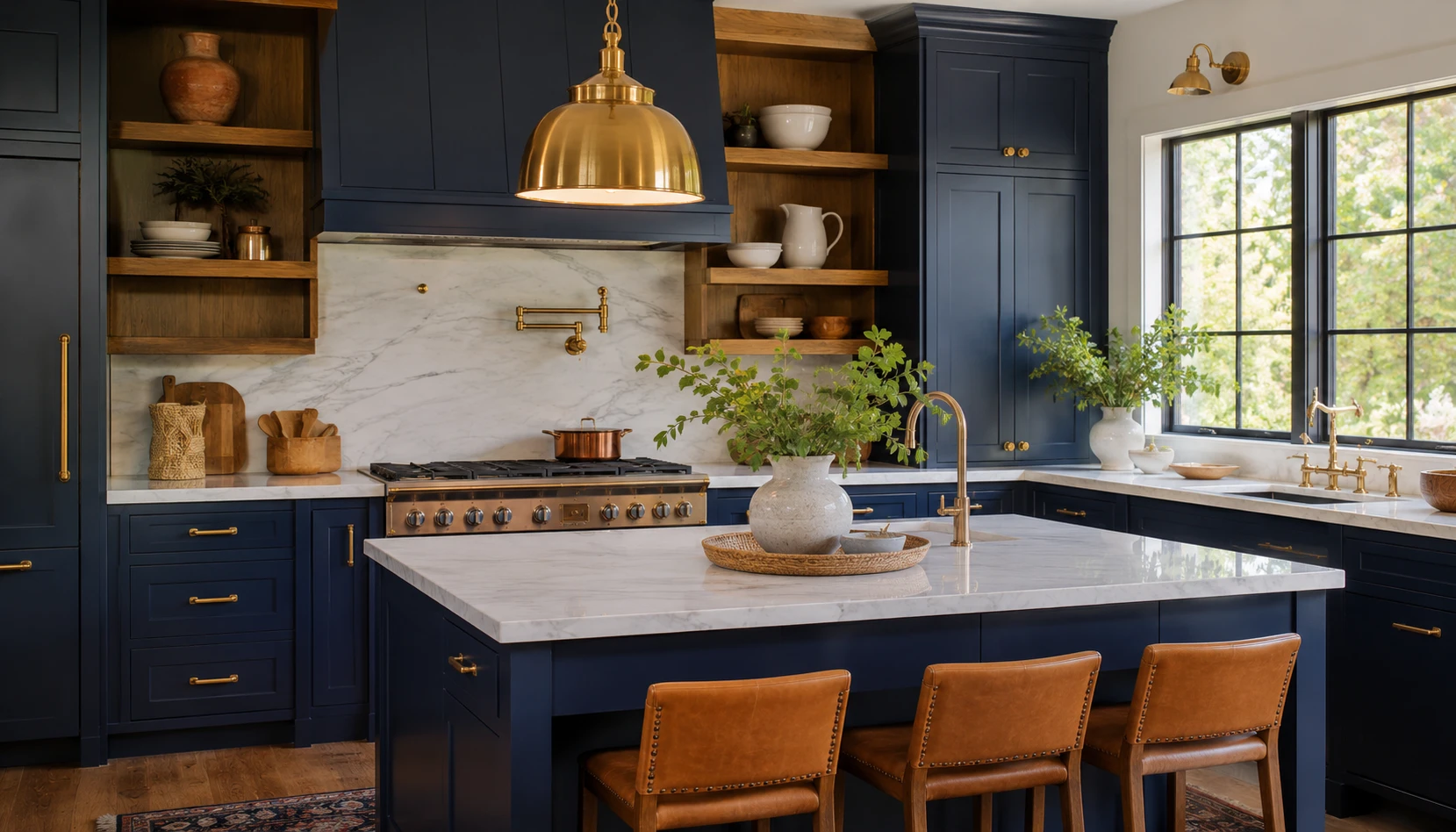
    Two-tone kitchens are everywhere for a reason. Keep your perimeter cabinets neutral (white, light gray, or wood tone) and make your island the star with a bold navy, forest green, or even black finish.

    This trick adds visual interest without overwhelming the whole room. It also draws attention to the island, which is usually the social hub of the kitchen anyway.

    Practical tip: Test your color choice with a large poster board taped to the island before committing to paint or new cabinet fronts.

    Coastal kitchens love soft blues for this effect, while traditional kitchens might lean toward deep hunter green or burgundy instead.

    Speaking of islands, let's look at what goes on top of them.

    3. Install a Waterfall Countertop Edge

    A waterfall edge is when your countertop material flows straight down the sides of the island instead of stopping at the top. It creates this seamless, sculptural look that instantly reads high-end.

    Quartz and marble work best for this because they can be cut and matched seamlessly at the seams. The continuous line draws your eye downward and makes the whole island feel like one solid piece of art.

    Practical tip: Ask your fabricator about "book-matching" the veining so the pattern flows naturally around the corner.

    This detail fits modern and contemporary kitchens best. Traditional kitchens rarely use waterfall edges since they clash with ornate cabinetry.

    Now let's move from countertops to something you'll notice the second you walk in the room.

    4. Choose Slab-Front Cabinets Over Shaker Style

    Shaker cabinets had their moment (okay, a really long moment). But modern kitchens are shifting toward flat slab fronts with zero grooves or panel lines. It's a simple change that instantly modernizes a space.

    Slab fronts work in wood veneer, laminate, or painted MDF. The key is keeping the surface completely flat and smooth.

    Practical tip: If you already have shaker cabinets, you can sometimes swap just the doors for slab fronts without replacing the entire cabinet box.

    Modern and Scandinavian kitchens thrive with this style. Farmhouse kitchens generally stick with shaker or beadboard styles instead.

    Let's talk about how lighting plays into all of this.

    5. Layer Your Lighting With Under-Cabinet Strips

    Good kitchen lighting isn't just one overhead fixture anymore. Modern kitchens layer light sources: ambient overhead lighting, task lighting under cabinets, and accent lighting inside glass cabinets or toe-kick areas.

    LED strip lights tucked under upper cabinets solve the classic "why can't I see my cutting board" problem. They also create a soft glow at night that feels cozy instead of harsh.

    Practical tip: Choose LED strips with adjustable color temperature so you can switch between warm and cool light depending on the time of day.

    This layered approach works across every style, from modern to traditional to coastal.

    Speaking of lighting, let's zoom into one specific fixture that makes a huge statement.

    6. Hang a Sculptural Pendant Light Over the Island

    One oversized, artistic pendant light (or a cluster of three smaller ones) over your island instantly becomes a conversation piece. Think smoked glass globes, matte black geometric shapes, or woven rattan domes.

    This is your chance to add personality without cluttering the counters. The pendant does all the visual work.

    Practical tip: Hang pendants 30 to 36 inches above the counter surface for the right proportion and to avoid blocking sightlines.

    Pendant Light Height Guide by Ceiling Height

    Ceiling Height Recommended Drop from Ceiling Distance Above Counter
    8 feet 20-24 inches 28-30 inches
    9 feet 26-30 inches 30-33 inches
    10+ feet 32-38 inches 32-36 inches

    Modern kitchens favor sleek metal or glass pendants, while coastal kitchens often go with woven or rope-wrapped fixtures instead.

    Now let's talk flooring, because it grounds the whole design.

    7. Install Large-Format Porcelain Tile Flooring

    Big tiles (think 24×24 inches or larger) mean fewer grout lines, which reads as cleaner and more modern. Porcelain also mimics the look of natural stone or concrete without the maintenance headaches.

    Large format tiles make small kitchens feel bigger too, since your eye isn't interrupted by tons of grout lines chopping up the visual space.

    Practical tip: Choose a matte or textured finish instead of high-gloss to avoid a slippery floor when it gets wet.

    Modern and industrial kitchens love concrete-look porcelain. Traditional kitchens usually stick with warm wood or smaller patterned tile instead.

    Let's shift gears and talk about a trend that's changing how we store our kitchen tools.

    8. Add Open Shelving in Strategic Spots

    Open shelving isn't about ditching all your cabinets. It's about picking one or two spots (like next to the stove or above a coffee station) to show off nice dishware or frequently used items.

    This creates breathing room in an otherwise closed-cabinet kitchen. It also makes everyday cooking more efficient since you're not digging through cabinets for your favorite mug.

    Practical tip: Only display items you actually use weekly. Open shelves get dusty fast if they're just for decoration.

    Modern kitchens pair open shelving with metal brackets, while farmhouse styles use reclaimed wood shelves instead.

    Next, let's talk about the unsung hero of modern kitchen design: the backsplash.

    9. Extend Your Backsplash to the Ceiling

    Instead of stopping your backsplash tile at the bottom of your upper cabinets, run it all the way to the ceiling. This is especially striking behind a stove or in a spot where you skipped upper cabinets entirely for open shelving or a window.

    Full-height backsplashes make a bold visual statement and protect your walls better too.

    Practical tip: Use large-format tile or slab material here to avoid a busy, choppy look with too many grout lines.

    Modern kitchens love slab quartz or large subway tile for this. Mediterranean kitchens might use handmade zellige tile instead for texture.

    Now let's talk storage, because modern kitchens are obsessed with hiding clutter.

    10. Build in a Hidden Pantry Behind Cabinet-Front Doors

    A hidden pantry is exactly what it sounds like. Cabinet doors that match your kitchen perfectly conceal a walk-in or butler's pantry behind them. Open the doors, and suddenly there's a whole extra room for small appliances, bulk groceries, and mess.

    This keeps your main kitchen looking pristine while giving you tons of practical storage.

    Practical tip: Add outlets inside the hidden pantry so you can store and use small appliances like coffee makers without cluttering your main counters.

    This idea fits any style since the pantry itself stays hidden. It's really about the exterior cabinet finish matching your chosen aesthetic.

    Kitchen Storage Solutions by Budget

    Storage Upgrade Budget Tier Approximate Cost
    Pull-out drawer organizers Low $50-$150 per drawer
    Corner lazy susan cabinet Medium $300-$600
    Hidden walk-in pantry High $3,000-$10,000+
    Custom pantry cabinet system Medium-High $1,500-$4,000

    Let's move on to a material choice that's really taken over countertops lately.

    11. Choose Quartz Over Granite for Countertops

    Quartz has basically dethroned granite as the go-to modern kitchen countertop material. It's engineered stone, so it comes in super consistent patterns and colors, unlike granite's natural variation.

    Quartz is also non-porous, which means no sealing required and better resistance to stains from wine, coffee, or oil.

    Practical tip: Look for quartz with subtle veining rather than heavy patterns if you want that clean, modern look to last through changing trends.

    Modern kitchens favor solid white or gray quartz. Traditional kitchens still often prefer the natural variation you get with granite or marble.

    Speaking of surfaces, let's talk about the walls themselves.

    12. Use a Matte Black Faucet as Your Statement Hardware

    Matte black faucets have become the go-to way to add contrast in an otherwise light, neutral kitchen. They pair beautifully with white cabinets, light countertops, and stainless appliances.

    This small hardware change makes a bigger visual impact than you'd expect for something so simple to swap.

    Practical tip: Match your matte black faucet with matching cabinet hardware and light fixtures to tie the whole look together instead of leaving it as a random accent.

    Modern kitchens love matte black. Coastal kitchens tend to favor brushed nickel or polished chrome instead for a lighter, breezier feel.

    Now let's talk about a layout trend that's reshaping how modern kitchens function.

    13. Design an Open-Concept Layout With a Multi-Purpose Island

    Modern kitchens are moving away from closed-off rooms and toward open layouts that flow into the living and dining areas. The island becomes the anchor, often handling seating, prep space, and sometimes even a small sink or cooktop.

    This layout makes entertaining way easier since the cook isn't stuck in a separate room while guests hang out elsewhere.

    Practical tip: Aim for at least 42 inches of clearance around your island so multiple people can move around comfortably while cooking.

    Open-concept works in modern, transitional, and farmhouse homes alike. Traditional homes sometimes keep the kitchen more enclosed for formality's sake.

    Last but not least, let's talk about a finishing touch that ties everything together.

    14. Add Warm Wood Accents to Balance Cool Materials

    Modern kitchens can start feeling a little cold with all that quartz, metal, and glass. The fix is adding warm wood elements, like a wood island base, open shelving, or wood bar stools, to soften things up.

    This creates what designers call "modern warm" or "Scandi-modern," which feels inviting instead of clinical.

    Practical tip: Stick to one or two wood tones throughout the kitchen to avoid a mismatched, chaotic look.

    This works across almost every style, though the wood tone shifts. Modern kitchens like light oak or walnut, while traditional kitchens often use darker cherry or mahogany tones.

    Tips for Success

    • Start with your layout before picking finishes. A beautiful kitchen with a bad workflow will frustrate you daily.
    • Set aside 10 to 15 percent extra in your budget for surprises, because renovations almost always find hidden issues.
    • Choose your countertop and flooring first, then build your cabinet color around those since they're harder to change later.
    • Don't skip ventilation. A good range hood matters more than most people realize for keeping your kitchen fresh.
    • Test paint and cabinet colors in your actual kitchen lighting, not just under store lights.
    • Keep at least one warm texture (wood, woven, or fabric) to avoid an overly sterile feel.
    • Plan your outlet placement early, especially if you're adding a hidden pantry or extra small appliances.

    Common Mistakes and How to Avoid Them

    Choosing trendy hardware over timeless finishes
    : Stick with classic shapes in matte black, brass, or chrome so you're not replacing hardware again in five years.

    Ignoring kitchen work triangle basics
    : Keep your sink, stove, and fridge in a reasonably close triangle shape so cooking doesn't feel like a workout.

    Skimping on lighting layers
    : Install at least three light sources (overhead, task, and accent) so your kitchen works well day and night.

    Going too matchy-matchy with metal finishes
    : Mix two metal finishes max, like matte black faucets with brass cabinet pulls, for a curated look instead of a showroom feel.

    Overcrowding open shelving
    : Limit open shelves to items you use often, and keep the rest tucked behind cabinet doors to avoid visual clutter.

    Forgetting about storage for small appliances
    : Plan an appliance garage or deep drawer specifically for things like blenders and toasters before you finalize your cabinet layout.

    Similar Variations

    • Scandinavian Modern Kitchen – Light woods, white walls, and minimal decor with a cozy, functional focus.
    • Industrial Modern Kitchen – Exposed brick, black metal fixtures, and concrete countertops for an edgier vibe.
    • Japandi Kitchen – A blend of Japanese minimalism and Scandinavian warmth, using natural materials and muted tones.
    • Contemporary Farmhouse Kitchen – Mixes modern lines with farmhouse warmth, like shiplap walls paired with sleek quartz counters.
    • Mid-Century Modern Kitchen – Retro shapes, warm wood tones, and bold accent colors inspired by the 1950s and 60s.
    • Minimalist Modern Kitchen – Stripped-down design with almost no visible hardware or decor, focused purely on clean function.

    Modern kitchens don't have to feel cold or impersonal, and they definitely don't have to break your budget if you pick your upgrades wisely. Whether you're going all-in on a full renovation or just swapping hardware and paint, these ideas give you a real roadmap to follow. At the end of the day, the best 14 Modern Kitchen ideas are the ones that fit how you actually live and cook, not just how a magazine says your kitchen should look.
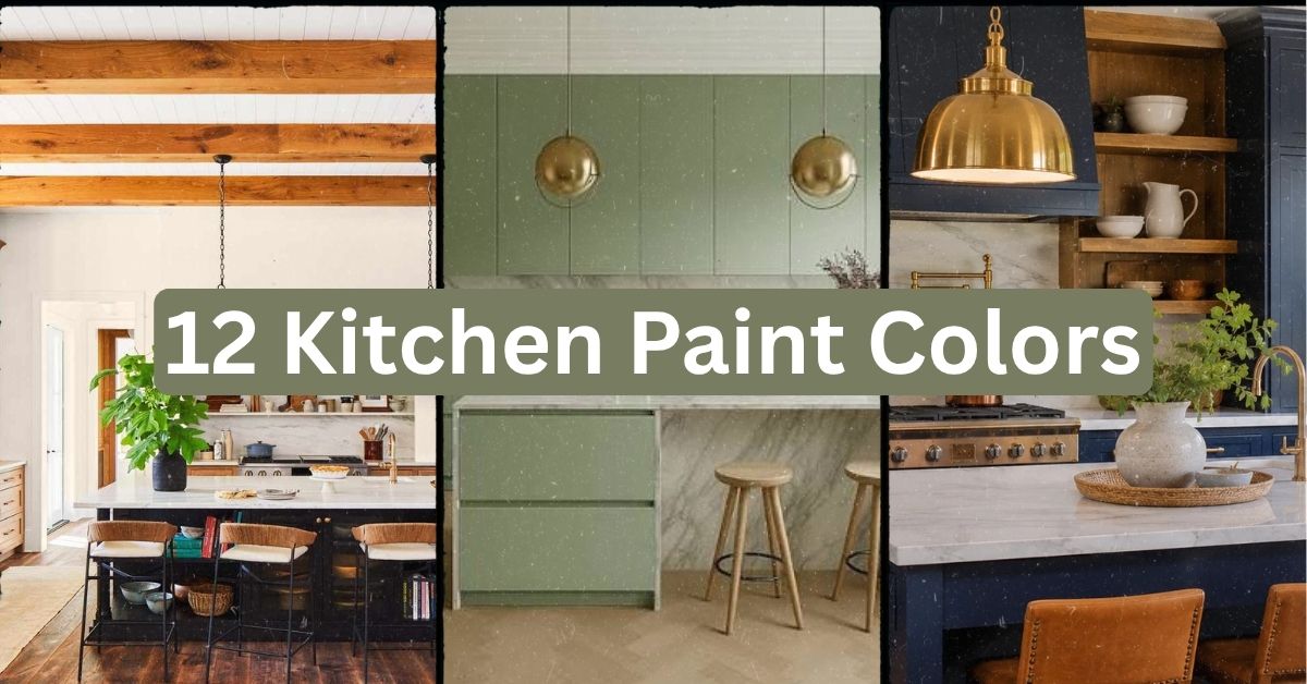
  • 12 Kitchen Paint Colors That Will Transform Your Cooking Space

    12 Kitchen Paint Colors That Will Transform Your Cooking Space

    I’ve tested more kitchen paint colors than I can count, and I’m about to hand you the most complete list of 12 kitchen paint colors that actually work in real homes. Ever stood in the paint aisle holding two nearly identical swatches, totally frozen, wondering if you’re about to ruin your whole kitchen? I’ve been there, and that’s exactly why I put this guide together.

    Which paint colors work best for kitchens? The best kitchen paint colors include warm whites, soft sage greens, navy blue, greige, buttery yellow, and charcoal gray. These shades balance light, hide daily wear, and pair well with most cabinet and countertop finishes.

    Stick around, because I’m walking you through twelve specific colors, how to pair them, and the mistakes that make people repaint within a year.

    What Makes a Kitchen Paint Color Actually Work

    Picking kitchen paint isn’t like picking a color for your bedroom. Your kitchen deals with grease splatters, steam, sunlight, and constant traffic. So the color needs to do more than look pretty. It needs to hide smudges, play nice with your cabinets, and still feel calm after a long day of cooking.

    I always tell people to think about light first. North-facing kitchens need warmer tones. South-facing ones can handle cooler shades without feeling cold. Once you get that part right, the rest is just personal taste. Let’s get into the actual colors.

    1. Warm White for a Timeless, Bright Look

    22 Warm White Paint Colors To Cozy Up Your Space
    Credit: https://www.southernliving

    Warm white is the color people pick when they want their kitchen to feel clean without feeling sterile. It has a hint of cream or beige mixed in, so it avoids that stark hospital vibe you get from pure white.

    This shade works with almost any countertop, from white quartz to butcher block. Pair it with brass or matte black hardware for contrast. A practical tip: test the white on your actual wall at different times of day before committing, since lighting changes it drastically.

    Warm white fits modern farmhouse kitchens, coastal kitchens, and even traditional ones. It’s the safest choice on this list, but it never feels boring.

    Next up is a color that’s a little bolder but still easy to live with.

    2. Sage Green for a Calm, Earthy Feel

    Sage Green Kitchen Cabinets: 10 Stunning Designs | OPPEIN
    Credit: Openin

    Sage green has taken over kitchens the last few years, and honestly, I get why. It feels fresh without screaming for attention. It works because it sits right between green and gray, so it doesn’t compete with wood tones or stainless steel.

    Pair sage with natural wood open shelves and woven baskets for texture. A great tip is to use sage only on lower cabinets and keep upper cabinets or walls lighter, so the room doesn’t feel heavy.

    This color shines in cottage-style kitchens and modern farmhouse spaces. It also works surprisingly well in mid-century kitchens with walnut cabinetry.

    Now let’s talk about a color that adds serious drama without being loud.

    3. Navy Blue for Bold Contrast

    Navy Blue Kitchen Ideas: 12 Designs That Feel Bold and Expensive in 2026 |  InterestDecor
    Credit: Interestdecor

    Navy blue on kitchen cabinets or an island creates instant contrast against white countertops. It’s rich, it’s classic, and it photographs beautifully, which is probably why you see it all over design blogs.

    Keep your walls lighter if you go navy on cabinets, so the room still feels open. Brass hardware and warm lighting soften the boldness. My tip: test navy on a poster board taped to your cabinet for a full day before painting, since navy can look black in low light.

    Navy adapts well to coastal kitchens, traditional kitchens, and transitional designs. It’s less common in strict minimalist spaces, but it can work if you keep everything else simple.

    Let’s move to something a bit more neutral and flexible.

    4. Greige for the Ultimate Neutral Balance

    Greige Kitchen Ideas | Kitchen Greige | Wren Kitchens
    Credit: Wrenkitchens

    Greige, that gray-beige hybrid, solves the age-old fight between warm and cool tones. It’s not too gray to feel cold, and not too beige to feel dated.

    This color pairs with almost any countertop material, including granite, quartz, and butcher block. A helpful tip: choose a greige with more gray undertone if your kitchen gets lots of natural light, since sunlight can wash out warmer beiges.

    Greige fits transitional kitchens best, but it also works in modern spaces when paired with matte black fixtures.

    Quick Color Comparison Table

    ColorBest Light ExposurePairs Well WithStyle Match
    Warm WhiteAnyBrass, black hardwareFarmhouse, Coastal
    Sage GreenNorth or EastNatural wood, wickerCottage, Mid-Century
    Navy BlueSouth or WestBrass, white countertopsTraditional, Coastal
    GreigeAnyQuartz, graniteTransitional, Modern

    This table gives you a quick gut check before you commit to a full gallon. Now let’s look at a color that feels sunny without being overwhelming.

    5. Buttery Yellow for a Cheerful Kitchen

    30 Beautiful Yellow Kitchen Ideas to Try
    Credit: The Spruce

    Buttery yellow brings warmth into a kitchen instantly. It’s softer than a bold sunflower yellow, so it won’t feel like you’re standing in a lemon.

    Use it on walls while keeping cabinets white or light wood, so the yellow doesn’t overpower the space. A solid tip: add white trim around windows to keep the yellow from feeling too saturated.

    This color fits cottage kitchens and vintage-inspired spaces really well. It also works in small kitchens since it reflects light nicely.

    Let’s switch gears to something darker and moodier next.

    6. Charcoal Gray for a Moody, Modern Vibe

    7 New Kitchens With Dark and Moody Elements
    Credit: Houzz

    Charcoal gray on cabinets creates a bold, modern statement. It’s darker than navy but not as harsh as pure black, so it still feels warm in the right lighting.

    Pair charcoal with gold or brass hardware to keep the room from feeling too heavy. A practical tip: use charcoal only on lower cabinets or an island, and keep upper cabinets white to balance the weight visually.

    Charcoal works beautifully in modern and industrial kitchens. It can also work in traditional kitchens if paired with classic molding and warm wood floors.

    Now let’s look at a color that’s having a huge moment in kitchens right now.

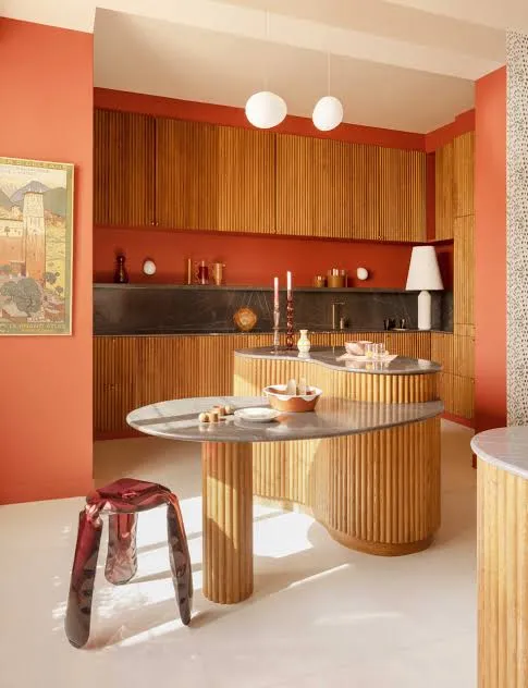
    7. Terracotta for Earthy Warmth

    Credit: MGM Tile

    Terracotta brings an old-world, sunbaked feel into a kitchen. It’s warm, a little rustic, and pairs beautifully with natural materials.

    Use terracotta on an accent wall or island rather than the whole room, since it’s a strong color. Pair it with cream cabinets and wood accents for balance. My tip: test terracotta next to your existing floor tile first, since some clay-based tiles clash with certain terracotta shades.

    This color fits Mediterranean, Spanish-style, and boho kitchens especially well. It can also work in modern farmhouse kitchens if you tone down other bold colors nearby.

    Let’s cool things down with a classic blue-gray next.

    8. Slate Blue for Subtle Sophistication

    32 Beautiful Blue Kitchen Ideas to Try in 2025
    Credit: Elle Decor

    Slate blue sits between blue and gray, giving it a quiet, sophisticated feel. It’s calming without being boring, which makes it a favorite for people who want color but not too much color.

    Pair slate blue with white marble or quartz countertops for a clean look. A helpful tip: use a satin or eggshell finish on walls, since slate blue can look flat in matte finishes.

    This shade works great in coastal kitchens, farmhouse kitchens, and transitional spaces. It also pairs nicely with black steel windows if you’re going for an industrial farmhouse look.

    Budget Tier Table for Repainting a Kitchen

    Budget TierWhat’s IncludedEstimated Cost Range
    DIY BasicPaint, brushes, rollers, tape$150-$300
    DIY PremiumHigh-end paint, primer, hardware swap$300-$600
    Professional BasicLabor plus standard paint$800-$1,500
    Professional Full Remodel PaintCabinets, walls, trim, hardware$2,000-$4,500

    Knowing your budget tier ahead of time saves a lot of stress later. Let’s move into a color that feels fresh and clean.

    9. Soft Blush for a Gentle, Modern Touch

    18 Dreamy Kitchens That Are Pretty in Pink | HGTV
    Credit: Hgtv

    Soft blush might sound unusual for a kitchen, but a muted, dusty pink can feel surprisingly grown-up. It’s not girly when done right, it’s just warm and soft.

    Pair blush walls with black or brass fixtures to keep the room from feeling too sweet. A tip that works well: use blush only on an accent wall behind open shelving, so it doesn’t overwhelm the whole kitchen.

    This color fits modern and Scandinavian kitchens especially well. It also works in eclectic kitchens mixed with patterned tile.

    Now let’s talk about a deep green that’s a bit different from sage.

    10. Hunter Green for Rich, Classic Style

    Credit: Elle Decor

    Hunter green feels more traditional and deep compared to sage. It’s the color you pick when you want your kitchen to feel like a cozy library crossed with a chef’s dream space.

    Pair hunter green cabinets with brass hardware and white or marble countertops for contrast. A useful tip: keep your ceiling white to prevent the room from feeling like a dark box.

    This shade works beautifully in traditional kitchens and English-country style spaces. It also fits modern kitchens if paired with sleek, handle-less cabinet fronts.

    Let’s look at a color that feels light, airy, and almost invisible in the best way.

    11. Pale Blue for a Fresh, Airy Feel

    Credit: Homesandgardens

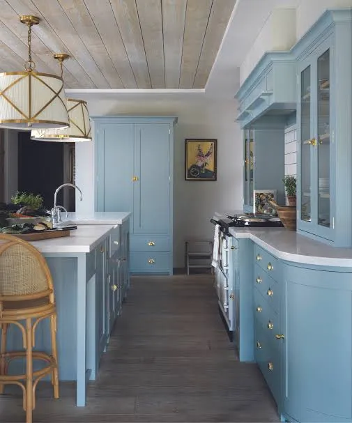
    Pale blue is one of those colors that makes a kitchen feel bigger and brighter. It’s calming, easy on the eyes, and works in almost any lighting condition.

    Pair pale blue with white subway tile and light wood floors for a clean, coastal feel. A solid tip: choose a blue with slight gray undertones if you want it to feel more sophisticated instead of babyish.

    This color shines in coastal kitchens, cottage kitchens, and Scandinavian-style spaces. It also works in small kitchens where you want to avoid a boxed-in feeling.

    Last but not least, let’s cover a color that’s bold but still surprisingly livable.

    12. Deep Olive for a Grounded, Natural Look

    16 Green Kitchen Cabinet Ideas That Interior Designers Love
    Credit: Marthastewart

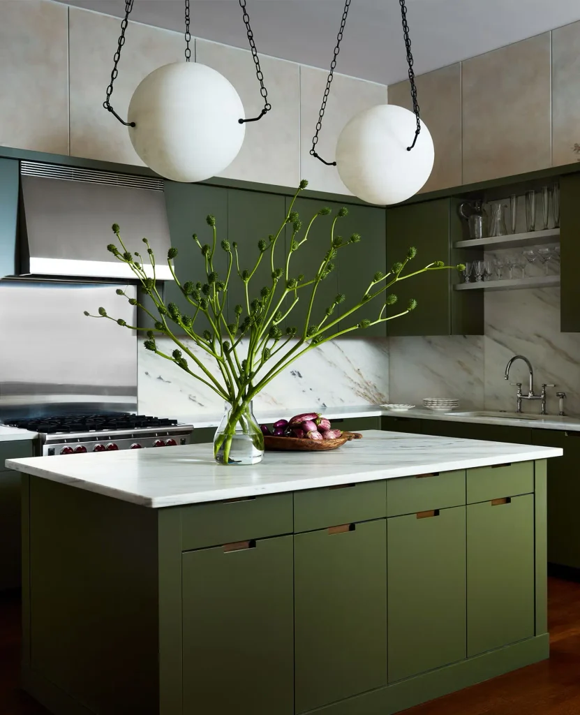
    Deep olive brings an earthy, grounded feeling into a kitchen without going full-on dark green. It reads more neutral than hunter green, which makes it easier to pair with a wider range of materials.

    Use olive on cabinets while keeping walls a soft cream or white, so the room stays balanced. A great tip: pair olive with unlacquered brass, since it tends to develop a warm patina that matches the earthy tone.

    This color works in modern farmhouse kitchens and Mediterranean-inspired spaces. It’s also a great fit for kitchens with lots of natural wood, since it doesn’t compete with warm tones.

    Tips for Success

    • Always buy a sample pot before committing to a full gallon, even if you’ve used the color before in a different room.
    • Paint a swatch on at least two different walls, since morning and evening light change everything.
    • Choose a finish based on function. Satin or semi-gloss holds up better than matte in high-traffic kitchens.
    • Don’t ignore your countertop and flooring undertones. They can clash with certain wall colors more than you’d expect.
    • Live with your sample for at least three days before deciding, since first impressions can be misleading.
    • If you’re nervous about commitment, start with an island or accent wall instead of painting the entire kitchen.
    • Ask your paint store for a color-matched primer, since it can prevent streaky, uneven coverage on bold colors like navy or charcoal.

    Common Mistakes and How to Avoid Them

    Skipping the sample stage
    : Buy a small tester can and paint a poster board so you can move it around the room and check different lighting angles.

    Ignoring the finish type
    : Use satin or semi-gloss on kitchen walls and cabinets, since matte finishes stain easily and are harder to clean.

    Matching paint to a photo instead of your actual room
    : Colors look different depending on your lighting, floor tone, and countertop material, so always test in your own space.

    Painting the whole kitchen one bold color
    : Balance strong shades like navy or charcoal with lighter walls, ceilings, or countertops so the room doesn’t feel closed in.

    Forgetting about undertones
    : Hold your paint swatch next to your cabinets and countertop sample before buying, since undertones can clash even if the colors seem to match.

    Rushing the prep work
    : Clean and lightly sand cabinets or walls before painting, since grease and dust prevent paint from sticking properly.

    Similar Variations

    • Coastal Kitchen Palette: Soft blues, whites, and sandy neutrals that mimic a beach house feel.
    • Modern Farmhouse Palette: Warm whites, sage green, and black accents for a cozy but clean look.
    • Mediterranean Kitchen Palette: Terracotta, olive, and deep blue tones inspired by coastal Europe.
    • Scandinavian Kitchen Palette: Pale blues, soft grays, and warm whites for a minimal, airy feel.
    • Industrial Kitchen Palette: Charcoal, matte black, and deep gray tones paired with metal accents.
    • English Cottage Palette: Hunter green, buttery yellow, and warm cream for a classic, storybook feel.

    Picking the right shade really comes down to your lighting, your materials, and how bold you want to feel every morning when you walk in for coffee. I’ve shown you real options that work in real homes, not just trendy shades that look good for one photo and fade fast. Whatever direction you choose, these 12 kitchen paint colors give you a solid, tested starting point for a kitchen you’ll actually love living in.

  • 10 Coastal Living Rooms That’ll Make You Want to Move to the Beach

    10 Coastal Living Rooms That’ll Make You Want to Move to the Beach

    I’ve spent way too many hours scrolling through home design boards, and let me tell you, these 10 coastal living rooms are some of the best inspiration I’ve found for bringing that breezy beach feel into your own space. If you’re tired of your living room feeling flat and boring, you’re in the right spot. I promise this guide covers everything you need, no fluff, no guessing games.

    A coastal living room is a space designed with light colors, natural textures, and beach-inspired accents to create an airy, relaxed feel. Common features include blue and white color schemes, woven materials, and nautical decor touches.

    Stick around because I’m about to walk you through a dozen ways to get this look right, plus some mistakes to dodge along the way.

    What Even Is “Coastal Style,” Anyway?

    Okay, so before we jump into the good stuff, let’s talk about what coastal style actually means. It’s not just throwing a few seashells on your coffee table and calling it done. Coastal design is about capturing that feeling you get when you’re near the ocean. Think sunlight bouncing off water, sandy beaches, and salty air.

    The colors are usually soft and light. The textures feel natural, like something you’d find washed up on shore. And the whole vibe should feel relaxed, not stuffy or formal. It’s beachy without being tacky. That’s the sweet spot we’re aiming for.

    Now let’s get into the actual ideas.

    1. Start With a Whites and Blues Color Palette

    Coastal Color Guide 101 : Everything You Need To Know For A Beach Inspired  Home - Edward George
    Credit: Edward

    This one’s the classic coastal combo, and for good reason. White walls or trim paired with soft blue accents instantly say “beach house” without saying a word. Think crisp white sofas, navy throw pillows, and maybe a robin’s egg blue accent wall.

    The trick is layering different shades of blue so it doesn’t look flat. Try pairing a deep navy rug with lighter periwinkle curtains. It creates depth without clashing.

    Practical tip: paint one wall a soft ocean blue and keep the rest white. This gives you the color without overwhelming the room.

    This palette works in almost any home style, from farmhouse to modern minimalist, because white and blue are timeless. Once your colors are set, it’s time to think about texture.

    2. Bring in Natural Woven Textures

    What Is Coastal Style (and How To Get the Look) - Thistlewood Farm
    Credit: thistlewoodfarms

    Woven textures are what make a coastal room feel grounded instead of sterile. I’m talking about jute rugs, rattan chairs, and wicker baskets. These materials add warmth and a handmade feel that pairs perfectly with all that white and blue.

    A woven pouf or ottoman is an easy way to test this out without committing to a big furniture piece. You can also swap out a plain lampshade for one made of rattan or bamboo.

    Quick tip: layer a chunky jute rug over a smaller patterned rug for extra texture and visual interest.

    This idea adapts well to bohemian and farmhouse styles too, since both love natural materials. Once you’ve got texture covered, let’s talk about furniture shapes.

    3. Choose Slipcovered Sofas for Easy, Breezy Comfort

    Why Slipcovered Furniture – Our Boat House
    Credit: Boat house

    Slipcovered sofas are a coastal living room staple. They look relaxed, they’re comfortable, and honestly, they’re practical too. If you spill something (and you will), you just toss the cover in the wash.

    Look for slipcovers in linen or cotton blends. These fabrics have a slightly wrinkled, lived-in look that fits the coastal vibe perfectly. Skip anything too shiny or structured.

    Actionable tip: choose a slipcover in an off-white or oatmeal shade so it doesn’t show every little stain immediately.

    This works great in casual and cottage-style homes, though it might feel out of place in a formal traditional setting. Speaking of furniture, let’s talk about what goes on top of it.

    4. Layer in Striped Throw Pillows and Blankets

    How to Layer our Coast Collection Fabrics | Ian Mankin
    Credit: Ian Markin

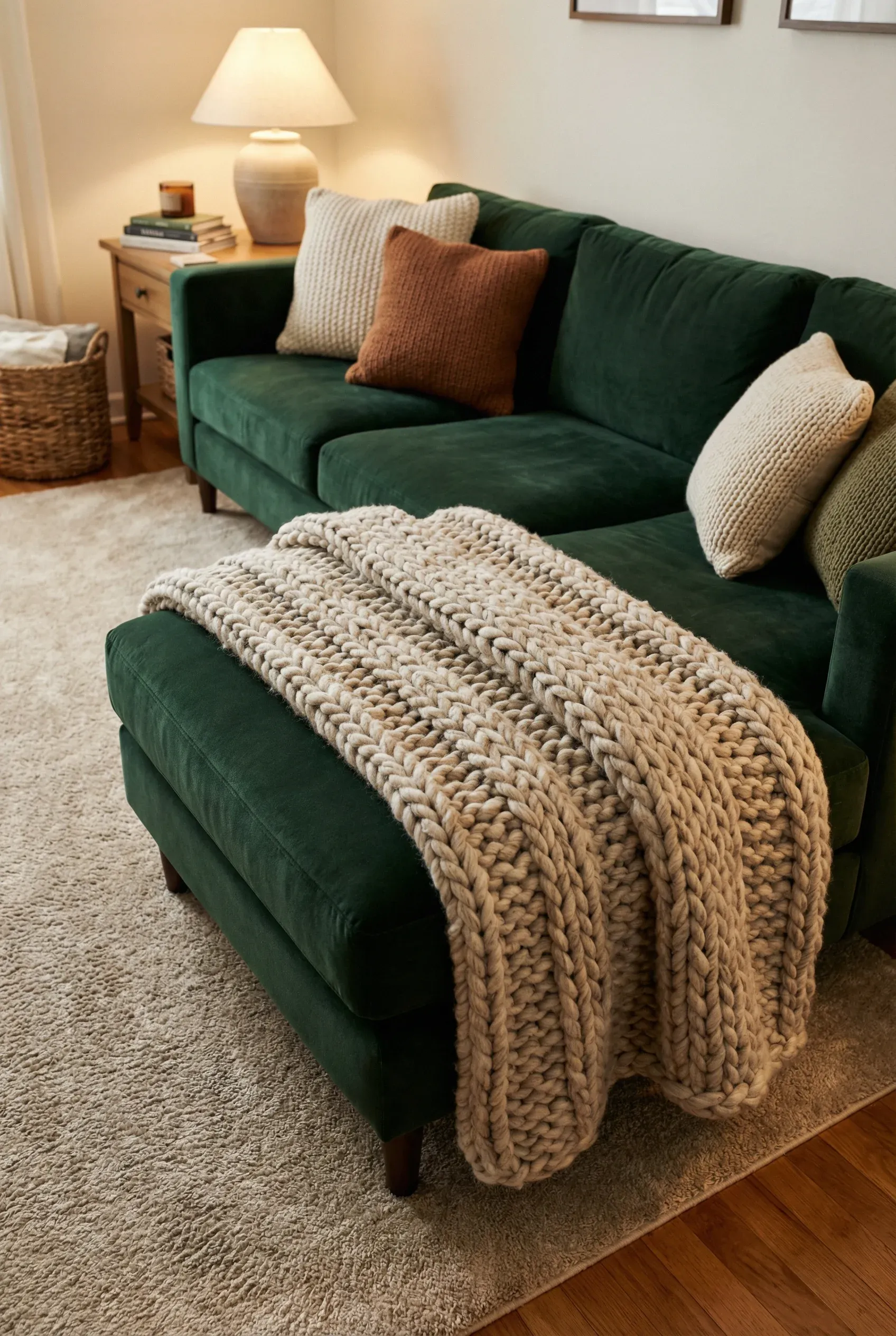
    Stripes are basically the unofficial pattern of coastal design. Whether it’s a classic nautical stripe or something more subtle, adding striped pillows or throws instantly boosts that seaside feeling.

    I like mixing a bold navy and white stripe with a smaller, more subtle pattern like a herringbone or gingham. This keeps things interesting without looking too matchy.

    Try this: use an odd number of pillows (three or five) on your sofa for a more natural, unstudied look.
    Stripes translate well into preppy, traditional, and even modern farmhouse spaces. Now let’s move from soft textiles to something a bit more structural.

    Coastal Color Palette Comparison

    Palette StyleMain ColorsBest ForMood Created
    Classic NauticalNavy, White, Red accentsTraditional homesBold, crisp
    Soft SeafoamSeafoam green, cream, tanCottage styleCalm, gentle
    Sandy NeutralBeige, white, driftwood grayModern coastalWarm, minimal
    Ocean BreezeSky blue, white, soft aquaFarmhouse coastalLight, airy

    5. Add a Statement Driftwood or Reclaimed Wood Piece

    Hampton Driftwood Side Table Base – Our Boat House
    Credit: Boat house

    Driftwood furniture or decor brings an authentic beachy touch that feels a little more elevated than your typical seashell decor. A driftwood coffee table, mirror frame, or even a decorative branch in a vase can add serious character.

    The rough, weathered texture contrasts nicely with smooth linens and soft fabrics. It gives the room a lived-in, collected-over-time feel rather than looking like it came straight from a catalog.

    Practical tip: if real driftwood is hard to find, look for reclaimed wood furniture instead. It has a similar texture and story.

    This idea works beautifully in rustic and industrial coastal blends too. Once you’ve got some natural wood in the mix, let’s talk lighting.

    6. Choose Rattan or Woven Pendant Lighting

    Lutta Handwoven Bamboo Pendant Light | Living and Home
    Credit: living Room

    Lighting can make or break a coastal room. Skip the crystal chandeliers and go for something woven instead. Rattan pendant lights or capiz shell fixtures add texture and a soft, diffused glow that feels warm and relaxed.

    These fixtures work especially well over a reading nook or above a console table. The shadows they cast add a subtle, interesting pattern on the walls and ceiling.

    Quick tip: pick a fixture with an open weave design so light filters through nicely, creating a cozy ambiance at night.

    This lighting choice adapts well to bohemian, tropical, and even mid-century modern coastal spaces. With lighting sorted, let’s think about how to bring the outside in.

    7. Incorporate Live Plants for a Fresh, Organic Feel

    32 Beach House Living Rooms to Transport You to the Coast
    Credit: The Spurace

    No coastal room feels complete without a little greenery. Plants add life, color, and a fresh, organic touch that pairs perfectly with all the natural textures we’ve talked about.

    Go for plants that thrive in bright, indirect light, like a fiddle leaf fig, palm, or even a simple pothos. Place them in woven baskets or ceramic pots in soft, neutral tones to keep the coastal theme consistent.

    Actionable tip: group two or three plants of different heights together near a window for a layered, jungle-like effect.

    This idea works in literally every design style, coastal or not, because plants are universally good for a space. Now let’s talk about something a little more nautical.

    8. Use Nautical Accents Sparingly but Intentionally

    30 Best Nautical Interior Design Ideas You Should Check
    Credit: Kreafolk

    Here’s the thing about nautical decor: a little goes a long way. One or two well-placed pieces, like a ship’s wheel mirror or a rope-wrapped vase, add charm. Ten pieces, and suddenly your living room looks like a theme restaurant.

    Pick a couple of standout pieces instead of covering every surface. A single striped anchor pillow or a small collection of shells in a glass jar works better than an overload of beach tchotchkes.

    Practical tip: stick to one nautical “theme” item per major furniture piece (one on the coffee table, one on a shelf, and so on).

    This restrained approach works well across coastal, preppy, and even modern farmhouse styles. Now, let’s talk flooring.

    9. Choose Light Wood or Whitewashed Flooring

    Best Flooring Options for Coastal Homes
    Credit: beareflooring

    Flooring sets the tone for the whole room, and coastal spaces do best with light wood or whitewashed floors. This mimics that sun-bleached boardwalk look and keeps the space feeling bright and open.

    If replacing your floors isn’t in the budget right now, a large jute or sisal area rug can create a similar visual effect. Just make sure it’s light in color to keep things airy.

    Quick tip: avoid dark wood floors if you’re going for true coastal style. They tend to make the room feel heavier and less breezy.

    This flooring choice works especially well in open-concept homes and modern coastal designs. Next, let’s talk window treatments.

    10. Hang Light, Airy Curtains

    A Complete Guide For Hanging Curtains in the Coastal Home
    Credit: cassdesignco

    Heavy drapes have no business in a coastal living room. Instead, go for lightweight linen or cotton curtains in white, cream, or a soft blue. These let in natural light while still giving you some privacy.

    Sheer curtains work great too, especially if you want that gentle, billowy movement when a breeze comes through an open window.

    Practical tip: hang your curtain rods a few inches above the window frame to make ceilings look taller and let in more light.

    This works in almost every design style since light curtains are pretty universally flattering to a room. Now, let’s cover furniture layout.

    Budget Breakdown for a Coastal Living Room Refresh

    Budget TierWhat You Can AffordExample Items
    Under $200Small accents, textilesThrow pillows, a jute rug, curtains
    $200-$800Mid-size furniture piecesAccent chair, pendant light, coffee table
    $800-$2,000Major furniture swapsSlipcovered sofa, area rug, driftwood mirror
    $2,000+Full room overhaulNew flooring, custom furniture, built-ins

    Tips for Success

    • Start small. Pick two or three ideas from this list instead of trying to do everything at once.
    • Stick to a consistent color palette so the room doesn’t feel chaotic.
    • Mix textures generously. Smooth, rough, woven, and soft should all show up somewhere in the room.
    • Don’t be afraid of empty space. Coastal design loves breathing room.
    • Shop secondhand for driftwood, rattan, and wicker pieces. They often look better with a little wear anyway.
    • Keep window treatments light so natural light stays the star of the show.
    • Add plants last, once your color and texture foundation is set.

    Common Mistakes and How to Avoid Them

    Overdoing the nautical theme
    : Stick to one or two nautical accents per room instead of covering every surface with anchors and shells.

    Choosing dark, heavy furniture
    : Opt for lighter wood tones and slipcovered or linen furniture instead to keep the room feeling airy.

    Ignoring texture
    : Add woven baskets, jute rugs, or rattan lighting so the room doesn’t feel flat or one-dimensional.

    Using too many bright colors
    : Stick to a soft, muted palette of blues, whites, and sandy neutrals rather than bold primary colors.

    Skipping natural light
    : Use sheer or lightweight curtains instead of heavy drapes so sunlight can actually get into the room.

    Forgetting scale
    : Measure your space before buying furniture so pieces don’t overwhelm or underwhelm the room.

    Similar Variations

    • Coastal Boho: Mixes beachy blues and whites with bohemian patterns, macrame, and warm earthy tones.
    • Modern Coastal: A cleaner, more minimalist take on coastal style with sleek furniture and fewer decorative accents.
    • Cottage Coastal: Leans into a cozy, vintage feel with floral prints, painted furniture, and softer color palettes.
    • Nautical Traditional: A more formal coastal look with classic navy and white stripes, brass accents, and structured furniture.
    • Tropical Coastal: Adds bold greenery, rattan furniture, and warmer tones for a more vacation-inspired feel.
    • Desert Coastal: Blends sandy neutrals and warm terracotta tones with coastal textures for a sun-baked, relaxed look.

    Getting the coastal look right really comes down to color, texture, and keeping things simple. You don’t need to buy every seashell at the craft store or repaint your whole house navy blue. Just focus on light colors, natural materials, and a relaxed layout, and you’ll be most of the way there.

    I hope this list gave you plenty of ideas to steal for your own space. Whether you go all in or just borrow a tip or two, these 10 coastal living rooms (and the extra ideas I snuck in) should give you a solid starting point for bringing that beachy, relaxed feeling home.

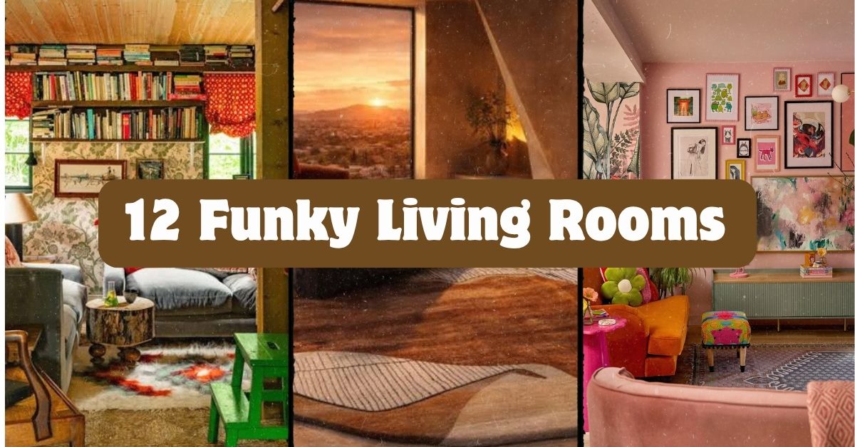
  • 12 Funky Living Rooms That’ll Make You Rethink Boring Decor

    12 Funky Living Rooms That’ll Make You Rethink Boring Decor

    I’ve spent way too many nights scrolling through home decor pages, and let me tell you, 12 funky living rooms can completely change how you think about your own space. If you’re tired of beige walls and matching furniture sets, you’re in the right place. I’m going to walk you through everything that makes a living room “funky” and give you real, usable ideas.

    A funky living room mixes bold colors, mismatched patterns, and unexpected decor pieces to create a space full of personality. The goal is fun over formality, with quirky furniture, layered textures, and statement pieces replacing plain, matchy-matchy decor.

    Stick around because I’m about to show you 12 specific ways to bring that funky energy into your own four walls, plus a few mistakes I’ve made so you don’t have to repeat them.

    What Even Is a “Funky” Living Room?

    Okay so real talk. Funky decor isn’t about following rules. It’s about breaking them, but on purpose. Think bright colors that shouldn’t work together but somehow do. Think a vintage lamp next to a modern couch. Think patterns on patterns on patterns.

    I like to describe it as the anti-Pinterest-perfect look. It’s messy in the best way. It’s got soul. Funky rooms usually pull from retro decades like the 70s and 80s, mixed with modern pieces and global finds. There’s no single formula, and that’s exactly the point. You’re building a room that feels like you, not like a catalog page.

    1. Paint One Wall in a Color You’d Never Expect

    70 Unexpected Room Colors 2023 - Best Room Color Ideas
    Credit: Veranda

    Forget the safe gray accent wall. A funky living room needs at least one wall that makes people stop and stare. Think mustard yellow, deep teal, or even hot pink. This single move can transform a boring box of a room into something with actual attitude.

    Pick a color that contrasts with your furniture instead of matching it. If your couch is neutral, go wild with the wall. If your furniture already has bold colors, choose a wall shade that complements rather than competes.

    Practical tip: Test your paint color on a big piece of poster board first. Move it around the room at different times of day before committing.

    This works in modern homes with clean lines, but it also fits cozy traditional spaces if you pick a richer, deeper shade. Once your wall is set, it’s time to bring in furniture that matches that same fearless energy.

    2. Mix Furniture Eras Like You’re Building a Time Capsule

    Home Decor Ideas - Mixing Antique Furniture and Contemporary Decor |  Architectural Digest
    Credit: Architecture

    Funky rooms don’t stick to one decade. I love pairing a 1970s velvet chair with a sleek modern coffee table. The contrast is what makes it interesting. When everything matches, the room feels flat. When pieces clash a little, it feels alive.

    Start with one statement vintage piece, maybe a thrifted armchair or an old record cabinet. Then build modern pieces around it so the old and new balance each other out.

    Actionable tip: Visit a local thrift store or estate sale before buying anything new. You’ll find pieces with more character for less money.

    Coastal homes can add a rattan vintage chair, while industrial lofts might mix in a retro leather sofa. Once you’ve got your furniture mix figured out, patterns are the next layer to play with.

    3. Layer Clashing Patterns on Purpose

    How To Pattern Clash In A Subtle Way
    Credit: Country

    This is the part that scares people the most, but it’s actually simple once you get the hang of it. Stripes with florals. Polka dots with geometric prints. The trick is keeping a common color thread running through each pattern so they don’t fight each other.

    Start small if you’re nervous. Add a patterned throw pillow to a solid couch. Then add a patterned rug. Then maybe curtains with a totally different print. As long as one or two colors repeat across all of them, it works.

    Quick tip: Pick three patterns max to start. More than that can get overwhelming fast.

    Bohemian and eclectic homes thrive on this kind of pattern mixing, but even minimalist spaces can handle one bold clashing moment if everything else stays simple. Now let’s talk about how color palettes tie this whole look together.

    Funky Color Palette Combos That Actually Work

    Palette NameMain ColorsBest Paired WithRoom Mood
    Retro SunsetBurnt orange, mustard, brownCream, dark woodWarm, nostalgic
    Jungle PopEmerald green, hot pink, goldWhite, black accentsBold, tropical
    Disco DreamPurple, silver, blueChrome, mirrored surfacesPlayful, glam
    Desert FunkTerracotta, sage, creamRattan, natural woodEarthy, relaxed

    4. Hang a Gallery Wall That Breaks All the Rules

    How to Style a Gallery Wall the Right Way, According to Designers
    Credit: house Beautiful

    Forget symmetrical frames in matching sizes. A funky gallery wall mixes frame styles, sizes, and even mediums. Throw in a vintage mirror, a neon sign, some framed art, and maybe a tapestry. The mismatch is the whole point.

    Start by laying pieces out on the floor before hanging anything. Move them around until the spacing feels balanced even though the styles don’t match.

    Practical tip: Use removable adhesive hooks first so you can test placement without punching holes everywhere.

    Modern homes can keep this cleaner with fewer, bigger pieces. Maximalist spaces can go all out and fill every inch of wall space. Speaking of walls, let’s talk about what goes on the floor next.

    5. Add a Rug That Doesn’t Match Anything Else in the Room

    The Rug Rules That Make Odd Shaped Rooms Feel Intentional
    Credit: Jaipur Rags

    A funky rug is basically a piece of art you walk on. Go for bold geometric shapes, bright colors, or even a vintage Persian rug with faded, mismatched tones. It should stand out, not blend in.

    Layer two rugs if you’re feeling brave. A large jute rug topped with a smaller, colorful patterned one adds texture and depth that a single rug can’t give you.

    Tip: Keep your rug’s main color connected to at least one other item in the room, like a pillow or piece of art, so it doesn’t feel totally random.

    This trick works in almost every style, from boho living rooms to mid-century modern spaces. Once your rug sets the tone, lighting is what brings the whole vibe to life after dark.

    6. Choose Lighting That Feels Like a Sculpture

    Living room lighting ideas for creating all kinds of moods | Homebuilding
    Credit: Homebuilding

    Skip the boring lamp from a big box store. Funky living rooms need lighting that doubles as art. Think a chunky ceramic lamp base, a colorful glass pendant, or a floor lamp shaped like something totally unexpected.

    Mix your lighting types too. A statement floor lamp, a quirky table lamp, and some string lights can all live in the same room without looking chaotic, as long as you keep a similar color family running through them.

    Actionable tip: Swap out plain white lampshades for colored or patterned ones. It’s a cheap fix with a big visual payoff.

    Retro-inspired homes might lean into globe lamps and lava lamp vibes, while modern spaces can pick sculptural, minimalist light fixtures with unexpected shapes. Next, let’s fill in the empty spaces with some fun textures.

    7. Bring in Textures That Beg to Be Touched

    Four rooms that demonstrate how important texture is in a scheme | House &  Garden
    Credit: House and garden

    A funky room isn’t just about what you see. It’s about what you feel too. Shag rugs, velvet cushions, faux fur throws, and woven wall hangings all add texture that makes a space feel rich and layered.

    Mixing textures also helps balance bold patterns and colors. If your walls and furniture are already loud, textured neutrals can calm things down just enough.

    Tip: Pick at least three different textures per room, like smooth leather, soft velvet, and rough woven fibers, to keep things interesting without matching everything perfectly.

    Coastal homes might lean into woven textures like seagrass and jute, while glam spaces can go heavier on velvet and faux fur. Now let’s talk about furniture shapes that break the mold.

    8. Pick Furniture With Unusual Shapes

    21 Funky Living Room Ideas That Are Full of Fun and Flair!
    Credit: Hayley

    Round couches. Curvy chairs. Asymmetrical coffee tables. Funky decor loves furniture that doesn’t follow the usual boxy rules. These pieces become instant conversation starters and give the room a playful, artistic feel.

    You don’t need to replace everything. One statement piece, like a bubble chair or a kidney-shaped ottoman, can be enough to shift the whole room’s personality.

    Practical tip: If budget is tight, thrift stores and vintage shops often carry unique shaped furniture for way less than retail.

    Mid-century modern homes were basically built around unusual shapes, but even farmhouse or traditional spaces can add one funky curved piece for contrast. Let’s move from furniture shapes to something smaller but just as impactful, wall art.

    9. Use Wall Art That Makes a Bold Statement

    Modern art for the living room: Making a statement | Unleashed Gallery
    Credit: Unleasehed Gallery

    Skip the generic canvas prints you see in every store. Funky wall art should feel personal and a little weird. Think oversized abstract paintings, vintage travel posters, or even neon signs with funny phrases.

    Don’t be afraid of scale either. One giant piece of art can do more for a room than five small matching frames.

    Tip: If you love a piece but it feels too big for the wall, that’s usually a sign it’s exactly the right size for a funky room.

    Eclectic and bohemian spaces can layer multiple bold pieces, while modern homes might stick to just one large, colorful statement piece. Once your walls feel complete, it’s time to think about how you’ll display your favorite objects.

    Budget Tiers for Funky Living Room Makeovers

    Budget LevelWhat You Can DoEstimated Cost
    Low ($100-$300)New throw pillows, a bold rug, thrifted decor$100-$300
    Mid ($300-$800)Accent wall paint, statement lamp, gallery wall frames$300-$800
    High ($800-$2,000+)Vintage furniture pieces, custom art, new lighting fixtures$800-$2,000+

    10. Display Quirky Objects Like They’re Museum Pieces

    12 Funky Home Decorating Ideas That Will Make You Gasp
    Credit: DecorMatters

    Funky rooms often have shelves or tables dedicated to weird little treasures. Vintage cameras, colorful vases, odd sculptures, or even a collection of old records can all become decor when displayed with intention.

    Group items by color or theme so they feel curated instead of cluttered. Three to five objects per shelf usually looks better than cramming every item you own into one spot.

    Actionable tip: Rotate your displayed objects every few months to keep the room feeling fresh without buying anything new.

    This idea fits almost any style, but bohemian and eclectic homes tend to lean into it the most. Now let’s talk about plants, because no funky room is complete without a little greenery.

    11. Add Plants in Unexpected Containers

    27 Great Ways to Decorate With Plants
    Credit: The Spruce

    Plants bring life into any room, but funky spaces take it further by putting them in unusual containers. Think a vintage teapot, a colorful ceramic pot, or even an old boot repurposed as a planter.

    Mix plant sizes too. A tall fiddle leaf fig in the corner paired with small trailing plants on shelves creates layers and movement throughout the room.

    Tip: Fake plants have come a long way and can work great in low-light corners where real plants might struggle.

    Boho and jungle-inspired funky rooms go heavy on plants, while modern spaces might keep it to just one or two statement plants in sculptural pots. Let’s wrap up the main ideas with one final touch that ties everything together.

    12. Add a Bold Ceiling Detail

    Today's Design Hack: Bold Ceilings for a Cozy, Grounded Vibe 🌹✨ What I  loved: The rich, terracotta-colored ceiling that pairs beautifully with the  sectional sofa, anchoring the room with warmth and depth.
    Credit: thecreativeshour

    Most people forget the ceiling completely, but funky rooms use it as another canvas. Try a bold paint color, wallpaper, or even hanging decor like paper lanterns or fabric draping.

    This is one of the easiest ways to surprise guests the second they walk in, since ceilings are the last place people expect color or pattern.

    Practical tip: Start with a removable wallpaper if you’re not ready to commit to paint. It’s easier to change later.

    Traditional homes can add subtle painted ceiling details, while maximalist and eclectic spaces can go all out with patterns or hanging installations. With all twelve ideas in place, your living room should already feel like a completely different space.

    Tips for Success

    • Start with one bold element, like a wall color or rug, and build the rest of the room around it slowly.
    • Keep at least one neutral surface, like a couch or wall, to balance out bold patterns and colors.
    • Shop secondhand first before buying new furniture pieces. You’ll find more unique items for less money.
    • Take photos of your room from different angles as you decorate to spot imbalance before it becomes permanent.
    • Don’t rush the process. Funky rooms often come together over months, not one weekend.
    • Repeat at least one color across three or more items to keep the space feeling connected instead of random.
    • Trust your gut over trends. The funkiest rooms are the ones that feel personal, not copied.

    Common Mistakes and How to Avoid Them

    Too many bold colors with no repetition
    : Pick two or three main colors and repeat them throughout the room so it feels intentional instead of chaotic.

    Matching everything perfectly
    : Let a few pieces clash on purpose. Perfect matching kills the funky vibe fast.

    Ignoring scale
    : Mixing big and small furniture without balance can make a room feel cluttered. Vary sizes but keep sightlines open.

    Forgetting texture
    : A room full of only smooth surfaces feels flat. Add at least one soft, one rough, and one shiny texture.

    Overcrowding every surface
    : Leave some breathing room on shelves and tables. Too many objects at once looks messy instead of curated.

    Skipping the ceiling and floor
    : Rugs and ceiling details are often ignored, but they’re two of the easiest ways to boost the funky factor fast.

    Similar Variations

    • Bohemian Funk – Leans heavier into layered textiles, macrame, and earthy tones with a relaxed, nomadic feel.
    • Retro 70s Revival – Focuses on shag textures, warm oranges and browns, and vintage furniture shapes from that exact era.
    • Maximalist Eclectic – Combines funky elements with an “everything goes” approach, packing in more pattern and color than a typical funky room.
    • Coastal Funky – Mixes bright, playful colors with beachy textures like rattan and driftwood for a lighter, breezier take.
    • Industrial Funky – Pairs raw materials like exposed brick and metal with bold pops of color and quirky vintage furniture.
    • Disco Glam – Adds metallics, mirrored surfaces, and jewel tones for a funky room with a nightlife-inspired sparkle.

    I hope this gave you a clear picture of how to bring more personality into your space without overthinking it. Funky decor isn’t about perfection, it’s about creating a room that actually feels like you live there. If you take just a few of these ideas and mix them into your own home, you’ll be well on your way to joining the ranks of these 12 funky living rooms that prove personality always beats perfection.

  • 15 Japanese Zen Living Room Ideas

    15 Japanese Zen Living Room Ideas

    If you’re hunting for 15 Japanese Zen Living Room Ideas that actually work in a real home (not just a magazine spread), you’re in the right place. I’ve pulled together the most practical, tested ideas so you don’t have to guess what actually creates that calm, grounded feeling.

    A Japanese Zen living room is a space designed around simplicity, natural materials, and open floor space, using low furniture, neutral colors, and minimal decor to create a calm, uncluttered environment that supports rest and mental quiet.

    Stick around, because I’m also going to show you the mistakes people make when they try this style, plus a few budget breakdowns so you know exactly what you’re working with.

    What Makes a Living Room Feel “Zen” Anyway?

    Okay, so before we jump into the list, let’s talk about what this style actually means. Japanese Zen design comes from a mix of traditional Japanese homes and Zen Buddhist ideas about simplicity and mindfulness. It’s not about buying a bunch of “Asian-inspired” decor from a big box store. It’s about空间, or space, and how little you can get away with while still feeling comfortable. Think low furniture, natural light, wood tones, and almost no visual clutter. Every object in the room should feel like it has a purpose. If it doesn’t, it probably shouldn’t be there.

    1. Choose a Low-Profile Sofa for a Grounded Feel

    Japanese Interior Design Living Room: Minimalist Style
    Credit: Awedeco

    Traditional Japanese rooms don’t have furniture that towers over you. That’s why a low sofa, one that sits close to the ground, works so well for this style. It changes how the whole room feels. You sit down and your eyeline drops, which naturally makes the ceiling feel higher and the room feel calmer.

    Look for sofas with wooden legs or no legs at all, paired with linen or cotton upholstery in tan, gray, or off-white. A tip: measure your current sofa height and try to go at least four inches lower for a noticeable difference.

    This idea works in modern homes too. Just swap in a sleek platform sofa instead of a traditional low-slung one. Next, let’s talk about color, because that’s where a lot of the Zen feeling actually comes from.

    2. Stick to a Neutral, Earthy Color Palette

    Asian Home Decor Ideas for Tranquil Interiors
    Credit: About

    Zen rooms almost never use bold, saturated colors. Instead, they lean on tones pulled straight from nature: sand, clay, moss green, charcoal, and soft cream. These colors don’t compete with each other, which is exactly the point. Your eyes get to rest instead of jumping around the room.

    Paint your walls in a warm off-white or light gray, then bring in color through wood furniture and a couple of textiles. A good tip is to pick one dominant neutral and two supporting tones, then stop there. Don’t add a fourth color unless it’s a plant.

    This palette translates well into farmhouse and Scandinavian homes too, since both styles already favor muted, natural tones. Once your colors are locked in, the next step is picking materials that match that same quiet energy.

    3. Bring in Natural Wood Furniture

    Japandi Style: blending japanese simplicity and nordic comfort
    Credit: Naan Furniture

    Wood is the backbone of Japanese Zen design. Light woods like ash, oak, and pine feel airy, while darker woods like walnut add warmth without feeling heavy. The key is using unfinished or lightly finished wood so the natural grain shows through.

    Try a wooden TV console, a low bookshelf, or even simple wood shelving brackets. Actionable tip: avoid glossy or lacquered finishes. Matte and raw finishes feel more authentic and age better over time.

    If your home leans more industrial, you can still use wood, just pair it with black metal accents instead of soft textiles. Now that your furniture bones are in place, let’s talk flooring, since that’s where a lot of people get stuck.

    4. Add a Tatami-Inspired Area Rug

    Tatami 101 | Japandi Tatami Mats & Sustainable Modern Flooring Guide |  Japandi Supply House
    Credit: Japandi Supply House

    Real tatami mats are woven from rice straw, but you don’t need the real thing to get the look. A flat-weave rug in a natural fiber like jute or seagrass gives you that same textured, grounded feeling without the maintenance headache.
    Place it under your coffee table and seating area to define the space without walls. Tip: choose a rug with a subtle grid pattern to mimic tatami panel lines.

    This idea works beautifully in coastal homes too, since jute rugs already show up a lot in that style. Speaking of color and texture working together, here’s a quick table to help you plan your palette before you buy anything.

    Zen Color Palette Combinations

    Palette NameWall ColorFurniture ToneAccent ColorBest For
    Warm SandCream whiteLight oakTerracottaSmall rooms
    Cool StoneLight grayAsh woodCharcoalModern homes
    Forest QuietSoft beigeWalnutMoss greenLiving rooms with lots of plants
    Minimal InkWhiteBlack-stained woodSlate grayBold, modern minimalist spaces

    5. Use Shoji-Style Screens for Soft, Diffused Light

    The Serenity of Japanese Shoji Screens: Light & Shadow Play ✨
    Credit: Ideal House

    Shoji screens are those wood-framed panels with translucent paper or fabric inserts. They soften harsh light and create a gentle glow instead of direct sunlight blasting into the room. You can use them as room dividers, window coverings, or even as a decorative backdrop behind a sofa.

    If a full screen feels like too much, start small with a shoji-style panel behind your TV stand. Tip: look for framed panels with rice paper inserts, since they diffuse light better than fabric.

    In a more traditional home, a full sliding shoji divider can replace a hallway door. Once your lighting feels softer, it’s time to think about what NOT to put in the room.

    6. Keep Surfaces Clutter-Free with Hidden Storage

    Zen Japanese Interior Design: Why This Interior Style Is So Trendy in 2025
    Credit: Interior

    This is the idea people skip, and it’s honestly the most important one. Zen rooms feel calm because there’s nothing extra sitting around. That means remotes, mail, chargers, all of it needs a home that isn’t the coffee table.

    Get a low storage bench or a wood console with drawers. Tip: do a nightly two-minute reset where you put everything back in its spot before bed. It sounds small but it makes a huge difference over time.

    Even a maximalist home can borrow this idea for just one room, creating a quiet contrast to busier spaces elsewhere in the house. Now let’s talk about plants, because they matter more than you’d think.

    7. Add One Statement Plant Instead of Many

    Indoor garden Ideas — 14 Ways to Elevate Homes With Plants | Livingetc
    Credit: Living Etc

    A single, well-placed plant does more for a Zen room than five scattered ones. Bamboo, snake plants, and bonsai trees are classic choices because of their clean lines and slow growth. The idea is quality over quantity.

    Place your plant in a simple ceramic or stone pot, not a busy patterned one. Tip: put it near a window so it gets natural light without needing constant care.

    Boho and mid-century homes usually go the opposite direction with plants everywhere, so this one-plant rule is really specific to the Zen look. Next up, let’s talk about lighting fixtures themselves.
    8. Incorporate Washi Paper Lighting

    Japanese Paper Floor Lamp "BEANS LIGHT" - Japandi Living Room Lamp –  Millennium Gallery JP
    Credit: Gallery Japan

    Washi paper lamps and pendant lights give off a warm, soft glow that feels nothing like a regular overhead light. The paper diffuses the bulb’s brightness so the whole room feels gentler in the evening.

    A round paper pendant over your coffee table or a floor lamp with a washi shade both work well. Tip: use warm white bulbs, not cool white, since cool light feels clinical and breaks the calm mood.

    This lighting style adapts easily into bohemian or eclectic rooms too, since paper lanterns already show up a lot in that aesthetic. Before we get to more decor ideas, here’s a table comparing flooring options since that’s a common sticking point.

    Flooring Material Comparison for a Zen Living Room

    MaterialFeel UnderfootCost RangeMaintenanceBest Use
    Real tatamiFirm, springyHighNeeds regular airingDedicated Zen rooms
    Bamboo flooringFirm, smoothMediumLowWhole living room
    Light oak woodWarm, solidMedium-highLowTraditional or modern homes
    Jute rug over woodSoft, texturedLowLowRenters, quick updates

    9. Display a Single Meaningful Art Piece

    Zen Decor Ideas: Create a Calm, Peaceful Home
    Credit: About

    Instead of a gallery wall, Zen rooms usually feature one piece of art that actually means something. This could be a simple ink painting, a calligraphy scroll, or even a framed photo of a landscape. The point is intention, not decoration for decoration’s sake.

    Hang it at eye level on the wall behind your sofa. Tip: leave plenty of blank wall space around it so it doesn’t feel crowded.

    In a modern home, this could be a single abstract print in a thin black frame. Once your wall is settled, let’s talk about seating flexibility.

    10. Use Floor Cushions for Flexible Seating

    12 Best Floor Cushions for Grounded Seating (2025) | Architectural Digest
    Credit: Architecture

    Floor cushions, sometimes called zabuton, give you extra seating without adding bulky furniture. They’re easy to store, easy to move, and they reinforce that low, grounded feeling we talked about earlier.

    Pick cushions in linen or cotton with simple, solid colors. Tip: stack two or three near your low coffee table so guests have a spot to sit during gatherings.

    This idea works great in small apartments of any style since floor cushions take up way less visual space than an extra chair. Speaking of the coffee table, let’s zoom in on that piece specifically.

    11. Choose a Low Wooden Coffee Table

    Solid Ash Wood Japanese Tatami Low Coffee Table, Low Sofa Chair,  Bench/Stool, Futon. Zen Tea Table For Lounge, Living Room, Patio, Porch,  Verandah, Deck, Balcony, Home Outdoor Living Spaces.
    Credit: Livings

    Your coffee table is basically the anchor of the whole room, so it deserves some thought. A low wooden table, ideally under 16 inches tall, keeps the room’s proportions consistent with your low sofa and floor cushions.

    Round or rectangular shapes both work, but avoid anything with ornate carving or metal detailing. Tip: choose a table with a slight wood grain visible on top, since a totally smooth, painted surface feels less natural.

    Farmhouse living rooms can absolutely borrow this idea, just pair it with a slightly more rustic, distressed wood finish. Now let’s bring in some texture through stone and ceramics.

    12. Bring in Stone or Ceramic Accents

    Japanese Interior Design Living Room: Minimalist Style
    Credit: AweDeco

    Stone and ceramic pieces add texture without adding visual noise, which is exactly what a Zen room needs. Think a small stone bowl, a ceramic vase, or even a smooth river rock displayed on a shelf.

    Group these in odd numbers, like three items, on a low shelf or console. Tip: stick to matte finishes since shiny, glazed ceramics can feel too flashy for this style.

    This works in coastal homes too, since beach stones and driftwood already share that same organic, earthy quality. Now that texture is covered, let’s talk money, because budget matters.

    Budget Tiers for a Zen Living Room Makeover

    Budget TierWhat You GetApproximate CostBest Starting Point
    Starter ($150-$400)Rug, cushions, one plant, lighting swap$150-$400Rent-friendly updates
    Mid-range ($800-$1,500)Low sofa, coffee table, shoji screen$800-$1,500First real room refresh
    Full room ($2,500+)Custom flooring, built-in storage, full furniture set$2,500 and upLong-term homeowners

    13. Create a Small Indoor Zen Corner

    20 Zen Room Ideas For Your Tranquil Home
    Credit: Diary

    If a full room makeover feels like too much right now, start with just one corner. A small stone dish, a candle, a plant, and a floor cushion can create a mini meditation spot without touching the rest of your furniture.

    Pick a corner near natural light if you can. Tip: keep this corner completely empty of electronics, no chargers, no remotes, nothing digital.

    This idea works in literally any home style since it’s such a small footprint. Once you’ve got your corner, let’s talk windows.

    14. Keep Window Treatments Minimal

    7 Essential Elements Behind the Japanese Living Room Trend
    Credit: Better Homes

    Heavy drapes and busy patterns fight against the calm feeling you’re building. Simple linen curtains in a neutral tone, or even a plain bamboo shade, let light in without adding visual clutter.

    Skip valances and tiebacks entirely. Tip: hang curtains close to the window frame instead of wide and dramatic, since that keeps the look understated.

    Traditional homes can keep wood shutters if they already have them, since they share that same natural material quality. Last but not least, let’s finish with lighting warmth.

    15. Add Warm, Indirect Lighting

    Japanese Interior Design Living Room: Minimalist Style
    Credit: AweDeco

    Overhead lighting tends to feel harsh and flat. Zen rooms favor multiple small light sources instead, like a floor lamp, a table lamp, and maybe a candle or two. This creates layers of soft light instead of one bright source.

    Use bulbs around 2700K for that warm, golden glow. Tip: put your lamps on dimmers if you can, so you can adjust the mood depending on the time of day.

    This layered lighting approach works in almost every design style, from traditional to modern minimalist. With all fifteen ideas covered, let’s go over a few extra tips to help you actually pull this off.

    Tips for Success

    • Start with decluttering before you buy anything new. An empty room already feels calmer.
    • Buy one quality piece at a time instead of a whole room set at once. It keeps the budget manageable.
    • Test paint colors on your actual wall before committing, since lighting changes how neutrals look.
    • Keep a “one in, one out” rule for decor so the room doesn’t slowly fill back up.
    • Add plants gradually and see how the room feels before adding more than one or two.
    • Use natural fiber materials like cotton, linen, and jute over synthetic fabrics whenever your budget allows.
    • Walk through the room barefoot occasionally. It sounds silly, but it helps you notice texture and comfort you’d otherwise miss.

    Common Mistakes and How to Avoid Them

    Overdecorating with “Asian-style” trinkets
    : Skip themed decor from big box stores. Stick to natural materials and let the furniture do the talking instead of ornaments.

    Choosing furniture that’s too tall or bulky
    : Measure pieces before buying and aim for lower profiles across sofas, tables, and shelving to keep the room feeling grounded.

    Using bright white or cool-toned lighting
    : Swap to warm bulbs around 2700K and add lamps instead of relying on one overhead fixture.

    Mixing too many wood tones
    : Pick one or two main wood tones and stick with them throughout the room for a cohesive look.

    Forgetting storage before decorating
    : Add hidden storage first, like a bench or console with drawers, so clutter has somewhere to go before you start styling.

    Adding too many plants at once
    : Start with one statement plant and give the room time to breathe before adding more greenery.

    Similar Variations

    • Scandinavian Zen: Blends Japanese minimalism with Scandinavian coziness, using lighter woods and more texture in blankets and cushions.
    • Wabi-Sabi Living Room: Focuses on imperfection and aged materials, like a chipped ceramic bowl or a rough wood beam left intentionally unfinished.
    • Modern Zen Minimalism: Uses the same low-clutter approach but leans into sharper lines and darker color palettes for a more contemporary feel.
    • Coastal Zen: Swaps traditional Japanese elements for driftwood, seagrass, and lighter, sandier tones while keeping the same calm, uncluttered layout.
    • Traditional Japandi: A direct mash-up of Japanese and Scandinavian design, often the most popular version of this style in Western homes right now.

    At the end of the day, creating a calm living room isn’t about buying a bunch of new stuff. It’s about slowing down, picking materials that feel good, and giving your space room to breathe. Start small, maybe with one plant or a new rug, and build from there.

    I hope this walkthrough of 15 Japanese Zen Living Room Ideas gave you a clear, practical starting point for making your own space feel calmer and more put together.

  • 10 Leather Couch Living Room Ideas That Actually Work in Real Homes

    10 Leather Couch Living Room Ideas That Actually Work in Real Homes

    If you’re hunting for 10 leather couch living room ideas that don’t look like a hotel lobby or your grandpa’s den, you’re in the right spot. I’ve pulled together the most practical, stylish, and livable ways to make a leather sofa the star of your room without it feeling stiff or dated.

    A leather couch living room is any space built around a sofa made from real or faux leather, styled with fabrics, colors, and decor that soften its bold, structured look. The goal is balance: pairing leather’s sleek texture with warm, cozy elements so the room feels inviting, not cold.

    Stick around, because I’m about to show you exactly how to style leather so it feels warm, current, and totally yours, no matter your budget or space.

    Why Leather Couches Are Having a Moment Again

    Okay, real talk. Leather couches used to have a reputation. Big, brown, kind of boring. But that’s changed a lot. Now you’ve got cognac tones, soft grays, even deep greens showing up in leather furniture, and designers are mixing them into spaces that feel warm and lived-in instead of cold and corporate.

    I love leather because it’s durable, it ages beautifully, and it works with almost any style if you style it right. The trick is what you put around it. A leather couch alone can feel flat. Add the right rug, lighting, and textures, and suddenly it’s the coziest seat in the house. That’s what this whole list is about.

    1. Pair a Cognac Leather Sofa With Warm Wood Tones

    Brown Leather Sofa Styling: 8 Decor Ideas | Castlery US
    Credit: Castlery

    Cognac leather has this rich, honey-brown color that just feels warm right out of the gate. Match it with wood furniture in similar warm tones, think walnut coffee tables or oak shelving, and the whole room starts to glow.

    Add brass or gold accents for extra warmth. A woven jute rug underneath ties the earthy palette together nicely.

    Practical tip: Stick to one dominant wood tone in the room so things don’t look mismatched. If your floor is dark oak, keep your side tables in a similar family.

    This combo shines in traditional and farmhouse-style homes, but it also works in modern spaces if you keep the lines simple. Now, if cognac feels too warm for your taste, let’s cool things down a bit.

    2. Cool It Down With a Gray Leather Sectional

    Gray Leather Sectional Sofas | Modern & Home Theater Seating
    Credit: Theator Seat Store

    Gray leather sofas are having a real moment because they’re so easy to work with. They read as modern and neutral, which means you can go bold with your accent colors without things clashing.

    Try navy or mustard throw pillows against gray leather. It creates contrast without overwhelming the room. Keep walls in a soft white or light gray so the sectional doesn’t feel heavy in the space.

    Quick tip: Use a large area rug under the whole sectional, not just the front legs. It grounds the piece and makes the room feel intentional instead of like furniture just got placed randomly.

    This works beautifully in modern, Scandinavian, and even industrial-style rooms. Speaking of industrial, let’s talk about a specific pairing that nails that look.

    3. Build an Industrial Look With Black Leather and Metal Accents

    How To Decorate A Living Room With A Black Leather Sofa
    Credit: Decoholic

    Black leather couches paired with raw metal, exposed brick, or concrete accents create that urban loft feel people love. It’s edgy but still comfortable, which is the whole point.

    Add a metal-framed coffee table and some Edison bulb lighting fixtures. Keep the color palette mostly black, gray, and warm wood so it doesn’t feel too cold or sterile.

    Tip: Balance the hard materials with one or two soft textiles, like a chunky knit throw blanket, so the room doesn’t feel like a warehouse.

    This style adapts well to city apartments and converted lofts, but you can soften it for a suburban home by adding more plants and warmer lighting.

    Leather Color and Style Pairing Guide

    Leather ColorBest Wall ColorsWood Tone MatchStyle Vibe
    Cognac/BrownCream, warm white, sage greenWalnut, oakTraditional, farmhouse
    GraySoft white, light blue, blushLight oak, white oakModern, Scandinavian
    BlackCharcoal, white, deep greenBlack walnut, dark woodIndustrial, contemporary
    White/CreamAny color worksLight or dark woodMinimalist, coastal
    GreenCream, tan, navyWalnut, teakEclectic, mid-century

    4. Soften a White Leather Sofa With Textured Throws

    Decorating Your Indoors Around White Leather Furniture – Accents@Home
    Credit: Accents

    White leather sofas can feel a little clinical if you don’t dress them up. The fix is layering texture: chunky knit blankets, linen pillows, maybe a faux fur throw draped over the arm.

    Keep the rest of the room light and airy. Add wood or rattan accents to warm things up without introducing more color. A statement plant in the corner adds life too.

    Actionable tip: Wash or wipe down white leather regularly since it shows dirt more than darker colors. A simple leather wipe once a week keeps it looking fresh.

    This look is a natural fit for coastal, minimalist, and Scandinavian living rooms. Next, let’s look at how leather works in a room full of pattern.

    5. Mix a Leather Couch With Patterned Accent Chairs

    Can You Mix Leather and Fabric Furniture? A Complete Guide to a Cohesive Living  Room
    Credit: Furniture

    Leather is a solid color by nature, so it actually plays really well as a neutral base. Bring in one or two accent chairs with bold patterns, florals, geometric prints, or stripes, and let the leather calm things down.

    Choose a pattern that pulls one color from your leather tone. If you’ve got a cognac sofa, an accent chair with rust or gold tones in the print ties everything together.

    Tip: Don’t go overboard. One patterned chair, maybe two if they match, is usually enough. Any more and the room starts competing with itself.

    This works in eclectic, traditional, and bohemian spaces especially well. Now let’s talk about layering leather with different leather.

    6. Layer Leather-on-Leather for a Rich, Curated Look

    Western Leather Furniture | Rustic Leather Sofas & Couches – Your Western  Decor
    Credit: Western Decor

    This one surprises people, but leather-on-leather can look amazing when done right. Think a leather sofa paired with a leather ottoman or accent chair in a slightly different shade or texture.

    The key is variation. Pair smooth leather with a distressed or pebbled leather piece so it doesn’t look matchy in a boring way. Add a wool rug underneath to break up all that shine.

    Practical tip: Choose pieces with different leather finishes, like matte and glossy, so your eye has something to catch onto.

    This look feels right at home in masculine, mid-century, or vintage-inspired living rooms. Speaking of vintage, let’s get into that specific style next.

    7. Go Vintage With a Distressed Leather Chesterfield

    28 Brown Couch Ideas for Living Rooms
    Credit: better Homes

    A Chesterfield sofa with distressed, worn-in leather brings instant character to a room. It looks like it has a story, even if you bought it last week.

    Pair it with brass lighting fixtures, dark wood furniture, and rich jewel-toned accents like emerald or burgundy pillows. Vintage rugs with faded patterns complete the look.

    Tip: Look for genuine top-grain leather if you want that natural distressed look to develop even more character over time. Cheaper bonded leather won’t age the same way.

    This idea is perfect for traditional, vintage, and English-manor-inspired spaces. If that feels too formal for you, here’s a more relaxed take.

    8. Create a Relaxed Coastal Vibe With Light Tan Leather

    28 Insanely Chic Leather Sofa Living Room Ideas That Feel High-End Without  the Fuss
    Credit: the coolist

    Light tan or camel leather sofas can actually work beautifully in coastal and beachy living rooms. The trick is keeping everything else light, breezy, and natural.

    Pair with linen curtains, a light jute or sisal rug, and lots of white or cream in your walls and other furniture. Add some rattan or wicker accent pieces for texture.

    Actionable tip: Keep leather pieces away from direct, constant sun exposure. It can dry out and crack over time, especially in bright coastal-facing rooms.

    This works great in beach houses, but also in any home that wants a laid-back, breathable feel. Now let’s talk about a bolder direction.

    9. Make a Statement With a Deep Green or Emerald Leather Sofa

    15 Green Living Room Ideas To Reinvigorate Your Space | Furniture & Choice
    Credit: Furniture and Choice

    Colored leather sofas, especially in deep green, are a great way to add personality without going too far outside your comfort zone. Green pairs surprisingly well with warm woods, brass accents, and cream walls.

    Add botanical prints or real plants to echo the green tone throughout the room. Keep other furniture pieces neutral so the sofa stays the focal point.

    Tip: If you’re nervous about a bold color commitment, start with green leather accent chairs instead of a full sofa to test the look first.

    This idea fits mid-century modern, eclectic, and even traditional homes with a twist. Let’s shift gears to layout now, not just color.

    Budget Tiers for Leather Sofas

    Budget TierPrice RangeWhat You GetBest For
    Budget$400–$900Faux leather or leather-look fabric, basic frameRenters, first apartments
    Mid-range$1,000–$2,500Top-grain leather, solid wood frameMost households
    High-end$2,500–$6,000+Full-grain leather, hand-stitched detailsLong-term investment pieces

    10. Anchor an Open-Concept Room With a Leather Sectional

    Modular Sectional Sofa vs Traditional: Best Choice for 2026
    Credit: Pavison

    If you’ve got an open floor plan, a large leather sectional can help define your living room space without walls. It creates a natural boundary between the living area and kitchen or dining space.

    Choose an L-shaped or U-shaped sectional depending on your room’s flow. Add a large rug underneath to visually anchor the seating area, and use a console table behind the sofa if it faces an open walkway.

    Tip: Measure your space carefully before buying. Leave at least 30 inches of walking room around the sectional so the space doesn’t feel cramped.

    This works especially well in modern, transitional, and open-plan suburban homes. Let’s talk about smaller spaces next.

    Tips for Success

    • Test leather samples in your actual room lighting before buying, since colors can shift dramatically under different bulbs.
    • Rotate cushions and throws seasonally to keep the room feeling fresh without buying new furniture.
    • Invest in a quality leather conditioner if you go with real leather. It prevents cracking and extends the sofa’s life by years.
    • Keep leather couches at least a foot away from direct heat sources like radiators or fireplaces.
    • Choose slightly darker leather if you have kids or pets, since it hides scuffs and marks better than light colors.
    • Always measure doorways and hallways before buying a large leather sofa or sectional, not just the room itself.
    • Mix at least two textures (wood, wool, linen, metal) with every leather piece to avoid a flat, one-note look.

    Common Mistakes and How to Avoid Them

    Buying leather that’s too big for the room
    Measure your space first and leave walking room. A too-large sofa makes even a nice room feel cramped and awkward.

    Matching every piece of wood furniture exactly
    This looks stiff and showroom-like. Mix similar wood tones instead of identical ones for a more natural, collected look.

    Ignoring maintenance until it’s too late
    Leather needs occasional conditioning to stay soft and crack-free. Set a reminder every few months to wipe it down and condition it.

    Skipping texture layers
    A bare leather couch with nothing around it feels cold. Always add pillows, throws, or a rug to soften the look.

    Choosing trendy colors without a plan
    Bold leather colors like green or blue can feel dated fast if the rest of the room doesn’t support them. Keep surrounding pieces neutral so you can update accents easily later.

    Placing leather sofas in direct sunlight
    This causes fading and cracking over time. Use curtains or blinds to protect leather from prolonged sun exposure.

    Similar Variations

    • Boho Leather Living Room – Mixes leather sofas with macrame, rattan, and warm earthy patterns for a relaxed, collected feel.
    • Mid-Century Leather Living Room – Pairs tan or cognac leather with clean lines, walnut wood, and retro-inspired accents.
    • Modern Farmhouse Leather Living Room – Combines leather seating with shiplap walls, neutral textiles, and vintage-style lighting.
    • Industrial Loft Leather Living Room – Uses black or brown leather with exposed brick, metal fixtures, and minimal decor.
    • Coastal Leather Living Room – Softens leather with linen, jute, and light, airy color palettes inspired by the beach.
    • Traditional English Leather Living Room – Leans into Chesterfield sofas, dark wood, and rich jewel-toned accents for a classic feel.

    At the end of the day, a leather couch doesn’t have to feel heavy, cold, or stuck in the past. With the right colors, textures, and layout choices, it can be the coziest, most personal piece in your whole home. Whether you go bold with green leather or keep it classic with cognac and wood tones, the options here give you a real starting point.

    I hope this list gave you some fresh direction and a little confidence to start planning your own space. However you mix and match colors, textures, and layouts, these 10 leather couch living room ideas prove that leather can feel warm, welcoming, and totally you.

  • 15 Brown Couch Living Room Ideas

    I've put together 15 brown couch living room ideas that actually work, based on what real designers do and what I've learned from years of obsessing over living room layouts. If you've ever stared at your brown sofa wondering if it's dated or just plain boring, you're about to get some real answers.

    A brown couch living room design pairs warm neutral tones, natural textures, and strategic color accents around a brown sofa as the anchor piece. The best combinations use rugs, throw pillows, wall colors, and wood tones that complement rather than compete with the couch's warmth.

    Stick around, because I'm going to walk you through 15 ways to make that brown couch look like you planned it that way all along, plus some mistakes I see people make way too often.

    What Makes a Brown Couch Living Room Work

    Brown couches get a bad reputation. People think they're boring or old-fashioned. But here's the truth: brown is a neutral, just like gray or beige, and neutrals are the easiest color to build a room around. The trick is treating your brown couch like a blank canvas instead of the star of the show. You add color through pillows, art, and rugs. You add texture through wood, wool, and metal. Once you stop fighting the brown and start working with it, the whole room comes together. I promise, this couch color is way more flexible than people give it credit for.

    1. Pair It With Warm Terracotta Accents

    Terracotta and brown are basically cousins. They sit close together on the color wheel, so they never clash. Toss a few burnt-orange throw pillows on your brown couch, add a terracotta vase or two, and you've got an instant warm, earthy vibe. This combo feels grounded and cozy, almost like a desert sunset walked into your living room.

    Practical tip: stick to one or two terracotta accent pieces so it doesn't turn into a Halloween color scheme. A little goes a long way here.

    This look adapts beautifully to boho and Southwestern style homes, but it also softens up a modern space that feels too cold. Next, let's talk about what happens when you go the opposite direction with cool blues.

    2. Balance Brown With Cool Blue Accessories

    Brown and blue is one of those combos that just works. The warmth of the couch balances out the coolness of the blue, so neither one feels overwhelming. Think navy throw blankets, a slate-blue area rug, or even a blue accent chair sitting across from the sofa.

    I like this pairing because it feels fresh without feeling trendy. It's not going anywhere anytime soon.

    Actionable tip: use a navy or denim blue instead of a bright turquoise if you want the room to feel calm instead of loud.

    This works in coastal homes, traditional spaces, and even farmhouse living rooms. Now let's look at how wood tones play into this whole equation.

    3. Match Wood Tones Instead of Fighting Them

    A lot of people panic about matching their wood furniture to their brown couch. Here's the secret: you don't need to match exactly. You need the tones to feel like they're in the same family. If your couch has warm, reddish undertones, pick a coffee table with similar warmth. If it's more of a cool, grayish brown, go with lighter oak or driftwood pieces.

    Quick tip: bring a fabric swatch from your couch to the furniture store so you can hold it next to wood samples in real lighting.

    This idea works across every style, from mid-century modern to farmhouse to traditional.

    Wood Tone Pairing Guide

    Couch Undertone Best Wood Match Style Vibe
    Warm/reddish brown Cherry, mahogany, walnut Traditional, cozy
    Cool/grayish brown Oak, ash, driftwood Modern, coastal
    Deep chocolate brown Espresso, black walnut Contemporary, moody
    Light tan/camel Pine, birch, light oak Scandinavian, farmhouse

    4. Add a Statement Rug With Movement

    A flat, plain rug under a brown couch can make the whole room feel sleepy. Instead, pick a rug with pattern or texture, like a Moroccan-style rug, a herringbone weave, or a bold geometric print. The rug becomes the visual anchor while the couch stays calm and steady.

    Tip: make sure your rug is at least big enough for the front legs of the couch to rest on it. Anything smaller looks like a mistake.

    In modern homes, go geometric. In traditional spaces, try an Oriental-style rug. Coastal rooms love a jute or sisal weave with subtle pattern.

    Speaking of texture, let's talk about how pillows and throws can completely transform the couch itself.

    5. Layer Textures With Pillows and Throws

    Brown couches, especially leather ones, can look a little flat without texture. Add a chunky knit throw, a few velvet pillows, and maybe a linen accent pillow for contrast. Mixing materials gives the couch depth, even if you keep the color palette simple.

    I always tell people: three pillow types max, or it starts looking cluttered. A good mix is one solid color, one pattern, and one textured neutral.

    Actionable tip: wash and fluff your throw pillows every season, it keeps them looking fresh instead of flat and lifeless.

    This idea flexes for any style. Boho leans into more texture and pattern, while minimalist spaces might stick to just one or two textured pieces.

    6. Go Bold With a Deep Green Wall

    Dark green and brown together feel like walking into a forest cabin, but in a good way. Paint one accent wall a deep hunter or forest green, and let your brown couch sit right in front of it. The two colors are both earthy, so they never clash.

    Practical tip: test the paint color in your actual room lighting before committing. Green can look very different in daylight versus lamp light.

    This works incredibly well in traditional and English-country style homes, but it also looks sharp in a moody, modern space with black metal accents.

    Now let's shift gears and talk about lighter, brighter backdrops.

    7. Keep Walls Light and Airy

    If deep colors aren't your thing, go the opposite direction. Paint your walls a soft white, warm greige, or pale cream. This makes the brown couch pop as the main focal point instead of blending into a dark room.

    Light walls also make small living rooms feel bigger, which is a nice bonus if you're working with limited square footage.

    Tip: add warmth back into the room with brass or gold light fixtures so the space doesn't feel too stark or clinical.

    This pairing is a favorite in Scandinavian, coastal, and modern farmhouse homes.

    Wall Color Options by Style

    Style Wall Color Accent Metal
    Scandinavian Soft white, pale gray Black or matte gold
    Modern farmhouse Warm greige, cream Brass
    Coastal Off-white, light blue-gray Nickel, chrome
    Traditional Warm beige, soft tan Brass, bronze

    8. Bring in Black Metal Accents

    Black metal, whether it's a coffee table frame, floor lamp, or picture frames, adds contrast against a brown couch without introducing a whole new color. It's a small design move that makes the room feel more current and put-together.

    I like using black metal in at least two spots in the room so it feels intentional, not accidental.

    Actionable tip: matte black tends to look more modern, while black with a slight sheen leans more traditional.

    This works especially well in industrial, modern, and transitional living rooms. Next, let's talk about a softer accent option: mustard yellow.

    9. Add a Pop of Mustard Yellow

    Mustard yellow next to brown feels retro in the best way. It's warm, a little unexpected, and instantly makes a room feel more inviting. A mustard accent chair, a couple of throw pillows, or even a piece of art with yellow tones can do the trick.

    Tip: keep the rest of the room neutral so the mustard has room to stand out without competing with other bold colors.

    This combo shines in mid-century modern and eclectic living rooms, but a small dose works in traditional spaces too.

    10. Use Cream and White for a Soft Contrast

    Sometimes the simplest move is the best one. Cream and white accessories against a brown couch create a soft, calm contrast. Think a cream boucle accent chair, white ceramic vases, or an ivory area rug.

    This is a great option if you want your living room to feel restful instead of busy.

    Practical tip: add texture through the cream and white pieces (like ribbed ceramic or woven baskets) so the room doesn't feel flat.

    This pairing works in nearly every style, but it's especially popular in modern farmhouse and Scandinavian rooms.

    11. Try a Two-Tone Wall for Depth

    Painting the bottom half of your wall one color and the top half another (sometimes called a color drench or wainscoting effect) adds architectural interest. Pair a deep brown or clay tone on the bottom with a lighter cream above, and your brown couch will feel like part of a designed color story instead of an afterthought.

    Tip: use painter's tape and a level to get a crisp, straight line between the two colors.

    This is a favorite in traditional and transitional homes, but modern spaces use it too with more graphic color blocking.

    12. Add Greenery for Natural Contrast

    Plants are an easy, cheap way to bring life into a room with a brown couch. A big leafy plant like a fiddle leaf fig or a few smaller potted plants on a side table add natural green tones that pair perfectly with brown's earthy feel.

    Actionable tip: choose low-maintenance plants like snake plants or pothos if you don't have a great track record keeping things alive.

    This works in literally every design style. Boho rooms tend to go heavy on plants, while modern spaces might stick to just one large statement plant.

    13. Use Patterned Curtains to Frame the Room

    Plain curtains are fine, but patterned ones can tie your whole color scheme together. Pick a curtain print that includes brown along with one or two of your accent colors, like blue, green, or terracotta. This creates a visual thread that runs through the whole room.

    Tip: hang curtains close to the ceiling, not just above the window frame, to make the room feel taller.

    Patterned curtains work especially well in traditional, coastal, and bohemian living rooms.

    14. Add a Gallery Wall Above the Couch

    A brown couch is the perfect backdrop for a gallery wall. Mix framed art, photos, and maybe a mirror in different sizes and frame colors. This draws the eye upward and gives the room personality without changing a single piece of furniture.

    Practical tip: lay your frames out on the floor first to plan the arrangement before you start hammering nails into the wall.

    This idea works in almost any style, though modern homes might prefer a more organized grid layout while eclectic spaces embrace the mismatched look.

    15. Mix Leather and Fabric Textures

    If your brown couch is leather, pair it with fabric chairs, a woven ottoman, or a fabric bench. If your couch is fabric, add a leather accent chair or leather pouf. This contrast in materials keeps the room from feeling one-note.

    Tip: choose one leather piece and one fabric piece as anchors, then build the rest of your accents around those two textures.

    This mix works especially well in transitional and industrial living rooms, where the combination of soft and structured materials feels balanced and intentional.

    Tips for Success

    • Test paint colors and fabric swatches in your actual room lighting before buying anything.
    • Stick to a maximum of three main colors besides brown to avoid visual clutter.
    • Use rugs that are large enough to anchor the couch and other furniture pieces together.
    • Bring in at least one natural material, like wood, wicker, or stone, for texture.
    • Don't be afraid of contrast. A little black metal or a bold accent color makes brown pop.
    • Rotate your throw pillows and small decor seasonally to keep the room feeling fresh.
    • Take a photo of your room and look at it in black and white to check if the layout has enough contrast and balance.

    Common Mistakes and How to Avoid Them

    Matching everything too closely
    : Don't try to match your rug, curtains, and pillows to the exact same brown. Vary the tones and add contrast colors instead.

    Choosing a rug that's too small
    : A tiny rug floating under a coffee table makes the room look unfinished. Size up so the couch legs sit on the rug.

    Ignoring lighting
    : Brown couches can look dull under cool white bulbs. Use warm white bulbs to bring out the couch's natural richness.

    Overloading on brown accessories
    : Too many brown pillows, brown frames, and brown baskets flatten the whole room. Break it up with color and texture.

    Skipping texture
    : A room full of smooth surfaces feels cold. Add knits, wool, or woven textures to soften things up.

    Forgetting the ceiling and walls
    : People focus so much on furniture that they forget the walls are half the room's visual space. Don't leave them as an afterthought.

    Similar Variations

    • Desert Boho Brown Couch: Leans into terracotta, rust, and woven textures for a warm, sun-baked feel.
    • Coastal Brown Couch: Pairs brown with soft blues, whites, and natural jute for a beachy, relaxed look.
    • Modern Farmhouse Brown Couch: Mixes brown leather or fabric with black metal accents and shiplap walls.
    • Scandinavian Brown Couch: Keeps things minimal with light woods, white walls, and just a touch of brown warmth.
    • Industrial Brown Couch: Combines brown leather with black metal, exposed brick, and raw wood finishes.
    • Traditional Brown Couch: Uses rich wood tones, patterned rugs, and classic brass accents for a timeless feel.

    At the end of the day, a brown couch isn't something to hide or replace. It's a solid foundation that can flex into almost any style you want, from cozy and traditional to fresh and modern. The key is building around it with color, texture, and a little bit of intention instead of leaving it to sit there alone.

    I hope these ideas gave you a clearer picture of what's possible in your own space. Whether you go bold with green walls or keep it soft with cream and white, you now have 15 brown couch living room ideas to turn that sofa into the best part of the room, not something you're trying to work around.

  • 11 Green Couch Living Room Ideas

    11 Green Couch Living Room Ideas

    Green couches are having a real moment right now, and if you’re standing in your living room wondering how to make one work, you’ve landed in the right place for 11 Green Couch Living Room Ideas that actually make sense. I’ve dug through design trends, color theory basics, and real decorating logic to put together something you can actually use today.

    A green couch works best when paired with neutral walls, warm wood tones, and metallic or natural accents that keep the room balanced instead of overwhelming it. Deep greens like emerald or forest pair well with gold and black, while sage or olive tones lean softer with cream, rattan, and linen textures.

    Stick around, because I’m about to walk you through a dozen ways to style your green sofa so it looks intentional, not accidental.

    What Makes a Green Couch Work in a Living Room

    Green is a weird color for furniture, right? Like, why not just get a beige couch and call it a day? But here’s the thing. Green is basically nature’s neutral. It goes with wood, it goes with metal, it goes with almost every other color if you pick the right shade. A green couch gives your room a personality without screaming for attention. It’s calm but not boring. I think that’s why designers keep bringing it back season after season. Once you understand the “why,” styling around it gets a whole lot easier.

    1. Pair a Green Couch with Warm Wood Tones

    17 Green couch living room ideas for a fresh look and feel - COCO LAPINE  DESIGNCOCO LAPINE DESIGN
    Credit: Coco Lapine

    Wood and green were basically made for each other. Think about it. Forests are literally trees and green leaves living together. Bring that same pairing indoors with a wooden coffee table, oak floors, or a walnut media stand. The warmth in the wood softens a deep green sofa so it doesn’t feel too heavy in the room.

    Practical tip: pick wood with reddish or honey undertones if your couch is a cool sage, and go with lighter blonde wood if your couch is a darker emerald.

    This combo works in almost any style. Mid-century modern rooms love it, farmhouse spaces eat it up, and even traditional living rooms can pull it off with the right pieces. Once your wood tones are locked in, you can start layering in fabric and color next.

    2. Go Bold with a Deep Emerald Velvet Sofa

    How to style an emerald green sofa in your living room | Ideal Home
    Credit: Ideal Home

    If you’re going to commit to a green couch, velvet emerald is the showstopper option. It catches light in a way that flat fabrics just can’t. This works especially well in smaller rooms where the couch becomes the focal point instead of getting lost.

    Keep the rest of the room simple. A velvet emerald couch doesn’t need loud wallpaper or a dozen patterns competing with it. Let it shine on its own with plain walls and minimal clutter.

    Actionable tip: add one metallic lamp or mirror nearby to bounce light off the velvet texture.

    This idea leans glam or art deco, but it also softens beautifully in a moody, traditional space with dark wood trim. Once your statement piece is set, the next step is figuring out what goes around it.

    3. Balance Sage Green with Cream and Ivory

    Green Living Room - 31 Inspiring Green Living Room Ideas
    Credit: House Beautiful

    Sage is the quieter cousin of emerald. It’s dusty, soft, and honestly kind of forgiving if you’re nervous about color. Pairing it with cream or ivory walls keeps the whole room feeling airy and light instead of dark and heavy.

    I’d suggest layering in cream curtains, an ivory area rug, and maybe a cream throw blanket folded over one arm of the couch. This creates a soft gradient effect that feels calm the second you walk in.

    Practical tip: avoid pure white with sage green. It can look too stark. Cream and ivory feel warmer and more intentional.

    This pairing is a coastal and farmhouse favorite, but it also works in Scandinavian-style rooms that lean minimal. Now let’s talk numbers, because picking the right shade matters more than people think.

    Green Couch Shades and Their Best Pairings

    Green ShadeBest Wall ColorBest Wood ToneStyle It Fits Best
    SageCream, IvoryLight Oak, AshCoastal, Scandinavian
    OliveWarm White, TanWalnut, TeakBoho, Mid-Century
    EmeraldCharcoal, CreamDark WalnutArt Deco, Glam
    ForestBeige, Soft GrayReclaimed WoodTraditional, Cabin
    MintWhite, Pale BlueWhitewashed WoodModern, Farmhouse

    4. Add Brass or Gold Accents for a Luxe Look

    Peccole House | So many people think Art Deco is just about glitz and  glamour, but it's really about balance. The sleek lines of a green sofa  paired with... | Instagram
    Credit: @peccolehouse

    Brass and green are basically best friends in the design world. Something about warm metal against cool green just clicks. Try brass lamp bases, a gold-framed mirror, or drawer pulls on a nearby console table.

    You don’t need a ton of it either. A little brass goes a long way. Overdoing metallic accents can make a room feel more like a showroom than an actual home.

    Practical tip: stick to one metal family throughout the room. Mixing brass with silver and chrome can feel chaotic instead of curated.

    This idea slots easily into glam, traditional, or art deco spaces. If your style is more rustic, swap brass for aged bronze instead. Once your metals are chosen, patterns are the next fun layer to add.

    5. Mix Patterns with Botanical Throw Pillows

    Botanical Throw Pillows Turning Every US Couch Into a Greenhouse – Fabdivine
    Credit: Fabdivine

    A solid green couch is basically begging for some pattern play. Botanical prints, especially ones with leaves or florals, feel like a natural extension of the couch color instead of a clash.

    Grab two or three pillows in different but complementary patterns. Maybe one leafy print, one solid cream, and one subtle stripe. This keeps things interesting without looking like a mismatched thrift store find.

    Actionable tip: keep pillow colors within the same tone family as your couch so nothing fights for attention.

    Botanical patterns fit coastal, boho, and cottagecore living rooms especially well. If your style is more modern minimalist, stick to one abstract pattern instead of florals. Speaking of layering, let’s talk about what goes under the couch next.

    6. Use a Neutral Rug to Ground the Room

    What Color Rug Goes with a Green Couch? | Rugs Direct
    Credit: Rugs Direct

    A green couch is already a strong color statement, so the rug underneath usually shouldn’t compete with it. Neutral rugs in beige, jute, or light gray give the eye somewhere to rest.

    Texture matters here too. A chunky jute rug adds warmth, while a flatweave cotton rug feels more casual and breezy. Either way, avoid rugs with busy patterns that clash with your pillow choices.

    Practical tip: size your rug so the front legs of the couch sit on it. This makes the room feel bigger and more put together.

    Neutral rugs work in literally every design style, which makes this one of the easiest and safest choices you can make. Once the floor is sorted, let’s brighten things up with better lighting.

    7. Create Contrast with a Dark Accent Wall

    15 Green Living Room Ideas To Reinvigorate Your Space | Furniture & Choice
    Credit: Furniture

    If your green couch feels like it’s getting lost in a light room, try flipping the script with a dark accent wall behind it. Charcoal, navy, or even black can make a green sofa pop in a way that neutral walls just can’t.

    This works especially well with lighter greens like sage or mint, since the contrast makes the color feel richer and more intentional.

    Practical tip: paint just one wall dark, usually the one directly behind the couch, so the room doesn’t feel closed in.

    Dark accent walls suit modern, moody, and eclectic living rooms best. Traditional spaces can pull it off too with deep hunter green or navy specifically. Now that we’ve covered wall color, let’s zoom out to full room budgeting.

    Budget Tiers for Styling a Green Couch Living Room

    Budget TierRugThrow PillowsWall TreatmentEstimated Total
    Budget-FriendlyMachine-made jute blend2-3 basic cotton coversFresh paint, single color$150-$300
    Mid-RangeWool blend area rugMixed pattern designer coversPaint plus one accent wall$400-$700
    SplurgeHand-knotted wool rugCustom or high-end textile coversWallpaper or wood paneling$800-$1,500+

    8. Bring in Natural Light with Sheer Curtains

    13 Living Room Curtain Ideas From Designers
    Credit: Martha Stewart

    Green couches, especially darker ones, can make a room feel a little heavy if there’s not enough natural light bouncing around. Sheer curtains solve this without you having to repaint anything.

    They let sunlight filter through softly while still giving you some privacy. Pair white or cream sheers with your existing color scheme for a light, airy contrast against the green fabric.

    Practical tip: hang curtains close to the ceiling instead of right above the window frame. This tricks the eye into thinking the ceiling is higher.

    Sheers work beautifully in coastal, Scandinavian, and modern farmhouse rooms. If you want more drama, layer sheers with heavier blackout drapes in a complementary color. Lighting sorted, let’s talk texture next.

    9. Layer Textures with a Chunky Knit Throw

    10 Green Couch Living Room Ideas for a Relaxed, Stylish Space - BambRise
    Credit: Bomb Rise

    A green couch, no matter the shade, instantly feels cozier with a chunky knit throw draped over one side. This is such a simple trick but it makes the whole room feel lived-in and warm instead of stiff.

    Cream, oatmeal, or soft gray throws work great against most greens. Fold it lengthwise over the armrest or drape it casually across the back cushions for that effortless look.

    Actionable tip: choose a throw with texture, not just color, since texture is what actually creates visual interest here.

    This trick fits basically every design style, but it’s an especially big deal in cottagecore, farmhouse, and hygge-inspired spaces. Once your textures are layered, greenery is the next natural step.

    10. Add Greenery to Echo the Couch Color

    29 Green Sofa Living Room Ideas for Every Style
    Credit: Sungoods

    This one might sound obvious, but hear me out. Real or faux plants next to a green couch create a color echo that ties the whole room together. Fiddle leaf figs, snake plants, or even simple pothos vines work great.

    Place one large plant in a corner and a smaller one on a side table for balance. This creates layers of green throughout the room instead of it being just one big block of color.

    Practical tip: use a terracotta or woven basket planter to add warmth and texture alongside the greenery.

    This idea works in literally every home style since plants are universal. Boho and jungle-inspired rooms can go even bigger with multiple plants clustered together. Now let’s talk about the walls themselves.

    11. Choose the Right Wall Color Family

    What Colours Go with a Green Sofa? | Barker and Stonehouse
    Credit: Barkar

    I touched on this earlier, but it deserves its own spotlight. The wall color you pick can make or break how your green couch looks. Warm whites, soft grays, and muted tans are usually the safest bets since they let the couch stay the star of the show.

    Avoid colors that are too close to your couch shade, since it can create a flat, one-note look. Instead, aim for colors that either contrast gently or complement without matching exactly.

    Practical tip: test paint swatches directly next to your couch fabric before committing to a full wall.

    This idea flexes across every single design style since wall color is foundational to any room. Traditional homes might lean warmer tones, while modern spaces often go cooler and more neutral. Let’s wrap up the color talk with metals and materials.

    Tips for Success

    • Test fabric swatches in natural daylight before buying anything, since lighting changes how green looks dramatically.
    • Keep your metal finishes consistent throughout the room for a more polished feel.
    • Balance a bold green couch with at least two neutral anchor pieces like a rug and curtains.
    • Don’t skip texture. Smooth velvet next to rough jute creates visual interest without adding more color.
    • Start with the couch first, then build your palette around it instead of the other way around.
    • Use plants as a bridge color between your green couch and neutral walls.
    • Step back and look at the room from the doorway before finalizing anything. Small details look different from a distance.

    Common Mistakes and How to Avoid Them

    Matching walls too closely to the couch color
    : This flattens the whole room. Choose a wall color a few shades lighter or in a totally different family.

    Overloading on patterns
    : Too many prints compete with each other. Stick to two or three patterns max and repeat colors already in the room.

    Ignoring room lighting
    : A green couch can look muddy in a room with poor lighting. Add lamps or sheer curtains to brighten things up.

    Skipping the rug
    : An empty floor makes the room feel unfinished. Even a small neutral rug pulls everything together.

    Mixing too many metal finishes
    : Gold, silver, and bronze all in one room feels messy. Pick one metal and stick with it throughout.

    Forgetting scale
    : A huge green sectional in a tiny room overwhelms the space. Measure your room before falling in love with a couch size.

    Similar Variations

    • Blue Couch Living Room: A cooler alternative that pairs beautifully with white, gray, and natural wood tones.
    • Terracotta Accent Living Room: Warm, earthy tones that pair well with green through a shared nature-inspired palette.
    • Boho Jungle Living Room: Heavy on plants and green furniture together for a lush, layered look.
    • Coastal Green and White Living Room: A lighter, breezier take using sage or seafoam tones with white trim.
    • Dark Academia Living Room: Deep emerald or forest green paired with leather, brass, and moody lighting.
    • Scandinavian Sage Living Room: Minimal furniture, light wood, and soft sage tones for a calm, uncluttered feel.

    Green couches are honestly one of the most flexible design choices you can make, whether you go bold with emerald velvet or keep it soft with sage and cream. The key is balancing warmth, texture, and just enough contrast so the couch feels like part of a bigger story instead of a random purchase. However you decide to style yours, I hope these 11 Green Couch Living Room Ideas gave you a clear, doable plan to finally pull your living room together.

  • 11 Grey Couch Living Room Ideas

    11 Grey Couch Living Room Ideas

    If you’re hunting for the best 11 grey couch living room ideas, you’ve landed in the right spot. I’ve spent way too many hours scrolling through design boards and testing color combos in my own house, so I know what actually works and what just looks good in a photo.

    A grey couch living room uses a neutral grey sofa as the main anchor piece, then builds color, texture, and pattern around it. Grey works with almost any accent color, which makes it one of the most flexible choices for a living room centerpiece.

    Stick around, because I’m about to walk you through twelve different ways to style a grey couch, plus some mistakes I’ve made so you don’t have to repeat them.

    Why Grey Couches Are Taking Over Living Rooms

    Grey couches are everywhere right now, and honestly, I get it. Grey sits between warm and cool, so it plays nice with almost any wall color, wood tone, or metal finish you throw at it. It’s not as stark as pure white or black, but it still feels modern and clean.

    I think people also love grey because it hides life a little better than lighter fabrics. Kids, pets, coffee spills. Grey just handles it. Plus, it gives you room to go bold with pillows, throws, or art without the room feeling chaotic. That’s the real magic here. A grey couch is basically a blank canvas that still looks intentional on its own.

    1. Pair a Charcoal Grey Sofa With Warm Wood Tones

    20 Gray Sofa Styling Ideas That Instantly Elevate Your Living Room
    Credit: Better Home

    A dark charcoal couch instantly feels cozy when you add warm wood furniture around it. Think a walnut coffee table, oak floors, or a rattan accent chair. The contrast between cool grey and warm wood keeps the room from feeling flat or cold.

    Add brass or gold lamp bases to bridge the two tones even more. My actionable tip: pick one dominant wood tone and repeat it at least twice in the room, like a coffee table and a media console, so it doesn’t look random.

    This combo works beautifully in mid-century modern homes, but it also fits farmhouse or traditional spaces if you swap the accents. Next up, let’s talk about going lighter with your grey shade choice.

    2. Choose a Light Dove Grey Couch for a Soft, Airy Feel

    What colours go with a grey sofa – interior stylists reveal | Ideal Home
    Credit: Ideal Home

    If your living room doesn’t get much natural light, a light dove grey sofa can open things up fast. Pale grey reflects light instead of absorbing it, so the whole room feels bigger and brighter. Pair it with white walls, sheer curtains, and light oak furniture for a soft, breezy vibe.

    Practical tip: stick to washable slipcovers or performance fabric if you have kids, since lighter grey shows stains more than darker shades.

    This look is a favorite in coastal and Scandinavian style homes, but it also works in small city apartments where you want an airy feel. Now let’s look at how color drenching can make your grey couch pop even more.

    3. Use Color Drenching to Make Your Grey Couch the Star

    10 Dark Gray Sofa Living Room Ideas That Feel Timeless | Livingetc
    Credit: Living Etc

    Color drenching means painting your walls, trim, and even ceiling the same bold color. When you put a grey couch in the middle of a color-drenched room, it becomes this calm, neutral island in a sea of color. Deep green, navy, or terracotta walls all look incredible with grey upholstery.

    Try this: pick a color from nature, like forest green or clay, so it feels grounded instead of overwhelming.

    This idea leans modern and moody, but you can soften it for traditional spaces by using a muted, dusty version of the color instead of a saturated one. Speaking of color, let’s break down which shades actually pair best with different grey tones.

    Grey Couch Color Pairing Guide

    Grey ShadeBest Wall ColorsBest Accent ColorsStyle Vibe
    Light Dove GreyWhite, soft blue, pale yellowBlush pink, sage greenCoastal, Scandinavian
    Medium GreyGreige, warm white, light greenMustard, terracotta, navyTransitional, Modern
    Charcoal GreyDeep navy, forest green, blackRust, gold, creamMid-century, Industrial
    Warm Taupe-GreyCream, tan, soft brownOlive, burnt orangeFarmhouse, Boho

    4. Layer a Chunky Knit Throw for Instant Texture

    How to Style a Throw Blanket on a Couch | Wayfair
    Credit: wayfair

    A plain grey sofa can look a little flat without texture. That’s where a chunky knit throw comes in. Drape it over one arm or fold it across the back cushions. It adds dimension and makes the whole couch feel more inviting.

    My tip: choose a throw in a slightly different shade of grey, cream, or a soft accent color rather than matching the couch exactly. That contrast is what makes it pop instead of blending in.

    This trick works in nearly every style, from boho to modern farmhouse, since texture is universally appealing. Now let’s talk about pillows, because they matter just as much as the throw.

    5. Mix Pattern and Solid Pillows in Odd Numbers

    How to Mix & Match Couch Pillow Sets | One Affirmation | ONE AFFIRMATION
    Credit: One Affirmation

    Grey couches are basically a pillow lover’s dream because almost any pattern works. I always recommend going with an odd number, like three or five, and mixing at least one pattern with solids. Try a striped pillow, a solid velvet one, and a small printed accent.

    Actionable tip: keep your patterns in the same color family so the mix feels curated instead of random. If your accent color is rust, use a rust stripe, a solid cream, and a small rust-and-cream print.

    This approach flexes easily across styles. Boho leans toward global prints, while traditional spaces might use plaid or floral. Once your pillows are sorted, it’s time to think about the floor beneath your grey couch.

    6. Anchor the Room With a Bold Patterned Rug

    The Best Rug Colors to Pair With a Grey Couch or Sofa
    Credit: Jaipur Rags

    A patterned rug under a grey couch gives the whole room a focal point without competing with your sofa. Since grey is neutral, it can handle a busy rug that would clash with a more colorful couch. Think Persian-style rugs, geometric prints, or even bold stripes.

    Tip: make sure your rug is big enough that at least the front legs of your couch sit on it. A too-small rug makes the whole room feel disjointed.

    Traditional homes look great with vintage-style rugs, while modern spaces might prefer a graphic black and white pattern. Let’s move from the floor to the walls next.

    7. Create a Gallery Wall Above the Sofa

    13 living room gallery wall ideas for an impressive look - COCO LAPINE  DESIGNCOCO LAPINE DESIGN
    Credit: Coco Lapine

    A grey couch is the perfect backdrop for a gallery wall since it won’t compete with your art choices. Mix frame sizes, colors, and even a few mirrors or small shelves for depth. I like using at least five to seven pieces for a wall that feels full but not overwhelming.

    Practical tip: lay your frames out on the floor first in the shape you want, then transfer that layout to the wall using painter’s tape as a guide.

    This idea works in almost any style. Just swap black frames for gold ones if you want something more traditional or vintage-inspired. Now let’s talk about a completely different vibe: monochrome styling.

    8. Go Full Monochrome With Tonal Grey Layers

    Grey and white living room ideas - how to pair this perfect colour combo |  Livingetc
    Credit: Living Etc

    If you want a calm, sophisticated look, try layering different shades of grey throughout the room. Think a charcoal couch, medium grey rug, light grey curtains, and silver decor accents. It sounds like it could feel boring, but the varying textures and tones actually keep it interesting.

    Tip: use at least three distinct grey tones so the room doesn’t read as one flat block of color.

    This look is a natural fit for modern and minimalist homes, though you can warm it up for transitional spaces with cream and beige mixed in. Speaking of warming things up, let’s talk about adding greenery next.

    9. Bring in Plants to Soften the Grey

    24 Grey Living Room Ideas - Grey Living Room
    Credit: House Beautiful

    Grey can feel a little cold or industrial if you’re not careful, and that’s where plants come in clutch. A big leafy plant like a fiddle leaf fig or a few smaller pothos plants add life and color instantly. Green is basically grey’s best friend since it contrasts without clashing.

    Tip: place a tall plant in the corner behind the couch to fill empty space and add height to the room.

    This works in every single style I can think of, from modern to farmhouse to boho. Plants are basically the universal decor accent. Now let’s check out how lighting changes the whole mood of your grey couch setup.

    10. Layer Multiple Light Sources for a Cozy Glow

    Light Grey Couch Living Room Ideas: Stop the Flat Look | FH
    Credit: Fancy House Design

    Overhead lighting alone makes a grey couch look flat and kind of sad, not gonna lie. I always recommend layering at least three light sources: a floor lamp, a table lamp, and maybe a few candles or string lights. Warm-toned bulbs work best with grey since they counteract any coolness in the fabric.

    Tip: aim for warm white bulbs around 2700K to 3000K for the coziest glow.

    This idea fits every style since lighting is more about mood than aesthetic. Traditional homes might use brass lamps while modern spaces go for sculptural black fixtures. Next, let’s talk furniture pairings beyond just the coffee table.

    11. Pair With a Curved Accent Chair for Softness

    Curved Furniture: How to Decorate with Curved Furniture
    Credit: Gdc Home

    Grey sofas, especially boxy ones, can feel a little stiff on their own. Adding a curved accent chair nearby softens the whole room and gives you extra seating. Try a bouclé chair in cream or a soft blush tone for contrast.

    Tip: angle the chair slightly toward the couch instead of placing it flat against the wall. It creates a more inviting conversation area.

    This trend fits modern and Scandinavian spaces especially well, but a curved wingback chair can bring the same softness to a traditional room. Let’s wrap up the main ideas with one more budget-focused option.

    Budget Tiers for Refreshing a Grey Couch Living Room

    Budget TierWhat You Can AffordExample Items
    Under $50Pillow covers, candles, small decorTwo pillow covers, a candle set
    $50 to $150A throw, small rug, wall artChunky throw, small accent rug
    $150 to $400Accent chair, larger rug, lightingFloor lamp, area rug, side table
    $400 and upNew sofa fabric, custom drapesReupholstery, custom curtain panels

    Tips for Success

    • Test fabric swatches in your actual room lighting before buying, since grey can look blue or green under certain bulbs.
    • Keep at least one large solid-color element, like a rug or curtain, to balance out busy patterns elsewhere.
    • Vary your textures on purpose. Combine smooth leather, soft knit, and woven jute so the room doesn’t feel one-note.
    • Don’t be afraid of black accents. A black coffee table or lamp gives grey rooms an anchor point.
    • Measure your space before buying a rug or sofa so you avoid awkward gaps or overcrowding.
    • Rotate seasonal pillow covers to keep the room feeling fresh without spending much money.
    • Step back and look at the room from the doorway. That’s the view guests see first, so it should feel balanced from there.

    Common Mistakes and How to Avoid Them

    Matching everything to the couch exactly
    : Skip the matchy-matchy look. Choose accent colors and textures that complement grey instead of copying it.

    Ignoring lighting temperature
    : Cool white bulbs make grey look sad and sterile. Switch to warm white bulbs for a cozier feel.

    Choosing a rug that’s too small
    : A tiny rug makes the room look pieced together. Size up so your furniture actually sits on it properly.

    Overloading the room with grey everywhere
    : Too much grey with no contrast feels flat. Bring in warm wood, greenery, or a bold accent color to break it up.

    Forgetting about texture
    : A room full of smooth, flat surfaces feels cold. Add knit throws, woven baskets, or textured pillows for warmth.

    Skipping the accent chair or extra seating
    : A single couch can look lonely in a bigger room. Add a chair or bench to balance the space visually.

    Similar Variations

    • Beige Couch Living Room – swaps grey for warm beige, giving a softer, more traditional base color.
    • Navy Sofa Living Room – uses a bold navy couch as the anchor instead of a neutral, great for moodier spaces.
    • All-White Living Room – leans fully into bright, airy minimalism with a white sofa as the centerpiece.
    • Black Leather Sofa Living Room – creates a bold, dramatic look, popular in modern and industrial spaces.
    • Green Velvet Couch Living Room – brings rich color and texture together for a more luxe, jewel-toned feel.
    • Two-Tone Sofa Living Room – mixes two fabric colors on one couch for a playful, custom look.

    At the end of the day, a grey couch gives you more freedom than almost any other sofa color out there. You can go warm, cool, bold, or quiet, and it’ll still look pulled together. That flexibility is exactly why these 11 grey couch living room ideas work for pretty much any home style you’re going for.

  • 11 Modern Pop Art Living Room Ideas That Bring Color and Personality to Any Space

    11 Modern Pop Art Living Room Ideas That Bring Color and Personality to Any Space

    I’ve spent way too many hours scrolling through design boards trying to find real, usable 11 Modern Pop Art Living Room ideas that don’t look like a museum threw up on your walls, and I think I finally cracked the code. This guide pulls together the best approaches I’ve found, tested, and seen work in actual homes, not just staged photos. Stick with me and you’ll walk away knowing exactly how to pull this look off in your own space.

    A modern pop art living room combines bold colors, comic-style graphics, and iconic imagery with clean, contemporary furniture. The style borrows from artists like Andy Warhol and Roy Lichtenstein but simplifies the layout so the room still feels livable, not like a gallery exhibit.

    But knowing the definition is just step one. The real magic happens when you start mixing colors, textures, and furniture pieces the right way, and that’s exactly what I’m about to break down for you.

    What Pop Art Style Actually Means for Your Living Room

    Okay, so pop art started as a rebellion against “serious” fine art. Think comic strips, soup cans, and bright primary colors slapped together in bold, graphic ways. When you bring that into a living room, you’re not recreating a Warhol exhibit. You’re borrowing the energy.

    That means bold color blocks, high contrast, and a little bit of playful attitude. It’s fun. It’s loud in a good way. And honestly, it’s one of the easier styles to do on a budget because a lot of the impact comes from art and color, not expensive furniture. Let’s get into the actual ideas now.

    1. Anchor the Room With a Warhol-Style Gallery Wall

    How to Create a Focal Point Gallery Wall in Any Room
    Credit: About

    A gallery wall packed with pop art prints is probably the fastest way to nail this style. Grab five or six prints in similar color families, bright reds, yellows, blues, and hang them in a grid pattern above your couch.

    Don’t overthink the frame choice. Simple black frames let the art do the talking.

    Practical tip: use painter’s tape to map out your grid on the wall before hanging anything, so you don’t end up with fifteen nail holes in the wrong spots.

    This idea flexes well too. A traditional home can use vintage-inspired pop prints, while a coastal space might mix in beachy color palettes with the same bold graphic style. Once your wall is set, the rest of the room should build around those colors, which brings me to furniture choices.

    2. Choose One Statement Furniture Piece, Not Five

    9 Statement Pieces for Your Living Room | Wayfair
    Credit: Wayfair

    A common mistake is going overboard with bold furniture everywhere. Instead, pick one hero piece. A bright orange accent chair. A cobalt blue sofa. A yellow ottoman shaped like a giant pill.

    Let that piece carry the color story. Everything else, your rug, your side tables, your curtains, should stay neutral or muted so the statement piece actually stands out.

    Actionable tip: if you’re nervous about commitment, start with a chair instead of a sofa. It’s cheaper to replace if you change your mind later.

    This works in small apartments and big houses alike. Modern farmhouse spaces can use this trick with a single bold accent piece against all that shiplap and neutral wood tone.

    3. Layer Primary Colors Like a Comic Strip

    How to Create a Focal Point Gallery Wall in Any Room
    Credit: About

    Pop art loves primary colors: red, yellow, and blue. Instead of picking just one accent color, try layering all three in smaller doses throughout the room.

    A red throw pillow here. A yellow lamp there. A blue rug underneath. It sounds chaotic on paper, but when the colors are balanced with white or gray walls, it reads as intentional and fun.

    Tip: keep your big furniture pieces neutral (sofa, walls, floors) and let the smaller decor items carry the primary colors. That way you can swap them out easily if you get tired of the look.

    Color Palette Combinations for Pop Art Living Rooms

    Palette NamePrimary ColorsAccent ColorsBest For
    Classic ComicRed, Yellow, BlueBlack, WhiteSmall apartments
    Warhol SoftPink, Orange, TealCream, GoldTraditional homes
    Neon PopHot Pink, Lime Green, Electric BlueBlack, SilverModern lofts
    Retro DinerRed, White, Chrome accentsBlack, GrayMid-century spaces
    Muted PopMustard, Rust, NavyBeige, WhiteFarmhouse or rustic

    Once you’ve settled on a palette, you can start thinking about how the walls themselves play into the design, which is a bigger decision than most people realize.

    4. Paint One Accent Wall in a Bold Color Block

    Colorful and unusual - POP ART! | Helios Deco
    Credit: Helios

    Instead of painting the whole room a wild color, try one accent wall. A deep red, sunshine yellow, or electric blue wall behind your sofa creates instant pop art energy without overwhelming the space.

    Keep the other three walls white or a soft gray. This lets your accent wall act like a backdrop for the rest of your bold decor choices, kind of like a stage.

    Tip: test your paint color with a large sample swatch taped to the wall for a few days before committing. Lighting changes how bold colors read throughout the day.

    This idea adapts beautifully. A minimalist home can use a single muted block of color, while a maximalist space might go two or three walls deep in different bold shades.

    5. Add Comic Book Text Art as Wall Decor

    29 Modern Pop Art Posters for a Bold Statement in Your Decor - Poster Blast
    Credit: Proster

    Words like “POW,” “BOOM,” or comic-style speech bubbles printed on canvas or metal are a fun, affordable way to nail the pop art vibe. These pieces are playful without needing a huge investment.

    Hang one large piece as a focal point, or scatter a few smaller ones near a bookshelf or entryway.

    Practical tip: look for canvas prints instead of framed posters. They’re lighter, cheaper to ship, and give a more modern gallery feel.

    Traditional or vintage-style homes can swap comic text for old-school advertisement reproductions, which carry a similar bold, graphic energy without feeling too cartoonish.

    6. Mix Chrome and Acrylic Furniture for a Retro-Modern Feel

    51 Acrylic Coffee Tables for Pure Modern Minimalism
    Credit: Interior

    Pop art loves shiny, futuristic materials. Chrome legs on a coffee table, clear acrylic side tables, or a glossy lacquered console all fit the aesthetic perfectly.

    These materials also help balance out all the bold color you’re adding elsewhere. Shiny and clear surfaces feel light, so the room doesn’t get visually heavy.

    Tip: acrylic furniture is great for small spaces because it visually disappears, letting your colorful decor take center stage instead of competing with bulky furniture.

    This works particularly well in modern and mid-century modern homes, though even a traditional space can sneak in one acrylic piece for a fun contrast against wood furniture.

    7. Use Oversized Floor Cushions in Bold Prints

    12 Best Floor Cushions for Grounded Seating (2025) | Architectural Digest
    Credit: Digest

    If you want a casual, lounge-y vibe, oversized floor cushions in graphic prints are perfect. They’re affordable, easy to store, and instantly bring in pattern and color.

    Look for cushions with polka dots, checkerboard patterns, or bold stripes. These simple, graphic patterns echo pop art’s love of clean shapes and high contrast.

    Actionable tip: buy removable, washable covers. Pop art color palettes show stains easily, especially bright white or yellow fabric.

    This idea is great for coastal or bohemian homes too, just swap the pop art colors for sandy neutrals with one or two bold accent prints mixed in.

    8. Install a Bold, Graphic Area Rug

    Graphic Rugs Redefining Modern Interiors
    Credit: Melaaura

    Your floor is prime real estate for pop art energy. A rug with bold geometric shapes, checkerboard patterns, or color-blocked sections can transform a plain room fast.

    Keep your furniture simpler if your rug is busy. You don’t want the eye fighting between two loud elements.

    Tip: measure your seating area first, then buy a rug at least six inches wider on each side than your coffee table setup. A too-small rug makes the whole room feel disjointed.

    Rug Size Guide for Pop Art Living Rooms

    Room SizeRecommended Rug SizeFurniture Placement
    Small (under 150 sq ft)5×7 feetFront legs of furniture on rug
    Medium (150-250 sq ft)8×10 feetAll furniture legs on rug
    Large (over 250 sq ft)9×12 feet or largerRug anchors entire seating group

    Farmhouse and traditional homes can still rock this idea, just choose a rug with softer, muted colors in the same bold pattern style. Now let’s talk about lighting, because pop art rooms need the right glow to really shine.

    9. Choose Sculptural, Colorful Light Fixtures

    Pop-Art Molecular Chandelier | Artistic Statement Lighting | Inspira  Lifestyles – INSPIRA LIFESTYLES
    Credit: Inspira

    A boring white lamp won’t cut it here. Look for lighting with personality: a bubblegum pink floor lamp, a chrome pendant light, or a lamp shaped like an abstract sculpture.

    Lighting is one of the easiest ways to add pop art flair without committing to a huge furniture purchase. Swap a lamp in an afternoon and the whole vibe shifts.

    Tip: mix warm bulb tones (2700K-3000K) with your bold fixtures. Cool white light can make bright colors look harsh and clinical instead of warm and inviting.

    This idea works across almost every home style, since lighting is such a low-commitment swap. Even a minimalist space can add one sculptural lamp as its single loud statement.

    10. Display Collectible Pop Culture Items as Decor

    Pop Art Decor: inspired by pop culture – Studio Pop Art
    Credit: Studio

    Vinyl records, vintage toys, retro cameras, or old movie posters all fit naturally into a pop art living room. These items add authenticity and a personal touch that mass-produced decor can’t match.

    Group similar items together on a shelf or console rather than scattering them randomly. Groupings of three or five tend to look more intentional than random pairs.

    Tip: use a shadow box frame for smaller collectibles like vinyl records or vintage toys. It protects them from dust while still displaying them like art.

    This idea is especially great for eclectic and maximalist homes, but even a clean modern space can showcase one curated shelf of collectibles for personality.

    11. Create Contrast With Black and White Base Furniture

    Black and White Art: Styles and How to Use Them
    Credit: About

    Here’s a trick a lot of designers use: keep your big furniture pieces (sofa, rug, walls) in black, white, or gray. Then let every colorful pop art element pop against that neutral base.

    This approach makes the room feel more sophisticated and less like a kid’s playroom, even though you’re using the same bold colors and graphics.

    Tip: a black and white striped or checkered accent chair bridges the gap between neutral furniture and colorful decor perfectly.

    This base works in almost any home style, honestly. Scandinavian, industrial, even traditional homes can use black and white furniture as a blank canvas for pops of bold color.

    Tips for Success

    • Start small with one or two ideas before committing to a full room overhaul, this helps you figure out what colors you actually enjoy living with.
    • Photograph your room in different lighting throughout the day before choosing paint colors, since pop art shades can look very different under natural versus artificial light.
    • Buy removable decor items like throw pillows and art prints first, since these are the cheapest way to test the style before investing in furniture.
    • Balance every bold color choice with a neutral element nearby, whether that’s a wall, rug, or piece of furniture.
    • Shop secondhand stores for vintage frames and furniture pieces, since pop art actually looks better with a slightly worn, authentic edge.
    • Keep window treatments simple and solid colored, so your walls and furniture stay the visual focus.
    • Don’t forget the ceiling and floor as design opportunities, most people only think about walls and furniture.

    Common Mistakes and How to Avoid Them

    Using too many bold colors at once
    : Pick two or three main colors and stick to them throughout the room instead of grabbing every bright shade you like.

    Skipping the neutral base entirely
    : Always ground your bold pop art elements with white, gray, or black furniture and walls so the room doesn’t feel overwhelming.

    Choosing cheap, flimsy art prints
    : Invest in slightly higher quality canvas or framed prints for your focal pieces, since flimsy paper posters can make the whole room feel less put together.

    Ignoring scale and proportion
    : A tiny 8×10 print on a huge wall looks awkward. Match your art size to your wall size, going bigger than you think you need.

    Forgetting lighting temperature
    : Cool white bulbs can wash out bold colors and make them look harsh, so stick with warm bulbs in the 2700K to 3000K range.

    Overcrowding the room with too many statement pieces
    : Choose one or two hero items, like a bold chair or a gallery wall, and let everything else play a supporting role.

    Similar Variations

    • Retro Mod Living Room: Focuses more on 1960s and 70s furniture shapes with pop art colors mixed in.
    • Maximalist Eclectic Living Room: Combines pop art with other bold patterns and textures for an even louder, layered look.
    • Minimalist Pop Living Room: Strips pop art down to just one or two bold elements against an otherwise clean, simple space.
    • Comic Book Nursery or Playroom: Uses the same graphic, colorful style but scaled for kids’ spaces instead of adult living rooms.
    • Neon Pop Living Room: Leans into brighter, almost electric colors for a more modern, nightlife-inspired take on the style.
    • Vintage Advertisement Living Room: Swaps comic book graphics for old-school ad posters and product art from the mid-20th century.

    Pulling off a pop art living room really comes down to balance. You want bold color and playful graphics, but you also need enough neutral space to keep the room from feeling chaotic. Start with one or two ideas from this list, see how they feel in your space, and build from there. Whether you’re going all in on a gallery wall or just testing the waters with a colorful lamp, these 11 Modern Pop Art Living Room ideas give you a solid, flexible roadmap to make your space feel bold, fun, and totally your own.