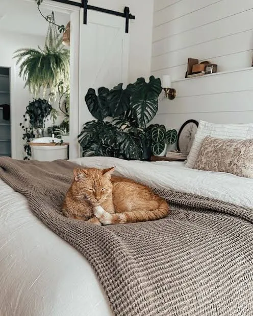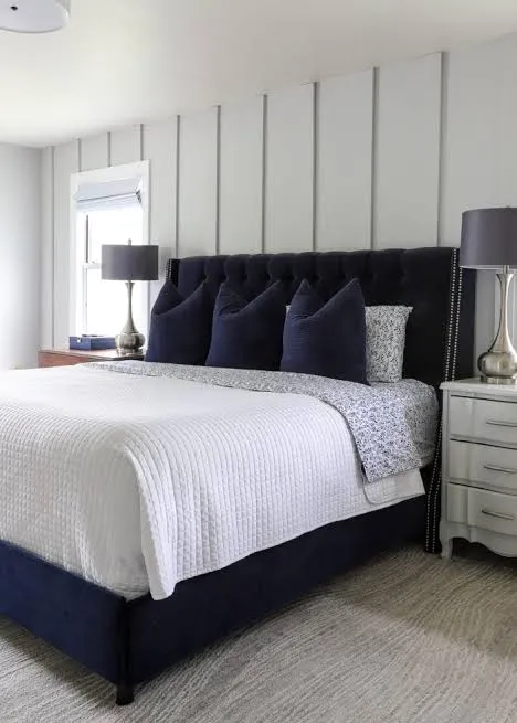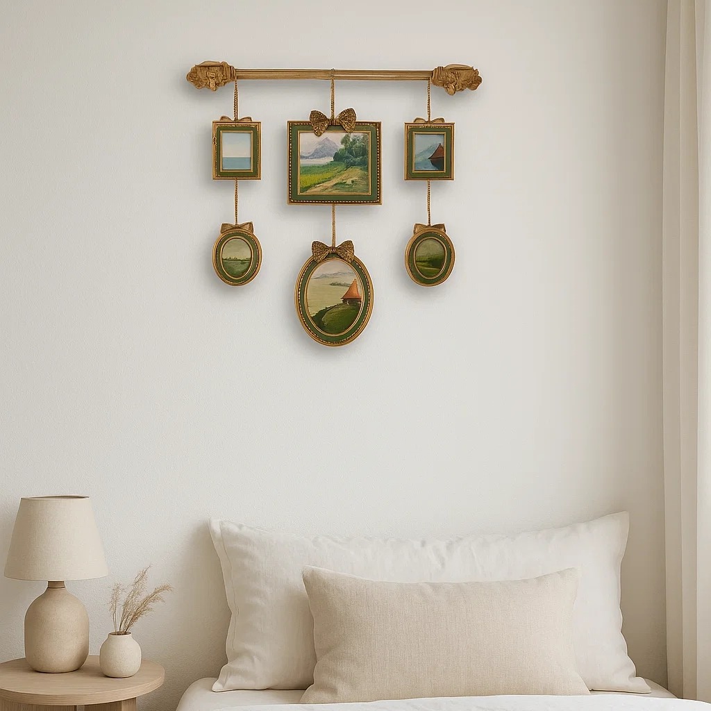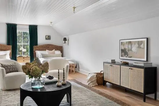
Author: Tayef

  • 13 Colorful Boho Bedroom Ideas

    13 Colorful Boho Bedroom Ideas

    If you’ve been hunting for 13 Colorful Boho Bedroom Ideas that actually work in a real bedroom (not just a Pinterest fantasy), you’re in the right spot. I’ve spent way too many hours studying what makes boho spaces feel warm instead of cluttered, and I’m putting all of it here. This guide covers the layout, the colors, and the small details that pull the whole look together.

    Colorful boho bedroom design combines warm, saturated color palettes with layered textures, vintage or handmade furniture, and global-inspired patterns to create a relaxed, personal sleeping space. The style favors mixed patterns, natural materials, and collected decor over matching sets.

    Stick around, because I’m breaking down thirteen specific ways to bring this look into your own room, plus a few mistakes that trip people up along the way.

    What Makes a Bedroom “Boho” Anyway?

    Boho is short for bohemian, and honestly, it’s less of a rulebook and more of a vibe. Think of it as the opposite of matchy-matchy showroom furniture. It’s about mixing things you love, even if they don’t “go together” on paper. A vintage rug from your grandma, a macrame wall hanging from a market stall, a plant that’s a little overgrown. That’s boho.

    Color is a huge part of it too. Unlike neutral boho (all beige and cream), colorful boho leans into rust, jewel tones, mustard, and deep greens. It feels cozy, a little wild, and totally lived-in. There’s no wrong way to do it, which honestly makes it one of the easiest styles to start experimenting with.

    1. Anchor the Room With a Rust and Terracotta Color Scheme
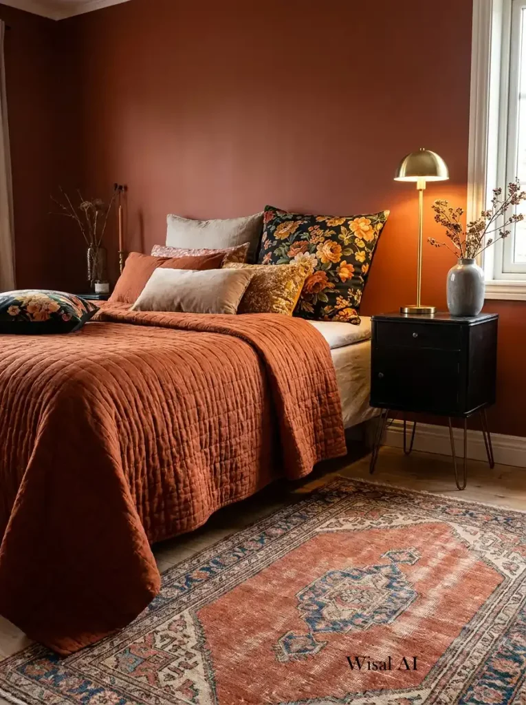
    Credit: Wisalai

    Rust and terracotta are the backbone of a lot of colorful boho rooms. These warm, earthy tones feel grounded without being boring. Paint one wall in a burnt orange or terracotta shade, then bring in the rest through bedding, curtains, or a floor cushion.

    Practical tip: if painting a whole wall feels risky, start with a terracotta throw blanket and a couple of clay-colored pillows. You can build up from there.

    This palette works in almost any home style. Modern homes can pair it with clean lines and metal accents, while traditional homes might lean into wood tones alongside it.

    Once your base color is set, it’s time to think about layering texture on top, which is where the next idea comes in.

    2. Layer a Woven Rug for Instant Warmth

    5 Creative Ways to Achieve a Perfect Layered Rug Living Room
    Credit: Decorilla

    A flat floor feels cold, even in a warm-colored room. Woven rugs, especially ones with pattern like Moroccan, kilim, or Turkish designs, add texture and history to the space. Layering two rugs, like a jute base with a smaller patterned rug on top, gives depth without much effort.

    Actionable tip: place your patterned rug at an angle under the bed frame, not perfectly centered. It looks more collected, less staged.

    Coastal boho homes might swap in a lighter jute or sisal rug, while traditional spaces do well with deeper red and navy kilim patterns.

    Rugs set the tone underfoot, but the walls need attention too, so let’s talk about what goes above the headboard next.

    3. Hang a Macrame Wall Hanging Above the Bed

    12 Above-Bed Decor Ideas That Are Sure to 'Wow' | Wayfair
    Credit: Wayfair

    Macrame is basically the unofficial symbol of boho decor, and there’s a reason for that. A large macrame piece above the headboard fills empty wall space and adds texture without color, which balances out a busy palette elsewhere in the room.

    Tip: hang it slightly wider than your headboard for the best visual balance. A too-small piece can look like an afterthought.

    In a modern boho mashup, pick a macrame piece with clean, geometric knots. Traditional boho spaces can go for looser, fringier styles.

    Now that your wall art is sorted, let’s bring in some color through the fabric of the bed itself.

    4. Mix Patterned Textiles on the Bed

    How to Mix Patterns: Master Bedroom Reveal – Sophie Robinson
    Credit: Sophierobinson

    This is where colorful boho really shines. Instead of one matching bedding set, layer a solid-colored duvet with a patterned throw, a couple of embroidered pillows, and maybe a tasseled blanket at the foot of the bed. The trick is picking colors that share a common thread, like all warm tones or all jewel tones, even if the patterns are different.

    Practical tip: stick to three patterns max on the bed. More than that starts to look chaotic instead of curated.

    Color Palette Combinations for Boho Bedding

    Palette NameBase ColorAccent ColorsBest For
    Desert SunsetTerracottaMustard, Cream, RustWarm, earthy rooms
    Jewel BoxDeep EmeraldMagenta, Gold, NavyBold, dramatic rooms
    Spice MarketBurnt OrangeChili Red, Ochre, BrownCozy, small spaces
    Ocean BohoTealCoral, Sand, WhiteCoastal boho blends
    Berry PatchPlumBlush, Mustard, SageFeminine boho spaces

    Once your bed is dressed, your eye naturally moves to the windows next.

    5. Choose Curtains With Bold Pattern or Rich Color

    24 Best Bedroom Curtain Ideas
    Credit: Housebeautiful

    Plain white curtains work fine in a lot of styles, but boho rooms benefit from something with more personality. Look for curtains in a rich jewel tone, a block print pattern, or even a tie-dye effect. They soften the light in a warm way and add another layer of pattern to the room.

    Tip: hang curtains higher than the window frame itself. It makes the ceiling feel taller and the window feel bigger.

    Modern boho spaces might choose a single bold color, while eclectic or traditional rooms can go wild with pattern.

    With the windows dressed, let’s talk about what happens with your walls beyond just the headboard area.

    6. Paint an Accent Wall in a Deep Jewel Tone

    How to Decorate with Jewel Tones for a Colorful and Happy Home
    Credit: Countryliving

    If terracotta feels too warm for your taste, jewel tones are the other classic boho route. Deep emerald, sapphire blue, or plum on one wall creates a dramatic backdrop for lighter furniture and warm wood tones. It’s a bigger commitment than a throw pillow, but it pays off in how “finished” the room feels.

    Actionable tip: paint the wall behind the headboard, not a random side wall. It frames the bed and becomes the room’s focal point automatically.

    Traditional homes tend to love deep jewel tones with gold trim, while modern boho keeps the rest of the room simple to let the color do the talking.

    Now, let’s get to the furniture that actually holds all this style together.

    7. Bring in Rattan or Wicker Furniture Pieces

    Rattan Bedroom Furniture: Bringing Natural Elements into Your Space - John Ryan By Design
    Credit: Johnryanbydesign

    Rattan headboards, wicker nightstands, and cane chairs are boho staples for a reason. The natural material adds texture and a slightly relaxed, sun-drenched feel, even in a room with no windows facing the sun. These pieces also tend to be lighter in color, which balances out darker wall paint or heavily patterned textiles.

    Practical tip: if a full rattan headboard feels like too much, start with a single rattan mirror or a woven pendant light shade.

    Coastal boho homes practically require this material, while modern boho spaces use it sparingly as an accent rather than a main piece.

    Furniture sets the bones of the room, but decorative layers bring it to life, starting with plants.

    8. Add Layers of Plants in Varied Pots

    How to Arrange Plants In Your Living Room to Add Natural Style
    Credit: BHg

    Boho bedrooms almost always have greenery, and lots of it. A tall plant in the corner, a trailing pothos on a shelf, a small succulent on the nightstand. Mixing plant sizes and pot materials (terracotta, ceramic, woven baskets) adds life and softens all the hard edges in the room.

    Tip: if you don’t have a green thumb, fake plants have gotten incredibly realistic. Nobody will know unless they touch it.

    This idea works in literally every home style, though modern spaces tend to keep plant collections smaller and more curated.

    Plants bring life, and lighting brings mood, which is exactly where we’re headed next.

    9. Layer Lighting With String Lights and Lanterns

    5 Easy Ways to Add Romance to a Room with Lantern Lighting - PaperLanternStore.com - Paper Lanterns, Decor, Party Lights & More
    Credit: Paperlanternstore

    Harsh overhead lighting kills the boho vibe fast. Instead, layer your light sources: a warm floor lamp, a string of fairy lights along the headboard, and maybe a small lantern-style candle holder on the dresser. This creates soft pools of light instead of one flat glow.

    Actionable tip: choose warm white string lights (2700K), not cool white. Cool white makes the room feel clinical instead of cozy.

    Traditional boho spaces love brass lanterns, while modern boho tends to favor simple globe string lights with no extra ornamentation.

    Lighting Options Compared

    Light TypeCost RangeMood CreatedBest Placement
    Fairy String Lights$10-$25Soft, dreamyHeadboard, canopy frame
    Rattan Pendant$40-$120Warm, texturedCeiling center
    Table Lantern$15-$50Cozy, flickeringNightstand, dresser
    Floor Lamp (fabric shade)$50-$150Ambient, warmReading corner

    With lighting handled, let’s talk about a detail that’s easy to skip but makes a big difference: the ceiling.

    10. Hang a Canopy or Draped Fabric Above the Bed

    How to Create a Canopy for your Bed
    Credit: Ballarddesigns

    A canopy sounds fancy, but it’s really just fabric hung from a hoop or frame above the bed. It adds drama and a soft, romantic feel without much cost. Sheer fabric in a warm color works best for a boho look, especially paired with string lights woven through the folds.

    Tip: mount the canopy frame to the ceiling with hooks rather than resting it against the wall. It stays more stable and looks more intentional.

    This idea shines in traditional and eclectic boho rooms, while modern spaces might skip it entirely in favor of cleaner lines.

    Once the bed area feels complete, it’s worth thinking about the walls that aren’t covered by macrame or paint.

    11. Create a Gallery Wall With Mixed Frames and Art Styles

    Tips for Creating a Vintage Style Gallery Wall - Love Grows Wild
    Credit: lovegrowswild

    Boho gallery walls aren’t about perfectly matched frames. They’re about a collection: a vintage mirror, a small tapestry, a few framed prints, maybe a woven basket used as wall art. The mismatched frame styles (wood, brass, no frame at all) actually make the wall look more curated, not less.

    Practical tip: lay everything out on the floor first in the shape you want before hammering a single nail. It saves a lot of wall patching later.

    Modern boho keeps the gallery wall smaller and more symmetrical, while maximalist boho spaces let it sprawl across most of the wall.

    Walls are covered, so now let’s zoom into a smaller detail that a lot of people forget: the nightstand.

    12. Style the Nightstand With Collected, Not Matched, Objects

    Do Nightstands Have to Match
    Credit: Roveconcepts

    A boho nightstand shouldn’t look like it came out of a furniture catalog box. Mix a small lamp, a stack of books, a small dish for jewelry, and maybe a candle in a color that pops against the wall behind it. The goal is a nightstand that looks like it was built up over time, not bought in one trip.

    Tip: keep it to four or five objects max. Even boho has a limit before “collected” turns into “cluttered.”

    Coastal boho nightstands might include shells or driftwood, while jewel-tone boho spaces lean into small brass trinket dishes.

    Last but not least, let’s talk about the one thing that ties every idea on this list together.

    13. Use a Repeating Color Thread to Tie Everything Together

    7 pieces designers swear by to instantly pull rooms together | Homes and  Gardens
    Credit: Homesandgardens

    With so many patterns and textures in a colorful boho room, it’s easy for things to feel scattered. The fix is picking one or two colors that show up again and again, even in small doses. Maybe it’s mustard yellow in a pillow, a lamp base, and a picture frame. Maybe it’s deep teal in the curtains, a vase, and a throw blanket.

    Actionable tip: before buying anything new, hold it up next to three things already in the room. If it doesn’t connect to at least one existing color, skip it.

    This trick works no matter what style you’re blending boho with, since a repeating color is basically the glue for any eclectic room.

    Tips for Success

    • Start with textiles before furniture. Bedding, rugs, and curtains are cheaper to swap than a headboard, so experiment there first.
    • Buy secondhand when you can. Boho thrives on pieces with history, and thrift stores are goldmines for woven baskets and vintage frames.
    • Don’t skip the ceiling. A canopy, a pendant light, or even a painted ceiling color adds a layer most bedrooms miss entirely.
    • Group plants in threes. Odd numbers look more natural and less staged than pairs.
    • Test paint colors in the actual room lighting. Jewel tones can look totally different under lamp light versus daylight.
    • Keep one “quiet” surface. If every shelf and table is packed with objects, the room reads as cluttered instead of cozy.
    • Shop your own house first. Old scarves, blankets, and pillows from other rooms often fit right into a boho scheme.

    Common Mistakes and How to Avoid Them

    Too many competing patterns at once
    : Pick a dominant pattern scale (large print) and pair it with one or two smaller, simpler prints instead of five bold ones fighting for attention.

    Cool-toned lighting in a warm-toned room
    : Swap any cool white bulbs for warm white (2700K-3000K) so the room’s color palette actually reads warm instead of washed out.

    Ignoring furniture scale
    : A tiny rattan nightstand next to an oversized bed looks off. Match furniture proportions to the room size before worrying about style.

    Buying everything new and matching
    : Boho depends on variety. If every item comes from one collection, the room loses the collected-over-time feel that makes this style work.

    Skipping texture in favor of only color
    : Bright colors alone can feel flat. Add woven baskets, knit throws, or a jute rug so the room has texture to match its color.

    Overcrowding the walls
    : Leave some breathing room between wall decor pieces so the gallery wall or macrame hanging doesn’t feel like it’s fighting the rest of the room for attention.

    Similar Variations

    • Desert Boho: Leans into sandy neutrals, cactus motifs, and warm terracotta with less bright color than classic colorful boho.
    • Coastal Boho: Combines beachy blues and sandy tones with rattan furniture and rope details for a breezier feel.
    • Jungle Boho: Focuses heavily on plants, green tones, and botanical prints for a lush, indoor-jungle atmosphere.
    • Global Boho: Pulls patterns and textiles specifically from different cultures around the world, often with a more curated, travel-inspired feel.
    • Modern Boho: Strips back the clutter and pattern mixing in favor of cleaner lines, while keeping natural materials and warm color accents.
    • Vintage Boho: Relies heavily on secondhand and antique furniture pieces paired with retro-inspired color palettes like mustard and burnt orange.

    Putting a colorful boho bedroom together really comes down to layering: warm colors first, then texture, then a few personal collected pieces on top. None of it has to be perfect, and honestly, a little imperfection is part of the charm. If you take even a handful of these 13 Colorful Boho Bedroom Ideas and start small, your room will feel warmer and more like you in no time.

  • 13 Neutral Boho Bedroom Ideas That Actually Feel Cozy (Not Cluttered)

    13 Neutral Boho Bedroom Ideas That Actually Feel Cozy (Not Cluttered)

    I’ve spent way too many nights scrolling through bedroom inspo, and I finally put together the 13 Neutral Boho Bedroom Ideas that keep popping up in the spaces I actually want to copy. If you’re tired of boho looking messy or neutral looking boring, you’re in the right spot. This isn’t a guessing game anymore.

    A neutral boho bedroom mixes warm, earthy tones like cream, tan, and taupe with natural textures such as rattan, linen, and jute. The style focuses on comfort and layered decor without loud colors, creating a calm space that still feels personal and lived-in.

    Stick around because I’m about to walk you through the exact furniture picks, color combos, and small details that make this look work in real homes, not just in photos.

    What Makes a Bedroom “Neutral Boho” Anyway?

    Okay, so here’s the thing about neutral boho. It’s not just beige everything. It’s boho’s free-spirit vibe (think plants, texture, mismatched decor) but toned down with a calm color palette. Instead of bright oranges or jewel tones, you lean on sand, ivory, cream, and soft brown. The magic happens in the layers. Woven baskets, chunky knit blankets, wood furniture, all sitting together in a room that feels warm but never busy. It’s the style for people who want their bedroom to feel like a retreat, not a museum. Honestly, once you get the hang of it, it’s hard to mess up.

    1. Start With a Warm, Layered Color Palette

    9 Ways to Layer Warm Neutral Colors for Comfortably Refined Rooms
    Credit: Houzz

    Before you buy a single throw pillow, nail down your palette. Neutral boho works best when you pick three or four shades in the same family, like ivory, sand, camel, and charcoal, then stick to them.

    Paint your walls a soft warm white or light greige. Then bring in furniture in natural wood tones. Add texture through fabric instead of bold color. A tip that works every time: pick one dark neutral (like espresso brown or charcoal) to ground the room so it doesn’t feel washed out.

    This palette idea adapts easily. In a modern bedroom, keep it crisp with less pattern. In a traditional space, add more texture and pattern layering.

    Once your palette is set, everything else you add will naturally fall into place, which brings us to the bed itself.

    2. Choose a Low-Profile Wood or Rattan Bed Frame

    Credit: Unitedcarpetsandbeds

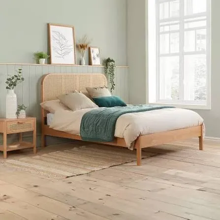
    The bed is the star of any bedroom, so this matters a lot. A low platform bed in light oak or a rattan headboard instantly says “boho” without trying too hard.

    Rattan headboards add texture without adding color, which keeps things neutral. If you want something sturdier, a solid wood frame with rounded edges softens the whole room. Skip anything with sharp metal or glossy finishes. That reads more modern-industrial than boho.

    Practical tip: if you’re renting or on a budget, a rattan headboard that leans against the wall (no mounting needed) gives you the look for way less money and effort.

    This idea flexes well too. Coastal bedrooms use whitewashed rattan, while traditional spaces might go for a carved wood frame instead.

    Now that your bed is set, let’s talk about what goes on top of it.

    3. Layer Textures on the Bedding, Not Colors

    Credit: Whiteandwoodgrain

    Here’s where a lot of people trip up. They think neutral means boring, so they add color to “spice it up.” Don’t do that. Instead, add texture.

    Start with a crisp white or ivory sheet set. Then layer a chunky knit throw, a linen duvet, and a couple of textured pillows in slightly different shades of cream and tan. Mixing materials like linen, cotton, and knit wool creates depth even though everything is basically the same color family.

    Quick tip: use at least three different textures on your bed at all times. It keeps things interesting without adding clutter.

    Modern homes might keep this minimal with just two layers, while eclectic boho spaces can go heavier with five or six layers.

    Once your bed feels cozy, it’s time to bring some green into the mix.

    Neutral Color Palette Combinations

    Palette NameWall ColorBedding TonesAccent WoodBest For
    Warm SandSoft whiteIvory + camelLight oakSmall bedrooms
    Desert DuskGreigeTaupe + rustWalnutLarger primary suites
    Coastal CreamOff-whiteWhite + sandWhitewashed rattanCoastal-inspired homes
    Modern StoneCool grey-beigeCharcoal + ivoryBlack-stained woodModern minimalist bedrooms

    4. Add Plants for Life Without Adding Color

    Credit: Nurserylive

    Boho design leans heavily on greenery, and neutral boho is no different. Plants bring life into a room that’s otherwise all soft, muted tones.

    Pick plants with interesting leaf shapes, like a fiddle leaf fig, snake plant, or trailing pothos. Put them in neutral pots made of concrete, woven fiber, or unglazed terracotta. Skip bright ceramic planters. They’ll fight with your color scheme.

    Actionable tip: place one large plant in a corner and two smaller ones on shelves or nightstands. This creates height variation without needing extra furniture.

    In a modern bedroom, one sculptural plant is often enough. In a maximalist boho space, you can go wild with five or six.

    Speaking of shelves, let’s talk about where you actually put your stuff.

    5. Swap Nightstands for Something With Character

    10 Nightstand Alternatives You May Already Have at Home
    Credit: Houzz

    A basic nightstand works, but neutral boho bedrooms shine when the furniture has a little story to it. Think a vintage wood stool, a woven basket turned upside down, or a small rattan side table.

    These pieces don’t match perfectly, and that’s the point. Boho design has always embraced a “collected over time” feel rather than a matching furniture set.

    Tip: mix two different nightstand styles on either side of the bed instead of buying a matching pair. It adds personality instantly and costs less if you’re shopping secondhand.

    Traditional homes can use antique wood tables for the same effect, while modern spaces might choose a single sculptural stone side table instead.

    Next, let’s get some texture happening on the floor.

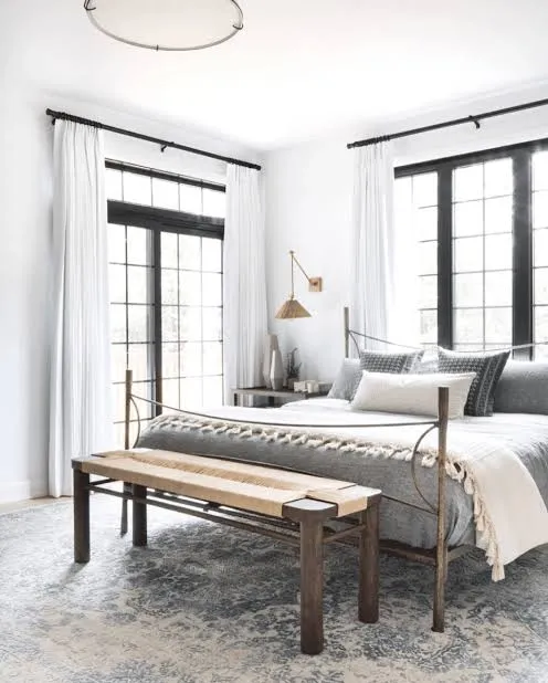
    6. Layer a Woven Rug for Warmth Underfoot

    Layering Rugs: Tips & Ideas
    Credit: Tsarcarpets

    Hardwood or light-colored flooring pairs beautifully with a jute or wool rug. The natural fibers keep things neutral while adding serious texture.

    Go for a rug with visible weave patterns, like a herringbone jute rug or a chunky wool option. If your room feels a little flat, try layering two rugs, a large jute rug on the bottom and a smaller, softer wool or shag rug on top near the bed.

    Practical tip: measure your bed frame width and add at least 12 inches on each side when picking a rug size. It should peek out from under the bed, not stop right at the edge.

    Coastal boho bedrooms often use sisal rugs for a beachy texture, while modern spaces stick to flatweave for a cleaner look.

    Now let’s move up to the walls, because they need some love too.

    7. Hang Textile Wall Art Instead of Framed Prints

    How to decorate with wallhangings and tapestries | House & Garden
    Credit: Houseandgarden

    Skip the typical framed art for a second. Woven wall hangings, macrame pieces, or textured tapestries in cream and tan tones bring in that boho softness without adding color to your palette.

    These pieces work especially well above the bed where a headboard might normally go, or on an empty wall that needs some personality. Look for pieces with fringe, tassels, or layered weaving for extra texture.

    Tip: hang one large piece rather than several small ones. It creates a focal point instead of visual clutter.

    In modern homes, a single abstract woven piece works better than an oversized macrame design, which fits more traditional or eclectic boho spaces.

    Once your walls have some texture, let’s think about lighting, because it changes everything.

    8. Use Warm, Layered Lighting Instead of One Overhead Fixture

    The Lighting Glow-Up: 17 Ways to Layer Light Like an Interior Designer
    Credit: Home-Designing

    Overhead lighting alone makes a room feel flat and cold, even with the coziest decor. Neutral boho bedrooms rely on layered lighting instead.

    Add a floor lamp with a linen or rattan shade in one corner. Use a small table lamp on your nightstand with a warm bulb. String lights, if you like them, should be tucked subtly rather than draped everywhere.

    Practical tip: stick to warm white bulbs (2700K to 3000K) instead of cool white. Cool lighting makes neutral tones look grey and lifeless instead of warm and inviting.

    Traditional homes might add a small chandelier with a linen shade, while modern boho spaces often use sculptural ceramic lamps instead.

    With the lighting sorted, let’s talk about curtains and how they frame the whole room.

    9. Choose Linen Curtains in a Soft, Sheer Neutral

    Linen Curtains: Natural Texture, Lining Options and Care
    Credit: Completeblinds

    Heavy blackout curtains in dark colors can make a neutral boho room feel closed off. Instead, go for linen curtains in a light, breathable neutral tone.

    Linen has natural texture built right in, which fits the boho aesthetic without any extra effort. It also lets soft light filter through during the day, keeping the room bright and airy.

    Tip: hang your curtain rod a few inches above the window frame and let the curtains fall just above the floor. This makes your ceiling look taller and the whole room feel more spacious.

    Coastal bedrooms often choose lighter, almost sheer linen, while traditional spaces might pick a slightly heavier weave with subtle texture.

    Now, let’s fill in some of those empty corners with baskets and storage.

    10. Use Woven Baskets for Storage and Texture

    Inspiration | Using Woven Baskets for Storage and Style - The Dharma Door
    Credit: Thedharmadoor

    Baskets aren’t just for storage, they’re a design element in neutral boho bedrooms. A stack of woven baskets in the corner holds blankets, and a smaller one on a shelf can hold books or accessories.

    Choose baskets in varying sizes and slightly different weaves for visual interest. Seagrass, rattan, and water hyacinth all work great and bring in that earthy, natural feel.

    Practical tip: use a large basket at the foot of the bed for extra blankets. It’s functional and adds an instant boho touch without much cost.

    Modern spaces might use just one sculptural basket as an accent, while eclectic boho rooms can layer five or six in different shapes and sizes throughout the room.

    Next up, let’s talk about a detail people often skip: the ceiling.

    Budget Breakdown by Bedroom Size

    Room SizeBudget TierApprox. CostKey Splurge ItemWhere to Save
    Small (10×10 ft)Low$300-$600Rattan headboardBedding & pillows (thrift/discount stores)
    Medium (12×14 ft)Mid$800-$1,500Wool area rugWall art (DIY macrame)
    Large (16×18 ft)High$2,000-$4,000Solid wood bed framePlant pots (basic terracotta)

    11. Add a Ceiling Detail Like a Woven Pendant Light

    Cozy Bedroom Ideas with Woven Rattan Pendant Lights
    Credit: Vietshopdesign

    Most people forget about the ceiling entirely, but a woven pendant light or a rattan drum shade adds a ton of character for a small investment. It draws the eye up and makes the whole room feel finished.

    Choose a fixture in a light wood tone or natural fiber that matches your other textures. Avoid anything metallic or glossy, since that clashes with the earthy boho feel.

    Tip: hang your pendant light about 12 inches lower than a standard flush-mount fixture. It creates a cozier, more intimate feel in the room.

    Traditional homes might choose a fabric drum shade instead, while modern spaces often go for a sculptural paper or wood pendant.

    Once the ceiling feels complete, let’s finish up with some smaller personal touches.

    12. Mix in Vintage or Handmade Decor Pieces

    Vintage Decor Pieces That Instantly Make a Home Feel More Charming
    Credit: Contryliving

    Neutral boho bedrooms feel personal because they’re never perfectly matched. Vintage ceramic vases, handmade pottery, or a thrifted mirror with a wood frame all add character that new, mass-produced items just can’t match.

    Look for pieces with imperfect shapes or handmade textures. A slightly uneven vase or a mirror with an aged wood frame tells a story and keeps the room from feeling like a showroom.

    Practical tip: shop secondhand stores or flea markets for one or two statement pieces instead of buying everything new. It saves money and adds authenticity.

    This works across styles too. Traditional homes might use antique brass pieces, while modern boho spaces stick to simple, sculptural ceramics.

    Last but not least, let’s talk about how scent and sound tie everything together.

    13. Bring in Natural Scents and Soft Sounds

    Best Natural Bedroom Scents for Sleep (2026) | Elyvora US
    Credit: Elyvora

    This one’s easy to overlook, but it makes a real difference. A neutral boho bedroom feels complete when it smells and sounds calming too. Think unscented or lightly scented candles in ceramic holders, a diffuser with woodsy or citrus oils, or even a small tabletop fountain for soft background noise.

    Choose candle holders in matte ceramic or stone to match your neutral palette. Skip anything with bright labels or plastic packaging sitting out in the open.

    Tip: keep scents subtle. Sandalwood, cedar, or eucalyptus work well without overpowering the room.

    Coastal boho spaces often use ocean-inspired scents, while modern rooms might skip scent altogether and focus purely on visual calm.

    Tips for Success

    • Shop your own home first. You probably already own neutral pieces you can repurpose before buying new stuff.
    • Buy textured items in person when possible. Photos don’t always show true texture or weave detail.
    • Stick to a maximum of four main colors, including your wall color, to avoid visual chaos.
    • Add one “imperfect” vintage piece to every room. It keeps things from feeling too staged.
    • Don’t skip window treatments. Bare windows make even the coziest room feel unfinished.
    • Test paint colors on the wall at different times of day. Neutral shades shift a lot under different lighting.
    • Leave a little empty space. Boho doesn’t mean packing every surface full of decor.

    Common Mistakes and How to Avoid Them

    Using too many bright accent colors
    : Stick to your chosen neutral palette and add interest through texture instead of color.

    Buying a matching furniture set
    : Mix pieces from different eras or styles for that collected-over-time boho look.

    Skipping texture in favor of flat fabrics
    : Always layer at least three different textures on your bed and seating areas.

    Choosing cool-toned lighting
    : Stick to warm bulbs between 2700K and 3000K for a cozy glow.

    Overcrowding the room with too many small decor items
    : Choose fewer, larger statement pieces instead of many small trinkets.

    Ignoring rug size
    : Always size your rug so it extends well beyond the bed frame on all sides.

    Similar Variations

    • Desert Boho — Leans into warm terracotta, rust, and clay tones with southwestern-inspired patterns.
    • Coastal Boho — Combines boho texture with beachy whites, driftwood, and rope details.
    • Jungle Boho — Focuses heavily on lush greenery and tropical-inspired prints layered over neutral bases.
    • Scandi Boho — Mixes minimalist Scandinavian furniture with boho texture and warmth.
    • Modern Boho — Uses cleaner lines and less pattern while keeping the natural materials and warm palette.
    • Vintage Boho — Relies heavily on thrifted and antique pieces for a lived-in, collected feel.

    Putting together a neutral boho bedroom really comes down to layering texture, sticking to a warm color palette, and choosing pieces that feel a little personal instead of perfectly matched. It doesn’t take a huge budget or a total renovation, just some thoughtful swaps and a willingness to mix things up. I hope these 13 Neutral Boho Bedroom Ideas give you a clear starting point for a room that finally feels like the calm, cozy retreat you’ve been picturing.

  • 14 Black And White Bedroom Ideas

    14 Black And White Bedroom Ideas

    I’ve put together 14 black and white bedroom ideas that actually work in real homes, not just in glossy magazines. If you’re staring at your walls wondering how to make this classic combo feel fresh instead of flat, you’re in the right spot. I’ve tested a lot of these tricks myself, and I’m sharing what actually holds up.

    A black and white bedroom uses only these two shades (plus their in-between grays) as the main color scheme for walls, bedding, furniture, and decor. The style works because black adds depth and drama while white keeps the space feeling open and calm. Together they create contrast that feels sharp, clean, and timeless without needing extra colors.

    Stick around, because I’m about to show you 14 ways to pull this off, some of which you’ve probably never tried before.

    What Makes A Black And White Bedroom Work

    Here’s the thing about black and white rooms. People think they’re boring. They’re not. This color pairing is actually one of the boldest choices you can make, because there’s nowhere to hide. Every texture, every shadow, every piece of furniture has to earn its spot.

    I like to think of black and white as a blank canvas with attitude. It’s not lazy design. It’s confident design. The trick is balancing the two colors so one doesn’t swallow the other. Too much black and the room feels like a cave. Too much white and it feels like a hospital. Get the mix right, though, and you’ve got a bedroom that looks pulled together no matter your budget.

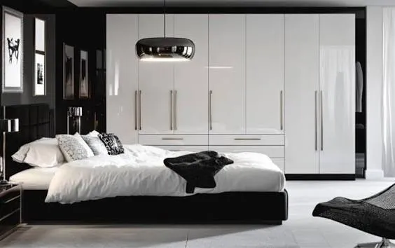
    Anchor The Room With A Statement Black Headboard

    12 Stunning Black Headboard Bedroom Designs to Anchor Your Space | Home  Styling Hub
    Credit: Homes-Styling-Hub

    Your bed is the biggest thing in the room, so let it do the heavy lifting. A black upholstered headboard, especially in velvet or linen, adds instant richness against white walls. It becomes the focal point the second someone walks in.

    Pick a headboard with some height. Tall headboards make the ceiling feel higher and the whole room feel more expensive. Pair it with crisp white sheets to keep the contrast sharp.

    Practical tip: go with a headboard that has removable, washable covers if you have kids or pets. Black shows dust and pet hair fast.

    This idea flexes easily. A tufted velvet headboard leans traditional. A slim leather one feels more modern. Either way, it sets the tone for everything else in the room, which brings us to the walls.

    Paint One Wall Black For An Accent Effect

    10 Black Bedroom Accent Wall Ideas You Should Try Out In 2025
    Credit: Evolveartisanal

    Full black rooms can feel heavy, so try just one wall. This is usually the wall behind your bed. It creates depth without making the room feel small or dark.

    Matte black paint hides imperfections better than glossy finishes. Glossy black looks sleek but shows every scuff and fingerprint. If this is your first time working with dark paint, start with a sample pot on cardboard before committing to the whole wall.

    Practical tip: keep your trim and ceiling white to frame the black wall like a piece of art.

    In a coastal-style bedroom, swap black for a deep charcoal to soften the look. In a modern loft, true black works perfectly. Once your wall is set, you’ll want furniture that plays nicely with that bold backdrop.

    Choose Furniture With Clean, Simple Lines

    Credit: Tukadubai

    Ornate furniture fights with a black and white color scheme. Simple shapes let the contrast between colors do the talking instead. Think straight-edged dressers, low-profile nightstands, and beds without a ton of carving or detail.

    White furniture against a black wall pops. Black furniture against white walls does the same thing in reverse. Either direction works, just don’t mix busy patterns with busy furniture shapes. That’s when rooms start looking cluttered.

    Practical tip: measure your room before buying furniture. Bulky pieces make small black and white bedrooms feel boxed in fast.

    Traditional homes can still keep clean lines by choosing furniture with subtle curves instead of full minimalism. Once your big furniture pieces are chosen, it’s time to think about what goes on top of the bed.

    Furniture Finish Comparison

    Finish TypeBest ForMaintenance LevelPrice Range
    Matte Black WoodModern, minimalist roomsLow$$
    Glossy Black LacquerContemporary, glam roomsHigh$$$
    White Painted WoodCoastal, farmhouse roomsMedium$
    Black Metal FrameIndustrial, loft roomsLow$$

    Layer Bedding In Textures, Not Just Colors

    How to Layer a Bed And Create the Ultimate Bedding Ensemble – Levtex Home
    Credit: levtexhome

    A black and white bed can still feel flat if everything’s the same fabric. Mix a chunky knit throw with smooth cotton sheets. Add a linen duvet cover with a faux fur pillow. The colors stay the same, but the textures do all the visual work.

    I always tell people to think in layers, like you’re building an outfit. Base layer, middle layer, top layer. Start with white sheets, add a black quilted coverlet, then toss on patterned throw pillows in black and white stripes or checks.

    Practical tip: wash white bedding separately and use a whitening detergent to keep it looking crisp, not gray.

    This layering trick works in every style, from farmhouse chunky knits to modern silk throws. Next, let’s talk about how patterns can add even more personality without adding new colors.

    Use Bold Graphic Patterns On One Feature Wall

    Credit: Decoist

    If a solid black wall feels too plain for you, try wallpaper instead. Geometric shapes, stripes, or botanical silhouettes in black and white can turn one wall into serious eye candy. This works especially well behind the headboard.

    Peel-and-stick wallpaper is a great option if you’re renting or just not ready to commit. It’s affordable and comes off clean when you’re ready for a change.

    Practical tip: stick to one patterned wall max. More than that and the room starts to feel busy instead of bold.

    Modern homes look great with abstract geometric prints. Traditional homes lean better toward damask or toile patterns in black and white. Once your walls have personality, your flooring should support that same balance.

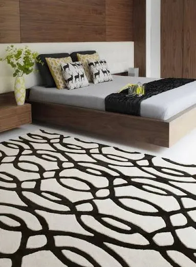
    Ground The Space With A Black And White Rug

    Credit: love-rugs

    Bare floors can make a black and white bedroom feel cold, especially with lighter wood or tile. A rug adds warmth and softens hard edges. Look for one with a mix of both colors, like a black and white diamond print or a simple striped design.

    Wool rugs feel amazing under bare feet and hold up longer than synthetic ones. If you’ve got a smaller room, a rug that’s mostly white with black accents will make the space feel bigger.

    Practical tip: size your rug so it extends at least a foot past each side of the bed. Small rugs make rooms look unfinished.

    Bohemian bedrooms can use a black and white rug with fringe detailing for extra texture. Now that your floor’s covered, let’s brighten things up with lighting.

    Mix Metallic Accents For Extra Shine

    Dazzling Ways to Mix Metallic Accents in Your Home Decor
    Credit: laurau

    Pure black and white can sometimes feel a little cold on its own. Adding gold, brass, or silver accents warms things up without breaking the color scheme. Think lamp bases, drawer pulls, or a mirror frame.

    Gold tends to feel more glam and traditional. Silver and chrome feel more modern and clean. Pick one metal and stick with it throughout the room so things don’t feel mismatched.

    Practical tip: swap out plain plastic light switch covers for a matching metallic finish. It’s a small detail that makes a big difference.

    Art deco lovers should lean hard into gold and black combos. Scandinavian-style rooms do better with simple silver or matte black hardware. Speaking of small details, let’s talk about how lighting fixtures can double as decor.

    Metallic Accent Pairings By Style

    Home StyleBest MetallicSuggested Placement
    Art DecoGold or BrassMirror frames, lamp bases
    ScandinavianMatte SilverDrawer pulls, light fixtures
    IndustrialBlack NickelBed frames, curtain rods
    GlamPolished ChromeVanity trays, picture frames

    Install A Statement Pendant Or Chandelier

    Inspiration: Pendant Lights for the Bedroom and Modern Chandeliers above  the Bed
    Credit: Artcrystal

    A ceiling fixture in black metal or with black and white glass detailing can act as jewelry for the room. It draws the eye up and adds another layer of contrast beyond just the walls and bedding.

    Pendant lights work great over nightstands if you’re short on table space. A small chandelier centered over the room adds drama without needing a huge budget.

    Practical tip: hang pendant lights about 30 inches above the nightstand surface for the best light and look.

    Farmhouse bedrooms look great with black lantern-style pendants. Modern spaces do better with sleek globe pendants in matte black. Once the lighting’s sorted, curtains are the next piece of the puzzle.

    Frame Windows With Black Curtain Rods And White Drapes

    Credit: Mydomaine

    Simple white curtains on a black metal rod is one of the easiest upgrades in this whole list. It’s a small change that ties the whole color scheme together without much effort or cost.

    Sheer white curtains let in soft light during the day. If you want more privacy or light-blocking power, choose a heavier white linen or cotton blend instead.

    Practical tip: hang curtain rods a few inches above the window frame and wider than the window itself. This makes ceilings feel taller and windows feel larger.

    Coastal bedrooms love this look with linen curtains that move easily in a breeze. Traditional rooms can add black trim or tassels for extra polish. Once your windows are dressed, let’s talk about the walls that don’t have paint or wallpaper.

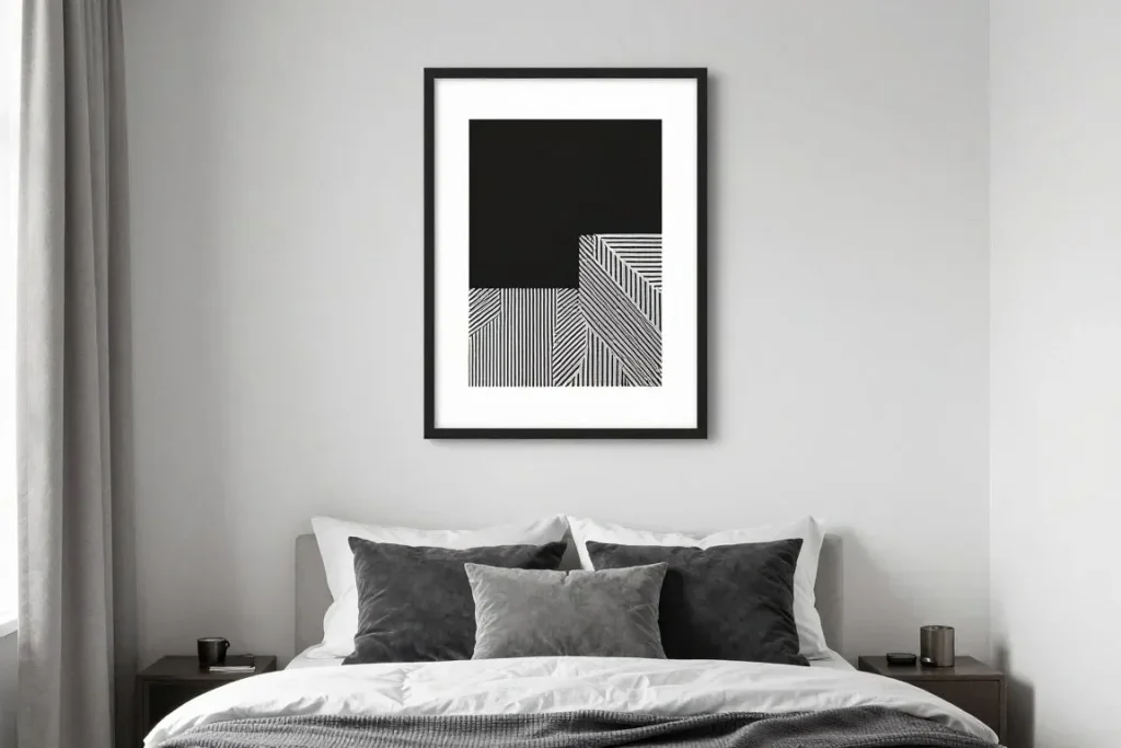
    Display Black And White Photography Or Line Art

    Credit: Rossettiart

    Empty wall space is a missed opportunity. Black and white photos, whether they’re personal family photos or artsy prints, fit this color scheme perfectly without adding new colors to manage.

    Gallery walls work great here. Mix frame sizes but keep frame colors consistent, either all black or all white, so it doesn’t look chaotic.

    Practical tip: lay your frames out on the floor first in the arrangement you want before hammering a single nail into the wall.

    Minimalist bedrooms look sharp with a single oversized black and white print. Eclectic rooms can go wild with a large gallery wall mixing photography, line art, and typography. Now let’s cover the closet and storage side of things.

    Choose Black Hardware For White Furniture Pieces

    Credit: Fcilondon

    If you already have white dressers or nightstands, don’t repaint them. Just swap the hardware. Black knobs and pulls on white furniture instantly modernize the piece and tie it into your color scheme.

    This is one of the cheapest upgrades on this whole list. A pack of black cabinet knobs costs way less than new furniture or a paint job.

    Practical tip: measure your existing hardware holes before ordering new knobs so you don’t end up drilling new holes.

    Farmhouse and cottage styles look great with matte black cup pulls. Modern spaces do better with sleek black bar pulls. With your furniture updated, let’s think about the ceiling, which people often forget about completely.

    Paint The Ceiling A Soft Charcoal Instead Of Stark White

    40 Grey & White Bedroom Ideas for a Stylish, Balanced Space
    Credit: Fancyhouse

    Ceilings usually get ignored, but painting yours a soft charcoal gray instead of bright white adds a cozy, cocoon-like feel to the whole room. It’s a subtle nod to the black and white theme without feeling too intense.

    This works especially well in bedrooms with high ceilings, since it brings the scale down to something more intimate and relaxing.

    Practical tip: use a flat or matte finish on ceilings to avoid glare from overhead lighting.

    Modern farmhouse bedrooms benefit from this trick most, since it softens the crisp white walls below. Coastal rooms should skip this one and keep ceilings bright and airy instead. Speaking of airy, let’s talk about adding some greenery next.

    Add Greenery In Black Or White Planters

    Credit: Tlcinteriors

    Plants are the easiest way to keep a black and white room from feeling too stiff or staged. A few houseplants in simple black or white pots add life and softness that fabric and furniture just can’t provide.

    Snake plants and pothos are low-maintenance options if you don’t have a great track record keeping plants alive. Group two or three planters together on a dresser for a bigger visual impact.

    Practical tip: choose matte pots over glossy ones. They photograph better and hide water stains longer.

    Bohemian bedrooms can go bigger with hanging plants in black macrame holders. Modern rooms do better with one or two structured plants in simple geometric planters. Let’s wrap up with a final idea that ties everything together.

    Add A Black Accent Chair Or Bench At The Foot Of The Bed

    3 Ways To: Integrate seating at the foot of the bed - Meg Lonergan Interiors
    Credit: Meglonergan

    A small black chair or bench at the end of the bed gives the room a finished, styled look, like something out of a hotel suite. It’s also genuinely useful for laying out clothes or sitting to put on shoes.

    Choose a bench with simple legs and a solid or subtly patterned black and white cushion. This ties back into your existing color scheme without adding anything new to think about.

    Practical tip: measure the width of your bed frame and choose a bench that’s a few inches narrower on each side for the best proportions.

    Traditional bedrooms look great with a tufted black bench. Modern rooms do better with a simple black metal-frame bench. With all 14 ideas in place, your bedroom should feel bold, balanced, and totally intentional.

    Tips for Success

    • Stick to a 60/40 or 70/30 split between your two main colors so one doesn’t overpower the other.
    • Add at least one warm material, like wood or rattan, to keep the room from feeling too stark.
    • Test paint samples on your actual wall at different times of day before committing.
    • Keep clutter to a minimum since black and white rooms show mess more obviously than busier color schemes.
    • Repeat your chosen metallic finish at least three times around the room for consistency.
    • Use dimmable lighting so the room can feel bright during the day and cozy at night.
    • Don’t skip texture. Smooth, flat surfaces everywhere will make the room feel cold.

    Common Mistakes and How to Avoid Them

    Too much black on the walls and furniture
    : Balance it out with white bedding, curtains, or a large area rug to keep the room from feeling heavy or dark.

    Mixing too many different black tones
    : Stick to one shade of black across furniture and decor so pieces don’t look mismatched or off.

    Ignoring texture completely
    : Add knits, linen, velvet, or wool somewhere in the room so it doesn’t feel flat or sterile.

    Skipping a warm accent color or material
    : Bring in wood tones, brass, or a plant to soften the strict black and white palette.

    Overcrowding one wall with patterns
    : Choose a single patterned wall or feature, and keep the rest of the room simple and calm.

    Choosing glossy black finishes without thinking about maintenance
    : Go with matte finishes in high-traffic areas since they hide fingerprints and dust much better.

    Similar Variations

    • Black And White Scandinavian — Combines this color scheme with light wood tones and cozy textiles for a softer, hygge-inspired feel.
    • Monochrome Glam Bedroom — Adds heavy metallics, velvet, and mirrored furniture for a more luxurious version of the look.
    • Industrial Black And White — Leans into raw materials like exposed brick, black metal frames, and concrete accents.
    • Coastal Black And White — Uses lighter grays instead of true black, paired with linen and natural fiber textures.
    • Art Deco Black And White — Adds gold accents, geometric patterns, and glossy surfaces for a more dramatic, vintage-inspired room.
    • Farmhouse Black And White — Mixes shiplap walls, black hardware, and cozy knit throws for a relaxed country feel.

    Putting together a black and white bedroom really just comes down to balance. You need contrast, but you also need warmth, texture, and a few personal touches so it doesn’t feel like a showroom. Pick a handful of ideas from this list, mix in your own style, and you’ll end up with a room that feels calm, bold, and completely yours using these 14 black and white bedroom ideas as your starting point.

  • 10 Navy Blue Bedroom Ideas That Will Change How You See This Color

    10 Navy Blue Bedroom Ideas That Will Change How You See This Color

    I’ve spent way too many nights scrolling through design boards, and I can tell you that these 10 navy blue bedroom ideas are exactly what you need if you’re tired of boring, beige walls. This guide covers everything from paint picks to furniture choices, so you won’t need to hunt down five other articles after this one.

    What is a navy blue bedroom? A navy blue bedroom uses deep blue tones (ranging from midnight to indigo shades) as the primary color for walls, bedding, or major furniture pieces. It creates a cozy, moody atmosphere while still feeling sophisticated and calm.

    Stick around, because I’m about to show you ways to use navy that you probably haven’t thought of yet, including some tricks for small rooms that feel cramped.

    Why Navy Blue Works So Well in Bedrooms

    I get it. Navy sounds dark. Maybe even a little scary for a bedroom. But here’s the thing, navy blue is one of those colors that feels expensive without costing a fortune. It’s calming, like the ocean at night. It also pairs with almost anything, gold, white, blush pink, you name it. A lot of people avoid dark colors because they think it’ll make the room feel small. Actually, navy can make a room feel cozier and more intentional, like a hotel suite instead of a college dorm. That’s the magic of this color. It’s bold without being loud.

    1. Paint All Four Walls in Deep Navy

    50 Blue Room Decorating Ideas - How to Use Blue Wall Paint & Decor
    Credit: Elledecor

    This is the boldest move on the list, and honestly, it’s my favorite. Painting every wall navy blue turns your bedroom into a cocoon. It feels intimate, like a little retreat from the rest of your house.

    Pick a matte or eggshell finish so the color doesn’t feel too glossy or cold. Add brass or gold hardware on your dresser to warm things up. White trim around doors and windows keeps the room from feeling like a cave.

    Practical tip: Test the paint on one wall for a few days before committing. Lighting changes everything with dark colors.

    This look works great in traditional and modern homes alike. Coastal spaces can pull it off too, just add lighter linens to balance it out.

    Once your walls are set, the next step is figuring out what goes on the bed.

    2. Layer Navy Bedding with Crisp White Sheets

    Credit: Thehomesihavemade

    A navy comforter or duvet paired with white sheets peeking out looks like something straight out of a boutique hotel. This combo feels fresh and put together without much effort.

    Choose a navy duvet cover in cotton or linen for breathability. Add two white pillows underneath your navy shams. Toss in a textured throw blanket, maybe cream or mustard, for extra warmth.

    Practical tip: Wash your white sheets separately to keep them bright and avoid navy dye transfer.

    This idea works in almost any style. Farmhouse bedrooms love this pairing, and so do modern minimalist spaces.

    Now let’s talk about what happens when you add some metal accents into the mix.

    3. Add Brass or Gold Accents for Warmth

    Before & After: Classy Bedrooms with Gold Accessories
    Credit: Decorilla

    Navy on its own can feel a bit cold or heavy. Brass and gold fix that instantly. These metals reflect light and give the room a little sparkle without overdoing it.

    Swap your lamp bases for brass ones. Add gold picture frames or a mirror with a gold edge. Even small drawer pulls in brass make a noticeable difference.

    Practical tip: Don’t mix silver and gold in the same room unless you’re going for an eclectic look on purpose.

    Traditional and glam bedrooms shine with this combo, but even industrial spaces can use brass to soften harsh lines.

    Speaking of softening things up, let’s move on to textures.

    4. Mix Textures Like Velvet, Linen, and Wool

    How To Mix Textures In Home Décor | Fondren Designer Fabrics
    Credit: Fabricresource

    Navy blue looks amazing with texture. A velvet headboard against navy walls is pure luxury. Linen curtains add a relaxed, breezy feel. Wool rugs bring warmth underfoot.

    Try a velvet accent chair in the corner of the room. Add a chunky wool throw at the foot of the bed. Linen curtains in a soft cream or light gray finish off the look.

    Practical tip: Stick to three textures max so the room doesn’t feel too busy.

    Modern farmhouse and bohemian styles both love this texture-mixing trick. Even minimalist rooms can handle one or two textured pieces.

    Texture and Fabric Pairing Guide

    Fabric TypeBest Used ForFeel It CreatesPrice Range (Per Yard/Piece)
    VelvetHeadboards, accent chairsLuxurious, cozy$20-$60
    LinenCurtains, beddingRelaxed, breathable$10-$30
    WoolRugs, throwsWarm, grounding$30-$100
    CottonSheets, duvet coversCrisp, clean$8-$25
    ChenilleBlankets, pillowsSoft, plush$15-$40

    Now that textures are covered, let’s talk about lighting because it changes everything with dark colors.

    5. Use Warm Lighting to Soften the Navy

    20 Romantic Cozy Navy Blue Bedroom Ideas That Feel Like a Luxury Hotel -  Purely Dwelling
    Credit: Purelydwelling

    Dark walls need the right lighting or they’ll feel gloomy instead of cozy. Warm bulbs are your best friend here. Skip the cool white LED bulbs completely.

    Add a table lamp on each nightstand with warm 2700K bulbs. Consider a dimmer switch for your overhead light. String lights behind the headboard add a soft glow too.

    Practical tip: Layer three light sources (ambient, task, and accent) for the best effect.

    This tip matters for every style, from Scandinavian to Hollywood glam. Warm lighting is non-negotiable with navy.

    Once lighting is sorted, let’s think about what’s on your walls.

    6. Hang Gallery Walls with Gold Frames

    Credit: homeinfunca

    Navy makes a killer backdrop for artwork. Photos and prints pop against that deep color. A gallery wall adds personality without cluttering the whole room.

    Mix different frame sizes but keep the gold or brass finish consistent. Include a mix of photos, art prints, and maybe a small mirror. Leave equal spacing between each piece, about two to three inches.

    Practical tip: Lay your frames out on the floor first to plan the arrangement before hammering any nails.

    Eclectic and traditional homes love a full gallery wall, while modern spaces might prefer just three or four large pieces.

    Let’s shift gears and talk about furniture finishes next.

    7. Choose Light Wood Furniture to Balance the Dark

    Credit: Wellbydesign

    Navy is heavy, so you want some lightness somewhere. Light wood furniture, think oak or ash, creates a nice contrast against those deep walls.

    Pick a light wood dresser or nightstand. A woven jute rug on the floor adds even more contrast. Keep the wood tones consistent throughout the room for a cohesive look.

    Practical tip: If your current furniture is dark, a coat of white or cream paint can mimic the light wood effect for cheap.

    Scandinavian and coastal styles thrive with this pairing. It softens navy’s intensity and keeps things airy.

    Now let’s look at how pattern can play into this navy scheme.

    8. Introduce Pattern Through Throw Pillows

    You're Styling Your Throw Pillows All Wrong—Here's How to Get It Right,  According to Experts
    Credit: Housebeautiful

    A solid navy room can feel a little flat after a while. Pattern fixes that instantly. Think stripes, florals, or geometric shapes on your throw pillows.

    Choose two or three patterns that share a color, maybe navy and mustard, or navy and blush. Keep your bedding solid so the pillows can be the star. Rotate seasonal patterns to keep things fresh.

    Practical tip: Odd numbers of pillows (three or five) look more natural than even numbers.

    Bohemian and eclectic bedrooms can go bold with pattern, while modern spaces should stick to one or two subtle prints.

    Next, let’s talk about a design choice that’s a little less common but super effective.

    9. Try a Navy Accent Wall Instead of Full Coverage

    15 Navy Blue Accent Wall Bedroom Ideas for Cozy Spaces
    Credit: lorddecor

    Not ready to commit to navy on all four walls? An accent wall behind your headboard gives you the drama without the full commitment.

    Paint just the wall behind your bed. Keep the other three walls white, cream, or light gray. This creates a natural focal point in the room.

    Practical tip: Extend the paint slightly onto the ceiling for a dramatic, cocooned feel.

    This works beautifully in rental homes since it’s easier to paint back to neutral later. It also suits small bedrooms that might feel cramped with full navy coverage.

    Small Room vs Large Room Navy Coverage Guide

    Room SizeRecommended CoverageBest Navy PlacementWhy It Works
    Under 100 sq ftAccent wall onlyBehind headboardPrevents closed-in feeling
    100-150 sq ftTwo wallsHeadboard wall plus one adjacentBalances drama and openness
    150-250 sq ftFull roomAll four wallsRoom is large enough to absorb dark color
    Over 250 sq ftFull room plus ceilingAll walls and ceilingCreates a cocoon effect without feeling small

    With wall coverage figured out, let’s move to something that ties the whole room together, your window treatments.

    10. Add Navy Curtains for a Cohesive Look

    Style A Bedroom With Blue Carpet | Frank's The Flooring Store
    Credit: Frankstheflooringstore

    Even if your walls aren’t navy, curtains in this color can tie the whole room together. They frame your windows and add depth to the space.

    Choose floor-length navy curtains in linen or cotton blend. Hang them close to the ceiling to make the room feel taller. Pair with sheer white curtains underneath for a soft, layered look.

    Practical tip: Curtains should just barely brush the floor or puddle slightly for a more polished look.

    This trick works everywhere, from traditional to contemporary bedrooms. It’s a low-commitment way to bring navy into the room.

    Let’s now look at how to use navy on a headboard specifically.

    Tips for Success

    • Start small if you’re nervous about commitment, try a navy accent wall or bedding before painting the whole room
    • Always test paint swatches at different times of day since navy shifts dramatically under different lighting
    • Balance dark navy with at least one light, neutral element in every part of the room
    • Don’t skip warm lighting, it’s the difference between cozy and cave-like
    • Mix metals sparingly, one dominant metal finish (brass, gold, or black) keeps things cohesive
    • Add greenery, a plant or two softens the boldness of navy and brings life into the room
    • Think about your flooring too, light rugs on dark floors help brighten a navy-heavy space

    Common Mistakes and How to Avoid Them

    Using only cool-toned lighting
    : Swap to warm bulbs (2700K to 3000K) to keep the room feeling inviting instead of cold.

    Painting a small room fully navy without testing first
    : Try an accent wall or peel-and-stick sample before committing to full coverage.

    Forgetting contrast
    : Add white, cream, or light wood pieces so the room doesn’t feel too heavy or dark.

    Overloading the room with too many patterns
    : Stick to two or three coordinating patterns max to avoid visual chaos.

    Ignoring the ceiling and trim
    : A stark white ceiling can feel disconnected, consider a soft cream or extending the navy slightly for cohesion.

    Choosing the wrong navy shade
    : Some navies lean purple or green, always test a sample against your existing furniture before buying gallons of paint.

    Similar Variations

    • Coastal Navy — Pairs navy with white, sandy beige, and rope textures for a beachy feel
    • Moody Maximalist — Combines navy with jewel tones, dark wood, and layered patterns for a rich, dramatic look
    • Scandinavian Navy — Uses navy sparingly against white walls and light wood for a clean, airy vibe
    • Navy and Blush — Softens the deep blue with pastel pink accents for a romantic touch
    • Nautical Navy — Leans into stripes, brass anchors, and rope details for a classic seaside look
    • Dark Academia Navy — Mixes navy with leather, brass, and vintage books for a scholarly, cozy feel

    Navy blue bedrooms don’t have to feel dark or heavy if you balance them right. A little warm lighting, some texture, and the right metal accents go a long way. Whether you paint one wall or all four, the goal is to make the room feel calm, cozy, and a little bit luxurious. I hope these 10 navy blue bedroom ideas gave you the inspiration you needed to finally make that color change you’ve been thinking about.

  • 15 Sage Green And Grey Bedroom Ideas

    15 Sage Green And Grey Bedroom Ideas

    I’ve spent way too many hours scrolling through paint chips and Pinterest boards, so let me save you the trouble with these 15 sage green and grey bedroom ideas that actually work in real homes, not just magazine shoots.

    Sage green and grey bedroom design pairs a muted, earthy green with cool or warm greys to create a calm, balanced space. This combo works because both colors sit low on the saturation scale, so nothing fights for attention.

    Stick around, because I’m about to show you exactly how to mix these two colors without ending up with a room that feels flat or boring.

    What Makes Sage Green And Grey Work So Well Together

    I think sage green and grey feel like that friend who’s calm no matter what’s happening around them. Sage is green, but it’s dusty and soft, not bright like lime or emerald. Grey is neutral but never cold when you pair it right. Put them together and you get a room that feels grounded, a little earthy, and honestly pretty sophisticated without trying too hard.

    I love this combo because it’s flexible. You can go moody and dark, or airy and light. It works for a teenager’s room, a guest room, or a master suite. And it plays nice with wood tones, brass, black metal, basically anything you already own. That’s why I keep coming back to it.

    1. Paint One Accent Wall In Deep Sage Green

    12 Sage Green Accent Wall Ideas for Fresh Home Decor
    Credit: lovechicliving

    Painting just one wall in a deep sage green gives you drama without overwhelming the whole room. I’d pick the wall behind your headboard since that’s where your eye naturally lands first. Keep the other three walls in a soft warm grey so the green really pops.

    Add a wood or upholstered headboard against that wall to break up the flat paint. Brass sconces on either side add a little shine without clashing.

    Tip: test your paint sample at different times of day since sage green can look grey in low light and green in bright sun.

    This idea adapts well to modern farmhouse rooms, but it also works beautifully in traditional bedrooms with crown molding.

    Next up, let’s talk about what happens when you flip the ratio and make grey the star instead.

    2. Use Grey As The Dominant Color With Sage Green Accents

    15 Sage Green and Grey Bedroom Ideas You'll Love
    Credit: Lorddecor

    Sometimes less green is more. I like using grey on the walls, bedding, and rug, then letting sage green sneak in through pillows, a throw blanket, or a vase of eucalyptus. This keeps the room feeling airy and open, especially in smaller bedrooms where too much color can feel heavy.

    Choose a light to medium grey for the walls so the room doesn’t feel gloomy. Then bring in three or four sage green touches so your eye keeps finding little pops of color around the space.

    Practical tip: repeat the sage green at least twice in the room, like a pillow and a lamp shade, so it feels intentional instead of random.

    This works great in coastal or Scandinavian style rooms where a light, breezy feel matters most.

    Now let’s look at how texture can make these two colors feel even richer.

    3. Layer Different Textures To Add Depth

    6 New Bedrooms With Layered Style and Texture
    Credit: Houzz

    Flat paint and smooth bedding can make a sage green and grey room feel a little lifeless. I always tell people to layer textures instead. Think a chunky knit throw, a woven jute rug, linen curtains, and maybe a velvet accent chair.

    Mixing rough and smooth surfaces catches the light differently and makes the room feel layered instead of one-note. Bedding is an easy place to start. Try a linen duvet in grey with a sage green knit blanket folded at the foot of the bed.

    Tip: aim for at least three different textures in every room, like wood, fabric, and metal.

    This layering trick works in every design style, from boho to minimalist, because texture is what keeps a neutral palette from feeling boring.

    Speaking of boho, let’s talk about how natural materials fit into this color scheme next.

    4. Bring In Natural Wood Furniture For Warmth

    Adding Warmth to Your Bedroom with Wood Tones
    Credit: Featherandblack

    Sage green and grey can feel a little cool on their own, so I always suggest warming things up with wood furniture. A walnut nightstand, an oak dresser, or even a rattan headboard adds warmth that balances out the cooler tones.

    Wood also gives your eye a break from all that green and grey. I like mixing wood tones a little too, maybe a lighter oak nightstand paired with a darker walnut dresser, just so it doesn’t feel too matchy.

    Practical tip: keep at least one big wood piece in the room, like a bed frame or dresser, so the warmth doesn’t get lost among smaller accessories.

    This works especially well in mid-century modern or Japandi style bedrooms where wood is already a key player.

    Let’s check out a quick table before moving into more ideas, since picking the right shade combo really does matter.

    Popular Sage Green And Grey Paint Combinations

    Sage Green ShadeGrey PairingOverall MoodBest Room Size
    Clary Sage (Sherwin Williams)Repose Gray (Sherwin Williams)Soft and calmSmall to medium
    Sea Salt (Sherwin Williams)Anew Gray (Sherwin Williams)Airy and coastalAny size
    Evergreen Fog (Sherwin Williams)Gray Screen (Sherwin Williams)Moody and cozyMedium to large
    Backdrop (Behr)Silver City (Behr)Warm and groundedSmall to medium
    Retreat (Behr)Mineral (Behr)Fresh and modernAny size

    5. Add A Statement Rug To Anchor The Room

    Bedroom And Bedside Rug Ideas For Cozy Comfort
    Credit: Rug Editorial

    A big rug pulls a room together fast. I like a grey base rug with a subtle sage green pattern, or vice versa, depending on which color you want to lead. Wool rugs feel soft underfoot and hold color well over time.
    Size matters here. Your rug should extend at least a foot beyond each side of the bed so it frames the whole setup instead of looking like a small mat floating in the middle of the room.

    Tip: go with a low pile rug if you have allergies, since it traps less dust than a high pile shag.

    This idea works in nearly every style, though a jute rug leans more boho while a wool rug feels more traditional or transitional.

    Once your rug is down, window treatments are the next thing to think through.

    6. Choose Sheer Or Linen Curtains For Softness

    How to Choose the Perfect Bedroom Curtains
    Credit: Littlehouseonthecorner

    Heavy blackout curtains have their place, but if you want that soft, calm bedroom feel, sheer or linen curtains do the trick. A soft grey linen curtain lets light filter through gently and keeps the room from feeling stuffy.

    If you want more color, sage green curtains against grey walls create a nice contrast without being loud. Just make sure your curtain rod is mounted higher than the window frame, since this makes ceilings look taller and windows look bigger.

    Practical tip: measure so your curtains just skim the floor, not pool or hover above it, for the cleanest look.

    Coastal and farmhouse bedrooms especially benefit from this airy curtain style, though you can add blackout liners behind sheers for function.

    Now let’s talk about a detail people often skip: your ceiling.

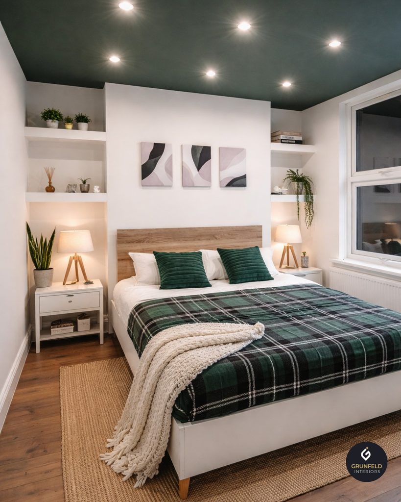
    7. Try A Painted Ceiling For A Cozy Cocoon Effect

    Credit: @grunfeld_interiors

    Painting your ceiling sage green or grey is one of those things that sounds bold but actually feels really calming once it’s done. I’ve seen bedrooms transform completely just by adding color up top instead of leaving it plain white.

    This works best in bedrooms with some architectural detail, like exposed beams or crown molding, since the color highlights those features instead of hiding them.

    Tip: if you’re nervous about commitment, start with a lighter grey on the ceiling and save deep sage green for an accent wall instead.

    This idea fits cottage, traditional, and modern farmhouse bedrooms particularly well, giving the whole room a wrapped, cozy feeling.

    Let’s shift gears now and talk about metal finishes, since hardware choices matter more than people think.

    8. Mix Metal Finishes For Visual Interest

    Mixing metallic finishes is growing trend | Home and Garden | Life
    Credit: Reviewjournal

    I used to think you had to match every metal finish in a room, but that’s just not true anymore. Brass, matte black, and brushed nickel all work beautifully against sage green and grey. Brass adds warmth, black adds contrast, and nickel keeps things sleek.

    Try brass drawer pulls on a grey dresser, black metal legs on a nightstand, and a brushed nickel lamp on top. The mix feels curated instead of matchy.

    Practical tip: pick one dominant metal finish and use the other two sparingly, so the room still feels cohesive.

    This mixed metal approach thrives in modern, transitional, and eclectic bedrooms where a little variety adds personality.

    Speaking of personality, let’s talk about plants next, because they’re an easy way to bring the sage green theme full circle.

    9. Bring In Real Or Faux Plants For A Natural Touch

    Fake Plants in the Bedroom: Yay or Nay? - Designer Plants USA
    Credit: Designerplants

    Since sage green already leans earthy, adding actual greenery just makes sense. A snake plant, pothos, or eucalyptus stem in a simple grey ceramic pot ties the whole room together.

    Plants also soften hard edges in a room, especially if you have a lot of straight furniture lines. I like placing one larger plant in a corner and a smaller one on a nightstand or dresser for balance.

    Tip: if you don’t have a green thumb, high quality faux plants look surprisingly real these days and need zero maintenance.

    This works in literally every design style, though boho and coastal rooms tend to use plants the most heavily.

    Now, let’s get into how bedding choices can make or break this whole color scheme.

    10. Layer Bedding In Varying Shades Of Sage And Grey

    21 Modern Sage Green Bedroom Ideas With Tips To Help You Design Yours
    Credit: Home-Designing

    Your bed is the biggest surface in the room, so bedding choices carry a lot of weight. I like layering a grey fitted sheet, a sage green duvet, and then a few throw pillows that mix both colors in different patterns, like stripes or subtle florals.

    This layered look feels intentional and gives you flexibility to switch things up seasonally without repainting anything.

    Practical tip: stick to two or three patterns max on your bed so it doesn’t feel too busy.

    This bedding-layering trick works everywhere, from minimalist bedrooms to more traditional, pattern-heavy spaces.

    Let’s look at another quick data table before diving into a few more ideas, this time comparing budget options for pulling this look together.

    Budget Tiers For A Sage Green And Grey Bedroom Refresh

    Budget LevelWhat You Can DoApproximate Cost
    Low ($50-150)New bedding, throw pillows, one accent piece$50-150
    Mid ($200-600)Paint one wall, new rug, curtains, lamps$200-600
    High ($700-2000)Full paint job, new furniture pieces, statement rug$700-2000
    Luxury ($2000+)Custom furniture, wallpaper, full room redesign$2000 and up

    11. Add Wallpaper With A Subtle Botanical Pattern

    Botanical Tropical Bedroom Wallpaper Design with Oversized Leaf Murals |  Livspace
    Credit: Livspace

    If solid paint feels too plain for you, wallpaper is a great middle ground. Look for botanical prints that blend sage green leaves against a grey background. This gives you pattern without going overboard on bold color.

    I’d suggest wallpapering just one wall if you’re nervous about commitment, or going all in if you love pattern and want a more immersive feel.

    Tip: peel and stick wallpaper is a great low-commitment option if you rent or just want to test the look first.

    This idea shines in traditional and grandmillennial style bedrooms, though modern homes can pull it off with a more abstract, less floral pattern.

    Let’s move into lighting next, since it changes how these colors actually read in your space.

    12. Choose Warm Lighting To Balance Cool Tones

    Bedroom Lighting Ideas for Peaceful Sleep Spaces - Home Fettle
    Credit: Homefettle

    Grey can turn cold fast under the wrong lighting. I always recommend warm white bulbs, around 2700K to 3000K, in any sage green and grey bedroom. This keeps the space feeling cozy instead of clinical.

    Layer your lighting too. A ceiling fixture alone isn’t enough. Add a bedside lamp, maybe a floor lamp in the corner, and if you can, a dimmer switch so you control the mood.

    Practical tip: avoid bright white or daylight bulbs in this color scheme, since they make grey look flat and sage green look washed out.

    This lighting approach matters across every style, since good lighting is honestly the most underrated design tool in any room.

    Now let’s talk about one more often-overlooked detail: your closet doors and trim.

    13. Paint Trim And Doors In A Complementary Grey

    A Single-Hue Haven: Painting Walls, Doors & Trim the Same Color | Tinted
    Credit; Sherwin-Williams

    Most people paint walls and totally forget about trim, doors, and baseboards. I like painting these in a soft grey that’s a few shades lighter or darker than the wall color. It gives the room a finished, cohesive look instead of stark white trim clashing with your color scheme.

    This is a small detail, but it makes a huge difference in how polished the room feels overall.

    Tip: use a satin or semi-gloss finish on trim so it’s easy to wipe clean and holds up over time.

    This works in every style, though modern homes tend to go monochromatic while traditional homes might keep white trim for contrast.

    Let’s wrap up the main ideas with a couple of finishing touches that pull everything together.

    14. Use Artwork That Echoes Both Colors

    Harmonizing Artwork with Room Colors | Rick Berk Fine Art Photography
    Credit: Rick

    Art ties a room together better than almost anything else. Look for pieces with soft sage green and grey tones, maybe a botanical print, an abstract landscape, or even black and white photography with a green mat.

    I like grouping two or three smaller pieces together over one large piece if your walls allow it, since it creates a gallery feel without costing a fortune.

    Practical tip: hang art so the center sits at eye level, about 57 to 60 inches from the floor.

    This works in every design style since art is one of the easiest ways to inject personality into any color palette.

    Last but not least, let’s talk about how to finish the room with the right accessories.

    15. Finish With Woven Baskets And Natural Storage

    Baskets to Add a Stylish Touch to Your Home Decor – Woodka Interiors
    Credit: Woodkainteriors

    Woven baskets in natural tones tie the earthy sage green vibe together while adding practical storage. Use them under the bed, in a closet, or as a catch-all in the corner for blankets or extra pillows.

    They add texture too, which we talked about earlier, and keep the room from feeling too polished or staged.

    Tip: choose baskets with handles so they’re easy to pull out and actually use, not just for decoration.

    This idea fits boho, coastal, and farmhouse bedrooms especially well, though even modern spaces benefit from a little natural texture.

    Tips for Success

    • Test paint samples on your actual walls, not just on paper, since lighting changes everything.
    • Keep at least 60 percent of the room in one dominant color so it doesn’t feel split down the middle.
    • Add texture through fabric, wood, and natural fibers so the room doesn’t feel flat.
    • Use warm lighting bulbs to keep grey from feeling cold or sterile.
    • Don’t skip trim and ceiling color, since these details finish the room’s overall look.
    • Bring in at least one living or faux plant to reinforce the earthy sage green feel.
    • Shop your own house first before buying new decor, since you might already own pieces that fit.

    Common Mistakes and How to Avoid Them

    Too much cool grey without warmth
    : Balance it out with wood tones, brass accents, or warm lighting so the room doesn’t feel sterile or cold.

    Choosing sage green that’s too bright
    : Stick to muted, dusty shades of sage rather than bright green so it stays calming instead of jarring.

    Ignoring texture completely
    : Mix in linen, wool, wood, and woven materials so the room feels layered instead of flat.

    Ignoring ceiling and trim color
    : Extend your palette to the ceiling and trim so the whole room feels intentional and finished.

    Overdoing one color and ignoring balance
    : Aim for a 60-30-10 split between your dominant color, secondary color, and accent color for better visual balance.

    Similar Variations

    • Sage Green And White Bedroom: A brighter, airier take that feels fresh and clean, especially in small spaces.
    • Sage Green And Cream Bedroom: Swaps grey for cream, creating a warmer, cozier version of this palette.
    • Grey And Blush Pink Bedroom: Keeps the calming grey base but swaps sage green for a softer, romantic pink accent.
    • Olive Green And Charcoal Bedroom: A deeper, moodier cousin of sage and grey, perfect for a dramatic bedroom feel.
    • Sage Green And Terracotta Bedroom: Mixes earthy green with warm clay tones for a more boho, sun-baked look.
    • Eucalyptus And Grey Bedroom: Uses a slightly cooler green tone paired with grey for a spa-like, calming vibe.

    At the end of the day, sage green and grey work so well together because they’re both calm, flexible colors that play nice with almost anything you already own, from wood furniture to brass hardware to woven baskets. Whether you go bold with an accent wall or keep things subtle with a few pillows and a plant, these 15 sage green and grey bedroom ideas give you plenty of ways to build a space that actually feels like you, without spending a fortune or repainting every single wall in your house.

  • 11 Bedroom Ideas For Small Rooms

    11 Bedroom Ideas For Small Rooms

    I’ve spent way too many hours online hunting for 11 bedroom ideas for small rooms that actually work in real houses, not just fancy showroom photos, and I think I finally cracked the code. This guide pulls together the tricks that actually make a tiny bedroom feel bigger, calmer, and way more “you.”

    A small bedroom is generally any room under 120 square feet where furniture placement, storage, and traffic flow feel tight. The best fixes combine multi-functional furniture, smart color choices, and vertical storage to open up visual space without a renovation.

    Stick with me and I’ll walk you through room layouts, color tricks, storage hacks, and a few mistakes I made myself so you don’t have to repeat them.

    What Makes Small Bedroom Design Different

    Small bedroom design isn’t just “regular decorating but smaller.” It’s a whole different game. Every inch counts. One bulky nightstand can throw off the entire flow of the room. I learned this the hard way when I crammed a full dresser into a 10×10 room and could barely open the closet door.

    The trick is thinking in layers, not square footage. You use height, light, and smart storage instead of floor space. You pick furniture that pulls double duty. And you get ruthless about what actually needs to live in that room. Once you start thinking this way, small rooms stop feeling like a limitation and start feeling like a fun puzzle to solve.

    1. Choose a Bed That Floats Instead of Boxes You In

    Everything You Ever Wanted to Know About Floating Beds
    Credit: Decoholic

    The bed is usually the biggest thing in a small bedroom, so its shape and placement matter a ton. Skip heavy platform beds with thick frames. Go for a bed with slim metal legs or an exposed frame that lets light travel underneath it. This creates a “floating” look that tricks the eye into seeing more floor space than actually exists.

    Practical tip: measure at least 24 inches of clearance on each side of the bed for walking room, even if that means going down a mattress size.

    This idea works in almost any style. Modern rooms love a low platform frame, while traditional spaces can use a slim wood frame with turned legs. Coastal rooms do great with a rattan or woven headboard that still feels airy.

    Once your bed is sorted, the next move is figuring out what goes on the walls around it.

    2. Mount Nightstands and Shelves Instead of Using Floor Furniture

    Credit: @hesterahome

    Floor-standing nightstands eat up precious square footage, and honestly, most of us only use the top surface anyway. Swap them for wall-mounted shelves or floating nightstands instead. You get a spot for your lamp, phone, and book, but the floor underneath stays open, which makes the whole room breathe easier.

    Try a small floating shelf about 18 to 20 inches wide on each side of the bed. Add a plug-in sconce above it so you skip the lamp cord clutter entirely.

    Modern farmhouse rooms look great with a simple wood shelf and black metal brackets. Boho spaces can add a woven basket underneath for extra storage. Traditional rooms can use a mini floating shelf with a decorative edge for a built-in look.

    Speaking of lighting, that’s actually a huge lever for making small rooms feel bigger, so let’s talk about that next.

    3. Use Layered Lighting Instead of One Overhead Fixture

    Bedroom Lights : A Comprehensive Guide on Bedroom Lighting Ideas | Light And Living
    Credit: Lightsandliving

    One flat overhead light makes small rooms feel flat and boxy. Instead, layer your lighting with three sources: ambient light from the ceiling, task light near the bed, and accent light somewhere else in the room, like a floor lamp in the corner or LED strips behind a headboard.

    This layering adds depth. Depth makes a room feel bigger even though the square footage hasn’t changed one bit.

    Practical tip: use warm white bulbs (2700K to 3000K) instead of cool white. Warm light makes small spaces feel cozy instead of clinical.

    Modern rooms can use a sculptural floor lamp for accent light. Traditional rooms do well with a small crystal or fabric-shaded lamp. Coastal rooms love a rattan pendant paired with a simple task lamp.

    Now that lighting is sorted, let’s tackle one of the biggest space-wasters in most small bedrooms: the closet.

    4. Rethink Your Closet With Vertical Storage Systems

    Bedroom Storage Ideas: Your Guide to an Organized Home
    Credit: Resourcefurniture

    Most closets waste half their space because everything just hangs at one height with a shelf on top. Add a second hanging rod below the first for shirts and folded pants. Use stackable bins on the closet floor instead of letting shoes pile up loose.

    If you don’t have a closet at all, a slim wardrobe that’s tall and narrow (rather than wide) works better in tight rooms. Look for one under 36 inches wide.

    Storage OptionBest ForApprox. CostSpace Saved
    Double hang rodShirts, pants, jackets$15-$30Doubles hanging capacity
    Stackable binsShoes, accessories$20-$40Frees floor space
    Slim wardrobe (30-36 in)Rooms with no closet$150-$400Fits tight corners
    Over-door organizerSmall items, jewelry$10-$25Uses dead door space
    Under-bed storage boxesOff-season clothes, linens$20-$50Uses wasted under-bed space

    Once your closet is working smarter, it’s time to look under the bed, because that’s free real estate most people forget about.

    5. Use Under-Bed Storage Instead of a Dresser

    56 Best Under-Bed Storage 2026 | Under Bed Storage Ideas | HGTV
    Credit: Hgtv

    If your room can’t fit both a bed and a full dresser, ditch the dresser. Use rolling storage bins or drawers under the bed instead. Fold shirts, sweaters, and extra bedding into these bins, and you basically get a hidden second closet.

    Practical tip: measure the gap under your bed frame before buying bins. Most beds clear either 7 inches or 11 inches, and bins are usually made for one or the other.

    This trick fits any style since the bins are hidden. Nobody walking into your room will ever know there’s storage under there. It’s a quiet win that works in modern, traditional, coastal, or farmhouse spaces equally well.

    With storage handled, let’s talk about color, because paint choice can make or break a small room’s whole vibe.

    6. Paint the Room in One Continuous Color

    31 bedroom paint ideas to easily transform your space | Ideal Home
    Credit: Ideal Home

    Painting walls, trim, and even the ceiling in the same color removes visual “stopping points” in the room. When your eye doesn’t hit a line where wall meets trim in a different shade, the room reads as one continuous space instead of a chopped-up box.

    Go with soft, light tones like warm white, pale sage, or dusty blue. These colors bounce light around instead of absorbing it.

    Practical tip: use the same paint sheen on walls and trim (eggshell works well) so the surfaces blend instead of contrasting.

    Modern rooms look sharp in soft gray-white. Traditional rooms glow in warm cream. Coastal rooms feel breezy in pale blue-green. Once your walls set the tone, mirrors are the next trick to bounce that color and light even further.

    7. Hang a Large Mirror Across From the Window

    Small bedroom mirror ideas to create the illusion of space | Ideal Home
    Credit: Idealhome

    Mirrors reflect light, and placing one directly across from your window doubles the natural light bouncing around the room. This single trick can make a cramped bedroom feel noticeably brighter and more open within seconds of walking in.

    Go big. A mirror that’s at least 30 by 40 inches makes a bigger visual impact than a small decorative one.

    Practical tip: lean a full-length mirror against a wall instead of hanging it if you’re renting and can’t drill holes.

    Modern spaces love a thin black metal frame. Traditional rooms do well with an ornate wood or gold frame. Coastal rooms often use a whitewashed or rope-wrapped frame for texture.

    Now let’s shrink down the furniture itself, because oversized pieces are one of the sneakiest small-room killers.

    8. Pick Furniture Scaled to the Room, Not the Showroom

    73 small room ideas that will make a big impact | House & Garden
    Credit; Houseandgarden

    Furniture stores show pieces in giant open rooms, so things look smaller than they really are. That oversized chair that looked “cute” in the store can swallow a small bedroom whole. Always measure your room first, then measure the furniture, and leave at least 30 inches of walking path between pieces.

    Practical tip: use painter’s tape on the floor to map out furniture dimensions before you buy anything. It sounds tedious but it saves you from expensive returns.

    Room SizeMax Bed SizeSuggested Furniture
    Under 80 sq ftTwin or Twin XLFloating shelf, slim wardrobe
    80-100 sq ftFullFloating nightstands, narrow dresser
    100-120 sq ftQueenSmall bench, compact desk
    120+ sq ftQueen or FullStandard nightstands, reading chair

    With the right-sized furniture in place, let’s look at how a few smart multi-use pieces can replace two or three separate items entirely.

    9. Choose Multi-Functional Furniture Over Single-Purpose Pieces

    15 Space-Saving Furniture Solutions for Small Spaces
    Credit: Thespruce

    A daybed that doubles as seating and sleeping space. An ottoman that opens up for storage. A desk that folds against the wall when you’re not using it. These multi-purpose pieces let a small room do more without feeling more crowded.

    Practical tip: look for furniture tagged “space-saving” or “convertible” on furniture sites. These are specifically designed with small rooms in mind, so the proportions are usually already right.

    Modern rooms often go for a Murphy bed with a built-in desk. Traditional spaces might use a storage bench at the foot of the bed instead. Coastal rooms love a woven storage ottoman that also works as a footrest.

    Once your furniture is working double duty, it’s time to think about what’s on your walls, because vertical space is your best friend in a small room.

    10. Use Vertical Stripes or Tall Decor to Draw the Eye Up

    The subtle 'vertical decorating' technique designers use to make small rooms look bigger and brighter | Homes and Gardens
    Credit: Homesandgardens

    When floor space is tight, the ceiling becomes your best design tool. Vertical striped wallpaper, tall bookshelves, or floor-to-ceiling curtains all pull the eye upward, which makes the room feel taller and less cramped.

    Practical tip: hang curtain rods a few inches below the ceiling instead of right above the window frame. This small change adds visual height instantly.

    Modern rooms can use a bold vertical accent wall. Traditional rooms might add a tall armoire in the corner. Coastal rooms often go with tall, airy linen curtains that puddle slightly on the floor for softness.

    Speaking of curtains, window treatments deserve their own moment, because they can quietly change how big or small a room feels.

    11. Swap Heavy Curtains for Light, Airy Window Treatments

    19 Bedroom Curtain Ideas for Style and Peace
    Credit: BHG

    Thick, dark curtains can make a small bedroom feel like a cave. Swap them for lighter fabrics like linen or cotton in pale colors. Light fabric lets more natural light filter through even when the curtains are closed, keeping the room from feeling boxed in.

    Practical tip: choose curtains that are slightly longer than your window and hang them wide of the frame. This makes the window itself look bigger than it is.

    Modern rooms do well with simple white linen panels. Traditional spaces might add a subtle pattern. Coastal rooms almost always lean toward sheer, breezy fabrics that move with the air.

    Last but not least, let’s talk about the one thing that ties every small room together: keeping it edited.

    Tips for Success

    • Measure everything twice before buying furniture, including doorway width for getting pieces into the room
    • Stick to a limited color palette of three tones max to avoid visual chaos
    • Use rugs to define zones instead of walls or furniture dividers
    • Keep floor space as clear as possible, since visible floor reads as “more room” to the eye
    • Test paint colors on the actual wall at different times of day before committing
    • Choose one statement piece per room instead of several competing focal points
    • Add plants in hanging planters instead of floor pots to save space

    Common Mistakes and How to Avoid Them

    Overcrowding with furniture
    : Stick to only the essentials: bed, one storage piece, one surface for a lamp. Anything extra should have a clear job.

    Using dark, heavy colors on all four walls
    : Balance dark accent walls with lighter ceiling and trim colors to keep the room from feeling smaller.

    Skipping curtains or rugs to “save space”
    : Soft textures actually help a room feel finished and cozy, not cramped, when chosen in light, breathable fabrics.

    Placing the bed under the window
    : This blocks natural light and airflow. Try placing the bed against the longest solid wall instead.

    Buying furniture before measuring the room
    : Always tape out dimensions on the floor first so you know exactly what will fit before you spend money.

    Ignoring vertical storage
    : Wasted wall space above furniture is one of the most common missed opportunities in small bedrooms.

    Similar Variations

    • Coastal Small Bedroom: Light woods, woven textures, and breezy blue-white tones for a beachy, airy feel
    • Modern Minimalist Small Bedroom: Clean lines, neutral palette, and almost no decorative clutter
    • Cozy Farmhouse Small Bedroom: Warm woods, soft textiles, and vintage-inspired accents in a compact layout
    • Scandinavian Small Bedroom: Light wood tones, simple furniture, and functional storage with minimal ornamentation
    • Boho Small Bedroom: Layered textiles, warm earthy colors, and plants in hanging or wall-mounted planters
    • Traditional Small Bedroom: Classic furniture shapes scaled down, soft color palettes, and subtle pattern use

    Small bedrooms don’t have to feel like a compromise. With the right bed placement, smart storage, and a color palette that keeps things light, even a tiny room can feel calm and put together. The real trick is choosing furniture and decor that pulls double duty instead of just filling space. Try even a few of these 11 bedroom ideas for small rooms, and I promise your tiny space will start feeling a whole lot bigger.

  • 13 Mid Century Modern Bedroom Ideas That Actually Work in Real Homes

    13 Mid Century Modern Bedroom Ideas That Actually Work in Real Homes

    I’ve spent way too many hours scrolling through bedroom inspiration, and I put together this guide on 13 mid century modern bedroom ideas because I got tired of seeing the same recycled advice everywhere. This list gives you real options, not just pretty pictures with no substance behind them.

    Mid century modern bedroom design refers to a style rooted in 1940s to 1960s furniture trends, featuring clean lines, organic curves, warm wood tones, and a mix of function with simple beauty. It avoids clutter and leans on natural materials paired with bold but limited color accents.

    Stick around, because I’m about to walk you through everything from furniture picks to color combos that actually hold up over time.
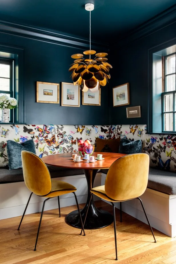
    What Makes a Bedroom “Mid Century Modern” Anyway

    So here’s the thing about mid century modern style. It’s not just about buying a walnut dresser and calling it done. This style came from a time when designers wanted furniture that looked good and worked hard. Think tapered legs, low profiles, and shapes inspired by nature.

    I like to think of it as the opposite of fussy. No heavy carvings. No overly ornate headboards. Just honest materials doing honest work. The colors tend to be warm woods paired with pops of mustard, teal, or burnt orange. Once you get the vibe, you start seeing it everywhere.

    Now let’s get into the actual ideas you can use in your own space.

    1. Choose a Low-Profile Platform Bed as Your Anchor

    Low Profile Bed Frames: The Modern | Mattress Miracle
    Credit: Mattressmiracle

    Your bed sets the tone for everything else in the room. Mid century modern beds sit low to the ground, usually with wooden slats or a simple upholstered headboard. Skip the tall, ornate frames you’d see in traditional bedrooms.

    Look for walnut, teak, or oak frames with tapered or angled legs. These woods have warm undertones that feel cozy without looking heavy.

    Practical tip: measure your ceiling height before buying. Low beds work best in rooms with standard 8 to 9 foot ceilings, otherwise the room feels unbalanced.

    This idea flexes well too. Add a tufted headboard for a slightly glam twist, or keep it bare wood for a more minimalist, Scandinavian-adjacent look. Once your bed is sorted, you’ll want to think about what goes on the walls behind it.

    2. Add a Sunburst or Geometric Wall Accent

    Painting a Colorful Sunburst Rainbow Accent Wall - in a corner
    Credit: Anikasdiylife

    Empty walls behind a low bed can feel unfinished. Mid century design loves geometric shapes, especially sunburst mirrors or wooden wall art with clean angular patterns.

    These pieces add visual height since your bed sits low. They also catch light in interesting ways, which adds movement to an otherwise calm room.

    Try a large sunburst mirror above the headboard instead of traditional framed art. It reflects light and makes small rooms feel bigger too.

    For traditional homes, swap the sunburst for a starburst clock instead. Coastal spaces can use a driftwood version of the same shape. Once your wall statement is set, it’s time to think about color.

    3. Pick a Warm, Earthy Color Palette

    37 Earth Tone Colors and paints for your Bedroom | Decoholic
    Credit: Decoholic

    Mid century modern doesn’t mean stark white walls with black furniture. It means warm, earthy tones inspired by nature. Think mustard yellow, avocado green, burnt orange, and deep teal.

    These colors work as accents rather than covering every wall. A neutral base with one or two bold accent colors keeps the room from feeling dated or costume-like.

    Color Palette Combinations for Mid Century Bedrooms

    Wall ColorAccent ColorWood ToneMood
    Warm WhiteMustard YellowWalnutCheerful, bright
    Soft GrayBurnt OrangeTeakCozy, grounded
    Sage GreenChocolate BrownOakCalm, natural
    TerracottaDeep TealRosewoodBold, dramatic

    Practical tip: paint one accent wall instead of the whole room if you’re nervous about commitment. This gives you the mid century punch without overwhelming the space.

    This palette approach adapts easily. Farmhouse bedrooms can lean into the sage green and oak combo. Modern minimalist spaces might prefer soft gray with just a hint of burnt orange. Speaking of wood tones, let’s talk about how to layer them properly.

    4. Mix Wood Tones Instead of Matching Everything

    credit: housewestdesign

    Here’s a mistake I see a lot. People think every piece of wood furniture needs to match perfectly. Mid century design actually thrives on mixing complementary wood tones.

    Pair a walnut dresser with teak nightstands. Add an oak accent chair. As long as the tones share warm undertones, they’ll blend nicely instead of clashing.

    Practical tip: bring a small wood sample or photo of your existing furniture when shopping for new pieces. This helps you match undertones instead of guessing.

    Traditional homes tend to prefer matched wood sets, so this mixing trick is more of a modern and mid century specific move. Rustic and boho spaces can push this even further by adding raw or reclaimed wood pieces into the mix. Once your woods are sorted, focus on the legs of your furniture.

    5. Prioritize Furniture with Tapered or Angled Legs

    How to Mix Modern Minimalism with Mid-Century Furniture
    Credit: Furniture-Store

    This detail seems small, but it makes a huge difference. Mid century furniture almost always has tapered legs, often angled outward slightly. This creates a lighter, airier feel compared to bulky furniture with straight or boxy legs.

    Dressers, nightstands, and chairs with these legs let light pass underneath them. This makes rooms feel more open, even if they’re small.

    Look specifically for hairpin legs or simple wooden tapered legs when shopping secondhand. These details are dead giveaways for authentic or well-designed reproduction pieces.

    This idea works great in small apartments regardless of overall style, since leggy furniture always reads lighter than boxy furniture. Coastal and modern farmhouse spaces both benefit from this same trick. Now let’s talk about textiles, because fabric choice matters just as much as furniture shape.

    6. Layer Textured Textiles Without Overdoing Patterns

    Bedroom Textile Tips: How to Choose the Perfect Fabrics
    Credit: Planner5d

    Mid century bedrooms use texture instead of busy patterns to add interest. Think boucle throw pillows, chunky knit blankets, and linen bedding in neutral or warm tones.

    Avoid loud florals or overly busy geometric fabric all over the bed. Instead, use one bold pattern as an accent, like a single patterned throw pillow, and keep everything else texture-focused.

    Practical tip: stick to three textures max per bed. Try linen sheets, a wool blanket, and a boucle pillow. Any more starts to feel cluttered.

    This textural approach translates well into boho and coastal bedrooms too, just swap wool for cotton or jute-based textiles. Once your textiles feel balanced, lighting becomes the next big piece of the puzzle.

    7. Install a Statement Pendant or Sputnik Light Fixture

    Flush Mount Ceiling Light 6-Light - Black & Gold Sputnik Chandelier With Glass Balls For Bedroom, Living Room, Hallway Bedroom Light Fixtures Ceiling
    Credit: Zam

    Lighting in mid century bedrooms isn’t an afterthought. Sputnik chandeliers, with their starburst arms and small bulbs, are iconic to this era. Pendant lights with wood or brass details also work beautifully.

    Skip generic flush mount ceiling lights if you want authentic mid century flair. A statement fixture becomes a piece of art in itself.

    Practical tip: hang pendant lights at least 30 inches above nightstands if using them as bedside lighting instead of lamps.

    This lighting choice adapts across styles easily. Industrial bedrooms can use similar fixtures in blackened metal, while glam spaces might choose brass sputnik fixtures instead. With lighting handled, let’s move into rugs and flooring.

    8. Layer a Low-Pile Area Rug for Warmth

    Layering Rugs: Tips & Ideas
    Credit: Tsarcarpets

    Hardwood floors are common in mid century homes, but bare floors can feel cold. A low-pile area rug with geometric patterns or solid warm tones adds comfort without hiding your beautiful flooring.

    Avoid shaggy or overly plush rugs, since they clash with the clean lines mid century style relies on. Stick to flatweave or low-pile options instead.

    Practical tip: size your rug so it extends at least 18 inches beyond each side of the bed. This creates visual balance in the room.

    Coastal bedrooms can use jute rugs for a similar effect with a beachier feel. Traditional spaces might prefer a Persian-style rug instead, though that shifts the vibe considerably. Now let’s talk storage, since function matters just as much as form here.

    9. Choose Dressers with Sculptural Hardware or None at All

    Guide to Dressers vs. Chests: Key Differences & Buying Tips – LuxenHome
    Credit: luxenhome

    Storage furniture in mid century bedrooms often skips bulky knobs entirely. Recessed pulls, sculptural wooden handles, or no visible hardware at all keep dressers looking sleek.

    This detail keeps the eye moving smoothly across furniture instead of getting caught on shiny metal knobs.

    Practical tip: if you already own a dresser, swap the hardware for simple brass or wood pulls. This small update can transform an outdated piece into something that reads mid century instantly.

    Furniture Budget Tiers for Mid Century Bedrooms

    Budget LevelBed FrameDresserNightstandsTotal Estimate
    Budget$200-400$150-300$60-100 each$500-900
    Mid-Range$500-900$400-700$150-250 each$1,200-2,000
    High-End$1,200-2,500$900-1,800$300-500 each$2,700-5,300

    Traditional bedrooms usually keep ornate hardware, so this minimal approach is fairly specific to mid century and modern styles. Once your storage pieces are sorted, accessories bring everything together.

    10. Add Live Plants in Simple Ceramic Planters

    Elegant Ceramic Planter Pots to Elevate Your Houseplants | Goodhomes.co.in
    Credit: Goodhomes

    Mid century design has strong ties to nature, and plants play a big role in that connection. Think rubber plants, snake plants, or fiddle leaf figs in simple ceramic or terra cotta pots.

    Avoid overly decorated planters. Simple, matte finishes in white, black, or earthy tones keep the focus on the plant itself.

    Practical tip: place one larger plant in a floor planter near a window instead of scattering several small pots around the room. This creates more visual impact.

    This idea works across nearly every design style, from boho to modern farmhouse, since plants are pretty universally loved. Once you’ve added some greenery, let’s talk about window treatments.

    11. Use Simple Panel Curtains Instead of Heavy Drapes

    Why One Curtain Panel Is Changing Homes in 2026 – Fabdivine
    Credit: Fabdivine

    Heavy, layered drapes don’t fit the mid century aesthetic. Instead, opt for simple panel curtains in linen or cotton, hung close to the window frame.

    Bold prints work if you want a retro touch, but solid neutral or muted tones keep things versatile long term.

    Practical tip: hang curtain rods just below the ceiling line instead of right above the window frame. This makes ceilings look taller and windows appear larger.

    Modern farmhouse bedrooms often use similar simple panels but in heavier cotton or linen blends. Coastal spaces might choose sheer white panels instead for a breezier feel. With windows covered, let’s discuss artwork placement.

    12. Display Abstract or Nature-Inspired Art in Simple Frames

    Printable Bedroom Wall Decor Nature Inspired Modern Art Prints Set Of With Frames For Home
    Credit: Cbtestweb

    Mid century art often features abstract shapes or nature scenes with bold, simplified color blocks. Skip ornate gold frames and choose thin wood or black metal frames instead.

    Gallery walls work too, but keep spacing consistent and avoid mixing too many frame styles together.

    Practical tip: hang art at eye level, roughly 57 to 60 inches from the floor to the center of the piece. This is a design industry standard that works in almost every room.

    This idea adapts to nearly any style since art is so personal. Traditional homes might choose ornate frames instead, while minimalist spaces might skip frames entirely and use canvas prints.

    13. Incorporate Brass or Walnut Accent Pieces Sparingly

    27 Velvet and Walnut Bedroom Ideas for a Sophisticated European Retreat | Wisal
    Credit: Wisalai

    Small details finish off the mid century look. Think brass drawer pulls, a walnut jewelry box, or a small brass reading lamp on the nightstand.

    The key word here is sparingly. Too many metallic accents can start to feel more glam than mid century.

    Practical tip: limit brass or metallic accents to two or three pieces per room. This keeps things intentional instead of scattered.

    Industrial bedrooms can lean harder into metal accents, while farmhouse spaces might prefer black iron instead of brass. With all thirteen ideas covered, you’ve got a solid foundation for building your own space.

    Tips for Success

    • Start with your bed and dresser first, since these anchor pieces set the tone for every other decision.
    • Buy secondhand when possible. Mid century furniture holds up well and thrift stores often have hidden gems.
    • Test paint colors in different lighting before committing to an accent wall.
    • Keep clutter minimal since this style relies on clean lines and open space to work visually.
    • Invest in one or two statement pieces rather than spreading your budget too thin across everything.
    • Photograph your room at different times of day to see how natural light interacts with your color choices.
    • Don’t rush the process. This style comes together best when pieces are chosen thoughtfully over time.

    Common Mistakes and How to Avoid Them

    Overloading the room with too many bold colors
    : Stick to one or two accent colors max, paired with warm neutrals as your base.

    Mixing mismatched wood undertones
    : Choose woods with similar warm or cool undertones so pieces blend instead of clash.

    Choosing furniture with heavy, boxy legs
    : Look specifically for tapered or angled legs to keep the room feeling light and open.

    Skipping texture in favor of pattern
    : Lean on textiles like boucle, linen, and wool instead of loud printed fabric everywhere.

    Hanging art or fixtures too high or too low
    : Follow standard placement guidelines, like eye level for art and proper clearance for pendant lights.

    Ignoring scale in small rooms
    : Choose smaller-scale mid century pieces designed for apartments instead of oversized statement furniture.

    Similar Variations

    • Scandinavian Modern: Similar clean lines but with lighter woods and an even more minimal color palette.
    • Danish Modern: A more specific subset focused heavily on craftsmanship and teak furniture.
    • Retro Modern: Leans into bolder, brighter colors and more playful patterns from the same era.
    • Modern Organic: Blends mid century shapes with natural materials like stone and rattan for a softer feel.
    • Atomic Age Style: Focuses on space-age patterns and shapes popular in the late 1950s and early 1960s.
    • Mid Century Boho: Combines mid century furniture with layered textiles and global-inspired decor pieces.

    Putting together a bedroom that actually feels intentional takes some trial and error, but these ideas give you a real starting point instead of vague inspiration. Focus on furniture shape first, layer in warm colors and natural textures, and let small details like lighting and hardware do the rest of the work. That’s really the whole formula behind a great 13 Mid Century Modern Bedroom setup, and once you see it click into place in your own space, you won’t want to go back to anything else.

  • 15 Room Ideas For Men Bedroom

    15 Room Ideas For Men Bedroom

    I’ve spent way too many hours scrolling through bedroom photos trying to figure out what actually makes a men bedroom feel put together, and I’m going to hand you everything I learned in this guide to 15 room ideas for men bedroom that actually work.

    A men’s bedroom design typically combines neutral or dark color palettes, functional furniture, minimal clutter, and a few bold decor pieces. The goal is a space that feels calm, organized, and personal without looking overdone.

    Stick around, because I’m about to walk you through fifteen ideas, a few tables to help you plan, and the mistakes I see guys make over and over again.

    What Makes A Bedroom Feel “For Men” Anyway?

    Honestly, there’s no rulebook that says a bedroom has to look a certain way just because a guy sleeps in it. But there are patterns. Most guys I know gravitate toward simple lines, darker colors, and stuff that has a job to do. Think leather, wood, metal, and maybe one plant that somehow survives. It’s less about “manly” in some cartoon sense and more about function meeting a calmer color story. Less frilly, more grounded. That’s really the whole vibe. Once you get that mindset, picking furniture and colors gets a lot easier.

    1. Go With A Charcoal And Warm Wood Color Scheme

    Grey Bedroom Ideas: 31 Ways To Decorate A Grey Bedroom
    Credit: Housebeautiful

    Charcoal walls paired with warm wood furniture is basically the backbone of a solid men’s bedroom. The dark gray keeps things moody without turning the room into a cave, and the wood tones warm it right back up. Add a platform bed frame in oak or walnut, and you’ve got contrast that feels intentional.

    Practical tip: paint just one wall charcoal (usually behind the headboard) instead of the whole room, so it doesn’t feel heavy.

    This combo works across styles too. Modern spaces keep the wood grain sleek, while traditional rooms lean into a chunkier, carved wood frame. Once your base colors are locked in, it’s time to think about what actually holds your stuff.

    2. Choose A Storage Bed To Cut Down On Clutter

    Men's grey bedroom ideas to give the neutral shade a twist | Ideal Home
    Credit: Idealhome

    A storage bed with drawers built into the base is one of those upgrades you don’t notice until you have it, then you wonder how you lived without it. It hides extra blankets, shoes, gym bags, whatever’s cluttering your floor right now.

    Look for a bed frame with at least two drawers per side. That’s usually enough for a guy’s average storage overflow.

    • Great for small bedrooms
    • Doubles as a nightstand-adjacent storage zone
    • Cuts down on needing a separate dresser

    In a coastal-style room, pick a whitewashed wood frame. In an industrial loft, go with black metal and wood combo frames. Once your storage problem is solved, you can focus on making the room actually feel warm instead of sterile.

    3. Add A Leather Accent Chair In The Corner

    Credit: @siya_interiors

    Every bedroom needs one spot that isn’t the bed. A leather accent chair gives you somewhere to sit, toss clothes for five minutes, or just have a “corner” that adds visual weight to the room.

    Tip: pick a chair in cognac or dark brown leather. It photographs well and ages nicely, unlike fabric that stains.

    This idea flexes easily. A mid-century modern room calls for a tan leather chair with wood legs. A more traditional bedroom looks great with a deep brown leather wingback. Either way, that chair becomes a little anchor point that pulls the whole room together, which leads nicely into thinking about lighting next.

    4. Layer In Warm, Low Lighting Instead Of One Overhead Light

    Bedroom Lights : A Comprehensive Guide on Bedroom Lighting Ideas | Light And Living
    Credit: lightsandliving

    One bright overhead light makes a bedroom feel like a hotel conference room. Swap that energy for layered lighting instead: a floor lamp, a couple of bedside lamps, and maybe a dimmer on the overhead fixture.

    Practical tip: stick to warm white bulbs (2700K to 3000K). Cool white bulbs make skin tones look weird and the room feel clinical.

    Lighting Options Compared

    Light TypeBest ForAverage CostVibe
    Bedside LampsReading, ambient light$25-$60 eachCozy, intimate
    Floor LampCorner filler, mood light$40-$120Modern, sculptural
    Dimmable OverheadFlexibility, full room light$30-$90Adaptable
    LED Strip LightsBehind headboard or shelves$15-$40Trendy, techy

    Once the lighting feels right, the next move is giving your walls something worth looking at.

    5. Hang Large-Scale Art Instead Of A Bunch Of Small Frames

    How to Hang Art Above a Bed: 9 Expert Tips on Hanging Art
    Credit: Tlcinteriors

    A single big piece of art over the bed does more work than five small frames scattered around. It gives the eye one clear spot to land and makes the room feel curated instead of cluttered.

    Go for something abstract, a black and white photo print, or even a large map if you’re into travel. Size matters here: aim for artwork that covers about two-thirds of your headboard’s width.

    Modern bedrooms do well with abstract line art. Traditional rooms look sharp with framed landscape paintings. Either way, that one big piece becomes the room’s visual anchor, and it pairs really well with a textured headboard, which is exactly what we’re covering next.

    6. Upgrade To A Textured Headboard

    43 Stylish Masculine Headboards For Your Man's Cave Bedroom - DigsDigs
    Credit: Digsdigs

    A headboard covered in linen, velvet, or even leather adds texture without adding more “stuff” to the room. It’s a subtle upgrade that makes the whole bed look more expensive than it actually was.

    Tip: if you’re on a budget, buy a headboard cover or slipcover instead of a whole new bed frame.

    • Linen headboards fit coastal and modern farmhouse styles
    • Velvet headboards fit moody, traditional, or Art Deco-inspired rooms
    • Leather headboards fit industrial and mid-century spaces

    Once your headboard has some texture, your bedding needs to match that energy instead of fighting it.

    7. Stick To A Simple, Two-Tone Bedding Palette

    7 Linen Colour Combinations for the Stylish Men in Your Life – Bed Threads
    Credit: Bedthreads

    Overly patterned bedding can make a room look busy fast. Instead, pick two colors max: something like navy and white, or charcoal and cream. Keep the pattern minimal, maybe just a subtle stripe or texture weave.

    Practical tip: buy a top sheet and duvet in the same tone family but slightly different shades. It gives depth without looking mismatched.

    Bedding Color Pairings

    Base ColorAccent ColorStyle Fit
    CharcoalCreamModern, minimalist
    NavyWhiteCoastal, classic
    OliveTanRustic, cabin-style
    BlackGrayIndustrial, urban

    This simple approach means your bedding won’t clash with new decor down the road. Speaking of decor, let’s talk rugs.

    8. Layer A Wool Rug Under The Bed

    Layering Rugs Under Beds | Centsational Style
    Credit: Centsationalstyle

    A rug grounds the whole room and keeps your feet warm getting out of bed. Wool rugs in particular hold up well and don’t show wear as fast as cheaper synthetic ones.

    Tip: the rug should extend at least 18 inches past each side of the bed so it doesn’t look like an afterthought.

    Herringbone or geometric patterns fit modern spaces. Solid, deep-colored rugs fit traditional rooms better. This grounding piece naturally leads into thinking about what’s on your walls besides art, like shelving.

    9. Add Floating Shelves For Books And Small Decor

    Floating Shelves - 40 Men's Bedroom Ideas for A Masculine Touch - PlusMood
    Credit: Pinterest

    Floating shelves are basically the easiest way to add personality without cluttering surfaces. Use them for a few books, a small plant, maybe a framed photo or two.

    Practical tip: don’t overfill them. Three to five items per shelf looks curated. Ten items looks messy.

    This idea flexes into almost every style. Reclaimed wood shelves fit rustic or farmhouse rooms, while sleek black metal shelves fit modern or industrial spaces. Once your shelves are dialed in, it’s worth thinking about scent and sound too, which brings us to the next idea.

    10. Bring In A Diffuser Or Candle With A Woodsy Scent

    Creating The Perfect Scent For Your Bedroom -
    Credit: lightingcompany

    Smell matters more than people think. A cedar, sandalwood, or leather-scented candle makes a bedroom feel finished in a way visuals alone can’t.

    Tip: keep it to one scent source per room. Mixing three candles with different scents just creates a weird smell soup.

    This works in literally any style bedroom. It’s a small, cheap upgrade that makes a bigger impact than most people expect. Now let’s zoom into furniture placement, starting with the nightstand setup.

    11. Match Nightstands In Material, Not Necessarily In Size

    No, Your Nightstands Don't Have to Match (& Here's How to Do It Like a Designer) - Emily Henderson
    Credit: Stylebyemilyhenderson

    You don’t need matching nightstands, but matching materials (like both in walnut, or both in matte black) keeps things looking cohesive even if the shapes are different.

    Practical tip: your nightstand height should sit within two inches of your mattress top for easy reach.

    • Wood nightstands fit traditional and rustic rooms
    • Metal and glass nightstands fit modern and industrial rooms
    • Woven rattan nightstands fit coastal or boho spaces

    Getting this detail right makes the whole bed area feel finished, which naturally leads into thinking about your closet and clothing storage.

    12. Organize An Open Closet Or Wardrobe System

    How to Maximize a Small Walk-In Closet Space | The Wardrobe Man
    Credit: Wardrobeman

    An open wardrobe system with clear zones for shirts, pants, and shoes saves time every single morning. It also keeps your bedroom looking tidy since everything has an actual home.

    Tip: use uniform hangers (all wood or all black) instead of a mismatched pile. It’s a five-dollar fix that makes closets look ten times more organized.

    This idea fits any style bedroom because it’s function over form. Once your closet’s sorted, you’ll want a spot for tech stuff too, since cords everywhere ruin a clean look fast.

    13. Hide Cords With A Cable Management Box

    Tips and Products for Organizing Cords and Cables| Cord Management Ideas | HGTV
    Credit: Hgtv

    Nothing kills a clean bedroom vibe faster than a tangle of phone chargers and lamp cords behind the nightstand. A small cable box or clip system tucks all that mess out of sight.

    Practical tip: label your cords with small tags before you tuck them away, future you will thank past you.

    This works no matter your style since it’s basically invisible once it’s done. With cords handled, let’s talk about adding a bit of life into the room with plants.

    14. Add One Low-Maintenance Plant For Life And Color

    20 Best Bedroom Plants for a Prettier, Healthier Space
    Credit: Countryliving

    A snake plant or ZZ plant adds a shot of green without demanding much attention. It also helps the room feel less like a showroom and more like someone actually lives there.

    Tip: place it near a window but not in direct blasting sun, most low-maintenance plants prefer indirect light.

    Modern rooms look sharp with a plant in a concrete pot. Traditional rooms look better with a woven basket planter. This small green touch pairs surprisingly well with the final idea: a personal display wall.

    15. Create A Personal Display Wall With Meaningful Items

    Men's Bedroom Ideas | Stylish, Modern & Masculine Design Guide – Sonno
    Credit: Sonno

    Instead of generic decor, use one wall for stuff that actually means something. Concert tickets, travel photos, a framed jersey, whatever tells your story.

    Practical tip: use matching frame colors even if the items inside are totally different, it keeps the wall from looking chaotic.

    This idea is the most flexible one on the list because it adapts to literally any personality or style. It’s also usually the part of the room guests remember most, since it’s the one thing that couldn’t belong to anyone else.

    Tips For Success

    • Start with your color palette before buying furniture, it’s easier to build around two or three colors than to force pieces together later.
    • Buy one statement piece first (a chair, a headboard, a rug) and build the rest of the room around it.
    • Keep a “one in, one out” rule for decor so surfaces don’t get cluttered again.
    • Test paint colors on the actual wall at different times of day before committing.
    • Measure your room before buying furniture, oversized pieces make small bedrooms feel cramped fast.
    • Don’t ignore closet and storage needs just because they’re not exciting to shop for.
    • Add texture through fabric and rugs if you’re scared of using too much color.

    Common Mistakes And How To Avoid Them

    Too much matching furniture
    : Buying a full bedroom set makes the room look like a hotel. Mix materials instead, like a wood bed with metal nightstands.

    Ignoring lighting temperature
    : Cool white bulbs make a warm room feel cold and sterile. Stick to warm white bulbs around 2700K to 3000K.

    Overcrowding the walls
    : Too many small frames create visual noise. Go with one or two larger, intentional pieces instead.

    Skipping a rug because “guys don’t need one”
    : A bare floor makes a room feel unfinished. Even a simple rug adds warmth and structure.

    Choosing trendy colors over ones you actually like
    : Trends fade, but you sleep in this room every night. Pick colors you’ll still like in five years.

    Neglecting storage until it’s a problem
    : Clutter builds fast without a plan. Add storage furniture early instead of fighting mess later.

    Similar Variations

    • Industrial Loft Bedroom — Exposed brick, black metal fixtures, and raw wood furniture for an urban, unfinished feel.
    • Mid-Century Modern Bedroom — Clean lines, tapered wood legs, and warm mustard or olive accent colors.
    • Coastal Minimalist Bedroom — Whitewashed wood, linen bedding, and light, breezy color palettes.
    • Scandinavian Bedroom — Light wood, neutral tones, and a heavy focus on function over decoration.
    • Rustic Cabin Bedroom — Exposed wood beams, plaid or flannel textiles, and deep forest color tones.
    • Art Deco Bedroom — Bold geometric patterns, brass fixtures, and rich jewel-toned accents.

    At the end of the day, a great men’s bedroom isn’t about following one strict formula, it’s about picking a few solid ideas that actually fit how you live and layering them in slowly. Start with color and storage, add texture and lighting, then finish with the personal touches that make the space feel like yours. That’s really the whole secret behind these 15 room ideas for men bedroom, small, intentional choices that add up to a room you actually want to walk into every night.

  • 11 Chandelier Dining Room Ideas That Will Change How You See Your Space

    11 Chandelier Dining Room Ideas That Will Change How You See Your Space

    If you’re trying to figure out how an 11 chandelier dining room actually works in real homes, you’ve landed in the right spot. I’ve spent way too many hours studying lighting layouts, and I’m going to walk you through exactly what makes this look click.

    An 11 chandelier dining room refers to a dining space lit by a chandelier featuring 11 arms or light points, often chosen for larger tables or rooms needing balanced, symmetrical illumination. This fixture size typically suits tables seating 8 to 12 people comfortably.

    Stick around, because I’m about to show you twelve ways to style this exact setup, plus mistakes that trip up almost everyone.

    What Makes an 11 Chandelier Dining Room Different

    Okay, so why does the number matter? An 11-light chandelier sits in a weird sweet spot. It’s bigger than your standard 6-arm fixture but not as massive as a giant 20-light ballroom piece. That means it gives you serious presence without swallowing a normal-sized room whole.

    I like to think of it as the “goldilocks” fixture. Not too small, not too much. It works great over long rectangular tables or big rounds where you need light spread evenly across a wide surface. The odd number also creates a natural focal point since the arms usually branch out symmetrically from a center point, which just looks balanced to the eye.

    Now let’s get into the actual design ideas.

    1. Center It Over a Long Rectangular Table

    35 Chandelier Over Dining Table Ideas You Need to See
    Credit: Soulandlane

    This one seems obvious, but people mess it up constantly. Your 11 chandelier needs to hang dead center over the table length and width, not just eyeballed close to it. Measure the table’s midpoint and drop a plumb line from the ceiling to double-check placement before you install anything.

    For a rectangular table, an 11-arm chandelier with an elongated or oval shape looks more intentional than a round one. It echoes the table’s lines instead of fighting them.

    Practical tip: hang the fixture so its bottom sits 30 to 34 inches above the tabletop for standard 8-foot ceilings.

    This setup works beautifully in traditional and transitional homes, though modern spaces can pull it off too with a sleeker, matte-finish fixture.

    Once you’ve nailed placement, the next thing to think about is how tall your ceiling actually is.

    2. Adjust Chain Length for Ceiling Height

    Guide to Hanging a Chandelier in Your Dining Room
    Credit: 1800lighting

    Ceiling height changes everything about how your chandelier reads in the room. A fixture that looks perfect in a 9-foot room can feel cramped or awkwardly low in a 12-foot one if you don’t adjust the chain or rod length.

    Most 11 chandelier fixtures come with adjustable chains specifically for this reason. Add length for higher ceilings so the fixture doesn’t look lost floating up near the crown molding. For every additional foot of ceiling height above 8 feet, add roughly 3 inches to your hanging height.

    Quick tip: stand at the doorway and look at the fixture from across the room, not just from your dining chair. That’s the view guests see first.

    In coastal or farmhouse homes, longer chains with rope or wood accents feel right at home, while modern spaces often prefer clean metal chains.

    Getting height right matters, but so does picking a finish that actually matches your room’s personality.

    3. Match the Metal Finish to Your Hardware

    Our Tips for Mixing Metals & Finishes | Bria Hammel Interiors
    Credit: Briahammelinteriors

    Here’s something I see missed all the time. People pick a gorgeous 11 chandelier dining room fixture in brushed brass, then leave their cabinet pulls in oil-rubbed bronze and door handles in chrome. It creates visual chaos even if each piece is beautiful on its own.

    Pick one dominant metal finish and stick with it across your lighting, hardware, and any metal furniture legs. Brass and gold tones warm up a space and pair nicely with jewel tones or deep greens. Black and bronze finishes add drama and work well in moody, traditional rooms.

    Actionable tip: bring a hardware sample to the lighting store so you can compare finishes side by side under real light.

    Farmhouse and industrial styles lean toward blackened metal, while glam and traditional spaces often favor gold or brass.

    Once your metals are consistent, it’s time to think about what’s happening underneath that gorgeous fixture.

    H3: Chandelier Metal Finish Guide by Style

    Home StyleBest Metal FinishComplementary Table Base
    ModernMatte black or brushed nickelSleek metal or glass
    TraditionalAntique brass or bronzeDark wood, carved legs
    FarmhouseAged black or wrought ironReclaimed wood
    CoastalBrushed gold or whitewashed woodLight oak or white-painted wood
    GlamPolished brass or chromeLacquered or mirrored surfaces

    4. Layer a Statement Rug Beneath the Table

    How Should A Large Rug Be Placed Under A Dining Table?
    Credit: Edwardmartin

    A rug grounds the whole dining area and keeps the eye moving from the chandelier down to the floor in a cohesive way. Choose a rug that extends at least 24 inches beyond the table’s edge on all sides so chairs stay on the rug even when pulled out.

    Wool and jute blends hold up well under daily chair-scooting, and patterned rugs hide crumbs better than solid colors, trust me on that one.

    Practical tip: go with a low pile height, under half an inch, so chair legs don’t wobble or catch.

    Traditional rooms look great with Persian-style patterns, while modern spaces often go for geometric or solid neutral rugs.

    With your rug sorted, let’s talk about what goes on the walls surrounding this whole scene.

    5. Add Wall Sconces for Layered Light

    How To Layer Lighting In A Dining Room For Ambience And Function
    Credit: Edwardmartin

    An 11-arm chandelier gives you plenty of overhead light, but a dining room needs more than one light source to feel warm and finished. Wall sconces flanking a buffet, mirror, or window add a softer glow at eye level, which makes everyone at the table look better too, not just the room.

    Choose sconces that echo the chandelier’s finish and general shape so they feel like part of the same family rather than an afterthought.

    Tip: put sconces on a separate dimmer switch from the chandelier so you can control mood independently during dinners versus daytime.

    Coastal rooms love glass or frosted sconces, while traditional spaces often go for candle-style arms that mimic old-world lighting.

    Speaking of dimmers, let’s dig into that a bit more because it changes everything about how your chandelier performs.

    6. Install a Dimmer Switch for Mood Control

    The Benefits of Installing Dimmer Switches in Your Dining Room - Richards  Lighting
    Credit: Richardslighting

    This is the cheapest upgrade with the biggest impact, hands down. An 11 chandelier dining room fixture on full blast can feel like an interrogation room during a relaxed dinner party. A dimmer lets you shift from bright task lighting for homework or bill-paying to soft, flattering light for evening meals.

    Most electricians can add a dimmer switch in under an hour, and LED-compatible dimmers work with nearly any bulb type these days.

    Practical tip: test your dimmer with the actual bulbs you plan to use, since not all LED bulbs dim smoothly with every dimmer switch.

    This upgrade works in literally every home style because mood lighting is universal, whether your dining room is farmhouse casual or sleek modern.

    Now that lighting control is handled, let’s think about scale and how your chandelier relates to the table beneath it.

    7. Size the Chandelier to the Table, Not Just the Room

    How To Choose the Right Size Dining Room Chandelier or Pendant – Schoolhouse
    Credit:Schoolhouse

    A common mistake is choosing chandelier size based on room square footage alone. What actually matters more is the table dimensions. For an 11-light chandelier, you generally want a table at least 84 inches long to give the fixture room to breathe without overwhelming a shorter table.

    The general rule of thumb is that your chandelier’s width should measure about half to two-thirds of your table’s width.

    Tip: use painter’s tape on the ceiling to outline the chandelier’s footprint before buying, so you can visualize the actual scale in your space.

    Modern dining rooms often go slightly smaller and sleeker, while traditional or formal rooms embrace bigger, more ornate scale.

    H3: Table Length to Chandelier Width Guide

    Table LengthRecommended Chandelier WidthSeating Capacity
    60-72 inches24-30 inches6-8 people
    72-84 inches30-36 inches8-10 people
    84-96 inches36-42 inches10-12 people
    96+ inches42-48 inches12+ people

    Now let’s talk color, because your chandelier doesn’t exist in a vacuum.

    8. Choose a Wall Color That Lets the Fixture Shine

    The 24 Best Dining Room Paint Colors to Brighten Your Space | HGTV
    Credit: Hgtv

    Busy wallpaper or a super bold accent wall can compete visually with an ornate 11-arm chandelier. If your fixture already has a lot of detail, crystal drops, curved arms, multiple candle covers, give your walls a break with a calmer, more neutral backdrop.

    Soft greens, warm greiges, and muted blues all let the fixture stay the star of the show without feeling washed out.

    Tip: paint a large sample swatch and view it under the chandelier’s actual light at night, not just daytime, since bulb color temperature changes how paint reads.

    Coastal homes lean toward soft blues and whites, while traditional rooms often prefer deep, rich hues like hunter green or navy.

    Once your walls are settled, think about what’s sitting on your table besides food.

    9. Coordinate Table Settings With the Fixture’s Tone

    Dining Room Table Decor Ideas | How to Decorate Your Dining Room Table |  HGTV
    Credit: Hgtv

    Little details tie a room together more than people expect. If your chandelier has warm gold accents, pull that same warmth into your table runner, candle holders, or even napkin rings. It creates a cohesive story from ceiling to tabletop.

    I’m not saying match everything exactly, that gets boring fast. Instead, pick two or three recurring tones that show up in the fixture, the rug, and the table decor.

    Practical tip: keep a small fabric or paint swatch from your dining room in your phone’s photo album so you can shop for matching decor on the go.

    Glam spaces love metallic table accents, while farmhouse rooms do better with matte, natural textures like linen and wood.

    Let’s move to something people often forget entirely, the ceiling itself.

    10. Treat the Ceiling as Part of the Design

    How to Decorate a Small Dining Room, According to Design Experts
    Credit: Elledecor

    Your 11 chandelier dining room fixture hangs from the ceiling, so why leave that surface totally blank? A simple ceiling medallion behind the fixture adds architectural interest and makes the whole installation look custom-built rather than store-bought.

    Wood beam details or a fresh coat of paint in a soft contrasting tone above the chandelier also draws the eye upward in a good way.

    Tip: choose a medallion slightly larger than the chandelier’s canopy so it peeks out from underneath rather than hiding completely.

    Traditional and colonial-style homes love ornate plaster medallions, while modern spaces might opt for a recessed tray ceiling instead.

    With the ceiling handled, let’s zoom back down to seating, because chairs matter more than most people realize.

    11. Pick Dining Chairs That Balance the Fixture’s Weight

    How To Choose The Right Dining Chairs For Your Table | MFI
    Credit: Mfi

    An ornate, heavy-looking 11-arm chandelier can make delicate chairs look flimsy by comparison. Balance visual weight by choosing chairs with a bit of substance, upholstered backs, carved wood details, or a slightly thicker frame.

    That said, you don’t need chairs that scream for attention. Simple silhouettes in a complementary tone often work best so the chandelier stays the focal point.

    Practical tip: mix a few statement end chairs with simpler side chairs if you want variety without visual competition.

    Modern rooms often go with sculptural, minimal chairs, while traditional dining rooms favor classic wingback or Chippendale-style seating.

    Last but not least, let’s talk about something that ties every single idea above together.

    12. Plan Your Bulb Choice for Warmth and Longevity

    The Best Light Bulbs for Dining Room Fixtures: Dimming & Color Options -  Zepboo
    Credit: Zepboo

    The bulbs you choose change everything about how your chandelier actually feels in daily life. Warm white bulbs, around 2700K to 3000K, flatter skin tones and food way better than cool white or daylight bulbs, which can feel clinical in a dining setting.

    LED candelabra bulbs now mimic that flickering warm glow of old-school incandescent without the energy cost or constant bulb replacement.

    Practical tip: buy one extra bulb when you purchase your set, so you have a matching replacement ready when one eventually burns out.

    Every style, from farmhouse to glam to coastal, benefits from warm-toned bulbs since they make food and faces look their best.

    Tips for Success

    • Always test chandelier placement with painter’s tape on the ceiling before drilling anything permanent.
    • Buy your rug and paint samples before the chandelier if you’re starting from scratch, since lighting is easier to match later.
    • Keep at least 7 feet of clearance from the floor to the bottom of the chandelier so tall guests don’t bump their heads.
    • Clean crystal or glass elements every few months since dust dulls sparkle fast and is very noticeable under direct light.
    • Don’t skip the dimmer switch. It’s the single easiest way to make an 11-arm fixture feel intentional rather than harsh.
    • Photograph your dining room at night before buying decor, so you understand how the fixture actually casts light and shadow.

    Common Mistakes and How to Avoid Them

    Hanging the chandelier too low
    : Keep at least 30 inches of clearance above the tabletop so it doesn’t interfere with sightlines across the table during meals.

    Choosing a fixture too small for the table
    : Measure your table width first and pick a chandelier that’s roughly half to two-thirds that width for proper scale.

    Mixing too many metal finishes
    : Stick to one dominant metal tone across lighting and hardware to avoid a disjointed, thrown-together look.

    Skipping additional light sources
    : Pair the chandelier with sconces or lamps so the room doesn’t feel flat or overly bright from a single source.

    Ignoring bulb color temperature
    : Choose warm white bulbs between 2700K and 3000K to keep the dining room feeling cozy rather than clinical.

    Forgetting to plan for chain or rod adjustment
    : Measure ceiling height accurately before installation so the fixture hangs proportionally, not too high or too low.

    Similar Variations

    • Tiered Crystal Chandelier Dining Room: Multiple stacked layers of crystal for a more dramatic, formal dining statement.
    • Linear Chandelier Dining Room: A single elongated fixture perfect for narrow or extra-long tables.
    • Rustic Wagon Wheel Chandelier: Wood and iron combo that suits farmhouse and cabin-style dining spaces.
    • Drum Shade Chandelier Dining Room: A fabric or metal drum shade softens light for a cozier, modern feel.
    • Sputnik Chandelier Dining Room: Mid-century modern starburst design that adds a retro, artsy edge.
    • Candle-Style Wrought Iron Chandelier: Mimics old-world European dining halls with a moodier, traditional vibe.

    Getting your dining room lighting right isn’t about following rigid rules, it’s about balance between scale, finish, and light quality. Once you nail those basics, everything else, the rug, the chairs, the wall color, just falls into place naturally around that centerpiece. An 11 chandelier dining room, when done thoughtfully, becomes the kind of space people remember long after dinner’s over.

  • 10 Dining Room Chandelier Ideas That’ll Make Your Whole Room Feel Brand New

    10 Dining Room Chandelier Ideas That’ll Make Your Whole Room Feel Brand New

    I’ve spent way too many hours scrolling through lighting stores trying to find the right dining room chandelier, so I put together this guide to save you that headache. This isn’t a rushed list. I actually dug into what works, what doesn’t, and why, so you get real answers instead of generic fluff.

    A dining room chandelier is a hanging light fixture installed above a dining table, usually centered, that provides both ambient lighting and a decorative focal point. The right size, height, and style depend on your table dimensions, ceiling height, and the room’s overall design.

    Stick around, because I’m about to walk you through 12 chandelier ideas, a sizing table, a budget breakdown, and the mistakes I see people make over and over again.

    What Makes a Dining Room Chandelier Actually Work

    Here’s the thing about chandeliers. They’re not just lights. They’re basically jewelry for your ceiling. A good one pulls the whole room together, sets the mood for dinner, and gives guests something to look up at (literally) when they walk in.

    But a chandelier that’s too small looks lost. One that’s too big feels like it’s about to swallow your table. The trick is balancing size, height, and style with the rest of your room. I’ll show you exactly how to do that with real examples below, so by the end you’ll know which direction fits your space best.

    1. Go Bold with an Oversized Statement Chandelier

    Bold Oversized Pendants and Chandeliers — Lighting Design Store
    Credit: Lightingdesign

    If your dining room has high ceilings, don’t be shy. An oversized chandelier fills empty space above the table and instantly becomes the room’s main event. Think dramatic metal frames, cascading crystals, or a mix of both.

    The key is proportion. Your chandelier’s width should be about half to two-thirds of your table’s width. So if your table is 72 inches long, look for a fixture around 36 to 48 inches wide.

    Practical tip: measure your ceiling height first. You need at least 30 to 36 inches of clearance between the chandelier’s bottom and the table.

    This idea works great in traditional and glam homes, but you can find oversized fixtures in matte black or brass for a more modern look too. Now let’s talk about what happens when your ceilings aren’t quite so tall.

    2. Choose a Low-Profile Drum Shade for Modest Ceilings

    Pleated Fabric Drum Shade Dimmable Chandelier | Ping Lighting
    Credit: Pink Lighting

    Not every dining room has soaring ceilings, and that’s fine. A drum shade chandelier hugs closer to the ceiling and still delivers plenty of light without eating up vertical space. These usually come in fabric, metal, or frosted glass.

    I like drum shades because they diffuse light softly, which makes dinner conversations feel warmer and less harsh. Pair a linen drum shade with a wood table for a cozy, understated look.

    Actionable tip: measure from your ceiling to the tabletop. If it’s under 8 feet, a drum shade keeps things proportional without crowding the room.

    This style adapts beautifully to farmhouse, transitional, and minimalist homes. Next, let’s look at a chandelier style that brings texture into the mix.

    3. Add Warmth with a Wood and Iron Combo Chandelier

    Modern Farmhouse Dining Room Looks That Make The Table The Best Seat In The  House - Edward George
    Credit: Edwardgeorgelondon

    Mixing materials gives your dining room depth without trying too hard. Wood and iron chandeliers combine rustic charm with an industrial edge, which works surprisingly well in almost any home.

    The wood adds warmth. The iron adds structure. Together they feel grounded instead of fussy. I’ve seen these in circular ring designs, wagon-wheel shapes, and even boxy geometric frames.

    Practical tip: match the wood tone to your existing furniture. If your table is a light oak, look for a chandelier with a similar finish so things don’t clash.

    This combo shines in farmhouse and rustic spaces, but a blackened iron frame with dark walnut accents can lean more modern industrial too. Speaking of modern, let’s talk metal finishes next.

    4. Try a Matte Black Fixture for Modern Drama

    Why Black Accents Are the Secret to Stylish Interiors: 13 Ideas for Any Room
    Credit: Home-Designing

    Matte black chandeliers have been everywhere lately, and honestly, I get why. Black grounds a room. It adds contrast against white walls or light ceilings, and it pairs with almost any color palette you already have going.

    These fixtures usually come in linear designs, sputnik styles, or simple candle-style arms. They photograph beautifully too, which matters if you’re the type who likes your dining room to look good on camera.

    Tip: if your dining room already has a lot of black accents (chairs, frames, hardware), a black chandelier ties everything together instead of adding more contrast.

    Matte black adapts to modern, industrial, and even traditional spaces when paired with warm wood tones. Now, let’s swing toward something with a little sparkle.

    5. Bring in Crystal Accents Without Going Overboard

    Credit: Modeneseinteriors

    Crystal chandeliers get a bad reputation for looking too fancy or old-fashioned, but modern versions have changed that. Think smaller crystal clusters on a sleek metal frame instead of a giant ballroom-style fixture.

    This gives you sparkle and light reflection without turning your dining room into a wedding venue. Crystals catch candlelight beautifully too, which is a nice touch for evening dinners.

    Practical tip: choose a chandelier with removable or minimal crystal strands if you want flexibility to dress it up or down later.

    This style works in glam, transitional, and even coastal homes when paired with white or sea glass toned crystals. Let’s move to something with a more natural feel next.

    6. Use a Rattan or Woven Chandelier for Coastal Vibes

    Credit: @marcialovesit

    If your dining room leans coastal or boho, a rattan or woven chandelier softens the space instantly. These fixtures often look like oversized pendant lights with a basket-like shape, and they cast really pretty shadows on the ceiling when lit.

    I love these because they bring texture without adding visual clutter. They’re lightweight looking, which helps in smaller dining rooms that can’t handle a heavy metal fixture.

    Tip: pair a woven chandelier with linen curtains and a light wood table to keep the coastal theme consistent throughout the room.

    This idea fits coastal, boho, and even Mediterranean-style homes surprisingly well. Now here’s a quick sizing table before we keep going.

    Chandelier Size Guide by Table Length

    Table LengthChandelier WidthRecommended Hanging Height Above Table
    48 inches24 to 30 inches30 to 34 inches
    60 inches30 to 36 inches30 to 34 inches
    72 inches36 to 44 inches32 to 36 inches
    84 inches42 to 50 inches32 to 36 inches
    96+ inches50+ inches or double fixtures34 to 38 inches

    7. Install a Linear Chandelier Over a Long Table

    How High to Hang a Chandelier Above a Dining Table – Seus Lighting
    Credit: Seus

    Round chandeliers look great over square or round tables, but if your table is long and rectangular, a linear chandelier fits the shape much better. These fixtures stretch horizontally instead of hanging in a single cluster, which spreads light more evenly down the table.

    Linear designs often come in sleek metal finishes with exposed bulbs or small shades along the length. They look especially sharp in modern and contemporary dining rooms.

    Practical tip: center the linear fixture over the table, not the room, since dining tables aren’t always centered in the space.

    This works well in modern, industrial, and Scandinavian style homes. Next, let’s talk about a chandelier option that saves you money without sacrificing style.

    8. Save Money with a Budget-Friendly Chandelier Alternative

    40 dining room ideas: trends, styles, and advice | Real Homes
    Credit: Realhomes

    Not everyone wants to drop hundreds of dollars on lighting, and that’s completely fair. Budget-friendly chandeliers made from lightweight metal, acrylic crystals, or basic fabric shades can still look expensive if you choose the right shape and finish.

    Look for simpler silhouettes with fewer decorative extras since ornate details usually drive up the price. A clean, symmetrical design in a trending finish like brushed gold or matte black often looks more expensive than it actually cost.

    Tip: shop clearance sections at lighting stores in January and July, when stores tend to clear out seasonal stock.

    This approach works in any home style since budget doesn’t limit design. Now let’s go the opposite direction and talk about investing in a statement piece.

    Chandelier Budget Tiers

    Budget TierPrice RangeWhat You Typically Get
    Budget$80 to $200Basic metal or fabric shade, standard finishes
    Mid-range$200 to $500Better materials, more finish options, larger sizes
    High-end$500 to $1,200Designer brands, crystal accents, mixed materials
    Luxury$1,200+Custom sizing, imported materials, statement scale

    9. Splurge on a Designer Piece as Your Room’s Focal Point

    87 Designer Dining Rooms That'll Inspire You to Refresh Your Space
    Credit: Housebeautiful

    Sometimes it’s worth spending more on one great chandelier instead of dropping money on lots of smaller decor pieces. A designer chandelier becomes the anchor of your whole dining room, meaning you can actually simplify other elements like wall art or table decor.

    These pieces often use higher quality materials like hand-blown glass, solid brass, or genuine crystal, which age better and hold up longer than budget versions.

    Practical tip: if you’re splurging, choose a timeless shape (like a classic tiered design or simple sputnik) so it doesn’t feel dated in five years.

    This works especially well in traditional, glam, and transitional homes. Let’s shift gears now to something a little more playful.

    10. Add Personality with a Colored Glass Chandelier

    30+ Best Dining Room Light Fixtures - Chandelier & Pendant Lighting for Dining  Room Ceilings
    Credit: Elle Decor

    White and clear glass get most of the attention, but colored glass chandeliers add a fun pop of personality. Amber, smoky gray, or even soft blue glass shades add warmth or coolness depending on the tone you pick.

    These work especially well if your dining room has neutral walls and furniture, since the chandelier becomes the color statement without overwhelming the space.

    Tip: choose warm tones like amber or smoked topaz if your room gets a lot of natural light, since these colors glow beautifully at sunset.

    This idea fits midcentury modern, eclectic, and transitional homes really well. Now, let’s talk about layering multiple light sources instead of relying on just the chandelier.

    Tips for Success

    • Always measure your table and ceiling height before shopping, not after you fall in love with a fixture online.
    • Bring a paint swatch or fabric sample from your dining room when shopping in person, since lighting finishes can look different under store lighting.
    • Consider the bulb type and color temperature, warm white (2700K to 3000K) usually feels more inviting than cool white.
    • Don’t ignore the chain or rod length, most chandeliers can be adjusted but double check before buying if your ceiling is unusually tall or short.
    • Think about cleaning and maintenance, crystal chandeliers need more upkeep than simple metal or glass fixtures.
    • Test the switch compatibility, older homes sometimes need an electrician to update wiring for dimmable fixtures.

    Common Mistakes and How to Avoid Them

    Hanging the chandelier too high
    : Keep it 30 to 36 inches above the tabletop so it doesn’t feel disconnected from the dining experience.

    Choosing a fixture that’s too small for the table
    : Follow the half to two-thirds width rule based on your table’s length to keep proportions balanced.

    Ignoring the room’s overall style
    : Pick a finish and shape that complements your existing furniture instead of shopping in isolation.

    Forgetting about dimmer compatibility
    : Check the fixture’s specs and your home’s wiring before installation to avoid returning it later.

    Centering the chandelier on the room instead of the table
    : Measure from the table’s center, especially if your table isn’t centered in the actual room layout.

    Overlooking bulb color temperature
    : Stick with warm white bulbs for most dining rooms since cool white can feel clinical during meals.

    Similar Variations

    • Kitchen Island Pendant Lighting: smaller scale fixtures hung over kitchen islands instead of dining tables
    • Foyer Chandeliers: taller, narrower designs meant for entryways with high ceilings
    • Bedroom Chandeliers: softer, smaller fixtures used as a statement piece above a bed or reading nook
    • Outdoor Chandeliers: weather-resistant versions designed for covered patios or outdoor dining spaces
    • Multi-Tier Ballroom Style Chandeliers: larger, layered designs typically reserved for formal or oversized dining rooms
    • Mini Chandeliers for Breakfast Nooks: compact versions scaled down for smaller eating areas

    Picking the right chandelier really comes down to knowing your space, your table size, and the mood you’re going for. Once you nail those three things, everything else, the finish, the material, the price, becomes a lot easier to figure out. I hope this list gave you a clearer picture of what to look for the next time you’re standing in a lighting aisle wondering where to even start with a 10 Dining Room Chandelier decision.