Category: Dining Room

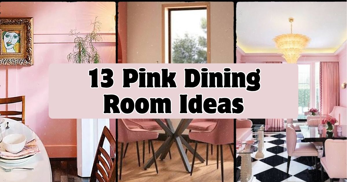
  • 13 Pink Dining Room Ideas

    13 Pink Dining Room Ideas

    I’ve put together 13 pink dining room ideas that actually work in real homes, not just in fancy magazine spreads. If you’ve ever stared at your dining room walls wondering if pink could actually look grown up and not like a kid’s bedroom, you’re in the right place. I dug into what makes pink dining rooms feel warm instead of overwhelming, and I’m sharing all of it here.

    A pink dining room is a dining space where pink appears as the dominant or accent color through walls, furniture, or textiles. Soft pinks like blush and dusty rose work in most homes, while bold pinks like fuchsia or coral suit spaces with bolder design goals. The right shade depends on lighting, room size, and existing decor.

    Stick around, because I’m about to show you exactly how to pull this off, from paint chips to chair fabric, without it looking like a dollhouse threw up on your walls.

    What Makes Pink Work in a Dining Room

    Pink gets a bad reputation. People hear “pink dining room” and picture bubblegum walls and ruffled curtains. But that’s not what we’re doing here. Pink, when you pick the right shade, can feel warm, cozy, and honestly kind of sophisticated. Think terracotta-pink, dusty mauve, or a warm blush that looks almost neutral in the right light. Dining rooms are perfect for this because you’re not living in there all day. You can go a little bolder than you would in a bedroom. Plus, pink has this weird effect where it makes food and skin tones look better under warm lighting. That’s why fancy restaurants use it more than you’d think.

    Paint Your Walls in a Warm Terracotta Pink

    10 Best Pink Paint Colors, According to Interior Designers | Apartment  Therapy
    Credit: Apartment Thearapy

    Skip the cotton candy shade and go for something with more brown or orange mixed in. Terracotta pink reads as earthy and grounded instead of sweet. It pairs beautifully with wood dining tables, rattan chairs, and brass light fixtures. This shade works especially well in rooms with lots of natural light because it warms up without turning neon.

    My actual tip: test the paint on a poster board and move it around the room at different times of day before committing. Pink shifts a lot depending on lighting.

    This look adapts easily to Mediterranean, boho, and modern farmhouse styles since terracotta already feels like it belongs outdoors and in.

    Now that your walls are sorted, let’s talk about what goes on top of them.

    Hang a Statement Pink Light Fixture

    27 Beautiful And Inspiring Pink Dining Rooms - Shelterness
    Credit: Shelterness

    If painting a whole room feels scary, start smaller. A pink glass chandelier or pendant light adds color without committing your walls to anything. Look for fixtures in smoked pink glass, blush ceramic, or even a powder-coated pink metal frame. This works as a focal point over your dining table and draws the eye up, which makes the room feel taller too.

    Practical tip: hang your fixture 30 to 34 inches above the table surface for the best light spread and sightlines.

    This idea works in almost any style, modern, traditional, art deco, because lighting is easy to swap out later if you change your mind.

    Once your lighting sets the tone, your table linens can echo that same color story.

    Layer Dusty Rose Table Linens and Napkins

    Luxurious Galentine's Day Table Setting Ideas for Unforgettable Celebr
    Credit: Kim Seybert

    Table linens are the cheapest way to test pink before going bigger. A dusty rose tablecloth or runner adds softness without permanence. Mix in white or cream napkins so the pink doesn’t overwhelm the table setting. Linen or cotton fabric holds color better than polyester and looks more expensive too.

    Quick tip: buy a few napkin rings in brass or gold to tie the pink and metallic tones together instantly.

    Coastal homes can use lighter blush linens, while traditional dining rooms look great with deeper rose tones and lace trim.

    Speaking of trim and texture, let’s move to something bigger: the chairs themselves.

    Choose Blush Velvet Dining Chairs

    Set of 2 Arwen Matte Velvet Dining Chairs - Blush Pink by Homebase |  uFurnish.com
    Credit: UFurnish

    Velvet chairs in a soft blush shade instantly make a dining room feel fancier. Velvet catches light in a way that flat cotton fabric just can’t, so even a simple chair looks luxe. Pair blush velvet chairs with a dark wood or black table for contrast, or keep it monochromatic with a white marble top.

    Actionable tip: choose performance velvet if you have kids or pets. It resists stains way better than standard velvet and still looks soft.

    This idea shines in modern glam, art deco, and transitional dining rooms where texture does a lot of the visual work.

    Chairs set the tone for comfort, but your table itself can carry pink too.

    Pink Shade Comparison Table

    Pink ShadeBest Used OnMood It CreatesPairs Well With
    BlushChairs, linensSoft, romanticGold, cream, light wood
    Dusty RoseWalls, curtainsWarm, cozySage green, brass
    Terracotta PinkWalls, potteryEarthy, groundedRattan, wood, black
    FuchsiaAccent pieces, artBold, energeticWhite, navy, black
    MauveWalls, upholsteryMuted, sophisticatedCharcoal, gold, walnut

    Add a Pink-Hued Area Rug Under the Table

    20 Sophisticated Ways To Style A Pink Rug | The Perennial Style | Dallas  Travel & Lifestyle Blogger
    Credit: Perennial style

    A rug grounds the whole room and gives you another spot to bring in pink without touching the walls or furniture. Look for a rug with a subtle pink pattern mixed with cream or gray so it doesn’t compete with your table setting. Wool rugs hold up best under dining chairs since they resist crushing.

    Practical tip: size your rug so it extends at least 24 inches beyond the table edge on all sides. That way chairs stay on the rug even when pulled out.

    Traditional homes look great with pink Persian-style rugs, while modern spaces do better with a simple pink and cream geometric pattern.

    Rugs anchor the room from below, but let’s look up now at what you can do with the ceiling.

    Paint the Ceiling a Soft Powder Pink

    A Bunch Of Really Good Rooms Painted Pink Because It's Valentine's Day And  We All Deserve It - Emily Henderson
    Credit: Emily Henderson

    This one surprises people, but a pink ceiling is a great way to add color without it feeling like too much. It’s called a “pink ceiling trick” in some design circles because it reflects a warm glow down onto the whole room, including your walls and furniture. Keep the walls white or a light neutral so the ceiling gets to be the star.

    My tip: use a flat or matte finish on the ceiling paint. Glossy finishes on ceilings show every imperfection.

    This works surprisingly well in traditional and coastal homes where a painted ceiling already feels classic and unexpected.

    If ceilings feel like too big a commitment, art is a much easier entry point.

    Hang Pink-Toned Art in Gallery Style

    Dining in the Pink with Carleton Varney and Lilly Pulitzer
    Credit: Pink Pagova

    A gallery wall with pink-toned artwork gives you flexibility. You can swap pieces in and out as your taste changes, unlike paint or furniture. Mix botanical prints, abstract art, and even black and white photos with pink mats to tie everything together.

    Actionable tip: lay your frames out on the floor first in the arrangement you want, then transfer that layout to the wall using painter’s tape as a guide.

    This idea works in literally every style because gallery walls are flexible by nature, modern, farmhouse, traditional, you name it.

    Once your walls have some personality, it’s time to think about the table’s centerpiece.

    Style Your Table with Pink Ceramic or Glassware

    30 Pink Tablescape Ideas for Soft, Youthful Gatherings
    Credit: Hello Hayley

    A simple bowl of fruit or fresh flowers gets way more interesting in a pink ceramic vase or dish. Pink glassware, like blush-tinted wine glasses or water goblets, adds color right at eye level during meals. This is one of the easiest ideas on this list because you’re not committing to anything permanent.

    Quick tip: mix matte ceramic pieces with glossy glassware so the table has some texture variation, not just color.

    This works in every single home style since tableware is easy to store away or swap for the seasons.

    Now let’s talk about something a little more structural: your window treatments.

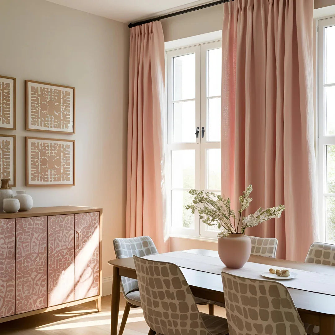
    Dress Windows in Sheer Blush Curtains
    Best Pink Curtains for a Cozy & Stylish Room Makeover in 2026 – Fabdivine
    Credit: Fabdivine

    Sheer curtains in a blush or soft pink shade let light filter through while still adding color to the room. This is way less intense than a solid pink curtain and feels more livable in a dining space where you want brightness during meals. Hang them close to the ceiling to make the windows, and the whole room, feel taller.

    Practical tip: use a curtain rod that extends 4 to 6 inches past the window frame on each side. This makes windows look bigger and lets more light in around the edges.

    Coastal and modern farmhouse homes love this soft, breezy look, while traditional homes can go for a heavier pink drapery with more structure.

    Curtains bring softness, but let’s get into furniture material next.

    Pick a Pink Lacquered or Painted Buffet Cabinet

    30 Pink Kitchen Ideas That Prove the Color Is a Perfect Neutral
    Credit: the spruce

    A buffet or sideboard is often overlooked, but painting it pink turns it into a statement piece without touching your walls. Lacquered finishes in coral or hot pink give a glossy, modern look, while a matte blush finish feels more traditional and soft. Use this piece to store dishware and display a few decor items on top.

    My tip: sand and prime the cabinet before painting, even if it’s already finished wood. This step is what makes the paint job look professional instead of streaky.

    Modern and art deco homes lean into glossy bold pinks, while cottage and traditional styles do better with a chalky matte finish.

    Once your storage piece pops, you can start layering smaller pink accents around the room.

    Budget Tiers for Adding Pink to a Dining Room

    Budget LevelWhat You Can DoEstimated Cost Range
    Low ($0-$100)Linens, napkins, small decor, candles$20-$100
    Mid ($100-$500)Painted accent wall, new rug, curtains$150-$500
    High ($500-$1500)New dining chairs, light fixture, buffet$500-$1500
    Investment ($1500+)Full room repaint, custom furniture, new flooring$1500-$4000+

    Bring in Dried or Fresh Pink Florals

    Sea Bass with Ginger Sauce
    Credit: My100

    Flowers are the easiest, lowest-risk way to add pink to any dining room. Dried pampas grass with a pink dye, fresh peonies, or even silk ranunculus in a simple vase can do the job. This works especially well if you’re renting or not ready to commit to paint or furniture changes.

    Actionable tip: buy dried florals in bulk from a craft store and arrange them in a vase you already own. It’s often cheaper than buying a pre-made arrangement.

    This idea fits any style because florals are temporary and easy to change with the seasons or your mood.

    Speaking of seasonal changes, let’s talk about how pink can work with your existing wood tones.

    Match Pink Accents to Warm Wood Tones

    39 Pink Room Decor Ideas to Use Throughout Your Home
    Credit: Better Homes

    Pink and warm wood, like oak, walnut, or cherry, actually complement each other really well. The orange undertones in wood pull out the warmth in pink instead of clashing with it. If you already have wood furniture you love, you don’t need to replace it. Just add pink through chairs, art, or textiles instead.

    Practical tip: hold a fabric swatch or paint chip next to your actual wood furniture in your dining room’s lighting before buying anything. Wood tones vary a lot and you want them to actually match.

    This approach works in mid-century modern, farmhouse, and traditional homes where wood furniture is already the star.

    Last but not least, let’s talk about the boldest move on this list.

    Go Bold with a Fuchsia or Hot Pink Accent Wall

    14 Pink Dining Room Ideas – Home Stratosphere
    Credit: Home Stratophere

    If you’re feeling brave, one bold wall in fuchsia or hot pink can transform a plain dining room into something people remember. Keep the other three walls neutral so the bold color doesn’t overwhelm the space. This works best on the wall behind your buffet or the one guests see first walking in.

    My tip: test a large sample swatch, at least 2 feet by 2 feet, on the actual wall for a few days before committing to the full paint job.

    Modern and eclectic homes handle bold pink walls the best, since those styles already embrace color and contrast.

    With all 13 of these ideas in your back pocket, you’ve got a real toolkit for making pink work in your own dining room.

    Tips for Success

    • Test paint colors at three different times of day since lighting changes how pink reads dramatically.
    • Balance bold pink choices with neutral furniture so the room doesn’t feel like a single color explosion.
    • Add metallics like brass or gold to make pink feel warmer and more expensive looking.
    • Start small with linens or decor before committing to paint or furniture if you’re unsure about pink.
    • Keep at least one large neutral surface, like a rug or ceiling, to balance out bold pink walls or furniture.
    • Photograph your room under both daylight and evening lighting before choosing a final pink shade.
    • Mix textures, velvet, ceramic, glass, wood, so the room doesn’t feel flat even with one dominant color.

    Common Mistakes and How to Avoid Them

    Choosing a shade that’s too sweet or juvenile
    : Test warmer, muted pinks like terracotta or mauve instead of bright bubblegum tones for a more grown-up feel.

    Using pink everywhere with no neutral break
    : Balance pink walls or furniture with white, cream, or wood tones so the eye has somewhere to rest.

    Skipping a sample test before painting
    : Always paint a large swatch and view it in your actual lighting conditions before committing to a full wall or room.

    Ignoring your existing furniture’s undertones
    : Check whether your wood or metal finishes have warm or cool undertones before picking a pink that might clash.

    Overcrowding the table with too many pink accessories
    : Pick one or two pink elements on the table, like linens or glassware, instead of layering five different pink items at once.

    Forgetting about lighting fixtures
    : A warm bulb can make pink look muddy while a cool bulb can make it look washed out, so test your actual bulbs beforehand.

    Similar Variations

    • Dusty Rose Farmhouse: Combines muted pink tones with rustic wood furniture and simple, cozy decor.
    • Glam Blush and Gold: Pairs soft pink with brass, mirrored surfaces, and velvet for a luxurious feel.
    • Coastal Pink and Cream: Uses light blush tones with white, rattan, and natural textures for a breezy look.
    • Art Deco Fuchsia: Bold pink paired with black, gold, and geometric patterns for a dramatic statement.
    • Mauve Traditional: Deeper, muted pink tones combined with classic furniture shapes and formal table settings.
    • Terracotta Boho: Warm, earthy pink shades mixed with rattan, plants, and natural fiber textures.

    Pink dining rooms don’t have to feel fussy or overly sweet if you pick the right shade and balance it with the right materials. Whether you go bold with an accent wall or start small with linens and a vase of flowers, there’s a version of pink that fits your home. I hope these 13 Pink Dining Room Ideas gave you enough inspiration to finally make that dining room feel like yours.
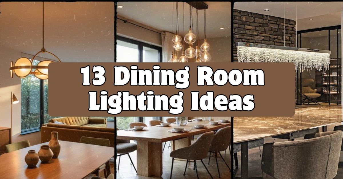
  • 13 Dining Room Lighting Ideas That’ll Change How You See Your Space

    13 Dining Room Lighting Ideas That’ll Change How You See Your Space

    I’ve pulled together 13 dining room lighting ideas that actually work in real homes, not just magazine spreads, and I’m going to walk you through every single one so you can pick what fits your space best.

    Dining room lighting refers to the fixtures and light sources used to illuminate a dining area, typically combining a central fixture with ambient and accent lighting. The right setup balances brightness, mood, and style based on room size and table placement.

    Ever sat under a dining room light that made your food look gray and your guests look tired? Yeah, me too. Let’s fix that together.

    What Makes Dining Room Lighting Different From Other Rooms

    Dining rooms have one job: make people want to linger. That’s different from a kitchen where you need bright task lighting, or a bedroom where you want soft and sleepy vibes. A dining room needs to flatter faces, make food look good, and set a mood that works for a quick Tuesday dinner and a holiday feast. That’s a lot of pressure for one light fixture. The good news? You don’t need one fixture doing all that work. You need a layered approach, and that’s exactly what I’m going to show you in the ideas below.

    1. Hang a Statement Chandelier as Your Anchor Piece

    Statement Lighting: How One Fixture Transforms a Room – Nauradika
    Credit: Nauradika

    A chandelier over the dining table is the classic move, and honestly, it still works. It gives the room a focal point and tells guests “this is where the magic happens.” Go for a fixture that’s roughly half to two-thirds the width of your table. Brass and gold finishes feel warm and traditional, while black iron or matte finishes lean modern.

    Practical tip: hang it so the bottom sits 30 to 36 inches above the tabletop. Any higher and it feels disconnected; any lower and you’ll bonk heads.

    This idea flexes easily. Crystal chandeliers suit traditional and glam homes, while a linear drum shade chandelier works great in modern farmhouse spaces. Once your anchor piece is in place, you’ll want something to soften the light it throws, which brings me to dimmers.

    2. Install a Dimmer Switch for Total Mood Control

    The Benefits of Installing Dimmer Switches in Your Dining Room - Richards  Lighting
    Credit: Richards Lightings

    This one’s cheap and it’s a total game changer. A dimmer switch lets you crank the lights up for homework and board games, then dial them down for candlelit dinners. Most dimmers cost under $30 and take about 20 minutes to install if your wiring is straightforward.

    I always tell people this is the single best return on investment in dining room lighting. You get flexibility without buying new fixtures.

    Actionable tip: pair your dimmer with warm white bulbs (2700K to 3000K) since dimmed cool white bulbs can look weird and blue-ish.

    Works in literally every style of home because it’s invisible. Nobody sees a dimmer switch and judges your decor. Speaking of bulbs, let’s talk about why bulb temperature matters so much.

    Bulb Temperature Guide for Dining Rooms

    Kelvin RatingLight AppearanceBest Use in Dining Room
    2200K – 2700KWarm, amber glowCandlelight-style dinners, cozy traditional spaces
    3000K – 3500KSoft whiteEveryday family dinners, transitional decor
    4000K – 5000KBright white/coolTask lighting on sideboards, modern minimalist rooms
    5000K+Daylight, bluishNot recommended for dining tables

    3. Layer in Wall Sconces for Softer Ambient Light

    Light Layering: Mastering the Art of Illuminating Your Space with Style
    Credit: Decorrila

    Wall sconces do double duty. They add ambient light without eating up table space, and they make your walls feel finished instead of bare. Place them flanking a buffet, mirror, or piece of art for a balanced look.

    I like sconces with fabric or frosted glass shades because they diffuse light gently instead of throwing harsh beams across the room. Mount them at eye level, roughly 60 to 66 inches from the floor.

    Practical tip: use sconces on a separate switch from your main fixture so you can mix and match brightness levels depending on the occasion.

    Coastal homes love sconces with rope or rattan details, while traditional homes go for brass and glass. Once your walls are glowing, it’s time to think about what’s happening right above the table.

    4. Choose a Linear Fixture for Long or Rectangular Tables

    Modern Dining Room Table Lighting Ideas – Seus Lighting
    Credit: Seus Lighting

    If your table is long and skinny, a single round chandelier can look lonely stuck in the middle. A linear fixture, think a row of pendants or a horizontal chandelier, stretches the light evenly across the whole table.

    This works especially well for farmhouse tables that seat eight or more. Aim for a fixture that covers about two-thirds of the table’s length so light reaches everyone, not just the folks in the middle.

    Actionable tip: if your table seats 10 or more, consider two smaller linear fixtures instead of one giant one. It balances the visual weight of the room better.

    Industrial and modern farmhouse spaces practically demand this look, but even traditional dining rooms can pull it off with a fixture that has candle-style bulbs. Now let’s zoom out and talk about pendant clusters, which give you more flexibility than a single fixture.

    5. Cluster Multiple Pendants for a Custom Look

    Transform Your Dining Room with Cascading Pendant Light Clusters – Future  Light - LED Lights South Africa
    Credit: Future Lightining

    Instead of one chandelier, try grouping three to five pendant lights at varying heights over the table. This creates visual interest and feels less formal than a traditional chandelier setup. It’s a favorite in eclectic and mid-century modern homes.

    Mix pendant shapes a little, but keep the finish consistent (all brass, all black, all glass) so it doesn’t look mismatched. Stagger the hanging heights by 4 to 6 inches for a relaxed, organic feel.

    Practical tip: use a multi-port canopy kit if you’re working with a single electrical box. It lets you run multiple cords from one point without extra wiring.

    This idea shines in boho and mid-century spaces but can work in modern homes with sleek glass globes. Speaking of globes, let’s talk about how fixture shape changes the mood of a room entirely.

    6. Pick Fixture Shapes That Match Your Table Shape

    32+ Dining Room Lighting Ideas ( CREATIVE ) - Lighting Fixtures
    Credit: BackSplash

    This sounds simple, but it trips people up constantly. Round tables pair naturally with round chandeliers or a single large pendant. Rectangular tables want linear fixtures or a row of pendants. Square tables often look best with a square or drum-shaped fixture centered above them.

    Getting this wrong isn’t the end of the world, but getting it right makes the whole room feel intentional instead of accidental.

    Practical tip: measure your table’s shape and bring those dimensions with you when shopping for fixtures. It saves you from falling in love with something that won’t actually fit the vibe.

    Table Shape to Fixture Pairing Guide

    Table ShapeBest Fixture TypeAverage Fixture Width
    Round (48-60 in)Round chandelier or drum pendant20-30 inches
    Rectangular (72-96 in)Linear chandelier or pendant row36-60 inches
    Square (36-48 in)Square or lantern-style fixture18-24 inches
    Oval (72-84 in)Elongated chandelier30-48 inches

    Once your main fixture matches your table, you can start layering in supplemental light sources, and that’s where things get fun.

    7. Add a Buffet Lamp for Warm, Low-Level Light

    Dining room lighting ideas – 15 ideas to illuminate your dining room | Real  Homes
    Credit: Real Homes

    A simple table lamp on your buffet or sideboard adds a cozy, lived-in feel that overhead lighting alone can’t give you. It’s soft, it’s warm, and it makes the room feel like a home instead of a showroom.

    Choose a lamp with a fabric shade for the warmest glow. Ceramic or wood bases feel more traditional, while metal bases lean modern.

    Practical tip: put buffet lamps on a smart plug so you can turn them on remotely or set them on a timer for ambiance every evening without lifting a finger.

    This idea works across every style because lamps are so easy to swap out. Traditional homes might choose a lamp with a pleated shade, while modern spaces go sleek and minimal. Now let’s talk about a lighting layer people forget entirely: the ceiling itself.

    8. Use Recessed Lighting for Even, Subtle Illumination

    How To Layer Lighting In A Dining Room For Ambience And Function
    Credit: Edwards Martin

    Recessed lights, sometimes called can lights, sit flush in the ceiling and spread light evenly without calling attention to themselves. They’re great as a supplemental layer alongside a chandelier, especially in rooms where you want brightness without visual clutter.

    Space them evenly around the perimeter of the room rather than directly over the table, since that’s the chandelier’s job. Four to six recessed lights usually cover an average dining room nicely.

    Practical tip: put these on a separate dimmer from your chandelier so you can crank up general brightness for cleaning or homework, then dim everything for dinner.

    This works in every style since recessed lighting is basically invisible during the day. It’s a workhorse, not a design statement. Next, let’s cover a trick that professional designers use constantly: layering light temperature.

    9. Mix Warm and Cool Light Sources Intentionally

    Kitchen lighting ideas: how to light a kitchen for style and function |  House & Garden
    Credit: House And Garden

    Most people don’t realize this, but mixing light temperatures (not just brightness) changes how a room feels. A warm chandelier paired with slightly cooler accent lighting on art or shelves adds depth instead of flatness.

    I recommend keeping your main table light warm (2700K-3000K) since that’s the most flattering for food and faces. Then you can experiment with slightly cooler tones (3500K) on shelving or display cabinets to make objects pop.

    Practical tip: stick within 500-1000K of each other across the room. Too big a gap and the room feels disjointed rather than layered.

    This trick is subtle enough to work in any design style since most people notice the effect without noticing the cause. Now, let’s talk about a fixture type that’s having a major moment right now: the drum pendant.

    10. Try a Drum Pendant for Soft, Diffused Glow

    Lightsin LED Bamboo Pendant Light Drum-Shaped 45/60/70/80 Dia – Living and  Home
    Credit: Living And Homes

    A drum pendant is a cylindrical shade, usually fabric or frosted glass, that hangs over the table and diffuses light in every direction. It’s less dramatic than a chandelier but way cozier than a bare bulb fixture.

    These work especially well in smaller dining rooms where a big ornate chandelier might feel overwhelming. The fabric shade also softens harsh bulb glare, which your dinner guests will thank you for.

    Practical tip: choose a drum pendant with a linen or cotton shade for the warmest diffusion. Metal drum shades throw more directional light and can feel a bit colder.

    Transitional and modern farmhouse homes love this fixture type. Coastal homes often choose drum pendants in woven rattan for texture. Speaking of texture, let’s talk about how natural materials change the whole feel of your lighting.

    11. Incorporate Natural Materials Like Rattan and Wood

    Dining room lighting ideas – 33 ways to elevate any mealtime | Ideal Home
    Credit: Ideal Homes

    Lighting fixtures made from rattan, wood, or woven fibers add warmth and texture that metal and glass just can’t match. They’re huge in coastal, boho, and Scandinavian-inspired dining rooms right now.

    These fixtures tend to cast dappled, softer light patterns because the material isn’t fully transparent. That dappled effect adds a lot of charm to a plain white ceiling.

    Practical tip: pair a natural material fixture with a warm bulb (2700K) to enhance the cozy, earthy feel instead of fighting against it with a stark white light.

    This idea is basically the calling card of coastal and boho dining rooms, but a single rattan pendant can even soften an otherwise modern, minimalist space. Now, let’s get into a lighting idea that’s often overlooked but makes a huge difference: picture lights.

    12. Add Picture Lights or Art Lighting on Dining Room Walls

    Dining Area Lighting Ideas That Perfectly Maximize Your Space and Style
    Credit: Horegener

    If you’ve got art or a big mirror in your dining room, a small picture light mounted above it adds a gallery-like glow that elevates the whole room. It’s a subtle detail, but it makes the space feel curated instead of just furnished.

    These fixtures use very little wattage, so they’re cheap to run, and they add a layer of ambient light that doesn’t compete with your main fixture.

    Practical tip: use LED picture lights since they run cooler and won’t damage artwork over time the way older halogen bulbs could.

    This works in traditional homes with oil paintings just as well as modern homes with abstract prints. Last but definitely not least, let’s talk about the fixture type that’s honestly underrated: candles.

    13. Bring in Candles for Flexible, No-Wiring Ambiance

    5 Great Dining Room Table Lighting Ideas
    Credit: Lights4Fun

    Sometimes the best lighting idea isn’t electric at all. A cluster of candles down the center of your table, or a few pillar candles on your buffet, adds instant warmth and flicker that no bulb can fully replicate.

    Taper candles in simple holders look elegant for dinner parties, while chunky pillar candles in glass hurricanes feel more casual and everyday.

    Practical tip: use flameless LED candles for everyday use if you’ve got kids or pets running around, and save real candles for special occasions when you can keep an eye on them.

    Candles work in literally every design style because they’re not tied to any particular fixture or wiring setup. They’re the most flexible dining room lighting idea on this entire list.

    Tips for Success

    • Always install a dimmer, even on secondary fixtures like sconces or buffet lamps
    • Measure your table before buying any fixture, don’t eyeball it
    • Stick to warm bulbs (2700K-3000K) for anything directly over the table
    • Layer at least three light sources: overhead, ambient, and accent
    • Clean glass or crystal fixtures every few months since dust dulls the sparkle fast
    • Test bulb brightness (lumens) before installing, too bright can feel like an interrogation room

    Common Mistakes and How to Avoid Them

    Hanging the fixture too high
    : Keep the bottom of the fixture 30-36 inches above the tabletop, not the floor.

    Choosing a fixture too small for the table
    : Aim for a fixture width that’s half to two-thirds of your table’s width or length.

    Using only one light source
    : Layer in sconces, lamps, or recessed lighting alongside your main fixture for flexibility.

    Picking harsh, cool-toned bulbs
    : Stick to warm white bulbs (2700K-3000K) since they flatter food and skin tones far better.

    Forgetting a dimmer switch
    : Install one, they’re inexpensive and instantly upgrade the mood control in the room.

    Ignoring table shape when choosing a fixture
    : Match round fixtures to round tables and linear fixtures to rectangular ones for visual balance.

    Similar Variations

    • Coastal Dining Lighting: Rattan pendants, woven shades, and airy drum fixtures in whitewashed finishes
    • Industrial Dining Lighting: Exposed bulb fixtures, black iron finishes, and cage-style pendants
    • Traditional Dining Lighting: Crystal chandeliers, brass sconces, and fabric shade buffet lamps
    • Modern Farmhouse Lighting: Linear chandeliers with candle-style bulbs and matte black finishes
    • Mid-Century Dining Lighting: Clustered globe pendants and sculptural sputnik-style chandeliers
    • Minimalist Dining Lighting: Single sleek pendant with clean lines and no ornamentation

    I know that’s a lot to take in, but the truth is you don’t need to do all 13 at once. Start with a dimmer and the right bulb temperature, then add layers as you go. Before long, your dining room will feel warm, intentional, and way more inviting, and you’ll have these 13 dining room lighting ideas to thank for it.

  • 11 Spring Dining Table Decor Ideas That’ll Make Your Table the Best Seat in the House

    11 Spring Dining Table Decor Ideas That’ll Make Your Table the Best Seat in the House

    I’ve tried a lot of dining table decor ideas over the years, and this list of 11 spring dining table decor ideas is the one I keep coming back to when friends ask me where to start. I’m not going to give you fluff or vague inspiration boards. I’m giving you the real, practical stuff that actually works when you sit down to decorate your own table.

    Spring dining table decor refers to seasonal centerpieces, linens, and accent pieces used to style a dining table between March and May. The goal is a fresh, light look using florals, pastel or citrus color palettes, and natural textures like wood, linen, and rattan.

    Stick around, because I’m about to walk you through everything from budget-friendly centerpieces to table settings that look like they belong in a magazine. Some of these ideas take five minutes. Others take an afternoon. All of them work.

    What Makes Spring Dining Table Decor Different

    Spring decor just hits different than winter or fall. Gone are the heavy, dark colors and chunky candles. Spring is all about lightness. Think fresh flowers, pastel colors, and airy textures that make your table feel like it just woke up from a long nap.

    I always tell people spring decorating is forgiving. You don’t need perfect symmetry or expensive vases. A few tulips in a mason jar can do more work than a $200 centerpiece from a fancy shop. The trick is picking a few key elements, like color, texture, and a focal point, and letting the season do the rest of the talking.

    Now let’s get into the actual ideas.

    1. Start With a Fresh Floral Centerpiece

    25 Stunning Spring Centerpieces That "Wow"
    Credit: Better Homes

    Nothing says spring like real flowers on the table. I like using tulips, ranunculus, or peonies because they’re affordable and they scream spring the moment you see them. Skip the tall, fussy arrangements. Go low and wide so people can actually see each other across the table.

    Practical tip: Buy flowers a day before you need them so they have time to open up fully.

    Pair pastel blooms with a simple glass vase for a modern look, or use a chipped ceramic pitcher if your style leans more farmhouse or cottage. Either way, keep the arrangement loose and a little wild looking, not stiff.

    Once your flowers are in place, you’ll want something underneath them to tie the whole table together, which brings me to the next idea.

    2. Layer a Linen Table Runner Instead of a Full Tablecloth

    Spring Table Decor That Says 'I Garden in Pearls' - Countess in the Kitchen
    Credit: Countless

    A full tablecloth can feel heavy for spring. I like swapping it out for a linen runner instead. It shows off the wood grain of your table while still adding some softness and color.

    Linen runners in sage green, butter yellow, or soft blue work great for spring. They wrinkle a bit, but that’s part of the charm. It gives the table a relaxed, lived-in feel instead of looking too stiff or formal.

    Practical tip: Iron the runner lightly with a spray of water instead of a full press. You want texture, not a crisp hotel-linen look.

    This works in almost any home style. Modern homes can use a solid neutral runner, while coastal or farmhouse homes might go for a striped or textured linen. Once your runner is down, it’s time to think about what’s sitting on top of it besides the flowers.

    3. Mix and Match Your Dinnerware for a Collected Look

    Set Your Table: Mix and Match your Dishware | Coton Colors
    Credit: Coton

    I used to think matching plates were the only “right” way to set a table. Then I started mixing patterns and it changed everything. Grab your grandma’s floral plates, pair them with plain white dinner plates, and add colored glassware on top.

    This works because spring is about freshness, not perfection. A mismatched table actually feels more personal and more like a home that’s lived in, not staged.

    Practical tip: Keep one element consistent, like the plate size or the glass shape, so the mismatch still feels intentional instead of random.

    Traditional homes can mix vintage china patterns. Modern homes can mix textures instead of patterns, like a matte plate with a glossy glass. Speaking of glassware, let’s talk about how that plays into your color scheme.

    Spring Color Palette Guide for Dining Tables

    Palette NameMain ColorsBest ForAccent Metal
    Citrus GroveLemon yellow, leaf green, whiteCasual brunchesBrass
    Soft PetalBlush pink, sage, creamBridal or garden partiesGold
    Coastal BreezeSky blue, sand, whiteOutdoor spring dinnersSilver
    Herb GardenOlive, cream, terracottaRustic or farmhouse tablesBlack iron
    Pastel SunrisePeach, lavender, soft yellowEaster or spring holidaysRose gold

    4. Add a Woven Placemat for Texture

    Woven Placemats for Elegant Dining Experiences
    Credit: Kim Seybert

    Woven placemats made from rattan, jute, or seagrass add a nice natural texture that plays really well with spring florals. They’re sturdy, they’re cheap, and they hide crumbs way better than fabric placemats.

    I like using round woven placemats under square plates. The contrast in shapes adds a little visual interest without trying too hard.

    Practical tip: Wipe woven placemats down with a damp cloth right after meals so food doesn’t get stuck in the weave.

    Coastal and farmhouse homes practically require this kind of texture, but even modern homes can use a woven placemat to soften an all-glass or all-metal table setup. Once your base layers are set, you can start building height with your centerpiece, which is where things get fun.

    5. Use Fresh Herbs as a Living Centerpiece

    How to Make a Living Herb Thanksgiving Centerpiece - Sanctuary Home Decor
    Credit: Sanctuary Home Decor

    Instead of cut flowers, try small potted herbs like rosemary, thyme, or basil down the center of the table. It’s a centerpiece and a conversation starter at the same time, plus you can just snip some for dinner.

    This idea works especially well if you’re hosting a spring dinner party with a lot of fresh, garden-style food on the menu. It ties the whole table together.

    Practical tip: Use small terra cotta pots and group them in odd numbers, like three or five, for a more natural-looking arrangement.

    Farmhouse and cottage homes love this look, but modern homes can pull it off too if you use sleek matte black or white planters instead of terra cotta. Now that we’ve got a living centerpiece, let’s talk about lighting, because it changes everything once the sun goes down.

    6. Add Taper Candles in Unexpected Colors

    37 Ways to Use Colorful Taper Candles at Your Wedding
    Credit: Brides

    Candles aren’t just for winter. Thin taper candles in soft pastel colors, like lilac or mint, look amazing on a spring table. Skip the classic white and ivory candles just this once.

    I like mixing candle heights instead of lining them all up the same. It creates a little movement and keeps the eye moving across the table instead of stopping in one spot.

    Practical tip: Use candle holders in mixed metals like brass and silver for a collected, not-too-matchy look.

    Traditional dining rooms can use brass candlesticks for a formal touch, while boho or eclectic spaces can mix mismatched holders in different heights and materials. Speaking of mismatched details, let’s talk napkins next.

    7. Fold Cloth Napkins With a Simple Spring Twist

    How to Set a Table With Napkins: Your Guide to a Beautiful Table
    Credit: Cammille Styles

    A cloth napkin instantly makes a table feel more special than paper ones. But you don’t need fancy folding skills. A simple rectangle fold with a sprig of greenery tucked underneath the napkin ring does the job just fine.

    I always keep a stack of linen napkins in neutral colors so I can mix them with whatever colorful runner or dinnerware I’m using that week.

    Practical tip: Tuck a single stem, like a small daisy or sprig of rosemary, under the napkin band for an easy, no-skill upgrade.

    Formal dining rooms can go with a classic fold and a monogrammed napkin ring. Casual or coastal tables can just knot the napkin loosely and slide a flower through it. Now let’s zoom out and talk about the table’s centerpiece height and balance.

    8. Create Height Variation With a Tiered Stand

    Stunning Faux Flower Dining Table Centerpiece Ideas: No Green Thumb Needed  | Bricks 'n Blooms with Stacy Ling
    Credit: Stacy Ling

    A flat table can feel boring after a while. I like adding a small tiered stand, the kind you’d use for cupcakes, and filling it with lemons, small potted succulents, or fresh fruit like strawberries.

    It adds height without blocking anyone’s view across the table, which is always my biggest worry with centerpieces.

    Practical tip: Keep the tiered stand under 10 inches tall so it doesn’t compete with taller candlesticks or flower vases nearby.

    This idea works great in casual and farmhouse kitchens, but you can dress it up for a more formal look by using a silver tiered stand filled with pastel macarons or small florals instead of fruit.

    Budget Breakdown for a Full Spring Table Setup

    Budget TierCenterpieceLinensDinnerwareTotal Estimated Cost
    Budget ($)Grocery store flowersPaper runnerExisting dishes$15 to $30
    Mid-Range ($$)Local florist bouquetLinen runner and napkinsMixed vintage plates$60 to $120
    Splurge ($$$)Custom floral arrangementFull linen set, monogrammedNew dinnerware set$200 and up

    9. Bring in Citrus for a Pop of Color

    A cheerful pop of colour for the spring table. Bright lemons, olive  branches, and fresh green accents bring a touch of Mediterranean charm to  everyday dining and entertaining. Our lemon collection beautifully
    Credit: davidson_chambers

    Bowls of lemons, limes, or oranges are one of my favorite cheap decor tricks. They look bright, they smell nice, and honestly, you can eat them after the party’s over so nothing goes to waste.

    I like piling citrus into a shallow bowl or wooden tray rather than a deep bowl. It keeps the fruit visible instead of hidden behind the rim.

    Practical tip: Add a few sprigs of mint or basil into the citrus bowl for extra color and a nice smell.

    This works in almost every style of home. Mediterranean and coastal homes especially love this look, but even a modern minimalist table can use one simple bowl of lemons as its only pop of color. Once you’ve got your color pop sorted, think about what’s happening at each place setting.

    10. Add a Small Place Card With a Handwritten Touch

    DIY Table Place Cards With Pretty Handwriting - In My Own Style
    Credit: In My Own Life

    Place cards aren’t just for weddings. A small handwritten card at each seat makes guests feel welcomed, and it gives you a chance to add a tiny design detail, like a pressed flower or a watercolor border.

    I like using simple kraft paper cards with a name written in a colored marker that matches the rest of the table’s palette.

    Practical tip: Tie the place card to the napkin with a thin ribbon instead of laying it flat, so it doesn’t slide around when people sit down.

    Formal dinners can use calligraphy and card stock, while casual spring brunches can just use a marker and some plain cardstock. Now, let’s talk about what goes above the table, because that matters too.

    11. Hang a Simple Greenery Garland Overhead

    Whimsical wedding sweetheart table - blush table linens, with greenery +  candles on the table and wooden chandelier with greenery {ShoeBox  Photography}
    Credit: WeddingWire

    If you really want to go all in, add a garland of eucalyptus or ivy above the table, either along a shelf, a window, or draped from a light fixture. It frames the whole table and makes the space feel like it’s part of the decor too, not just the table itself.

    I like keeping the garland loose and a little uneven. Too much symmetry makes it look fake.

    Practical tip: Use fresh greenery for a party, but switch to a faux version if you plan on keeping it up for weeks.

    Modern and boho homes both use this trick a lot, since it adds softness to a room without cluttering the actual table surface. And with that, you’ve got a full setup from tabletop to ceiling.

    Tips for Success

    • Start with one anchor piece, usually the centerpiece, then build the rest of the table around its color and height.
    • Don’t overcrowd the table. Leave breathing room between plates, glasses, and decor.
    • Shop your own house first. Vases, bowls, and candle holders you already own can usually be repurposed for spring.
    • Stick to two or three main colors max so the table doesn’t feel busy.
    • Use real greenery when you can. It smells better and looks less stiff than fake plants.
    • Test your lighting at the time of day you’ll actually be eating, since candlelight looks different than daylight.
    • Keep a few extra napkins and place settings on hand in case guests show up unannounced.

    Common Mistakes and How to Avoid Them

    Overcrowding the centerpiece
    : Keep arrangements low and narrow so people can talk across the table without craning their necks.

    Ignoring the table’s natural wood or material
    : Use runners and placemats that show off some of the table surface instead of covering it completely.

    Using scented candles at the dinner table
    : Stick to unscented candles so the smell doesn’t compete with the food.

    Matching everything too perfectly
    : Mix at least one unexpected texture or pattern, like a woven placemat with smooth ceramic plates, for a more natural look.

    Forgetting the guest’s view
    : Sit in a chair before the party starts to check that tall centerpieces or candles don’t block sightlines.

    Similar Variations

    • Coastal Spring Tablescape – Uses blues, sandy neutrals, and shells alongside spring florals for a beachy feel.
    • Farmhouse Spring Table – Leans on wood, linen, and terra cotta pots for a rustic, cozy vibe.
    • Modern Minimalist Spring Setup – Sticks to one flower type and a neutral palette for a clean, simple look.
    • Boho Garden Table – Mixes mismatched textiles, macrame, and wildflowers for a relaxed, eclectic feel.
    • Easter Brunch Tablescape – Adds pastel eggs, bunny accents, and soft yellows for a holiday-specific spring look.
    • French Country Spring Table – Combines toile linens, lavender sprigs, and antique-style dinnerware for a romantic touch.

    Spring dining table decor doesn’t have to be complicated or expensive to look good. A few flowers, some texture, and a little bit of color go a long way toward making your table feel fresh and inviting. Whether you go all out with a floral garland overhead or keep it simple with a bowl of lemons, the goal is the same: a table that feels warm and welcoming to sit down at.

    I hope this list gave you a real starting point instead of just another vague mood board. Pick two or three ideas from this list, mix them with what you already own, and you’ll have a table that feels like spring without much effort at all. That’s really the whole point of these 11 spring dining table decor ideas.

  • 13 Green Dining Room Ideas

    13 Green Dining Room Ideas

    I’ve pulled together 13 green dining room ideas that actually work in real homes, not just magazine shoots. If you’ve been staring at your dining room walls wondering why they feel so flat and boring, I get it, and I’m about to fix that for you.

    What are the best green dining room ideas? The best green dining room ideas mix a versatile shade of green (sage, forest, olive, or emerald) with natural materials like wood and rattan, paired with warm metallics or crisp white trim to keep the space balanced and inviting.

    Stick around, because I’m going to walk you through exactly how to pick the right green, which furniture pairs best with it, and a few mistakes that trip up almost everyone.

    Why Green Works So Well in Dining Rooms

    Green just makes sense for a dining room. It’s the color of plants, of fresh food, of the outdoors, and dining rooms are literally where we eat plants and food. There’s something calming about it too. Unlike a loud red or a stark black, green doesn’t shout at you while you’re trying to enjoy dinner. It sits back and lets the food and the company be the star. I’ve noticed that green also plays nice with almost every wood tone, from honey oak to dark walnut, which makes it a low-stress choice if you’re nervous about commitment. Whether you like moody and dramatic or light and airy, there’s a green for that.

    1. Go Bold with a Forest Green Accent Wall

    50 Gorgeous Green Dining Rooms That Will Give You Envy
    Credit: The Spruce

    If you’re scared of full color commitment, start with one wall. Forest green on a single accent wall gives you drama without overwhelming the whole room. Pick the wall behind your buffet or china cabinet so the color has something to frame. Keep the other three walls white or a soft cream to let that dark green pop.

    Practical tip: use a matte or eggshell finish instead of glossy. Glossy paint on a dark color shows every bump and imperfection on the wall.

    This idea flexes well for traditional homes with wainscoting, but it also works in modern spaces if you keep the furniture simple and low-profile.

    Next up, let’s talk about what happens when you take that green all the way around the room.

    2. Wrap the Whole Room in Sage Green

    50 Gorgeous Green Dining Rooms That Will Give You Envy
    Credit: The Spruce

    Sage green is the friendliest shade of green out there. It’s soft, a little gray, and never feels too intense. Painting all four walls in sage creates a cocoon-like feel that’s perfect for long dinners and lazy Sunday brunches. Pair it with a light wood table and white or cream dining chairs so the room doesn’t feel too heavy.

    Actionable tip: test the paint in both morning and evening light before committing. Sage can look green in daylight and almost gray at night.

    Coastal and farmhouse homes love this shade because it feels beachy without being on-the-nose nautical.

    Once your walls are set, the next move is thinking about what goes on the floor.

    3. Add a Botanical Print Wallpaper

    Long, empty walls are always a challenge—but that just means there's an  opportunity to get creative. This dining room is proof that a beautiful  wallpaper can transform even the trickiest spaces. With
    Credit: lizmearns

    Solid color walls are great, but wallpaper with a botanical print adds texture and story to the room. Look for large-scale leaf patterns in deep green and cream. This works especially well in smaller dining rooms where a bold pattern can make the space feel more intentional instead of cramped.

    Practical tip: wallpaper one focal wall instead of all four if you’re worried about pattern overload. It still makes a statement without competing with your table setting.

    Traditional and grandmillennial style homes practically require this move, but even modern farmhouse spaces can pull it off with a simpler leaf print.

    Once the walls are handled, it’s time to think about the biggest piece of furniture in the room: the table.

    4. Choose an Olive Green Dining Table

    Green Dining Room Ideas to Bring Nature in | OKA
    Credit: OKA

    Most people think about wall color first, but the table itself can carry the green theme. An olive green lacquered or painted table becomes the centerpiece instead of the backdrop. Keep your chairs neutral (think natural wood, black metal, or cream upholstery) so the table gets to shine.

    Tip: if a full green table feels risky, start with a green table base and keep the tabletop natural wood.

    This idea is a favorite in mid-century modern and eclectic homes where furniture is expected to make a statement.

    Now let’s move from furniture to something softer: fabric.

    5. Layer in Emerald Green Dining Chairs

    Emerald Green Velvet Dining Chairs with Hammered Base Table - Transitional  - Dining Room
    Credit: DecorPad

    Emerald is the jewel-toned cousin of regular green, and it makes dining chairs look expensive even if they weren’t. Velvet upholstery in emerald green catches light beautifully and adds a soft texture contrast against a wood table. You don’t need to reupholster all your chairs either. Even two accent chairs at the head of the table in emerald velvet can transform the whole vibe.

    Practical tip: stick to a stain-resistant velvet blend since dining chairs see a lot of spills.

    This works beautifully in glam and traditional dining rooms, but toned-down linen versions of emerald chairs also fit modern farmhouse spaces.

    Once you’ve got color on the chairs, let’s talk about what hangs above the table.

    Green Shade Guide by Room Mood

    Green ShadeMood It CreatesBest Paired WithIdeal Room Size
    Sage GreenCalm, airy, relaxedLight oak, white trimSmall to medium
    Forest GreenCozy, dramaticBrass, dark woodMedium to large
    Olive GreenEarthy, groundedTerracotta, rattanAny size
    Emerald GreenBold, luxuriousGold, velvet, marbleMedium to large
    Mint GreenFresh, playfulWhite, blush pinkSmall

    6. Hang a Statement Light Fixture with Brass and Green Glass

    Vintage Glass Pendant Light Vintage Milk Glass Pendant Light – Brass Finish  Green Glass Ceiling Fixture, Adjustable & Dimmable, Retro Industrial For ...
    Credit: Chesham

    Lighting can carry color too, not just walls. A pendant light with green glass shades and brass hardware adds a warm glow that bounces green tones across the whole table. This is a great option if you’re renting and can’t paint the walls at all.

    Tip: hang the fixture about 30 to 34 inches above the table surface so it doesn’t block sightlines across the table.

    Art deco and vintage-inspired dining rooms love this look, but even a minimalist Scandinavian space can use one green glass pendant as a quiet accent.

    With the lighting sorted, let’s bring in something living: actual plants.

    7. Bring the Outdoors In with Potted Plants

    Conservatory plants: 13 sun-loving options for garden rooms | Gardeningetc
    Credit: Gardening

    This one feels almost too obvious, but hear me out. A tall fiddle leaf fig or a trailing pothos in the corner of your dining room does more for the “green” theme than another can of paint sometimes. Plants add real texture, movement, and life that painted walls can’t fake.

    Actionable tip: pick low-light tolerant plants like snake plants or ZZ plants if your dining room doesn’t get much natural sunlight.

    Bohemian and coastal homes go all-in on this, filling corners with plants, but even a single plant in a corner works for minimalist or modern spaces.

    Once you’ve got greenery growing, let’s talk about what’s covering your floor.

    8. Add a Green and Cream Patterned Rug

    Persian Easy to Clean Bordered Floral Green Traditional Rug for Dining Room
    Credit: Bedding Hill

    A rug under the dining table grounds the whole space and adds warmth underfoot. Choose one with a green and cream pattern, like a faded vintage-style print, to tie the wall color and furniture together without matching everything perfectly.

    Tip: your rug should extend at least 24 inches beyond the edge of the table on all sides so chairs don’t slide off when pulled out.

    Traditional and eclectic homes can go bold with pattern here, while modern spaces should stick to simpler geometric green designs.

    Now that the floor is covered, let’s talk trim and molding, because details matter more than people think.

    9. Paint the Trim and Molding in a Deep Green

    15 Gorgeous Green Dining Room Paint Colors You'll Never Regret Choosing -  Mindful Hues
    Credit: Mindfulhues

    Instead of white trim, try painting your baseboards, crown molding, and door frames in a deep hunter green. This creates a cohesive, almost architectural look that feels intentional and expensive. It’s a subtle move that a lot of guests won’t consciously notice, but they’ll feel like the room is put together.

    Practical tip: use a semi-gloss finish on trim since it’s more durable and easier to wipe clean than matte paint.

    This works especially well in older homes with existing molding detail, like Victorian or colonial style houses.

    Speaking of details, let’s look at what goes on your table when it’s set for dinner.

    10. Style Your Table with Green Glassware and Linens

    Green Theme Dinner Party & Tablescape - Celebrations at Home
    Credit: Celebration

    You don’t have to repaint anything to get a green dining room feel. Swap in green glassware, like colored wine glasses or water goblets, and a green linen tablecloth or runner. This is the lowest commitment option on this whole list, and it’s reversible for every meal if you want variety.

    Tip: mix two shades of green glassware (like sage and emerald) instead of matching everything exactly. It looks more curated that way.

    This works in literally every home style since it’s just decor, not a structural or paint choice.

    Next, let’s zoom out and talk about how green pairs with other colors in the room.

    Green Color Pairing Combinations

    Green ShadeBest Pairing ColorStyle VibeWhere to Use It
    Sage + CreamSoft neutral pairingFarmhouse, coastalWalls and linens
    Forest + BrassRich, warm contrastTraditional, art decoLighting and hardware
    Olive + TerracottaEarthy, groundedBohemian, MediterraneanRugs and pottery
    Emerald + GoldBold, glamorousGlam, maximalistChairs and frames
    Mint + BlushPlayful, lightModern, cottagecoreAccents and florals

    11. Use a Green Buffet or China Cabinet as a Focal Point

    30 Delightful Dining Room Hutches and China Cabinets
    Credit: Decoist

    If painting the whole room feels too risky, paint just one piece of furniture instead. A buffet, sideboard, or china cabinet in deep green becomes a focal point that anchors the whole room. Keep the walls neutral so this piece really stands out.

    Actionable tip: use chalk paint for an easy DIY finish, and add new brass or black hardware to make the piece feel updated.

    This idea works especially well in traditional and transitional homes where furniture pieces are meant to be showcased, not hidden.

    Now let’s think bigger picture: what if you want green without commitment to any fixed surface?

    12. Layer Green Through Artwork and Framed Prints

    25 green living room ideas that are the perfect spring refresh | Real Homes
    Credit: Real Homes

    Sometimes the easiest way to add green is through art. Botanical prints, abstract green paintings, or even framed pressed leaves can bring color to the walls without any paint or wallpaper commitment. Group a few small frames together in a gallery wall for more visual interest than one single piece.

    Tip: use frames in a consistent finish, like all black or all natural wood, so the gallery wall feels cohesive even with different art inside.

    This works in every home style imaginable since art is one of the easiest things to swap out as your taste changes.

    Last but not least, let’s talk about mixing multiple greens together for a layered look.

    13. Mix Multiple Shades of Green for a Layered Look

    20 Green Rooms and Why You NEED this Color in Your Home
    Credit: Ballard

    Don’t feel like you have to pick just one green. Sage walls, an olive rug, emerald chairs, and forest green trim can all live in the same room if you approach it thoughtfully. This layered look feels collected over time rather than matched from a single paint chart.

    Practical tip: keep one green as the dominant shade (covering the most square footage) and use the others as smaller accents so the room doesn’t feel busy.

    This mixed approach is a favorite in eclectic and maximalist homes, but even a minimalist space can pull off two shades of green if kept simple.

    Tips for Success

    • Test paint swatches on your actual walls, not just paper samples, since lighting changes everything.
    • Balance dark greens with plenty of natural light or bright artificial lighting so the room doesn’t feel like a cave.
    • Add metallic accents like brass or gold to keep deep greens from feeling flat or heavy.
    • Don’t forget the ceiling. A painted green ceiling, sometimes called a “ceiling fifth wall,” can add unexpected depth.
    • Keep upholstery fabrics practical. Dining chairs need stain-resistant materials more than any other seat in your house.
    • Mix textures, like velvet, rattan, and wood, so the green doesn’t feel like one flat block of color.
    • Start small if you’re nervous. A single accent wall or a few green accessories can tell you if you’re ready for more.

    Common Mistakes and How to Avoid Them

    Choosing too many bold greens at once
    : Pick one dominant shade and treat other greens as smaller accents, not equal partners.

    Ignoring the room’s natural light
    : North-facing rooms need warmer, lighter greens like olive, while south-facing rooms can handle deeper shades like forest green.

    Matching everything too perfectly
    : Mix slightly different shades of green in your decor instead of buying a matching set. It looks more natural and collected.

    Forgetting about contrast
    : Pair green with cream, white, or warm wood tones so the room doesn’t feel flat or one-note.

    Skipping a test patch on trim and furniture
    : Paint a small hidden section first, especially on furniture, since some woods can bleed tannins through certain paint colors.

    Overcrowding with plants and prints
    : Choose two or three green elements to focus on rather than combining wallpaper, plants, rugs, and furniture all in deep green at once.

    Similar Variations

    • Botanical Green Dining Room: Leans heavily on real and printed plant life, with lots of leaf patterns and potted greenery.
    • Coastal Green Dining Room: Combines sage and seafoam tones with light wood and white shiplap for a beachy feel.
    • Dark Academia Green Dining Room: Uses forest green with dark wood, brass, and vintage books or art for a moody library feel.
    • Mediterranean Olive Dining Room: Pairs olive green with terracotta tile, wrought iron, and warm textiles.
    • Modern Emerald Dining Room: Sticks to clean lines, emerald accents, and minimal decor for a sleek, updated look.
    • Cottagecore Mint Dining Room: Mixes mint green with florals, vintage china, and soft pastel accents for a whimsical touch.

    Green isn’t just a color choice, it’s a mood you’re setting for every meal and every conversation that happens at your table. Whether you go bold with a forest green accent wall or keep it subtle with green glassware and a few potted plants, the goal is the same: a room that feels warm, welcoming, and a little alive.

    I hope these ideas gave you a clear starting point for your own space. Pick one or two that feel right for your home, test them out, and build from there, because that’s really what these 13 Green Dining Room Ideas are meant to do: give you a starting point, not a strict rulebook.

  • 15 Blue Dining Room Ideas

    15 Blue Dining Room Ideas

    So you’re thinking about blue for your dining room, and honestly, I’ve spent way too many hours pinning, testing paint swatches, and bugging designer friends to bring you 15 Blue Dining Room Ideas that actually work in real homes, not just magazine spreads.

    A blue dining room uses shades ranging from soft powder blue to deep navy on walls, furniture, or textiles to create a calm, sophisticated eating space. Blue works because it’s a color linked to relaxation, making meals feel less rushed and more intentional.

    Stick around, because I’m about to walk you through everything from paint picks to lighting tricks that make blue dining rooms look expensive without draining your wallet.

    What Makes Blue Dining Rooms So Popular Right Now

    I get why people gravitate toward blue dining rooms. It’s not just a trend, it’s a color that plays nice with almost everything else in your house. Wood tones, brass, white trim, even bold patterns all sit comfortably next to blue. I think part of the appeal is that blue feels grown-up without being boring. You can go moody and dramatic with navy, or keep things airy and coastal with a pale sky blue. Either way, it photographs beautifully and it makes food look good too (weirdly, blue plates and blue walls make white dishes pop). It’s a color that works for breakfast nooks and formal dining rooms alike.

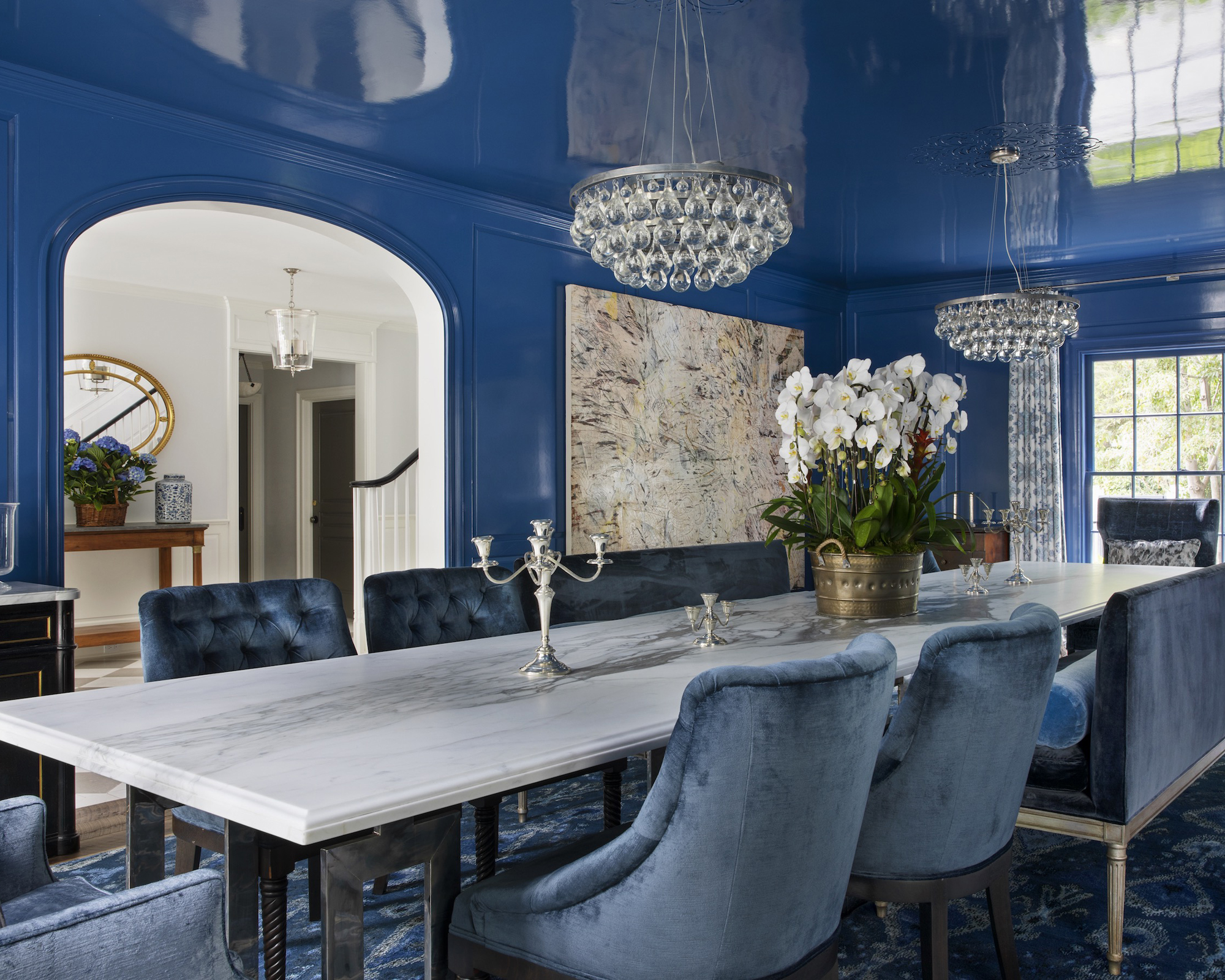
    1. Paint the Walls in a Deep Navy for Drama

    Blue dining room ideas: 12 ways to use this soothing color | Homes and  Gardens
    Credit: Homes And Garden

    Navy walls turn an ordinary dining room into something that feels like a fancy restaurant. This shade absorbs light in a cozy way instead of feeling dark and gloomy, especially at night with candles or warm bulbs going. I always tell people to pair navy walls with lighter furniture, think a whitewashed table or cream upholstered chairs, so the room doesn’t feel like a cave. Add brass or gold light fixtures for contrast, since metallics practically glow against navy. Quick tip: test the paint on a large poster board and move it around the room at different times of day before committing. This look fits modern and traditional homes equally well. Once your walls are set, the next move is thinking about what goes on the table itself.

    2. Layer Blue and White Dinnerware for a Classic Look

    Blue And white: The Dreamy Tablescape Trend Everyone's Talking About
    Credit: House Beautiful

    Blue and white dishes are a timeless combo, and they instantly tie into a blue dining room theme without repainting anything. Think classic willow pattern plates, striped bowls, or simple solid blue chargers stacked under white dinner plates. This works because it’s low commitment. If you rent your place or you’re scared of full color commitment, this is your entry point. Mix in some patterned napkins or a runner with blue accents to pull it together. Practical tip: buy dishes in sets of four so you can mix and match without it looking chaotic. Coastal and farmhouse homes especially love this pairing, but it works in traditional dining rooms too. Once your table settings feel right, let’s talk about what’s underneath your feet.

    3. Add a Textured Rug in Muted Blue Tones

    Modern Blue Dining Room Ideas with Smart Color Tricks | FH
    Credit: Fancy House Design

    A rug under the dining table grounds the whole room, and blue rugs specifically add softness without stealing attention from your furniture. I like going with a lower pile rug in the dining area since chairs slide in and out constantly, and high pile rugs get messy fast with food crumbs. Look for a jute or wool blend with subtle blue patterns, like a faded Persian design or simple geometric print. Practical tip: your rug should extend at least 24 inches beyond the edge of the table so chairs stay on it when pulled out. This idea flexes easily, bohemian homes can go bold with pattern, while minimalist spaces might choose a solid pale blue. Speaking of pattern, let’s move to the walls again, but this time with something other than solid paint.

    Rug Size Guide for Dining Tables

    Table SizeRecommended Rug SizeRug Shape
    4-seat round (42″ diameter)6′ x 6′ or 6′ roundRound or square
    6-seat rectangular (60″-72″)8′ x 10′Rectangular
    8-seat rectangular (84″-96″)9′ x 12′Rectangular
    10-seat rectangular (108″+)10′ x 14′Rectangular

    4. Use Blue Wallpaper with a Botanical or Chinoiserie Print

    Blue Elegant Dining Space with Blue Chinoiserie Wallpaper - Transitional - Dining  Room
    Credit: DecorPad

    Wallpaper gets a bad reputation for being fussy, but a blue botanical or chinoiserie print in a dining room feels intentional and rich. These patterns usually mix navy, teal, and cream tones with leafy or bird motifs, which gives the room depth without needing extra artwork. I always suggest wallpapering just one accent wall if you’re nervous about commitment, usually the wall behind a china cabinet or sideboard. Practical tip: order a sample swatch first and tape it up for a few days to see how it reads in your lighting. Traditional and grandmillennial styles thrive with this look, though modern homes can pull it off with a more abstract blue print. Once your walls have personality, your lighting needs to match that energy.

    5. Hang a Statement Chandelier in Brass or Black

    40 dining room ideas: trends, styles, and advice | Real Homes
    Credit: Real Homes

    Lighting makes or breaks a blue dining room. Blue tends to cool a room down visually, so a warm-toned chandelier in brass, gold, or even aged black iron balances things out. I’ve noticed that a chandelier with exposed bulbs or glass details adds sparkle that bounces nicely off blue walls. Size matters here too, a fixture that’s too small will look lost above a big table. Practical tip: as a general rule, your chandelier width should be about half to two-thirds the width of your table. This idea adapts across styles easily, farmhouse dining rooms love wrought iron fixtures, while contemporary spaces might choose sleek matte black globes. With the lighting sorted, let’s think about the biggest piece of furniture in the room.

    6. Choose a Navy Upholstered Dining Bench

    51 Blue Dining Room Ideas You'll Want to Bookmark
    Credit: MyDomaine

    Benches bring a relaxed, collected feel to dining rooms, and a navy upholstered one adds softness that hard wooden chairs can’t match. I like pairing a bench on one side of the table with chairs on the other, it breaks up the symmetry in a good way and makes the room feel less staged. Velvet or performance fabric in navy holds up well and hides stains better than you’d think. Practical tip: choose a bench with removable, washable cushion covers if you have kids or pets around the table often. This works beautifully in transitional and modern farmhouse homes, and honestly it makes squeezing in extra guests way easier during holidays. Now let’s talk about a piece of furniture that often gets ignored.

    7. Pick a Blue Sideboard or China Cabinet as a Focal Point

    Blue Dining Rooms: 18 Exquisite Inspirations, Design Tips
    Credit: Decoist

    A sideboard or china cabinet in blue can act as the anchor piece of your whole room, especially if your walls stay neutral. I’ve seen people take an old wooden cabinet and paint it a soft slate blue, and it instantly becomes the piece everyone comments on. This is a great option if you’re not ready to paint your walls but still want that blue dining room feeling. Style the top with stacked plates, a lamp, or a vase of greenery to keep it from feeling like plain storage. Practical tip: sand and prime wood furniture before painting so the color doesn’t chip within a few months. Coastal and traditional homes both love this approach. Once your furniture has its own personality, curtains are the next logical step.

    8. Hang Curtains in a Soft Powder Blue Linen

    40 dining room ideas: trends, styles, and advice | Real Homes
    Credit: Real Homes

    Curtains soften a dining room and add a bit of movement, especially if your windows are large. Powder blue linen curtains feel light and breathable, unlike heavier velvet which can make a small dining space feel stuffy. I always recommend hanging curtain rods a few inches above the window frame and letting the panels almost touch the floor, it tricks the eye into thinking the ceiling is taller. Practical tip: choose curtains with a slight sheer element if your dining room doesn’t get much natural light, since sheer fabric still lets sunshine through while adding color. Coastal and cottage-style homes especially benefit from this soft, breezy touch. Once your windows are dressed, let’s think about the walls one more time, but through art this time.

    Blue Paint Shade Comparison

    Shade NameUndertoneBest ForMood Created
    Sky BlueCoolSmall, bright roomsAiry, calm
    Slate BlueGray-blueNorth-facing roomsSophisticated
    NavyDeep, coolFormal dining roomsDramatic, cozy
    TealGreen-blueEclectic or bold roomsEnergetic
    Dusty BlueMuted, warmTraditional or vintage roomsRelaxed, gentle

    9. Display Blue-Toned Artwork in Gallery Style

    15 Blue Dining Room Ideas for Every Home
    Credit: Lord Decor

    Artwork ties a room together fast, and a gallery wall using blue-toned pieces gives you flexibility without repainting anything. Mix in landscape paintings, abstract prints, and even vintage botanical illustrations as long as blue shows up somewhere in each piece. I like using frames in mixed metals, like brass and black together, so the wall doesn’t look too matchy. Practical tip: lay your frames out on the floor first in the arrangement you want before hammering a single nail, it saves you from a wall full of unnecessary holes. This idea is flexible enough for eclectic, modern, and traditional dining rooms alike. Once your walls are covered, let’s zoom into the smaller details that pull a room together.

    10. Add Blue Glassware for Sparkle on the Table

    26 Blue Wedding Tablescape Ideas: From Coastal to Romantic
    Credit: Hello Hayley

    Glassware might feel like a small detail, but blue-tinted glasses or a set of cobalt water goblets add instant charm to any table setting. They catch light beautifully, especially near a window or under a chandelier. I love mixing a few vintage blue glasses I found at a thrift store with newer clear ones, it keeps the table from feeling too matchy or overly styled. Practical tip: use blue glassware as your centerpiece by grouping a few empty ones with candles down the center of the table instead of buying a separate decorative piece. This works in literally every design style since glassware is easy to swap in and out depending on the mood. Speaking of centerpieces, let’s dig into that idea a bit more.

    11. Build a Centerpiece Using Blue and White Ceramics

    Decorating with Blue and White Chinoiserie - Celebrate & Decorate
    Credit: Celebrate

    A cluster of blue and white ceramic vases, bowls, or ginger jars makes an effortless centerpiece that doesn’t block conversation across the table. I like varying the heights slightly, maybe one taller vase with two shorter bowls, so it feels curated instead of accidental. Fill one with fresh greenery or dried eucalyptus for texture. Practical tip: keep your centerpiece under 12 inches tall if you want guests to see each other easily during meals. This idea works especially well in traditional, coastal, and grandmillennial dining rooms where ceramics already feel at home. Once your table is dressed, let’s think bigger picture again with flooring.

    12. Choose Blue Grasscloth or Textured Wall Panels

    40 Blue Dining Rooms That Stole The Show
    Credit: The Spruce

    If wallpaper patterns feel like too much, blue grasscloth wallcovering gives texture and color without a busy print. It has a woven, natural look that adds warmth even in a cool blue tone. I think this works especially well in dining rooms with a lot of natural light, since the texture catches shadows in a subtle way throughout the day. Practical tip: grasscloth can be tricky to install because it stains easily with adhesive, so hiring a professional installer usually saves you from ruining an expensive material. This look leans modern and transitional, though it can work in coastal homes too if paired with natural wood furniture. Now let’s talk about pulling in some greenery to soften all that color.

    13. Bring in Greenery to Balance the Blue Tones

    Blue dining room ideas: 12 ways to use this soothing color | Homes and  Gardens
    Credit: Home And Gardens

    Plants add life to a blue dining room and stop the space from feeling too cool or flat. A large leafy plant in the corner, like a fiddle leaf fig or a snake plant, adds height and a pop of green that contrasts nicely with blue walls or furniture. Smaller potted herbs or a simple vase of eucalyptus on the table work too if you’re short on floor space. Practical tip: choose low-maintenance plants if your dining room doesn’t get direct sunlight, since most dining rooms are used mainly at night. This works across every style, from modern to farmhouse to coastal, because greenery is basically a universal design tool. Once your plants are in place, let’s finish up with flooring choices that complement everything else.

    14. Select Wood Flooring with Warm Undertones

    Modern Blue Dining Room Ideas with Smart Color Tricks | FH
    Credit: Fancy House Design

    Blue dining rooms need warmth somewhere, and flooring is a great place to add it without touching your walls or furniture. Warm wood tones, like honey oak or walnut, balance out cooler blue shades and keep the room from feeling too icy. If you already have cold-toned flooring like gray-washed wood, a warm rug can fix that instantly without a full renovation. Practical tip: bring a flooring sample home and set it next to your blue paint swatch before making a final decision, lighting changes how both colors read together. This balancing trick works no matter what style you’re going for, since warm and cool contrast is a classic design rule. Last but not least, let’s talk about mixing metals for that final polished touch.

    15. Mix Metal Finishes for a Layered, Collected Feel

    Feast Your Eyes: 19 Gorgeous Blue Dining Room Ideas that Will Elevate Your  Next Dinner Party – Home Stratosphere
    Credit: House Spratosphere

    Sticking to just one metal finish, like all brass or all black, can make a room feel a little flat. I like mixing two metals in a blue dining room, maybe brass on the chandelier and black on the chair legs or candlesticks. It creates depth and makes the space feel like it was put together over time instead of bought in one trip to a store. Practical tip: pick one dominant metal and one accent metal, roughly a 70-30 split, so the mix feels intentional rather than random. This trick works in basically every design style and is one of the easiest ways to make a blue dining room feel finished and personal.

    Tips for Success

    • Test paint swatches at different times of day since blue shifts dramatically between morning and evening light.
    • Balance cool blue tones with warm materials like wood, brass, or rattan so the room doesn’t feel cold.
    • Keep at least one neutral surface, like a table or floor, so the blue doesn’t overwhelm the whole room.
    • Layer different shades of blue instead of using just one, it adds depth without looking mismatched.
    • Use dimmable lighting so your blue walls can feel bright during the day and cozy at night.
    • Don’t forget the ceiling. A soft blue ceiling paint can make the room feel more finished and cohesive.
    • Start small with accessories like dishes or linens before committing to a full wall repaint.

    Common Mistakes and How to Avoid Them

    Skipping the lighting test
    : Blue paint looks completely different under warm bulbs versus daylight, so always check swatches under your actual dining room lighting before buying gallons of paint.

    Using only cool tones throughout the room
    : Too much cool color makes a room feel unwelcoming, so mix in warm wood, brass, or cream textiles to balance things out.

    Choosing a rug too small for the table
    : A rug that doesn’t extend past the chairs looks awkward and gets messy fast, so always size up based on your table dimensions.

    Overcrowding the centerpiece
    : A tall or bulky centerpiece blocks conversation across the table, so keep it low or split into smaller pieces down the center.

    Ignoring the ceiling and trim
    : Leaving trim stark white against a deep navy wall can look unfinished, so consider a soft cream or matching blue tone for cohesion.

    Matching every metal finish
    : An all-brass or all-black room can feel flat and staged, so mix two complementary metals for a more natural, collected look.

    Similar Variations

    • Coastal Blue Dining Room: Lighter blues paired with white shiplap, rattan chairs, and natural rope details for a beachy feel.
    • Moody Navy Dining Room: Deep navy walls, dark wood furniture, and dramatic lighting for an intimate, restaurant-like vibe.
    • Blue and Brass Traditional Dining Room: Classic millwork, chinoiserie accents, and warm brass fixtures against soft blue walls.
    • Modern Farmhouse Blue Dining Room: Slate blue cabinetry or shiplap paired with black metal chairs and simple wood tables.
    • Bohemian Teal Dining Room: Bold teal walls mixed with patterned textiles, mixed wood tones, and eclectic vintage finds.
    • Scandinavian Powder Blue Dining Room: Pale blue walls, light wood furniture, and minimal decor for a clean, airy feel.

    Blue dining rooms work because they’re flexible, calming, and honestly just really pretty to eat dinner in. Whether you go bold with navy walls or keep it subtle with blue glassware and dishes, there’s a version of this color story that fits your home and your budget. I hope these 15 Blue Dining Room Ideas gave you enough inspiration to finally start that dining room refresh you’ve been putting off.

  • 11 Rustic Farmhouse Dining Room Ideas That Will Make Your Space Feel Like Home

    11 Rustic Farmhouse Dining Room Ideas That Will Make Your Space Feel Like Home

    If you’ve been scrolling through a hundred different sites trying to figure out how to nail that rustic farmhouse dining room look, I get it. I’ve done the same thing, and honestly, most of those lists just repeat the same tired tips. This article is different. I’m going to walk you through real, specific ideas you can actually use.

    A rustic farmhouse dining room combines natural wood furniture, neutral color palettes, vintage accents, and cozy textiles to create a warm, inviting space for meals and gatherings. The style draws from old barns, country kitchens, and simple craftsmanship.

    Stick around, because I’m about to show you eleven ways to bring that cozy, lived-in charm into your own dining space, plus some mistakes to dodge along the way.

    What Makes a Dining Room “Rustic Farmhouse” Anyway?

    Okay, so before we jump into the list, let’s chat about what this style actually means. Rustic farmhouse is all about looking like your furniture has a story. Think reclaimed wood tables, chairs that don’t all match, and metal light fixtures that look like they came from an old barn. It’s not fancy. It’s not shiny. It’s warm, textured, and a little imperfect on purpose.

    I love this style because it feels lived in from day one. You don’t need brand new furniture that looks pristine. You want pieces with character, dents, and grain patterns that show real wood. It’s cozy without trying too hard, and that’s exactly the point.

    1. Choose a Chunky Reclaimed Wood Table

    Live Edge Dining Table Ideas for Every Home Style (2026)
    Credit: AshDeco

    The dining table is the heart of this whole look. Go for a thick, solid wood table with visible grain and maybe even a few knots or cracks. Reclaimed barn wood is perfect because it already has that weathered charm built in.

    Practical tip: look for tables with a matte or low-sheen finish instead of glossy. Glossy wood reads more traditional or modern, not rustic.

    This idea works across styles too. In a modern farmhouse space, pair the table with sleek black metal legs. In a more traditional home, stick with an all-wood pedestal base.

    Once you’ve got your table sorted, the chairs around it matter just as much, so let’s talk seating next.

    2. Mix and Match Your Dining Chairs

    Dining Table With Mismatched Chairs: A Guide | Grain & Frame
    Credit: Grain

    Here’s a secret: you don’t need matching chairs. Rustic farmhouse dining rooms often use a mix of wooden chairs, maybe a bench on one side, and even a couple of upholstered seats at the ends. This mismatched look actually makes the room feel more collected over time, not staged.

    Try pairing ladder-back wood chairs with a simple bench along one side of the table. Add a cushion to the bench for comfort.

    Practical tip: keep the wood tones similar even if the shapes differ. That way things still feel cohesive.

    Coastal farmhouse spaces might swap in whitewashed chairs, while modern farmhouse leans toward black metal seats mixed with wood.

    Now that your seating is sorted, let’s bring in some color.

    3. Stick to a Neutral, Earthy Color Palette

    30 Farmhouse Kitchen Ideas for a Rustic yet Refined Look
    Credit: Elle Decor

    Rustic farmhouse rooms lean heavy on whites, creams, tans, and soft grays. These colors let the natural wood and textures do the talking. Walls in a warm white or soft greige make the room feel open and calm.

    Add small pops of color through pillows, table runners, or artwork, but keep the base palette neutral.

    Color Palette Options for Rustic Farmhouse Dining Rooms

    Palette NameWall ColorAccent ColorWood Tone
    Warm CreamAntique WhiteTerracottaHoney Oak
    Soft GrayDove GrayNavy BlueWeathered Gray
    Classic WhiteChalk WhiteSage GreenWalnut Brown
    Earthy TanWarm BeigeRust OrangeReclaimed Barn Wood

    Practical tip: paint one accent wall in a deeper tone like clay or forest green if you want a little drama without overwhelming the space.

    This palette adapts easily. Farmhouse coastal style just adds more blue and white, while farmhouse traditional leans into deeper browns and burgundy accents.

    With your colors picked, let’s talk about lighting because that changes everything.

    4. Hang a Wrought Iron or Wood Bead Chandelier

    50 Best Modern Farmhouse Chandeliers (2024) - LightLady Studio
    Credit: LightLadyStudio

    Lighting sets the whole mood in a dining room. For rustic farmhouse, skip the crystal chandeliers. Instead, go for wrought iron fixtures, wood bead chandeliers, or lantern-style pendants with an aged bronze or black finish.

    Practical tip: hang your fixture about 30 to 34 inches above the table for the right proportion.

    These fixtures look great with warm bulb tones, around 2700K, which gives off that soft, golden glow instead of harsh white light.

    Modern farmhouse spaces might choose a simpler black metal fixture with clean lines, while traditional farmhouse leans into more ornate wrought iron designs with scrollwork.

    Once your lighting is set, it’s time to think about what goes on the walls.

    5. Add a Statement Shiplap or Wood Plank Wall

    Affordable Shiplap Dining Room Ideas: Tips for Stylish Spaces
    Credit: Fancy House Design

    One accent wall covered in shiplap or wood planks instantly makes a room feel farmhouse. You can use real wood boards or budget friendly MDF shiplap panels from a hardware store.

    Paint it white for that classic look, or leave it natural wood for more warmth.

    Practical tip: install shiplap horizontally for a classic feel, or try vertical planks if you want the ceiling to feel taller.

    This idea works in almost any style. Coastal homes often whitewash the wood, while industrial farmhouse spaces might leave the wood raw and unfinished.

    Now let’s dress up your table with the right centerpiece.

    6. Style Your Table with a Wood Slab Centerpiece

    Ashdeco Live Edge Dining Table – Handmade Solid Wood Rustic Farmhouse
    Credit: AshDeco

    Skip the fancy vase and go for something simple. A wood slab runner down the middle of the table with a few mason jars, dried wheat stems, or candles creates that effortless farmhouse feel.

    Practical tip: keep your centerpiece low, under 12 inches tall, so people can still see each other across the table during meals.

    Add seasonal touches like small pumpkins in fall or greenery in spring to keep things fresh without buying new decor every season.

    This works beautifully across styles too. Modern farmhouse might use a concrete or metal tray instead of wood for contrast.

    Next, let’s talk about what’s underneath your feet.

    7. Layer a Jute or Wool Area Rug

    Top 5 Jute Rugs for Layering | Designer Buying Guide – Atlanta Designer Rugs
    Credit: Atlanta Designer Rugs

    A natural fiber rug like jute or wool adds texture and warmth under your dining table. These materials feel earthy and durable, perfect for catching crumbs and spills.

    Practical tip: your rug should extend at least 24 inches beyond the table edge on all sides so chairs don’t slide off when pulled out.

    Rug Size Guide by Table Shape

    Table ShapeTable SizeRecommended Rug Size
    Rectangular60″ x 36″8′ x 10′
    Rectangular72″ x 40″9′ x 12′
    Round48″ diameter8′ x 8′ round
    Square42″ x 42″7′ x 7′ square

    A jute rug fits coastal and bohemian farmhouse spaces well too, while a darker wool rug leans more traditional.

    With your floor covered, let’s move up to window treatments.

    8. Dress Windows with Simple Linen Curtains

    Farmhouse Window Treatments I Ideas for Modern & Rustic
    Credit: Spiffy Spools

    Skip heavy drapes. Rustic farmhouse dining rooms usually feature light, airy linen curtains in white, cream, or soft gray. They let natural light pour in while still adding softness to the room.

    Practical tip: hang curtain rods about four to six inches above the window frame to make windows look taller and the ceiling feel higher.

    Avoid patterns here. Solid linen keeps the focus on texture rather than busy prints.

    For a coastal farmhouse twist, add a subtle blue stripe. For a more traditional farmhouse feel, choose curtains with a slight texture like waffle weave.

    Now let’s talk storage, because every dining room needs a spot for dishes and linens.

    9. Bring in a Vintage Farmhouse Hutch or Sideboard

    Vintage Farmhouse Hutch Styling Tips: Classic White Decor Ideas You'll Love
    Credit: Dabbling

    A weathered wood hutch or sideboard gives you storage and serious character at the same time. Look for pieces with distressed paint, visible wood grain, or aged brass hardware.

    Practical tip: if you can’t find an authentic vintage piece, distress a new one yourself with sandpaper and a dry brush technique using white or cream paint.

    Style the top with stacked plates, a few books, and a small plant for that collected-over-years look.

    This piece adapts well too. Paint it a soft sage or navy for a more traditional feel, or keep it raw wood for a modern farmhouse vibe.

    Once your storage is sorted, let’s add some softness with textiles.

    10. Add Texture with Woven Placemats and Table Runners

    Rustic Dining Table with Natural Placemats and Table Runner | Foter
    Credit: Foter

    Instead of shiny placemats, go for woven textures like rattan, jute, or linen. These add that handmade, natural feel that defines rustic farmhouse style.

    Practical tip: mix textures instead of matching everything exactly. Try a linen runner with rattan placemats underneath simple white dishes.

    Layering textures like this makes the table feel styled without looking overly decorated or fussy.

    Modern farmhouse spaces might swap in a solid canvas runner, while traditional spaces lean toward more textured, woven table linens.

    Finally, let’s finish the room with the right wall decor.

    11. Hang Vintage Signs, Mirrors, or Botanical Prints

    Large Pictures for Dining Room Walls: Transform Your Dining Space with
    Credit: Rossetti Arts

    Wall decor ties the whole room together. Rustic farmhouse spaces often feature vintage metal signs, distressed wood frames, botanical prints, or a large round mirror with a black metal frame.

    Practical tip: hang art at eye level, roughly 57 to 60 inches from the floor to the center of the piece, for the most natural look.

    Group a few smaller pieces together in a gallery wall format if you have an empty wall, mixing frame styles and sizes for that collected-over-time feel.

    Coastal farmhouse spaces might add botanical prints of grasses or shells, while traditional farmhouse leans into family portraits in simple wood frames.

    Tips for Success

    • Start with your table and build everything else around its wood tone and shape.
    • Don’t buy everything new. Thrift stores and estate sales often have the best rustic farmhouse pieces for less money.
    • Keep at least 70 percent of your color palette neutral so accent colors actually stand out.
    • Measure your space before buying a rug or table so scale feels right, not cramped or too small.
    • Layer textures on purpose. Wood, wool, linen, and metal should all show up somewhere in the room.
    • Add greenery, even fake, to soften all the hard wood surfaces and bring life into the space.
    • Change small details seasonally, like table runners or centerpieces, to keep the room feeling fresh without a full redesign.

    Common Mistakes and How to Avoid Them

    Buying furniture that’s too polished
    : Rustic farmhouse depends on texture and imperfection. Choose pieces with visible grain, distressing, or matte finishes instead of glossy, perfect surfaces.

    Overloading the room with too many accents
    : Pick a few strong focal points, like a chandelier and a statement wall, rather than covering every surface with decor.

    Ignoring lighting temperature
    : Cool white bulbs clash with warm wood tones. Stick to warm bulbs around 2700K for a cozy glow that matches the style.

    Choosing a rug that’s too small
    : A rug that doesn’t extend past the chairs looks awkward and can bunch up when chairs get pulled out. Always size up.

    Skipping texture variety
    : A room full of only wood can feel flat. Mix in woven baskets, metal fixtures, and soft textiles for balance.

    Matching every piece of furniture perfectly
    : Perfectly matched furniture reads more like a showroom than a home. Let pieces vary slightly in tone and shape.

    Similar Variations

    • Modern Farmhouse Dining Room: Cleaner lines, black metal accents, and a slightly more minimal approach to decor.
    • Coastal Farmhouse Dining Room: Lighter wood tones, blue and white palettes, and beachy textures like rope or rattan.
    • Industrial Farmhouse Dining Room: Raw metal fixtures, exposed brick or concrete, paired with reclaimed wood furniture.
    • Traditional Farmhouse Dining Room: Richer wood tones, more ornate details, and classic patterns like plaid or gingham.
    • Scandinavian Farmhouse Dining Room: Lighter woods, simple shapes, and a heavier focus on white and pale gray tones.
    • Southern Farmhouse Dining Room: Warmer color palettes, vintage floral touches, and cozy, layered textiles.

    Bringing rustic charm into your dining space doesn’t require a total renovation or a huge budget. Small changes like swapping light fixtures, layering the right rug, or mixing your chairs can transform the whole feel of the room. Start with one or two ideas from this list, live with them for a bit, and build from there. That’s really how the best 11 Rustic Farmhouse Dining Room spaces come together over time, one thoughtful piece at a time.

  • 11 Kitchen Dining Room Combo Ideas That Actually Work in Real Homes

    11 Kitchen Dining Room Combo Ideas That Actually Work in Real Homes

    If you’ve been searching for the smartest way to plan an 11 Kitchen Dining Room Combo, I’ve got you covered here with real ideas that work in actual homes, not just showrooms. I’ve spent way too many hours studying floor plans and pinning layouts, so I’m sharing what actually holds up. By the end of this, you’ll know exactly how to make your space work harder without feeling cramped.

    A kitchen dining room combo is a layout where your cooking space and eating space share one open area instead of being closed off into separate rooms. This setup works by using smart furniture placement, consistent flooring, and matching color schemes to make the two zones feel connected but still distinct.

    Stick around, because I’m about to show you 11 layouts that solve the “where does the table even go” problem for good.

    What Makes a Kitchen Dining Combo Actually Work

    Okay, so here’s the thing about combo spaces. They sound easy on paper. Just knock down a wall, right? Wrong. The magic is in how you separate the zones without actually separating them. You want your eyes to know “this is where I cook” and “this is where I eat” without a single door or wall telling you that.

    I think the best combos use rugs, lighting, or even just a change in chair style to draw invisible lines. It’s less about square footage and more about intention. Small kitchens can pull this off just as well as big open-concept lofts, honestly sometimes better because there’s less wasted space to worry about.

    1. Use a Kitchen Island as the Dividing Line

    How to Make Your Kitchen Island Your Favorite Dining Spot
    Credit: Houzz

    An island is probably the easiest way to split a kitchen dining room combo without adding a single wall. It gives you extra counter space, storage, and a visual break between cooking and eating zones. Pick an island with a different finish than your cabinets, like a butcher block top on white cabinets, so it reads as its own feature.

    Practical tip: leave at least 36 inches of walking space around the island so people can pass through during meal prep without bumping elbows.

    This works in almost any style. Farmhouse kitchens love a wood island with a marble top, while modern spaces go for waterfall-edge quartz. Once your island is set, you can start thinking about what goes on the dining side of that line.

    2. Anchor the Dining Area with a Statement Light Fixture

    How To Layer Lighting In A Dining Room For Ambience And Function
    Credit: Edwards

    Lighting does more work than people give it credit for. A pendant light or small chandelier hung right over the dining table tells everyone “this is where you eat” the second they walk in. It also adds personality without taking up floor space, which matters a lot in combo layouts where every square foot counts.

    Go for a fixture that hangs about 30 to 36 inches above the table for the right visual weight. If your ceilings are low, a flush mount with a bold shape still gets the job done.

    Traditional homes look great with brass or wrought iron fixtures, while coastal spaces do well with woven rattan pendants. Once the light is set, the flooring underneath becomes the next thing to think about.

    3. Define Zones with a Rug Under the Dining Table

    Should You Put a Rug Under a Dining Room Table? 7 Rules to Follow
    Credit: TheSpruce

    A rug under your dining table is one of the cheapest ways to separate the eating zone from the kitchen without touching a hammer. It softens the space, adds color, and gives your feet a break from hard flooring.

    Make sure the rug is big enough that chairs stay on it even when pulled out. As a rule, add at least 24 inches of rug space beyond each side of the table.

    Boho and traditional homes can go bold with pattern, while modern and minimalist kitchens do better with a solid neutral rug. Once your rug is down, the table and chairs you pick will either match or clash with that foundation, so let’s talk about that next.

    4. Choose a Table Shape That Matches Your Traffic Flow

    The Best Dining Table Shapes | Castlery US
    Credit: Castlery

    Not every table shape works in every combo space. Round tables are great for tight corners since there are no sharp edges to bump into. Rectangular tables fit long, narrow rooms better and usually seat more people. Square tables work well in smaller combos where you want a cozy, balanced look.

    Actionable tip: measure your walking path first. You need at least 36 inches of clearance around the table for comfortable movement, more if it’s a high-traffic area near the kitchen entrance.

    Farmhouse and traditional homes often go long and rectangular, while modern lofts play with round pedestal tables for a cleaner look. With your table shape locked in, seating comes next.

    Table Shape Guide by Room Size

    Room SizeBest Table ShapeSeats ComfortablyMinimum Clearance Needed
    Under 100 sq ftRound or square430 inches
    100 to 150 sq ftRectangular or round4 to 636 inches
    150 to 250 sq ftRectangular6 to 842 inches
    Over 250 sq ftRectangular or extendable8 plus48 inches

    5. Mix Seating Styles for a Layered Look

    30 Kitchen Dining Room Combo Ideas That'll Make Guests Ask How You Made It  Flow So Well
    Credit: TheCoolist

    I used to think all your dining chairs had to match perfectly. Turns out, mixing it up actually makes a combo space feel more thought out. Try a bench on one side of the table and upholstered chairs on the other. Or keep four matching chairs and add two mismatched ones at the ends for contrast.

    Practical tip: stick to one shared color or material so the mix still feels cohesive instead of random.

    This trick works especially well in eclectic and farmhouse styles, where a little imperfection feels intentional. Modern spaces can mix seating too, just keep the shapes clean and simple. Once seating is sorted, wall color becomes your next big decision.

    6. Use One Wall Color to Unify Both Zones

    14 dining room wall ideas to die for | Real Homes
    Credit: TheHomes

    Painting your kitchen and dining area the same color, or at least close variations, keeps the whole combo feeling like one room instead of two rooms awkwardly stuck together. This matters a lot in open floor plans where there’s no wall to separate the spaces anyway.

    I’d suggest picking a warm neutral like greige or soft white if you want the space to feel calm and put together. Bold colors work too, just carry them through consistently.

    Coastal homes love soft blues and whites, while traditional spaces lean toward warm creams and taupes. Once your walls are settled, the ceiling is the next surface people forget about.

    7. Add a Ceiling Detail to Separate Zones Visually

    Top 10 Ways to Separate Living Room and Kitchen (Glass, Wood & More)
    Credit: Andor Willow

    Ceilings are the most underused design tool in combo spaces. A change in ceiling treatment, like exposed beams over the dining area or a different paint color, creates a subtle line between the kitchen and dining zones without blocking sightlines.

    Try painting the dining area ceiling a shade darker than the kitchen ceiling for a soft visual break. It’s a small move but it changes how the whole room reads.

    Farmhouse and traditional homes look amazing with wood beams, while modern spaces do well with recessed lighting in a grid pattern over the dining zone only. Now let’s talk about what goes on the floor since flooring choices can make or break the whole combo.

    8. Keep Flooring Consistent Across Both Zones

    how to mix & match different flooring types in an open-plan home | tiletoria
    Credit: tiletoria

    This one seems obvious but a lot of people mess it up. Using the same flooring material in the kitchen and dining area makes the whole space feel bigger and more connected. Switching materials mid-room, like tile in the kitchen and hardwood in the dining area, chops up the space visually.

    If you do want a subtle change, stick to the same color family but a different finish, like matte tile in the kitchen and a similar toned wood-look tile in the dining zone.

    Coastal and farmhouse styles often go with light wood or wood-look tile throughout, while modern spaces prefer polished concrete or large-format tile. With flooring handled, let’s move to storage, because combo spaces need smart storage more than most rooms.

    9. Build In Storage That Serves Both Areas

    Dining Room Storage Cabinets | Kountry Kraft
    Credit: Kountry kraft

    Combo spaces need double-duty storage since you’re cramming two rooms’ worth of stuff into one shared footprint. A buffet or sideboard on the dining side can hold table linens and serving dishes while also displaying decor. On the kitchen side, open shelving keeps everyday dishes within reach without cluttering counters.

    Practical tip: measure your buffet depth before buying. Anything over 18 inches deep can eat up walking space fast in a tight combo room.

    Traditional homes love a wood buffet with brass hardware, while modern spaces go for slim console-style storage. Once storage is sorted, it’s time to think about how color palettes tie the whole room together.

    Budget Tiers for Combo Room Furnishing

    Budget TierTable and ChairsRugLighting FixtureTotal Estimated Cost
    Budget$300 to $600$100 to $200$50 to $100$450 to $900
    Mid-range$800 to $1,500$250 to $450$150 to $300$1,200 to $2,250
    High-end$2,000 to $4,000$500 to $900$400 to $800$2,900 to $5,700

    10. Pick a Color Palette That Flows Between Zones

    Choosing Colour for an Open Plan Kitchen
    Credit: A Casa

    Your color palette should feel like one continuous idea, not two separate rooms trying to compete. I like picking three colors max: a neutral base, a secondary color, and one accent. Use the neutral on walls, the secondary on cabinets or furniture, and the accent in smaller doses like pillows or artwork.

    Actionable tip: test paint swatches in both the kitchen and dining zone at different times of day since lighting shifts the color more than you’d expect.

    Coastal combos often use white, soft blue, and driftwood tones. Traditional spaces go cream, sage green, and brass accents. Once your palette is locked, it’s easier to pick artwork and accessories that actually fit.

    11. Layer in Personal Touches Without Cluttering the Space

    30 Kitchen Dining Room Combo Ideas That'll Make Guests Ask How You Made It  Flow So Well
    Credit: TheCoolist

    The last step is making the space feel like yours. Add a piece of art on the dining wall, a plant on the counter, or a stack of cookbooks on open shelving. These small touches keep the room from feeling like a showroom.

    Practical tip: pick three to five decor pieces max for the dining area so the space stays functional, not fussy.

    Bohemian homes can layer in more texture and pattern, while minimalist spaces should stick to one or two intentional pieces. And with that, you’ve got a full plan for building a combo space that actually feels like home.

    Tips for Success

    • Measure your space before buying furniture. A table that looks great online might block your kitchen walkway in real life.
    • Keep at least one sightline open between the cooking and eating zones so the space still feels open, not chopped up.
    • Choose durable fabrics for dining chairs since food and drink spills happen more often in combo rooms.
    • Use dimmer switches on your dining light so you can shift the mood from bright cooking light to soft dinner light.
    • Don’t skip window treatments. Simple curtains or blinds tie the two zones together visually.
    • Test your furniture layout with painter’s tape on the floor before committing to a final arrangement.
    • Leave room to grow. Pick a table that can extend for guests instead of buying the biggest one you can fit right now.

    Common Mistakes and How to Avoid Them

    Buying a table too big for the space
    : Measure clearance paths first, aim for at least 36 inches around the table on all sides before purchasing.

    Ignoring lighting zones
    : Install separate light fixtures or dimmers for the kitchen and dining areas so you can control each mood independently.

    Matching every single element
    : Mixing textures and slight color variations makes the room feel designed, not sterile.

    Skipping a rug because “it’s a kitchen”
    : A washable, low-pile rug works fine near dining tables and adds warmth without much maintenance risk.

    Overcrowding open shelving
    : Limit shelving to everyday items and a few decor pieces, keep the rest in closed storage.

    Forgetting ventilation near the dining zone
    : Make sure range hoods are strong enough that cooking smells don’t linger over your dinner table.

    Similar Variations

    • Open-Concept Great Room Combo – kitchen, dining, and living room all share one large connected space.
    • Galley Kitchen Dining Combo – a narrow kitchen layout with a small dining nook tucked at one end.
    • L-Shaped Kitchen Dining Combo – cabinets wrap around a corner, leaving an open pocket for the dining table.
    • Farmhouse Kitchen Dining Combo – wood tones, shiplap walls, and a long communal table define this variation.
    • Coastal Kitchen Dining Combo – light woods, white cabinets, and blue accents give this style a beachy feel.
    • Loft-Style Kitchen Dining Combo – exposed brick, industrial lighting, and minimal walls define this urban variation.

    Building a great combo space really comes down to smart zoning, consistent colors, and furniture that fits your actual traffic flow, not just what looks good in a photo. Once you nail those basics, the rest is just personal style layered on top. I hope this rundown gives you the confidence to plan your own 11 Kitchen Dining Room Combo without second-guessing every decision along the way.

  • 12 Modern Farmhouse Dining Room Ideas That Actually Feel Like Home

    12 Modern Farmhouse Dining Room Ideas That Actually Feel Like Home

    If you’ve been scrolling through hundreds of design boards trying to find real, workable 12 Modern Farmhouse Dining Room ideas, I think you can stop now. I’ve pulled together the most practical, tested-and-true options out there, so you don’t have to sift through fluff to find what actually works in a real house.

    Modern farmhouse dining room design blends rustic wood elements, neutral color palettes, and clean-lined furniture to create a space that feels both cozy and current. The style typically pairs a farmhouse table with mixed seating, black metal accents, and soft textiles for warmth without clutter.

    Stick around, because I’m about to walk you through twelve ideas that go way beyond “just add a shiplap wall.” Some of these might surprise you.

    What Makes a Dining Room “Modern Farmhouse” Anyway?

    Okay, let’s back up for a second. Modern farmhouse isn’t just white walls and barn doors. It’s really about balance. You take something old and worn, like a reclaimed wood table, and you pair it with something sleek, like black metal chairs or a simple pendant light. That contrast is the whole point.

    I like to think of it as your grandma’s farmhouse got a makeover from a minimalist. Warm but not cluttered. Rustic but not messy. It’s comfort food in furniture form, honestly. And the best part? It works in almost any size room, from a tiny apartment nook to a big open-concept space.

    1. Anchor the Room With a Reclaimed Wood Table

    35 Unique Modern Farmhouse Dining Room Ideas for Rustic Charm – CharmyDecor
    Credit: CharmyDecor

    Your dining table is the star of the show, so start there. A reclaimed or distressed wood table brings instant farmhouse character without trying too hard. Look for tables with visible wood grain, knots, or a slightly uneven finish. That imperfection is the charm.

    Pair it with a neutral rug underneath to ground the space. I’d say go for a table with thick, chunky legs. It reads more farmhouse than a table with thin, tapered legs.

    Practical tip: If you can’t find a real reclaimed piece, look for “farmhouse finish” tables at furniture stores. They mimic the worn look without the higher price tag.

    This idea flexes well too. In a coastal home, pick a lighter, whitewashed wood. In a traditional space, go darker and more polished. Once your table is set, the next move is figuring out what goes around it.

    2. Mix Chair Styles Instead of Matching Everything

    Dining Table With Mismatched Chairs: A Guide | Grain & Frame
    Credit: Grain And Frame

    Here’s a secret: matching chair sets can actually make a room feel stiff. Modern farmhouse loves a good mismatch. Try pairing wood chairs on one side with upholstered or metal chairs on the other. Or add a bench along one edge of the table.

    This mix creates visual interest and keeps the room from feeling like a showroom. It also solves a practical problem. Benches let you squeeze in extra guests without buying more chairs.

    Actionable tip: Keep one element consistent, like the wood tone or the color black, so the mismatch still feels intentional instead of random.

    For a more traditional twist, use wingback chairs at the head of the table. For modern spaces, stick with sleek metal frames. Once your seating feels balanced, it’s time to think about what hangs above it.

    3. Hang a Statement Light Fixture

    Modern Dining Room Lighting with a Rustic Farm Table | Most Lovely Things
    Credit: Most Lovely Things

    Lighting sets the mood, and in a modern farmhouse dining room, the fixture usually does double duty as decor. Think black metal chandeliers, wood bead pendants, or lantern-style lights with clear glass. These pieces feel handmade and warm, but still current.

    Size matters here. A fixture that’s too small will look lost over a big table. A good rule of thumb: the fixture should be about one-third the width of your table.

    Quick tip: Hang the light 30 to 36 inches above the table surface for the best proportion and lighting spread.

    If you’re going coastal, swap metal for woven rattan pendants. If you want something more industrial, go with exposed bulbs and black iron. Lighting really is the jewelry of the room, and once it’s in place, the walls behind it need some attention too.

    4. Add Shiplap or Board and Batten (But Just One Wall)

    Board and Batten - Amelia Lawrence Style
    Credit: Amelia

    I know, I know, shiplap gets a lot of eye rolls these days. But used sparingly, it still works. The trick is committing to just one accent wall instead of covering the whole room. Board and batten is another great option if you want more texture without going full farmhouse cliché.

    Paint it white or a soft warm gray to keep things airy. This wall becomes the backdrop for artwork, a mirror, or open shelving.

    Practical tip: Use MDF board and batten kits from home improvement stores. They install fast and cost way less than real wood paneling.

    In a more modern home, skip the wall texture and go with a smooth, painted accent color instead. Once your walls are set, let’s talk about what covers your windows.

    5. Layer Simple, Natural Fabric Curtains

    Farmhouse Window Treatments I Ideas for Modern & Rustic
    Credit: Spiffy

    Curtains often get overlooked, but they really pull a farmhouse dining room together. Go for linen or cotton in soft neutrals like cream, oatmeal, or light gray. Avoid heavy patterns. This style thrives on texture, not print.

    Hang your curtain rods high and wide. This makes windows look bigger and ceilings feel taller. It’s a small trick that makes a big visual difference.

    Actionable tip: Choose curtains that just brush the floor or puddle slightly. Too short makes the whole room look unfinished.

    For a coastal farmhouse feel, add sheer white curtains that let in tons of light. For a moodier traditional look, go with a heavier fabric in deeper tones. With your windows dressed, let’s move to something you can actually touch and feel every day: table textiles.

    Fabric and Material Guide for Farmhouse Dining Rooms

    ElementBest MaterialsColors to TryStyle Pairing
    CurtainsLinen, cottonCream, oatmeal, light grayCoastal, traditional
    Table RunnerWoven cotton, juteNatural tan, whiteModern, rustic
    Chair CushionsPerformance fabric, leatherCharcoal, camel, creamModern, industrial
    RugWool, jute blendBeige, ivory, soft grayAll styles
    NapkinsLinenWhite, sage, dusty blueTraditional, coastal

    6. Bring in a Woven Rug for Warmth

    24 Dining Room Rug Ideas
    Credit: Better Homes

    A dining room can feel cold fast, especially with wood floors and a wood table. A woven jute or wool rug softens things up and adds texture underfoot. Stick to neutral tones so it doesn’t compete with your table or chairs.

    Make sure your rug is big enough. As a rule, it should extend at least 24 inches beyond the table edge on all sides so chairs don’t slide off when pulled out.

    Practical tip: Choose a low-pile rug for dining rooms. High-pile rugs trap crumbs and make chairs harder to scoot in and out.

    Coastal homes do well with a light, sisal-style rug. Traditional spaces can handle a patterned wool rug instead. Once your floor feels grounded, it’s time to think vertical with some open shelving.

    7. Add Open Shelving for Dishware Display

    22 Best Open Shelving Ideas for Your Kitchen
    Credit: Country

    Open shelves near the dining area give you a spot to show off simple stoneware, glass jars, or a stack of linen napkins. It’s practical and pretty at the same time. Choose wood shelves with black metal brackets for that classic modern farmhouse combo.

    Keep the styling simple. Group items in threes, mix heights, and leave some breathing room. Overcrowded shelves lose the calm, airy vibe this style is known for.

    Actionable tip: Rotate your shelf decor seasonally. It keeps the space feeling fresh without buying new furniture.

    In a more modern kitchen-dining combo, floating shelves in a matte black finish look sleek. In a cottage-style home, add small hooks underneath for hanging mugs or towels. Now that your walls have some function, let’s talk about the actual dinnerware sitting on your table.

    8. Choose Stoneware and Matte Ceramic Dishes

    The Top 7 Tableware Trends for 2024 That Will Elevate Your Dining Experience
    Credit: Wilmax

    Your table setting matters more than people think. Skip the shiny porcelain and go for stoneware or matte ceramic dishes instead. They have a handmade, earthy look that fits the farmhouse vibe perfectly.

    Neutral colors work best: white, cream, or soft sage green. Mix in a few wood serving boards or black utensils for contrast.

    Quick tip: Buy dishes in odd numbers, like sets of five instead of six. It feels less matchy and more collected-over-time.

    Coastal tables can add blue-and-white patterns for a beachy twist. Traditional dining rooms might layer in gold-rimmed plates for a touch of formality. Once your table settings feel right, don’t forget the walls need a little art too.

    9. Decorate With Simple, Meaningful Wall Art

    50 Dining Room Wall Art Ideas For Elevated Entertaining
    Credit: southern living

    Farmhouse style doesn’t do “busy.” Choose one or two pieces of wall art with black or wood frames. Botanical prints, black-and-white photography, or simple line art all work great. Avoid anything too glossy or colorful. It should feel calm.

    A large statement piece above a buffet or sideboard can anchor the whole wall. If you prefer a gallery approach, keep the frames matching for a clean, cohesive look.

    Practical tip: Hang art so the center sits at eye level, about 57 to 60 inches from the floor. This is a designer standard that just works.

    Modern spaces can go abstract with black and white shapes. Traditional rooms might prefer framed botanical illustrations. With your walls dressed, let’s think about how to bring some green life into the space.

    10. Add Greenery With Simple, Low-Maintenance Plants

    33 Low-Maintenance Rockery Garden Ideas to Add Alpine Charm to Your  Landscape
    Credit: Gardening Chores

    A little greenery goes a long way in softening all that wood and metal. Think olive branches in a big floor vase, a small potted fiddle leaf fig in the corner, or a simple eucalyptus centerpiece on the table.

    Skip anything too colorful or tropical looking. Keep the greenery muted and simple to match the farmhouse palette.

    Actionable tip: Use faux stems if you don’t have a green thumb. High-quality faux greenery looks just as good and never wilts before guests arrive.

    Coastal dining rooms might swap greenery for dried palm fronds or pampas grass. Traditional rooms can use classic ferns in brass pots instead. Once your plants are placed, let’s zoom out and talk furniture layout and flow.

    11. Add a Farmhouse Sideboard or Buffet for Storage

    How To Style a Farmhouse Buffet and Sideboard Table - The How-To Home
    Credit: thehow

    A sideboard isn’t just storage, it’s also a styling opportunity. Choose one with a distressed wood finish or black metal hardware. Use it to store table linens, extra dishware, or serving pieces, and style the top with a lamp, a stack of books, or a vase.

    This piece also helps balance the room visually, especially if your table sits in the center of an open floor plan.

    Practical tip: Leave at least 36 inches of clearance in front of the sideboard so people can walk by comfortably, even with chairs pulled out.

    In smaller homes, a narrow console works just as well. In larger, more traditional spaces, go for a taller hutch with glass-front doors. With your storage sorted, let’s talk about one final detail that ties everything together.

    12. Use Black Metal Accents to Tie the Room Together

    90 Chic Modern Farmhouse Dining Rooms - DigsDigs
    Credit: DigsDigs

    Black metal is the glue that holds modern farmhouse together. Think chair frames, light fixtures, window frames, or even door hardware. It adds contrast against all that warm wood and soft neutral fabric.

    Don’t overdo it though. A little black metal goes a long way. Too much can make the room feel cold or industrial instead of warm and farmhouse-y.

    Quick tip: Pick two to three black metal pieces max in the room, like your light fixture and chair frames, so it feels intentional and not scattered.

    Modern homes can lean into more black metal for a bold, edgy feel. Traditional spaces should use it sparingly, just as small accents. And with that final touch, your dining room should already feel pulled together and lived in.

    Budget Guide for a Farmhouse Dining Room Makeover

    Budget TierTable & ChairsLightingRug & TextilesTotal Estimate
    Budget-Friendly$400-$700$80-$150$100-$200$600-$1,000
    Mid-Range$900-$1,500$200-$400$250-$400$1,400-$2,300
    High-End$2,000-$4,000$500-$900$500-$800$3,000-$5,700

    Tips for Success

    • Start with your table and lighting first. Everything else builds around these two anchor pieces.
    • Keep your color palette to three tones max: a neutral base, a wood tone, and one accent color.
    • Buy one statement piece and keep the rest simple. A room full of statement pieces competes with itself.
    • Measure your space before buying anything. A table that’s too big kills the open, airy farmhouse feel.
    • Mix textures on purpose. Wood, metal, linen, and ceramic should all show up somewhere in the room.
    • Don’t skip the rug. It’s an easy way to add warmth without much effort.
    • Shop secondhand for character pieces like a sideboard or accent chairs. Farmhouse style loves a little history.

    Common Mistakes and How to Avoid Them

    Too much shiplap
    : One accent wall is plenty. Covering every wall makes the room feel like a theme park instead of a home.

    Matching everything perfectly
    : Mix chair styles, mix textures, and let a few things feel collected instead of purchased as a set.

    Ignoring scale
    : Measure your room and furniture before buying. A too-small table or an oversized light fixture throws off the whole balance.

    Overdoing black metal
    : Stick to two or three black metal elements. More than that and the room loses its warmth.

    Skipping textiles
    : Curtains, rugs, and napkins add softness. Without them, the room can feel stiff and unfinished.

    Choosing shiny, formal dishware
    : Glossy porcelain and gold trim clash with the earthy, handmade farmhouse look. Go matte and simple instead.

    Similar Variations

    • Coastal Farmhouse – Lighter woods, blue and white accents, and airy linen textiles for a beachy twist.
    • Industrial Farmhouse – More exposed metal, Edison bulb lighting, and darker wood tones for an edgier feel.
    • Traditional Farmhouse – Softer curves, floral accents, and a more formal table setting with classic dinnerware.
    • Scandinavian Farmhouse – Lighter color palettes, minimal decor, and a focus on clean lines with cozy textiles.
    • Rustic Farmhouse – Heavier, chunkier wood pieces, exposed beams, and a warmer, more cabin-like feel.
    • Cottage Farmhouse – Soft pastel accents, floral prints, and a more feminine, vintage-inspired vibe.

    At the end of the day, a great dining room isn’t about following every rule perfectly. It’s about picking a few ideas that feel like you and running with them. Mix the wood tones, add a little black metal, layer in some soft textiles, and don’t be afraid to let a few things feel a little imperfect. That’s really what farmhouse style is all about anyway.

    I hope this gave you a clearer picture of what’s possible and made the whole process feel a lot less overwhelming. Whether you go big with a full room makeover or just swap out a few small details, these 12 Modern Farmhouse Dining Room ideas should give you everything you need to create a space that feels warm, current, and totally your own.

  • 15 Dining Room Decor Ideas That’ll Make You Actually Want to Eat at Home

    15 Dining Room Decor Ideas That’ll Make You Actually Want to Eat at Home

    I’ve spent way too many hours scrolling through home decor pages trying to figure out what makes a dining room feel special, and I think I finally cracked it. This guide pulls together 15 dining room decor ideas that actually work in real homes, not just magazine spreads.

    Dining room decor refers to the furniture, colors, lighting, and accessories used to design a space for eating and gathering. A well-decorated dining room balances function with style, using elements like a table, chairs, lighting, and wall art to create a welcoming atmosphere.

    Stick around, because I’m about to show you exactly how to turn that boring table-and-chairs setup into a room people don’t want to leave.

    What Makes Dining Room Decor Actually Work

    Here’s the thing about dining rooms. They’re kind of the forgotten middle child of home design. Everyone obsesses over the living room and kitchen, but the dining room just sits there with a table and some chairs, looking sad.

    But a good dining room does more than hold furniture. It sets a mood. It makes people want to linger after dinner instead of bolting for the couch. The best dining rooms mix comfort with a little bit of drama, some texture, some color, and lighting that actually flatters people instead of making everyone look tired.

    Let’s get into the ideas.

    1. Hang a Statement Chandelier Above the Table

    15 Dining Room Lighting Fixtures - Stylish Ideas for Dining Room Lights
    Credit: Beautiful House

    Nothing changes a dining room faster than swapping a boring ceiling fixture for a statement chandelier. It becomes the focal point the second someone walks in. I’m talking oversized, sculptural, maybe even a little weird looking.

    Pick something that matches your table’s vibe. A wood table pairs great with a wrought iron or rattan fixture. A glass or marble table looks amazing under something sleek in brass or chrome.

    Practical tip: hang it so the bottom sits about 30 to 34 inches above the table surface. Any higher and it loses impact.

    This idea flexes easily. Modern homes go for geometric metal shapes. Traditional spaces love crystal. Coastal rooms lean into woven rattan pendants.

    Once your lighting is sorted, it’s time to think about what’s happening below it.

    2. Layer a Patterned Rug Under the Table

    A Complete Beginner's Guide To Layering Rugs | Layla Grayce
    Credit: Layla

    A rug grounds the whole room. Literally and visually. It adds warmth, softens hard floors, and gives you a chance to bring in color or pattern without repainting a wall.

    Choose a rug that extends at least 24 inches beyond the table edge on all sides. That way chairs stay on the rug even when pulled out.

    Wool rugs handle spills better than you’d think, and jute rugs add texture if you want something more relaxed. Avoid high pile rugs here. Chair legs get stuck and it drives you nuts.

    Farmhouse dining rooms look great with a vintage-style faded rug. Modern spaces do well with abstract geometric patterns.

    Next up, let’s talk about the table itself, because size and shape matter more than people realize.

    3. Choose a Table Shape That Fits the Room’s Flow

    How to choose the right dining table shape for small spaces » Gal at Home®  Design Studio
    Credit: Gal At Home

    Rectangular tables are the default for a reason, but they’re not always right. Round tables work better in smaller or square rooms because they let people flow around them easier. Oval tables split the difference nicely.

    Here’s a quick sizing guide I use when helping friends pick a table.

    Dining Table Size Guide

    Room SizeBest Table ShapeRecommended SeatingTable Length/Diameter
    Small (under 120 sq ft)Round or Square4 people36-44 inches
    Medium (120-200 sq ft)Rectangular or Oval6 people60-72 inches
    Large (200+ sq ft)Rectangular8-10 people84-108 inches
    Open concept/great roomOval or rectangular with rounded ends6-8 people72-96 inches

    Practical tip: leave at least 36 inches of clearance between the table edge and the nearest wall or furniture so chairs can slide out without bumping anything.

    Modern homes favor sleek rectangular tables with thin legs. Traditional rooms love a solid wood oval with turned legs. Once the table’s picked, chairs bring in the next layer of personality.

    4. Mix Chair Styles Instead of Matching Everything

    How To Style Dining Table With Mismatched Chairs
    Credit: Domino

    I know matching chair sets feel safe. But mixing styles makes a dining room feel collected and intentional instead of showroom stiff. Try pairing upholstered chairs at the head of the table with simpler wood chairs on the sides.

    This works because it adds visual interest without chaos. Keep one thing consistent, like wood tone or fabric color family, so it doesn’t look random.

    Practical tip: if you’re nervous about mixing, start small. Just swap the two end chairs for a different style and leave the sides matching.

    Coastal dining rooms mix woven and painted wood chairs beautifully. Industrial spaces pair metal chairs with a single leather bench.

    Speaking of benches, let’s talk about that option next.

    5. Add a Bench on One Side for Flexibility

    35+ Charming Banquette Seating Ideas - Kitchen Banquette Design
    Credit: Elle Decor

    A bench on one side of the table is a small change that makes a big difference. It’s casual, it saves space, and it lets more people squeeze in when needed. Kids especially love benches, honestly.

    Pick a bench with a similar wood tone to your table, or go bold with a contrasting color for a fun pop. Upholstered benches add comfort and soften the room’s overall look.

    Practical tip: leave about 24 inches of space per person when figuring out how many can sit on a bench comfortably.

    Farmhouse and Scandinavian styles use benches constantly. Modern spaces use sleek upholstered versions instead of the classic wood farmhouse bench.

    Now let’s move to the walls, because empty walls waste so much potential.

    6. Create a Gallery Wall Instead of One Big Piece

    How to Create a Gallery Wall That Feels Collected, Not Cluttered - The  Stripe
    Credit: The Stripe

    One large piece of art is fine, but a gallery wall tells a story. Mix frame sizes, colors, and even mediums like photos, prints, and small mirrors. It gives the eye more to explore during long dinners.

    Keep spacing consistent, about 2 to 3 inches between frames, so it looks organized instead of cluttered.

    Practical tip: lay the frames out on the floor first before hanging anything. Trust me, this saves so many nail holes.

    Traditional homes lean into ornate gold frames. Modern spaces prefer black frames and abstract art. Minimalist rooms might do just three large-scale prints instead of a dozen small ones.

    If a gallery wall feels like too much commitment, wallpaper might be your answer instead.

    7. Use Bold Wallpaper on One Accent Wall

    Peccole House | If you're ready to elevate your dining space, consider a bold  accent wall. Floral wallpaper adds a fresh touch and creates a vibrant... |  Instagram
    Credit: peccolehouse

    Wallpaper had a rough reputation for a while, but it’s back and better than ever. A bold pattern on just one wall gives the room personality without overwhelming the whole space.

    Botanical prints, geometric shapes, and textured grasscloth are all popular right now. Pick a pattern that complements your table and chairs instead of fighting with them.

    Practical tip: apply wallpaper on the wall behind a china cabinet or sideboard so furniture doesn’t hide the pattern.

    Coastal homes love grasscloth texture. Modern spaces go for geometric black and white patterns. Traditional rooms often choose floral or damask designs.

    Once your walls have some personality, it’s worth thinking about what sits against them.

    8. Bring In a Sideboard or Buffet for Storage and Style

    How To Decorate A Buffet, Sideboard, Console, or Other Flat Surface -  StoneGable
    Credit: StoneGable

    A sideboard does double duty. It stores linens, dishware, and serving pieces while giving you a surface to style with decor. Think a stack of books, a vase, maybe a small lamp.

    Choose a piece with some contrast to your table. If your table is light wood, a dark wood or black sideboard adds nice depth.

    Practical tip: leave the top third of the sideboard open for styling and use the rest for actual storage.

    Modern homes favor sleek sideboards with hidden hardware. Traditional rooms use ornate wood pieces with carved details.

    Dining Room Color Palette Ideas

    Palette NameWall ColorAccent ColorBest For
    Warm NeutralGreige or warm whiteTerracotta or rustFarmhouse, traditional
    Moody ModernDeep charcoal or navyBrass or goldModern, industrial
    Coastal FreshSoft white or pale blueSandy beige, sea greenCoastal, cottage
    Earthy NaturalSage green or oliveWarm wood tonesBoho, organic modern

    With your color palette locked in, let’s talk about how texture plays into the mood of the room.

    9. Layer in Texture With Textiles and Table Linens

    From Ordinary to Extraordinary: How (and Why) to Set a Stunning, Elegant Dining  Table – ODAYA Home I Premium Artisan Crafted Linens
    Credit: Odyaya

    A tablecloth or runner instantly makes a table feel finished. Linen is a great choice because it wrinkles in a way that looks intentional rather than sloppy.

    Cloth napkins beat paper ones every time for everyday elegance. Keep a small stack in a drawer so they’re easy to grab.

    Practical tip: layer a runner over a solid tablecloth for texture without overdoing the pattern.

    Boho spaces love mixed textures like jute placemats with linen napkins. Traditional dining rooms often use classic white linens with embroidered edges.

    Now, let’s not forget one of the easiest wins in any room: greenery.

    10. Add Greenery With a Centerpiece or Potted Plant

    11 Houseplant-Happy Dining Rooms
    Credit: Houzz

    Nothing freshens up a dining room like a plant. A tall potted plant in the corner adds life to the room even when the table is bare. A low centerpiece of greenery or flowers works for everyday use since it doesn’t block sightlines across the table.

    Practical tip: keep centerpieces under 14 inches tall so people can actually see each other while eating.

    Modern homes prefer sculptural plants like a fiddle leaf fig. Farmhouse rooms love simple eucalyptus or wildflowers in a mason jar.

    Once your table has some life to it, mirrors are the next trick worth trying.

    11. Hang a Mirror to Bounce Light Around the Room

    How High Should A Dining Room Mirror Be Hung?
    Credit: Edwards

    Dining rooms often don’t get much natural light, especially if they’re tucked away from windows. A large mirror on one wall bounces light around and makes the whole space feel bigger.

    Position it across from a window if possible, or reflect the chandelier for extra sparkle at night.

    Practical tip: choose a mirror that’s about two-thirds the width of the furniture piece below it, like a sideboard or console table.

    Traditional homes love ornate framed mirrors. Modern rooms go for simple round or arched mirrors with thin metal frames.

    Speaking of sparkle, let’s chat about how candles change the whole vibe of a meal.

    12. Set the Mood With Candles and Dimmable Lighting

    The Best Dining Room Lighting Ideas, According to Designers
    Credit: Veranda

    Candles are cheap and instantly cozy. Group a few different heights down the center of the table for a relaxed dinner party look. Dimmable overhead lighting also matters a ton. Bright light is great for homework, but nobody wants that during dinner.

    Practical tip: install a dimmer switch on your chandelier or overhead light. It’s a small update that changes the whole feel of the room.

    Coastal spaces love simple white pillar candles. Moody modern rooms use black taper candles in brass holders for drama.

    Let’s move to something a little unexpected next: ceiling decor.

    13. Don’t Ignore the Ceiling

    Don't forget to look up 👆 The ceiling has a quiet influence on the way a  room feels. Choosing an alternative to white, with a deeper tonal shade or  a contrasting bold
    Credit: farrowandball

    Most people forget the ceiling exists. But a painted ceiling, some wood beams, or even wallpaper up top adds a surprising wow factor. It’s called the “fifth wall” for a reason.

    A deep color on the ceiling makes a small dining room feel cozy and intentional instead of cramped. Practical tip: if painting the whole ceiling feels risky, try it in a small dining nook first to test the effect.

    Traditional homes use exposed wood beams. Modern spaces might paint the ceiling a deep matte black for drama.

    Now, let’s talk about something practical but often overlooked: window treatments.

    14. Frame Windows With Simple, Functional Drapes

    65 Window Treatment Ideas to Accentuate Your Space in 2026
    Credit: Elle Decor

    Curtains soften a dining room and add another layer of color or texture. Go for something simple, like linen drapes in a neutral tone, unless you’re going for a bold statement look.

    Practical tip: hang curtain rods a few inches above the window frame to make ceilings feel taller.

    Coastal rooms love light, breezy linen. Traditional spaces often use heavier fabrics with tiebacks for a formal look.

    Last but not least, let’s finish with something that ties the whole room together.

    15. Display a Curated Collection on Open Shelving

    How to Decorate a Kitchen Shelf: Tips for Open Shelving - Robyn's French  Nest
    Credit: Robyn

    Open shelving near the dining area gives you a spot to show off dishware, glassware, or a small book collection. It feels more personal than a closed cabinet and keeps the room from feeling too formal.

    Practical tip: group items in odd numbers, like three or five, for a more natural, balanced look.

    Modern homes use floating shelves with minimal styling. Farmhouse rooms stack mismatched vintage plates for a collected-over-time feel.

    Tips for Success

    • Start with lighting first, since it affects how every other color and material looks in the room.
    • Measure your space before buying furniture. A table that looks small online can overwhelm a room in person.
    • Stick to two or three main colors so the room doesn’t feel busy.
    • Add at least one soft texture, like a rug or curtains, to balance out hard surfaces like wood and glass.
    • Rotate your centerpiece with the seasons to keep the room feeling fresh without a full redesign.
    • Test paint colors on the wall at different times of day before committing.
    • Don’t forget the smell. A simple candle or diffuser makes the whole room feel more inviting.

    Common Mistakes and How to Avoid Them

    Hanging the chandelier too high
    : Keep it 30 to 34 inches above the table so it still feels connected to the space below.

    Buying a rug that’s too small
    : Make sure the rug extends past the chair legs even when they’re pulled out, usually 24 inches beyond the table edge.

    Matching every piece of furniture exactly
    : Mix wood tones and chair styles slightly for a more collected, lived-in look.

    Overcrowding the table with a tall centerpiece
    : Keep centerpieces low, under 14 inches, so people can see each other while eating.

    Ignoring natural light sources
    : Position mirrors and light fixtures to work with existing windows instead of against them.

    Forgetting a dimmer switch
    : Add one during any lighting update. It instantly makes evening meals feel more relaxed.

    Similar Variations

    • Farmhouse Dining Decor – Focuses on reclaimed wood, neutral colors, and cozy textiles for a relaxed, homey feel.
    • Modern Minimalist Dining Decor – Clean lines, monochrome colors, and very little clutter on surfaces.
    • Coastal Dining Decor – Light woods, blues and whites, and natural textures like rattan and linen.
    • Industrial Dining Decor – Metal fixtures, exposed brick or concrete, and darker color palettes.
    • Boho Dining Decor – Mixed patterns, warm earthy colors, and lots of plants and woven textures.
    • Traditional Dining Decor – Rich wood furniture, classic patterns, and formal lighting like crystal chandeliers.

    Putting even a handful of these ideas together can completely change how your dining room feels, from a room people rush through to one they actually want to sit in. Start small if you need to, maybe just a rug or a lighting swap, and build from there as your budget and confidence grow. That’s really the heart of good 15 Dining Room Decor: mixing function, comfort, and a little bit of personality until the space feels like yours.
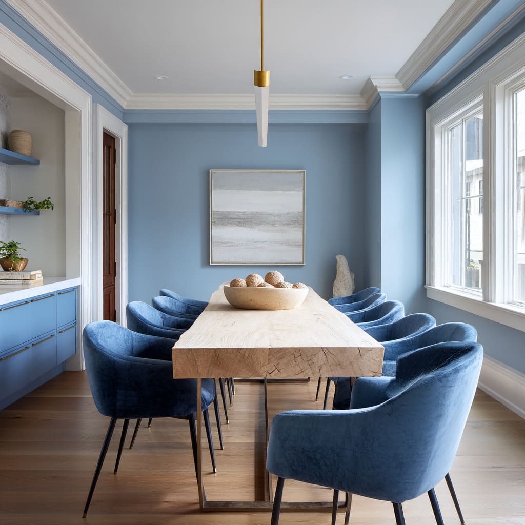
  • 14 Coastal Dining Room Ideas That Bring the Beach Home

    14 Coastal Dining Room Ideas That Bring the Beach Home

    If you’ve been searching for 14 coastal dining room ideas that actually work in a real house (not just a magazine spread), you’re in the right spot. I’ve spent a lot of time digging through what makes this style tick, and I’m going to walk you through every piece of it.

    A coastal dining room uses light woods, breezy textiles, and ocean-inspired colors like blue, white, and sandy tan to create a relaxed, beach-like eating space. It works in beach houses and inland homes alike.

    Stick around, because I’m also going to show you the mistakes people make when they try this look and end up with something that feels more “tacky souvenir shop” than “beachside bungalow.”

    What Even Is Coastal Style, Anyway?

    Coastal style is basically what happens when a beach vacation moves into your house and never leaves. Think light, airy, and a little worn in a good way. It’s not about seashell everything or nautical rope on every surface (please, no). It’s about color, texture, and light doing the heavy lifting. Whites and blues show up a lot, but so do warm sandy tones and driftwood browns. The goal is a room that feels calm, sunny, and a little bit like you just walked in from the boardwalk. Once you get the formula, you can use it anywhere, even if your closest beach is three states away.

    1. Start With a Whitewashed Wood Table

    Amelia Whitewash Dining Set with Light Oak Chairs - Laura James
    Credit: Laura James

    The dining table is the anchor of the whole room, so pick one that already feels coastal on its own. Whitewashed or weathered wood tables do a lot of the visual work without you needing to add much else. The grain shows through a little, giving it that sun-bleached, salt-air look.

    A round or oval table softens the room and keeps traffic flowing better than sharp corners. If you’re working with a smaller space, a drop-leaf table in a whitewashed finish gives you flexibility without sacrificing style.

    Practical tip: look for reclaimed wood or “farmhouse coastal” tables at furniture stores, they’re built for this exact look.

    This idea flexes well too. Add darker wood tones and it leans more traditional. Keep it pale and simple, and it stays firmly coastal. Once your table is set, the chairs around it need to match that same relaxed energy.

    2. Mix Woven and Wood Dining Chairs

    How to Mix and Match Dining Chairs in a Coastal Modern Style
    Credit: Mix And Max

    Matching chair sets can feel stiff in a coastal room. Instead, mix woven rattan or wicker chairs with a couple of wood ones. This creates texture and keeps things from looking too matchy.

    Woven chairs bring in that natural, beachy texture instantly. They’re lightweight, they photograph beautifully, and they pair with almost any table style. Wood chairs on the ends or interspersed add a bit of grounding weight so the room doesn’t feel too flimsy.

    Actionable tip: if buying new chairs feels pricey, swap out just two or four chairs from your current set with rattan ones for an instant refresh.

    In a more modern coastal home, go with clean-lined woven chairs. In a traditional coastal space, choose ones with curved backs and turned legs. Now that your seating has texture, let’s talk about what goes above the table.

    3. Hang a Rope or Woven Pendant Light

    Black Rattan Ceiling Light 16-Inch Hand-Woven Abaca Rope Pendant Light –  Coastal Black Hanging Lamp For Dining Room, Living Room, Bedroom, E26 Bulb  Compatible
    Credit: Landoo

    Lighting sets the mood, and a woven or rope-wrapped pendant does double duty. It gives off warm, soft light and adds a sculptural, natural element hanging right where everyone will notice it.

    These lights often come in rattan, jute, or seagrass, and they cast a really pretty dappled light across the table and walls. That little detail makes dinners feel cozier without you doing much.

    Practical tip: hang the pendant about 30 to 36 inches above the table so it lights the space without blocking sightlines across the table.

    For a more modern coastal look, pick a fixture with a simple geometric shape. For traditional coastal spaces, a lantern-style woven fixture feels right at home. Once the lighting’s sorted, it’s time to think about what’s under everyone’s feet.

    4. Layer a Jute or Seagrass Rug

    Keeping It Natural | A Guide to Jute, Sisal, and Seagrass Rugs - Molly in  Maine
    Credit: Molly In Miane

    A natural fiber rug adds texture underfoot and ties the whole room together. Jute and seagrass rugs are coastal staples because they mimic the look of sand and dried grasses, without being scratchy or hard to maintain.

    These rugs are also super durable, which matters a lot in a dining room where spills happen. Go with a rug big enough that the front legs of your chairs stay on it even when pulled out.

    Practical tip: measure your table and add at least 24 inches on all sides before buying your rug size, this keeps chairs from sliding off the edge.

    Rug Size Guide by Table Size

    Table SizeRecommended Rug SizeShape
    4-seat round (42″)6′ x 6′ round or squareRound or square
    6-seat rectangle (60-72″)8′ x 10′Rectangle
    8-seat rectangle (84-96″)9′ x 12′Rectangle
    Oval table (70-84″)8′ x 11′ ovalOval

    Jute works better in casual, beachy spaces, while a flatweave seagrass rug fits slightly more polished coastal rooms. With the flooring handled, let’s move up to the walls.

    5. Paint Walls in Soft Ocean Blues or Warm Whites

    Coastal Color Palette and Paint Ideas | Benjamin Moore
    Credit: Benjamin Moore

    Color is where coastal style really shows up. Soft blues, seafoam greens, and warm off-whites make a room feel airy and calm. Skip stark bright white, it can feel cold and clinical instead of beachy.

    I always tell people to test paint samples on the wall for a few days before committing. Light changes throughout the day, and a color that looks perfect at noon might feel totally different at dinner time.

    Practical tip: try a warm white with a hint of beige or gray undertone, like “Swiss Coffee” or “Alabaster,” for walls that feel soft, not sterile.

    Modern coastal rooms often go for a single soft blue accent wall. Traditional coastal spaces tend to paint the whole room in a pale tone with white trim. Once your wall color is set, it’s time to bring in some pattern.

    6. Add Striped or Textured Table Linens

    15 Coastal Decorating Ideas for 2026 That Bring Breezy Texture and Relaxed  Contrast Into Every Room
    Credit: Homedit

    Table linens are an easy, low-cost way to bring in pattern. Blue and white stripes are the classic coastal choice, but subtle textures like linen or waffle weave work just as well if you want something quieter.

    Cloth napkins in a natural fiber like linen or cotton feel more relaxed than stiff, formal fabric. They also wash easily, which matters if you’re using your dining room often.

    Practical tip: rotate a few tablecloth options (striped, solid, textured) so you can change the room’s feel without buying new furniture.

    In a more formal coastal dining room, use crisp white linen with subtle blue trim. In a laid-back beach cottage style, go with a slightly wrinkled linen tablecloth, that relaxed texture is part of the charm. Speaking of texture, let’s look at window treatments next.

    7. Choose Light, Breezy Curtains

    Neutral Curtains in White, Beige & Patterned Styles
    Credit: The Shade Store

    Heavy drapes feel wrong in a coastal room. You want something light that lets sunlight filter through and moves a little with the breeze. Linen or cotton curtains in white, cream, or soft blue work best.

    Sheer curtains alone can work if privacy isn’t a big concern. If you need more coverage, layer a sheer with a slightly heavier linen panel that you can pull closed at night.

    Practical tip: hang curtain rods a few inches above the window frame and extend them wide, this makes windows look bigger and lets in more light.

    Modern coastal spaces often skip curtains entirely and use simple woven blinds instead. Traditional coastal rooms lean toward soft curtain panels with a bit of movement. Now let’s bring some life into the room, literally.

    8. Bring in Coastal Greenery, Not Just Shells

    23 Inspiring Coastal Dining Rooms Ideas for Modern Beach Home Interiors
    Credit: Finding Sea Turtles

    A lot of people go straight for shells and starfish, but greenery actually does more for the coastal vibe. Palms, ferns, and even simple olive branches in a woven basket planter bring life and color without looking like a souvenir shop.

    Fresh or faux, greenery softens hard edges in the room and adds a natural pop of color against all those whites and blues.

    Practical tip: place a mid-size potted plant in a corner and a small one as a centerpiece, this creates layers without overwhelming the table.

    For modern coastal rooms, go with simple, sculptural plants like a single fiddle leaf fig. For traditional coastal spaces, a mix of smaller potted plants across a sideboard works nicely. Let’s talk storage and display furniture next.

    9. Use a Weathered Wood or Whitewashed Sideboard

    Whitewashed Reclaimed Wood Dining Table - Satori Design for Living
    Credit: Satori Designes

    A sideboard gives you storage and display space in one piece. Look for weathered wood, whitewashed finishes, or even a piece with a bit of chippy paint for that lived-in coastal feel.

    This is a great spot to display coastal-inspired items like glass vases, driftwood pieces, or a stack of woven baskets. It also keeps your table clear since extra dishes and linens can live inside.

    Practical tip: choose a sideboard with a few open shelves or glass-front doors so you can style it, not just hide clutter inside.

    Modern coastal homes might choose a sideboard with clean lines and brass hardware. Traditional coastal rooms often go for a more ornate piece with turned legs and a distressed finish. Once your storage is sorted, let’s think about the ceiling.

    10. Add Shiplap or Beadboard Detailing

    21 Coastal Dining Room Ideas That Bring Beachy Vibes and Elegance to Your  Home
    Credit: The Coolist

    Shiplap and beadboard walls or ceilings are a coastal signature. They add texture and a slightly cottage-like feel without requiring much color. White shiplap on a single wall, or even on the ceiling, instantly makes a room feel more beachy.

    You don’t need to redo the whole room. Even a chair-rail-height beadboard treatment on the lower half of the walls makes a difference.

    Practical tip: if a full renovation feels like too much, peel-and-stick shiplap panels give you the look for a fraction of the cost and effort.

    In a modern coastal space, keep shiplap minimal, maybe just behind a sideboard. In a traditional coastal room, full-wall shiplap feels right at home. Let’s talk about what goes on those walls next.

    11. Hang Ocean-Inspired Artwork (Without Being Cheesy)

    Ocean Wall Art: Bring Coastal Serenity to Your Home Decor
    Credit: Savy Canvas

    Art is where a lot of coastal rooms go wrong. Skip the literal beach scenes and anchors if you want something that feels more elevated. Instead, look for abstract art in blues and sandy tones, black and white beach photography, or simple line drawings of waves.

    A gallery wall of a few smaller pieces works great above a sideboard. A single large piece works well as a focal point above the table if you don’t have a chandelier drawing the eye.

    Practical tip: frame art in natural wood or white frames instead of dark, heavy frames, this keeps things feeling light.

    Coastal Color Palette Combos

    Palette NameWall ColorAccent ColorsBest For
    Classic NauticalWhiteNavy, red accentsTraditional coastal
    Sandy NeutralWarm beigeCream, driftwood brownModern coastal
    Soft SeafoamPale green-blueWhite, natural woodCottage coastal
    Misty MorningLight gray-blueWhite, soft goldModern coastal

    Modern coastal rooms lean toward abstract art. Traditional coastal spaces sometimes still use a classic ship painting or vintage map. Now let’s talk about the small details that pull it all together.

    12. Style the Table With Natural Centerpieces

    Coastal Dining Room Decor Ideas - Chalking Up Success!
    Credit: Chalking UP

    Skip the fake flowers and go for something with texture, like a bowl of dried starfish, a woven tray with candles, or a low arrangement of eucalyptus. Glass hurricane candle holders also work great, they catch light beautifully and feel a little coastal without trying too hard.

    Keep the centerpiece low so it doesn’t block conversation across the table. Simple is usually better here.

    Practical tip: use a wood or woven tray as a base for your centerpiece items, it keeps everything looking intentional instead of scattered.

    Modern coastal tables often go with just a single sculptural object, like a large piece of driftwood. Traditional coastal tables might layer a few smaller items together. With the table styled, let’s look at flooring options beyond rugs.

    13. Choose Light Wood or Whitewashed Flooring

    Seaside Serenity: Whitewashed Wood Floors in Beach Houses
    Credit: Floor Sanding

    If you’re doing any renovation, flooring matters more than people realize. Light wood floors, whitewashed planks, or even a light-toned tile all support the coastal look better than dark hardwood.

    Dark floors can make a room feel heavier and more formal, which fights against that relaxed coastal feeling. Light floors bounce light around the room and make everything feel more open.

    Practical tip: if replacing floors isn’t in the budget, a large jute or seagrass rug can visually “lighten” darker existing floors.

    Modern coastal homes often use wide-plank whitewashed engineered wood. Traditional coastal spaces might use a distressed pine floor for a more cottage feel. Finally, let’s talk about pulling in metal accents.

    14. Add Warm Metal or Brass Accents

    10 Best Coastal Pendant Lights for a Relaxed UK Home (2026) – The Bonnie  Home
    Credit: The Bonnie Home

    Coastal doesn’t mean everything is white and blue. A few warm metal touches, like brass drawer pulls, gold-rimmed glassware, or a brass light fixture, keep the room from feeling flat or one-note.

    These small metallic details add a little shine and warmth, balancing out all that light, airy color happening everywhere else in the room.

    Practical tip: stick to one metal finish throughout the room (brass, gold, or brushed nickel) so things feel cohesive instead of mismatched.

    Modern coastal rooms often use brushed gold for a subtle glow. Traditional coastal spaces might use aged brass for a more vintage feel. And with that, you’ve got all fourteen pieces of the puzzle.

    Tips for Success

    • Start with your biggest piece (the table) and build color and texture around it, not the other way around.
    • Keep at least one element in every room slightly imperfect or weathered, it makes the space feel more authentic.
    • Don’t be afraid to mix wood tones. Coastal style isn’t about matching everything perfectly.
    • Natural light matters a lot here, so avoid heavy window treatments that block it.
    • Add texture in layers: rug, linens, chairs, and lighting should each bring something different to the table.
    • Shop secondhand for sideboards and chairs, weathered pieces often look more authentic than brand new ones.
    • Keep decorative accessories to a minimum. Coastal style is calm, not cluttered.

    Common Mistakes and How to Avoid Them

    Overdoing the nautical theme
    : Skip the anchors, ropes, and shell-covered everything. Use color and texture instead of literal beach objects.

    Choosing dark, heavy furniture
    : Stick with light woods, whitewashed finishes, or weathered pieces instead of dark mahogany or cherry wood.

    Ignoring lighting
    : A dim, closed-off room kills the coastal vibe fast. Add sheer curtains and warm-toned bulbs to keep the space bright.

    Using stark white everywhere
    : Stark white can feel cold. Warm whites and creams feel much closer to real coastal homes.

    Skipping texture
    : A room with only smooth surfaces feels flat. Add woven baskets, jute rugs, and linen fabrics for depth.

    Matching every piece of furniture
    : A perfectly matched dining set looks stiff. Mix chair styles and materials for a more relaxed, collected-over-time feel.

    Similar Variations

    • Coastal Boho: Adds more pattern, layered rugs, and global textiles to the classic coastal base.
    • Nantucket Coastal: Leans traditional with navy and white stripes, brass accents, and classic New England details.
    • Mediterranean Coastal: Mixes in terracotta tones, wrought iron, and warmer color palettes.
    • Modern Coastal: Strips things down to clean lines, minimal decor, and a more neutral, sandy color scheme.
    • Cottage Coastal: Focuses on shiplap, vintage furniture, and a slightly worn, cozy farmhouse feel.
    • Tropical Coastal: Brings in bold greenery, rattan furniture, and brighter accent colors like coral or turquoise.

    Putting together a coastal dining room really comes down to picking the right mix of light woods, natural textures, and calm colors, then layering in just enough detail to keep it interesting without going overboard. Once you’ve worked through these 14 coastal dining room ideas, you’ll have everything you need to build a space that feels relaxed, bright, and a little like a permanent vacation.