Author: Tayef

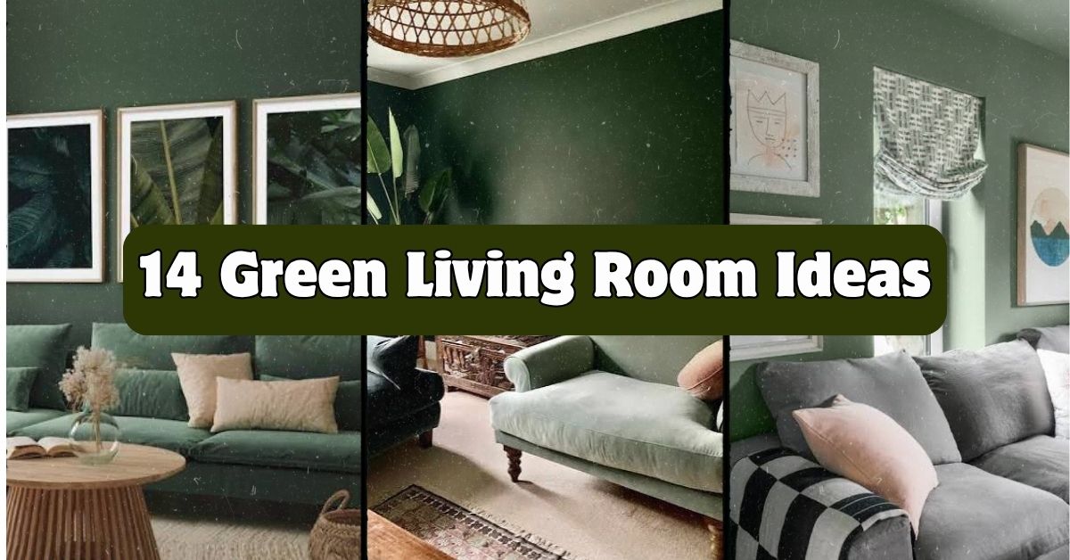
  • 14 Green Living Room Ideas

    14 Green Living Room Ideas

    If you’re hunting for 14 green living room ideas that actually work in real homes (not just fancy showrooms), you’ve landed in the right spot. I’ve spent way too many hours scrolling through design sites and testing paint swatches on my own walls, so I know what actually holds up and what’s just a pretty photo.

    Green living rooms use shades ranging from soft sage to deep emerald to bring nature indoors, paired with natural materials, warm woods, and layered textures to create a calming, grounded space. The result is a room that feels fresh without feeling cold.

    Stick around and I’ll walk you through specific ways to use green in your living room, from paint picks to furniture choices, plus some mistakes I’ve made so you don’t have to repeat them.

    What Makes a Green Living Room Work

    So here’s the thing about green rooms. Green is basically the easiest color to live with because it’s everywhere in nature already. Your brain doesn’t fight it. It’s not like hot pink or neon orange where you either love it or hate it. Green just feels right.

    But there’s a catch. Not all greens play nice together, and picking the wrong shade can make a room feel like a hospital waiting room instead of a cozy retreat. The trick is understanding which greens pair with which materials, and how lighting changes everything. I learned this the hard way after painting a wall a gorgeous forest green that turned muddy brown by 3pm every day. Let’s get into the ideas so you can skip that mistake.

    1. Paint One Accent Wall in Deep Forest Green

    30 Green Living Rooms That Bring the Outdoors Inside
    Credit: Thespruce

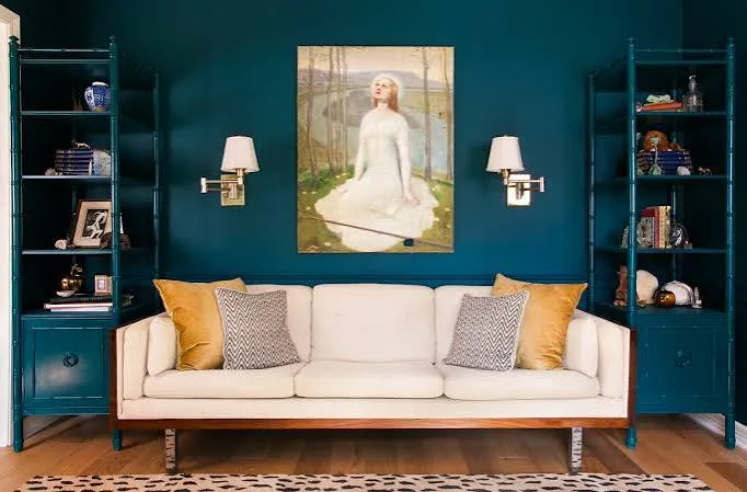
    Forest green on a single wall gives you drama without overwhelming the whole room. This works best on the wall behind your sofa or the one you see first when walking in. Pair it with white trim to keep things crisp.

    Keep your furniture neutral, think cream or tan sofas, so the wall stays the star. Add a gold-framed mirror or brass lamp to warm things up.

    Practical tip: test the paint at different times of day before committing. Forest green can look black in low light.

    This idea adapts well to traditional and modern farmhouse styles, but skip it in coastal spaces where lighter greens feel more natural.

    Once your wall is set, you’ll want furniture that doesn’t fight with it, which brings us to the next idea.

    2. Choose a Sage Green Sofa as Your Anchor Piece

    15 Green Living Room Ideas To Reinvigorate Your Space | Furniture & Choice
    Credit: Furniturechoice

    A sage green sofa is a commitment, but it’s a smart one. Sage sits between gray and green, so it goes with almost any other color you throw at it. It’s the chameleon of the paint world, except it’s fabric this time.

    Build your room around it with warm wood side tables and a jute rug. Toss in a few mustard or rust pillows for contrast.

    Actionable tip: choose a performance fabric if you have kids or pets. Sage shows stains less than you’d think, but durability still matters.

    This piece works in mid-century modern, boho, and even minimalist spaces since sage never feels loud.

    Now that your anchor piece is picked, let’s talk about what goes underneath it.

    3. Layer a Jute or Sisal Rug for Texture

    10 Best Jute Runners for 2025: Eco-Friendly Home Decor Picks – The Rugs
    Credit: The-Rugs

    Green rooms need texture, or they start feeling flat. A jute or sisal rug adds that raw, natural element that makes the green feel intentional instead of random.

    These rugs work because they’re neutral in color but rough in texture, which contrasts nicely against smooth green fabrics or painted walls. Go for a rug that’s at least eight inches wider than your sofa on each side for proper scale.

    Practical tip: layer a smaller printed rug on top of the jute base if you want more pattern without losing the texture.

    This works across nearly every style, though in coastal rooms you might swap jute for a lighter seagrass version.

    Texture handled, now let’s bring in something living.

    4. Add Real Plants, Not Just Green Decor

    27 Great Ways to Decorate With Plants
    Credit: Thespruce

    I know this sounds obvious, but hear me out. A green room without actual plants feels like it’s missing the point. Real plants tie the whole color scheme together and clean your air while they’re at it.

    Go for a mix of heights: a tall fiddle leaf fig in a corner, a trailing pothos on a shelf, and a small snake plant on the coffee table. Use ceramic or woven pots that match your other textures.

    Actionable tip: if you kill plants easily (no judgment), start with a snake plant or ZZ plant. They survive almost anything.

    This idea fits every single style because plants are universal. Even the most minimalist room needs one.

    Speaking of shelves, let’s talk about what else you can put on them.

    Green Shade Comparison Table

    Shade NameBest Used ForMood It CreatesPairs Well With
    Sage GreenSofas, accent chairsCalm, softCream, blush, brass
    Forest GreenAccent walls, drapesDramatic, cozyWhite, gold, navy
    Olive GreenTextiles, pillowsEarthy, warmRust, mustard, wood tones
    Mint GreenSmall accents, vasesFresh, lightWhite, pale pink, gray
    Emerald GreenStatement furnitureBold, luxuriousBlack, gold, deep blue

    5. Mix Wood Tones for Warmth

    5 Secrets to Mixing Wood Tones, From an Interior Design Expert | Apartment Therapy
    Credit; apartmenttherapy

    Green and wood are basically best friends. But if you use only one wood tone, the room can feel flat. Mixing a light oak coffee table with a darker walnut bookshelf adds depth without clashing.

    The key is keeping the undertones similar, either all warm or all cool, so nothing looks accidental. Warm woods like oak, walnut, and cherry pair beautifully with earthy greens like olive and forest.

    Practical tip: bring a paint swatch to the furniture store so you can hold it against wood samples before buying.

    This approach works especially well in Scandinavian and mid-century modern living rooms, where wood grain is already a design feature.

    Now let’s talk about what hangs above all that wood.

    6. Hang Botanical Art or Framed Leaves

    Botanical Leaf Trio - Set Of 3 Prints – Abstract House
    Credit: abstracthouse

    Botanical prints reinforce the green theme without adding more paint or fabric. A gallery wall of simple leaf prints in thin black frames looks clean and pulled together.

    Choose prints with white backgrounds so they don’t compete with your wall color. If your walls are already green, go with cream-colored mattes instead.

    Actionable tip: press real leaves from your yard and frame them yourself for a personal touch that costs almost nothing.

    Botanical art fits transitional and traditional homes especially well, giving the space a slightly formal but still natural feel.

    Once your walls are dressed, it’s time to think about the little details that tie a room together.

    7. Use Brass or Gold Hardware for Contrast

    Stylish Green and Gold Living Room Ideas | 42 Design Images
    Credit: Fancyhouse

    Green needs a metal to bounce off of, and brass does it best. Gold and green have this old-money look together that instantly makes a room feel more expensive than it is.

    Swap out lamp bases, curtain rods, and picture frames for brass versions. Even small changes like drawer pulls on a media console add up.

    Practical tip: mix matte and shiny brass finishes so it doesn’t look too matchy or showroom-perfect.

    This combo shines in art deco and glam living rooms, but it also softens a farmhouse space nicely.

    With metal accents in place, let’s talk about the fabric choices that pull everything together.

    8. Layer Throw Pillows in Complementary Patterns

    How to Style Green Living Rooms: Tips for Color & Decor
    Credit: Fancyhouse

    A green sofa or green walls need pillows that don’t just match, they need to talk to each other. Mix a solid cream pillow, a small floral print, and a textured knit throw pillow together.

    Stick to three colors max in your pillow mix: your green, a neutral, and one accent color like rust or navy. Too many colors and the couch looks cluttered instead of curated.

    Actionable tip: buy pillow inserts one size larger than your covers for a fuller, less deflated look.

    This layering trick works in every style, from boho to traditional, since pillows are an easy, low-commitment way to test color combos.

    Now that your seating area feels cozy, let’s zoom out to the bigger furniture pieces.

    9. Choose a Green Accent Chair Instead of a Full Sofa

    Green Living Room - 31 Inspiring Green Living Room Ideas
    Credit: Housebeautiful

    If a green sofa feels too bold, start smaller with an accent chair. A single emerald or olive velvet chair in the corner gives you all the color impact with way less commitment.

    Pair it with a neutral sofa so the chair stands out as a focal point. Velvet fabric especially catches light in a way that makes the green look richer.

    Practical tip: place the chair near a window so natural light hits the fabric throughout the day, showing off the color shifts.

    This works great in eclectic and transitional rooms where you want one bold piece without overhauling everything.

    Chairs are great, but let’s not forget what’s happening on the floor beneath your feet and walls around you.

    Budget Tiers for a Green Living Room Makeover

    Budget LevelWhat You Can AffordEstimated Cost Range
    Small BudgetPaint accent wall, add plants, swap pillows$100 to $300
    Mid BudgetAdd accent chair, new rug, brass hardware$500 to $1,200
    Full BudgetNew sofa, custom drapes, art, full furniture refresh$2,000 to $5,000+

    10. Add Green Curtains for Softness

    Green And Gold Room Ideas: 15 Stunning Living Room Looks
    Credit: apartmentcharm

    Curtains in a soft moss or sage green soften hard light and add color without touching your walls. This is a great option for renters who can’t paint.

    Choose a linen or cotton blend so the fabric drapes naturally instead of looking stiff. Hang the rod a few inches above the window frame to make ceilings look taller.

    Actionable tip: measure so your curtains just brush the floor, not pool excessively or hover awkwardly above it.

    This idea works beautifully in cottage and coastal homes, where soft, flowing fabric feels right at home.

    Curtains set the mood for light, and next we’ll talk about the light fixtures themselves.

    11. Choose Warm-Toned Lighting Over Cool White Bulbs

    Stylish Green and Gold Living Room Ideas | 42 Design Images
    Credit: Fancyhouse

    Cool white light makes green look sickly, almost gray. Warm-toned bulbs, the kind labeled 2700K to 3000K, make green feel rich and inviting instead.

    Swap your overhead bulbs first since that light affects the whole room. Then move to lamps and any accent lighting.

    Practical tip: keep a warm bulb on hand and screw it into a lamp before buying a whole box, just to check the color against your specific green.

    This tip applies to every single design style because bad lighting ruins any color scheme, no exceptions.

    With the lighting sorted, let’s look at one more layer that often gets skipped.

    12. Incorporate a Green and White Striped or Checkered Pattern

    New Design Trend: Checkered Pattern | HGTV
    Credit: hgtv

    Patterns keep a green room from feeling like one giant color block. A striped ottoman or checkered throw blanket in green and white adds visual movement.

    Use pattern in small doses, one piece is usually enough. Too much stripe or checker competes with your solid green pieces instead of complementing them.

    Actionable tip: choose a pattern in a similar green shade to your main color so it reads as a variation, not a mismatch.

    This pattern trick fits coastal, cottagecore, and modern farmhouse rooms especially well.

    13. Use a Green Gallery Shelf for Books and Decor

    How Bookshelf Wealth Became the Ultimate Status Symbol
    Credit:Elledecor

    Open shelving painted the same green as your walls creates a built-in look without construction. Books, small plants, and ceramic pieces pop against the color instead of disappearing into white shelves.

    Keep the items on the shelf varied in height and texture, but limited in color palette so it doesn’t look chaotic. Group items in threes for a more curated feel.

    Practical tip: leave some negative space on each shelf. Fully packed shelves look cluttered no matter how nice the items are.

    This works great in eclectic and traditional homes where display pieces matter as much as furniture.

    14. Bring in a Green Statement Rug as the Star

    Green Rugs: Revitalize Your Home with Nature-Inspired Décor – The Rugs
    Credit: The-Rugs

    Instead of green walls or a green sofa, let a bold green patterned rug carry the whole color story. This works especially well if you’re renting and can’t paint or if you already have neutral furniture you love.

    Choose a rug with green as the dominant color but with cream, rust, or navy woven through the pattern. Keep your walls and big furniture neutral so the rug gets the spotlight.

    Practical tip: vacuum patterned rugs weekly since busy patterns hide dirt longer, which means it builds up before you notice.

    This idea works in almost any style since a rug is easy to swap out later if your taste changes.

    Tips for Success

    • Start with one green element before committing to a whole room, like a pillow or small rug, to see how you feel about living with it daily
    • Test paint swatches on at least two different walls since light changes throughout the day and room
    • Balance cool greens with warm materials like wood and brass so the room doesn’t feel cold
    • Shop secondhand for wood furniture pieces since vintage wood often has richer tones than new furniture
    • Keep at least one plant alive in the room at all times, even if it’s fake, to reinforce the nature theme
    • Photograph your room before and after changes so you can actually see the progress instead of just feeling it

    Common Mistakes and How to Avoid Them

    Using too many different greens at once
    : Stick to two or three shades max in one room, or the space starts feeling busy instead of intentional.

    Ignoring the room’s natural light direction
    : North-facing rooms need warmer greens like olive, while south-facing rooms can handle cooler sage tones.

    Skipping texture entirely
    : Pair smooth painted walls with rough textures like jute, linen, or raw wood so the room doesn’t feel flat.

    Choosing trendy shades over ones you actually love
    : Pick a green that feels calming to you personally, not just what’s popular this year.

    Forgetting to test lighting before buying furniture
    : Bring fabric swatches home and view them under your actual lamps before finalizing a sofa or chair purchase.

    Overdoing metallic accents
    : One or two brass or gold pieces is plenty. More than that and the room starts looking like a jewelry store.

    Similar Variations

    • Botanical Boho: Mixes green tones with rattan furniture and lots of hanging plants for a jungle-like feel
    • Coastal Green: Uses lighter mint and seafoam shades paired with white and natural wood for a beachy vibe
    • Dark Academia Green: Combines deep forest green with leather furniture and vintage books for a moody, scholarly look
    • Scandinavian Sage: Pairs soft sage walls with light wood and minimal decor for a clean, calm space
    • Cottagecore Green: Uses olive and moss tones with floral patterns and vintage furniture for a cozy, homey feel
    • Modern Emerald: Uses bold emerald green as a statement color against black and gold accents for a luxe look

    Putting together a green living room isn’t about picking one perfect shade and calling it done. It’s about layering the right materials, lighting, and textures so the color feels natural instead of forced. Whether you start small with a few pillows or go all in with a painted wall and new sofa, these 14 green living room ideas give you plenty of ways to bring that calm, grounded feeling into your space.
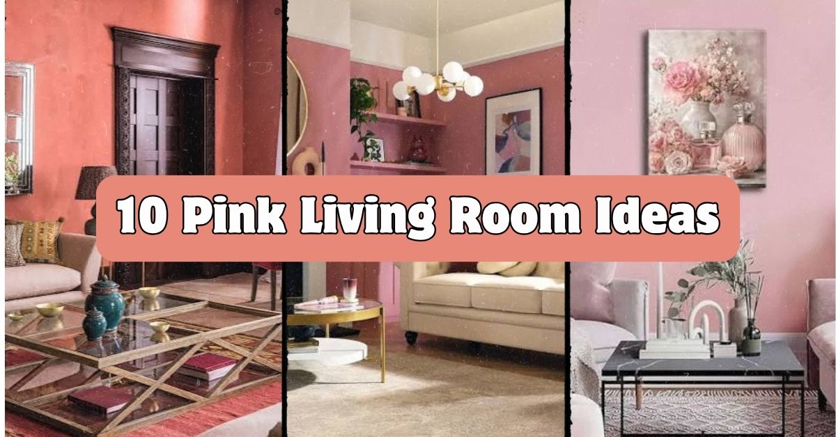
  • 10 Pink Living Room Ideas That Actually Work in Real Homes

    10 Pink Living Room Ideas That Actually Work in Real Homes

    If you’ve been searching for 10 pink living room ideas that go beyond basic Pinterest boards, I’ve got you covered here with real, practical advice you can actually use. I’ve spent way too many hours studying paint swatches and furniture layouts, so I’m handing you the good stuff without the fluff.

    What is a pink living room? A pink living room uses pink as a dominant or accent color across walls, furniture, textiles, or decor. It ranges from soft blush tones to bold magenta, and it works in modern, traditional, and eclectic homes alike.

    Stick around, because I’m about to show you exactly how to make pink feel grown up, cozy, and totally not “little girl’s bedroom.”

    Why Pink Living Rooms Are Having a Moment

    I get it. Pink used to feel off-limits for living rooms. Too soft. Too feminine. Too risky.

    But that’s changing fast. Designers are using pink like a neutral now, pairing it with black, brown, and deep green to make it feel rich instead of sugary. Blush and dusty rose tones especially work because they act like a warm beige with personality. Pink also plays nice with natural light, so it can make a dark room feel warmer without going overboard. Once you see it done right, you can’t unsee how good it looks.

    1. Paint the Walls in a Soft Blush Tone

    The Ultimate Guide To Pink Living Rooms | Furniture & Choice
    Credit: Furniturechoice

    Start simple. A blush pink wall is way less scary than people think. It reads more like a warm neutral than a bold statement color, especially in matte or eggshell finish.

    Pair it with white trim and light wood floors to keep things airy. Add black metal light fixtures for contrast so the room doesn’t feel too soft.

    Tip: Test your paint color at different times of day. Blush can look peachy in morning light and much pinker under warm bulbs at night.

    This works beautifully in modern farmhouse spaces, but it also softens up mid-century modern rooms that lean too cold otherwise. From here, let’s talk about what to do if you’re not ready to commit to walls.

    2. Use a Pink Sofa as Your Anchor Piece

    How a Pink Velvet Sofa Duo Transformed Our Family Room
    Credit: Witanddelight

    Not ready for pink walls? A pink sofa gives you the same effect without the commitment. Velvet in dusty rose or terracotta pink adds texture and warmth instantly.

    Keep the walls neutral, think warm white or light gray, so the sofa becomes the star. Add brass or gold hardware on nearby furniture to elevate the look.

    Tip: Choose performance velvet if you have kids or pets. It looks luxe but wipes clean easily.

    This idea adapts well to almost any style. In a traditional room, pair it with tufted details. In a modern space, keep the sofa’s lines clean and simple. Once your anchor piece is set, accessories become way easier to choose.

    3. Layer in Terracotta and Rust Accents

    Pink living room ideas: 10 blush and terracotta decor tips | Homes and Gardens
    Credit: Homesandgardens

    Pink doesn’t have to stand alone. Terracotta and rust tones make pink feel earthy instead of sweet. Think clay-colored throw pillows, rust curtains, or a burnt orange accent chair.

    This combo works because both colors sit close together on the color wheel, so they blend without clashing. Add woven baskets or jute rugs to tie in natural texture.

    Tip: Stick to a 70-20-10 rule. Seventy percent neutral, twenty percent pink, ten percent rust or terracotta as a pop.

    Boho and Southwestern-style homes practically beg for this combo. Even coastal spaces can pull it off if you keep the terracotta muted. Speaking of coastal, let’s look at how pink fits into that vibe next.

    Pink Color Palette Combos and What They Pair Best With

    Pink ShadeBest Pairing ColorsStyle It SuitsMood Created
    Blush PinkCream, sage green, light woodModern farmhouse, coastalSoft, calm
    Dusty RoseCharcoal, brass, terracottaTraditional, bohoWarm, grounded
    Hot PinkBlack, white, goldMaximalist, art decoBold, energetic
    Millennial PinkGray, black, marble whiteMinimalist, modernClean, trendy
    MauveNavy, olive, walnut woodTransitional, vintageMuted, sophisticated

    4. Try a Coastal Pink Living Room

    20 Pretty Pink Living Rooms | HGTV
    Credit: hgtv

    Yes, pink and coastal go together. Think sun-washed blush walls, white linen sofas, and rattan furniture. The trick is keeping the pink muted, almost sandy, so it doesn’t compete with the breezy vibe.

    Add jute rugs, seagrass baskets, and light wood coffee tables. Skip anything glossy or metallic and lean into matte, natural textures instead.

    Tip: Use sheer white curtains to soften sunlight and keep the whole room feeling airy.

    This look works especially well in homes near water or in bright, sunny climates. If your space feels too soft after this, adding some dark contrast can balance it out fast.

    5. Add Deep Green for Contrast

    How to decorate a living room | Swoon
    Credit: Swooneditions

    Green and pink are basically best friends. Pair a blush or rose pink sofa with deep emerald or forest green curtains. It’s a classic combo that shows up in botanical prints for a reason.

    Add plants throughout the room to reinforce the color pairing naturally. A few potted palms or fiddle leaf figs work great here.

    Tip: Use green in larger doses (curtains, an accent wall) and let pink stay smaller (pillows, throws) for balance.

    Traditional and grandmillennial homes love this combo especially. Modern spaces can pull it off too if you keep the shapes simple and clean. Now let’s talk metal finishes, because they matter more than people think.

    6. Choose Brass or Gold Hardware for Warmth

    How to Choose the Right Coloured Metal Finishes For Your Home
    Credit: Janelockhart

    Pink walls or furniture look flat without the right metal accents. Brass and gold add warmth and a little sparkle without feeling too flashy.

    Swap out silver or chrome light fixtures, drawer pulls, and picture frames for brass versions. Even small changes like a gold-rimmed mirror make a difference.

    Tip: Stick to one metal finish throughout the room. Mixing gold, brass, and silver randomly can make a space feel unplanned.

    This trick works in nearly every style, from art deco glam to simple modern minimalism. Once your metals are sorted, it’s time to think about pattern.

    7. Mix in Botanical or Floral Prints

    NO DISPONIBLE ‼️L 250 Arte de camba floral rosa para pared, flores rosas, pintura de plantas, pósters botánicos de perfume, impresiones para sala de estar, vestidor, apartamento, sala de belleza
    Credit: @evelinstorehn

    Florals sound risky with pink, but the right print actually grounds the color instead of making it too sweet. Look for prints with green leaves, cream backgrounds, and just a touch of pink woven in.

    Use this on throw pillows, curtains, or even one statement wallpaper wall. Keep everything else in the room simple so the pattern doesn’t overwhelm.

    Tip: If wallpaper feels like too much commitment, try a large framed botanical print instead.

    Grandmillennial and traditional homes lean into this hard, but even modern rooms can use a single floral pillow to soften sharp lines. Next, let’s talk about texture, because pink loves texture.

    Budget Breakdown for a Pink Living Room Makeover

    Budget TierWhat You GetApprox. Cost Range
    Low ($100-$300)Pink throw pillows, one accent piece, small decor swaps$100-$300
    Mid ($300-$1,000)Accent chair, area rug, curtains, wall art$300-$1,000
    High ($1,000-$3,000)Pink sofa, paint job, new lighting, rug$1,000-$3,000
    Full Remodel ($3,000+)Custom furniture, wallpaper, built-ins, full redesign$3,000-$8,000+

    8. Add Texture With Velvet and Boucle

    Hot Pink Interior Design Looks That Prove Bold Can Feel This Joyful - Edward George
    Credit: Edwardgeorgelondon

    Pink can look flat in cheap fabric. But swap in velvet or boucle, and suddenly it feels expensive. These textures catch light differently and add depth that flat cotton just can’t match.

    Try a boucle accent chair or velvet throw pillows in a deeper rose shade. The fuzzy, tactile feel makes the room instantly cozier.

    Tip: Mix textures within the same color family. A velvet pillow next to a boucle ottoman in similar pink tones looks intentional, not random.

    This trick shines in modern and Scandinavian-inspired rooms especially. It softens minimalist spaces without adding visual clutter. Speaking of minimal, let’s cover how to do pink in a smaller space.

    9. Keep It Minimal With One Pink Statement Piece

    51 Pink Living Rooms With Tips, Ideas And Accessories To Help You Design Yours
    Credit: Home-designing

    If a whole pink room feels overwhelming, just pick one statement piece. A pink accent chair, a single wall, or even one oversized piece of art can do the job.

    Keep everything else neutral, white walls, beige rug, light wood furniture, so the pink piece really pops.

    Tip: Place your pink statement piece somewhere it catches natural light, like near a window, to make it feel even more vibrant.

    This idea is perfect for renters or anyone nervous about commitment. It works in literally any style because it’s such a small, controlled dose of color. Now let’s go bigger with an accent wall.

    10. Create a Pink Accent Wall Behind the Sofa

    The Ultimate Guide To Pink Living Rooms | Furniture & Choice
    Credit: Furniturechoice

    Instead of painting the whole room, just do one wall. The wall behind your sofa is the classic choice because it acts like a backdrop without overwhelming the space.

    Choose a slightly deeper pink than you’d use on all four walls, since one wall can handle more intensity. Rose, mauve, or even a soft raspberry works well here.

    Tip: Keep your sofa and rug in neutral tones so the wall color stays the star of the show.

    This idea works in basically every home style since it’s low commitment but high impact. From here, let’s talk about lighting, which changes everything.

    Tips for Success

    • Test paint samples on your actual wall, not just a swatch card, since lighting changes everything.
    • Balance soft pink with at least one bold or dark color so the room doesn’t feel too sugary.
    • Stick to one dominant pink shade throughout instead of mixing five different pinks.
    • Add plants. Green makes almost every shade of pink look better instantly.
    • Don’t skip texture. Flat, shiny pink fabric looks cheap; velvet and boucle look expensive.
    • Start small if you’re nervous. Pillows and throws are way easier to change than walls.
    • Take a photo of your room in both natural and artificial light before committing to big changes.

    Common Mistakes and How to Avoid Them

    Using too many different pink shades at once
    : Stick to one main pink tone and let other colors like green, black, or terracotta do the supporting work.

    Choosing cool-toned lighting for a warm pink room
    : Swap to warm white bulbs (2700K-3000K) so the pink glows instead of looking flat or gray.

    Skipping texture entirely
    : Add velvet, boucle, or woven materials so the pink doesn’t read as flat or cheap.

    Going too matchy with metals
    : Pick one metal finish, brass or black or chrome, and stick with it throughout the room.

    Forgetting to test paint in your actual space
    : Paint a sample patch and check it morning, noon, and night before buying gallons.

    Making pink the only color in the room
    : Pair it with a neutral base and one grounding color so the space feels balanced, not overwhelming.

    Similar Variations

    • Terracotta Pink Living Room: Leans warmer and earthier, mixing clay tones with dusty rose for a cozy, grounded feel.
    • Millennial Pink Minimalist Room: Pairs pale pink with gray and marble for a clean, trendy, low-clutter look.
    • Grandmillennial Pink Room: Combines florals, ruffles, and traditional furniture shapes with soft pink tones for a vintage charm.
    • Coastal Blush Living Room: Uses sandy, muted pink with white linen and natural textures for a breezy beach feel.
    • Art Deco Pink Room: Pairs bold pink with black, gold, and geometric patterns for a glam, dramatic vibe.
    • Boho Rose Living Room: Mixes dusty rose with rust, mustard, and woven textures for an eclectic, layered look.

    Pink living rooms aren’t just a trend that’s going to fade out next season. When you balance the right shade with good lighting, solid textures, and a grounding color like black or green, pink becomes a color that actually works hard for your space instead of just looking pretty. Whether you go bold with a full accent wall or start small with a single throw pillow, these 10 pink living room ideas give you a real starting point for a space you’ll actually love coming home to.

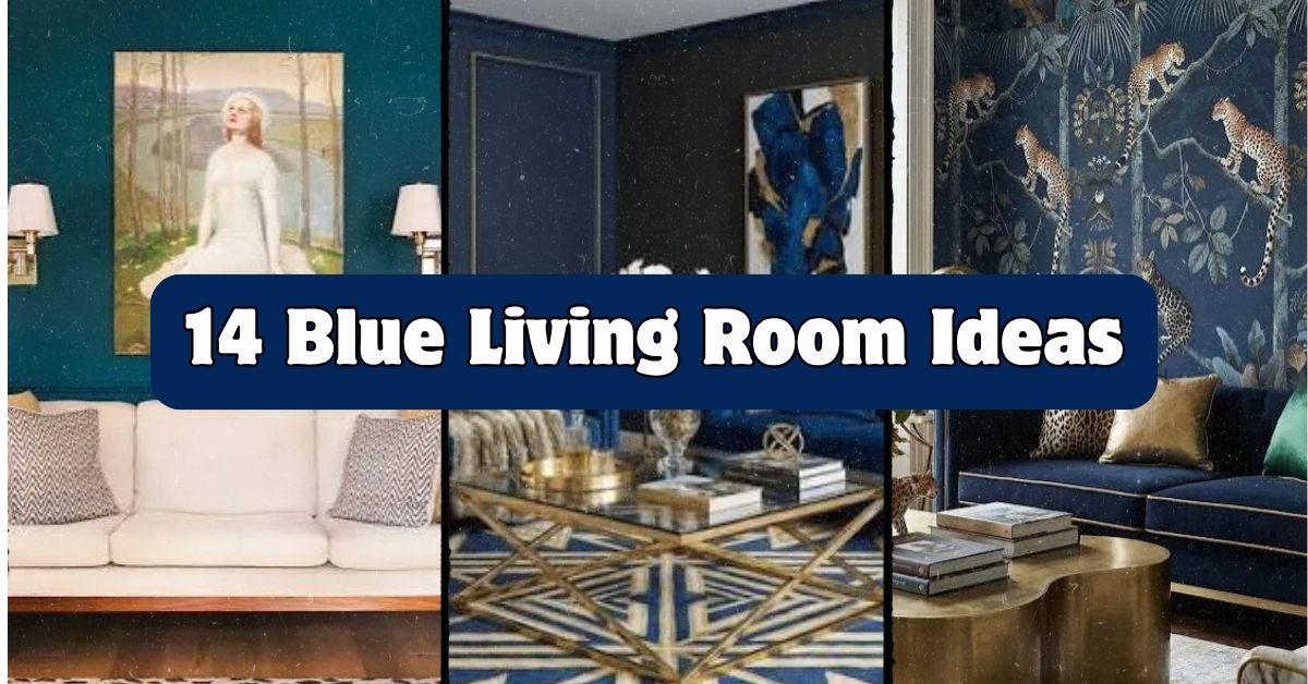
  • 14 Blue Living Room Ideas

    14 Blue Living Room Ideas

    I’ve spent way too many hours scrolling design boards, and I finally pulled together the best 14 blue living room ideas that actually work in real homes, not just magazine spreads. This isn’t some rushed list either. I dug through what works, what flops, and what designers keep coming back to year after year.

    Blue living rooms are one of the most requested color schemes in home design because blue works with almost every style, from coastal cottages to sleek modern condos, and it pairs with warm woods, metals, and neutral fabrics without clashing.

    Stick around, because I’m about to show you exactly how to pull off this look in your own space, plus a few mistakes that trip people up all the time.

    What Makes a Blue Living Room Actually Work

    Ever walked into a room painted blue and felt like you were standing inside a swimming pool? Yeah, me too. That’s the thing about blue. It’s a color that can go two totally different directions. Done right, it feels calm, collected, and kind of luxurious. Done wrong, it feels cold and flat.

    The secret is balance. You need warmth mixed in with all that cool blue, whether that’s through wood tones, brass hardware, or a cream rug. Blue also changes personality depending on the shade. Navy feels moody and grown up. Sky blue feels light and airy. Teal leans a bit more jewel-toned and bold. I’ll walk you through all of it below.

    1. Anchor the Room With a Navy Sofa

    Blue Sofa Living Room Ideas | Designer Sofas 4U
    Credit: Designersofa

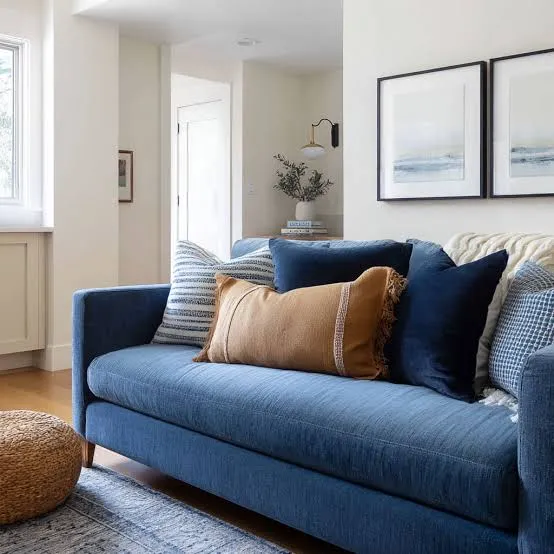
    A navy sofa is basically the little black dress of living room furniture. It’s bold enough to make a statement but neutral enough to work with almost any accent color you throw at it. Pair it with cream throw pillows, a light wood coffee table, and maybe a brass floor lamp for contrast.

    Practical tip: choose a performance fabric if you have kids or pets, since navy shows lint and pet hair less than lighter shades but still needs durability.

    This idea adapts beautifully across styles. In a modern space, keep the sofa’s lines clean and simple. In a traditional room, go for rolled arms and tufted details instead.

    Once your sofa sets the tone, it’s time to think about what goes on the walls around it.

    2. Paint an Accent Wall in Deep Teal

    Credit: livingetc

    If a full blue room feels like too much commitment, start with one wall. Deep teal on a single accent wall gives you drama without overwhelming the whole space. It works especially well behind a sofa or as the backdrop for a media console.

    Keep the other three walls a soft white or warm greige so the teal wall really pops. Add a piece of art with gold or orange tones to warm things up.

    Practical tip: test paint swatches at different times of day since teal can look almost black under low lighting.

    This works in coastal homes, modern lofts, and even farmhouse spaces if you pair it with shiplap trim.

    Next, let’s talk about how fabric choices can carry that same blue theme without repainting anything.

    3. Layer Blue Patterns Through Throw Pillows

    Credit: Fancyhouse-design

    Not ready to commit to paint or furniture? Pillows are your best friend. Mixing a few different blue patterns, like a stripe, a small floral, and a solid, creates depth without looking chaotic. I always tell people to follow a rule of odd numbers. Three or five pillows tend to look more intentional than an even number.

    Stick to a tight color family so things don’t feel busy. Navy, cornflower, and a soft powder blue work great together.

    Practical tip: mix textures too, like a velvet pillow next to a linen one, for added richness.

    This idea is basically a cheat code for renters or anyone who wants flexibility, since pillows adapt to farmhouse, boho, or coastal grandma styles instantly.

    Now let’s move to something a little more permanent: rugs.

    4. Ground the Space With a Blue and Cream Rug

    Credit: Marthastewart

    A rug does more work than people give it credit for. It ties furniture together and adds softness underfoot. A blue and cream patterned rug, like a trellis or medallion design, gives your room structure without adding another solid block of color.

    Make sure your rug is big enough. A common mistake is buying one too small, which makes the room feel disconnected.

    Practical tip: leave about 10 to 15 inches of bare floor between the rug edge and the wall in a mid-sized room.

    Coastal and traditional homes both love this combo, while modern spaces might prefer a more geometric blue pattern instead.

    Once your rug is set, let’s bring in some blue through smaller furniture pieces.

    Rug Size Guide by Room Dimension

    Room SizeRecommended Rug SizeBest Placement
    10×10 ft8×10 ftUnder front legs of sofa
    12×14 ft9×12 ftAll furniture legs on rug
    14×16 ft10×14 ftFully anchors seating area
    Open concept12×15 ft or largerDefines living zone clearly

    5. Add a Blue Accent Chair for Contrast

    51 Blue Accent Chairs for a Cool New Hue
    Credit: Home-designing

    A single blue accent chair can do wonders in a room that’s otherwise neutral. Think of it as a pop of color that draws the eye without taking over. A velvet chair in cobalt or teal looks especially rich next to beige or cream sofas.

    Practical tip: place the chair at an angle to the sofa rather than directly facing it, which creates better conversation flow and looks less staged.

    In modern homes, go for a chair with slim metal legs. In traditional spaces, a wingback style feels more at home.

    Now that we’ve got seating handled, let’s talk walls again, but this time with wallpaper instead of paint.

    6. Use Blue Wallpaper With a Botanical Print

    Credit: feathr

    Wallpaper has made a serious comeback, and blue botanical prints are everywhere right now. They add pattern and life to a room without needing extra artwork. This works great in a smaller living room or even just behind a media wall.

    Practical tip: if full wallpaper feels risky, try a removable version so you can test it before committing long term.

    This style leans traditional and coastal most naturally, but a bold graphic blue print can also work in eclectic or maximalist spaces.

    Let’s shift gears now and talk about how lighting changes the whole mood of a blue room.

    7. Warm Up the Room With Brass or Gold Lighting

    Credit: Housebeautiful

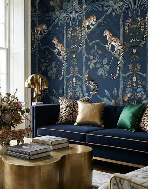
    Blue rooms can feel a little cold if you’re not careful. That’s why lighting fixtures with warm metal tones matter so much. A brass floor lamp, gold pendant, or even a chandelier with warm bulbs balances out all that cool blue.

    Practical tip: choose bulbs labeled “warm white” around 2700K to avoid a harsh, clinical glow.

    Modern homes look great with sleek brass sconces, while traditional spaces might prefer an ornate gold chandelier instead.

    Speaking of balance, let’s talk about how much blue is actually too much.

    8. Balance Bold Blue With Neutral Furniture

    Blue and Yellow Living Room Ideas | Balance Bold Colors Smartly
    Credit: Fancyhouse-design

    If you love a saturated blue wall or bold wallpaper, keep your big furniture pieces neutral. A cream sofa, tan leather chair, or light wood console lets the blue shine without the room feeling like it’s closing in on you.

    This 60-30-10 rule works well here: 60 percent neutral, 30 percent blue, 10 percent accent color like mustard or terracotta.

    Practical tip: test this ratio with photos of your room before buying furniture, since it’s easier to spot imbalance in a picture than in person.

    This approach fits almost every style because it’s really about proportion, not aesthetic.

    Now let’s talk about a smaller detail that makes a big difference: curtains.

    Blue Living Room Color Palette Combinations

    Palette NameMain Blue ShadeAccent ColorsBest For
    Coastal CalmSky blueWhite, sand, light woodBeach houses, sunrooms
    Moody NavyNavyBrass, cream, blackFormal living rooms
    Jewel ToneTealEmerald, gold, blushEclectic, maximalist spaces
    Soft ScandinavianPowder blueGray, white, light oakMinimalist, modern homes
    Vintage CharmCornflower blueCream, rust, walnutTraditional, farmhouse

    9. Frame Windows With Floor-Length Blue Curtains

    Blue Peony Curtains for Living Room & Bedroom Window Drapes – Anady Top
    Credit: Anadytop

    Curtains that go all the way to the floor (or even slightly puddle) make ceilings feel taller and rooms feel more finished. A soft blue linen curtain adds color without being as bold as a full accent wall.

    Practical tip: hang curtain rods a few inches above the window frame and extend them wider than the window itself. This trick makes windows look bigger.

    Coastal and cottage styles love a light, breezy blue linen. Modern spaces might prefer a solid navy curtain with clean, structured pleats.

    Now, let’s talk about something people often forget: the ceiling.

    10. Paint the Ceiling a Soft Blue for a Sky-Like Feel

    Credit: btcdrapery

    This one surprises people, but painting the ceiling a pale blue creates a subtle, sky-like effect that makes rooms feel open and calm. It’s a classic trick in Southern coastal homes, sometimes called a “haint blue” ceiling.

    Practical tip: use a flat or matte finish on ceilings to avoid glare from overhead lighting.

    This works especially well in coastal, farmhouse, and traditional homes, though a deep navy ceiling can also create a cozy, cocoon-like feel in a moody modern space.

    Next, let’s bring some blue into your décor through art and accessories.

    11. Display Blue and White Ceramics on Shelves

    Decorating shelves: 13 ideas for beautiful arrangements | Homes and Gardens
    Credit: Homesand

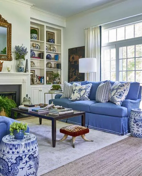
    Blue and white ceramics, like ginger jars or striped vases, are a classic way to bring color into open shelving or a mantel without repainting anything. They’re small, affordable, and easy to swap out if you change your mind later.

    Practical tip: group items in odd numbers and vary their heights for a more curated look.

    This detail fits traditional and coastal homes perfectly, though modern spaces can use simpler, more geometric blue ceramics for the same effect.

    Now let’s talk about a bigger commitment: built-in cabinetry.

    12. Paint Built-In Shelving or Cabinets Navy

    See This Navy Living Room Makeover with 2 Built-In Bookcases | Apartment Therapy
    Credit: apartmenttherapy

    If you have built-in bookshelves or a media cabinet, painting them navy instantly makes the room feel custom and intentional. It’s a great way to add color in a more permanent spot while keeping your walls neutral.

    Practical tip: use a durable semi-gloss or satin paint on cabinetry since it gets more wear than walls.

    Traditional and transitional homes love this look, but modern spaces can pull it off too with flat-panel cabinet doors and minimal hardware.

    Let’s wrap up the color ideas with something a little unexpected: blue on the floor.

    13. Add a Blue Painted or Stained Wood Floor Accent

    Tips for Matching Wall Color and Wood Floor + Color Ideas | Precision Painting Plus
    Credit: Precisionpaintingplus

    This one’s bold, but a blue-stained wood floor or a painted floor pattern near an entryway can set a striking tone before you even walk into the seating area. It’s more common in older homes but works in new builds too if done carefully.

    Practical tip: stick to a small area, like an entry nook, rather than the whole floor, so it doesn’t overwhelm the space.

    This idea leans traditional and coastal, though a geometric blue floor stencil can work in a bohemian or eclectic room too.

    Finally, let’s finish with the small stuff that ties everything together.

    14. Mix in Blue Through Books and Small Decor Objects

    How to Decorate with Blue: 10 Tips for Stunning Blue Room Decor
    Credit: Decorilla

    If you’re still not sure about committing to big blue furniture or paint, start small. Blue book covers, small trays, candles, and framed art can slowly build up the color scheme without any big purchases. It’s low risk and easy to change later.

    Practical tip: shop your own house first. You might already have blue items tucked away in other rooms.

    This approach works in literally every home style since it’s flexible, affordable, and totally reversible.

    Tips for Success

    • Start with one blue element, like a rug or pillow, before committing to paint or big furniture
    • Mix in warm tones like brass, wood, or cream to keep the room from feeling cold
    • Test paint colors on the actual wall at different times of day before buying gallons
    • Keep pattern mixing within the same color family to avoid visual chaos
    • Use lighting with warm bulbs to soften darker blue shades
    • Balance bold blue moments with plenty of neutral furniture and flooring
    • Add greenery, since plants naturally complement almost every shade of blue

    Common Mistakes and How to Avoid Them

    Using too many cool tones without warmth
    : Mix in brass, wood, or cream fabrics to keep the room from feeling sterile.

    Choosing a rug that’s too small
    : Measure your seating area first and size up rather than down.

    Painting a dark blue in a room with little natural light
    : Test samples during both day and night, and consider a lighter shade if the room stays dim.

    Matching every blue shade exactly
    : Mix different tones like navy, teal, and powder blue instead of one flat color everywhere.

    Forgetting texture
    : Combine velvet, linen, and wood finishes so the room doesn’t feel flat despite the color.

    Similar Variations

    • Coastal Blue Living Room: Lighter blues paired with white, rattan, and natural textures for a beachy feel
    • Moody Navy Study Vibe: Deep navy walls with leather furniture and brass accents for a den-like atmosphere
    • Scandinavian Blue Minimalism: Soft powder blue paired with light wood and simple, clean-lined furniture
    • Jewel Tone Eclectic Living Room: Teal mixed with emerald, gold, and bold patterns for a maximalist look
    • Farmhouse Blue and White: Cornflower blue paired with shiplap, cream linens, and vintage-style decor

    I hope this gave you a real starting point instead of just another list of pretty pictures. Blue is one of those colors that can feel totally different depending on the shade, the lighting, and what you pair it with, so don’t be afraid to mix things up until it feels right for your space. Whether you go bold with a navy accent wall or start small with a few throw pillows, these 14 Blue Living Room Ideas should give you plenty of ways to bring this color into your home without second-guessing every decision.

  • 14 Rustic Farmhouse Living Room Ideas That Actually Feel Like Home

    14 Rustic Farmhouse Living Room Ideas That Actually Feel Like Home

    I’ve spent way too many nights scrolling through home decor pages, and I finally put together 14 rustic farmhouse living room ideas that I think give you the clearest, most complete picture out there. This isn’t a fluffy roundup. It’s the stuff that actually works when you’re staring at your own boring beige walls wondering where to start.

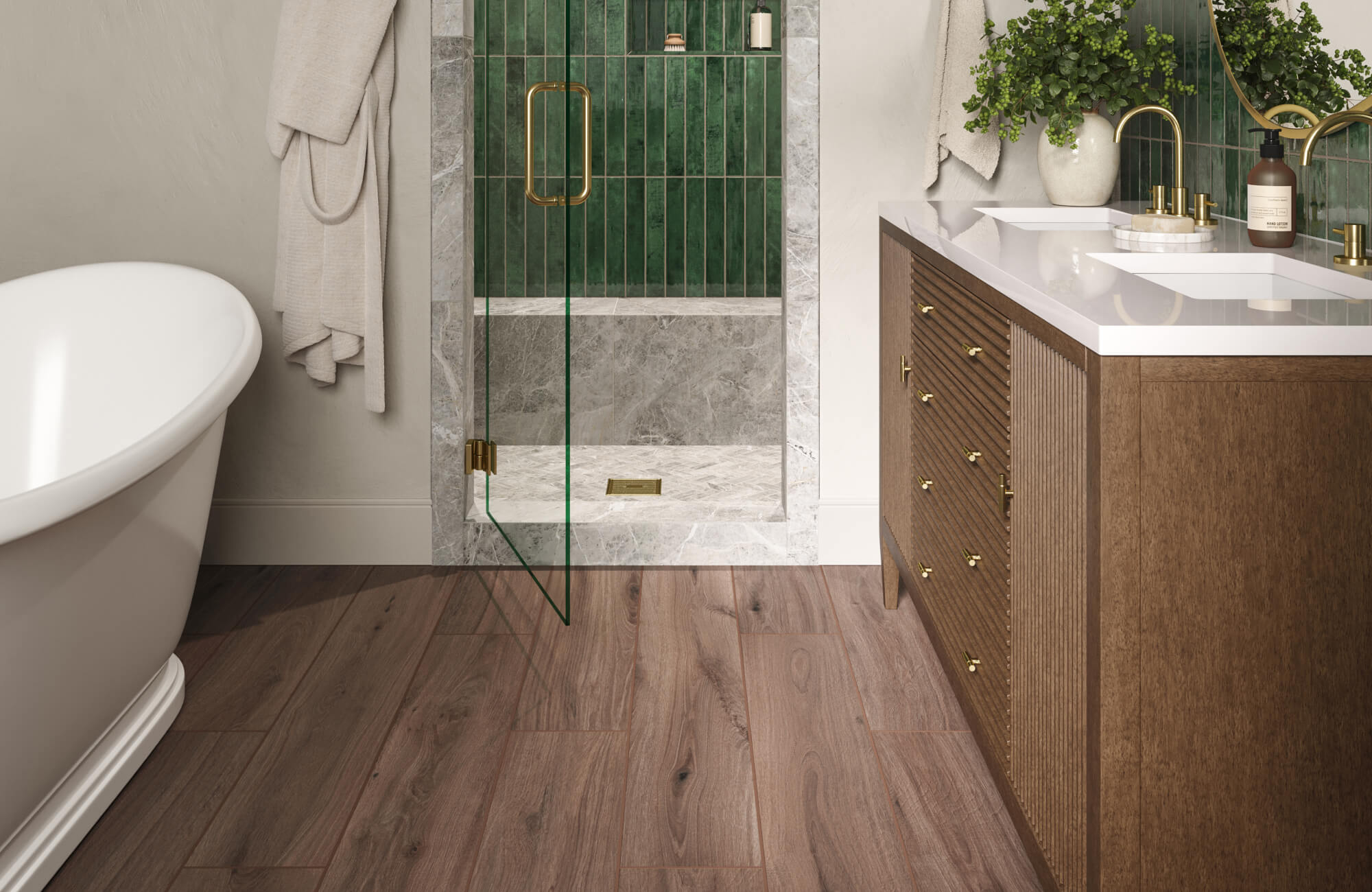
    A rustic farmhouse living room combines natural wood textures, neutral color palettes, and vintage-inspired furniture to create a warm, lived-in space. Common elements include shiplap walls, distressed furniture, cotton or linen textiles, and metal accents like black iron or galvanized steel.
    Stick around, because I’m also going to show you the mistakes people make when they try this style, plus a few budget breakdowns you won’t find anywhere else.

    What Makes a Living Room “Rustic Farmhouse” Anyway

    Okay so here’s the thing about farmhouse style. It’s not about buying everything from one store and calling it done. It’s really about mixing old and new. Think worn wood next to soft fabric. Think a metal light fixture hanging over a cozy cotton sofa. The whole point is comfort that looks a little imperfect, a little lived-in, like your grandma’s house but cleaner and less cluttered. I always tell people the goal is “cozy cabin meets clean modern home.” You want texture, warm colors, and furniture that looks like it has a story, even if you bought it last week at a furniture outlet.

    1. Start With a Shiplap Accent Wall

    Modern Shiplap Accent Walls: A Fresh Look for Any Interior
    Credit: Fancyhouse

    Shiplap is basically the poster child of farmhouse style, and for good reason. Those horizontal wood planks instantly add texture and make a room feel taller and cozier at the same time. You don’t need to cover every wall either. Pick one, usually behind the sofa or around the fireplace, and let it do the heavy lifting.

    Paint it white or a soft warm gray to keep things bright. If you want a moodier feel, try a deep charcoal.

    Practical tip: Use MDF shiplap boards instead of real wood. They’re cheaper, lighter, and way easier to install yourself over a weekend.

    This idea flexes well too. Coastal homes use whitewashed shiplap, while modern farmhouse spaces go for cleaner painted panels. Once your wall is set, it’s time to think about what sits in front of it.

    2. Choose a Distressed Wood Coffee Table

    51 Rustic Coffee Tables That Redefine Shabby Chic
    Credit: Home-designing

    Your coffee table is basically the anchor of the room, so don’t skip this one. A distressed or reclaimed wood table brings instant character. Look for pieces with visible wood grain, chunky legs, or even a slightly uneven top. That imperfection is the whole point.

    Pair it with a neutral rug underneath so the wood tones pop instead of getting lost.

    Practical tip: If you can’t find real reclaimed wood, look for “distressed finish” tables at big box furniture stores. They fake the aging process convincingly and cost way less.

    Traditional homes can use a darker stained version, while modern farmhouse spaces lean toward lighter, raw wood finishes. Now that your table is set, let’s talk about what goes around it.

    3. Pick a Cozy, Overstuffed Sofa in Neutral Fabric

    Couch Most Comfortable? 7 MOMU Sofas Worth Trying
    Credit: Momu

    Farmhouse style isn’t just about looks, it’s about comfort too. A deep, overstuffed sofa in a neutral color like cream, oatmeal, or soft gray gives you that “sink in and relax” feeling. Linen and cotton blends work best because they add texture without feeling too formal.

    Avoid slick leather or shiny fabrics here. They read more modern industrial than cozy farmhouse.

    Practical tip: Add a slipcover if you have kids or pets. It keeps the farmhouse look while letting you toss it in the wash when things get messy.

    This works in almost any home style honestly, since a comfy neutral sofa is basically a safe bet everywhere from coastal to traditional interiors.

    Sofa Fabric Comparison for Farmhouse Living Rooms

    Fabric TypeDurabilityFarmhouse Look RatingPrice Range
    Cotton/Linen BlendModerateHigh$$
    Performance FabricHighMedium-High$$$
    LeatherHighLow$$$$
    ChenilleModerateHigh$$
    VelvetLow-ModerateLow$$$

    4. Add Black Metal Accents for Contrast

    Stunning Black Accent Wall Ideas for Your Living Room |
    Credit: Fancyhouse

    Wood and fabric alone can feel a little flat after a while. That’s where black metal comes in. Think light fixtures, curtain rods, picture frames, or even a metal-framed mirror. This small touch adds contrast and keeps the room from feeling too soft or too country.

    I like using matte black instead of glossy. It feels more industrial-farmhouse and less “kitchen appliance.”

    Practical tip: Start small with drawer pulls or a lantern-style pendant light before committing to bigger pieces like a metal bookshelf.

    Modern farmhouse spaces lean heavier into black metal, while traditional farmhouse rooms use it sparingly, just enough to add depth without overpowering the wood tones.

    5. Layer a Chunky Knit Throw and Woven Pillows

    How To Style A Throw Blanket 10 Attractive Ways - StoneGable
    Credit: Stonegableblog

    Texture is everything in farmhouse design, and this is the easiest way to add it. Grab a chunky knit throw blanket, a couple woven jute pillows, and maybe a sheepskin or faux fur accent for the chair. These little layers make the whole room feel warmer instantly.

    Stick to a neutral color story here too. Cream, tan, soft gray, maybe a hint of sage green.

    Practical tip: Mix textures, not just colors. A smooth linen pillow next to a chunky knit throw creates visual interest without adding clutter.

    This idea travels well into boho and coastal spaces too, just swap the color palette slightly to match.

    6. Install a Reclaimed Wood Mantel

    How to Install a Reclaimed Wood Mantel - Plank and Pillow
    Credit: Fujidan

    If you’re lucky enough to have a fireplace, the mantel is prime real estate for farmhouse charm. A thick, reclaimed wood beam mantel instantly makes the space feel more custom and less builder-grade. Even a simple painted brick fireplace looks ten times better with a rough wood mantel on top.

    Keep the surrounding area simple. A few candles, a small plant, maybe one framed piece of art.

    Practical tip: If you’re renting, look for a floating shelf that mimics a mantel look without permanent installation.

    This idea works beautifully in traditional and cottage-style homes too, since a wood mantel feels timeless no matter what’s around it.

    7. Use a Vintage-Inspired Area Rug

    Raleigh, NC | Bell's Carpets & Floors
    Credit: Bellscarpets

    Rugs pull a whole room together, and farmhouse style loves a good vintage or Persian-inspired rug with faded, muted colors. It sounds like an odd pairing with all that rustic wood, but the worn-in pattern actually softens the room and adds a collected-over-time feel.

    Avoid anything too bold or brand new looking. You want it to feel like you found it at an estate sale, even if you bought it online.

    Practical tip: Size matters here. Your rug should extend at least a few inches beyond the front edge of your sofa so furniture doesn’t float on top of it awkwardly.

    Coastal and eclectic farmhouse spaces do great with this too, especially with a faded blue or terracotta color story.

    8. Build an Open Wood Shelving Display

    25 Ways to Work Open Shelves in Your Living Room | Houzz IE
    Credit: Houzz

    Skip the boxy entertainment center and go with open wood shelves instead. They’re great for displaying books, baskets, and a few decorative jars or vintage tins. It keeps the room feeling airy instead of boxed in by furniture.

    Style them with odd numbers of items, like three or five pieces per shelf, and vary the heights.

    Practical tip: Don’t overfill. Leave breathing room between items so the shelf doesn’t look cluttered.

    Modern farmhouse rooms keep these shelves minimal, while traditional versions layer on more collectibles and family photos.

    Budget Breakdown for a Full Rustic Farmhouse Living Room Refresh

    Budget TierTotal SpendWhat’s Included
    Starter$500-$1,000Paint, throw pillows, rug, small decor swaps
    Mid-Range$1,500-$3,000New sofa, coffee table, lighting, rug
    Full Remodel$4,000-$8,000+Shiplap wall, mantel upgrade, full furniture set, custom shelving

    9. Hang Vintage-Style Wall Art and Signs

    7 things to hang on walls that aren't prints | Homes and Gardens
    Credit: Homesandgardens

    Farmhouse walls love a little personality. Think black and white botanical prints, vintage-style advertisement signs, or simple wood-framed family photos. The key is keeping the frames simple and the imagery a little nostalgic.

    Avoid overly modern abstract art here, it clashes with the whole aesthetic.

    Practical tip: Create a gallery wall using mismatched frame sizes but keep the color palette consistent (black, wood tone, or white) so it still looks intentional.

    This idea shifts easily into cottage and traditional homes, just swap vintage signs for botanical prints or family heirloom pieces.

    10. Choose Wood or Wicker Accent Chairs

    Credit: Valyoufurniture

    Instead of matching everything to your sofa, add an accent chair in wood or wicker for contrast. A simple ladder-back wood chair or a woven wicker armchair adds texture and breaks up the “everything is soft and stuffed” feeling.

    Toss a cushion on it in a coordinating neutral fabric so it still feels comfortable, not stiff.

    Practical tip: Place it near a window if you can. Farmhouse style loves a little reading nook vibe.

    Coastal farmhouse rooms lean hard into wicker, while modern farmhouse spaces prefer clean-lined wood chairs instead.

    11. Add a Galvanized Metal or Wood Bucket Planter

    How to Upcycle a Galvanized Tub Into a Planter | HGTV
    Credit: Hgtv

    Plants soften up all that wood and metal, and a galvanized bucket or wood crate planter keeps it on theme. Fiddle leaf figs, eucalyptus branches, or even simple potted herbs work great here.

    Group a few different heights together near a window or beside the fireplace for a layered, natural look.

    Practical tip: Fake plants are totally fine here if you don’t have a green thumb. Just choose ones with matte, realistic-looking leaves instead of shiny plastic ones.

    This idea works in basically every style honestly, greenery softens modern, coastal, and traditional rooms equally well.

    12. Install Wood Beams on the Ceiling

    DIY WOOD BEAMS AND INSTALL WITH SHORTER CEILINGS - Grace Oaks Designs
    Credit: Graceoaksdesigns

    If you really want to go all in, exposed or faux wood beams on the ceiling completely transform a room. They add architectural interest and make the whole space feel more custom-built, even in a newer home.

    You don’t need real structural beams either. Lightweight faux wood beams look nearly identical and install way easier.

    Practical tip: Stain beams a shade darker than your floors for contrast, or match them for a more seamless look.

    This is a bigger commitment style-wise, but it fits beautifully into traditional, cottage, and modern farmhouse homes alike.

    13. Use Woven Baskets for Storage That Doubles as Decor

    Credit: Stonegableblog

    Farmhouse style is practical, and baskets are proof. Use large woven baskets to store blankets, magazines, or kids’ toys instead of hiding them in plastic bins. They look intentional sitting next to the sofa or tucked under a console table.

    Stick to natural fibers like seagrass, rattan, or jute for the most authentic texture.

    Practical tip: Buy a couple different sizes so you can nest smaller baskets inside larger ones when not in use.

    This idea works in coastal and boho spaces too, just swap in a lighter, bleached basket tone.

    14. Bring In a Barn Door or Sliding Wood Panel

    22 Barn Door Ideas for Every Room of Your Home
    Credit: Bhg

    If your living room connects to a hallway or another room, a sliding barn door adds instant farmhouse flair while saving space compared to a swinging door. Even a fake, decorative barn door mounted on the wall as an accent piece works if you don’t need functional doors.

    Choose a wood tone that complements your other furniture pieces for a cohesive feel.

    Practical tip: Add black iron hardware to tie it into your other metal accents around the room.

    This works especially well in modern farmhouse and industrial farmhouse spaces where clean lines meet rustic textures.

    Tips for Success

    • Start with your biggest piece first, usually the sofa, then build your color palette around it
    • Keep your color story to three or four tones max so the room doesn’t feel busy
    • Mix at least three textures in every room (wood, metal, woven fiber, soft fabric)
    • Shop secondhand stores for authentic distressed furniture at a fraction of retail cost
    • Don’t be afraid of empty space, farmhouse style breathes better when it’s not overcrowded
    • Layer lighting with a mix of overhead fixtures, lamps, and candles for warmth
    • Repeat one material (like black metal or reclaimed wood) throughout the room to tie everything together

    Common Mistakes and How to Avoid Them

    Overdoing the “signs and quotes” decor
    : Skip the cutesy wall signs and focus on textures and materials instead. One or two is plenty.

    Choosing furniture that’s too matchy
    : Mix wood tones and finishes slightly instead of buying an entire matching set from one store.

    Forgetting about lighting warmth
    : Use warm white bulbs (around 2700K to 3000K) instead of cool white, which can make farmhouse rooms feel sterile.

    Going too dark with the whole palette
    : Balance dark wood and black metal with plenty of white, cream, or light gray so the room doesn’t feel heavy.

    Skipping texture in favor of just color
    : Even a perfectly neutral room needs texture through rugs, throws, and woven baskets or it’ll feel flat.

    Cluttering every surface with decor
    : Leave breathing room on shelves and tables. Farmhouse style should feel calm, not crowded.

    Similar Variations

    • Modern Farmhouse: Cleaner lines, more black and white contrast, less clutter than traditional rustic style
    • Coastal Farmhouse: Lighter wood tones mixed with blues, whites, and woven natural textures
    • Industrial Farmhouse: Heavier use of black metal, exposed brick, and factory-style lighting
    • Cottage Farmhouse: Softer florals, pastel accents, and more vintage collectibles
    • Scandinavian Farmhouse: Minimalist furniture shapes with light wood and a monochrome palette
    • Southern Farmhouse: Warmer color tones, more traditional furniture shapes, and antique accents

    Putting together a rustic farmhouse living room really comes down to layering the right textures, sticking to a warm neutral palette, and not being afraid to mix old with new. You don’t need to buy everything at once either, this style actually looks better when it grows a little over time. Whether you start with a single shiplap wall or go all in on wood beams and a barn door, these 14 rustic farmhouse living room ideas give you a real, practical starting point for building a space that feels warm, welcoming, and totally your own.

  • 11 Christmas Living Room Ideas

    11 Christmas Living Room Ideas

    If you’re hunting for 11 Christmas living room ideas that actually work in real homes (not just magazine spreads), I’ve got you covered. I’ve spent way too many holiday seasons rearranging furniture and testing what makes a room feel festive without looking like a craft store exploded. This guide gives you the most practical, tested-in-real-life answer you’ll find on the topic.

    Christmas living room decor refers to the seasonal styling of your main living space using trees, lighting, textiles, and accent pieces that create a warm, festive atmosphere. The best approach balances a focal point (usually the tree), layered lighting, and coordinated colors without overcrowding the room.

    Stick around and I’ll walk you through twelve specific ideas, a few tables to help you plan colors and budgets, and the mistakes most people make when decorating their living room for the holidays.

    What Makes a Christmas Living Room Actually Work

    Here’s the thing about holiday decorating. Most people just start piling stuff on every surface until it looks “Christmassy enough.” But the living rooms that actually feel cozy and put-together follow a plan. They pick a color story. They think about where people will sit and walk. They layer lighting instead of just plugging in one string of lights and calling it done.

    I look at Christmas living room styling like this: your everyday decor is the bones, and the holiday stuff is just seasonal clothing on top. You don’t need to buy a whole new wardrobe. You need a few smart pieces that work with what you already have. That’s what these ideas are built around.

    1. Anchor the Room With a Tree That Fits the Space

    Standing Tree Bookshelf: A Freestanding Room Centerpiece
    Credit: Ashdeco

    Your tree is the star, so pick one that actually fits your room instead of the biggest one on the lot. A cramped tree jammed against furniture kills the cozy vibe fast. Measure your ceiling height and leave at least a foot of clearance above the tree topper.

    Go for a color scheme first, then choose ornaments and ribbon that match. Traditional homes look great with red, gold, and deep green. Modern spaces do well with monochrome white and silver.

    Practical tip: measure the width of your intended tree spot before shopping, not after.

    This idea adapts easily. Coastal homes might swap green for a flocked white tree. Farmhouse styles love a slightly asymmetrical, natural-looking tree with burlap accents.

    Once your tree is set, the next step is making sure the lighting around it doesn’t fight for attention.

    2. Layer Your Lighting Instead of Relying on One Source

    The Lighting Glow-Up: 17 Ways to Layer Light Like an Interior Designer
    Credit: Home-designing

    A single string of tree lights isn’t enough to make a room glow. I always tell people to think in layers: string lights on the tree, a few flameless candles on the mantel, and maybe a small lit garland on a shelf.

    Warm white bulbs feel cozier than cool white for most living rooms. Battery-operated candles are safer near curtains and rugs than real flames.

    Practical tip: put your string lights on a timer so you’re not fumbling with switches every evening.

    Modern homes tend to prefer clean, single-tone lighting. Traditional and rustic spaces layer warm ambers with a bit of flicker for extra charm.

    Once the lighting layers are in place, it’s time to think about what goes above your fireplace or main wall.

    3. Dress Up the Mantel as a Focal Point

    70 Mantel Decor Ideas That Make Your Fireplace a Focal Point
    Credit: Bhg

    If you have a fireplace, the mantel is basically begging to be decorated. A garland draped along the top, paired with a few pillar candles and some pinecones, instantly makes the room feel finished.

    Keep height variation in mind. Mix tall candlesticks with shorter ornaments so the eye moves around instead of staring at one flat line.

    Practical tip: use garland with built-in wire stems so it holds its shape instead of drooping.

    Coastal living rooms might swap pinecones for dried starfish or driftwood. Traditional spaces lean into velvet ribbon and gold accents.

    With your mantel handled, let’s talk about the couch and chairs, because textiles make a bigger difference than most people expect.

    4. Swap in Seasonal Throw Pillows and Blankets

    Ways to Use Throws and Pillows Around the House | Crane Home
    Credit: Crane-home

    This is the easiest, cheapest way to make a living room feel like Christmas without touching a single wall. Swap your regular pillow covers for plaid, knit, or velvet ones in deep red, forest green, or icy blue.

    Add a chunky knit throw blanket over the arm of the couch. It looks intentional and gives guests something cozy to grab.

    Practical tip: buy pillow covers, not whole new pillows. It’s cheaper and easier to store after the holidays.

    Modern homes look sharp with solid-color pillows in just two tones. Farmhouse and traditional rooms can mix plaid, buffalo check, and cable knit textures together.

    Once your soft textiles are updated, your coffee table is the next spot that needs a little love.

    5. Style the Coffee Table With a Seasonal Centerpiece

    Coffee Table Decor For Fall | A Blissful Nest
    Credit: Ablissfulnest

    An empty coffee table looks unfinished during the holidays. A simple centerpiece, like a wooden tray with candles, mini ornaments, and a few sprigs of greenery, pulls the whole look together.

    Keep it low profile so it doesn’t block sightlines to the TV or fireplace. Height matters here more than people think.

    Practical tip: use a tray to corral small items so the table doesn’t look cluttered when you need to set down drinks or snacks.

    Boho living rooms might add dried oranges and cinnamon sticks. Minimalist spaces do well with just three or four matte ornaments and a single candle.

    Speaking of scent, let’s talk about how smell plays into your Christmas living room too.

    6. Bring in Seasonal Scent Without Overdoing It

    How to Get Your Home Smelling Good Without It Being Overwhelming | Apartment Therapy
    Credit: Apartmenttherapy

    A living room isn’t just about looks. Smell matters too. A candle with notes of pine, cinnamon, or clove instantly makes a room feel festive the second someone walks in.

    Don’t burn five different scented candles at once though. Pick one signature scent for the whole room so things don’t clash.

    Practical tip: place your scented candle near the entryway to the room, not buried on a back shelf, so the scent greets people first.

    Every style works with this one. Just match the scent to your vibe: fresh pine for rustic homes, spiced vanilla for cozy traditional spaces.

    Next up, let’s get your windows in on the holiday spirit too.

    7. Frame Your Windows With Simple Garland or Lights

    45 Christmas Window Decorations That Will Outshine the View
    Credit: Elledecor

    Bare windows feel like a missed opportunity during Christmas. A simple garland draped across the top of the window frame, or a string of icicle lights along the edge, adds festive charm without blocking your view.

    Keep it simple. You don’t need bows and ornaments hanging everywhere. A clean garland line is often more elegant than an overloaded one.

    Practical tip: use clear adhesive hooks instead of nails so you don’t damage window trim.

    Modern rooms look best with just a thin line of warm lights. Traditional homes can add a bow or two at the corners for extra flair.

    Now let’s zoom out and think about the color palette tying your whole room together.

    H3: Christmas Color Palette Combinations by Style

    StylePrimary ColorsAccent ColorsBest For
    TraditionalRed, GreenGoldClassic family rooms
    ModernWhite, SilverBlackMinimalist apartments
    FarmhouseCream, Burlap TanRed plaidRustic cabins
    CoastalWhite, Sea BlueDriftwood brownBeach houses
    BohoTerracotta, CreamDried orangeEclectic spaces
    ScandinavianWhite, Light WoodSoft pinkCozy minimalist rooms

    Picking a palette from this table before you shop will save you from buying random decor that doesn’t match anything else in the room.

    8. Add a Cozy Rug Layer for Ground-Level Warmth

    A Beginner's Guide to Layering Rugs for a Cozy Look
    Credit: Home-designing

    Rugs don’t get enough credit in holiday decorating conversations. A seasonal rug, or even just a plaid throw rug layered over your existing one, adds warmth right at foot level where people notice it most.

    This works especially well in front of the fireplace or under the coffee table, where people naturally gather.

    Practical tip: choose a rug in a darker tone if you have kids or pets, since spills are basically guaranteed during the holidays.

    Coastal rooms can use a jute rug with subtle red accents. Modern spaces might stick with a simple geometric pattern in muted winter tones.

    Let’s move from the floor up to something people often forget: the walls beyond the mantel.

    9. Hang a Christmas-Themed Wall Art Swap

    30 Christmas Wall Decor Ideas to Spruce Up Your Space
    Credit: Bhg

    Swapping your regular wall art for something seasonal is an underrated trick. A framed print of a snowy scene, a simple “Joy” sign, or even a wreath hung on the wall instead of the door adds festive charm fast.

    This doesn’t require permanent changes. Lean pieces against the wall or use the same nail with a seasonal frame insert.

    Practical tip: keep seasonal art at eye level from a seated position on the couch, since that’s the angle people see it most.

    Traditional homes love ornate framed prints. Modern spaces might just hang a single oversized ornament as wall art instead.

    Next, let’s talk about a detail that ties the whole tree area together: the tree skirt and base.

    10. Choose a Tree Skirt That Matches Your Room’s Palette

    The Best Tree Skirts Don't Look Like a Tacky Christmas Sweater
    Credit: Domino

    The base of your tree is often an afterthought, but a good tree skirt finishes the whole look. Match it to your color palette instead of grabbing whatever’s cheapest at the store.

    A chunky knit skirt feels cozy in farmhouse and traditional rooms. A simple metallic or velvet one suits modern spaces better.

    Practical tip: measure your tree stand’s width before buying, since skirts come in different diameters and a too-small one looks awkward.

    This small detail matters more than people expect, especially in open living rooms where the tree base is visible from multiple angles.

    Now let’s talk furniture arrangement, because where you put your seating changes everything.

    11. Rearrange Seating to Create a Gathering Circle

    Living Room's Chairs Arrangement That Make The Most Out Of Your Space – COZY Living
    Credit: Cozyliving

    During the holidays, people gather more than usual. If your furniture is arranged for TV watching only, it might not work for conversation and game nights.

    Pull chairs and the couch into more of a circle or U-shape around the coffee table or fireplace. This small shift makes the room feel more social instantly.

    Practical tip: leave at least 30 inches of walking space between furniture pieces so guests can move around comfortably.

    Open-concept modern homes benefit most from this since there’s usually more floor space to work with. Smaller traditional living rooms may need to temporarily remove a side table to make room.

    Finally, let’s cover one more idea that pulls double duty: functional and festive.

    H3: Holiday Decor Budget Tiers

    Budget TierTotal SpendWhat You Can Get
    Low$50-$100Pillow covers, one garland, battery candles
    Mid$150-$300Small tree, lights, mantel decor, throw blanket
    High$400-$700Full-size tree, curated ornaments, new rug layer
    Luxury$800+Designer tree, professional lighting install, custom textiles

    Knowing your tier before you start shopping keeps you from overspending on one area and running out of budget for the rest of the room.

    Tips for Success

    • Start with your color palette before buying a single decoration, so nothing clashes later.
    • Decorate in layers: big pieces first (tree, garland), then mid-size (pillows, rugs), then small details (candles, ornaments).
    • Take a photo of your finished room and look at it on your phone screen. Flaws show up faster in photos than in person.
    • Don’t decorate every single surface. Leave a few open spots so the eye has somewhere to rest.
    • Buy a few extra ornaments and light strands each year instead of everything at once. It spreads out the cost.
    • Test all lights before hanging them. Nothing’s worse than climbing down to swap a dead strand.
    • Store decorations by room, not by type, so next year’s setup takes half the time.

    Common Mistakes and How to Avoid Them

    Overcrowding every surface
    : Pick two or three focal points, like the tree and mantel, and let other areas stay simple.

    Mixing too many color palettes
    : Stick to one primary palette with one or two accent colors across the whole room.

    Ignoring furniture flow
    : Walk through the room after decorating to check that pathways stay clear for guests.

    Using only cool white lights
    : Warm white tones generally feel cozier and more festive in living rooms.

    Forgetting to measure the tree spot
    : Always measure width and height clearance before buying or cutting your tree.

    Skipping a lighting timer
    : Set timers so lights turn on automatically in the evening without you remembering.

    Similar Variations

    • Scandinavian Christmas: Focuses on white, light wood, and minimal ornaments for a clean, cozy look.
    • Farmhouse Christmas: Uses burlap, plaid, and natural greenery for a rustic, welcoming feel.
    • Coastal Christmas: Swaps traditional reds for whites and blues with driftwood and shell accents.
    • Glam Christmas: Leans into metallics, velvet, and mirrored ornaments for a dressed-up look.
    • Boho Christmas: Mixes warm terracotta tones with dried florals and natural textures.
    • Vintage Christmas: Uses antique ornaments, muted colors, and classic string lights for a nostalgic feel.

    At the end of the day, a great holiday living room doesn’t need to be complicated. Pick a color palette, layer your lighting, and focus on a few key spots like the tree, mantel, and coffee table. Small swaps like pillows and a tree skirt go a long way too. If you take just a few of these 11 Christmas living room ideas and apply them this season, your space will feel warm, festive, and totally yours.

  • 10 Nancy Meyers Living Room Ideas That’ll Make Your Space Feel Like a Movie Set

    10 Nancy Meyers Living Room Ideas That’ll Make Your Space Feel Like a Movie Set

    If you’ve ever paused a Nora Ephron or Nancy Meyers film just to stare at the living room instead of watching the actors, you’re in the right place. This guide on 10 Nancy Meyers living room ideas is built to give you the most accurate, complete rundown you’ll find anywhere, straight from someone who has spent way too many hours studying these movie sets.

    A Nancy Meyers living room is a design style inspired by film sets from movies like “The Holiday” and “Something’s Gotta Give.” It features neutral tones, layered textures, built-in bookshelves, oversized sofas, and soft natural light for a warm, lived-in elegance.

    Stick around, because I’m about to break down exactly how to steal this look room by room, piece by piece, without needing a Hollywood budget.

    What Exactly Is the Nancy Meyers Living Room Look?

    Okay, so let’s talk about why this style even has a name. Nancy Meyers directs movies where the houses are basically co-stars. Think creamy sofas, stacks of books, fresh flowers, and light pouring through big windows. It’s not flashy or trendy. It’s comfortable, grown-up, and warm.

    The whole vibe feels like a home that’s been lived in for decades by someone who reads a lot and loves to cook. Nothing matches perfectly, but everything feels right. That’s the magic of it. It’s less about following strict rules and more about layering things that feel personal, cozy, and quietly expensive.

    Start With a Neutral, Layered Color Palette

    15 Best Living Room Color Schemes Designers Swear By
    Credit: Decorillla

    The backbone of any Nancy Meyers living room is color, or really, the lack of loud color. Think creams, warm whites, soft taupes, and buttery beiges. These shades bounce light around the room and make everything feel calm.

    Don’t go flat though. Layer at least three shades of neutral so the room has depth instead of looking washed out. Mix a linen sofa with a slightly darker wood coffee table and a lighter rug underneath.

    Practical tip: paint your walls in a warm white like Benjamin Moore’s “White Dove,” then build furniture and textiles a shade or two darker.

    This palette works in modern farmhouse spaces, coastal homes, and traditional interiors alike since neutrals never clash. Once your base color story is set, it’s time to think about the furniture that’ll sit on top of it.

    Choose an Oversized, Slipcovered Sofa

    30 Sofas Made for Hours of Lounging | HGTV
    Credit: HGTV

    Every Nancy Meyers living room has that one sofa you want to disappear into. It’s usually big, a little slouchy, and covered in a washable slipcover instead of stiff upholstery. This isn’t about looking perfect. It’s about looking like real people actually sit there.

    Go for a sofa with deep seats and soft rolled arms. Skip anything with sharp, modern lines. A slipcover in linen or cotton canvas gives you that relaxed, “I’ve had this forever” feeling.

    Actionable tip: size your sofa so there’s at least three feet of walking space around it. Cramped rooms kill the cozy factor fast.

    In a coastal home, add a blue and white striped throw. In a traditional space, keep the slipcover solid cream. Once your seating anchor is in place, you’ll want a rug that ties it all together.

    Layer a Natural Fiber Rug Underneath Everything

    A Beginner's Guide to Layering Rugs for a Cozy Look
    Credit: Home-designing

    Rugs in these movie living rooms are almost never bold or patterned. They’re usually jute, sisal, or a soft wool in a neutral tone. The texture matters more than the color here.

    A natural fiber rug adds warmth without competing with anything else in the room. It also grounds the furniture so the space doesn’t feel like it’s floating.

    Tip: layer a smaller vintage-style rug on top of a bigger jute one for extra texture and visual interest. This trick alone can make a plain room feel curated.

    For modern spaces, keep the rug flat and simple. For traditional rooms, an oriental-style layered rug adds a bit more pattern without breaking the neutral rule. With your foundation set, let’s talk about the furniture piece that really makes this style sing: the coffee table.

    Pick a Coffee Table With Character, Not Just Function

    Styling An Updated Looking Coffee Table In 5 Easy Steps - StoneGable
    Credit: Stonegableblog

    The coffee table in a Nancy Meyers living room isn’t some flat-pack box. It’s usually wood, sometimes a little worn, and often has a story behind it, even if that story is made up.

    Look for round or oval shapes over sharp rectangles. A weathered wood finish or a vintage trunk-style table works beautifully here. Stack a few big art books on top and add a small tray with candles.

    Practical tip: choose a table lower than your sofa cushions so knees have room and the room feels open.

    This idea flexes well across styles. Farmhouse homes can use a reclaimed wood table, while modern spaces might choose a simple round table in a matte black or walnut finish. Now that the center of the room is handled, let’s build up the walls.

    Add Built-In Bookshelves or a Statement Bookcase

    31 Built-In Bookshelf Ideas for Every Room in Your Home
    Credit: Bhg

    If there’s one thing that screams “Nancy Meyers” the loudest, it’s a wall of books. Built-ins are the dream, but even a large freestanding bookcase gets the job done.

    Fill it with a mix of hardcover books, small plants, and a few framed photos. Avoid lining everything up perfectly. Let some books lean, stack others horizontally, and leave a little breathing room.

    Tip: group items in odd numbers, like threes and fives, for a more natural look.

    Traditional homes can go for dark wood built-ins with glass doors. Modern spaces can use open white shelving instead. Once your shelves are styled, the next step is bringing in soft, ambient lighting to match the mood.

    Lighting Style Comparison for a Nancy Meyers Living Room

    Lighting TypeBest UseWarmth LevelApprox. Cost Range
    Table Lamps (linen shade)Side tables, bookshelvesHigh$60-$180
    Floor Lamps (brass or wood base)Reading nook, cornersHigh$100-$300
    Picture LightsAbove framed artMedium$50-$150
    Recessed Ceiling Lights (dimmable)General room lightingLow-Medium$150-$400 installed
    Candles/LanternsCoffee table, mantelHigh$10-$50

    Use Warm, Layered Lighting Instead of Overhead Lights

    The Lighting Glow-Up: 17 Ways to Layer Light Like an Interior Designer
    Credit: Home-designing

    Nancy Meyers rooms are never lit by one harsh overhead light. They’re lit by lamps, candles, and sunlight streaming through big windows. This layered lighting is what gives the space its soft, golden glow.

    Add at least two table lamps and one floor lamp to any living room this size. Use warm bulbs, around 2700K, instead of cool white ones.

    Tip: put your lamps on a dimmer or use smart bulbs so you can adjust brightness depending on the time of day.

    Coastal homes can use rattan-shaded lamps for texture. Traditional spaces do well with brass lamp bases. Now that lighting is sorted, let’s talk about how to bring some green life into the space.

    Bring in Fresh Flowers and Real Greenery

    How To Decorate With Flowers And Greens In Every Room Of Your Home - StoneGable
    Credit: Stonegableblog

    You’ll almost never see fake plants in these movie living rooms. Fresh flowers, herb pots, or a big leafy plant in the corner are non-negotiable.

    A simple vase of white hydrangeas or peonies on the coffee table instantly upgrades the whole room. Even a small pot of rosemary on a side table adds that lived-in, cared-for feeling.

    Practical tip: keep a standing order for fresh flowers every week or two, even if it’s just from the grocery store. Consistency matters more than fancy florals.

    Modern homes can stick to single-stem arrangements in simple glass vases. Traditional homes can go bigger with mixed garden-style bouquets. Once the greenery is in, it’s time to think about how your window treatments frame all this natural light.

    Frame Windows With Simple, Flowing Curtains

    65 Window Treatment Ideas to Accentuate Your Space in 2026
    Credit: Elledecor

    Big windows are basically a requirement in this style, but if you don’t have them, curtains can help fake it. Go for long linen panels that puddle slightly on the floor. Avoid heavy patterns or dark blackout fabric.

    The goal is to let in as much light as possible while softening the hard edges of the window frame.

    Tip: hang curtain rods a few inches above the window frame and wider than the window itself. This makes ceilings look taller and windows look bigger.

    Coastal spaces can use sheer white linen for a breezy feel. Traditional rooms might add a subtle stripe or textured weave. With your windows framed, let’s move to the walls themselves.

    Choose Textured Walls Over Flat Paint

    The Texture Room: 19 Ways to Make Your Walls Do the Heavy Lifting
    Credit: Home-designing

    A lot of these movie living rooms have walls with a little something extra, whether it’s wood paneling, wainscoting, or a subtle plaster finish. Flat drywall alone can feel a little cold for this style.

    If a full renovation isn’t in the budget, picture frame molding or a beadboard accent wall can fake the look for way less money.

    Tip: paint any wall trim the same color as the wall itself for a soft, monochromatic look instead of stark white trim against colored walls.

    Modern homes can use subtle Venetian plaster. Traditional homes can go full wainscoting. Once your walls have some texture, it’s time to bring in furniture layers that add even more personality.

    Mix in Vintage and Antique Furniture Pieces

    7 Tips for Mixing Modern and Antique Furniture | DOMO
    Credit: Domo

    Nothing in these rooms looks brand new, and that’s the point. A few vintage or antique pieces, like an old wooden side table or a weathered leather armchair, give the room a sense of history.

    You don’t need real antiques. Thrift stores, estate sales, and even marketplace apps have plenty of options that’ll work just fine.

    Practical tip: mix one or two vintage pieces per room instead of overdoing it. Too many can start to feel like a museum instead of a home.

    Farmhouse and traditional homes can lean heavier into antiques. Modern spaces should use just one vintage accent piece to avoid clashing. Speaking of accents, let’s talk about how throw pillows and blankets pull everything together.

    Budget Breakdown by Room Size

    Room SizeBasic Refresh (paint, textiles, lighting)Mid-Range Update (add furniture pieces)Full Room Overhaul (furniture + built-ins)
    Small (under 150 sq ft)$500-$1,200$2,000-$4,000$6,000-$10,000
    Medium (150-300 sq ft)$800-$1,800$3,500-$6,500$9,000-$16,000
    Large (300+ sq ft)$1,200-$2,500$5,000-$9,000$14,000-$25,000

    Tips for Success

    • Buy fewer, better pieces instead of filling every corner with cheap decor.
    • Stick to a limited color palette across the whole room, even the small stuff like candles and vases.
    • Shop secondhand for at least one or two statement pieces to save money and add character.
    • Keep surfaces a little imperfect. A stack of books left open or a slightly wrinkled throw looks more real.
    • Let natural light lead your lighting choices, and only add lamps to fill in the gaps.
    • Rotate seasonal decor instead of buying new furniture every year.
    • Test paint colors in different light before committing to a full wall.

    Common Mistakes and How to Avoid Them

    Overdoing matching furniture sets
    : Skip buying a full living room set from one store. Mix pieces from different sources for a more natural look.

    Using cool-toned white bulbs
    : Swap them for warm bulbs around 2700K so the room feels golden instead of clinical.

    Choosing a rug that’s too small
    : Size up so the rug fits under the front legs of your main furniture pieces at minimum.

    Skipping texture in favor of flat paint
    : Add trim, paneling, or textured fabrics to avoid a flat, builder-grade look.

    Forgetting fresh elements like flowers or plants
    : Keep at least one living plant or a small vase of flowers in the room at all times.

    Placing furniture only for TV viewing
    : Rearrange seating into a conversational layout, and hide the TV when possible.

    Similar Variations

    • Coastal Grandmother – similar neutral palette but with more blue accents and beachy textures.
    • Modern Farmhouse – trades soft antiques for cleaner lines and more black and white contrast.
    • Old Money Aesthetic – leans more formal with tailored furniture and richer wood tones.
    • French Country Living Room – adds more pattern and ornate details while keeping the warm, lived-in feel.
    • Quiet Luxury Interior – similar restraint in color but with higher-end materials and fewer decorative pieces.

    At the end of the day, this style isn’t about copying a movie set exactly. It’s about borrowing the feeling those rooms give you: warm, calm, and a little bit magical. Layer your neutrals, invest in a comfy sofa, add real books and real flowers, and let the light do the rest.

    Once you start mixing these pieces together, you’ll notice your space feels less like a showroom and more like somewhere you actually want to curl up with a cup of tea. That’s really the whole point behind every one of these 10 Nancy Meyers living room ideas.

  • 11 Bathroom Wallpaper Ideas

    11 Bathroom Wallpaper Ideas

    If you’ve been searching for 11 bathroom wallpaper ideas that actually work in a small, steamy space, you’ve landed in the right spot. I’ve spent way too many hours scrolling through design boards and testing what holds up in real bathrooms, not just pretty showroom photos. So let me save you the guesswork and walk you through what actually looks good and lasts.

    Bathroom wallpaper is a decorative wall covering designed to add pattern, color, or texture to bathroom walls. The best options are moisture-resistant, vinyl-coated, or specifically labeled for high-humidity rooms, and they typically hold up for 5 to 10 years with proper installation and ventilation.

    Stick around, because I’m about to show you exactly which patterns, colors, and materials turn a boring bathroom into the best room in the house.

    What Makes Bathroom Wallpaper Different From Regular Wallpaper

    Here’s the thing nobody tells you at the store. Not all wallpaper can handle a bathroom. Steam, splashes, and humidity will straight up destroy regular paper-based wallpaper within months. It’ll bubble, peel, and grow mold faster than you’d think.

    That’s why bathroom wallpaper needs to be vinyl, vinyl-coated, or treated with a moisture-resistant finish. Some brands even sell “bathroom safe” lines specifically for this reason. I always tell people to check the label before falling in love with a pattern.

    The good news? Once you know what to look for, the design options are honestly endless. You can go bold, subtle, textured, or even trick the eye with faux finishes. Let’s get into the ideas that actually work.

    1. Botanical Prints for a Fresh, Spa-Like Feel

    Stylish and Affordable Spa Bathroom Ideas | Wallsauce EU
    Credit: WallSauce

    Leafy greens and tropical plants make a bathroom feel like a little escape. I love this look because it brings the outdoors in without needing actual plants that might die from lack of light. Pick a botanical print in deep green, soft sage, or even navy for more drama.

    Pair it with white fixtures and natural wood accents like a teak stool or bamboo shelf. A woven basket for towels finishes the vibe perfectly.

    Practical tip: use a semi-gloss or vinyl-coated version so steam doesn’t warp the leaves’ fine detail lines.

    This style adapts beautifully to coastal, modern organic, and even traditional homes depending on the color palette you choose. Next up, let’s talk about a pattern that never really goes out of style.

    2. Classic Stripes for a Timeless, Tailored Look

    Stripe tile layouts are trending, but would you commit to the look? | Homes  and Gardens
    Credit: Homes And Garden

    Stripes are one of those patterns that just work everywhere. Vertical stripes make low ceilings feel taller. Horizontal stripes make narrow bathrooms feel wider. It’s basically a design cheat code.

    Go with a soft two-tone combo like navy and cream, or keep it monochrome with varying shades of gray. Add brass or matte black fixtures to give it a polished, tailored feel.

    Quick tip: measure your ceiling height before choosing stripe width. Thinner stripes elongate small spaces better than wide ones.

    This idea fits traditional, coastal, and even modern farmhouse bathrooms without much tweaking. Now let’s move into something with a little more texture.

    3. Grasscloth Texture for Natural, Earthy Warmth

    Classic Stripe Wallpaper in Elegant Linear Design
    Credit: Giffywalls

    Grasscloth wallpaper adds texture without adding busy patterns. It’s woven from natural fibers, so it brings warmth and depth to a bathroom that feels too sterile or cold. I especially love this in powder rooms that don’t get heavy moisture exposure.

    Pair it with warm wood vanities, stone countertops, and soft linen curtains if you have a window. Stick to earthy tones like tan, oatmeal, or warm gray.

    Practical tip: grasscloth isn’t fully waterproof, so save it for half-baths or areas away from the shower and tub splash zone.

    This texture works especially well in organic modern, Japandi, and coastal-inspired bathrooms. Speaking of texture, let’s talk about a bolder option next.

    4. Bold Florals for a Statement-Making Powder Room

    23 Whimsical Powder Rooms - Powder Room Design Ideas
    Credit: Elle Decor

    Small bathrooms are the perfect place to go big with pattern. Nobody’s living in there full-time, so why not make a statement? Oversized florals in rich jewel tones like emerald, burgundy, or deep blue turn a plain powder room into a conversation piece.

    Balance the boldness with simple white fixtures and minimal decor. You don’t need much else once the wallpaper is doing the heavy lifting.

    Practical tip: test a sample swatch under your bathroom’s lighting before committing. Florals can look totally different under warm versus cool bulbs.

    This idea shines in traditional, grandmillennial, and eclectic homes. Now let’s compare a few wallpaper material options so you know exactly what you’re working with.

    Wallpaper Material Comparison

    Material TypeMoisture ResistanceBest Bathroom UseAverage Lifespan
    Vinyl-coated paperHighFull bathrooms, near showers8-10 years
    Solid vinylVery HighHigh-humidity, kids’ bathrooms10-15 years
    GrassclothLowPowder rooms only3-5 years
    Peel-and-stick vinylModerate to HighRentals, temporary updates2-4 years
    Foil wallpaperModerateAccent walls, low splash areas5-7 years

    5. Geometric Patterns for a Modern, Graphic Edge

    7 Geometric Wallpaper Patterns and How to Design Your Own
    Credit: Wallanza

    If florals aren’t your thing, geometric prints bring the same visual punch with cleaner lines. Think hexagons, chevrons, or abstract shapes in high-contrast colors like black and white or navy and gold.

    This works great in modern or contemporary bathrooms where you want personality without softness. Pair it with matte black fixtures and simple, unadorned mirrors so the pattern stays the star.

    Practical tip: geometric patterns show seams easily, so hire a pro installer or take extra care matching pattern repeats yourself.

    It also works surprisingly well in art deco and mid-century modern spaces. Now let’s slow things down with a softer, more soothing option.

    6. Watercolor Washes for a Soft, Dreamy Vibe

    40 Bathroom Wallpaper Ideas to Add Pretty Color and Pattern
    Credit: Country Design Megazine

    Watercolor-style wallpaper gives you color and movement without hard lines or repeating patterns. It feels artistic and calm, almost like the walls are painted by hand. Soft blues, blush pinks, and muted greens work especially well here.

    Pair this with brushed nickel or gold fixtures and simple white subway tile on the lower half of the wall if you want extra moisture protection.

    Practical tip: use wainscoting or tile up to 36 inches, then apply wallpaper above that line to protect against splashes.

    This idea fits shabby chic, coastal, and modern romantic bathroom styles. Next, let’s look at a trend that’s taken over small bathrooms everywhere.

    7. Metallic Accents for Glamorous Shine

    15 Chic Gold Wallpapers - Best Ideas for Metallic Gold Wallpaper
    Credit: Elle Decor

    A little shimmer goes a long way in a bathroom. Metallic wallpaper, whether it’s gold, copper, or silver-toned, reflects light beautifully, which is great news for windowless bathrooms that need a boost.

    Use it as a full wall treatment or just on one accent wall behind the vanity. Pair with glass fixtures, a statement mirror, and warm-toned lighting to really let the shine pop.

    Practical tip: metallic finishes show fingerprints and water spots more than matte options, so wipe walls down regularly near sinks.

    This look feels right at home in glam, art deco, and modern luxury bathrooms. Now let’s talk about bringing the whole ceiling into the design.

    8. Wallpapered Ceilings for Unexpected Drama

    Ceiling wallpaper ideas: 10 ways to wow with wallpaper | Homes and Gardens
    Credit: Homes And Gardens

    Most people forget the ceiling exists when decorating. Big mistake. Wallpapering the ceiling, especially with a fun pattern or color, adds a surprise element that makes guests look up and go “whoa.”

    This works especially well in powder rooms with lower humidity. Try a small-scale print or solid color that complements your wall treatment below.

    Practical tip: hire a professional for ceiling installation. It’s trickier than wall application and mistakes are way more visible overhead.

    This idea works in traditional, eclectic, and maximalist bathroom styles. Let’s shift now to a budget-friendly option that’s beginner-approved.

    9. Peel-and-Stick Wallpaper for Renters and Beginners

    Peel and Stick Wallpaper Ideas for Powder Rooms – CostaCover
    Credit: Costa Cover

    Not ready to commit to a permanent wallpaper install? Peel-and-stick is your best friend. It’s removable, affordable, and easy enough to install on a Saturday afternoon without professional help.

    Choose a pattern you love since swapping it out is low-stress if you change your mind later. Great for renters, first-time DIYers, or anyone testing a bold look before committing long-term.

    Practical tip: clean and dry your walls completely before applying, and avoid installing on textured or freshly painted walls (wait at least 3-4 weeks after painting).

    This option works across literally every design style since patterns vary so widely. Now let’s talk budget more directly.

    Budget Tiers for Bathroom Wallpaper Projects

    Budget TierPrice Range (per roll)What You GetBest For
    Budget$15-$40Peel-and-stick, basic patternsRenters, small powder rooms
    Mid-range$40-$90Vinyl-coated, designer patternsMost full bathrooms
    Premium$90-$200+Grasscloth, hand-printed, metallicStatement walls, luxury homes
    Custom/Designer$200-$500+Made-to-order, exclusive printsHigh-end renovations

    10. Toile Patterns for Classic, Storybook Charm

    10 Best Toile Wallpaper Ideas - Gorgeous Toile Wallpaper Inspiration
    Credit: Elle Decor

    Toile wallpaper features detailed scenic illustrations, often in a single color against a cream or white background. It’s old-school in the best way and adds serious character to traditional or cottage-style bathrooms.

    Stick with classic color combos like navy and white or red and cream. Pair with vintage-style fixtures, a pedestal sink, and simple white trim to let the pattern breathe.

    Practical tip: toile works best in bathrooms with good natural light since the fine details can get lost in dim spaces.

    This style is a natural fit for French country, cottagecore, and traditional homes. Let’s move on to something a little more playful.

    11. Playful Prints for Kids’ Bathrooms

    33 Trendy Bathroom Wallpaper Ideas to Elevate Your Space | Bored Panda
    Credit: Bored Panda

    Kids’ bathrooms don’t need to follow grown-up design rules. Bright colors, fun characters, or whimsical patterns like clouds, animals, or rainbows make bath time way more fun for little ones.

    Choose washable, scrubbable wallpaper since kids’ bathrooms see more splashing and mess than any other room. Add colorful towels and simple, kid-friendly hardware to complete the look.

    Practical tip: install wallpaper only on the upper half of walls and use beadboard or tile below for easier cleanup.

    This idea flexes easily from whimsical and eclectic to modern minimalist, depending on the print you pick. Now, one more idea before we wrap up the list.

    Tips for Success

    • Always buy 10-15% extra wallpaper to account for pattern matching and mistakes during installation.
    • Test a sample in your actual bathroom lighting before ordering full rolls, since lighting changes color perception dramatically.
    • Prime your walls first, especially if they’ve never been wallpapered before, for better adhesion.
    • Install an exhaust fan if you don’t already have one. It protects your wallpaper investment by reducing trapped moisture.
    • Avoid wallpapering directly around shower stalls or tub surrounds unless the product is specifically rated for constant water exposure.
    • Keep leftover wallpaper scraps for future repairs in case of small damage down the road.
    • Hire a professional installer for large patterns or expensive materials since mistakes can get costly fast.

    Common Mistakes and How to Avoid Them

    Skipping the moisture rating check
    : Always confirm the wallpaper is vinyl or vinyl-coated before buying anything for a full bathroom.

    Ignoring ventilation
    : Run your exhaust fan during and after showers, and consider adding one if your bathroom doesn’t have proper airflow.

    Choosing pattern size without measuring the room
    : Small bathrooms need smaller-scale patterns, while larger rooms can handle bigger, bolder prints.

    Wallpapering wet areas directly
    : Keep wallpaper away from direct water contact zones like inside shower stalls unless it’s specifically rated for that use.

    Rushing the installation
    : Take time to smooth out air bubbles and match seams carefully. Rushed jobs show every flaw within weeks.

    Forgetting about long-term maintenance
    : Wipe down wallpaper regularly, especially near sinks and mirrors, to prevent water spot buildup and staining.

    Similar Variations

    • Coastal Bathroom Wallpaper: Soft blues, sandy neutrals, and subtle wave or shell motifs for a beachy feel.
    • Moody Maximalist Bathroom: Dark, dramatic patterns in deep jewel tones paired with brass fixtures.
    • Scandinavian Minimalist Bathroom: Simple, muted patterns or solid textures in soft whites and grays.
    • Vintage Botanical Bathroom: Aged-look florals and greenery paired with antique-style fixtures.
    • Industrial Chic Bathroom: Concrete-look or metallic wallpaper paired with black pipes and exposed hardware.
    • Boho Eclectic Bathroom: Mixed patterns, warm earth tones, and layered textures for a relaxed, collected feel.

    Picking the right wallpaper really comes down to knowing your space, checking that moisture rating, and choosing a pattern that actually fits how you live. Small changes like these make a huge difference without requiring a full renovation budget. Whether you go bold with florals or keep it subtle with textured neutrals, the right choice is out there waiting for your walls, and now you’ve got 11 Bathroom Wallpaper Ideas (plus a bonus) to help you find it.

  • 14 Bathroom Paint Colors That Will Totally Change How Your Space Feels

    14 Bathroom Paint Colors That Will Totally Change How Your Space Feels

    I’ve tested more bathroom paint colors than I care to admit, and I put together this list of 14 bathroom paint colors so you don’t have to waste time or money on the wrong shade. Picking paint for a bathroom is trickier than any other room in your house, and I get why you might be stuck staring at swatches right now feeling overwhelmed.

    What are the best bathroom paint colors? The best bathroom paint colors include soft blues, warm whites, sage green, charcoal gray, and blush pink. These shades handle humidity well when paired with a satin or semi-gloss finish, and they work in both small powder rooms and larger primary bathrooms.

    Stick around, because I’m about to walk you through 14 specific colors, when to use them, and how to avoid the mistakes that make bathrooms look flat, cold, or just plain wrong.

    Why Bathroom Paint Color Actually Matters So Much

    Bathrooms are weird rooms. They’re small, they get steamy, and the lighting is usually harsh or dim with no in-between. That means a paint color that looks amazing in your living room can look sickly or muddy in your bathroom. I learned this the hard way after painting my first apartment bathroom a “pretty” gray that turned out looking like a hospital hallway once the fog cleared from the mirror.

    The right color can make a tiny bathroom feel bigger, hide imperfections, or turn a boring space into your favorite room in the house. It’s honestly one of the cheapest upgrades you can make with the biggest visual payoff.

    1. Soft Sage Green for a Calm, Spa-Like Feel

    15 Best Sage Green Paint Colors
    Credit: Havenly

    Sage green has been my go-to recommendation for the last few years, and for good reason. It’s calming without being boring, and it pairs beautifully with white subway tile, brass fixtures, or even black hardware. This color works because it’s not quite green and not quite gray, so it feels sophisticated instead of theme-y.

    Practical tip: pair sage green walls with natural wood accents like a teak stool or rattan mirror frame to keep the look grounded and warm.

    This color adapts well across styles. In a modern bathroom, keep the sage matte and pair it with clean lines. In a farmhouse bathroom, add shiplap and vintage brass for extra character. Next up is a color that’s basically impossible to mess up.

    2. Warm Greige for Bathrooms That Need to Feel Bigger

    30 Designer-Approved Bathroom Paint Colors to Try in 2025
    Credit: Elle Decor

    Greige, that magical mix of gray and beige, is the color I recommend to anyone who’s scared of commitment. It’s neutral enough to sell your house with, but warm enough to not feel sterile. Greige works especially well in bathrooms with limited natural light because it doesn’t turn blue or purple in shadow like some grays do.

    Actionable tip: test greige samples both morning and night before committing, since undertones shift a lot depending on your bulbs.

    In a traditional bathroom, greige lets your molding and hardware take center stage. In a minimalist space, it becomes the whole vibe on its own. Now let’s talk about a bolder option for those who want more drama.

    3. Moody Charcoal for a Dramatic Powder Room

    Top 8 Dramatic Paint Colors for Your Powder Room
    Credit: Pamela

    If you’ve got a small powder room that nobody spends more than five minutes in, charcoal gray is your best friend. Dark colors in small spaces create a cocoon effect that feels intentional and expensive, not cramped. Pair it with gold fixtures and a statement mirror, and you’ve got a bathroom that looks like it belongs in a boutique hotel.

    Tip: use a matte or eggshell finish on charcoal walls to avoid glare under bathroom lighting, which tends to be bright and unflattering on glossy dark paint.

    This look leans modern and moody by default, but you can soften it for traditional homes with white marble and vintage sconces. Speaking of soft, let’s swing back to something lighter.

    4. Blush Pink for a Warm, Feminine Touch

    Best Bathroom Paint Colors 2025 – 18 Designer Picks
    Credit: Lily Ann Cabinet

    Blush pink gets a bad reputation for being “too girly,” but a dusty, muted blush actually reads as sophisticated, not sweet. It works surprisingly well with black fixtures, brass hardware, or even sage green tile if you’re feeling bold. This color adds warmth to a bathroom without screaming for attention.

    Practical tip: use blush on just one accent wall if you’re nervous about committing to it everywhere.

    Coastal bathrooms can use blush as a warm counterpoint to blues and whites. Traditional bathrooms can lean into it with vintage fixtures and floral textiles. Next, let’s cool things down with a classic favorite.

    Bathroom Paint Colors by Room Size

    Bathroom SizeBest Color CategoryExample ShadesFinish to Use
    Small powder room (under 40 sq ft)Dark, dramatic tonesCharcoal, navy, blackMatte or eggshell
    Medium bathroom (40-80 sq ft)Soft neutralsGreige, warm white, sageSatin
    Large primary bathroom (80+ sq ft)Bold or layered colorsDeep green, terracotta, navySatin or semi-gloss
    Windowless bathroomWarm-toned neutralsWarm white, blush, soft yellowSatin

    5. Classic Navy Blue for Timeless Style

    21 Blue Bathroom Ideas With Timeless Style
    Credit: Better Homes

    Navy is one of those colors that never really goes out of style. It reads as classic, a little nautical, and always polished. In a bathroom, navy pairs perfectly with white trim, brass or nickel fixtures, and natural stone counters. It’s bold without being trendy, which means you won’t be repainting in three years when the color goes out of fashion.

    Tip: if full navy walls feel too intense, paint just the vanity or lower half with wainscoting and keep the upper walls white.

    Coastal bathrooms practically demand navy somewhere in the mix. Traditional bathrooms use it with polished brass for an old-money feel. Let’s move from cool tones to something a little more unexpected.

    6. Terracotta for an Earthy, Sun-Baked Look

    Room AI – Southwestern Bath with Terracotta Tub and Reed Ceiling -
    Credit: Room Ai

    Terracotta is having a moment, and I don’t think it’s going anywhere soon. This warm, clay-like color brings an earthy, sun-baked feeling to a bathroom that most neutrals just can’t match. It works especially well with natural materials like woven baskets, wood stools, and unlacquered brass fixtures.

    Practical tip: balance terracotta walls with plenty of white or cream in your tile and towels so the room doesn’t feel too heavy or cave-like.

    This shade fits beautifully into boho and Mediterranean-style bathrooms. In a more modern space, pair it with black fixtures and simple lines to keep it from feeling too rustic. Next, let’s look at a color that works in almost any lighting situation.

    7. Warm White for Maximum Brightness and Flexibility

    Warm white bathroom: Your Perfect Glow 2025!
    Credit: Prime Construction

    Not all whites are created equal, and bathrooms are where this really shows. Cool whites can look sterile and washed out under bathroom lighting, but a warm white with a hint of cream or beige undertone feels soft and inviting instead. This is the safest choice if you’re planning to sell your home soon or just don’t want to commit to a bold color.

    Tip: always test white paint next to your tile and countertop samples, since whites shift dramatically depending on what’s around them.

    Warm white works in literally every style, from farmhouse to modern to traditional. It’s basically the little black dress of bathroom paint colors. Now let’s get a little more playful.

    8. Buttery Yellow for a Cheerful Morning Boost

    Butter Yellow Decor: 15 Ways to Add This Trending Sunny Shade
    Credit: Interior Designs Home

    Yellow is a divisive color, but a soft, buttery yellow (not neon or mustard) can make a bathroom feel sunny even if it doesn’t get much natural light. This color works great in guest bathrooms or kids’ bathrooms where you want a happy, welcoming feeling first thing in the morning.

    Actionable tip: pair buttery yellow with white subway tile and simple chrome fixtures to keep the look fresh instead of dated.

    Farmhouse and cottage-style bathrooms embrace yellow beautifully. In modern spaces, keep the yellow muted and pair it with black accents so it doesn’t feel too retro. Let’s cool things down again with a color that’s basically foolproof.

    9. Soft Blue-Gray for a Coastal, Airy Feel

    Coastal bathroom ideas — 7 breezy ways to make waves | Real Homes
    Credit: Real Homes

    Soft blue-gray sits right in that sweet spot between calming and interesting. It’s not as committed as full navy, but it’s got way more personality than plain gray. This color works beautifully in bathrooms with lots of white trim, subway tile, or marble-look surfaces.

    Tip: choose a blue-gray with a slight green undertone if your bathroom gets a lot of natural light, since blue tones can look cold in bright sun.

    Coastal and traditional bathrooms both love this shade equally. It’s one of the most versatile colors on this entire list. Now for something with a little more punch.

    Popular Color Pairings for Bathroom Walls and Trim

    Wall ColorTrim/Ceiling ColorFixture FinishOverall Mood
    Sage greenWarm whiteBrassCalm, organic
    Charcoal grayBright whiteMatte blackDramatic, modern
    TerracottaCreamUnlacquered brassEarthy, warm
    Navy blueCrisp whitePolished nickelClassic, bold
    Blush pinkWhiteBlackSoft, sophisticated

    10. Deep Forest Green for a Bold Statement Bathroom

    15 Moody Dark Green Bathroom Ideas - Edward George
    Credit: Edwards

    If sage feels too safe for you, deep forest green is the next step up. This color is rich, moody, and pairs incredibly well with gold fixtures, marble countertops, and dark wood vanities. It’s a great choice for a primary bathroom where you want the space to feel like a retreat, not just a functional room.

    Practical tip: use a high-quality paint with a satin finish here, since darker colors show brush strokes and roller marks more easily than lighter shades.

    This color leans traditional or modern glam depending on your fixtures. Pair it with brass and marble for glam, or matte black and wood for a more grounded, modern look. Next, let’s talk about a shade that photographs beautifully.

    11. Dusty Lavender for a Subtle Pop of Color

    42 Perfect Purple Bathroom Ideas for Any Style
    Credit: The Spruce

    Dusty lavender is criminally underused in bathrooms. It’s soft enough to feel neutral but different enough to stand out from the usual white, gray, and beige lineup. This color works especially well in bathrooms with lots of natural light, where it can look almost silvery depending on the time of day.

    Tip: pair dusty lavender with brushed nickel or chrome fixtures rather than warm metals, since cool tones complement the purple undertone better.

    Traditional and transitional bathrooms both suit this color nicely. It’s a great option if you want something different without going too bold. Now, let’s look at a color combo that’s making a serious comeback.

    12. Warm Taupe for a Cozy, Grounded Feel

    Warm Bathroom Colours & Materials for a Cosy Space | 34 St John
    Credit: 34 JT

    Taupe is one of those colors that quietly does a lot of work. It’s warmer than gray, more subdued than beige, and it makes a bathroom feel cozy without being dark. This is a great pick for bathrooms that connect to a bedroom, since it can flow nicely between the two spaces.

    Actionable tip: use taupe on the walls and a slightly darker shade of the same color family on the vanity for a built-in, custom look.

    This color works across almost every design style, but it especially shines in transitional and traditional bathrooms. Let’s finish strong with two more standout options.

    13. Black for an Unexpected Luxe Bathroom

    10 Bathroom Colors And Tips From Designers | LUXE Interiors + Design
    Credit: Luxe

    Full black walls sound scary, but in a bathroom with good lighting, it can look incredibly luxurious. Black absorbs light in a way that makes gold or brass fixtures practically glow by comparison. This works best in bathrooms with a window or strong artificial lighting setup, since black can feel like a cave otherwise.

    Tip: balance black walls with a large mirror to bounce light back into the room and keep the space from feeling too closed in.

    Modern and glam bathrooms take to black instantly. Even traditional bathrooms can pull it off with the right lighting and marble accents. Last but not least, here’s a color for the minimalists.

    14. Soft Oatmeal for a Quiet, Minimalist Bathroom

    16 Japandi Bathroom Design Ideas for a Calm Modern Space
    Credit: RoomTistics

    Oatmeal is like taupe’s calmer, quieter cousin. It’s got almost no undertone drama, which makes it a safe bet if you just want a clean, simple backdrop for your towels, tile, and fixtures to shine. This color is perfect if you’re someone who changes your bathroom decor seasonally and needs a wall color that goes with everything.

    Practical tip: pair oatmeal walls with texture, like a woven bath mat or linen shower curtain, so the room doesn’t feel too plain.

    This color fits minimalist, Scandinavian, and modern farmhouse bathrooms equally well. It’s the kind of shade that lets everything else in the room do the talking.

    Tips for Success

    • Always buy a sample pot before committing to a full gallon, and paint a section at least two feet wide.
    • Use a paint with built-in mildew resistance, since bathrooms deal with more moisture than any other room.
    • Stick with satin or semi-gloss finishes on walls so you can wipe away splashes and steam marks easily.
    • Look at your color samples under your actual bathroom lighting, not daylight from another room.
    • Don’t forget the ceiling. A tinted ceiling paint can make a small bathroom feel cozier instead of cavernous.
    • Consider your grout and tile color as a fixed variable, then choose paint that complements it rather than fighting it.
    • If you’re painting a rental or planning to sell soon, lean toward warm neutrals that appeal to more buyers.

    Common Mistakes and How to Avoid Them

    Choosing paint based on a chip alone
    : Always test a sample on the actual wall, since lighting and surrounding colors change how a shade looks.

    Using flat paint in a high-moisture room
    : Stick to satin, semi-gloss, or specialty bathroom paint that resists mildew and wipes clean easily.

    Matching paint to trends instead of your fixtures
    : Pick a color that works with your existing tile, countertop, and hardware first, then build from there.

    Painting a small bathroom stark white to “make it bigger”
    : Warm neutrals or even deeper colors often make small spaces feel more intentional and cozy instead of just blank.

    Ignoring the ceiling color
    : A plain white ceiling can make colorful walls look unfinished. Consider a soft tint that ties the whole room together.

    Skipping proper primer before a color change
    : Bathrooms often have existing moisture damage or glossy paint that needs primer for the new color to stick and look even.

    Similar Variations

    • Coastal Bathroom Palette: Soft blues, sandy neutrals, and white paired with natural wood and rope details.
    • Modern Farmhouse Bathroom: Warm whites and greige paired with black fixtures and shiplap accents.
    • Moody Modern Bathroom: Charcoal, black, or deep navy paired with brass or matte black hardware.
    • Vintage Cottage Bathroom: Soft pastels like blush or buttery yellow paired with clawfoot tubs and floral textiles.
    • Minimalist Scandinavian Bathroom: Oatmeal, warm white, and soft gray paired with light wood and simple lines.

    Picking the right shade really does change how your whole bathroom feels, from the mood it sets to how big or small the space seems. Whether you go bold with charcoal or keep it soft with warm white, the important thing is testing your color in real bathroom lighting before you commit to a whole gallon. I hope this list of 14 bathroom paint colors gave you enough options and confidence to finally pick up that paintbrush.

  • 13 Bathroom Flooring Ideas

    13 Bathroom Flooring Ideas

    I’ve spent way too many weekends crawling around flooring showrooms, so let me save you the trouble with these 13 bathroom flooring ideas that actually work in real homes, not just showroom displays.

    Bathroom flooring needs to handle water, temperature changes, and daily foot traffic while still looking good. The best options include porcelain tile, luxury vinyl plank, natural stone, and heated floor systems, each offering different balances of cost, durability, and style.

    Stick around, because I’m about to walk you through everything from budget-friendly picks to the fancy stuff your contractor probably didn’t mention.

    What Makes Bathroom Flooring Different From Everywhere Else

    Bathrooms are weird rooms. They’re small, wet, and get used every single day. That means your flooring choice can’t just look pretty. It has to survive splashes, steam, and the occasional dropped hairdryer.

    I learned this the hard way when I put hardwood in a half bath years ago. Big mistake. Water seeped into the seams and warped the boards within a year.

    So before you pick anything based on looks alone, think about your bathroom’s specific challenges. Is it a steamy shower room? A kid’s bathroom that floods twice a week? Once you know that, the right flooring option becomes way easier to spot.

    1. Porcelain Tile for Everyday Durability

    Top 10 Bathroom Floor Tile Ideas That Will Transform Your Space
    Credit: Edwards Marthin

    Porcelain tile is my go-to recommendation for most bathrooms. It’s dense, water resistant, and comes in colors and patterns for basically any style you want.

    You can find porcelain that mimics wood, marble, or even concrete. That means you get the durability of tile with the look of pricier materials.

    Practical tip: Choose a matte or textured finish instead of high gloss. Wet glossy tile gets slippery fast.

    This style works great in modern bathrooms with clean lines, but it also fits farmhouse or traditional spaces if you pick a wood-look pattern. Next up, let’s talk about a material that brings warmth without sacrificing water resistance.

    2. Luxury Vinyl Plank for Budget-Friendly Warmth

    Bathroom LVT Flooring | Harvey Maria
    Credit: Hello Hayley

    Luxury vinyl plank, or LVP, has become a favorite for good reason. It’s waterproof, soft underfoot, and way cheaper than real hardwood or stone.

    I actually installed this in my own bathroom last year. It took a weekend, cost less than $500 for a small space, and looks like real wood from three feet away.

    Practical tip: Look for a wear layer of at least 12 mils if you want it to last through years of daily use.

    LVP works especially well in coastal or farmhouse bathrooms where you want that wood look without the wood problems. Speaking of wood looks, let’s compare a few material options side by side.

    Material Comparison Table

    MaterialWater ResistanceCost Per Sq FtLifespanBest For
    Porcelain TileExcellent$3-$1020+ yearsHigh-traffic bathrooms
    Luxury Vinyl PlankExcellent$2-$710-20 yearsBudget renovations
    Natural StoneGood (needs sealing)$8-$2025+ yearsLuxury spaces
    Ceramic TileVery Good$2-$815-20 yearsStandard bathrooms
    Sheet VinylExcellent$1-$510-15 yearsRental properties

    3. Natural Stone for a Spa-Like Feel

    Create a Spa-Like Bathroom with Nature-Inspired Tile
    Credit: American Olean

    If you want your bathroom to feel like a five-star hotel, natural stone delivers. Travertine, marble, and slate all bring texture and elegance you can’t fake with tile.

    The catch? Stone needs sealing every year or two to stay water resistant. Skip that step and you’ll end up with stains or cracks.

    Practical tip: Ask your installer for honed (not polished) stone. It grips better when wet, which matters a lot in a bathroom.

    Natural stone shines in traditional and Mediterranean-style bathrooms, though slate also works in modern minimalist spaces. Now let’s look at an option that solves the “cold floor” problem once and for all.

    4. Heated Flooring Systems for Cold Mornings

    The Best Heated Flooring Materials for a Cozy Home – Tile Club
    Credit: Tile Club

    Nobody likes stepping onto an ice-cold tile floor at 6 a.m. Radiant floor heating fixes that problem completely.

    These systems sit under your tile or stone and warm the surface using electric coils or hot water tubes. Most homeowners install them during a full renovation since they need to go under the flooring itself.

    Practical tip: Pair heated flooring with porcelain or stone since both materials conduct heat evenly.

    This upgrade fits any style since it’s invisible once installed. Whether you’re going modern or traditional, warm floors just feel like a luxury nobody regrets. Next, let’s talk about a flooring trend that’s taking over Pinterest boards everywhere.

    5. Patterned Tile for a Statement Floor

    20 Bathroom Floor Tile Ideas for Small Spaces
    Credit: MyDomaine

    Patterned tile has exploded in popularity, and I get why. A bold geometric or floral design turns a plain bathroom into something people actually notice.

    These tiles work best in smaller bathrooms since too much pattern in a large space can feel overwhelming. Powder rooms and half baths are perfect candidates.

    Practical tip: Keep your walls and fixtures simple if you go with patterned flooring. Let the floor be the star.

    Patterned tile adapts beautifully to Moroccan, bohemian, or vintage-inspired bathrooms. It also works in modern spaces if you choose a black-and-white geometric design. Let’s shift gears now to something more budget-conscious.

    6. Sheet Vinyl for Quick, Affordable Updates

    Cool Trends in Sheet Vinyl | Summer Edition | Best4Flooring
    Credit: The Uk

    Sheet vinyl doesn’t get much love, but it deserves more credit. It’s completely waterproof, affordable, and installs faster than almost any other option.

    Modern sheet vinyl comes in realistic wood and stone patterns, so it doesn’t look cheap the way it used to decades ago.

    Practical tip: Hire a pro for installation. Sheet vinyl needs a perfectly smooth subfloor, or every bump will show through.

    This option works great for rental properties or bathrooms you plan to update again in a few years. It fits almost any style since the pattern options are so wide-ranging. Now, let’s talk about a flooring choice that’s great for households with kids or pets.

    7. Textured Tile for Slip Resistance

    Best Shower Floor Tiles Non Slip Ideas 2026 | Updated! | Country Floors
    Credit: Country Floors

    Safety matters just as much as looks, especially in bathrooms used by kids or older family members. Textured tile gives your feet extra grip, even when the floor is wet.

    You’ll usually see this labeled as “R10” or higher on the slip-resistance rating scale. That number tells you how much traction the tile provides.

    Practical tip: Save textured tile for shower floors and wet zones, and use smoother tile for the rest of the room to balance safety and comfort.

    Textured tile fits any design style because manufacturers now make it in wood-look, stone-look, and solid color finishes. Speaking of shower zones, let’s dig into a flooring choice built specifically for wet areas.

    8. Pebble Tile for a Natural Shower Floor

    Pebble Tile Shower Floor 101: How To Use Them?
    Credit: Stone Tile Depot

    Pebble tile turns your shower floor into something that feels like a walk on a riverbed. It’s textured, slip-resistant, and adds a spa-like touch you won’t get from flat tile.

    The downside is grout lines. With so many small stones, you’ll have more grout to clean and reseal over time.

    Practical tip: Choose a darker grout color to hide water spots and mineral buildup between cleanings.

    This style pairs perfectly with rustic, coastal, or zen-inspired bathrooms. It’s less common in strict modern designs, but a gray pebble tile can still work if kept simple. Let’s move on to a flooring trend inspired by old European homes.

    9. Encaustic Cement Tile for Old-World Charm

    Creative Ways to Use Cement Tiles in Bathroom Design
    Credit: Original Mission The

    Cement tile has a handmade look that feels like it belongs in a Spanish villa or a New Orleans townhouse. Each tile is individually pigmented, so slight color variations are part of the charm.

    These tiles are porous, which means they need sealing to resist water and stains, similar to natural stone.

    Practical tip: Order 10% more tile than you think you need. Cement tile batches can vary slightly, and you’ll want extras from the same batch for repairs later.

    This flooring style fits Mediterranean, bohemian, and eclectic bathrooms best. It doesn’t usually suit sleek modern spaces since the whole appeal is that imperfect, handcrafted look. Next, let’s cover a material that’s gaining popularity for its eco-friendly reputation.

    10. Cork Flooring for an Eco-Friendly Option

    Bathroom floor ideas for the eco-conscious : Grand Designs Magazine
    Credit: Grand Designs Megazine

    Cork might sound like an odd choice for a bathroom, but hear me out. When properly sealed, cork resists water, feels warm underfoot, and comes from a renewable resource.

    It’s not as tough as tile, so I wouldn’t recommend it for a high-traffic family bathroom. But for a guest bath or powder room, it works beautifully.

    Practical tip: Reseal cork flooring every one to two years to maintain its water resistance.

    Cork fits earthy, Scandinavian, or minimalist bathroom styles especially well. Now, let’s talk budget tiers so you can figure out where your project actually lands.

    Budget Tier Breakdown

    Budget LevelPrice Range (100 sq ft)Best MaterialsWhat to Expect
    Budget$200-$800Sheet vinyl, basic ceramicDIY-friendly, quick install
    Mid-Range$800-$2,500Luxury vinyl plank, porcelain tilePro installation, good durability
    High-End$2,500-$6,000Natural stone, cement tileCustom patterns, longer lifespan
    Luxury$6,000+Heated stone floors, imported marbleFull renovation, premium finishes

    11. Large Format Tile for a Seamless Look

    Extra Large Bathroom Tiles: Ideas, Layouts & Tips | Stone Tile Company
    Credit: Stone Tile Company

    Large format tiles, usually 12×24 inches or bigger, create a clean, seamless look with fewer grout lines. That means less cleaning and a bathroom that feels more spacious.

    Because there are fewer seams, water has fewer places to seep through, which helps with long-term durability too.

    Practical tip: Make sure your subfloor is perfectly level before installing large tiles. Uneven surfaces cause big tiles to crack more easily than small ones.

    This style is a favorite in modern and minimalist bathrooms, but it also works in transitional spaces if you choose a warmer color tone. Let’s look at a flooring choice that brings a splash of personality through color.

    12. Colorful Terrazzo for a Retro Touch

    Terrazzo bathrooms: 12 ideas and design advice | Homes and Gardens
    Credit: Homes And Garden

    Terrazzo is having a major comeback, and honestly, I’m here for it. This speckled flooring style mixes chips of marble, quartz, or glass into a solid base, creating a fun, retro look.

    It’s incredibly durable and low maintenance once sealed, making it a smart long-term investment despite the higher upfront cost.

    Practical tip: Choose a terrazzo pattern with colors that match your existing tile or wall paint so it doesn’t clash with the rest of the room.

    Terrazzo works wonderfully in retro, mid-century modern, or eclectic bathrooms. It can also work in a modern space if you pick a neutral, subtle pattern. Finally, let’s finish with an option that blends two materials for the best of both worlds.

    13. Mixed Material Flooring for Custom Zones

    Your Guide to the Different Bathroom Flooring Options, Plus Great Project  Ideas - Build It
    Credit: Self Build

    Why settle for one material when you can combine two? Mixed material flooring uses different materials in different zones, like tile in the shower and wood-look vinyl everywhere else.

    This approach lets you get the durability you need in wet areas while adding warmth and softness in dry zones.

    Practical tip: Use a metal or stone transition strip where materials meet to create a clean, finished edge.

    Mixed flooring adapts to nearly any style since you’re customizing the combination yourself. It’s especially popular in larger bathrooms with separate wet and dry zones. Now that you’ve seen all 13 options, let’s talk about how to make sure your choice actually succeeds long-term.

    Tips for Success

    • Always check the slip-resistance rating before buying, especially for shower floors and areas near the tub.
    • Order extra material, at least 10%, to account for cuts, mistakes, and future repairs.
    • Match your grout color to your maintenance habits. Light grout shows dirt fast; dark grout hides it better.
    • Get a moisture barrier installed under your flooring, especially in humid climates or homes with radiant heating.
    • Test flooring samples in your actual bathroom lighting before committing. Showroom lighting can make colors look totally different.
    • Hire a licensed installer for stone or large format tile. These materials are unforgiving if installed incorrectly.
    • Think about resale value if you’re not planning to stay in your home long-term. Neutral tile tends to appeal to more buyers than bold patterns.

    Common Mistakes and How to Avoid Them

    Skipping the sealant on natural stone or cement tile
    : Reseal these materials every 12 to 18 months to prevent staining and water damage.

    Choosing glossy tile for the whole bathroom
    : Save high-shine finishes for walls and vertical surfaces, and stick to matte or textured tile for the floor.

    Ignoring the subfloor condition before installation
    : Have a contractor check for levelness and moisture issues before laying any new flooring material.

    Picking flooring based on trends instead of household needs
    : Match your material choice to your family’s actual lifestyle, whether that means kids, pets, or heavy daily use.

    Forgetting about grout maintenance
    : Reseal grout lines once a year to prevent mold growth and water seepage.

    Installing hardwood or hardwood-look materials without waterproofing
    : Choose waterproof LVP instead of real wood if you love the wood look but need water resistance.

    Similar Variations

    • Spa-Inspired Bathroom Flooring: Focuses on natural stone, heated floors, and neutral tones for a relaxing retreat feel.
    • Industrial Bathroom Flooring: Uses concrete-look tile, dark grout, and metal fixtures for an urban, edgy vibe.
    • Coastal Bathroom Flooring: Leans on light wood-look vinyl, white tile, and sandy color palettes for a beachy feel.
    • Vintage Bathroom Flooring: Combines patterned tile, cement tile, or terrazzo for a nostalgic, old-home charm.
    • Minimalist Bathroom Flooring: Sticks to large format tile in neutral tones with minimal grout lines for a clean, simple look.
    • Farmhouse Bathroom Flooring: Pairs wood-look porcelain or LVP with shiplap walls and vintage-style fixtures.

    Picking the right bathroom floor really comes down to knowing your space, your budget, and how much upkeep you’re willing to do. Some materials cost more upfront but save you money over time, while others give you a quick, affordable refresh that still looks great. Whatever direction you choose, I hope these 13 bathroom flooring ideas give you a clear starting point for your next project.

  • 13 Half Bathroom Ideas

    13 Half Bathroom Ideas

    If you’ve been searching for 15 Half Bathroom Ideas that actually work in real homes, not just in fancy magazine spreads, you’re in the right place. I’ve pulled together a list that covers every style, budget, and skill level, so you’ll walk away with something you can actually use this weekend.

    A half bathroom (also called a powder room) is a small bathroom with only a toilet and sink, no shower or tub. Because of its small size, it’s the easiest room in your house to redesign with bold colors, wallpaper, or statement fixtures without breaking your budget or your back.

    Stick around, because I’m about to show you the exact ideas designers use to turn a boring half bath into the most talked-about room in the house.

    What Makes Half Bathroom Design So Much Fun

    Here’s the thing about half baths. They’re tiny, which sounds like a problem, but it’s actually your biggest advantage. You don’t need a shower curtain, tile surround, or a giant vanity. You just need a toilet, a sink, and a little creativity. That means you can go bold with a wallpaper you’d never dare use in your living room. You can splurge on fancy hardware since you’re only buying one faucet, not three. Small rooms forgive big risks. I always tell people to treat their powder room like a piece of jewelry for the house. It’s small, but it makes a statement every time a guest walks by.

    1. Bold Wallpaper Statement Wall

    32 Bathroom Wallpaper Ideas That Will Transform Your Space
    Credit: Southern Living

    Wallpaper is my favorite trick for a half bath because you don’t need much of it. A single roll or two can cover the whole room. Go for a pattern you love but would never put in a bigger space, like a jungle print, a busy floral, or geometric shapes. Since there’s no shower spray to worry about, you don’t need special water-resistant paper either.

    Practical tip: measure twice before ordering, since pattern matching on small walls can eat up more paper than you’d expect.

    This idea flexes easily. Traditional homes look great with damask or toile prints, while modern spaces shine with bold graphic patterns. Once your walls are dressed up, it’s time to think about what sits below them.

    2. Floating Vanity for a Spacious Feel

    Best Floating Vanity Sizes for Small Bathrooms (2026 Guide) – O&N Floating  Vanity
    Credit: Floated

    A floating vanity is mounted to the wall instead of sitting on the floor. This makes the whole room feel bigger because you can see the floor underneath it. It’s a simple swap that changes the whole vibe of a cramped powder room.

    Pick a vanity in a color that pops against your wall, like a deep green against white subway tile. Add a slim, round mirror above it for balance.

    Practical tip: leave at least 24 inches of clearance in front of the vanity so the room doesn’t feel cramped.

    Coastal homes love a whitewashed wood floating vanity, while modern spaces prefer sleek lacquered finishes. Now that your vanity is set, let’s talk about color on the walls themselves.

    3. Moody Dark Color Scheme

    18 Beautiful Dark & Moody Bathrooms • White Oak & Linen Design Co. |  Interior Design Services & Blog
    Credit: White

    Going dark in a small room sounds backwards, but it works. Deep navy, forest green, or even black paint can make a half bath feel like a cozy little cocoon instead of a cave. The trick is pairing dark walls with bright brass or gold fixtures so the room doesn’t feel flat.

    Add a warm-toned light bulb to keep the mood soft, not gloomy.

    Practical tip: paint the ceiling the same dark color as the walls to make the room feel taller, not smaller.

    This works in almost any style. Farmhouse homes pair dark walls with white trim, while contemporary spaces skip the trim altogether for a seamless look.

    Color Palette Combinations for Half Baths

    StyleWall ColorAccent ColorFixture Finish
    ModernCharcoal GrayWhiteMatte Black
    CoastalSoft Sky BlueSandy BeigeBrushed Nickel
    TraditionalDeep Forest GreenCreamPolished Brass
    FarmhouseWarm WhiteBlackOil-Rubbed Bronze
    BohoTerracottaRust OrangeAged Brass

    4. Pedestal Sink for Old-World Charm

    35 Beautiful Half Bathroom Ideas to Inspire Your Small Space
    Credit: Country

    A pedestal sink skips the cabinet entirely, showing just a slim column and basin. It’s a great pick if your half bath is really tiny, since it takes up almost no visual space. There’s no storage underneath, so you’ll need a small shelf or wall hooks nearby for supplies.

    Pair it with a vintage-style mirror and a single sconce on each side for a classic barbershop feel.

    Practical tip: add a small wicker basket next to the pedestal to hold extra hand towels since you lose storage space.
    Traditional and cottage-style homes love this look, but even modern lofts can pull it off with a sculptural, curved pedestal design. Once your sink is picked, the mirror above it deserves just as much thought.

    5. Statement Mirror as the Room’s Centerpiece

    Bathroom mirror ideas: 10 designs to suit any bathroom | Homes and Gardens
    Credit: Home And Garden

    Skip the boring builder-grade mirror. A half bath is the perfect spot for an oversized, oddly-shaped, or ornately framed mirror since there’s no shower steam to worry about ruining it. Round, arched, or sunburst mirrors all work great above a single sink.

    Practical tip: hang the mirror so the bottom edge sits about 6 to 8 inches above your faucet for the right proportion.

    Art deco fans might pick a fan-shaped mirror, while minimalist homes look great with a plain round mirror and no frame at all. Now that your walls, vanity, and mirror are handled, let’s bring in some texture.

    6. Textured Tile Accent Wall

    15 half-bathroom ideas that will create an impact | Real Homes
    Credit: Real Homes

    Instead of tiling the whole room, pick one wall behind the toilet or sink and cover it in textured tile. Think fluted tile, scalloped shapes, or a small mosaic pattern. It adds depth without costing a fortune since you’re only tiling one wall.

    Practical tip: use light grout with dark tile or dark grout with light tile to make the pattern pop, not blend in.

    Mediterranean homes love handmade zellige tile, while modern homes prefer sleek, large-format tile in a single bold color. With your walls sorted, let’s move to something people often forget: the ceiling.

    7. Bold Ceiling Treatment

    Small Bathroom Ideas to Make Your Space Feel So Much Bigger
    Credit: MyDomaine

    Most people ignore the ceiling completely, but a half bath is the perfect place to try something fun up there. Wallpaper, a bold paint color, or even a small light fixture with some personality can make the whole room feel finished. Since the ceiling in a powder room is usually small, it’s cheap to experiment.

    Practical tip: use a paintable wallpaper on the ceiling if you want texture without a huge price tag.

    Traditional homes might add a decorative medallion around the light fixture, while modern spaces keep it simple with just a bold paint color. Speaking of lighting, let’s talk about how to layer it properly.

    8. Layered Lighting for a Warmer Glow

    Warm white bathroom: Your Perfect Glow 2025!
    Credit: Prime

    A single overhead light makes most half baths feel harsh and clinical. Instead, add a wall sconce on each side of the mirror plus a small overhead fixture. This layered approach softens shadows on your face and makes the whole room feel warmer.

    Practical tip: choose bulbs around 2700K for a warm, flattering glow instead of a cold white light.

    Modern homes like slim, black metal sconces, while traditional spaces look great with glass globe sconces in brass. Lighting sets the mood, but hardware finishes tie the whole look together.

    Budget Tiers for a Half Bath Refresh

    Budget LevelWhat’s IncludedEstimated Cost
    LowPaint, new mirror, hardware swap$150 to $400
    MidWallpaper, new light fixture, faucet$500 to $1,200
    HighNew vanity, tile accent wall, custom lighting$1,500 to $4,000
    LuxuryFull remodel with custom fixtures and stone$5,000 and up

    9. Brass and Gold Hardware for a Polished Look

    Bathroom with gold fixtures: 20 elegant and stylish ideas - COCO LAPINE  DESIGNCOCO LAPINE DESIGN
    Credit: Coco Lapine

    Swapping out your faucet, towel bar, and cabinet knobs for warm brass or gold instantly makes a half bath feel more expensive. This is one of the cheapest upgrades on this whole list, and you can usually do it yourself in an afternoon.

    Practical tip: stick to one metal finish throughout the room so it looks intentional, not mismatched.

    Traditional and transitional homes lean toward polished brass, while modern farmhouse spaces prefer a warm, slightly aged gold finish. Once your hardware shines, think about what you’re storing and how.

    10. Open Shelving for Function and Display

    Bathroom shelving ideas – 13 ways to style shelving in a practical space |  Livingetc
    Credit: Living Etc

    A half bath doesn’t need much storage, but a small open shelf above the toilet or beside the sink gives you a spot for extra hand towels, a small plant, or a candle. It’s functional and adds a decorative touch at the same time.

    Practical tip: keep shelves to two or three items max so the space doesn’t look cluttered.

    Boho spaces love woven baskets and trailing plants on open shelves, while modern homes keep it minimal with just one or two sculptural objects. Storage handled, let’s talk about the sink itself again, but this time the bowl on top.

    11. Vessel Sink as a Sculptural Focal Point

    Bathroom Vessel Sinks | Modern & Designer Above-Counter Sinks
    Credit: The Sink

    A vessel sink sits on top of the counter instead of being built into it, kind of like a bowl. It instantly becomes the focal point of the room. Stone, glass, or copper vessel sinks all bring a different vibe depending on your style.

    Practical tip: pair a vessel sink with a taller faucet so the water has enough clearance to pour in without splashing.

    Rustic and Southwestern homes love hammered copper vessels, while modern spaces prefer smooth white stone or glass. With your sink chosen, let’s compare a few material options side by side.

    Vanity Top Material Comparison

    MaterialDurabilityPrice RangeBest For
    LaminateFair$Budget remodels
    QuartzExcellent$$$High-traffic powder rooms
    MarbleGood, needs sealing$$$$Traditional, luxury looks
    Butcher Block WoodFair, needs sealing$$Farmhouse, cottage style
    ConcreteVery Good$$$Modern, industrial style

    12. Nature-Inspired Wall Art for a Calming Touch

    Stylish and Affordable Spa Bathroom Ideas | Wallsauce NZ
    Credit: WallSauce

    A few small framed botanical prints, a pressed leaf collection, or a single piece of nature photography can soften up a half bath without taking much wall space. It’s a low-cost way to add personality that doesn’t compete with bolder choices like wallpaper.

    Practical tip: hang art at eye level for a seated guest, not a standing one, since most people notice wall art while washing their hands or sitting.

    Coastal homes love framed botanical prints in light wood frames, while modern spaces prefer abstract black and white photography. Let’s wrap up the design ideas with one more trick for tiny spaces.

    13. Monochrome Color Blocking for a Modern Statement

    25 bathroom color ideas we love for 2021 | Real Homes
    Credit: Real Homes

    Picking one color and using it on the walls, trim, and even the vanity creates a bold, monochrome look that feels intentional and high-end. Think all soft blush, all sage green, or all deep navy from floor to ceiling.

    Practical tip: vary the finish, like matte walls with a glossy vanity, so the single color doesn’t feel flat or boring.

    Modern and contemporary homes love this trick most, but even traditional spaces can pull it off with a muted, classic color like hunter green. This wraps up the design ideas, but here are a few more things worth knowing before you start.

    Tips for Success

    • Measure your space before buying any fixture, since half baths often have odd, tight dimensions.
    • Test paint and wallpaper samples under your actual bathroom lighting before committing.
    • Choose moisture-resistant paint finishes, even in a half bath, since humidity still builds up.
    • Keep the toilet’s sightline in mind. It’s often the first thing guests see when the door opens.
    • Don’t skip ventilation. Even without a shower, a small fan keeps the room fresh.
    • Buy hardware in sets so finishes match perfectly instead of guessing at coordinating pieces separately.
    • Add a small scented candle or diffuser since half baths often lack good airflow.

    Common Mistakes and How to Avoid Them

    Overcrowding the walls
    : Adding too much art or too many shelves makes a small room feel smaller. Stick to one or two focal points.

    Ignoring scale
    : A huge vanity or oversized mirror can overwhelm a tiny room. Measure the space and choose fixtures sized for a half bath specifically.

    Using cheap, non-washable wallpaper
    : Even without a shower, hands touch walls near the sink often. Pick a scrubbable or vinyl-coated wallpaper.

    Skipping the exhaust fan
    : Without airflow, moisture and odors linger. Install a fan even if the room feels small enough to skip it.

    Mismatched metal finishes
    : Mixing chrome, brass, and black in one small room looks accidental. Pick one metal finish and stick with it throughout.

    Poor lighting placement
    : A single overhead bulb casts harsh shadows. Add sconces beside the mirror for even, flattering light.

    Similar Variations

    • Coastal Powder Room: Light blues, whitewashed wood, and rope or shell accents for a beachy feel.
    • Industrial Half Bath: Exposed pipes, concrete countertops, and black metal fixtures for an urban loft vibe.
    • Art Deco Powder Room: Bold geometric tile, brass fixtures, and a fan-shaped mirror for old Hollywood glam.
    • Farmhouse Half Bath: Shiplap walls, black hardware, and a simple pedestal sink for cozy country charm.
    • Boho Powder Room: Warm terracotta tones, woven textures, and layered plants for a relaxed, earthy feel.
    • Minimalist Half Bath: All-white walls, a single floating vanity, and zero clutter for a calm, clean look.

    Half baths might be small, but they pack a big punch when it comes to first impressions. Whether you go bold with wallpaper or keep it simple with a fresh coat of paint and new hardware, small changes add up fast in a room this size. I hope this list of 15 Half Bathroom Ideas gave you enough inspiration to finally tackle that powder room you’ve been putting off.