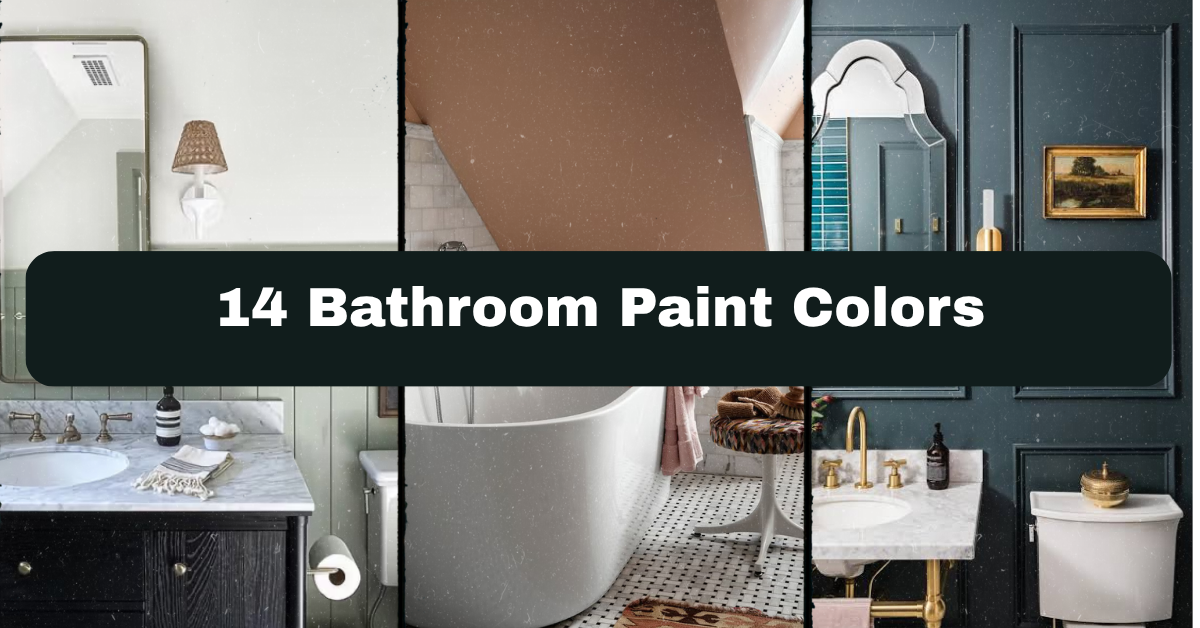
I’ve tested more bathroom paint colors than I care to admit, and I put together this list of 14 bathroom paint colors so you don’t have to waste time or money on the wrong shade. Picking paint for a bathroom is trickier than any other room in your house, and I get why you might be stuck staring at swatches right now feeling overwhelmed.
What are the best bathroom paint colors? The best bathroom paint colors include soft blues, warm whites, sage green, charcoal gray, and blush pink. These shades handle humidity well when paired with a satin or semi-gloss finish, and they work in both small powder rooms and larger primary bathrooms.
Stick around, because I’m about to walk you through 14 specific colors, when to use them, and how to avoid the mistakes that make bathrooms look flat, cold, or just plain wrong.
Why Bathroom Paint Color Actually Matters So Much
Bathrooms are weird rooms. They’re small, they get steamy, and the lighting is usually harsh or dim with no in-between. That means a paint color that looks amazing in your living room can look sickly or muddy in your bathroom. I learned this the hard way after painting my first apartment bathroom a “pretty” gray that turned out looking like a hospital hallway once the fog cleared from the mirror.
The right color can make a tiny bathroom feel bigger, hide imperfections, or turn a boring space into your favorite room in the house. It’s honestly one of the cheapest upgrades you can make with the biggest visual payoff.
1. Soft Sage Green for a Calm, Spa-Like Feel

Sage green has been my go-to recommendation for the last few years, and for good reason. It’s calming without being boring, and it pairs beautifully with white subway tile, brass fixtures, or even black hardware. This color works because it’s not quite green and not quite gray, so it feels sophisticated instead of theme-y.
Practical tip: pair sage green walls with natural wood accents like a teak stool or rattan mirror frame to keep the look grounded and warm.
This color adapts well across styles. In a modern bathroom, keep the sage matte and pair it with clean lines. In a farmhouse bathroom, add shiplap and vintage brass for extra character. Next up is a color that’s basically impossible to mess up.
2. Warm Greige for Bathrooms That Need to Feel Bigger

Greige, that magical mix of gray and beige, is the color I recommend to anyone who’s scared of commitment. It’s neutral enough to sell your house with, but warm enough to not feel sterile. Greige works especially well in bathrooms with limited natural light because it doesn’t turn blue or purple in shadow like some grays do.
Actionable tip: test greige samples both morning and night before committing, since undertones shift a lot depending on your bulbs.
In a traditional bathroom, greige lets your molding and hardware take center stage. In a minimalist space, it becomes the whole vibe on its own. Now let’s talk about a bolder option for those who want more drama.
3. Moody Charcoal for a Dramatic Powder Room
If you’ve got a small powder room that nobody spends more than five minutes in, charcoal gray is your best friend. Dark colors in small spaces create a cocoon effect that feels intentional and expensive, not cramped. Pair it with gold fixtures and a statement mirror, and you’ve got a bathroom that looks like it belongs in a boutique hotel.
Tip: use a matte or eggshell finish on charcoal walls to avoid glare under bathroom lighting, which tends to be bright and unflattering on glossy dark paint.
This look leans modern and moody by default, but you can soften it for traditional homes with white marble and vintage sconces. Speaking of soft, let’s swing back to something lighter.
4. Blush Pink for a Warm, Feminine Touch
Blush pink gets a bad reputation for being “too girly,” but a dusty, muted blush actually reads as sophisticated, not sweet. It works surprisingly well with black fixtures, brass hardware, or even sage green tile if you’re feeling bold. This color adds warmth to a bathroom without screaming for attention.
Practical tip: use blush on just one accent wall if you’re nervous about committing to it everywhere.
Coastal bathrooms can use blush as a warm counterpoint to blues and whites. Traditional bathrooms can lean into it with vintage fixtures and floral textiles. Next, let’s cool things down with a classic favorite.
Bathroom Paint Colors by Room Size
| Bathroom Size | Best Color Category | Example Shades | Finish to Use |
|---|---|---|---|
| Small powder room (under 40 sq ft) | Dark, dramatic tones | Charcoal, navy, black | Matte or eggshell |
| Medium bathroom (40-80 sq ft) | Soft neutrals | Greige, warm white, sage | Satin |
| Large primary bathroom (80+ sq ft) | Bold or layered colors | Deep green, terracotta, navy | Satin or semi-gloss |
| Windowless bathroom | Warm-toned neutrals | Warm white, blush, soft yellow | Satin |
5. Classic Navy Blue for Timeless Style

Navy is one of those colors that never really goes out of style. It reads as classic, a little nautical, and always polished. In a bathroom, navy pairs perfectly with white trim, brass or nickel fixtures, and natural stone counters. It’s bold without being trendy, which means you won’t be repainting in three years when the color goes out of fashion.
Tip: if full navy walls feel too intense, paint just the vanity or lower half with wainscoting and keep the upper walls white.
Coastal bathrooms practically demand navy somewhere in the mix. Traditional bathrooms use it with polished brass for an old-money feel. Let’s move from cool tones to something a little more unexpected.
6. Terracotta for an Earthy, Sun-Baked Look

Terracotta is having a moment, and I don’t think it’s going anywhere soon. This warm, clay-like color brings an earthy, sun-baked feeling to a bathroom that most neutrals just can’t match. It works especially well with natural materials like woven baskets, wood stools, and unlacquered brass fixtures.
Practical tip: balance terracotta walls with plenty of white or cream in your tile and towels so the room doesn’t feel too heavy or cave-like.
This shade fits beautifully into boho and Mediterranean-style bathrooms. In a more modern space, pair it with black fixtures and simple lines to keep it from feeling too rustic. Next, let’s look at a color that works in almost any lighting situation.
7. Warm White for Maximum Brightness and Flexibility
Not all whites are created equal, and bathrooms are where this really shows. Cool whites can look sterile and washed out under bathroom lighting, but a warm white with a hint of cream or beige undertone feels soft and inviting instead. This is the safest choice if you’re planning to sell your home soon or just don’t want to commit to a bold color.
Tip: always test white paint next to your tile and countertop samples, since whites shift dramatically depending on what’s around them.
Warm white works in literally every style, from farmhouse to modern to traditional. It’s basically the little black dress of bathroom paint colors. Now let’s get a little more playful.
8. Buttery Yellow for a Cheerful Morning Boost
Yellow is a divisive color, but a soft, buttery yellow (not neon or mustard) can make a bathroom feel sunny even if it doesn’t get much natural light. This color works great in guest bathrooms or kids’ bathrooms where you want a happy, welcoming feeling first thing in the morning.
Actionable tip: pair buttery yellow with white subway tile and simple chrome fixtures to keep the look fresh instead of dated.
Farmhouse and cottage-style bathrooms embrace yellow beautifully. In modern spaces, keep the yellow muted and pair it with black accents so it doesn’t feel too retro. Let’s cool things down again with a color that’s basically foolproof.
9. Soft Blue-Gray for a Coastal, Airy Feel

Soft blue-gray sits right in that sweet spot between calming and interesting. It’s not as committed as full navy, but it’s got way more personality than plain gray. This color works beautifully in bathrooms with lots of white trim, subway tile, or marble-look surfaces.
Tip: choose a blue-gray with a slight green undertone if your bathroom gets a lot of natural light, since blue tones can look cold in bright sun.
Coastal and traditional bathrooms both love this shade equally. It’s one of the most versatile colors on this entire list. Now for something with a little more punch.
Popular Color Pairings for Bathroom Walls and Trim
| Wall Color | Trim/Ceiling Color | Fixture Finish | Overall Mood |
|---|---|---|---|
| Sage green | Warm white | Brass | Calm, organic |
| Charcoal gray | Bright white | Matte black | Dramatic, modern |
| Terracotta | Cream | Unlacquered brass | Earthy, warm |
| Navy blue | Crisp white | Polished nickel | Classic, bold |
| Blush pink | White | Black | Soft, sophisticated |
10. Deep Forest Green for a Bold Statement Bathroom

If sage feels too safe for you, deep forest green is the next step up. This color is rich, moody, and pairs incredibly well with gold fixtures, marble countertops, and dark wood vanities. It’s a great choice for a primary bathroom where you want the space to feel like a retreat, not just a functional room.
Practical tip: use a high-quality paint with a satin finish here, since darker colors show brush strokes and roller marks more easily than lighter shades.
This color leans traditional or modern glam depending on your fixtures. Pair it with brass and marble for glam, or matte black and wood for a more grounded, modern look. Next, let’s talk about a shade that photographs beautifully.
11. Dusty Lavender for a Subtle Pop of Color

Dusty lavender is criminally underused in bathrooms. It’s soft enough to feel neutral but different enough to stand out from the usual white, gray, and beige lineup. This color works especially well in bathrooms with lots of natural light, where it can look almost silvery depending on the time of day.
Tip: pair dusty lavender with brushed nickel or chrome fixtures rather than warm metals, since cool tones complement the purple undertone better.
Traditional and transitional bathrooms both suit this color nicely. It’s a great option if you want something different without going too bold. Now, let’s look at a color combo that’s making a serious comeback.
12. Warm Taupe for a Cozy, Grounded Feel

Taupe is one of those colors that quietly does a lot of work. It’s warmer than gray, more subdued than beige, and it makes a bathroom feel cozy without being dark. This is a great pick for bathrooms that connect to a bedroom, since it can flow nicely between the two spaces.
Actionable tip: use taupe on the walls and a slightly darker shade of the same color family on the vanity for a built-in, custom look.
This color works across almost every design style, but it especially shines in transitional and traditional bathrooms. Let’s finish strong with two more standout options.
13. Black for an Unexpected Luxe Bathroom
Full black walls sound scary, but in a bathroom with good lighting, it can look incredibly luxurious. Black absorbs light in a way that makes gold or brass fixtures practically glow by comparison. This works best in bathrooms with a window or strong artificial lighting setup, since black can feel like a cave otherwise.
Tip: balance black walls with a large mirror to bounce light back into the room and keep the space from feeling too closed in.
Modern and glam bathrooms take to black instantly. Even traditional bathrooms can pull it off with the right lighting and marble accents. Last but not least, here’s a color for the minimalists.
14. Soft Oatmeal for a Quiet, Minimalist Bathroom

Oatmeal is like taupe’s calmer, quieter cousin. It’s got almost no undertone drama, which makes it a safe bet if you just want a clean, simple backdrop for your towels, tile, and fixtures to shine. This color is perfect if you’re someone who changes your bathroom decor seasonally and needs a wall color that goes with everything.
Practical tip: pair oatmeal walls with texture, like a woven bath mat or linen shower curtain, so the room doesn’t feel too plain.
This color fits minimalist, Scandinavian, and modern farmhouse bathrooms equally well. It’s the kind of shade that lets everything else in the room do the talking.
Tips for Success
- Always buy a sample pot before committing to a full gallon, and paint a section at least two feet wide.
- Use a paint with built-in mildew resistance, since bathrooms deal with more moisture than any other room.
- Stick with satin or semi-gloss finishes on walls so you can wipe away splashes and steam marks easily.
- Look at your color samples under your actual bathroom lighting, not daylight from another room.
- Don’t forget the ceiling. A tinted ceiling paint can make a small bathroom feel cozier instead of cavernous.
- Consider your grout and tile color as a fixed variable, then choose paint that complements it rather than fighting it.
- If you’re painting a rental or planning to sell soon, lean toward warm neutrals that appeal to more buyers.
Common Mistakes and How to Avoid Them
Choosing paint based on a chip alone
: Always test a sample on the actual wall, since lighting and surrounding colors change how a shade looks.
Using flat paint in a high-moisture room
: Stick to satin, semi-gloss, or specialty bathroom paint that resists mildew and wipes clean easily.
Matching paint to trends instead of your fixtures
: Pick a color that works with your existing tile, countertop, and hardware first, then build from there.
Painting a small bathroom stark white to “make it bigger”
: Warm neutrals or even deeper colors often make small spaces feel more intentional and cozy instead of just blank.
Ignoring the ceiling color
: A plain white ceiling can make colorful walls look unfinished. Consider a soft tint that ties the whole room together.
Skipping proper primer before a color change
: Bathrooms often have existing moisture damage or glossy paint that needs primer for the new color to stick and look even.
Similar Variations
- Coastal Bathroom Palette: Soft blues, sandy neutrals, and white paired with natural wood and rope details.
- Modern Farmhouse Bathroom: Warm whites and greige paired with black fixtures and shiplap accents.
- Moody Modern Bathroom: Charcoal, black, or deep navy paired with brass or matte black hardware.
- Vintage Cottage Bathroom: Soft pastels like blush or buttery yellow paired with clawfoot tubs and floral textiles.
- Minimalist Scandinavian Bathroom: Oatmeal, warm white, and soft gray paired with light wood and simple lines.
Picking the right shade really does change how your whole bathroom feels, from the mood it sets to how big or small the space seems. Whether you go bold with charcoal or keep it soft with warm white, the important thing is testing your color in real bathroom lighting before you commit to a whole gallon. I hope this list of 14 bathroom paint colors gave you enough options and confidence to finally pick up that paintbrush.
Leave a Reply