Author: Tayef

  • 10 Two Tone Kitchen Cabinets Ideas That’ll Change How You See Your Kitchen

    10 Two Tone Kitchen Cabinets Ideas That’ll Change How You See Your Kitchen

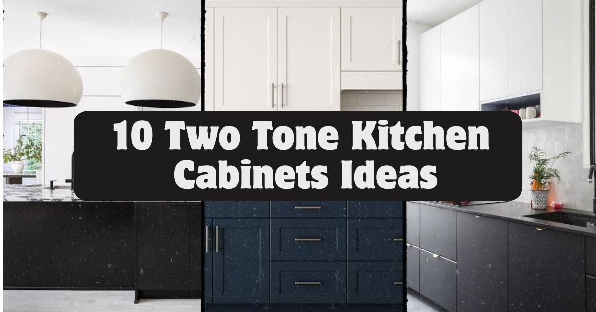
    I’ve spent way too many hours scrolling through kitchen photos, and I can tell you that 10 two tone kitchen cabinets ideas are exactly what you need if you’re stuck picking just one color. I’m going to walk you through real combos that work, why they work, and how to pull them off without hiring a design team.

    Two tone kitchen cabinets means using two different colors or finishes on your upper and lower cabinets, or on your island versus the rest of your cabinetry, to create visual contrast and depth in a kitchen. This approach adds dimension without requiring a full color overhaul.

    Stick around, because I’m about to show you combos you probably haven’t thought of, plus a few mistakes that’ll save you money if you avoid them.

    What Even Is a Two Tone Kitchen, Anyway?

    So here’s the deal. A two tone kitchen just means you’re not painting every single cabinet the same shade. Maybe your bottom cabinets are navy and your top ones are white. Maybe your island stands out in a totally different color from everything else. That’s it. That’s the whole concept.

    I love this style because it feels custom without costing custom prices. You get the drama of bold color, but you’re not trapped in a dark cave of a kitchen either. It’s like getting the best of both worlds. Light stays light, dark stays interesting, and your eyes actually have something fun to look at instead of one flat wall of cabinets.

    1. Navy Blue Lowers with Crisp White Uppers

    Modern Navy Blue Kitchen Cabinets: 35+ Chic and Trendy Design Ideas
    Credit: Nelsonkb

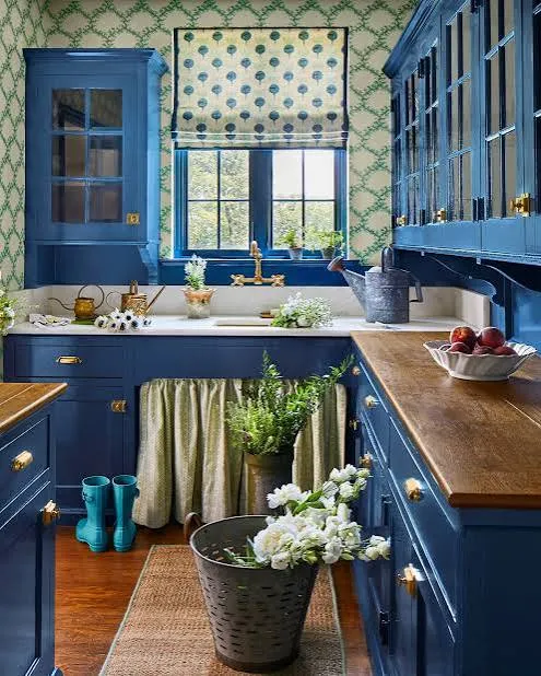
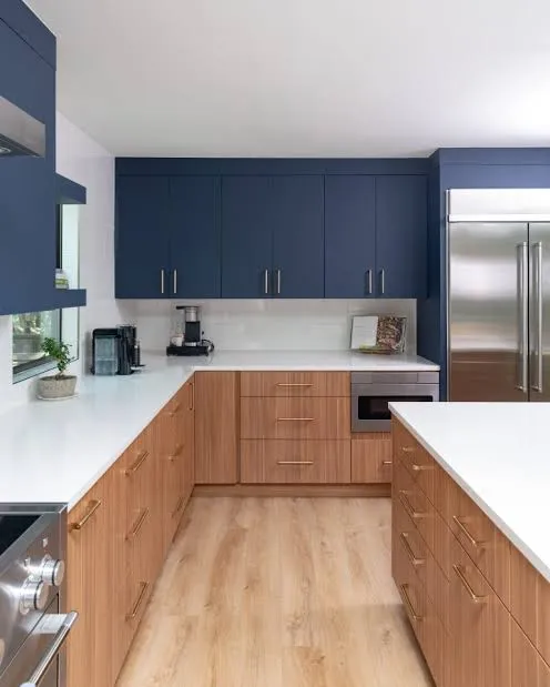
    This combo never gets old, and I mean that. Navy blue on the bottom cabinets grounds the room, while white uppers keep everything feeling airy and open. It’s the classic starting point for anyone nervous about going bold.

    Pair it with brass or gold hardware to warm things up. A practical tip: use navy on cabinets that see less light, since dark colors can make shadowy corners feel heavier.

    This look works beautifully in traditional kitchens, but it also slides right into modern farmhouse spaces if you add shaker-style doors. Once you nail this base pairing, you can start playing with a bolder island color, which brings me to the next idea.

    2. A Contrasting Island That Steals the Show

    80 Modern Kitchen Island Ideas to Transform Your Home in 2026
    Credit: elledecor

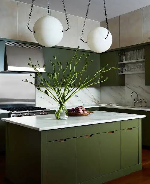
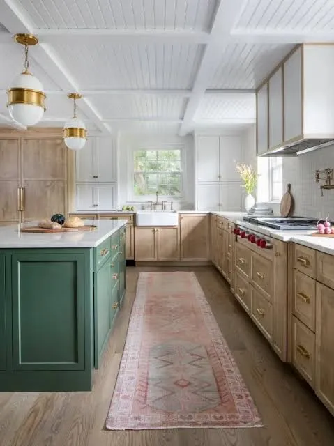
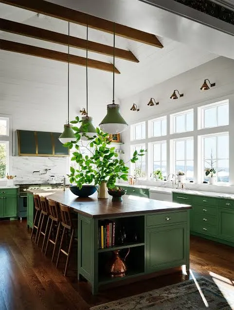
    Your island doesn’t have to match anything. Seriously. Paint it forest green, black, or even a deep burgundy while the rest of your cabinets stay a soft white or cream. This creates a natural focal point the second someone walks in.

    I’d suggest picking a color that shows up somewhere else in the room, like a light fixture or a rug, so it feels intentional and not random.

    This trick works in almost every style, from coastal to industrial, because islands are meant to stand apart anyway. Now let’s talk about a softer version of this same idea using wood tones instead of paint.

    3. Natural Wood Island Against Painted Perimeter Cabinets

    19 Kitchen Island Color Ideas for a Striking Accent
    Credit:bhg

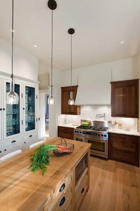
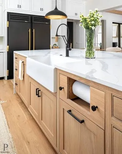
    If full color commitment scares you, wood is your friend. Keep your perimeter cabinets painted white or light gray, then let your island cabinets show off raw or stained wood grain. This brings warmth into a kitchen that might otherwise feel too clinical.

    Practical tip: choose a wood tone that matches your flooring so the room doesn’t feel disconnected.

    This pairing is basically made for modern farmhouse and Scandinavian style kitchens, though it works in traditional spaces too if you pick a richer wood stain. Next up, let’s flip the whole script and go dark on top instead of bottom.

    4. Dark Upper Cabinets with Light Lower Cabinets

    Trending - Dark Lower Kitchen Cabinets - The Decorologist
    Credit: Thedecorologist

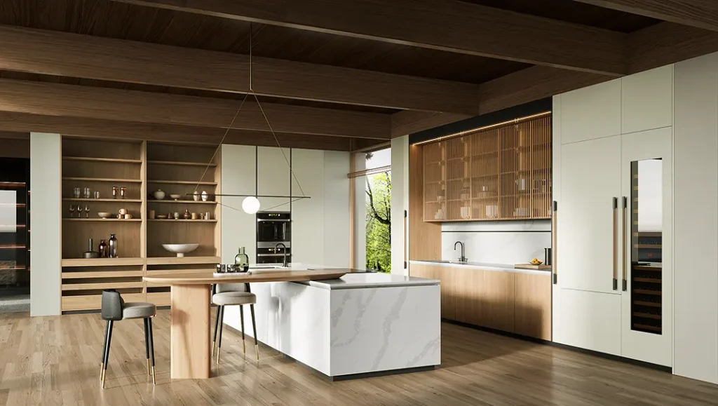
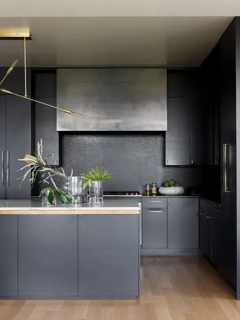
    Most people go light on top and dark on bottom, but flipping it creates a totally different mood. Dark uppers, like charcoal or black, feel bold and dramatic, especially with open shelving mixed in. Light lower cabinets keep the room from feeling too heavy.

    This works best in kitchens with high ceilings and good lighting, since dark upper cabinets can shrink a small, dim space fast.

    It’s a great match for modern and industrial kitchens, especially with matte black fixtures. Speaking of fixtures, let’s talk about how hardware choices change everything in a two tone kitchen.

    Two Tone Cabinet Color Pairings and Best Home Styles

    Color PairingUpper CabinetsLower CabinetsBest Suited Style
    Classic NavyWhiteNavy BlueTraditional, Coastal
    Warm WoodWhiteNatural WoodFarmhouse, Scandinavian
    Bold ContrastBlackWhiteModern, Industrial
    Soft SageCreamSage GreenCottage, Traditional
    Moody CharcoalCharcoalLight GrayModern, Transitional
    Terracotta WarmthWhiteTerracottaBoho, Mediterranean

    5. Sage Green Base with Warm White Uppers

    Sage Green Kitchen Cabinets: 10 Stunning Designs | OPPEIN
    Credit: Oppeinhome

    Sage green has become one of my favorite colors for kitchens because it’s calming but not boring. Use it on your lower cabinets and keep the uppers a warm white, not stark white, so the whole thing feels cozy instead of cold.

    Add wooden cutting boards, woven baskets, or brass hardware to tie the natural feel together. A quick tip: test the sage color in your actual kitchen lighting before committing, since green shifts dramatically between natural and artificial light.

    This combo fits cottage kitchens perfectly, but it also works in modern spaces if you keep the rest of the room simple and uncluttered. Now let’s look at a pairing that leans into texture instead of just color.

    6. Matte Black Lowers with Textured White Uppers
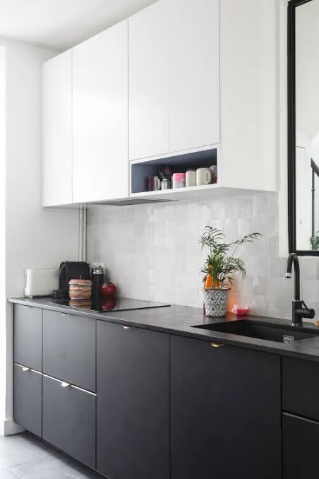
    Credit: Backsplash

    Matte black cabinets on the bottom give a kitchen serious depth. Pair them with white uppers that have some texture, like beadboard or fluted panel doors, so the top half doesn’t feel flat compared to the bold black base.

    Practical tip: stick with matte finishes instead of glossy black, since matte hides fingerprints and smudges way better in a kitchen.

    This look is a favorite in modern and transitional kitchens, but it can work in traditional homes too if the white uppers have classic raised-panel details. From here, let’s soften things up with a pastel option.

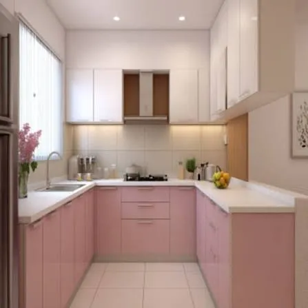
    7. Blush Pink Island with Neutral Perimeter Cabinets
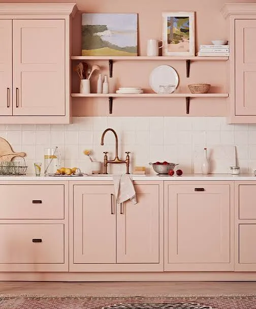
    Credit: Homesandgardens

    I know pink sounds risky, but a dusty blush pink island can be surprisingly sophisticated. Keep the surrounding cabinets in a neutral tone like greige or soft white so the pink doesn’t overwhelm the space.

    Pair it with brushed nickel or matte gold hardware for a polished finish. Tip: use pink sparingly, just on the island, so it reads as a design choice rather than a theme.

    This pairing shines in transitional and modern kitchens, especially ones with lots of natural light. Next, let’s talk about a two tone approach that uses different materials, not just colors.

    8. Mixed Material Cabinets Using Wood and Painted Panels
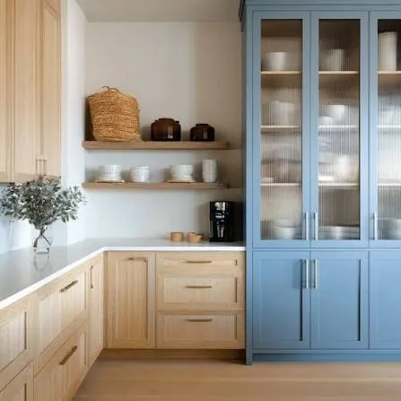
    Credit: Blockrenovation

    Instead of two paint colors, try mixing painted cabinet doors with natural wood ones on the same wall. Maybe your drawers are painted white while your upper cabinet doors are wood. This creates contrast through texture and material, not just color.

    Practical tip: keep the wood tone and paint color in the same temperature family, either both warm or both cool, so they don’t clash.

    This idea is perfect for Scandinavian and Japandi style kitchens, but it also works beautifully in farmhouse spaces. Let’s move on to a bolder, moodier combination next.

    9. Deep Green Lowers with Black Uppers
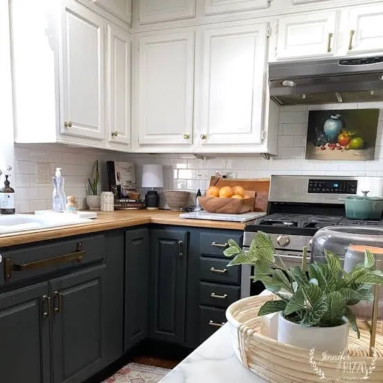
    Credit: Jenniferrizzo

    This one’s for people who want serious drama. Deep forest green on the bottom paired with black upper cabinets creates a rich, almost jewel-toned kitchen. It’s not for everyone, but it’s stunning when done right.

    Balance the darkness with a light-colored countertop, like white marble or a pale quartz, so the room doesn’t feel like a cave. Practical tip: add under-cabinet lighting since dark cabinets absorb light instead of reflecting it.

    This combo works incredibly well in modern and industrial kitchens with plenty of windows. Now let’s cover a two tone idea that’s all about the backsplash tying everything together.

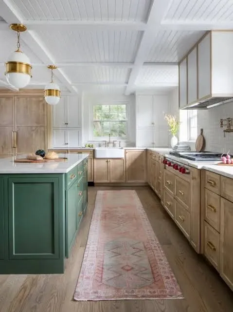
    10. Two Tone Cabinets Unified by a Bold Backsplash
    Credit: Hgtv

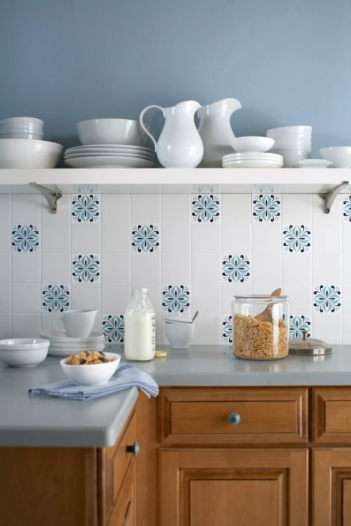
    Sometimes the two tone effect isn’t about the cabinets fighting each other, it’s about a backsplash bridging them. Pick a backsplash with colors that pull from both your upper and lower cabinet tones so everything feels connected.

    For example, if you’ve got white uppers and navy lowers, a backsplash with navy and white patterned tile ties the whole look together instantly.

    Practical tip: choose the backsplash before finalizing paint colors if you’re doing a full renovation, since tile options are often more limited than paint options.

    This trick works across every style because a good backsplash acts like a translator between two different colors. Let’s check out one more budget-friendly approach before wrapping up the color ideas.

    Two Tone Kitchen Cabinet Budget Breakdown

    Budget TierApproachEstimated Cost RangeBest For
    Low BudgetPaint existing cabinets, keep one section natural wood$200–$600DIY renovators
    Mid BudgetPaint cabinets professionally, new hardware$1,500–$4,000Homeowners updating a kitchen
    High BudgetNew custom cabinets in two finishes$8,000–$20,000+Full kitchen remodels

    Tips for Success

    • Test paint samples on your actual cabinets, not just a wall, since cabinet material changes how color looks.
    • Keep your hardware finish consistent across both colors so the kitchen still feels unified.
    • Choose your darker color for the lower cabinets in most cases, since it grounds the room and hides scuffs better.
    • Don’t skip the primer step, especially when painting over stained or glossy cabinets.
    • Bring home a countertop or backsplash sample before finalizing cabinet colors so everything works together.
    • Live with paint swatches for at least a few days to see how they look in morning and evening light.
    • If you’re unsure, start with your island as the “test” color since it’s a smaller, lower-commitment space.

    Common Mistakes and How to Avoid Them

    Choosing colors with the wrong undertones
    : Fix this by checking if your two colors are both warm or both cool. Mixing warm white with cool gray, for example, can look muddy and unintentional.

    Going too dark in a small, low-light kitchen
    : Fix this by limiting dark tones to lower cabinets or just the island, and keeping walls and ceilings light to balance things out.

    Forgetting about hardware consistency
    : Fix this by picking one metal finish, like brushed brass or matte black, and using it throughout the whole kitchen.

    Skipping a cohesive element between the two colors
    : Fix this by adding a shared accent, like a backsplash, countertop, or light fixture, that pulls both colors together.

    Painting without proper prep work
    : Fix this by cleaning, sanding, and priming cabinets before painting, since skipping steps leads to peeling and chipping fast.

    Picking trendy colors without long-term appeal
    : Fix this by choosing one neutral tone and one accent color, so the kitchen doesn’t feel outdated in a few years.

    Similar Variations

    • Tri-Tone Kitchens – Using three different cabinet colors or finishes for even more visual layering.
    • Ombre Cabinet Kitchens – Gradually shifting from a dark shade to a lighter one across a wall of cabinets.
    • Two Tone with Open Shelving – Combining painted cabinets with open wood shelves for a mixed, airy look.
    • Contrast Trim Kitchens – Keeping cabinet doors one color while painting the trim or molding a different shade.
    • Mixed Metal Two Tone Kitchens – Pairing two cabinet colors with two different hardware metals for extra contrast.

    I’ve walked you through a ton of combos here, and honestly, the best one is whichever makes you excited to walk into your kitchen every morning. Whether you go bold with navy and white or keep it subtle with two shades of gray, the goal is the same: create a kitchen that feels layered, personal, and a little more interesting than a single flat color ever could. If you take away one thing from all these 10 two tone kitchen cabinets ideas, let it be this: contrast doesn’t have to be scary, it just has to be intentional.
  • 12 Top Of Kitchen Cabinet Decor

    12 Top Of Kitchen Cabinet Decor

    If you’ve ever stared at that awkward empty space above your kitchen cabinets and wondered what to do with it, I’ve got you covered. This guide walks through 12 top of kitchen cabinet decor ideas that actually work in real homes, not just magazine spreads. I’ve tested a bunch of these myself, and I’m sharing what actually holds up over time.

    Top of kitchen cabinet decor refers to styling the gap between your upper cabinets and the ceiling using items like baskets, plants, jars, or artwork. The goal is to fill dead space with pieces that add color, texture, or personality without looking cluttered or collecting dust unnecessarily.

    Stick around, because I’m also going to show you the mistakes people make with this space, plus some style variations you probably haven’t thought of yet.

    What Is Top-of-Cabinet Decor, Really?

    Okay so here’s the deal. Most kitchens have this weird gap above the cabinets. Builders leave it there because running cabinets to the ceiling costs more. That gap can look sad and empty, or it can become one of the coolest parts of your kitchen. I think of it like the top shelf of a bookcase. You wouldn’t leave it bare, right? Same idea here. The trick is picking things that fit your kitchen’s personality without turning into a dust trap you dread cleaning every few months. Let’s get into the good stuff.

    1. Group Vintage Pottery in Odd Numbers

    Credit: Stockcake

    Vintage pottery instantly makes cabinet tops feel curated instead of random. I like grouping pieces in threes or fives because odd numbers just look more natural to the eye than even ones. Mix heights and shapes but keep the color family similar, like earthy browns, creams, or muted blues.

    Actionable tip: place your tallest piece slightly off-center, not dead in the middle, to avoid a stiff, symmetrical look.

    This works great in farmhouse or traditional kitchens. For modern spaces, swap pottery for sleek ceramic vessels in matte black or white instead.

    Once you’ve got your pottery grouped up, you might want something that adds a bit of natural texture nearby, which brings me to baskets.

    2. Add a Row of Woven Baskets

    Credit: Thebasketcompany

    Woven baskets are a classic for a reason. They add warmth and texture without screaming for attention. I love lining up two or three baskets of slightly different sizes across the cabinet top. They also double as sneaky storage if you flip them upside down or tuck small items inside.

    Actionable tip: choose baskets with flat bottoms so they sit stable and don’t wobble every time you open a cabinet door underneath.

    Coastal and boho kitchens practically demand this look, but even a modern farmhouse kitchen can pull it off with lighter-toned rattan.

    Baskets bring texture, but if you want something with a little more visual weight, large jars or jugs are your next move.

    3. Display Large Decorative Jugs or Jars

    Credit: Homesandgardens

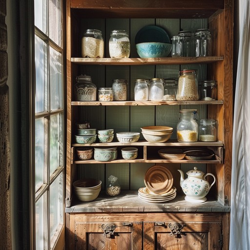
    Big glass or ceramic jugs fill vertical space fast, which is great if your cabinet gap is on the taller side. I’ve seen these look amazing in amber glass, matte stoneware, or even old milk jug styles picked up from flea markets.

    Actionable tip: stick to one or two large jugs rather than five small ones. Fewer, bigger pieces read as intentional instead of cluttered.

    Traditional and farmhouse kitchens love this look. In a modern kitchen, try a single oversized glass vessel with clean lines instead of anything rustic.

    Now that we’ve covered a few decor styles, let’s compare materials so you can pick what actually fits your space and budget.

    Material Comparison for Cabinet-Top Decor

    MaterialAverage CostDurabilityBest Style Match
    Ceramic pottery$15-$60 per pieceHigh, but chips if droppedFarmhouse, traditional
    Woven rattan/seagrass$10-$40 per basketModerate, fades in direct sunCoastal, boho
    Glass jars/jugs$8-$50 per pieceHigh, but breakableModern, farmhouse
    Metal/copper$20-$80 per pieceVery high, tarnishes over timeIndustrial, traditional
    Wood crates$10-$35 per pieceHigh, may warp with humidityRustic, farmhouse

    4. Bring in Greenery with Trailing Vines

    Credit: Elledecor

    Plants make everything feel alive, and cabinet tops are perfect for trailing varieties like pothos or ivy. The vines cascade down naturally and soften all those hard lines from your cabinets. Fake plants work fine here too if you don’t want to deal with watering something you can barely reach.

    Actionable tip: use a small stool or step ladder monthly to dust and check real plants for pests, since this spot gets forgotten easily.

    This idea flexes across almost every style. Boho kitchens love lush greenery, while modern kitchens might prefer one simple trailing plant in a minimalist pot.

    Greenery softens a space, but if you want more personality on display, your book collection might be the answer.

    5. Line Up Vintage Cookbooks

    Credit: Thecottagemarket

    Old cookbooks add color, texture, and a little storytelling to your kitchen. I like stacking some flat and standing others upright with a small bookend or decorative object leaning against them. It feels lived-in without looking messy.

    Actionable tip: choose books with spines in colors that complement your kitchen palette, not just random ones from a thrift store bin.

    This works beautifully in traditional and cottage-style kitchens. Modern kitchens can still pull it off with a few carefully chosen design books instead of grandma’s recipe collection.

    Speaking of collections, few things say “kitchen charm” quite like a display of copper cookware.

    6. Showcase a Collection of Copper Pots

    Credit: Hunker

    Copper pots and pans have that warm, glowing look that instantly makes a kitchen feel cozy. Even if you never cook with them, hanging or displaying a few on top of your cabinets adds shine and warmth to an otherwise flat space.

    Actionable tip: use a light polish every few months to keep that copper glow from turning dull and greenish.

    This is a natural fit for traditional and French country kitchens. In modern spaces, stick to one or two pieces for contrast rather than a full collection.

    If your cabinets don’t reach that high or you want more flexibility, floating shelves might solve your whole layout problem.

    7. Install Floating Shelves Instead of Blank Space

    Credit: Biggerthanthethreeofus

    Sometimes the smartest move isn’t decorating the gap, it’s changing it. Adding a thin floating shelf just below the ceiling gives you a real surface to work with instead of balancing everything on cabinet edges. This also makes cleaning way easier.

    Actionable tip: keep the shelf depth under 10 inches so it doesn’t compete visually with your cabinets below.

    Floating shelves fit almost any style since you control the finish, from raw wood for rustic kitchens to painted white for modern ones.

    Once you’ve got a shelf or flat surface, lighting can take the whole display to another level.

    8. Add String Lights or Warm Lighting

    Credit: Digsdigs

    A little hidden lighting above your cabinets creates a soft glow that makes your whole kitchen feel warmer at night. I’ve used simple LED strip lights tucked behind decor items, and it completely changes the mood without any major renovation.

    Actionable tip: choose warm white bulbs, around 2700K to 3000K, instead of bright white, so the light feels cozy instead of clinical.

    Modern kitchens look great with clean LED strips, while farmhouse and traditional spaces can use small string lights with exposed bulbs for extra charm.

    Lighting sets the mood, but nothing personalizes a space faster than art or signage.

    9. Mix in Framed Art or Wooden Signs

    Credit: bhg

    Small framed prints or wooden signs leaned against the wall above cabinets add personality fast. I like mixing a piece of art with a small plant or jar so it doesn’t look like a random picture frame just sitting there awkwardly.

    Actionable tip: lean pieces at a slight angle using a small stand or easel instead of laying them completely flat, so they catch the eye.

    Coastal kitchens love beachy signs, farmhouse kitchens go for “gather” or “eat” style wood signs, and modern kitchens do best with abstract art in simple frames.

    Now let’s talk budget, because not every idea here costs the same amount to pull off.

    Budget Tiers for Cabinet-Top Decor

    Budget TierPrice RangeWhat You Get
    LowUnder $50Thrifted jars, a few plants, basic baskets
    Mid$50-$150New pottery, quality baskets, small art prints
    High$150-$400Floating shelves, copper collection, curated vintage pieces
    Splurge$400+Custom shelving, professional lighting, designer decor pieces

    10. Use Matching Glass Jars for a Uniform Look

    Credit: Nakpunar

    If you want a cleaner, more organized look, matching glass jars are the way to go. I fill mine with pasta, dried flowers, or even just leave a few empty for visual variety. The uniformity makes the whole cabinet top feel put together instead of thrown up there.

    Actionable tip: buy jars from the same set or brand so lids and shapes actually match, since mismatched jars ruin the clean effect.

    This idea is perfect for modern and minimalist kitchens. Farmhouse kitchens can still use it by choosing jars with a slightly frosted or vintage glass finish.

    If you’re someone who loves to entertain, a small bar display might be more your style than jars.

    11. Add a Wine or Bar Display

    Credit: Soinspalliatifspaca

    Turning your cabinet top into a mini bar area is a fun twist most people don’t think about. A few wine bottles, some stemware, or a small decorative tray with bar tools can make that space feel intentional and useful, not just decorative.

    Actionable tip: use a small tray underneath bottles and glasses so everything looks grouped instead of scattered across the surface.

    This works especially well in modern and industrial kitchens. Traditional kitchens can soften it with a wooden tray and warmer glass tones.

    Whatever style you choose, remember that decor doesn’t have to stay the same all year, which brings me to my last big idea.

    12. Layer with Seasonal Decor Rotations

    Credit: bhg

    Swapping a few pieces every season keeps your kitchen feeling fresh without a full redo. I keep a small bin of seasonal items, pumpkins in fall, greenery in winter, light florals in spring, and rotate them in with my permanent pieces like baskets or pottery.

    Actionable tip: keep your “base” decor neutral year-round and only rotate two or three small accent pieces, so the swap takes five minutes, not an hour.

    This flexes beautifully across every style since you’re just changing accents, not the whole setup. Coastal kitchens might rotate shells and driftwood, while traditional kitchens rotate seasonal florals or wreaths.

    13. Use Decorative Trays to Anchor Groupings

    Credit: letsfoodie

    A decorative tray placed under a cluster of jars, plants, or pottery instantly makes the whole display look organized. Without a tray, items can look like they’re just randomly sitting up there. With one, it looks styled on purpose, even if you didn’t spend much time on it.

    Actionable tip: choose a tray slightly wider than your grouping so there’s a small visible border around the items, not edges hanging off.

    Modern kitchens do well with metal or lacquered trays, while farmhouse and cottage kitchens look great with a distressed wood tray instead.

    Tips for Success

    • Measure your cabinet gap before buying anything, since even two inches of extra clearance changes what fits.
    • Keep a step stool nearby so dusting actually happens instead of getting ignored for months.
    • Stick to a consistent color palette across all your pieces so the display feels planned, not random.
    • Leave some negative space between groupings instead of filling every inch of the surface.
    • Choose lightweight items if your cabinets are older or not built for heavy weight up top.
    • Repaint or refinish thrifted pieces to match your kitchen instead of leaving them mismatched.
    • Take a photo of your finished display and live with it for a week before making final tweaks.

    Common Mistakes and How to Avoid Them

    Overcrowding the space
    : Fewer, larger items look more intentional than a dozen small trinkets crammed together.

    Ignoring scale
    : Tiny decor items get lost above tall cabinets. Choose pieces sized to match the height of the gap.

    Skipping dust maintenance
    : This spot collects grease and dust fast in kitchens. Clean it monthly, not yearly.

    Mismatched color palettes
    : Random colors make the space look chaotic. Stick to two or three complementary tones.

    Using heavy, unstable items
    : Top-heavy decor near the ceiling is a safety risk, especially in homes with kids. Choose stable, lightweight pieces.

    Forgetting your kitchen’s style
    : Rustic crates in a sleek modern kitchen look out of place. Match decor to your existing design language.

    Similar Variations

    • Farmhouse Cabinet Topper: Wood crates, cookbooks, and warm pottery for a cozy, lived-in feel.
    • Coastal Cabinet Display: Woven baskets, driftwood, and glass jars in soft blues and sandy neutrals.
    • Modern Minimalist Topper: A few sleek vessels and one plant, nothing more, in a tight neutral palette.
    • Industrial Loft Style: Metal containers, copper accents, and exposed bulb lighting for an urban edge.
    • Traditional French Country: Copper pots, vintage jugs, and framed botanical prints for old-world charm.
    • Boho Eclectic Mix: Layered plants, textured baskets, and mismatched pottery in warm earthy tones.

    Filling that empty space above your cabinets doesn’t need to be complicated or expensive. A few well-chosen pieces, some greenery, or a simple floating shelf can completely change how your kitchen feels. Whether you go rustic, modern, or somewhere in between, these 12 top of kitchen cabinet decor ideas give you a real starting point to make that awkward gap actually work for you.

  • 14 Kitchen Cabinet Color Ideas That’ll Change How You See Your Kitchen

    14 Kitchen Cabinet Color Ideas That’ll Change How You See Your Kitchen

    I’ve spent way too many hours staring at paint swatches, so let me save you the trouble with these 14 kitchen cabinet color ideas that actually work in real homes, not just magazine spreads.

    What are the best kitchen cabinet colors? The best kitchen cabinet colors depend on your kitchen’s light, size, and style. Popular choices include navy blue, sage green, warm white, charcoal gray, and two-tone combos. Darker colors add drama in larger spaces, while lighter shades open up small kitchens.

    Stick around, because I’m about to walk you through ideas you probably haven’t thought of, plus a few mistakes that could cost you a repaint.

    Why Cabinet Color Matters So Much

    Here’s the thing. Your cabinets take up more visual space than almost anything else in your kitchen. Counters get covered in stuff. Walls get hidden behind cabinets. But cabinet doors? They’re always on display.

    I learned this the hard way when I painted my first kitchen a trendy gray that looked amazing online and depressing in my actual house. Lighting changes everything. So does the size of your room and even the direction your windows face.

    Cabinet color sets the whole mood. It can make a kitchen feel like a cozy cabin or a bright, airy escape. Let’s get into the ideas.

    1. Go Bold With Navy Blue Lower Cabinets

    Credit: Countryliving

    Navy blue is having a real moment, and I get why. It’s dramatic without being scary. Pair navy lower cabinets with white or cream uppers, and you get contrast that feels intentional, not accidental.

    I’d recommend brass or gold hardware here. It warms up the blue and keeps things from feeling too cold or corporate.

    Practical tip: Test navy on the side of your island first. Islands get less direct light than wall cabinets, so you’ll see the true depth of the color before committing to the whole kitchen.

    This look works beautifully in traditional kitchens, but it also slides right into modern farmhouse style if you swap the hardware for matte black.

    Speaking of contrast, let’s talk about a color combo that never seems to go out of style.

    2. Try Classic White Uppers With Wood Lower Cabinets

    Credit: Rollcallpainting

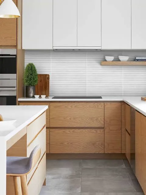
    This combo has stuck around for a reason. White cabinets up top keep things bright. Natural wood on the bottom adds warmth and texture. It’s the best of both worlds.

    Choose a wood tone that matches your flooring, or at least doesn’t clash with it. Oak, walnut, and maple all work depending on how warm or cool you want the space to feel.

    Practical tip: If your kitchen doesn’t get much natural light, lean toward lighter wood tones like white oak instead of dark walnut. Dark wood can eat up light fast.

    Coastal kitchens love this look, and so do modern farmhouse and Scandinavian-style spaces. It’s flexible enough to fit almost anywhere.

    Now let’s move to a color that’s basically the new neutral.

    3. Warm Up Your Space With Sage Green

    Credit: countryliving

    Sage green is soft, earthy, and way more forgiving than people expect. It’s not as loud as emerald or forest green, but it still adds personality.

    This color pairs really well with brushed nickel or unlacquered brass hardware. Butcher block counters and open wooden shelving also look amazing next to sage.

    Practical tip: Sage green can look muddy under yellow-toned lighting. Test your paint swatch under your actual kitchen bulbs before buying gallons.

    In cottage-style kitchens, sage feels right at home. It also works surprisingly well in mid-century modern spaces when paired with clean lines and simple hardware.

    If green feels like too big a leap, there’s a safer cousin waiting in idea number four.

    4. Keep It Timeless With Warm White or Cream

    Credit: Oppeinhome

    Warm white is not the same as stark white. Warm white has a hint of yellow or beige mixed in, which keeps things from feeling clinical or cold.

    This shade works with literally every countertop material and backsplash color. That’s part of why it’s so popular.

    Practical tip: Ask for a sample pot before committing. Warm whites can shift dramatically depending on your wall color and lighting, so don’t trust the paint chip alone.

    Traditional kitchens practically live on warm white. Modern farmhouse kitchens use it constantly too, especially paired with black hardware and open shelving.

    Let’s compare a few popular cabinet color families so you can see how they stack up.

    Kitchen Cabinet Color Comparison Table

    ColorBest ForLight RequirementMaintenance Level
    Navy BlueBold statement kitchensBright natural light preferredMedium (shows dust)
    Warm WhiteAny kitchen sizeWorks in low or bright lightHigh (shows smudges)
    Sage GreenCottage, farmhouse stylesModerate to bright lightLow to medium
    Charcoal GrayModern, industrial kitchensBright light recommendedMedium
    Natural WoodCoastal, Scandinavian stylesAny lightingLow

    5. Add Drama With Charcoal Gray Cabinets

    Credit: Pahome

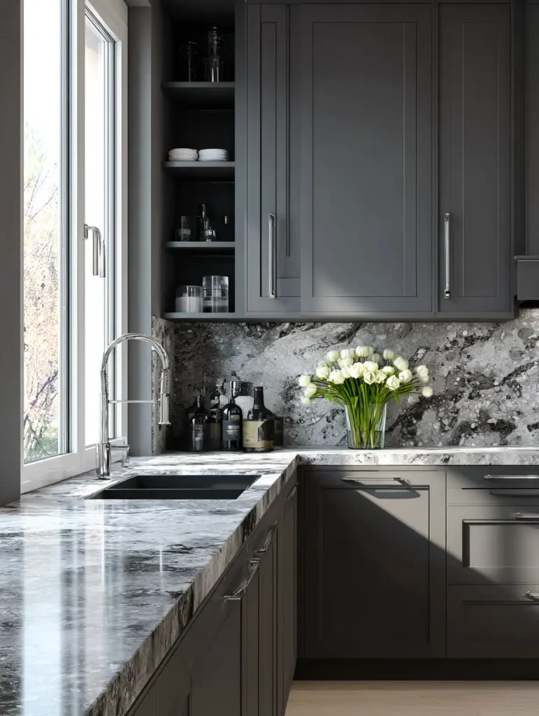
    Charcoal gray sits right between black and gray, giving you drama without the commitment of full black. It’s moody but still livable.

    I like pairing charcoal with white countertops to keep the whole kitchen from feeling like a cave. Gold or brushed brass hardware adds a nice pop against the dark background.

    Practical tip: Add under-cabinet lighting if you go charcoal. Dark cabinets can make small kitchens feel closed in without extra light sources.

    This color shines in modern and industrial kitchens, but a softer charcoal with brass accents can also work in transitional spaces.

    Now, if you want two colors working together instead of one, keep reading.

    6. Mix Two Tones for a Custom Look

    Credit: hgtv

    Two-tone kitchens are everywhere right now, and it’s not just a trend. Splitting your colors, usually a darker shade on the island or lower cabinets and a lighter shade up top, adds depth without overwhelming the room.

    Popular combos include navy and white, black and wood, or sage and cream. The key is picking colors that don’t fight each other in tone or saturation.

    Practical tip: Keep your darker color on the lower half of the kitchen. This grounds the room and feels more balanced than a top-heavy dark color scheme.

    Two-tone works in almost any style, from farmhouse to contemporary, because you control the exact color pairing to match your vibe.

    Let’s talk about a color that feels fresh precisely because it’s a little unexpected.

    7. Go Unexpected With Terracotta or Burnt Orange

    Credit: Hgtv

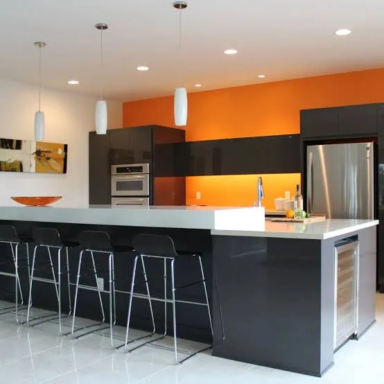
    I know this sounds bold, but terracotta cabinets are showing up in more kitchens, and they bring instant warmth. Think sun-baked clay, not neon orange.

    This works best as an accent, maybe on an island, rather than covering every cabinet in the kitchen. Pair it with cream walls and brass or black hardware.

    Practical tip: Balance terracotta with plenty of neutral counter and floor space. This color needs breathing room to look intentional instead of overwhelming.

    Mediterranean and boho kitchens practically beg for this shade. It also works surprisingly well in modern kitchens that want a warm, earthy contrast.

    If earthy tones speak to you, there’s a deeper, richer option coming up next.

    8. Deepen the Mood With Forest Green

    Credit: elledecor

    Forest green is sage green’s bolder sibling. It’s rich, a little formal, and instantly makes a kitchen feel more finished and intentional.
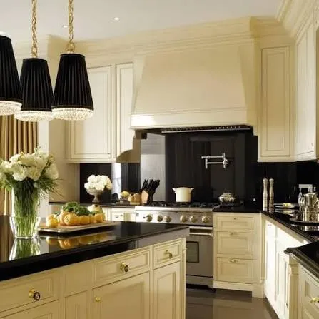
    Pair forest green with brass hardware and marble or quartz counters for a look that feels expensive without the expensive price tag.

    Practical tip: Use forest green only on lower cabinets if your kitchen is small. Full forest green walls of cabinets can shrink a room visually.

    Traditional and transitional kitchens love this shade. It also fits nicely into moody, English-cottage-inspired spaces.

    Let’s lighten things up again with a color that’s basically a kitchen chameleon.

    9. Stay Flexible With Soft Gray-Greige

    Credit: jk-cabinetry

    Greige, that in-between shade of gray and beige, is the ultimate compromise color. It’s warmer than gray but more grounded than beige.

    This color plays nice with almost any countertop, from white quartz to darker granite. It’s a safe bet if you’re worried about resale value or just can’t commit to something bolder.

    Practical tip: Look for greige with warm undertones if your kitchen faces north, since north-facing rooms tend to get cooler light.

    Greige works in transitional, modern, and even traditional kitchens. It’s basically the little black dress of cabinet colors.

    Now let’s talk about going all in on black.

    10. Make a Statement With Matte Black Cabinets

    Credit: architecturaldigest

    Matte black isn’t for everyone, but when it works, it really works. It photographs beautifully and gives kitchens a sleek, high-end feel.

    I always recommend matte over glossy black. Glossy shows every fingerprint and smudge, while matte hides small imperfections much better.

    Practical tip: Balance black cabinets with a light-colored backsplash and countertop. Otherwise, the kitchen can feel dark and heavy.

    Modern and industrial kitchens are the natural home for black cabinets, though a softer black with wood accents can work in transitional spaces too.

    Let’s shift toward something a little more playful.

    11. Add Personality With Dusty Blue

    credit: countryliving

    Dusty blue sits between navy and powder blue, giving you color without the intensity of a true navy. It’s calm, a little vintage-feeling, and works in kitchens big and small.

    This shade pairs really well with white subway tile and natural wood floors. It doesn’t compete with other elements in the room.

    Practical tip: Test dusty blue next to your existing floor and counter samples. This color can lean either gray or purple depending on the light, so double-check before painting.

    Cottage kitchens and coastal kitchens both love dusty blue. It even fits into vintage-inspired retro kitchens with the right hardware.

    Speaking of vintage vibes, let’s talk about a color combo that feels like it walked out of an old farmhouse.

    12. Bring Character With Cream and Black Combos

    Credit: interiorcompany

    Cream cabinets paired with black accents, whether that’s a black island, black hardware, or a black range hood, create instant character. It’s a classic combo that never really goes out of style.

    The cream keeps things soft and warm, while the black adds sharp definition and a little edge.

    Practical tip: Use black sparingly at first, maybe just hardware and light fixtures, then add more black elements if you want a bolder look later.

    Farmhouse kitchens are basically built around this combo. Traditional and transitional kitchens use it constantly too.

    Let’s check out a quick budget breakdown before moving to the last two ideas.

    Cabinet Painting Budget Guide

    Project ScopeDIY Cost RangeProfessional Cost RangeTime Estimate
    Small kitchen (10-15 cabinets)$200-$400$1,500-$3,0002-4 days
    Medium kitchen (16-25 cabinets)$400-$700$3,000-$5,5004-6 days
    Large kitchen (26+ cabinets)$700-$1,200$5,500-$9,0006-10 days
    Two-tone custom job$500-$900$4,000-$7,0005-8 days

    13. Try a Muted Blush or Dusty Rose

    Credit: interiorcompany

    This one surprises people, but muted blush cabinets can look sophisticated instead of childish when done right. The key word is muted. Skip anything bright or cotton-candy toned.

    Pair blush with warm wood floors and brass hardware for a look that feels soft but grown-up.

    Practical tip: Use blush on an island or a small bank of cabinets rather than the whole kitchen. It’s a strong color that works best in smaller doses.

    This idea fits beautifully in modern glam kitchens and soft, feminine cottage-style spaces.

    Last but not least, let’s talk about a trend that’s all about texture over color.

    14. Layer Different Wood Tones Instead of Paint

    Credit: houzz

    Sometimes the best cabinet color idea isn’t a paint color at all. Mixing two different wood tones, like a walnut island with white oak upper cabinets, gives you warmth and contrast without touching a paint can.

    This works especially well if you love the look of natural materials and want your kitchen to feel grounded and organic.

    Practical tip: Stick to two wood tones max. Three or more starts to look busy and unplanned.

    Scandinavian, coastal, and modern organic kitchens all lean heavily on this approach.

    Tips for Success

    • Always test paint samples on your actual cabinets, not just a wall, since cabinet material affects how color reads
    • Consider your countertop and backsplash before locking in a cabinet color
    • Choose semi-gloss or satin finishes for easier cleaning, especially with darker colors
    • Don’t skip primer if you’re switching from a dark color to a light one
    • Live with a sample for at least three days to see it in morning, afternoon, and evening light
    • Factor in hardware finish early since it changes how a color feels
    • Ask your painter about durability ratings if you have kids or pets in the house

    Common Mistakes and How to Avoid Them

    Choosing a color based only on online photos
    Lighting and screens distort color constantly. Always get a physical sample before committing.

    Ignoring your kitchen’s natural light direction
    North-facing kitchens need warmer tones. South-facing kitchens can handle cooler shades without looking cold.

    Going too dark in a small, low-light kitchen
    Dark colors can work anywhere, but small dark kitchens need extra lighting to avoid feeling cramped.

    Skipping proper prep work
    Cabinets need cleaning, sanding, and priming. Skipping steps leads to peeling and chipping within months.

    Matching cabinet color to current trends instead of your style
    Trends fade fast. Pick a color you’ll still like in five years, not just this season.

    Forgetting about hardware and lighting
    The wrong hardware finish can make an otherwise great color choice feel off balance.

    Similar Variations

    • Coastal Blue Kitchens – Lighter, breezier blues paired with white and natural rope or wood accents
    • Modern Farmhouse Neutrals – Warm whites and soft grays paired with black hardware and shiplap
    • Moody Traditional Kitchens – Deep greens or navy paired with brass and marble for a formal feel
    • Scandinavian Minimalist Kitchens – Light wood tones and white cabinets with almost no ornamentation
    • Industrial Loft Kitchens – Matte black or charcoal cabinets paired with exposed brick and metal accents
    • Vintage Cottage Kitchens – Soft pastels like dusty rose or sage paired with brass and glass-front cabinets

    Picking a cabinet color doesn’t have to feel overwhelming once you break it down into real options instead of vague trends. Whether you go bold with navy, safe with warm white, or something totally unexpected like terracotta, the right choice comes down to your light, your style, and honestly, what makes you happy every time you walk into your kitchen. I hope these 14 Kitchen Cabinet Color Ideas gave you a clearer picture of what will actually work in your own home.

  • 12 Kitchen Backsplash With White Cabinets

    12 Kitchen Backsplash With White Cabinets

    If you’re hunting for the best 12 kitchen backsplash with white cabinets ideas, you’ve landed in the right spot. I’ve put together a list that covers every style, budget, and taste so you don’t have to scroll through a hundred confusing sites to find what actually works.

    A kitchen backsplash with white cabinets is a tile or material application installed behind countertops and sinks, chosen to pair with white cabinetry for contrast, texture, or color. Popular options include subway tile, marble, colorful mosaics, and natural stone, each creating a different mood in the kitchen.

    Stick around because I’m about to walk you through twelve ideas, a few handy tables, and some real talk about mistakes people make way too often.

    Why White Cabinets and Backsplashes Go Together So Well

    Here’s the thing about white cabinets. They’re like a blank canvas. You can throw almost any backsplash at them and it works. I’ve seen white kitchens with black backsplashes that look moody and cool. I’ve seen the same white cabinets paired with soft blue tile that feels like a beach cottage. That’s the magic of white. It doesn’t fight with your other choices, it just makes them pop harder.

    White cabinets also bounce light around the room, so your backsplash choice can either boost that brightness or add a little contrast and depth. Either way, you’re not stuck. That’s why this combo is so popular in kitchens across the country, from tiny apartment galleys to big farmhouse layouts.

    1. Classic White Subway Tile for a Timeless Look

    Credit: Backsplash

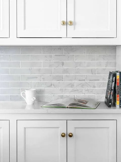
    Subway tile is the safe bet that never actually feels boring. The rectangular shape and the slight sheen on ceramic versions add texture without shouting for attention. Pair it with white cabinets and you get a clean, bright kitchen that photographs well and sells well too, if resale is on your mind.

    Go with a 3×6 inch tile in a classic running bond pattern for that timeless subway look. Want something a little different? Try a herringbone layout instead of straight rows.

    Practical tip: use a light gray grout instead of stark white. It hides dirt better and still keeps things bright.

    This style adapts beautifully to farmhouse, coastal, and even minimalist modern kitchens. Next up, let’s talk about a backsplash that brings in some drama.

    2. Bold Black Backsplash for High Contrast

    Credit: Backsplash

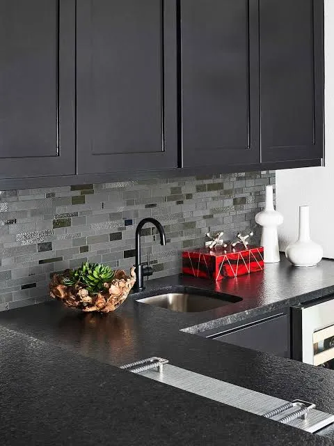
    If you want your kitchen to feel a little edgier, a black backsplash against white cabinets creates serious visual punch. Think matte black subway tile, or even a textured black stone mosaic. The contrast draws the eye and makes your cabinets look even crisper and whiter by comparison.

    This works great in kitchens with black hardware, black light fixtures, or a black kitchen island. It ties the whole room together instead of feeling like a random accent.

    Practical tip: balance the darkness with plenty of natural light or bright under-cabinet lighting so the space doesn’t feel too heavy.

    This pairing shines in modern, industrial, and even transitional kitchens. Now let’s soften things up with a natural material.

    3. Warm Wood-Look Tile for a Cozy Feel

    Credit: Countryfloors

    Wood-look porcelain tile behind white cabinets brings warmth into a space that might otherwise feel a little cold or sterile. It mimics real wood grain but resists water and heat way better, which matters a lot right behind your stove.

    I like this option for kitchens that want a farmhouse or Scandinavian vibe without going full-on rustic. The tile comes in planks, so you can run it horizontally for a subtle, calming effect.

    Practical tip: choose a matte finish wood-look tile to avoid glare near windows or pendant lights.

    This idea fits farmhouse, Scandinavian, and even some coastal kitchens really well. Speaking of coastal, let’s dive into a color that feels like the ocean.

    4. Soft Blue Mosaic for a Coastal Vibe

    Credit: Arizonatile

    A soft blue or seafoam green mosaic tile against white cabinets instantly says “beach house,” even if you live nowhere near water. The small mosaic pieces catch light differently than large tiles, giving the wall some movement and life.

    Pair this with brushed nickel or brass fixtures and maybe some woven baskets or light wood accents. The overall feel should be airy, not overwhelming.

    Practical tip: keep the rest of your color palette neutral so the blue backsplash stays the star of the show.

    This idea works wonders in coastal, cottage, and Hamptons-style kitchens. Let’s move from color to texture with a natural stone option.

    Backsplash Material Comparison

    MaterialAverage Cost per Sq FtMaintenance LevelBest For
    Ceramic Subway Tile$5 to $15LowBudget-friendly classic looks
    Natural Stone (Marble)$20 to $50HighLuxury, traditional kitchens
    Porcelain Wood-Look$8 to $20LowFarmhouse, Scandinavian styles
    Glass Mosaic$15 to $30MediumCoastal, modern accents
    Peel and Stick Tile$3 to $8LowRenters, quick updates

    5. Elegant Marble Slab for a Luxury Statement

    Credit: Elledecor

    Nothing says upscale quite like a big slab of marble running up your backsplash wall. Instead of grout lines breaking up the visual, you get one continuous sweep of veining that feels expensive and dramatic. Pair it with white cabinets and gold or brass hardware for a real showstopper kitchen.

    This option costs more upfront, but it delivers a wow factor that tile just can’t match. Many homeowners extend the marble from the countertop straight up the wall for a seamless look.

    Practical tip: seal marble regularly since it’s porous and can stain from acidic spills like lemon juice or wine.

    This idea is perfect for traditional, transitional, and glam kitchens. Now let’s look at something a bit more playful.

    6. Colorful Moroccan Tile for Personality

    Credit: Interiorcompany

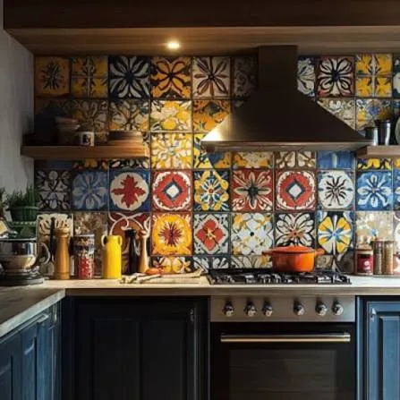
    If you want your kitchen to feel like it has a story, Moroccan-style tile is the way to go. These tiles come in bold patterns, often with blues, terracottas, and greens mixed together. Against white cabinets, the pattern really gets to shine since there’s nothing else competing for attention.

    I’d recommend using this tile as an accent strip rather than covering the whole wall, unless you really love pattern. A little goes a long way here.

    Practical tip: order extra tiles upfront since patterned tile often has more waste during cutting and installation.

    This style fits bohemian, eclectic, and Mediterranean kitchens especially well. Let’s swing back toward something simpler and sleeker.

    7. Sleek Glass Panel Backsplash for Modern Kitchens

    Credit: Backsplash

    A single sheet of tempered glass behind your stove and counters gives a super clean, seamless look. No grout lines, no busy patterns, just a smooth surface that’s easy to wipe down. Pair this with white cabinets and stainless steel appliances for a modern kitchen that feels almost commercial-grade in its cleanliness.

    Glass backsplashes come in tons of colors, but a soft white, gray, or even a pale blush tone works beautifully with white cabinetry.

    Practical tip: go with back-painted glass instead of printed glass, since back-painted holds color better over time.

    This idea is a natural fit for modern, minimalist, and urban loft-style kitchens. Next, let’s talk about a pattern that’s having a real moment right now.

    8. Geometric Hexagon Tile for a Trendy Touch

    Credit: Backsplash

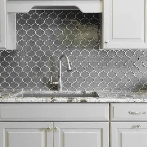
    Hexagon tile has been popping up everywhere, and for good reason. The six-sided shape creates a honeycomb pattern that feels fresh and a little unexpected compared to standard square or rectangular tile. Against white cabinets, a white or light gray hexagon tile keeps things subtle, while a colored hexagon adds punch.

    I like small hexagon tiles, around 1 to 2 inches, for backsplashes since the pattern reads clearly at that size.

    Practical tip: use a contrasting grout color to really highlight the hexagon shape instead of letting it blend into the wall.

    This works in modern, mid-century, and eclectic kitchens alike. Now onto a texture-forward option for those who love a tactile kitchen.

    9. Textured Zellige Tile for Handmade Charm

    Credit: Ardaogan

    Zellige tile is handmade in Morocco, and every piece has slight variations in color and texture. That imperfection is actually the whole point. Against crisp white cabinets, zellige tile in soft blues, greens, or even white tones adds a handcrafted feel that mass-produced tile just can’t replicate.

    The slight sheen and uneven surface catch light in a way that makes the whole wall feel alive rather than flat.

    Practical tip: order samples before committing since zellige colors can vary a lot between batches.

    This style pairs beautifully with Mediterranean, boho, and modern farmhouse kitchens. Let’s shift gears to something budget-conscious next.

    10. Budget-Friendly Peel and Stick Tile for Renters

    Credit: bhg

    Not everyone can rip out tile and start fresh, especially if you’re renting. Peel and stick backsplash tile has come a long way and now mimics ceramic, marble, and even metal finishes pretty convincingly. Against white cabinets, a peel and stick subway or marble-look tile gives you a big style upgrade without a big commitment.

    This is also a smart option if you like to change your kitchen look every few years without a full renovation.

    Practical tip: clean and prime the wall surface thoroughly before applying, or the tiles may peel prematurely.

    This idea works for basically any kitchen style since the designs mimic pricier materials so closely. Now let’s look at a metallic option for extra shine.

    Budget Tiers for Backsplash Projects

    Budget LevelTotal Cost Range (Average Kitchen)Typical Materials
    Low Budget$150 to $400Peel and stick, basic ceramic
    Mid Range$500 to $1,200Standard subway tile, glass mosaic
    High End$1,500 to $4,000Marble slab, zellige, hand-painted tile

    11. Metallic Accent Tile for a Glam Touch

    Credit: Arizonatile

    A little shine goes a long way in a white kitchen. Metallic tile, whether it’s brushed copper, brass, or silver, adds glam without overwhelming the space. Against white cabinets, metallic accents catch the light and give the kitchen a warm glow, especially under pendant lighting.

    I like using metallic tile as a border or accent strip rather than the full backsplash, since too much shine can feel a bit much in a small kitchen.

    Practical tip: match the metallic tone to your faucet and cabinet hardware for a cohesive look.

    This style fits glam, art deco, and modern transitional kitchens really well. Let’s finish strong with a bold pattern choice.

    12. Bold Encaustic Tile for a Statement Floor-to-Backsplash Match

    Credit: Studiocementtile

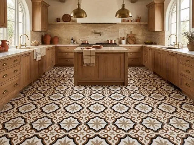
    Encaustic tile, with its inlaid patterns and rich colors, isn’t just for floors anymore. Using it on your backsplash, especially if you carry the same pattern up from the floor, creates a really striking visual connection in the kitchen. Against white cabinets, the pattern gets to be the main character without any competition.

    This works best in kitchens with plenty of open wall space, since busy patterns can feel cramped in tight areas.

    Practical tip: keep your countertop material simple and solid colored so the encaustic pattern doesn’t compete with veining or speckles.

    This idea suits Mediterranean, Spanish colonial, and bold eclectic kitchens especially well. Now that we’ve covered all twelve ideas, let’s get into some practical advice to help you pull this off successfully.

    Tips for Success

    • Always order 10 to 15 percent extra tile to cover cuts, breaks, and future repairs.
    • Test tile samples under your actual kitchen lighting before buying in bulk, since store lighting can be misleading.
    • Choose grout color intentionally. It changes the whole look more than people expect.
    • Keep your backsplash height consistent, usually ending at the bottom of your upper cabinets, for a clean finish.
    • If you’re unsure, start small with a sample wall or a single accent strip before committing to a full installation.
    • Match your backsplash sheen to your cabinet finish. Glossy cabinets pair well with glossy tile, matte with matte.
    • Don’t forget the outlets. Plan your tile layout around switches and outlets so cuts look intentional, not sloppy.

    Common Mistakes and How to Avoid Them

    Choosing tile before finalizing countertops
    : Pick your countertop material first, then find a backsplash that complements it, not the other way around.

    Ignoring grout maintenance
    : Use sealed grout or epoxy grout in high-splash areas like behind the stove to prevent staining and mold.

    Going too matchy with cabinets and backsplash
    : Add at least some contrast in color or texture so the wall doesn’t disappear into the cabinetry.

    Skipping the sample stage
    : Always test a physical sample in your kitchen before ordering the full amount, since lighting changes everything.

    Overcomplicating small kitchens
    : In tighter spaces, stick to one bold element, either a pattern or a color, not both at once.

    Forgetting about long-term cleaning
    : Textured tiles look great but can trap grease and grime, so consider your cleaning habits before choosing heavily textured options.

    Similar Variations

    • Farmhouse Backsplash Styling – leans on shiplap, wood tones, and simple subway tile for a cozy, lived-in feel.
    • Modern Minimalist Backsplash – focuses on large-format tile or glass panels with almost no visible grout lines.
    • Coastal Cottage Backsplash – uses soft blues, whites, and natural textures like rope or driftwood accents.
    • Mediterranean Tile Backsplash – brings in bold patterns, warm colors, and handmade tile like zellige or encaustic.
    • Industrial Loft Backsplash – pairs exposed brick or metal panels with white cabinets for an urban edge.
    • Transitional Glam Backsplash – mixes marble or metallic tile with classic cabinet shapes for a polished, updated traditional look.

    Picking the right backsplash really comes down to your own taste, your budget, and how much maintenance you’re willing to deal with long term. White cabinets give you so much freedom to experiment, whether you want something loud and colorful or calm and classic. I hope this list of 12 kitchen backsplash with white cabinets ideas gave you a clearer picture of what could work in your own space.

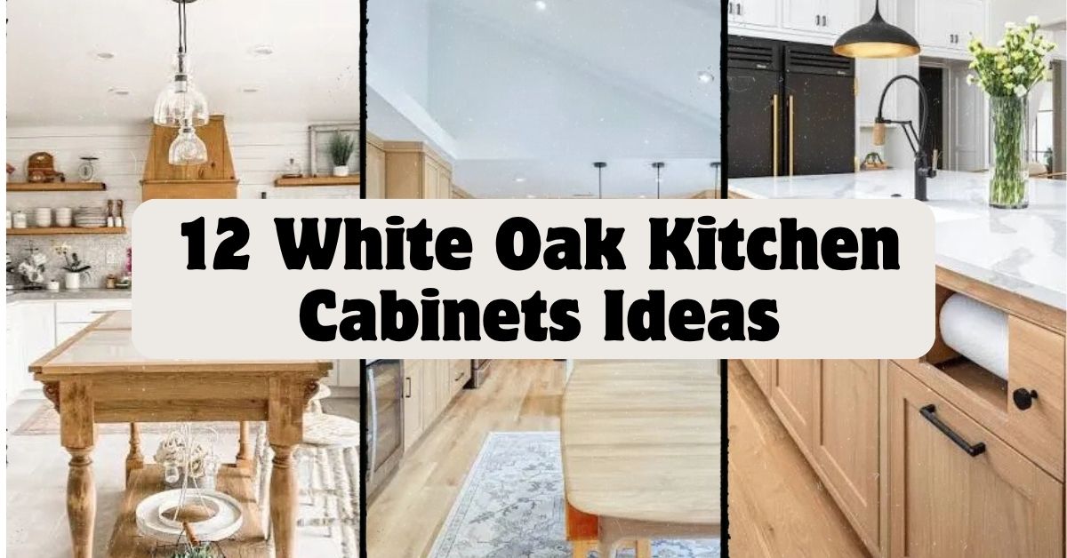
  • 12 White Oak Kitchen Cabinets: Ideas That Actually Work in Real Homes

    12 White Oak Kitchen Cabinets: Ideas That Actually Work in Real Homes

    I’ve spent way too many hours scrolling through kitchen photos, and I can tell you that 12 White Oak Kitchen Cabinets ideas are some of the most requested designs I see right now. If you’re tired of generic advice that doesn’t tell you anything useful, you’re in the right spot. I put this together to give you real answers, not fluff.

    White oak kitchen cabinets are cabinets made from white oak wood, known for their light color, visible grain pattern, and natural durability. They work well in modern, traditional, and transitional kitchens because the wood tone is neutral enough to pair with almost any color scheme.

    Stick around, because I’m about to walk you through a dozen ways to use white oak cabinets that most articles never even mention.

    What Makes White Oak Cabinets So Popular Right Now

    Okay, so here’s the deal with white oak. It’s not new. People have used it in furniture and flooring for decades. But kitchens? That’s where it’s blowing up lately.

    White oak has this warm, honey-ish color that isn’t too yellow and isn’t too gray. It sits right in the middle. The grain lines are straight and subtle, not wild and busy like some other woods. That means it looks calm. It looks expensive without actually costing a fortune compared to some exotic woods.

    I think people are also just tired of stark white kitchens. White oak brings warmth back into the room without going full-on rustic cabin vibes.

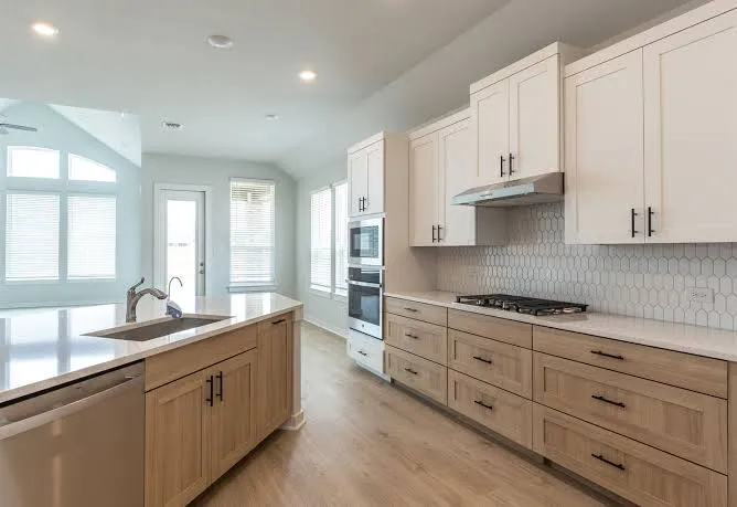
    1. Pair White Oak Lowers with White Upper Cabinets

    Credit: Burrowscabinets

    This combo is everywhere right now, and for good reason. You get the warmth of wood on the bottom and a clean, bright feel up top. It keeps the kitchen from feeling too heavy or too cold.

    Use white oak for your base cabinets and drawers, then go with a soft white or off-white for your uppers. Add brass or matte black hardware to tie the two tones together.

    Practical tip: Keep your countertop a light color, like white quartz, so it doesn’t compete with either cabinet tone.

    This idea works great in modern farmhouse kitchens, but it also fits coastal and Scandinavian-style homes just as easily. Now let’s talk about a bolder option if you want more wood showing.

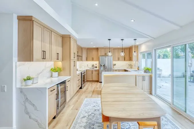
    2. Go Full White Oak, Top to Bottom

    Credit: 405cs

    If you really love the wood look, skip the mixing and just use white oak cabinets everywhere. Upper and lower cabinets in the same tone create a cozy, cohesive feel.

    This works best in kitchens with lots of natural light. Dark kitchens can feel closed in if every cabinet is wood. Add a light-colored backsplash, like a white subway tile or a pale stone, to break things up a little.

    Quick tip: Stick with simple hardware, like slim brass pulls, so the wood grain stays the star of the show.

    This all-wood approach fits traditional kitchens beautifully, but it also works in Japandi and mid-century modern spaces. Next, let’s look at how color can change the whole mood.

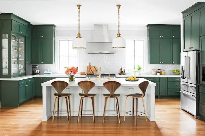
    3. Add a Deep Green Island for Contrast

    Credit: bhg

    White oak cabinets look amazing next to a dark green island. The green adds richness. The wood keeps things feeling grounded and natural.

    Choose a forest green or hunter green paint for the island cabinets. Keep the rest of your cabinets in white oak. This creates a natural focal point in the kitchen without needing extra decor.

    Practical tip: Use gold or brass hardware on the island to make it feel a little more special than the surrounding cabinets.

    This pairing works in traditional and transitional kitchens especially well. Farmhouse kitchens love this combo too. Speaking of color pairings, let’s check out a full breakdown of what works with white oak.

    White Oak Color Pairing Guide

    Accent ColorBest Used OnStyle MatchHardware Suggestion
    Soft WhiteUpper cabinetsModern FarmhouseBrass
    Charcoal GrayIslandTransitionalMatte Black
    Forest GreenIslandTraditionalBrass or Gold
    Navy BlueLower cabinetsCoastalBrushed Nickel
    TerracottaBacksplash accentsMediterraneanBronze
    BlackUppers or trimModernMatte Black

    4. Use Open Shelving Made from White Oak

    Credit: Decorilla

    Open shelves in white oak give your kitchen a lighter, airier feel. They show off dishes, glassware, and small plants. This works really well in smaller kitchens that need to feel less boxed in.

    Keep the shelves simple. Thick, chunky white oak boards look better than thin ones. Style them with a mix of ceramics and a few plants for texture.

    Practical tip: Don’t overload the shelves. Leave some breathing room so it doesn’t look cluttered.

    This idea shines in Scandinavian and coastal kitchens, but it also works in modern farmhouse spaces if you keep the styling minimal. Now let’s talk about flooring, because it matters more than people think.

    5. Match Cabinets with Wide-Plank Wood Flooring

    Credit: Decorcabinets

    Here’s something a lot of people miss. If your white oak cabinets don’t match your floor tone, the whole kitchen can feel off. Wide-plank white oak or light oak flooring pairs beautifully with white oak cabinets.

    You don’t need the exact same wood. Just keep the tones close, so everything flows together instead of clashing.

    Practical tip: Bring a cabinet door sample to the flooring store before you pick your floor. Lighting changes how wood looks, so compare them in person.

    This works across almost every style, from modern to traditional to coastal. Once your floors and cabinets are talking to each other, it’s time to think about counters.

    6. Choose a Honed Marble or Quartz Countertop

    Credit: Marblesystems

    White oak cabinets look their best with countertops that have soft veining. Honed marble or a quartz that mimics marble gives a soft, quiet elegance. Shiny, polished stone can feel too formal next to the natural wood grain.

    Stick with white, cream, or light gray countertops with subtle veining. Avoid busy patterns that fight with the wood grain.

    Practical tip: Ask for a honed finish instead of polished. It matches the relaxed, natural feel of white oak better.

    This pairing fits modern, traditional, and transitional kitchens equally well. Now let’s move to something a lot of people forget: the ceiling.

    7. Add a Wood Beam Ceiling to Match

    Credit: Digsdigs

    If you really want your kitchen to feel intentional, add exposed wood beams that match your white oak cabinets. This ties the whole room together, from floor to ceiling.

    You don’t need real structural beams. Faux beams work just as well and are way easier to install.

    Practical tip: Stain the beams slightly darker than your cabinets. It adds depth without looking matchy-matchy.

    This idea is perfect for farmhouse and traditional kitchens. It can even work in modern spaces if the beams are kept clean and simple. Next, let’s talk hardware, because small details matter a lot here.

    8. Use Brass or Matte Black Hardware for Contrast

    Credit: pikeproperties

    Hardware might seem like a small detail, but it changes everything. White oak cabinets look flat without the right pulls and knobs.

    Brass hardware adds warmth and a little shine. Matte black adds contrast and a modern edge. Both work great, depending on the vibe you want.

    Practical tip: Stick with one metal finish throughout the kitchen. Mixing too many metals can make the space feel busy.

    Brass leans traditional and warm. Matte black leans modern and bold. Either way, this small choice makes a big difference. Let’s look at a simple comparison table to help you decide.

    Hardware Finish Comparison

    FinishStyle FeelBest Paired WithMaintenance
    BrassWarm, classicWhite oak + white wallsLow, ages naturally
    Matte BlackBold, modernWhite oak + gray tonesLow, shows fingerprints less
    Brushed NickelSoft, coastalWhite oak + blue accentsMedium, needs occasional polishing
    BronzeRustic, earthyWhite oak + terracotta tonesLow, patinas over time

    9. Add a Textured Backsplash for Visual Interest

    Credit: Backsplash

    White oak cabinets are pretty simple looking on their own. A textured backsplash, like zellige tile or fluted stone, adds personality without overwhelming the space.

    Stick to a light color family so the backsplash doesn’t fight with the cabinets. Cream, soft white, or pale blue zellige tiles look amazing against oak.

    Practical tip: Use a handmade-look tile. The slight imperfections add charm and pair naturally with the organic wood grain.

    This works in Mediterranean, coastal, and modern farmhouse kitchens. It’s a small update with a big visual payoff. Now let’s talk about a design choice that changes the whole shape of your kitchen.

    10. Try Slab-Front Cabinet Doors for a Modern Look

    Credit: Kitchendesignconcepts

    If you want a cleaner, more modern feel, skip the shaker-style doors and go with flat slab fronts. The white oak grain becomes the star, without any extra lines or details competing for attention.

    This style works best when the wood grain is bookmatched or aligned carefully across the doors. It looks intentional and high-end.

    Practical tip: Ask your cabinet maker about grain matching. It costs a little more, but the visual payoff is huge.

    Slab doors fit modern and minimalist kitchens perfectly. They can also work in Japandi-style spaces where simplicity is the whole point. Speaking of simplicity, let’s talk about lighting next.

    11. Use Warm, Layered Lighting to Highlight the Wood Grain

    Modern White Oak Kitchen Cabinets: Texture & Contrast Guide
    Credit: Harmonyhome

    White oak looks different depending on the light. Cool, harsh lighting can make it look flat and washed out. Warm, layered lighting brings out the grain and the golden tones.

    Use a mix of under-cabinet lighting, pendant lights, and recessed ceiling lights. Choose warm white bulbs, somewhere around 2700K to 3000K.

    Practical tip: Add under-cabinet lighting specifically to highlight the grain pattern on lower cabinets. It’s a small touch that makes a big visual difference at night.

    This tip applies to literally every kitchen style. Good lighting is universal. Now, let’s finish with one more idea that ties everything together.

    12. Balance Wood with Black Metal Accents

    Natural Wood Kitchen Cabinets Design Guide for 2026 | OPPEIN
    Credit: oppeinhome

    Too much wood can start to feel heavy after a while. Adding black metal accents, like a black faucet, black window frames, or black light fixtures, creates contrast and keeps the kitchen from feeling one-note.

    Keep the black accents scattered but intentional. A faucet here, a pendant light there, maybe a black-framed window over the sink.
    Practical tip: Don’t overdo it. Two or three black accents is usually enough to create contrast without taking over the room.

    This idea works especially well in modern, industrial, and transitional kitchens. It’s the finishing touch that makes white oak cabinets look polished instead of plain.

    Tips for Success

    • Test cabinet samples in your actual kitchen lighting before committing, since lighting changes wood tone dramatically.
    • Keep grout lines thin and light-colored if you’re using a textured backsplash, so it doesn’t visually clash with the wood.
    • Avoid cabinets with the exact same stain but different sheens, since that mismatch is more noticeable than people expect.
    • Choose countertop edges that are simple and slightly rounded to keep the overall look soft and warm.
    • Balance warm wood tones with at least one cool element, like a stone counter or metal fixture, so the kitchen doesn’t feel too monochrome.
    • Stick with one wood species throughout the kitchen if possible. Mixing oak with walnut or maple can look chaotic.
    • Order a physical cabinet sample before buying anything. Photos online almost never show the true color.

    Common Mistakes and How to Avoid Them

    Choosing cabinets based only on online photos
    : Wood tone shifts a lot depending on screen and lighting. Always request a physical sample first.

    Ignoring the floor-to-cabinet color relationship
    : If your floor and cabinets clash, the whole kitchen feels disjointed. Match tones or choose intentional contrast, not accidental mismatch.

    Overloading the kitchen with too many wood tones
    : Stick to one dominant wood tone. Mixing multiple different wood shades makes a kitchen look unplanned.

    Skipping the hardware decision until the end
    : Hardware finish changes the whole personality of the cabinets. Decide on it early, not as an afterthought.

    Using cool white lighting with warm wood cabinets
    : This makes the wood look dull and gray. Stick with warm white bulbs to keep the tones looking rich.

    Choosing a busy countertop pattern
    : Bold veining or patterns can fight with the wood grain. Simple, subtle countertops let the cabinets shine.

    Similar Variations

    • White Oak with Charcoal Island – A moody, high-contrast look that keeps things modern and grounded.
    • Coastal White Oak Kitchen – Light wood paired with blues, whites, and natural textures like rattan.
    • Japandi White Oak Kitchen – A mix of Japanese minimalism and Scandinavian warmth, with clean lines and natural materials.
    • Farmhouse White Oak Kitchen – Wood cabinets paired with shaker doors, apron sinks, and vintage-inspired hardware.
    • Modern Minimalist White Oak Kitchen – Slab doors, hidden hardware, and a neutral palette with almost no clutter.
    • Mediterranean White Oak Kitchen – Warm wood paired with terracotta tile, wrought iron, and earthy color accents.

    At the end of the day, white oak cabinets give you a warm, timeless base that works with almost any style you’re going for. Whether you go bold with a green island or keep things simple with open shelving, the wood grain does a lot of the heavy lifting on its own. I hope these 12 White Oak Kitchen Cabinets ideas gave you a clearer picture of what’s possible in your own kitchen.

  • 13 Tropical Living Room Ideas That Bring Paradise Home

    13 Tropical Living Room Ideas That Bring Paradise Home

    If you’ve been searching for real, practical 13 tropical living room ideas that actually work in a normal house (not just a Pinterest fantasy), I’ve got you covered. I’ve spent way too many hours studying what makes tropical spaces feel authentic instead of cheesy, and I’m about to share all of it with you.

    A tropical living room is a space designed with natural materials, lush greenery, warm colors, and airy layouts to mimic the relaxed feel of island or rainforest environments. Common elements include rattan furniture, palm print textiles, botanical prints, and light, breathable fabrics.

    Stick around, because I’m about to walk you through 13 specific ways to pull this look off, plus a few mistakes that trip people up every single time.

    What Even Is a Tropical Living Room Style?

    Okay, so here’s the deal. Tropical style isn’t just throwing a palm leaf pillow on your couch and calling it a day. It’s about creating a whole vibe, one that feels warm, breezy, and a little bit like vacation. Think Bali resort meets your actual living room. The style leans on natural textures like rattan, bamboo, and jute. It uses colors pulled straight from nature, deep greens, sandy tans, ocean blues. And it always, always includes plants. Lots of them. Once you get the formula down, it’s actually pretty easy to recreate anywhere, even in a tiny apartment with zero natural sunlight.

    1. Anchor the Room With a Rattan or Wicker Sofa

    Rattan Sofa Styling Guide | Boho Living Room Dubai Tips
    Credit: Home & Soul

    Rattan furniture is basically the backbone of tropical design. A rattan-framed sofa or loveseat instantly signals “island vibes” without you having to say a word. The natural woven texture adds warmth and breaks up all that flat, boring furniture you see in most living rooms.

    Pair it with soft cushions in cream, olive, or terracotta to keep it comfortable, not scratchy. My tip: look for rattan pieces with removable cushion covers so you can wash them when spills happen (and they will happen).

    This idea works in modern homes too. Just pick a rattan piece with clean lines instead of an ornate, curvy frame, and it’ll blend right into a minimalist space.

    Once your seating is sorted, the next step is figuring out what goes on top of it and around it.

    2. Layer in Botanical Print Textiles

    Where architecture meets a tropical garden. This seamless home-textile print combines ornamental archways with layered palms, banana leaves and delicate flowering branches. Designed as a statement pattern for cushions, upholstery, curtains and
    Credit: Instagram

    Palm leaves, banana leaves, monstera prints, these patterns are tropical shorthand. Toss a few botanical print throw pillows on your sofa or drape a leaf-patterned throw blanket over an armchair. It’s a low-cost way to bring the theme in without buying new furniture.

    Actionable tip: stick to two or three prints max. Too many competing patterns make the room feel cluttered instead of curated.

    For a traditional home, choose botanical prints with a more classic, muted color scheme. For coastal-inspired spaces, pair leaf prints with striped or woven textures for contrast.

    Now that your textiles are set, let’s talk about the wall behind that sofa.

    3. Paint an Accent Wall in Deep Jungle Green

    32 Gorgeous Green Accent Wall Ideas for Any Room or Style
    Credit: The Spruce

    A dark green accent wall does more work than almost any other single design choice. It grounds the room and gives all your plants and rattan furniture something rich to pop against. Colors like emerald, olive, or forest green work best.

    Try painting just one wall instead of the whole room. It’s cheaper, less overwhelming, and still makes a huge visual statement.

    Modern homes can pair this with matte black frames and metal accents. Traditional spaces might add crown molding painted white for contrast.

    Once your walls are set, it’s time to bring in the real stars of any tropical room: the plants.

    4. Fill Corners With Large Statement Plants

    Indoor plant corner ideas - Plant Folks
    Credit: Plant Folks

    You can’t have a tropical living room without actual greenery. Big leafy plants like fiddle leaf figs, monstera, or bird of paradise fill empty corners and add life to the space. They also help soften hard furniture edges.

    Practical tip: if you don’t have a green thumb, go for high-quality faux plants. Nobody will know unless they touch the leaves.

    This idea flexes easily. Coastal homes might pair plants with woven baskets as planters, while modern spaces prefer sleek ceramic pots in white or black.

    Speaking of pots and baskets, let’s talk about how natural textures show up in other parts of the room too.

    5. Add a Jute or Sisal Area Rug

    Living Room Rug Ideas: Jute vs Sisal Rug Options - Perfecting Places
    Credit: Perfecting places

    A natural fiber rug ties the floor into the same earthy palette as your furniture and plants. Jute and sisal rugs have a rough, organic texture that feels grounded and warm underfoot.

    Quick tip: layer a smaller printed rug on top of a larger jute rug for texture without losing the natural base look.

    In modern homes, keep the rug plain and geometric. In bohemian spaces, mix in a rug with fringe or a subtle diamond pattern.

    Once your floor is covered, you’ll want lighting that matches the mood you’ve created.

    Tropical Color Palette Guide

    Palette NameMain ColorsBest Paired WithMood Created
    Jungle CanopyDeep green, chocolate brown, creamRattan, gold accentsRich, cozy, dramatic
    Beach SunsetCoral, sand beige, warm whiteBamboo, linen fabricSoft, relaxed, breezy
    Ocean BreezeTeal, aqua, driftwood greyWhite walls, glass decorFresh, airy, clean
    Bali RetreatTerracotta, olive, natural rattanWood tones, woven texturesEarthy, grounded, calm

    6. Use Warm, Ambient Lighting Instead of Harsh Overheads

    Why Ambient Lighting Is More Popular Than Overhead Lighting
    Credit: Real Mom Life

    Tropical spaces rely on soft, golden lighting to feel cozy rather than clinical. Skip the bright white overhead light and add table lamps with woven or bamboo shades instead. Floor lamps with a warm bulb also work great in reading corners.

    Tip: use bulbs labeled “warm white” (around 2700K) instead of “daylight” bulbs for that golden glow.

    Coastal homes might use lighting with a driftwood base, while modern spaces lean toward black metal fixtures with a woven shade for contrast.

    Good lighting sets the tone, but nothing beats natural light bouncing off the right window treatments.

    7. Hang Sheer or Linen Curtains

    How to Install & Hang Sheer Linen Curtains at Home DIY — CONNIE CAO
    Credit: Connie Cao

    Heavy blackout curtains kill the airy feeling tropical rooms need. Swap them for sheer linen or cotton curtains that let light filter through softly. This creates that breezy, resort-like feeling even if your window just faces a parking lot.

    Actionable tip: hang curtain rods a few inches above the window frame and wider than the window itself. It makes ceilings look taller and windows look bigger.

    Traditional homes can add a subtle pattern or trim to the curtain edge. Minimalist spaces should stick to solid, uncomplicated fabric.

    With your windows dressed, let’s move to the furniture that ties everything together in the middle of the room.

    8. Choose a Bamboo or Rattan Coffee Table

    Flores Rattan Coffee Table | Rattan Living Table - Harvest Design Living
    Credit: Harvest Design Living

    Your coffee table is a great spot to reinforce the natural material theme without committing to a big furniture purchase. Bamboo and rattan coffee tables are lightweight, affordable, and easy to find secondhand.

    Tip: add a glass top over a rattan base if you want durability plus that woven texture underneath.

    In modern rooms, pick a table with straight legs and minimal detailing. In traditional rooms, a carved wood table works just as well as rattan.

    Now let’s talk about what goes on top of that table, because decor matters just as much as furniture.

    9. Style Shelves With Natural Elements

    Our Stylist's Guide to Bookshelf Styling | Bria Hammel Interiors
    Credit; Bria Hammel Interiors

    Fill your shelves with items like dried palm fronds, seashells, wooden bowls, and woven baskets instead of generic decor. These small touches reinforce the tropical theme without taking up much space or money.

    Practical tip: group items in threes for a more balanced, intentional look instead of scattering them randomly.

    Coastal-style rooms might lean into shells and driftwood, while jungle-inspired spaces prefer dried leaves and carved wood figures.

    Once your shelves are styled, don’t forget the ceiling. Yes, really.

    10. Install a Ceiling Fan With Wood Blades

    Wood Ceiling Fans in South Africa: The Complete Style, Cooling & Light – Future Light - LED Lights South Africa
    Credit: Future Light

    A wood-bladed ceiling fan does double duty. It keeps the room feeling breezy (literally) and adds another layer of natural material to the design. Bonus: it’s actually functional, especially in warmer climates.

    Tip: choose a fan with a matte black or bronze motor housing to keep it from looking too plain against the wood blades.

    This works in almost every home style. Just adjust the blade shape, curved for tropical or coastal, straight for modern farmhouse.

    Let’s shift from big fixtures to smaller decorative touches that make the room feel finished.

    11. Add Woven Baskets for Storage and Texture

    Beautifully versatile, baskets are a simple way to bring both style and function into the home.​ ​ Whether used for serving, storage, or displaying everyday essentials, these timeless pieces add warmth, texture,
    Credit: Instagram

    Woven baskets aren’t just decor, they’re storage heroes. Use them to hold blankets, magazines, or plants. They add texture without adding visual clutter since they blend into the natural color palette.

    Tip: choose baskets in varying sizes and stack them in a corner for an easy styling win.

    In modern homes, pick baskets with tighter, more uniform weaves. In boho spaces, looser and more irregular weaves feel right at home.

    Now let’s bring in some color contrast so the room doesn’t feel one-note.

    12. Introduce Pops of Coral or Sunset Orange

    Colors That Go With Orange | Living Spaces
    Credit: Living Spaces

    Tropical doesn’t mean only green and brown. Adding coral, sunset orange, or hot pink through pillows, art, or a single accent chair keeps the room from feeling flat. These warm pops mimic tropical flowers and sunsets.

    Tip: use these bold colors in small doses, one accent chair or a set of pillows is plenty.

    Modern spaces might use a single abstract art piece in these tones. Coastal spaces might use coral-colored ceramic vases instead.

    Last but not least, let’s talk about the finishing touch that ties the whole room together.

    13. Hang Botanical Wall Art or a Gallery Wall

    Hanging Wall Art Complete Guide - How to Decorate
    Credit: Ballard Designs

    Finish the room with framed botanical prints, palm leaf illustrations, or even pressed leaves in simple frames. A small gallery wall above the sofa adds personality and reinforces the theme without needing more furniture.

    Tip: use frames in the same finish (all black, all wood, all white) for a cohesive look even if the art varies.

    Traditional homes might frame vintage botanical illustrations. Modern spaces might prefer oversized, single-print statement art instead.

    Budget Tier Guide for Tropical Living Room Makeovers

    Budget TierPrice RangeWhat You Can DoBest For
    Starter$50-$150Throw pillows, one plant, botanical art printRenters, small updates
    Mid-Range$300-$800Area rug, ceiling fan, coffee table, curtainsFull room refresh
    Full Makeover$1,500-$4,000Rattan sofa, accent wall paint, new lighting, multiple plantsComplete redesign

    Tips for Success

    • Start with one or two big changes (like the rug or accent wall) before adding smaller decor pieces
    • Keep your color palette to three main tones so the room doesn’t feel chaotic
    • Mix real and faux plants if you’re worried about maintenance
    • Shop secondhand for rattan and bamboo furniture since it holds up well over time
    • Test paint colors on your actual wall before committing, lighting changes everything
    • Don’t skip texture. Smooth, shiny surfaces work against the tropical feel

    Common Mistakes and How to Avoid Them

    Overdoing the prints
    : Stick to two or three patterns max. Too many competing prints make the room look busy instead of styled.

    Using only fake plants
    : Mix in at least one or two real plants for authentic texture and better air quality. Faux plants alone can feel flat.

    Choosing cool, clinical lighting
    : Swap daylight bulbs for warm white bulbs around 2700K to keep the room feeling cozy instead of sterile.

    Forgetting the ceiling and floor
    : Most people decorate walls and furniture but skip rugs and fans. These finish the look and shouldn’t be an afterthought.

    Going too matchy-matchy
    : Don’t buy an entire matching furniture set. Mix rattan with wood, metal, and fabric for a more natural, collected look.

    Ignoring scale
    : A tiny plant in a huge corner looks awkward. Match plant and furniture size to your actual room dimensions.

    Similar Variations

    • Coastal Boho: Combines beachy blues and whites with boho fringe and macrame details
    • Jungle Modern: Pairs deep green tones and heavy plant life with sleek, minimalist furniture
    • Bali Retreat Style: Focuses heavily on carved wood, rattan, and earthy neutral tones
    • Safari Chic: Uses animal print accents alongside natural wood and woven textures
    • Resort Glam: Adds gold accents and marble touches to a tropical base for a more upscale feel
    • Desert Boho: Swaps tropical greens for warm terracotta, cacti, and sandy neutrals

    Putting together a tropical living room really comes down to layering natural materials, warm colors, and greenery until the space feels calm and lived-in rather than staged. You don’t need every single idea on this list, just pick the ones that fit your space and budget, and build from there. Whether you go all in or start small, these 13 tropical living room ideas give you a real, workable roadmap to get that warm, island-inspired feeling right in your own home.

  • 10 Cottagecore Living Room Ideas That’ll Make You Want to Ditch City Life

    10 Cottagecore Living Room Ideas That’ll Make You Want to Ditch City Life

    If you’ve been searching for 10 cottagecore living room ideas that actually work in real homes (not just Pinterest fantasy land), you’re in the right spot. I’ve spent way too many hours falling down design rabbit holes, and I’m about to hand you everything I’ve learned. No fluff, just the good stuff.

    Cottagecore is a design style rooted in rural, old-fashioned charm. It blends vintage furniture, natural materials, floral patterns, and soft colors to create a cozy, nostalgic living space that feels like a countryside cottage.

    Ready for the fun part? Stick around because I’m about to walk you through a dozen ways to turn your living room into the coziest little escape you never knew you needed.

    What Even Is Cottagecore, Anyway?

    Okay, so before we jump into the list, let’s chat about what cottagecore actually means. Think grandma’s farmhouse but way cuter and way less musty. It’s all about slowing down, embracing imperfection, and surrounding yourself with things that feel handmade and lived-in.

    Picture soft linens, dried flowers in mason jars, and furniture that looks like it has a story to tell. It’s not about spending a ton of money. It’s about creating warmth. Honestly, it’s the opposite of those cold, sterile modern spaces you see all over social media. Cottagecore says “come sit down, stay a while, have some tea.”

    1. Start With a Warm, Neutral Color Palette

    Cottagecore Room Decorating Ideas | Valspar Paint
    Credit: Valspar Paint

    Your walls set the mood for everything else. Cottagecore loves soft, warm tones like buttery cream, sage green, dusty rose, and warm terracotta. Skip the stark whites and cool grays. They feel too modern and clinical for this vibe.

    Paint your walls a soft cream or pale sage, then let your furniture and decor add pops of color. A practical tip: test paint samples on your wall at different times of day before committing. Light changes everything.

    This palette adapts well too. Traditional homes can go deeper with olive and rust. Modern farmhouse spaces might stick to lighter creams with black accents. Once your base color is set, you’re ready to bring in the furniture that’ll really make the room feel like a cottage.

    2. Choose Furniture With Curves and History

    Modern Cottagecore Aesthetic: Cozy Decor & Styling Ideas
    Credit: Roam And Reside

    Straight lines and sleek metal? Not here. Cottagecore furniture has curves, carved details, and a worn-in feel. Think of a wooden armchair with rolled arms or a coffee table with turned legs.

    Secondhand shops are goldmines for this. You don’t need brand-new pieces. Actually, older furniture often looks better because it already has character built in. A tufted sofa in a faded floral fabric or a rocking chair by the window works perfectly.

    Quick tip: hit up estate sales before furniture stores. You’ll find unique pieces for way less money.

    This idea flexes easily too. Coastal homes might pick weathered white wood. Traditional spaces can lean into darker, ornate carvings. Once your furniture is settled, it’s time to think about what covers it.

    3. Layer Soft Textiles Everywhere

    Cottagecore Living Room Design Rules for a Comfortable Storybook Home - The Decor Nest
    Credit: The Decor Nest

    Cottagecore rooms feel huggable. That softness comes from textiles. Think quilts draped over the sofa, knit throws on chairs, and embroidered pillows piled high.

    Mix patterns like gingham, florals, and stripes. They shouldn’t match perfectly. That’s part of the charm. A practical move: grab a few vintage quilts from thrift stores and layer them on your couch for instant texture and warmth.

    This works in almost any style home. Modern spaces can use one bold quilt as a statement piece instead of layering several. Now that your textiles are cozy, let’s talk about what goes on the floor.

    4. Add a Braided or Woven Rug

    6 Cozy Living Room Looks with a Braided Rug
    Credit: Eco Crave

    Bare floors feel too stark for this style. A braided rug or a woven jute rug adds warmth and texture without overpowering the room. Look for rugs in oatmeal, moss green, or faded red tones.

    These rugs are durable too, which is great if you’ve got kids or pets running through the living room. Practical tip: layer a smaller vintage-style rug on top of a larger jute rug for extra depth and visual interest.

    Coastal homes might swap in a lighter, more textured sisal rug. Traditional homes could go with a patterned wool rug instead. Once your floor feels right, your eye naturally moves up to the walls.

    Rug Material Comparison for Cottagecore Rooms

    MaterialFeelBest ForPrice Range
    JuteRough, naturalHigh-traffic areas$50-150
    Braided WoolSoft, thickLiving rooms, bedrooms$100-300
    Cotton RagLight, washableSmall spaces, kitchens$30-80
    SisalTextured, durableEntryways, sunrooms$80-200

    5. Hang Botanical or Vintage Art

    Set of 3 Dark Botanical Flower Prints | Cottagecore Decor, Moody Floral Art, Nature Wall Art, Vintage Gallery Wall Set, Gothic Home Decor - Etsy
    Credit: ETSY

    Walls in a cottagecore living room aren’t blank. They’re covered in things that feel personal. Botanical prints, pressed flower art, or vintage-style landscape paintings all work beautifully here.

    Frame these in mismatched wooden frames for that collected-over-time feel. A tip that works every time: visit flea markets for old frames, then swap out the art inside with prints you actually love.

    This idea shifts easily across styles. A modern space could use one large botanical print instead of a gallery wall. Traditional rooms might add family portraits in ornate gold frames. Speaking of walls, let’s talk about what else can live there.

    6. Install Open Shelving for Charm and Storage

    Cottagecore Living Room: Complete Styling Guide
    Credit: Ashdeco

    Open shelves let you show off your cottagecore treasures. Stack books, display pottery, or line up little glass jars filled with dried herbs. It’s functional and pretty at the same time.

    Use wood shelves instead of metal ones. They feel warmer and fit the aesthetic way better. Practical tip: don’t overfill your shelves. Leave breathing room so each item actually gets noticed.

    This adapts nicely too. Coastal homes could add seashells and driftwood. Modern farmhouse spaces might mix in black metal brackets for contrast. Now let’s brighten things up with some lighting.

    7. Use Warm, Ambient Lighting

    10 Easy Cottagecore House Interior Decor Ideas - Obviousmag
    Credit: Obviousmag

    Harsh overhead lighting kills the cottagecore mood instantly. Swap it out for warm-toned bulbs and multiple light sources like table lamps, string lights, and candles.

    A vintage brass lamp with a fabric shade adds instant warmth. Practical tip: use bulbs labeled “soft white” or “warm white” (around 2700K) for that golden, cozy glow instead of bright white light.

    This works across all home styles honestly. Even ultra-modern spaces benefit from warmer lighting choices. Once your lighting feels right, let’s bring in some greenery.

    8. Fill the Room With Potted Plants and Dried Florals

    Cozy Cottagecore Living Room with Wicker Furniture and Lush Green Plants Filling Sunlit Space Creating Warm and Inviting Stock Image - Image of decor, sofa: 379838351
    Credit: Dreamstime

    Nothing says cottagecore quite like plants. Ferns, ivy, and herbs in terracotta pots bring life into the space. Dried flowers in mason jars or vintage vases add a rustic touch too.

    Mix fresh and dried together for variety. Practical tip: hang a small bundle of dried lavender or eucalyptus upside down near a window for natural decor that also smells amazing.

    Traditional homes might prefer more formal arrangements in ceramic urns. Coastal spaces could swap in dried sea grasses instead. With your greenery in place, let’s think about window treatments.

    9. Dress Windows With Soft, Airy Curtains

    65 Window Treatment Ideas to Accentuate Your Space in 2026
    Credit: ELLE Decor

    Skip heavy blackout curtains. Cottagecore windows want light, breezy fabric that lets sunshine filter through. Think white linen, floral cotton, or lace panels.

    Curtain rods can be simple wood or wrought iron for that farmhouse touch. Practical tip: hang your curtain rod a few inches above the window frame to make ceilings feel taller and windows feel bigger.

    This idea flexes well across styles too. Modern homes might choose plain linen without pattern. Traditional spaces could add tasseled tiebacks for extra detail. Now let’s talk about a small but mighty detail: hardware.

    10. Swap Hardware for Vintage-Style Pulls and Knobs

    Cottagecore Hardware Is Trending: Design Experts Share How to Use It
    Credit: Better Homes & Gardens

    If your living room has built-in cabinets or a media console, don’t overlook the hardware. Small brass knobs or ceramic pulls instantly transform a plain piece into something that feels cottagecore.

    This is a cheap, easy update too. Practical tip: check antique shops for mismatched vintage knobs. The imperfection actually adds charm instead of looking sloppy.

    Coastal homes might prefer glass knobs instead. Modern farmhouse spaces often go with matte black hardware for contrast. Speaking of small details, let’s chat about displaying collections.

    11. Display Collected Items Like Books and Pottery

    Cottagecore decor ideas for living rooms | Ideal Home
    Credit: Ideal Home

    Cottagecore rooms feel personal because they show off things you’ve gathered over time. Stack old hardcover books with worn spines. Display handmade pottery or ceramic bowls on your coffee table.

    These items don’t need to match. In fact, they shouldn’t. Practical tip: group collections in odd numbers (like three or five items) for a more natural, curated look instead of a stiff, symmetrical one.

    This works in any home style. Modern spaces might display fewer items with more negative space around them. Traditional homes can pile on more without it feeling cluttered. Now let’s talk about a detail people often skip: scent.

    12. Add Natural Scents Through Candles and Herbs

    15 Spring Cottagecore Decor Ideas for a Cozy, Nature-Inspired Home - Shiplap and Shells
    Credit: Shiplap and shells

    Cottagecore isn’t just visual. It’s sensory too. Beeswax candles, dried herb bundles, and simmering pots of cinnamon or citrus on the stove all add to the atmosphere.

    Skip synthetic, overly sweet candle scents. Go for something that smells like a garden or a bakery instead. Practical tip: keep a bundle of dried rosemary or lavender near your seating area. Brush against it occasionally to release the scent naturally.

    This idea barely changes across styles since scent is universal. Every home style can benefit from warm, natural fragrances. Now that we’ve covered the big ideas, let’s talk budget.

    Cottagecore Living Room Budget Breakdown

    Budget TierTotal SpendWhat You Get
    Starter$200-400Thrifted textiles, dried flowers, secondhand frames
    Mid-Range$500-1,200One statement furniture piece, new rug, curtains
    Full Room$1,500-3,000New sofa, vintage-style lighting, custom shelving
    Splurge$3,500+Antique furniture pieces, custom millwork, designer textiles

    Tips for Success

    • Shop secondhand first. Cottagecore thrives on items with history, and thrift stores are packed with perfect pieces.
    • Don’t rush the room. This style looks best when it feels collected over months or years, not bought all at once.
    • Mix patterns confidently. Florals, stripes, and checks can coexist if the color palette stays consistent.
    • Keep some negative space. Too much clutter tips the room from cozy into chaotic.
    • Prioritize natural materials like wood, cotton, and linen over plastic or synthetic fabrics.
    • Let imperfections shine. A slightly worn rug or a chipped vase adds authenticity, not flaws.
    • Test lighting at night. A room can look totally different once the sun goes down.

    Common Mistakes and How to Avoid Them

    Buying everything brand new
    : Cottagecore depends on that lived-in feel. Mix in secondhand or vintage pieces so the room doesn’t look staged.

    Choosing cool-toned paint colors
    : Grays and stark whites clash with the warm, rustic mood. Stick to creams, sages, and warm neutrals instead.

    Overcrowding every surface
    : Too many trinkets makes the room feel cluttered instead of charming. Group items thoughtfully and leave breathing room.

    Skipping texture
    : A room with only smooth surfaces feels flat. Add knits, woven baskets, and rough linen for depth.

    Using harsh, bright lighting
    : Cool white bulbs ruin the cozy vibe instantly. Swap in warm-toned bulbs around 2700K for a golden glow.

    Ignoring scale
    : Oversized modern furniture can clash with cottagecore’s smaller, curved pieces. Measure your space and choose furniture that fits the room’s proportions.

    Similar Variations

    • Grandmillennial – A mix of traditional grandma-style decor with modern touches like bold color and updated silhouettes.
    • Coastal Cottage – Cottagecore’s charm meets beachy elements like driftwood, linen, and soft blues.
    • French Country – Similar rustic warmth but with more ornate details and a European flair.
    • Modern Farmhouse – Cleaner lines and neutral palettes with just a touch of rustic cottagecore charm.
    • Boho Cottage – Combines cottagecore’s coziness with boho’s eclectic patterns and layered textures.
    • Rustic Prairie – Leans into homesteading vibes with wood beams, gingham, and vintage farm tools as decor.

    Cottagecore isn’t about perfection. It’s about creating a space that feels warm, lived-in, and a little bit magical. Once you start layering in soft textiles, warm lighting, and secondhand furniture with character, the whole room comes together naturally. You don’t need a big budget or a huge house to pull this off either. Just a little patience and an eye for cozy details will get you there.

    So whether you’re starting from scratch or slowly updating what you already own, these 10 cottagecore living room ideas give you a real roadmap to follow. Pick a few that speak to you, start small, and watch your space transform into the cozy retreat you’ve been dreaming about.

  • 11 Eclectic Living Room Ideas That Actually Work in Real Homes

    11 Eclectic Living Room Ideas That Actually Work in Real Homes

    I’ve helped enough friends redo their living rooms to tell you this: an 11 eclectic living room isn’t about throwing random stuff together and hoping it looks cool. There’s a real method to it, and once you see it laid out, you’ll never look at your grandma’s vase or your thrift-store lamp the same way again.

    An eclectic living room mixes different design styles, time periods, colors, and textures into one cohesive space. It works when pieces share a common thread, like color, scale, or a repeated material, instead of clashing at random.

    Stick around, because I’m about to walk you through 12 specific ideas, a couple of handy tables, and the mistakes that trip up almost everyone who tries this look.

    What Makes a Living Room “Eclectic” Anyway?

    Okay, so here’s the thing about eclectic style. It’s not messy. It’s not “anything goes.” It’s actually one of the harder styles to pull off well because you’re breaking rules on purpose, not by accident. Think of it like a mixtape. You’ve got jazz next to punk rock next to a folk song, but somehow the playlist still flows. That’s eclectic design. You’re pulling from mid-century, boho, vintage, modern, whatever speaks to you, and tying it together with a smart color palette or a repeated shape. I promise, once you get the hang of the balance, it’s honestly one of the most fun styles to decorate in.

    1. Anchor the Room With One Bold Vintage Piece

    Vintage Maximalism with Antique Doors and Furniture
    Credit; Mogul Interior

    Every great eclectic room needs a hero item. Something old, something with a story, something that makes people go “wait, where did you get that?” This could be a carved wooden cabinet from a flea market, a mid-century armchair, or even your great-aunt’s coffee table.

    Pick one standout piece and build everything else around it in scale and tone. Don’t let it fight with five other loud items in the same room.

    Practical tip: if you’re not sure where to start, hit up estate sales before furniture stores. You’ll find one-of-a-kind pieces for less money.

    This idea works in almost any home style, whether your base is modern minimalist or cozy farmhouse, because one vintage anchor adds character without overwhelming the room. Now let’s talk about how color ties all these mismatched pieces together.

    2. Build a Color Story, Not a Color Match

    Transform Spaces Using Bold And Balanced Color Stories
    Credit: amykartheiserdesign

    Here’s a mistake I made early on: I tried to match colors exactly, like the throw pillow had to be the same green as the rug. That’s not eclectic, that’s just matchy. Instead, pick three to five colors that feel related, like they belong in the same sunset, and let each piece use those colors differently.

    A rug might have rust and navy. A chair might be solid mustard. A lamp might have a cream shade. They don’t match, but they relate.

    Actionable tip: pull your palette from one patterned item you already love, like a rug or curtain, and repeat those colors in smaller doses elsewhere.

    Sample Eclectic Color Palettes by Mood

    MoodBase ColorsAccent PopBest For
    Warm & EarthyTerracotta, cream, oliveMustard yellowBoho or Southwestern mixes
    Moody & RichCharcoal, deep green, brassBurgundyVintage or industrial mixes
    Bright & PlayfulWhite, sky blue, sageCoral or pinkCoastal or modern mixes
    Neutral GroundedBeige, taupe, walnut brownBlack accentsTraditional or mid-century mixes

    Once your palette is locked in, it’s way easier to add pattern without things looking chaotic.

    3. Layer Patterns With a Common Color Thread

    20 Fabric Wall Decor Ideas Stealing Attention From Every Other Piece of Art You Own
    Credit: Trendir

    Pattern mixing scares people, but it’s honestly the fun part. The trick is that every pattern in the room, whether it’s a floral pillow, a striped rug, or a geometric throw, needs to share at least one color with its neighbors.

    Try three patterns max in one seating area to start. Any more and your eye won’t know where to rest.

    Practical tip: vary the scale of your patterns. Pair a big bold floral with a tiny geometric print and a solid color in between as a buffer.

    This trick flexes easily. In a coastal-leaning room, mix stripes with rattan textures. In a traditional room, mix damask with plaid. The rule stays the same even when the patterns change completely.

    4. Mix Furniture Eras on Purpose

    Mixing Eras: How to Blend Antique and Contemporary Furniture - Nolita Harbour
    Credit: Nolita Harbour

    Don’t buy a matching living room set. Seriously, skip it. An eclectic space wants a mid-century sofa next to a Victorian side table next to a modern glass coffee table. The contrast is the point.

    Keep one thing consistent, like wood tone or leg style, so the mismatched pieces still feel like they’re in conversation with each other.

    Actionable tip: shop secondhand marketplaces and mix in at least one new piece so the room doesn’t feel like a museum of old furniture.

    This works whether your home leans modern farmhouse or urban loft. The eras clash, but the room still feels pulled together because of that one repeated detail. Speaking of details, let’s talk about textures next.

    5. Layer Textures for Depth

    Layer Home Textures: 7 Simple Ways to Add Depth and Warmth to Any Room - nestaura.com.au
    Credit: Nestaura

    A room full of smooth surfaces feels flat, even if the colors are great. Eclectic style thrives on texture contrast: velvet next to woven rattan, chunky knit throws against sleek leather, a rough jute rug under a polished wood table.

    Add texture through small, swappable items first, like pillows, throws, and baskets, before committing to big furniture texture changes.

    Practical tip: aim for at least four different textures in your main seating area, like wood, woven fiber, metal, and soft fabric.

    In a coastal eclectic room, this might mean linen and driftwood. In a moody, vintage-leaning room, it might mean velvet and dark leather. Same idea, totally different feel.

    6. Use Art as the Great Unifier

    The Great Unifier | Original oil on board by Heather Bailey – Arty Corner
    Credit: Arty Corner

    Gallery walls are basically eclectic style’s best friend. Mixing photography, paintings, prints, and even textiles on one wall pulls a whole room together because it shows your personality is the theme, not a single decor “look.”

    Frame styles matter here. Mix a few gold frames with black ones and a couple of unframed canvases for variety.

    Practical tip: lay your art pieces on the floor first and arrange them before you touch a hammer. It saves your walls from a dozen extra nail holes.

    Traditional homes might lean toward oil paintings and ornate frames, while modern spaces might mix abstract prints with sleek black frames. Either way, art on the walls sets the tone for everything below it.

    7. Choose a Rug That Grounds Multiple Styles

    How to Pick Multiple Rugs That Work Together | Rug Styling Tips – Simple Style Co
    Crediit: Simple Style Co.

    Your rug is basically the referee of the room. It needs to calm down all the mismatched furniture and patterns happening above it. A busy vintage-style rug, like a Persian or Moroccan pattern, works great because it already contains a bunch of colors your other pieces can borrow from.

    Size matters a lot here too. A too-small rug makes an eclectic room look unfinished instead of curated.

    Rug Size Guide by Room Layout

    Living Room SizeRecommended Rug SizeFurniture Placement
    Small (under 120 sq ft)5×7 ftFront legs of furniture on rug
    Medium (120–200 sq ft)8×10 ftAll furniture legs on rug
    Large (200+ sq ft)9×12 ft or largerAll furniture legs on rug, with border showing

    Practical tip: go bigger than you think you need. Most people undersize their rugs and it makes the whole layout feel cramped.

    Once the rug is set, lighting is your next big move.

    8. Mix Lighting Styles Like You Mix Furniture

    How To Mix Contemporary Lighting For An Eclectic Feel
    Credit: Soho Home

    Don’t just use one overhead light and call it done. Eclectic rooms need layered lighting: a statement pendant, a quirky floor lamp, maybe a vintage sconce. Each fixture can be a totally different style as long as the metal finishes or bulb tones feel related.

    Practical tip: stick to warm bulbs (around 2700K to 3000K) across all your fixtures so the room feels cohesive even if the lamp shapes don’t match.

    A modern eclectic room might pair a sculptural floor lamp with a rattan pendant. A traditional-leaning room might mix a crystal sconce with a brass reading lamp. Different vibes, same layering trick.

    9. Add Plants for Organic Contrast

    Indoor garden Ideas — 14 Ways to Elevate Homes With Plants | Livingetc
    Credit: Living etc

    Plants soften all the hard lines and mismatched furniture edges in an eclectic room. A big leafy plant in the corner, a trailing vine on a shelf, a small succulent on the coffee table, these add life without adding more “stuff” to clash visually.

    Practical tip: vary your plant pot styles too, like a woven basket planter next to a ceramic pot, to keep the eclectic theme going all the way down to the details.

    This idea works in literally every style variation, since greenery softens modern, traditional, boho, and coastal spaces equally well. Next, let’s talk about the often-overlooked coffee table styling.

    10. Style Your Coffee Table Like a Mini Gallery

    A beautifully styled coffee table is like a mini-gallery for your home, and nobody does it better than @juliaberolzheimer! Her signature style of blending classic design books with natural, inviting elements is
    Credit: Instagram

    Your coffee table is basically a stage for tiny curated moments. Stack a few books, add a small sculptural object, toss in a candle or a small plant. The goal is variety in height and shape without cluttering the surface.

    Practical tip: follow the “rule of three”: group items in sets of three for a naturally balanced look.

    In a modern eclectic room, this might mean a marble tray with one bold sculpture. In a vintage-leaning room, it might mean stacked leather books with an old brass compass. The styling logic stays the same no matter the objects.

    11. Don’t Skip Window Treatments

    When Not to Use Window Coverings | Livingetc
    Credit: Living etc

    People forget curtains, but they’re a huge part of tying an eclectic room together. Skip the boring beige panels. Go for a bold pattern, a rich color, or even a textured linen that adds one more layer to your palette.

    Practical tip: hang curtain rods close to the ceiling, not just above the window frame, to make your ceilings feel taller.

    Coastal rooms might use light linen in soft blues, while moody eclectic rooms might use deep velvet drapes. Either way, don’t leave your windows as an afterthought.

    12. Add One Unexpected “Wow” Item

    33 Easy and Unexpected Ways to Refresh Your Living Room
    Credit: Real Simple

    Every great eclectic room has one thing that makes guests do a double-take. Maybe it’s a neon sign, a huge vintage mirror, or a funky sculptural chair nobody expected. This is your personality piece, and it’s what stops the room from feeling like a showroom.

    Practical tip: pick something you genuinely love, not something trendy, because trends fade but personal favorites don’t.

    This idea is honestly universal. Every home style benefits from one surprising, personal touch that breaks the pattern in a good way. And with that, you’ve got the full toolkit for building a space that feels curated, not chaotic.

    Tips for Success

    • Start with your rug or one statement piece, then build the rest of the room around it
    • Keep a repeated material or color running through at least three items in the room
    • Shop slowly. The best eclectic rooms are collected over months or years, not one weekend
    • Take a photo of your room and check it in black and white to see if the contrast and balance actually work
    • Leave a little negative space. Not every surface needs decor on it
    • Trust your gut on pieces you love, even if they don’t seem to “match” anything else yet

    Common Mistakes and How to Avoid Them

    Too many focal points
    : Pick one hero piece per room, like a bold rug or a statement chair, and let everything else support it quietly.

    No color connection between pieces
    : Choose a palette of three to five colors first, then shop within that palette even for mismatched styles.

    Ignoring scale and proportion
    : Balance one oversized piece with smaller, lighter items nearby so the room doesn’t feel top-heavy.

    Overcrowding with too many patterns
    : Cap yourself at three patterns per seating area and use solid colors as visual breathing room.

    Forgetting a unifying material or finish
    : Repeat one wood tone, metal finish, or fabric type across a few pieces to tie the whole look together.

    Buying everything at once
    : Add pieces slowly over time so the room feels collected and personal instead of staged.

    Similar Variations

    • Modern Boho – Clean lined furniture mixed with woven textures and warm earthy tones
    • Vintage Maximalist – Heavy on antique furniture, bold wallpaper, and layered patterns everywhere
    • Coastal Eclectic – Light, breezy fabrics and driftwood textures mixed with a few unexpected vintage finds
    • Industrial Eclectic – Raw materials like metal and exposed brick paired with soft vintage furniture pieces
    • Global Eclectic – Textiles, art, and furniture collected from different cultures and travels around the world
    • Mid-Century Eclectic – Retro furniture shapes mixed with modern art and bold graphic patterns

    Putting together a space like this really comes down to trusting your own taste while still following a few smart rules about color, scale, and texture. You don’t need a designer’s budget or a perfectly matched furniture set to make it work. You just need patience, a good eye for balance, and the willingness to mix things that maybe shouldn’t work together on paper. That’s the whole magic of an 11 eclectic living room: it looks like it happened naturally, even though every piece was chosen on purpose.

  • 15 Modern Farmhouse Living Room Ideas That Actually Feel Like Home

    15 Modern Farmhouse Living Room Ideas That Actually Feel Like Home

    I’ve spent way too many hours scrolling through home decor pages, and I can tell you this guide on 15 modern farmhouse living room ideas is the most practical one you’ll find today. I’ve pulled together real, doable design tips instead of just pretty pictures that leave you guessing how to actually pull off the look.

    Modern farmhouse living room design blends rustic wood textures, neutral color palettes, and clean-lined furniture to create a space that feels cozy but not cluttered. It mixes old-world charm (shiplap, reclaimed wood) with updated, minimal furniture shapes for a balanced, livable look.

    Stick around, because I’m about to walk you through 15 specific ways to get this look right, plus some mistakes that trip people up constantly.

    What Even Is Modern Farmhouse Style, Anyway?

    Okay, so let’s back up for a second. Modern farmhouse is basically what happens when a cozy old barn meets a clean city loft. You get warm wood tones and comfy textures, but the furniture shapes stay simple and current. Think shiplap walls next to a sleek black metal light fixture. Or a soft linen couch sitting on a chunky wood coffee table.

    I love this style because it doesn’t feel stiff or fussy. It feels lived in. It’s the kind of room where you can put your feet up on the coffee table and nobody freaks out. That’s the whole point, actually. Comfort first, style second, but somehow you get both.

    Now let’s get into the good stuff.

    1. Start With a Neutral Base Color Palette

    Explore Interior Design Color Combinations for Every Style | King Living
    Credit: King Living

    Every modern farmhouse living room I’ve seen starts with neutrals. White, cream, greige, and soft beige walls give you a blank canvas. This isn’t boring, trust me. It’s the foundation that lets your wood tones and textures do the talking.

    Paint your walls a warm white like Sherwin Williams Alabaster or a soft greige. Then bring in darker accents through furniture or trim. A practical tip: test paint samples on your wall for a few days before committing, since lighting changes everything.

    This neutral base works for coastal and Scandinavian styles too, so it’s a safe long-term choice even if your taste shifts later. Once your walls are set, you’ll want furniture that matches that same relaxed, warm feeling.

    2. Choose a Slipcovered or Linen Sofa

    How to Choose the Right Slipcover Fabric for Your Furniture | The Stated Home Blog
    Credit: The Stated HomeBlog

    A slouchy linen sofa is basically the heart of a modern farmhouse living room. Look for slipcovered styles in white, cream, or light gray. They feel soft and casual, not stiff like leather or velvet.

    Slipcovers also mean you can wash them when life happens, and life always happens if you’ve got kids or pets. Go for rolled arms or simple track arms to keep the shape modern instead of old-fashioned.

    Quick tip: buy a slipcover sofa with a removable, washable cover instead of dry-clean-only fabric. You’ll thank yourself later.

    This idea flexes well into coastal and transitional homes too, since light fabric sofas fit almost anywhere. Next, let’s talk about what goes under that sofa.

    3. Layer a Chunky Jute or Wool Rug

    Top 5 Jute Rugs for Layering | Designer Buying Guide – Atlanta Designer Rugs
    Credit: Atlanta Designer Rugs

    Rugs ground the whole room. For modern farmhouse spaces, jute and wool rugs in natural, undyed tones work best. They add texture without adding busy patterns.

    Go with a rug that’s at least 8×10 for a standard living room, so all your furniture legs sit on it comfortably. Layering a smaller vintage-style rug on top of a jute rug adds even more depth if you want that layered farmhouse look.

    Practical tip: measure your seating area first, then size up. A too-small rug makes the whole room feel disconnected.

    This layering trick works in bohemian and eclectic living rooms too, just swap in more colorful patterns instead of neutrals. Now let’s move upward, toward the walls.

    Rug Size Guide by Room Size

    Room SizeRecommended Rug SizeBest Rug Shape
    Small (10×10 ft)5×8 ftRectangle
    Medium (12×15 ft)8×10 ftRectangle
    Large (15×20 ft)9×12 ftRectangle or Round accent layer
    Open concept living/dining10×14 ftRectangle

    4. Add Shiplap or Board and Batten Walls

    Board and batten shiplap walls - Benjamin Moore
    Credit: Benjamin Moore

    Shiplap gets a bad reputation for being overdone, but it’s still one of the fastest ways to bring texture to a plain wall. Board and batten is a nice alternative if you want something a little more structured and less “trendy.”

    Paint it white or a soft off-white to keep things bright. Use it on an accent wall behind the TV or sofa instead of the whole room, so it doesn’t overwhelm the space.

    Tip: peel-and-stick shiplap panels exist now, so you don’t need to be a contractor to try this out.

    This wall treatment adapts beautifully into cottage and coastal styles, especially with a whitewashed finish. Once your walls have texture, it’s time to bring in some wood furniture pieces.

    5. Use a Reclaimed Wood Coffee Table

    Harbour Indian Reclaimed Wood Furniture Coffee Table with Shelf
    Credit: Made With Oak

    A chunky reclaimed wood coffee table is basically non-negotiable in this style. It brings warmth and grounds the lighter furniture around it. Look for tables with visible grain, knots, and a slightly weathered finish.

    Pair it with black metal legs or hairpin legs for that modern contrast. Round or rectangular shapes both work, depending on your room’s layout.

    Practical tip: measure so there’s at least 14 to 18 inches of space between your coffee table and sofa for comfortable walking room.

    This furniture idea works great in industrial and rustic modern spaces too. Speaking of contrast, let’s talk metal finishes next.

    6. Mix In Black Metal Accents

    JRL Interiors — How Do I Mix Metal Finishes in a Room?
    Credit: JRL Interiors

    Black metal is the modern part of modern farmhouse. Think window-pane style mirrors, black metal light fixtures, or thin-framed accent chairs. It keeps the room from feeling too soft or too country.

    Use it in small doses, like a lantern-style pendant light or a black metal plant stand. Too much black metal can tip the room into industrial territory instead.

    Tip: pick one main black metal piece as your anchor, like a light fixture, then repeat the finish in two or three smaller accessories.

    This trick also works beautifully in mid-century modern and industrial farmhouse spaces. Now let’s bring some green into the mix.

    7. Add Greenery With Simple Plants

    5 Easy Ways to Add Greenery to Your Kitchen Right Now | The Kitchn
    Credit: The Kitchn

    Plants soften a room fast. A big fiddle leaf fig in the corner or a few eucalyptus stems in a vase add life without adding clutter. Modern farmhouse rooms tend to favor simple greenery over bright flowers.

    Stick to plants with subtle, textured leaves rather than bold tropical ones. Snake plants, olive trees, and pothos all fit the vibe well.

    Practical tip: if you don’t have a green thumb, faux stems from a craft store look surprisingly real now and need zero maintenance.

    This greenery approach works in almost every design style, from boho to traditional. Next, let’s talk about that all-important focal wall.
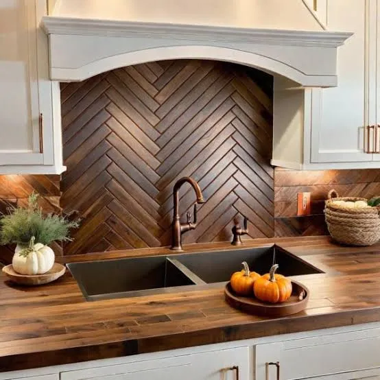
    8. Create a Statement Fireplace Wall

    How to Make a Statement Fireplace Work in Your Home | Napoleon
    Credit: napoleon

    A fireplace wall wrapped in shiplap, stone, or whitewashed brick instantly becomes the room’s anchor. Even if you don’t have a working fireplace, an electric insert with a simple wood mantel gets you the same cozy look.

    Keep the mantel styling simple: a mirror or art piece, two candlesticks, and maybe a small plant. Overloading the mantel makes it feel cluttered instead of curated.

    Tip: paint brick fireplaces white or cream if the original brick feels too dark or dated.

    This idea adapts well into traditional and transitional living rooms too, especially with stone finishes instead of shiplap. Once your focal point is set, lighting comes next.

    9. Choose Warm, Layered Lighting

    Light Layering: Mastering the Art of Illuminating Your Space with Style
    Credit: decorilla

    Good lighting makes or breaks this style. You want a mix of overhead lighting, table lamps, and maybe a floor lamp, all in warm white bulbs (around 2700K to 3000K).

    Farmhouse-style fixtures often use black metal, wood, or woven rattan shades. Avoid stark white LED light, since it clashes with the warm, cozy feel you’re going for.

    Practical tip: use dimmer switches on your main overhead lights so you can adjust brightness depending on time of day.

    This lighting approach works across almost every style, honestly, since warm lighting flatters most rooms. Now, let’s talk about that big blank wall space.

    Lighting Options Compared

    Fixture TypeBest PlacementAverage Cost Range
    Woven pendant lightOver coffee table or entry$60 to $150
    Black metal chandelierLiving room ceiling center$150 to $400
    Wood table lampSide table or console$40 to $100
    Floor lamp with linen shadeBeside sofa or reading chair$70 to $180

    10. Hang Simple, Neutral Wall Art

    Neutral Abstract Wall Print Ready-To-Hang Wall Art Abstract Neutral Splash – Gold Furnish
    Credit: Nationwideloghomes

    Skip the busy, colorful gallery walls. Modern farmhouse rooms usually favor black and white photography, simple line art, or a single large canvas in muted tones. Frames in black or natural wood keep things cohesive.

    A great trick is grouping three same-size frames in a row above the sofa instead of one giant piece. It’s affordable and easy to switch out later.

    Tip: hang art so the center sits at eye level, about 57 to 60 inches from the floor.

    This wall art approach transitions easily into minimalist and Scandinavian interiors too. Now, let’s talk textiles.

    11. Layer Throw Pillows and Cozy Blankets

    How Can I Layer Bedding for a Cozy Look? Top 6 Tips
    Credit: Beddi’s

    Texture is everything in this style. Mix linen, chunky knit, and cotton throw pillows in cream, oatmeal, and soft gray tones. A chunky knit throw blanket draped over the sofa arm adds instant coziness.

    Avoid shiny or overly patterned fabrics, since they clash with the natural, relaxed farmhouse feel. Stick to two or three pillow textures max so it doesn’t look cluttered.

    Practical tip: wash and fluff pillow inserts regularly so they don’t go flat and lifeless.

    This textile layering idea works beautifully in coastal and cottagecore living rooms too. Next, let’s talk furniture arrangement.

    12. Arrange Furniture for Conversation, Not Just TV Watching

    Expert Eye: 7 Ways to Arrange a Living Room for Conversation | Houzz NZ
    Credit: Houzz

    A common mistake is pointing every chair at the television. Modern farmhouse rooms tend to favor a conversational layout, with the sofa facing a couple of accent chairs, and the TV as a secondary focus.

    Try an L-shaped or U-shaped furniture arrangement around the coffee table. This makes the room feel more social and welcoming.

    Tip: leave at least 30 inches of walking space between furniture pieces for comfortable movement.

    This arrangement style transitions well into traditional and transitional living rooms too. Now let’s talk window treatments.

    13. Use Simple Linen or Cotton Curtains

    Linen vs. Cotton Curtains: The Ultimate Decision Guide (Style, Care & – THREE GIRLS
    Credit: Three Girls Curtains

    Skip heavy, formal drapes. Modern farmhouse windows usually get simple linen or cotton curtains in white or natural tones. They let in soft light while still framing the window nicely.

    Hang curtain rods close to the ceiling, above the window frame, to make ceilings feel taller. This is a cheap trick that instantly upgrades the whole room.

    Practical tip: curtains should just graze the floor or puddle slightly for that relaxed, farmhouse feel.

    This window treatment idea also fits coastal and cottage-style homes easily. Now let’s talk about open shelving.

    14. Add Open Wood Shelving for Display

    11 Open Wooden Shelves Bringing Modularity and Decorating Ease | Decoist
    Credit: decoist

    Open shelves made from reclaimed wood with black metal brackets are a farmhouse classic. Use them to display books, small plants, and a few decorative baskets or vases.

    Keep styling simple. Group items in threes, mix heights, and leave some empty space so it doesn’t look crowded.

    Tip: paint the wall behind the shelves a slightly darker tone than the shelves themselves, so items pop visually.

    This shelving idea adapts to industrial and Scandinavian spaces too, just swap the wood tone and metal finish. Last but not least, let’s talk about mixing old and new pieces.

    15. Blend Vintage Finds With New Furniture

    How to Blend New Furniture with Vintage Finds | Home Interior Warehouse
    Credit: Home Interior Warehouse

    The best modern farmhouse rooms don’t look brand new. They mix a vintage side table or antique mirror with newer, simpler furniture pieces. This gives the room a collected-over-time feeling instead of a showroom vibe.

    Thrift stores, estate sales, and flea markets are goldmines for this. Look for pieces with good bones, even if the finish needs updating.

    Practical tip: repaint or lightly sand vintage wood pieces to match your color palette without losing their character.

    This mixing approach honestly works in almost every design style, since blending old and new always adds personality.

    Tips for Success

    • Start with your rug and sofa first, then build the rest of the room around those two big pieces.
    • Keep your color palette to three or four main tones so the room stays cohesive.
    • Buy one or two higher-quality statement pieces instead of filling the room with cheap decor.
    • Add texture through natural materials like wood, jute, linen, and wool instead of relying on color.
    • Leave some negative space on shelves and walls so the room can breathe.
    • Test paint and fabric swatches in your actual room lighting before buying anything.
    • Shop secondhand for at least one piece to keep the room from feeling too matched or staged.

    Common Mistakes and How to Avoid Them

    Overdoing the shiplap
    : Using it on every wall makes a room feel like a stage set. Stick to one accent wall.

    Choosing furniture that’s too formal
    : Stiff leather sofas or ornate wood pieces clash with the relaxed farmhouse feel. Go for slouchy, simple shapes instead.

    Ignoring lighting temperature
    : Cool white bulbs make the room feel clinical. Stick to warm bulbs around 2700K to 3000K.

    Too many patterns at once
    : Mixing plaid, florals, and stripes together looks chaotic. Limit yourself to two patterns max per room.

    Skipping texture
    : An all-smooth room with no wood grain, knits, or woven baskets feels flat. Add at least three different textures.

    Forgetting scale
    : A tiny rug or undersized art piece makes furniture look disconnected. Always size up when unsure.

    Similar Variations

    • Coastal Farmhouse — Same neutral base but with lighter blues, sandy tones, and rope or rattan accents.
    • Industrial Farmhouse — Adds more raw metal, exposed brick, and darker wood tones for a grittier feel.
    • Modern Rustic — Leans heavier on wood textures and less on the crisp white farmhouse elements.
    • Scandinavian Farmhouse — Combines Nordic minimalism with farmhouse warmth, using lighter woods and fewer accessories.
    • Cottagecore Living Room — Softer, more romantic version with florals, vintage textiles, and pastel accents.
    • Transitional Farmhouse — Blends traditional furniture shapes with the same neutral, textured farmhouse palette.

    Putting together a room like this really comes down to balancing warmth with simplicity. You don’t need every single idea on this list, just pick a handful that fit your space and budget, then build from there. The little details, like a chunky throw blanket or a reclaimed wood shelf, are what make the room feel personal instead of like a copy of someone else’s Pinterest board.

    At the end of the day, a great space comes down to comfort, texture, and a few honest, well-chosen pieces, and that’s really the whole secret behind any good 15 Modern Farmhouse Living Room design.

  • 15 Sage Green And Cream Living Room Ideas

    15 Sage Green And Cream Living Room Ideas

    If you’re hunting for 15 sage green and cream living room ideas that actually work in real homes (not just fancy showrooms), you’ve landed in the right spot. I’ve pulled together the most practical, tested, and genuinely beautiful ways to bring this color combo into your space, and I’m not holding back any details.

    Sage green and cream is a soft, muted color pairing that combines a dusty, gray-toned green with warm off-white tones. This combo creates a calm, nature-inspired living room look that works with modern, traditional, and farmhouse style furniture alike.

    Stick with me and I’ll walk you through room layouts, furniture picks, fabric choices, and little styling tricks that make this color duo look expensive without costing a fortune.

    What Makes Sage Green And Cream Such A Popular Pairing

    I get why people fall for this combo. Sage green feels calm, almost like a walk in the woods, but it’s not loud or trendy in a way that’ll date fast. Cream softens everything. It keeps the room from feeling too cold or too “green.”

    Together, they create a look that feels put-together but never stiff. It works whether your house leans modern, cottage, coastal, or somewhere in between. I think that’s the real magic here. You’re not locked into one style. You’re just picking two colors that play nice with almost anything else you already own.

    Now let’s get into the actual ideas.

    1. Anchor The Room With A Sage Green Sofa

    Green sofa living room ideas: a shade-by-shade colour guide – Swyft
    Credit: Swyft

    A sage green sofa instantly sets the tone for the whole room. It’s a bigger commitment than a throw pillow, sure, but it pays off because it becomes your color anchor. Pair it with cream walls or a cream area rug so the sofa has room to breathe visually.

    Go with a boucle or linen fabric if you want texture without adding more color. Keep your coffee table and side tables in warm wood tones like oak or walnut to balance out the coolness of the green.

    Tip: if you’re nervous about commitment, start with a slipcovered sofa so you can swap the color later.

    This idea adapts beautifully to modern farmhouse rooms and also fits traditional homes with rolled-arm sofas.

    Once your sofa is set, it’s time to think about what goes behind it.

    2. Paint An Accent Wall In Muted Sage

    38 Best Sage Green Paint Colors for a Soothing Space
    Credit: The Spruce

    Not ready to paint the whole room? An accent wall is your best friend. Pick the wall behind your sofa or the one your eye lands on first when you walk in. Sage green on just one wall keeps the room from feeling heavy while still making a statement.

    Balance it out with cream trim, cream curtains, and a cream or off-white ceiling. This keeps the room bright even with a darker wall color in the mix.

    Practical tip: test your paint swatch at different times of day. Sage green can look gray in the morning and more olive at night depending on your lighting.

    This works especially well in modern and minimalist living rooms where clean lines let the color do the talking.

    Next, let’s talk about what goes on the floor.

    3. Layer A Cream Boucle Rug For Softness

    Boucle Carved Faux Fur Rug by Dunelm | uFurnish.com
    Credit: Ufurnish

    A cream rug grounds the room and adds a cozy, tactile layer that sage green walls or furniture alone can’t give you. Boucle and shag textures work really well here because they add dimension without adding more color to an already color-forward room.

    Keep your rug a few shades lighter than your walls so it doesn’t disappear into the background. If your sofa is sage, a cream rug creates nice contrast underneath it.

    Actionable tip: size your rug so all four legs of your main seating pieces sit on it. This makes the room feel intentional, not accidental.

    This idea works in coastal, Scandinavian, and traditional living rooms alike since neutral rugs are pretty universal.

    Now that your floor is sorted, let’s bring in some greenery to tie it all together.

    4. Add Real Or Faux Plants In Terracotta Pots

    How to Pot Artificial Plants Using Planters
    Credit: designer plants

    Since sage green already mimics nature, adding actual plants makes total sense. Fiddle leaf figs, snake plants, or even simple pothos vines echo the wall or furniture color while adding real texture and life to the room.

    Terracotta pots work great here because their warm, earthy tone pairs nicely with cream furniture and sage accents. If you don’t have a green thumb, high-quality faux plants look just as good these days.

    Tip: cluster plants in odd numbers (three or five) near a window for a more natural, less staged look.

    This works across every style, from boho to modern farmhouse, since plants are basically style-neutral.

    Once you’ve got some greenery going, let’s look at how throw pillows can pull the whole color scheme together.

    Sage Green And Cream Color Palette Combinations

    Palette NamePrimary Sage ToneCream ToneAccent ColorBest For
    Soft MeadowLight sage (#B2C2A1)Ivory (#F5F0E6)Warm brassSmall living rooms
    Deep Forest CalmMuted olive-sage (#8A9A78)Bone white (#EDE6D6)Walnut brownTraditional homes
    Coastal SagePale sage (#C7D3BE)Sandy cream (#F2E9D8)Driftwood grayCoastal or beach style
    Modern NeutralGray-sage (#A3AC9A)Cream (#F0EBDD)Matte blackMinimalist apartments

    5. Mix In Cream Throw Pillows With Texture

    How to Layer Throw Pillow Textures | One Affirmation | ONE AFFIRMATION
    Credit: One Affirmation

    Throw pillows are the easiest, cheapest way to test this color combo before committing to bigger furniture pieces. Cream pillows on a sage sofa (or the reverse) create instant contrast without overwhelming the space.

    Look for boucle, linen, or waffle-weave fabrics to add texture. Mixing two or three different cream shades keeps things interesting instead of flat.

    Tip: aim for pillows in odd numbers, like three or five, arranged asymmetrically for a more relaxed, lived-in look.

    This trick works in literally any home style because pillows are low commitment and easy to swap out seasonally.

    Speaking of easy swaps, let’s talk curtains next.

    6. Hang Cream Linen Curtains For Softness And Light

    Cream Curtains - Custom Made-to-Measure Drapes | EaseEase
    Credit: EaseEase Curtains

    Cream linen curtains do double duty. They soften the light coming through your windows and they add a warm, airy layer against sage walls or furniture. Linen specifically has a slightly rumpled, casual texture that keeps the room from feeling too formal.

    Hang your curtain rods a few inches above the window frame and let the curtains graze the floor. This small trick makes ceilings look taller and the whole room feel bigger.

    Practical tip: choose curtains with a slight sheer quality if your room doesn’t get much natural light, since heavy fabric can make a small room feel darker.

    This idea fits coastal, farmhouse, and transitional living rooms especially well since soft window treatments feel relaxed rather than stiff.

    Now let’s think about what’s holding your TV, books, and decor.

    7. Choose Cream Or Bleached Wood Furniture Pieces

    How to Strip and Bleach Wood Furniture - Our Southern Home
    Credit: Our southern Home

    Your bigger furniture pieces, like bookshelves, media consoles, and coffee tables, work best in cream or bleached wood tones. This keeps the sage green from feeling too dominant and gives your eyes a place to rest.

    Rattan and cane furniture also pair really well here, adding texture without introducing a new color into the mix.

    Tip: if your current wood furniture is too dark, a light whitewash or pickling stain can transform it without a full refinish.

    This works great in coastal and Scandinavian rooms, but bleached wood also softens up more traditional, formal spaces.

    Next, let’s talk about the walls themselves beyond just paint.

    8. Use Cream Wallpaper With Subtle Texture Or Pattern

    Cream Wallpaper for Walls – from ₹99/sq ft
    Credit: MagicDecor

    If a solid accent wall feels too plain, textured or subtly patterned cream wallpaper is a great middle ground. Grasscloth, linen-textured, or faint botanical prints in cream tones add depth without competing with your sage green furniture or accents.

    This works especially well in dining nooks attached to open-concept living rooms, or on a single feature wall behind a shelving unit.

    Tip: stick to wallpaper with a matte finish rather than glossy, since matte tends to look more expensive and less “trendy.”

    This idea shines in traditional and transitional homes but can also work in modern spaces if you pick a very minimal, subtle pattern.

    Once your walls are sorted, let’s talk about lighting.

    9. Choose Warm Brass Or Gold Light Fixtures

    Should I Go With Gold Or Black Bathroom Light Fixtures?
    Credit: Edward Martin

    Sage green and cream can start to feel a little cool or muted without the right lighting fixtures. Warm brass, gold, or antique bronze fixtures add just enough shine and warmth to balance things out.

    Floor lamps with linen shades, brass table lamps, and even a small brass chandelier can make a huge difference in how “finished” the room feels.

    Tip: use warm white bulbs (around 2700K to 3000K) instead of cool white to keep the room feeling cozy rather than clinical.

    This works in nearly every style, though modern rooms might lean toward matte gold while traditional rooms can go for more ornate antique brass.

    Now let’s talk about artwork and how it fits into this palette.

    10. Hang Botanical Or Landscape Art In Cream Frames

    Cream Blossom Study Botanical Framed Wall Art Print A1 (84.1×59.4cm) Black, Wall Decor for Living Room, Bedroom, Office & Home, Ready to Hang, Art Gift by Amazon | uFurnish.com
    Credit: Ufurnish

    Botanical prints, simple landscape paintings, or abstract art with sage and cream tones tie the whole room together. Cream or natural wood frames keep the focus on the art itself rather than a bold black frame competing for attention.

    Group two or three pieces in a small gallery wall for extra visual interest, or go with one large statement piece above your sofa.

    Tip: hang art so the center sits at eye level, roughly 57 to 60 inches from the floor, for the most natural look.

    This idea works in basically any home style since art is one of the easiest ways to personalize a space without changing the bones of the room.

    Speaking of personal touches, let’s look at how to bring in natural materials next.

    11. Incorporate Woven Baskets And Natural Fiber Baskets

    Natural Fiber Baskets: Materials, Uses, and Care Tips
    Credit: OakenArk

    Woven baskets in jute, seagrass, or rattan bring in texture and a little bit of organized storage, which every living room needs. They also echo the earthy, natural feeling that sage green already brings to the space.

    Use them for blankets, magazines, or even as a plant pot cover. Stack two or three different sizes near your sofa or under a console table for a curated, collected-over-time look.

    Tip: look for baskets with handles if you plan to actually use them for storage, since they’re way easier to move around.

    This works especially well in coastal, boho, and farmhouse living rooms, though even modern spaces can use one or two for texture.

    Next, let’s talk about a smaller but impactful detail, your throw blankets.

    12. Drape Cream Or Sage Throw Blankets Over Furniture

    Best Bed Throws - 15 Cosy Throws For Beds 2025
    Credit: House Beutiful

    A draped throw blanket instantly makes a living room feel cozier. Cream chunky knit blankets look great over a sage sofa, while a sage green throw can add a pop of color to a cream or neutral sectional.
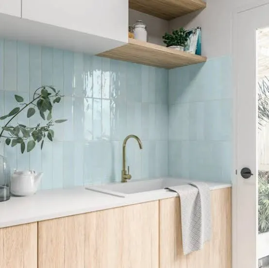
    Fold it in thirds and drape it over one arm of the sofa, or fold it at the foot of the sofa for a more casual, lived-in vibe.

    Tip: mix textures here too. A chunky knit throw next to a smooth linen pillow adds visual interest without adding more colors.

    This idea works in literally every home style since blankets are one of the most flexible, low-cost decor pieces you can buy.

    Budget Tiers For A Sage Green And Cream Living Room Refresh

    Budget TierWhat You Can Realistically UpdateEstimated Cost Range
    Small BudgetThrow pillows, one throw blanket, a few frames$80 to $200
    Mid BudgetAccent wall paint, area rug, curtains, lamp$400 to $900
    Full RefreshNew sofa, rug, curtains, lighting, wall treatment$1,500 to $4,000+

    13. Add A Sage Green Accent Chair For Contrast

    13 Ways to Style a Vibrant Green Accent Chair in Your Home – CHITA LIVING
    Credit: Chita Living

    If a full sage sofa feels like too much, one accent chair does the job just as well. A curved, boucle-covered accent chair in sage green pulls the color scheme together while still letting your main seating stay neutral.
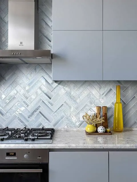
    Place it near a window or in a reading nook with a small side table and a floor lamp for a cozy corner that actually gets used.

    Tip: pick a chair with a swivel base if the space also needs to double as a conversation area, since it adds flexibility without extra furniture.

    This works particularly well in transitional and modern living rooms, but a wingback version of this idea fits traditional homes just as easily.

    Now, let’s talk about a detail people often forget, ceiling and trim color.

    14. Paint Trim And Ceiling In Warm Cream Instead Of Bright White

    Ceiling Paint Color Trends 2026: Top Colors & Ideas Beyond White - Hackrea
    Credit: Hackrea

    Bright white trim can feel harsh next to soft sage green walls. Swapping it for a warm cream tone instead creates a smoother transition between wall and trim, and it makes the whole room feel more cohesive.

    This is a small change, but it has a big visual impact, especially in older homes with a lot of trim detail like crown molding or wainscoting.

    Tip: use a satin or eggshell finish on trim instead of high gloss for a softer, more updated look.

    This idea works beautifully in traditional and cottage-style homes where trim detail is already a focal point.

    Finally, let’s finish with one more idea that ties everything together.

    15. Style Open Shelves With Cream Ceramics And Sage Books

    Marbury Sage Green Painted Small Low Bookcase | The Furniture Market
    Credit: The Furniture Market

    Open shelving is a great spot to show off smaller sage and cream decor pieces, like ceramic vases, stacked books with cream or sage covers, and small framed art. It’s also a low-pressure way to test the color combo in a small, contained space before committing to bigger furniture changes.

    Group items in threes, mix heights, and leave a little negative space so the shelf doesn’t feel cluttered.

    Tip: turn a few books spine-in and cover-out to add color blocking without buying new decor.

    This idea works in nearly every home style since open shelving is common in modern, farmhouse, and traditional homes alike.

    Tips For Success

    • Test paint swatches on your actual wall for at least two full days before committing, since lighting changes throughout the day.
    • Balance cool sage tones with warm materials like brass, rattan, or light wood to avoid a cold-feeling room.
    • Don’t match every sage item to the exact same shade. Slight variation looks more natural.
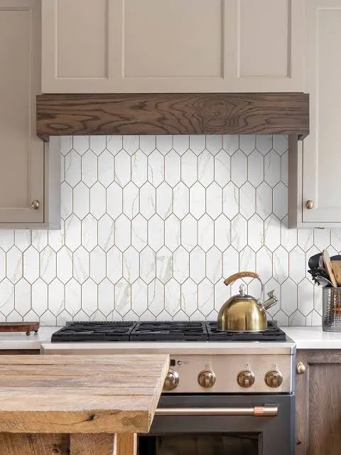
    • Keep at least one large neutral surface, like a rug or sofa, to prevent the room from feeling too busy.
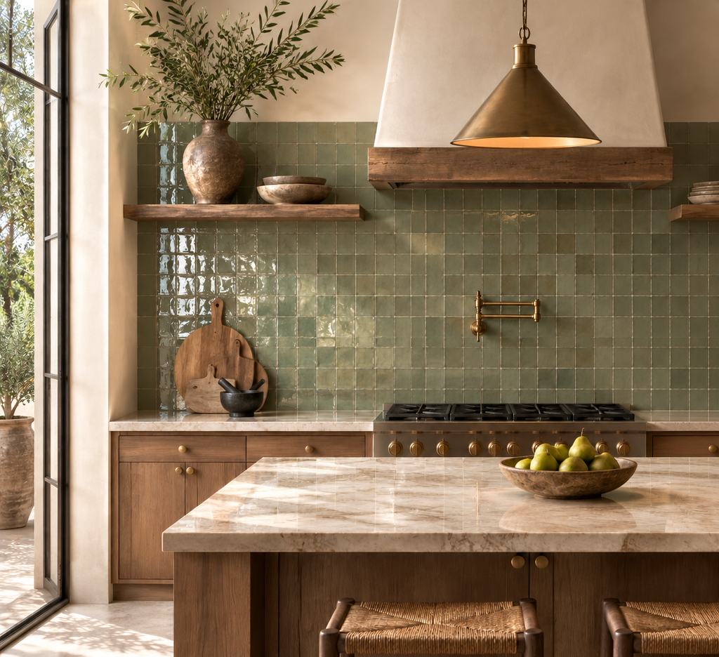
    • Add texture generously since sage and cream are both muted colors that can look flat without it.
    • Use plants as a bridge color since they naturally connect sage tones to the rest of the room.
    • Save receipts on bigger furniture pieces in case the color doesn’t read the way you expected once it’s home.

    Common Mistakes And How To Avoid Them

    Using stark white instead of cream
    : Stark white creates too much contrast with sage green and can make the room feel cold. Stick with warmer, creamier whites instead.

    Choosing only cool-toned metals
    : Chrome and silver fixtures can make the room feel sterile. Swap in brass or bronze for warmth.

    Skipping texture
    : A room with only flat paint and smooth fabric can look boring fast. Add knits, boucle, jute, and rattan for depth.

    Going too matchy with green tones
    : Using the exact same sage shade everywhere flattens the room. Mix in slightly different sage tones for depth.

    Forgetting lighting temperature
    : Cool white bulbs clash with warm cream tones. Stick with warm white bulbs for a cozier feel.

    Overcrowding with too many accent colors
    : Adding too many extra colors on top of sage and cream competes for attention. Keep additional colors minimal, like one warm wood tone and one metal finish.

    Similar Variations

    • Coastal Sage: leans more heavily on driftwood, linen, and sandy cream tones for a beachy, relaxed feel.
    • Modern Farmhouse Green: pairs sage with black metal accents and shiplap for a more rustic, structured look.
    • Sage And Terracotta: swaps out some cream for warm terracotta accents, adding a more earthy, Mediterranean feel.
    • Scandinavian Sage: keeps things minimal with pale sage, cream, and light wood, avoiding heavy patterns or clutter.
    • Sage And Charcoal: adds a moody contrast by pairing sage green with charcoal gray instead of cream for a more dramatic room.

    Putting a room together with sage green and cream doesn’t have to feel complicated or expensive. Small swaps like pillows, rugs, and lighting can completely shift the mood of a space, and bigger commitments like a sofa or accent wall just build on that same calm, natural feeling. Whatever combination you choose from this list, you’re set up with a solid, flexible plan thanks to these 15 sage green and cream living room ideas.