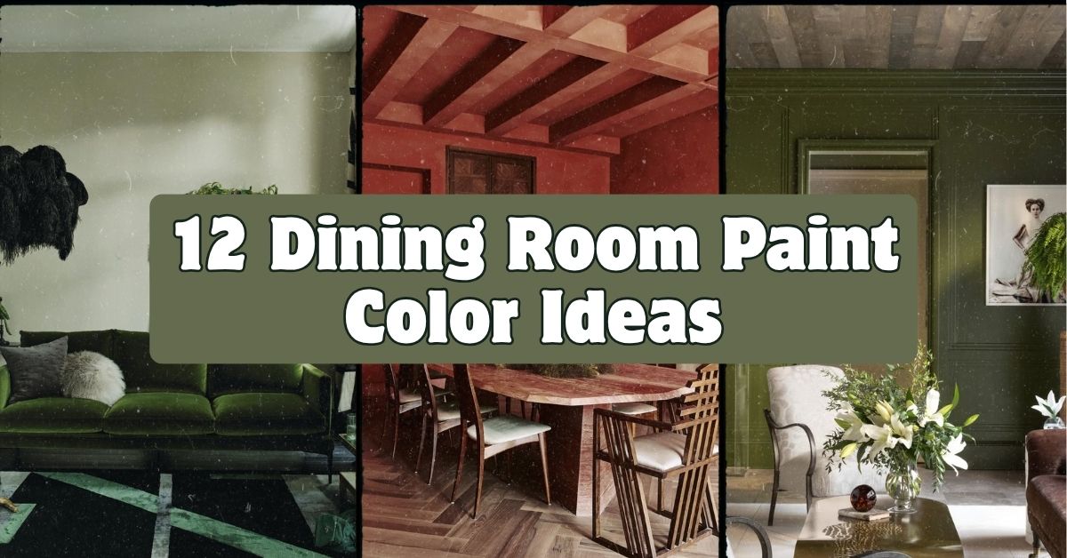
Picking the right color for your dining room is way harder than it sounds, but I’ve got you covered with 12 Dining Room Paint Color Ideas that actually work in real homes, not just magazine spreads. I’ve spent way too many weekends staring at paint chips, so let me save you the trouble.
The best dining room paint colors depend on lighting, room size, and the mood you want. Warm tones like terracotta and burgundy create coziness, while cool tones like sage and navy add calm sophistication. Neutrals work everywhere.
Stick around, because I’m about to walk you through every shade, tone, and trick that turns a boring dining room into the room everyone wants to sit in.
What Makes a Dining Room Paint Color “Work”
Here’s the thing about dining rooms. You don’t hang out in them all day like a living room. You sit in them for an hour or two, usually with people you like, over food you made an effort with. That changes the rules a bit.
A dining room can handle bolder colors than a bedroom because you’re not staring at the walls while trying to fall asleep. It’s a “special occasion” room in a lot of houses, so it can afford some drama. But it still needs to feel warm and inviting, not like a waiting room. That balance is what we’re chasing with every idea below.
1. Warm Terracotta for a Cozy Gathering Feel

Terracotta is having a moment, and honestly, it deserves it. This warm, earthy orange-red brings instant coziness to a dining room, kind of like walking into a sunlit kitchen in Tuscany. It pairs beautifully with wood furniture, rattan chairs, and brass light fixtures.
Try pairing terracotta walls with a cream or white tablecloth to keep things balanced instead of overwhelming. A good tip: paint one accent wall first if you’re nervous about commitment, then decide if you want the whole room.
This color works great in farmhouse or Mediterranean-style homes, and it even softens up an industrial loft. Once terracotta wins you over, you might want something even richer, which brings us to deep greens.
2. Deep Forest Green for Dramatic Elegance

Forest green is the color equivalent of a velvet blazer. It’s rich, a little fancy, and makes any dining room feel like it belongs in a boutique hotel. This shade works especially well in rooms with natural light because it won’t feel like a cave.
Pair it with gold or brass hardware, a wood table, and warm-toned art. A practical tip: use a matte or eggshell finish so the deep color doesn’t look shiny or plasticky under chandelier light.
Traditional and modern farmhouse homes both love this color. Modern spaces can pair it with sleek black chairs, while traditional homes might go with tufted upholstery. If deep green feels like too much, sage is the gentler cousin waiting in the wings.
3. Soft Sage Green for a Calm, Natural Vibe
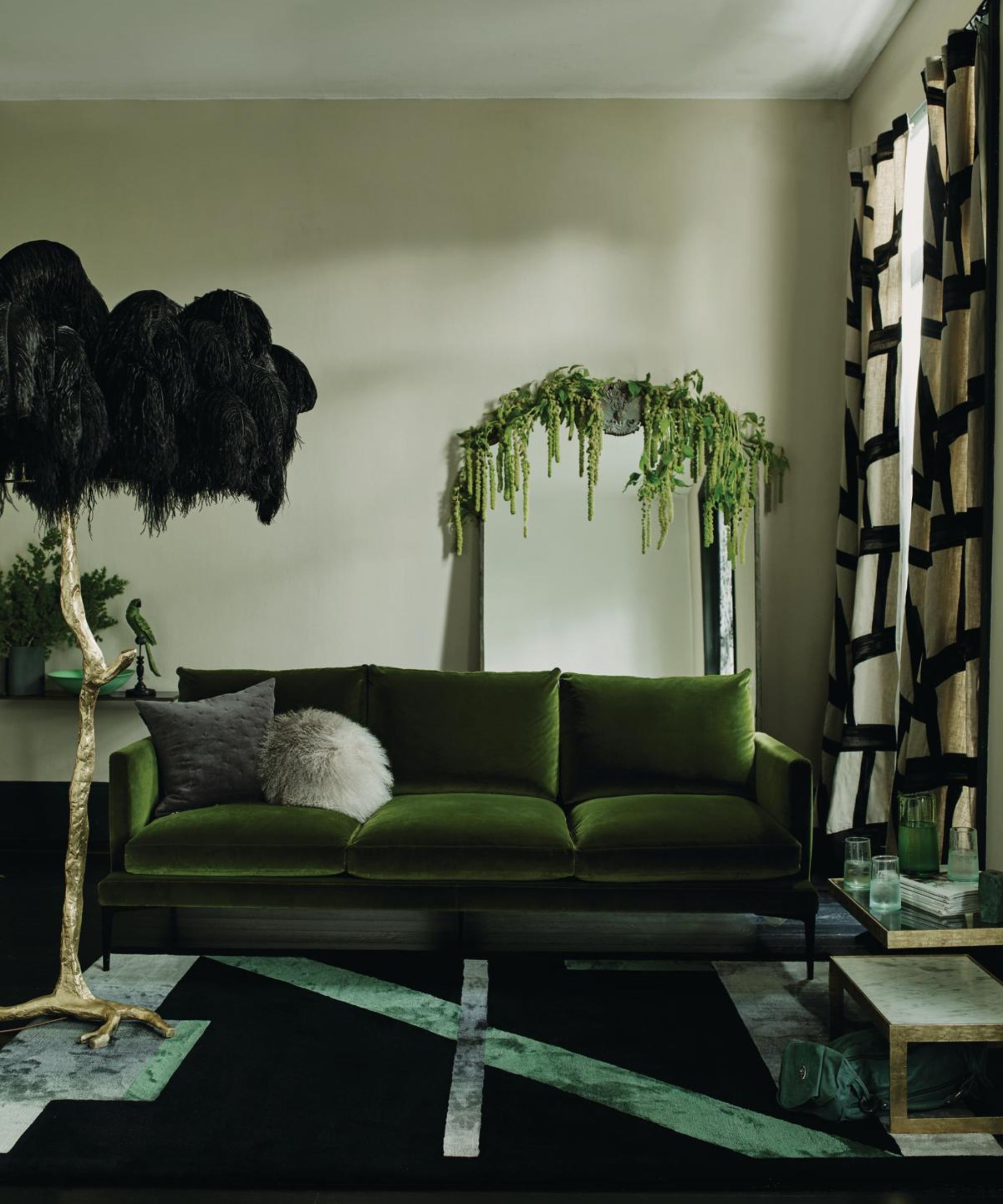
Sage green is soft, muted, and endlessly easy to live with. It’s the color of eucalyptus leaves and calm mornings. Unlike forest green, sage doesn’t demand attention. It just quietly makes the room feel fresh.
This shade pairs well with light wood tones, white trim, and woven textures like rattan or jute. A quick tip: test sage in both morning and evening light before committing, because it can shift from green to gray depending on the time of day.
Coastal and Scandinavian-style dining rooms practically beg for this color. It also works in small rooms since it doesn’t shrink the space visually. Speaking of small rooms, let’s talk about a color that works in literally any size space.
4. Classic Navy Blue for Timeless Sophistication

Navy blue is one of those colors that never really goes out of style. It’s bold without being loud, and it makes white trim, gold accents, and wood floors pop like nothing else. Navy walls paired with a big statement chandelier can make even a small dining room feel elegant.
My tip here: keep your ceiling white or a very light color to stop the room from feeling boxed in. Navy on all four walls plus a dark ceiling can get heavy fast.
This color fits traditional, coastal, and modern homes equally well. Coastal spaces might add white shiplap, while modern rooms go sleek with black metal chairs.
Color Palette Combinations for Popular Dining Room Colors
| Wall Color | Trim/Ceiling | Accent Metal | Best Wood Tone |
|---|---|---|---|
| Terracotta | Warm white | Brass | Medium oak |
| Forest Green | Off-white | Brass or gold | Walnut |
| Sage Green | Bright white | Matte black | Light oak or birch |
| Navy Blue | Crisp white | Gold or brass | Dark walnut or espresso |
5. Warm Greige for a Versatile Neutral Backdrop

Greige, that magic mix of gray and beige, is the color you pick when you can’t decide on anything else. It’s warm enough to avoid feeling cold, but neutral enough to let your furniture and art do the talking.
I like this color for dining rooms that double as home offices or playrooms during the week. It won’t clash with whatever chaos happens to be sitting on the table. Tip: choose a greige with warm undertones (check the paint’s base color) so it doesn’t turn pink or purple in certain lighting.
Greige works in literally every home style, from farmhouse to mid-century modern. Once you’ve got your neutral base down, you might want something with a bit more edge, like charcoal.
6. Moody Charcoal for Modern Contrast

Charcoal gray is bold without going full black. It creates serious contrast against white trim, light wood tables, and metallic accents. This color makes a dining room feel like a design magazine cover, especially at night with warm lighting.
A helpful tip: balance charcoal walls with lots of texture, think linen curtains, woven placemats, or a jute rug, so the room doesn’t feel flat or cold.
Modern and industrial homes eat this color up, but even traditional dining rooms can pull it off with the right molding and classic furniture shapes. Now let’s brighten things up with a color that does the opposite job.
7. Buttery Yellow for Cheerful Mornings
Yellow gets a bad reputation, but a soft, buttery yellow (not the neon stuff) makes a dining room feel sunny even on gray days. It’s especially great for breakfast nooks or rooms that double as morning coffee spots.
Pair it with white furniture, natural wood, and blue or green accents for a fresh, cheerful look. Tip: go for a warm, muted yellow rather than a bright lemon shade, which can feel more like a kid’s playroom than a dining room.
This color shines in farmhouse and cottage-style homes. Coastal homes can use it too, paired with white and navy accents for a classic nautical feel.
8. Dusty Rose for Soft Romantic Charm
Dusty rose is that grown-up pink that doesn’t scream “little girl’s bedroom.” It’s muted, warm, and surprisingly easy to decorate around. This color adds softness to a dining room without feeling overly feminine.
Pair dusty rose with brass fixtures, dark wood furniture, and green plants for contrast. Tip: keep your furniture on the neutral side (think cream or wood tones) so the walls stay the star of the show.
This works beautifully in transitional and traditional homes. Modern farmhouse spaces can use it too, paired with black metal chairs for a bit of edge.
Paint Finish Comparison for Dining Rooms
| Finish Type | Shine Level | Best For | Durability |
|---|---|---|---|
| Flat/Matte | None | Ceilings, low-traffic walls | Low, hard to clean |
| Eggshell | Slight | Most dining room walls | Medium |
| Satin | Noticeable | Homes with kids or frequent wiping | High |
| Semi-Gloss | High | Trim, doors, chair rails | Very high |
9. Rich Burgundy for a Bold Statement
Burgundy is the color for people who want their dining room to feel like a fancy restaurant. This deep wine shade pairs beautifully with dark wood, brass candlesticks, and moody lighting.
Because it’s such a strong color, I’d recommend using it in a room with decent natural light or plenty of overhead lighting, otherwise it can feel too dark and heavy. Tip: add mirrors to bounce light around and keep the room from feeling closed in.
Traditional and eclectic homes love this shade. It also works surprisingly well in art deco-inspired spaces with gold accents and geometric patterns.
10. Two-Tone Walls with a Chair Rail Divide
If picking just one color feels impossible, don’t. A chair rail lets you split the wall into two colors, usually a darker shade below and a lighter one above. This adds visual interest and protects your walls from chair scuffs, which is a nice bonus.
A classic combo is navy below and white above, but you can play with almost any pairing. Tip: keep the darker color on the bottom two-thirds of the wall for the most balanced, grounded look.
This idea is a favorite in traditional and coastal homes, but modern spaces can pull it off too with a slim, simple rail instead of an ornate one.
11. Deep Teal for Jewel-Tone Drama
Teal sits right between blue and green, and it brings a jewel-toned richness that photographs beautifully. It’s bold but not as common as navy, so it gives your dining room a little personal flair.
Pair teal walls with brass or copper accents and warm wood tones to keep things cozy instead of cold. Tip: if the room feels too dark, add a large mirror or metallic art piece to reflect light around.
Eclectic and bohemian homes love this color, though modern dining rooms can use it too with sleek black or white furniture for contrast.
12. Warm Taupe for Understated Elegance

Taupe is the quiet cousin of greige and gray. It leans warmer and softer, making it a comforting backdrop for a dining room that gets a lot of use. This color doesn’t try too hard, which is exactly the point.
It pairs well with cream linens, wood furniture, and soft green plants. Tip: add texture through curtains or a textured rug since taupe alone can feel a little flat without it.
This shade fits transitional and modern farmhouse homes especially well, and it plays nice with almost any furniture color you already own.
13. Crisp White with Colorful Trim Accents
Sometimes the boldest move is keeping the walls simple and letting the trim do the talking. Crisp white walls paired with a colorful chair rail, door frame, or wainscoting give you personality without covering the whole room in color.
This is a great option if you rent or plan to sell soon, since white walls are easy to keep neutral while the trim adds character. Tip: pick just one accent color for the trim so the room doesn’t feel busy or mismatched.
Coastal, modern, and traditional homes all use this trick well. It’s especially popular in beach house dining rooms with navy or seafoam trim against white walls.
Tips for Success
- Test paint samples on your actual walls, not just a paint chip, since lighting changes everything.
- Look at your samples at three different times of day before deciding.
- Consider your dining table’s wood tone before picking a wall color so they don’t clash.
- Don’t ignore the ceiling. A colored ceiling can make a small dining room feel cozier and more intentional.
- Match your paint finish to how the room actually gets used, not just how it looks on the swatch.
- Keep a leftover paint can labeled with the color name and finish for easy touch-ups later.
- If you’re nervous about a bold color, paint the inside of a china cabinet or accent nook first as a low-risk test.
Common Mistakes and How to Avoid Them
Skipping the sample stage
: Always test a sample patch on the wall for a few days before buying gallons. Colors shift depending on your specific lighting.
Ignoring the flooring and furniture already in the room
: Choose your paint color after considering your existing wood tones and rug colors, not before.
Using a flat finish on high-traffic walls
: Go with eggshell or satin in dining rooms since they resist scuffs and wipe clean easier than flat paint.
Painting without considering the light fixture’s warmth
: Warm bulbs make colors look richer and more yellow, while cool bulbs can make the same color look flat or gray. Check your bulbs before finalizing a color.
Going too trendy without a backup plan
: If you love a trendy color but worry about resale value, paint an accent wall instead of the whole room so it’s easy to change later.
Similar Variations
- Coastal Dining Room – Light blues, whites, and sandy neutrals that feel like a beach house year-round.
- Modern Farmhouse Dining Room – Warm whites and soft grays paired with black metal and reclaimed wood accents.
- Art Deco Dining Room – Bold jewel tones like emerald and burgundy paired with gold geometric details.
- Scandinavian Dining Room – Soft neutrals, light wood, and minimal color contrast for a calm, airy feel.
- Bohemian Dining Room – Rich, layered colors like rust and deep teal mixed with global patterns and textures.
- Traditional Formal Dining Room – Deep, saturated colors like navy or burgundy paired with classic wood furniture and brass fixtures.
Picking a dining room color doesn’t have to feel overwhelming once you know your options. Whether you go bold with burgundy or keep it simple with warm greige, the right shade can completely change how your dining room feels to sit in every day. I hope these 12 Dining Room Paint Color Ideas gave you exactly the inspiration and confidence you needed to finally pick up that paintbrush.
Leave a Reply